First and foremost – our thanks to everyone who reviewed our preliminary DevExtreme 2020 Roadmap last year. Your feedback helped us refine our development plans and to finalize our 2020 Roadmap.
Should you have any questions about our 2020 Roadmap or if you’d like to discuss your development needs further, please post a comment below. We’ll be happy to follow up.
Important Note: The features listed below should be available for Angular, React, Vue, and jQuery simultaneously. Exceptions are highlighted.
Official Product Release Schedule
We released community tech previews of several major components in 2019. We expect to officially ship the following products in 2020.
DevExtreme Gantt Control for Angular, React, Vue and jQuery (v20.1)
![]()
We will officially release
DevExtreme Gantt in our first major release of 2020 (v20.1). DevExtreme Gantt will ship with the following new features:
- Localization support
- New toolbar with commands to edit default items and add custom items
- New Current Time Marker to indicate current date and time
- Data validation support
- Custom task color support
- Touch device support
In our second release of 2020 (v20.2) we’ll add the following capabilities to our Gantt Control for Angular, React, Vue, and jQuery:
- Export the Gantt content to PDF, PNG, etc.
- Template support (Gantt chart tasks)
- Context menu customization
- Task Detail dialog customization.
DevExtreme Diagram for Angular, React, Vue and jQuery (v20.1-v20.2)
We will officially release
DevExtreme Diagram in 2020. v20.1 will include the following features:
- Performance enhancements
- Custom shape templates
- New UI that offers additional workspace for a document. This should improve user experiences on mobile and tablet devices.
- Dash, dot, and other types of lines for shapes and connectors
- Support for touch devices
v20.2 will include the following new features:
- Toolbar and context menu customization
- New API to refresh Diagram document when a data model is changed outside the component
- Text validation in shapes and connectors
- Automatically resize shapes based on text content
- New API to restrict end-user operations such as shape resizing, dragging, adding or removing shapes, dragging shapes out of container, etc.
- Shape rotation support
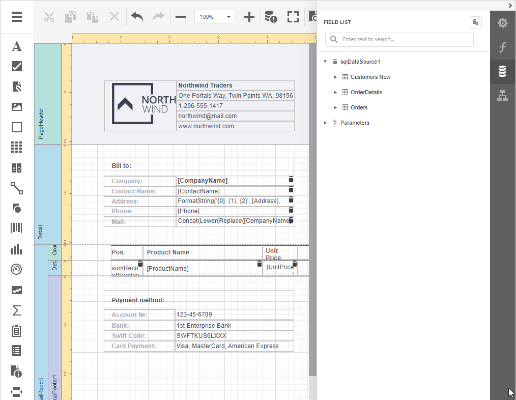
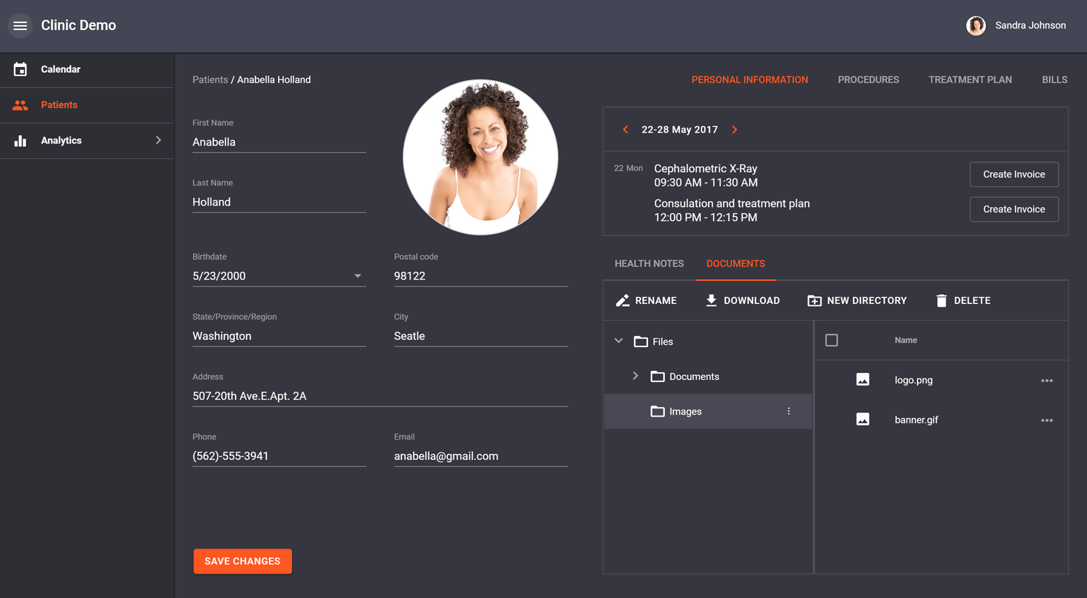
DevExtreme File Manager for Angular, React, Vue and jQuery (v20.1)
![]()
Our first release of 2020 (v20.1), will include a production version of the
JavaScript File Manager component for Angular, React, Vue and jQuery. It will include the following new features:
- Upload and download files via our ArrayFileProvider
- Declarative column customization using component options
- New API to manage file and directory selection and control end-user actions on UI elements
- Intuitive file management error handling support
- Notification and Progress panel UX enhancements
- Item hover and selection within the thumbnail view
- Touch device support enhancements
DevExtreme Architectural Enhancements
For the last couple of years, we worked to extend our product line’s features and delivered multiple new products to address a broad range of usage scenarios. Throughout next year, we will dedicate significant resources to evolve existing capabilities and improve our product line’s architecture:
Reduce JS/CSS Bundle Sizes (v20.2)
Smaller production bundles (or code chunks) offer the following benefits:
- Less time to compile application source code.
- Less time to deploy applications to hosting servers.
- Less time to deliver apps to end-user web browsers (better UX).
SCSS Support
We will migrate existing DevExtreme LESS styles to the more modern SCSS format and make them available to everybody. You will be able to integrate DevExtreme SCSS styles into your application build process. This will allow you to precisely customize CSS styles and minimize resulting CSS bundles. The SCSS team recently
announced a new-generation module system. We plan to fully support this new system.
Improved Code Splitting
Code Splitting allows web developers to group application code into multiple small bundles and reduce initial load time. To help maximize its benefits, we hope to organize DevExtreme into smaller/functionality specific
modules (for instance, we want to give you the option to use a read-only Data Grid without bundling any of its data editing features).
Efficient Tree Shaking
Tree shaking is the process of removing unused code during the bundling process. We plan to refactor our codebase to allow JS bundling tools to tree-shake DevExtreme products more efficiently.
Improved Responsiveness/Adaptivity (v20.1-v20.2)
We will create and publish a fully responsive real-world DevExtreme application built from ground up. We want it to look and work perfectly on any screen – from wide desktops and tablets to mobile phones. Adaptability enhancements can be applied to many components from Toolbars and Menus to our DevExtreme Scheduler and DataGrid.
![]()
DevExtreme DataGrid/TreeList
New Export to Excel API (v20.1)
Export to Excel will be made more flexible and robust approach via the
ExcelJS library.
Our new export capabilities will give you granular control over the Excel file generation process. We’ll do our best to make the migration process as smooth as possible. For a limited time, both options (old and new) will work side by side.
We expect to deliver the following features prior to official release:
- Introduce transparent (WYSIWYG) export of our DataGrid’s column format.
- Export the DataGrid’s filter configuration as Excel worksheet column filters.
- Fully document our new export to Excel API.
- Demonstrate popular usage scenarios via technical demos.
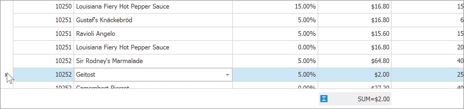
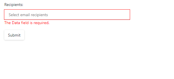
Remote Validation Support (v20.1)
![]()
API Enhancements (v20.1-v20.2)
We plan to improve the design-time experience of both our DataGrid and TreeList when using MVVM-like reactive frameworks such as React, Vue, and Angular. You’ll be able to work with the component state via bindings/properties rather than via instance methods. For instance, you’ll be able to bind expanded detail row IDs in the markup instead of calling the ‘expandRow’ and ’collapseRow’ methods.
We will allow you to track and control the following DataGrid and TreeList states:
- Expanded group rows
- Expanded master-detail rows
- Expanded adaptive rows
- DataSource properties (items, totalCount, summary)
- Load panel visibility
- Validation state (invalid cells, error text and position)
In addition, we plan to introduce the following API enhancements:
- Add new editing-related ‘saving’ and ‘cancel’ events
- Allow you to manipulate DataGrid/TreeList data without using a CustomStore
DevExtreme PivotGrid
New Export to Excel API (v20.2)
We received a lot of positive feedback about the new Export to Excel API mentioned in the DataGrid section above and expect to extend it to DevExtreme PivotGrid in 2020.
UI Components
Editors & Form Layout
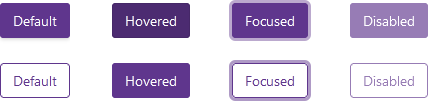
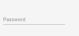
Label Animations (v20.1)
According to Material Design Guidelines, editor placeholder text can turn into a label once the editor obtains focus. We plan to support this feature.
![]()
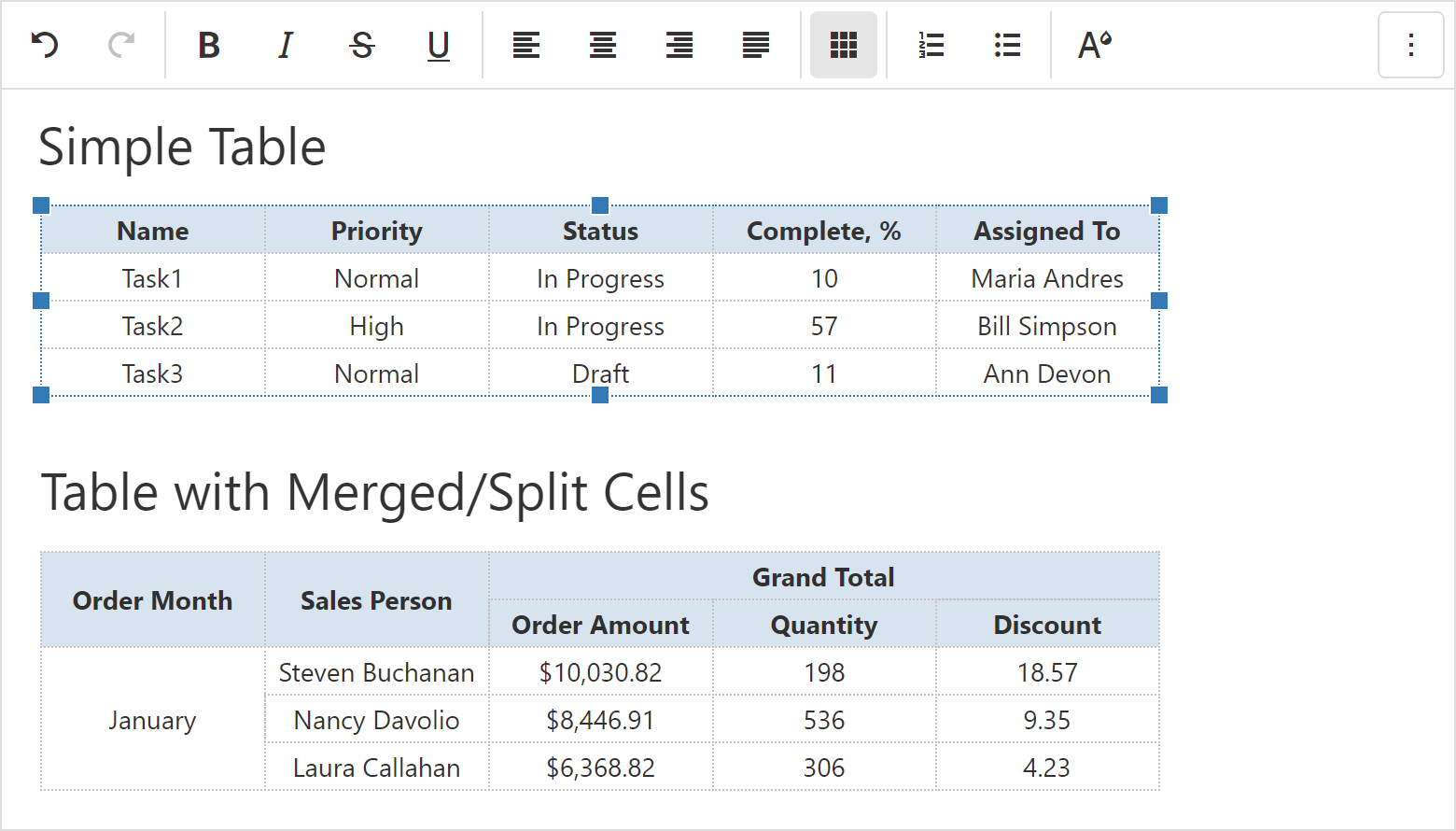
DevExtreme HTML/Markdown Editor
Table Support (v20.2 or later)
DevExtreme HTML/Markdown Editor (CTP) core is based on the open-source implementation known as Quill. Quill 2.0 was expected in 2019 and was purported to offer a new API with table support. Unfortunately, Quill 2.0 has yet to be released. Since we consider table support as a must-have feature, we can’t ship RTM before we find a way to implement tables. If Quill 2.0 is not released or we can’t deliver this capability with Quill 1.x, this feature may not be released in 2020.
![]()
Upload Images via a Form, Drag-and-Drop, and Copy/Paste (v20.2 or later)
Though we were unable to deliver this feature in 2019, we
have prepared a custom solution you can use today. We expect to integrate this feature once we resolve the table support issue mentioned earlier.
DevExteme Scheduler
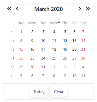
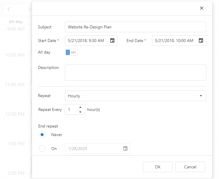
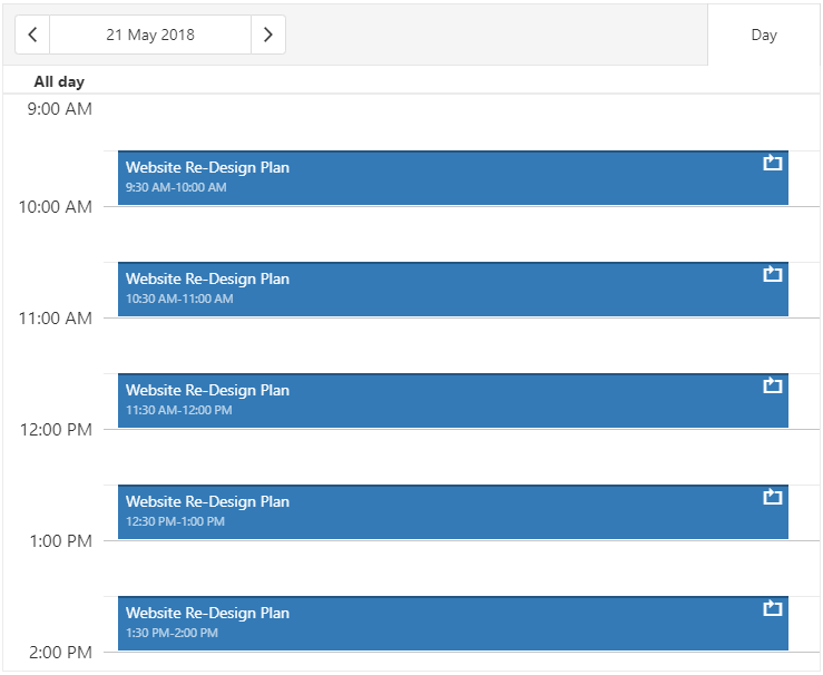
Hour Values within the Recurrence Form (v20.1)
We will allow users to specify the ‘hour’ portion of a recurrence pattern within the DevExtreme Scheduler Recurrence Form.
![]()
![]()
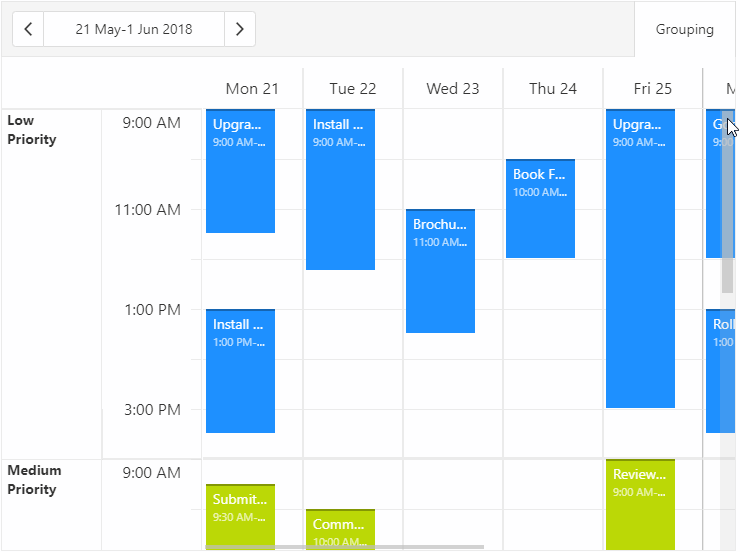
Sticky Group/Resource Names (v20.1)
When scrolling a very wide or a very high group, names can exceed visible boundaries. With our new implementation, sticky names can remain visible during scroll operations.
![]()
Virtual Scrolling (v20.2)
To help improve overall performance and usability, we will add a new virtual scrolling mode to our Scheduler component. When enabled, only visible appointments will be rendered.
Data Visualization
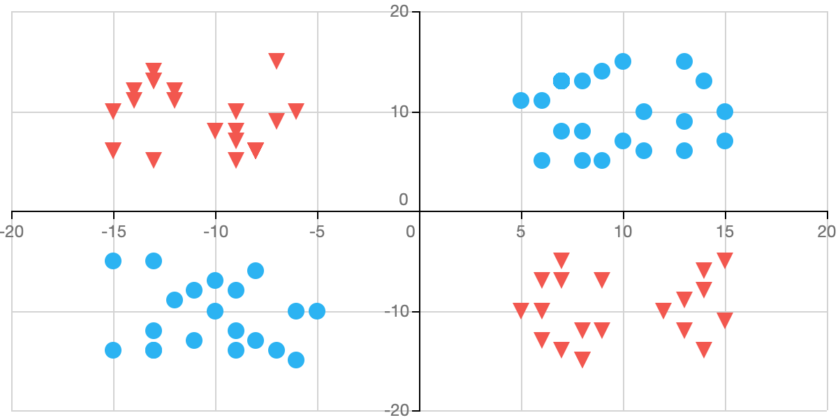
Annotations in Maps, Pie and Polar Charts (v20.1)
We recently introduced
chart annotations. We plan to extend this capability to Maps, Pie and Polar Charts.
![]()
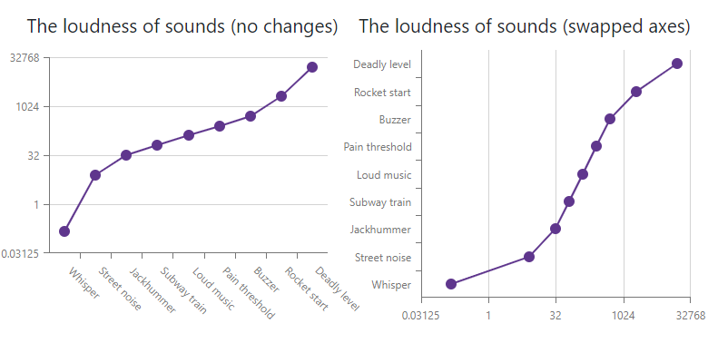
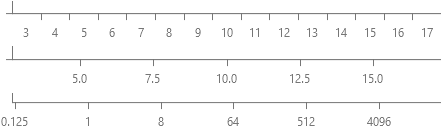
Custom Position of Chart Axes (v20.1)
We planned to release this feature in 19.2 but failed to do so. Please, refer to our
discussion page for more information.
![]()
Additional Customization Options (v20.2)
We’ll allow you to use templates to render images (or other custom content) within chart axis labels.
![]()
Application Templates
Authentication UI Templates (Angular, React, Vue) (v20.1-v20.2)
We want to extend our existing Login Form template with a new Sign Up, Reset/Change Password form template. We will also implement corresponding client-side user workflows so you can integrate our forms with your backend authentication API.
![]()
Native React Components
Native React Grid
Export to Excel (v20.1)
Export the contents of the DevExtreme React Grid to Excel (including options to configure formatting).
![]()
Row Reordering (v20.1)
We’ll create a plugin that allows a user to alter record order via drag-and-drop.
![]()
Popup Editing (v20.1)
We’ll allow users to edit a grid record in a separate popup form.
![]()
Detail Editing (v20.1)
Your users will be able to edit records within an inline detail form.
![]()
Keyboard Navigation (v20.2)
We’ll allow your users to navigate through Grid cells via the keyboard.
Batch Editing (v20.2)
A user will be able to edit, create or delete multiple records and then save or cancel changes in a single batch operation.
Native React Scheduler
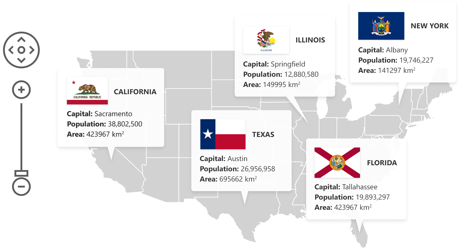
Resources & Grouping (v20.1)
![]()
Compact Appointment View (v20.2)
We’ll allow you to group multiple appointments into a
single item if space is limited (if we are unable to display all appointments simultaneously).
![]()
Timeline View (v20.2)
We will introduce a new type of view to display schedule timelines. You can find an example of a timeline here.
![]()
The information contained within this blog post details our current/projected development plans. Please note that this information is being shared for INFORMATIONAL PURPOSES ONLY and does not represent a binding commitment on the part of Developer Express Inc. This roadmap and the features/products listed within it are subject to change. You should not rely on or use this information to help make a purchase decision about Developer Express Inc products.
![]()


.png)