Quantcast
Channel: Developer Express Global
Viewing all 3390 articles
Browse latest View live

Blog Post: ASP.NET AJAX Control Toolkit v20.1.0 - Now Available

$
0
0

A few years ago, we took over maintenance and guidance for the ASP.NET AJAX Control Toolkit project. Please refer to this blog post for more information on the project and why we stepped in to assist.

As part of our ongoing commitment to the project, we’ve released an update (ASP.NET AJAX Control Toolkit v20.1.0) to address the following issues.

Resolved Issues

  • CascadingDropDown continuously refreshes in Firefox 65 (#477)
  • MaskedEditExtender with ClearMaskOnLostFocus=False adds an extra character at the first position (#493)
  • ListSearchExtender does not work in Firefox 66+ (#494, contributed by @TheUlderico)
  • AjaxFileUpload fails with <sessionState cookieless="UseUri"> (#500)
  • ReorderList adds the opacity CSS property to the <LI> element (#503)
  • SCRIPT1028 error in legacy IE (#515, contributed by @SIkebe)
  • Tabs control doesn't preserve the active tab when it contains a LinkButton with a validator (#518)
  • DragPanelExtender - JavaScript errors in IE 11 with non-100% zoom (#522)
  • The onchange handler on a TextBox with AutoComplete is triggered twice in Google Chrome (#529)
  • HtmlEditorExtender.Decode - Remove insecure HTML (#532)

Ready to Upgrade?

To update the ASP.NET AJAX Control Toolkit, please download our most recent installer using the link below.

Download

Or, if you prefer, use Nuget:

ASP.NET AJAX Control Toolkit Nuget package

As always, we welcome your feedback. Please share your thoughts on this update via GitHub.

Want More? Try the DevExpress ASP.NET Subscription Free for 30-days

We’d like to thank you for installing the DevExpress Edition of the AJAX Control Toolkit and look forward to your feedback as you begin leveraging its capabilities.

If you require additional UI controls for your ASP.NET WebForms application, we invite you to download and try a free 30-day evaluation of our ASP.NET Subscription. With over 100 UI controls, the DevExpress ASP.NET Subscription helps you build your best, and deliver elegant line-of-business applications in the shortest possible time. For a complete list of products and features in our ASP.NET Subscription, please refer to the following webpage.


Blog Post: TestCafe Studio v1.3.0 - A New Way to Work with Selectors

$
0
0

TestCafe's Visual Test Recorder automatically creates selectors for all elements used in a test. This complicated algorithm balances many different variables, and we just recently added a few options so that you can customize it to meet your specific needs.

This article first covers what we consider to be a reliable selector. We then mention the pros and cons of various selector strategies, and custom attributes in particular. Finally, we'll show you how to customize TestCafe options so that it builds selectors that are optimized for your website.

How TestCafe Studio Generates Selectors

To record an automated test in TestCafe Studio, specify the tested page’s URL and start the recorder. TestCafe Studio launches the selected browser, opens the web page, and records your actions. Once the test scenario is ready, you can run it in any local browser, a mobile device, or as part of your CI pipeline.

TestCafe Studio not only records your actions (element clicks, text input), but it also creates a selector for every affected page element. The selector generation algorithm was developed to adhere to the following requirements:

  • Selectors shouldn’t be too specific. Otherwise, you might have to rewrite them after each page modification. For instance, Selector(‘body’).find(‘div’).nth(5).find(‘p’).nth(3) must be revised each time the number of elements on the page changes.
  • Selectors shouldn't be too generic. Otherwise, they may return different elements after each markup change. For example, Selector(‘div > button’) can match multiple elements at once.
  • Selectors shouldn’t rely on element parameters that are likely to change. For instance, Selector('[style*="background-color: red"]') uses a CSS style that changes frequently.
  • Selectors should remain readable. Selectors should be easy to understand (by you or another developer) for as long as the test is maintained. For instance, it may be difficult to understand which element corresponds to the following selector: Selector(‘div’).find(‘pre’).nextSibling(-1). If you use Selector(‘#topContainer’).find(‘.child’).withText(‘Add item’) instead, the selector is much easier to read.
  • Selectors should reflect the user’s point of view. Since TestCafe supports end-to-end testing, it’s a good idea to build selectors that identify elements as an end-user would. For instance, Selector(‘form’).find(‘[name=”btn-foo-123”]’) might be stable, but it is written from the programmer’s perspective rather than from the user’s point of view.

In addition to these general requirements for selectors, page organization is also vital in the testing process. Some pages may have stable selectors that rely on the ‘id’ attribute, while other pages use auto-generated ‘id’ attributes - so it does not make sense to use ‘id’ in a selector. This also applies to other attributes such as ‘class’. Text-based selectors can also be ineffective, depending on changes you introduce to the page over time.

Why Custom Attributes are Required

Modern web component frameworks, like React, complicate DOM element identification. This is why many developers prefer to assign custom attributes to page elements. Custom attributes enable tests to survive changes in HTML structure, script behavior, and styles.

Let’s consider the following Populate button on our example page:

<inputtype="button" id="populate" data-testid="populate-button" value="Populate">

You can build the following selectors for this button:

HTML-based

  • Selector:Selector('input').nth(1)
    Pros and Cons: Too generic.
    Summary: Might match the wrong elements because it is vague.
  • Selector:Selector('body').find('form').find('div').find('fieldset').find('input').nth(1)
    Pros and Cons: Too strict.
    Summary: May break due to minor changes in HTML structure.

ID-based

  • Selector:Selector('#populate')
    Pros and Cons: Relies on ID only, which could be introduced for styling or event handling, or may be auto-generated.
    Summary: Better options are available.
  • Selector:Selector('#main-form').find('input').nth(1)
    Pros and Cons: Similar to the above selector, but relies on the parent ID.
    Summary: Appears to be more specific than the above selector, but it is not.

Class-based

  • Selector:Selector('.column.col-1').find('input').nth(1)
    Pros and Cons: The element has no class, so this selector uses the parent class. Classes can change because they are usually assigned for styling purposes.
    Summary: Sensitive to CSS modifications; difficult to maintain.

Text-based (text matches the attribute value in this case)

  • Selector:Selector('input[value="Populate"]')
    Pros and Cons: Mirrors how users perceive the page, so it may be stable. Detects actual issues caused by accidental text changes.
    Summary: Satisfactory, but fails even when text changes are intended.

Custom attribute-based

  • Selector:Selector('[data-testid="populate-button"]')
    Pros and Cons: The most stable selector, since it is not affected by changes.
    Summary: The preferred selector type for most scenarios.

In summary, custom attributes have the following benefits:

  • Tests do not break based on markup or code changes. A test will not fail when you refactor HTML or implement new behavior in JavaScript.
  • Tests do not depend on page styles. You can switch themes as many times as you wish - tests will not fail because of a certain style or theme.
  • Text content modifications do not affect tests. Tests are not affected by changes to content, including localization changes. Note, however, that if an element’s text is essential to a test scenario, you should verify the text content or use a text-based selector: Selector(‘div’).withText(‘Add to Cart’).
  • Use a custom attribute to indicate that an element is used in tests.

A New Way to Customize Selectors

When you record a test, TestCafe automatically generates a selector. TestCafe also lets you choose an alternative selector from a drop-down list or create one manually. The latest TestCafe update (v1.3.0) ships with an adjustable selector generation algorithm. You can now configure the selector generator on the fly, based on the tested page:

  • Prioritize selector types. Use this option if you often need to choose a different selector from the suggestion list. The default selector is generated based on your preferences.

    Prioritize selector types

  • Disable unwanted selector types. For instance, your website can generate id, class, or other element attributes automatically, so that they change each time the page reloads. However, you cannot use these values in selectors because the test cannot be replayed. In this instance, you may want to exclude these attributes from selector generation rules. You can now simply disable the corresponding selector type - and switch back to it at any time - without restarting the recorder.

    Prioritize selector types

  • Add selector types based on custom attributes. These selector types are preferred because if you configure them, you won’t have to edit selectors due to changes. The only requirement is that you maintain unique attribute values during development.

    Prioritize selector types

Recap

TestCafe Studio generates selectors for every page element that takes part in a test. Good selectors must comply with strict guidelines to be stable and reliable. TestCafe algorithms use best practices to generate selectors that meet these criteria. You can also optimize selectors based on your understanding of how the website works. Our latest update (v1.3.0) allows you to instruct TestCafe Studio to use custom attributes in selectors or ignore dynamic IDs. The result is more stable selectors that are easy to read and maintain.

You can read more about the new adjustable selector generation algorithm in our documentation. As always, we are happy to answer your questions in the comments. Happy testing!

Blog Post: DevExpress Controls for WinUI 3 Preview are Now Available

$
0
0

At Microsoft Build 2020 the WinUI team released its first public preview of WinUI 3. In addition to fixes and enhancements for UWP-powered apps, this preview introduces support for managed desktop C#/.NET and native C++/Win32 desktop apps. Today, we are excited to announce that the entire suite of DevExpress UWP controls is available for WinUI 3 as well.

What is WinUI?

WinUI is a framework that contains controls and tools for building modern Windows apps that incorporate the principles of Fluent Design.

The current production-ready version of WinUI is WinUI 2. This library contains controls and utilities for UWP apps, such as a Tree View, toolbars, and the Acrylic brush.

WinUI 3 – under current development - expands WinUI into a standalone framework. It takes the entire UI component toolset for the native Windows UI layer and ships them separately from Windows updates via NuGet. This allows developers to fully utilize WinUI features in any UWP or Win32 app that targets Windows 10 1803 (Oct 2018 update) and above.

Source: Developer platform updates at Microsoft Ignite 2019

Since the first preview of WinUI 3 was just made available, it’s difficult to predict long-term demands for the framework. This notwithstanding, WinUI can potentially become the primary Windows desktop development platform for the following reasons:

  • WinUI's rendering engine uses the newest version of DirectX and can achieve better performance levels that potentially outpace both WPF and WinForms.
  • Most of the framework’s API is asynchronous, making it easier to develop responsive applications.
  • Animations can be smoother and less resource-intensive. Many built-in transition animations are available.
  • As a native Windows 10 UI platform, WinUI will be the first to support new features as they are introduced Windows. Some examples are - support for modern input devices, built-in gesture recognition, screen capture protection, additional application states.
  • WinUI makes it easier to develop apps for dual-screen devices running on Windows 10X.
  • Support for managed desktop and native apps removes sandbox restrictions, simplifying access to hardware and the file system.

Limitations

Of course, as a new framework, WinUI handles some things differently and has limitations, both temporary and permanent.

Preview 1 limitations:

  • Visual Studio designer and UI debugging tools for XAML are not supported.
  • IntelliSense in XAML is not supported.
  • WinUI content can only be hosted in one window per process (ETA: Preview 3).
  • XAML Islands are not supported (ETA: Preview 3).
  • Background Acrylic is not supported.
  • Debugging is limited.
  • Desktop apps developed with WinUI must be packaged.
  • You may encounter performance issues caused by marshalling.
  • Controls don't react to INotifyCollectionChanged notifications.

Other Preview 1 limitations not included in this list can be found in this help topic: Preview 1 limitations and known issues.

Platform limitations that will likely remain unresolved in the release version:

  • WinUI 3.0 requires Windows 10 1803 (April 2018 Update) or higher. Previous Windows versions are not going to be supported.
  • WinUI controls are written in C++. This complicates debugging and makes it harder to derive from standard controls.
  • Asynchronous API can be harder to work with and complicates debugging.
  • WPF developers will not have access to certain XAML-related features that they are familiar with. TypeConverters, RelativeSource bindings, Triggers, Dynamic Resources, and markup extensions such as x:Type and x:Shared are not available.

DevExpress UWP Controls for WinUI 3

The complete set of DevExpress UWP controls is now available for WinUI 3 Preview and can be used in applications that target UWP. This WinUI 3 component set includes over 30 controls, utilities, and multi-purpose tools for those targeting Windows 10. Components include a WinUI 3 Data Grid, Scheduler, Charting, and Navigation.

To explore the capabilities of DevExpress controls for WinUI 3, you first have to configure your development environment - install the latest Visual Studio 2019 Preview and the WinUI 3.0 Preview 1 VSIX extension. You can find detailed instructions in the following help topic: Try WinUI 3.0 Preview 1.

Once everything is installed, you can check our product demos available on GitHub
DevExpress WinUI UWP Demos

Your Vote Counts

Needless to say, WinUI 3 will play an important part in future product development plans. We are actively working with Microsoft to synchronize objectives – both for ourselves and our loyal users. Your early feedback will help shape future product offerings and help us deliver UI components that meet and exceed expectations. Please take a moment to answer the following survey questions and let us know what you think about WinUI 3.

Blog Post: Reporting - Enhancements, Documentation Updates and Tips & Tricks (April - May 2020)

$
0
0

In this post, I will highlight recent enhancements to DevExpress Reports and share links to a few interesting technical support tickets. We hope the information in this post will be of value to those of you using DevExpress Reports. Should you have any questions, feel free to post your comments below. We’ll be happy to respond.

Our Most Recent Enhancements

The following is a list of v20.1.4 enhancements.

Report Designer - Group Band Captions Update

The WinForms End-User Report Designer and Visual Studio Report Designer reflect the appropriate grouping level within group band captions. This enhancement helps you associate group headers and footers within the same grouping level when viewing/constructing a report:

Report Designer - Group Band Captions

Expression Editor - Visual Warning Indicator

We updated the Report Designer Expression Editor to display a visual warning indicator when executing [int] / [int] division. Since our tools are built atop the .NET Framework, 10 divided by 4 will equal 2 ([int] / [int] = [int]). This is obviously unexpected behavior for those unfamiliar with .NET.

Yes, most users will in fact expect Excel-like results in this scenario: [int] / [int] = [double] (i.e. 10 / 4 = 2.5). We decided to add a warning during [int] to [int] division operations to avoid confusion and possible data loss.

Expression Editor - Visual Warning Indicator

Web Report Designer - Incremental Search for Subreport Sources

Based on your feedback, we introduced incremental search to the ReportSourceUrl property editor. This should help quickly locate subreport sources.

Web Report Designer - Incremental Search for Subreport Sources

If you’d like to see us add similar functionality elsewhere within the Web Report Designer, please let us know in the comments section below.

Web Report Designer and Document Viewer - Skeleton Screens

Skeleton screens indicate that a screen or a component is being loaded. This version of the UI that does not contain actual content, but it is more like a wireframe of the screen or component. Skeleton screens mimic the screen or component layout using a shape similar to actual content during load operations. Skeleton screens can help reduce user frustration and improve an app’s user experience. The picture helps illustrate the value of skeleton screens and how we’ve implemented this feature within DevExpress Reports.

Web Report Designer and Document Viewer - Skeleton Screens

While this skeleton screen is available by default for our Blazor Document Viewer, you can enable it in ASP.NET Core web apps using the dx-reporting-skeleton-screen.css file from the devexpress-reporting NPM package as follows:

Viewer.cshtml

@model ASPNetCoreApp.Models.ViewerModel
@{
    var viewerRender = Html.DevExpress().WebDocumentViewer()
        .AutoBind(false)
        .Height("700px")
        .Name("viewer")
        .Bind(Model.ReportName);
    @:@viewerRender.Build("viewerModel")
}

@section Scripts {
    <link href="~/lib/devexpress-reporting/dist/css/dx-reporting-skeleton-screen.css" rel="stylesheet" />
    <link href="~/lib/jquery-ui-dist/jquery-ui.min.css" rel="stylesheet" />
    @*do not forget to include the other required scripts and styles*@
    <script type="text/javascript">
        (function() {
            ko.applyBindings({ viewerModel: @viewerRender });
        })()
    </script>
 }
Layout.cshtml
<div class="container body-content">
	  @RenderBody()
	  @RenderSection("Scripts", false)
	</div >

Web Report Designer - Localizable Properties

We enhanced usability during report localization within the DevExpress Web Report Designer. Our Properties panel is now filtered, and displays only localizable report control properties (when you select a non-default language in the Localization Editor and switch to Web Report Designer).

Web Report Designer - Localizable Properties

Web Report Designer - Expression Bindings Validation

Bindable property editors in the Web Report Designer properties panel now display a warning icon if a field name used within the expression binding does not exist in the data source schema.

Web Report Designer - Expression Bindings Validation

Report & Dashboard Server - Desktop Report Designer Update

We updated the Report and Data Source Wizard in the Desktop Report & Dashboard End-User Report Designer.

Report & Dashboard Server - Desktop Report Designer Update

You can now create Vertical and Cross Tab reports, use Invoice Templates, and define page settings and report color schemes with the help of the wizard. For more information about individual wizard pages, refer to the following help topics:

Interesting Support Tickets

Here is a list of interesting tickets our support team answered in the past two months. If you have a support ticket you’d like to share with the DevExpress developer community, feel free to post a link in the comment section below.

Reporting – Multiple Supported Platforms (WinForms, WPF, ASP.NET, .NET Core)

WinForms Reporting

Web Reporting

Documentation Updates

Examples

End-User Documentation Updates

We updated the End-User Documentation section for the DevExpress Report Designer and Document Viewer controls. They now include descriptions of features released in v20.1. Remember, you can freely distribute the End-User Documentation section of our help file with your solution.

Blog Post: DevExtreme JavaScript Gantt Released (v20.1)

$
0
0

As you may already know, we have officially released our JavaScript Gantt control for all supported JavaScript frameworks including Angular, React, Vue and jQuery.

In this post, we’ll describe some the following new features:

  • Gantt Strip lines
  • Validation
  • Toolbar customization
  • Appearance customization.

Strip Lines

Strip lines allow you to highlight specific time points or time periods within the Gantt’s timeline. Use the new stripLines option to add strip lines as needed.

Demo: Strip Lines

Validation

You can now define custom validation rules to check dependencies between individual tasks. When a change in a task or dependency violates dependency validation rules, the Gantt control asks for user confirmation to resolve the conflict – and offers ways to do so.

DevExtreme Gantt can now automatically update parent tasks (start time, end time, duration) each time a user modifies child tasks. Use the new autoUpdateParentTasks option to enable this mode.

Demo: Validation

Toolbar

Our JavaScript Gantt allows you to display predefined (built-in) or custom commands within its Toolbar.

Demo: Toolbar

Documentation: Toolbar

Appearance customization

You can specify custom task colors and resources as necessary. To use this feature, your corresponding data source should contain a 'color' field. If this field’s name differs from the default name ('color') in your data source, specify the colorExpr option to map your data field.

Blog Post: Word Processing - Character Spacing Options, Wrapped Tables and Custom XML Parts (v20.1)

$
0
0

Both the DevExpress Rich Text Editor and Word Processing Document API (v20.1) ship with new table, character formatting and additional content-related capabilities. In this post, we’ll summarize what you can expect in v20.1 and how you can leverage these features in your next app.

Wrap Text Around a Table

Our RTF/Word Processing components (WinForms, WPF, API) allow you to wrap text around a table and specify the table’s position.

We added new API members and User Interface elements to manage/modify table positioning options.

The code sample below demonstrates how you can wrap text around a table:

using (RichEditDocumentServer wordProcessor = new RichEditDocumentServer())
{
  Document document = wordProcessor.Document;
  Table table = document.Tables[0];
  table.BeginUpdate();
  //Wrap text around the table
  table.TextWrappingType = TableTextWrappingType.Around;

  //Specify vertical alignment:
  table.RelativeVerticalPosition = TableRelativeVerticalPosition.Margin;
  table.VerticalAlignment = TableVerticalAlignment.Center;

  //Specify horizontal alignment:
  table.RelativeHorizontalPosition = TableRelativeHorizontalPosition.Margin;
  table.HorizontalAlignment = TableHorizontalAlignment.Center;

  //Set distance between the text and the table:
  table.MarginBottom = Units.InchesToDocumentsF(0.2f);
  table.MarginLeft = Units.InchesToDocumentsF(0.2f);
  table.MarginTop = Units.InchesToDocumentsF(0.1f);
  table.MarginRight = Units.InchesToDocumentsF(0.2f);
  table.EndUpdate();
}

Character Properties Enhancements

This release include new character formatting options. You can now specify spacing, position, kerning threshold and a horizontal scale.

The code example below demonstrates how to specify these options in code:

using (RichEditDocumentServer wordProcessor = new RichEditDocumentServer()) 
{
    Document document = wordProcessor.Document;

    //Change formatting options for the first paragraph:
    DocumentRange range = document.Paragraphs[0].Range;
    CharacterProperties cp = document.BeginUpdateCharacters(range);
    cp.Scale = 150;
    cp.Spacing = -2;
    cp.Position = 2;
    document.EndUpdateCharacters(cp);
}

Our Rich Text Editor/Word Processing components (WinForms and WPF) ship with a new Font dialog tab used to change character spacing parameters.

Custom XML Parts

You can now embed arbitrary XML data (called custom XML parts) within documents (DOCX and DOC formats). You can create, modify or remove custom XML parts, obtain associated content and display it in a document.

The code sample below demonstrates how to retrieve employee names from a custom XML part and display them in the main document.

using (RichEditDocumentServer wordProcessor = new RichEditDocumentServer())
{
    Document document = wordProcessor.Document;
    
    // Load a document.
    document.LoadDocument("Document.docx");
    
    // Access a custom XML file stored in the document.
    XmlDocument xmlDoc = document.CustomXmlParts[0].CustomXmlPartDocument;
    
    // Retrieve employee names from the XML file and display them in the document.
    XmlNodeList nameList = xmlDoc.GetElementsByTagName("Name");
    document.AppendText("Employee list:");
    foreach (XmlNode name in nameList)
    {
        document.AppendText("\r\n \u00B7 " + name.InnerText);
    }
}

Please refer to the following GitHub repository for more code samples: Custom XML Parts Examples

Your Feedback Matters

As always, we welcome your thoughts. Please comment below and let us know what you think of these new features. Once again, should you have technical questions, feel free to contact us via the DevExpress Support Center.

Blog Post: Upgrade to jQuery v3.5.1+ - DevExpress Controls

$
0
0

In May 2020, the jQuery team released v3.5.1 to fix a regression and address two security issues.

In this post, I'll discuss why you should update both your jQuery and DevExpress installations.

Security Fixes

The security issues are related to jQuery's DOM manipulation methods (.html(), .append(), etc.):

The second issue was very similar to the first. It was an XSS vulnerability that had to do with passing <option> elements to jQuery’s DOM manipulation methods. Essentially, we’re using a regex to wrap <option> elements with <select> elements to ensure those elements get parsed correctly in old IE (IE <= 9 replaces any <option> tags with their contents when inserted outside of a <select> element). - Timmy Wilson, jQuery Blog

This vulnerability is specific for jQuery versions older than v3.5.0. We encourage you to upgrade to jQuery v3.5.1+.

Upgrade DevExpress

While many DevExpress web components use jQuery, this vulnerability does not affect our web controls directly. However, if you're using the vulnerable jQuery methods mentioned above (for user input), compromising code can be injected from the client browser.

The good news: this vulnerability has been fixed in jQuery v3.5.1+. As such, we've updated the following versions of our product suite:

  • v19.1.11
  • v19.2.8
  • v20.1.4

I recommend that you install our update - this will be the easiest way to move to jQuery v3.5.1.

Learn more here: DevExpress Security Advisory

Upgrade npm packages

Please run the following command - it'll update your jQuery to the latest version:

npm i jquery

If you encounter any issues, please contact our support team for immediate assistance.

Blog Post: WPF Appearance Customization

$
0
0

Our v20.1 release includes an extended list of the control appearance properties. This blog post summarizes appearance customization enhancements you can integrate in your DevExpress-powered WPF app today.

DateNavigator Control

You can now specify cell appearance for the following cell states:

  • MouseOverState
  • DisabledState
  • InactiveState
  • FocusedState
  • SelectedState
  • TodayState
  • SpecialDateState
  • HolidayState
  • NormalState.

The code sample below specifies aspecial date foreground and disables highlighting for the current date:

<dxe:DateNavigator>
	<dxe:DateNavigator.Appearance>
		<dxe:DateNavigatorCellAppearance>
			<dxe:DateNavigatorCellAppearance.SpecialDateState>
				<dxe:DateNavigatorStateAppearance Foreground="#FF7200" BorderThickness="0"/>
			</dxe:DateNavigatorCellAppearance.SpecialDateState>
			<dxe:DateNavigatorCellAppearance.TodayState>
				<dxe:DateNavigatorStateAppearance BorderBrush="White"/>
			</dxe:DateNavigatorCellAppearance.TodayState>
		</dxe:DateNavigatorCellAppearance>
	</dxe:DateNavigator.Appearance>
</dxe:DateNavigator>
DateNavigator - Appearance Customization

Standard Properties Support

We extend the list of controls that support the following standard customization properties:

  • Background / Foreground
  • BorderBrush
  • BorderThickness
  • CornerRadius
  • Margin / Padding

Our most recent themes (Office 2016 SE, Office 2019, VS 2017, VS 2019) now offer enhanced templates for the following controls:

  • Ribbon items, pages, categories, and groups
  • Toolbars and Toolbar items
  • Context menu and Context menu items
  • SimpleButton, DropDownButton, and SplitButton

Supported appearance settings allow you to quickly customize look and feel throughout your application or create individual UI elements that stand out from the rest. For example, the code snippet below creates an orange action button that your users won’t miss.

<dx:SimpleButton Content="Simple button" Background="#FF7200" Foreground="White" 
Padding="10" CornerRadius="5" BorderBrush="#505050" BorderThickness="3" …/>
Standard Properties Support - Appearance Customization

Bar Triggers

As you may know, Toolbar items used in DevExpress Ribbon and Toolbars are non-visual elements that generate visual counterparts in the UI. The same item can be displayed in multiple places at the same time. For example, the image below displays the same items on a Ribbon page and in the Quick Access Toolbar area:

Bars - Appearance Customization

Because Toolbar items are non-visual elements, it is hard to customize associated visual states with regular WPF triggers. In v20.1, we introduced custom triggers for Toolbar items. These triggers provide the same functionality as regular WPF triggers, but can be defined for Toolbar items directly.

Here's how to customize the appearance of BarCheckItems based on checked state:

<dxb:BarCheckItem Content="Private" …>
	<dxb:BarCheckItem.Triggers>
		<dxb:ItemTrigger Property="IsChecked" Value="True">
			<dxb:ItemSetter Property="Background" Value="#ffeb3b"/>
		</dxb:ItemTrigger>
	</dxb:BarCheckItem.Triggers>
</dxb:BarCheckItem>
<dxb:BarCheckItem Content="High Importance" …>
	<dxb:BarCheckItem.Triggers>
		<dxb:ItemTrigger Property="IsChecked" Value="True">
			<dxb:ItemSetter Property="Background" Value="#d20f38"/>
			<dxb:ItemSetter Property="Foreground" Value="White"/>
		</dxb:ItemTrigger>
	</dxb:BarCheckItem.Triggers>
</dxb:BarCheckItem>
Bar Triggers - Appearance Customization

Feedback

As always, we welcome your thoughts/opinions. Please post a comment below and let us know what you think about our new WPF Appearance Customization options.


Blog Post: DevExpress Dashboard Roadmap 2020: Current Progress and What’s Coming Next

$
0
0

Needless to say this has been quite a challenging year for everyone. I certainly hope you and your loved ones are in good health and that your business is on its road to recovery.

Since we've reached the mid-way point of 2020, I thought it would be good time to describe what we've accomplished so far this year and what we expect to release by year's end.

v20.1

Here's a brief summary of a few DevExpress Dashboard-related features we released last month (You can find additional information within our What's New v20.1 webpage).

Ongoing Enhancements

Thanks to some insightful feedback in our "Are we on the Same Page – 2019" survey, we were able to extend the capabilities of our Dashboard API in the first release of 2020. Specifically, we:

I want to extend my thanks to everyone who contributed to the evolution of DevExpress Dashboard. Your feedback and engagement matters. We are definitely listening and doing everything we can to meet your expectations.

Lifecycle API

We delivered about 50 new APIs (methods, events, extended event arguments, enumerations) in 12 groups. Together, they offer new opportunities for those using DevExpress Dashboard. Simply said, our new API allows you to embed new end-user options and commands for DevExpress Dashboard's Designer controls.

We also reworked our documentation and created a single-entry point that lists all current customization options:

Еach help topic refers to the samples that demonstrate capabilities. You can download and modify these samples as needed.

The Dashboard's Lifecycle API was first released as an EAP. Once again, your feedback helped us shape its direction. Thank you.

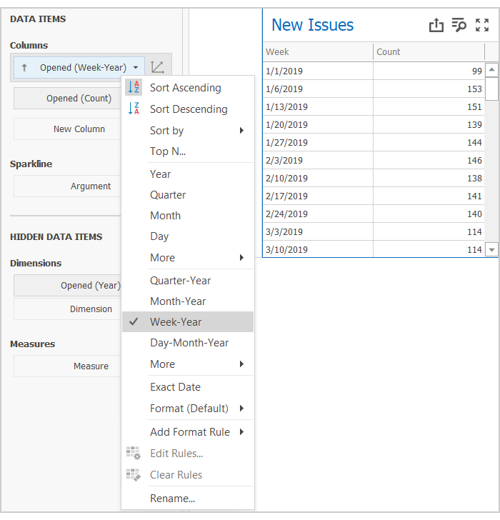
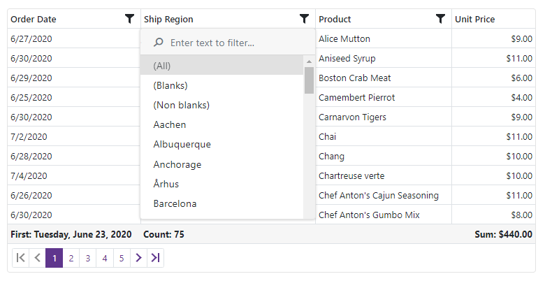
Week-Year Group Interval

Yes, here's another feature that was driven by customer feedback.

We discovered that our default approach to divide time into Weeks based on current Culture Settings, sounded logical but did not effectively address user requirements. Basically, we learned that users do not expect that a week at the beginning of the year can be divided into two parts.

So this lesson forced us into a breaking change (v20.1.4). Our new group interval will always break a timeline into equal periods. Of course, we sincerely apologize for the breaking change and the fact that unexpected behavior made its way into production code. Thanks to everyone who helped us fix this error.

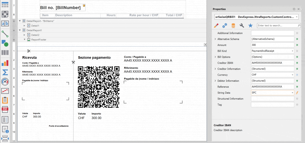
Card Conditional Formatting

This was a highly demanded feature. Once incorporated into your Dashboard, you'll have more opportunities to focus user attention on unexpectedly bad (or good, or just… unexpectedly unexpected) KPIs.

You can use Formatting Styles – styles that mirror those of the DevExpress Data Grid/Pivot Grid - as needed. You can change selected Card element Font, add an Icon or apply a background color to the entire Card.
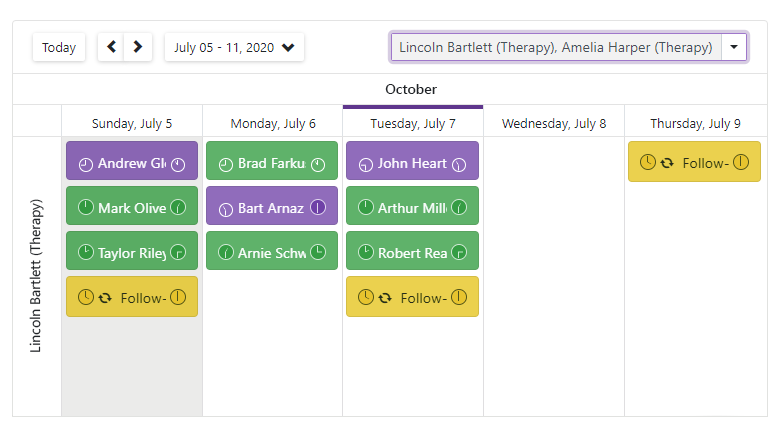
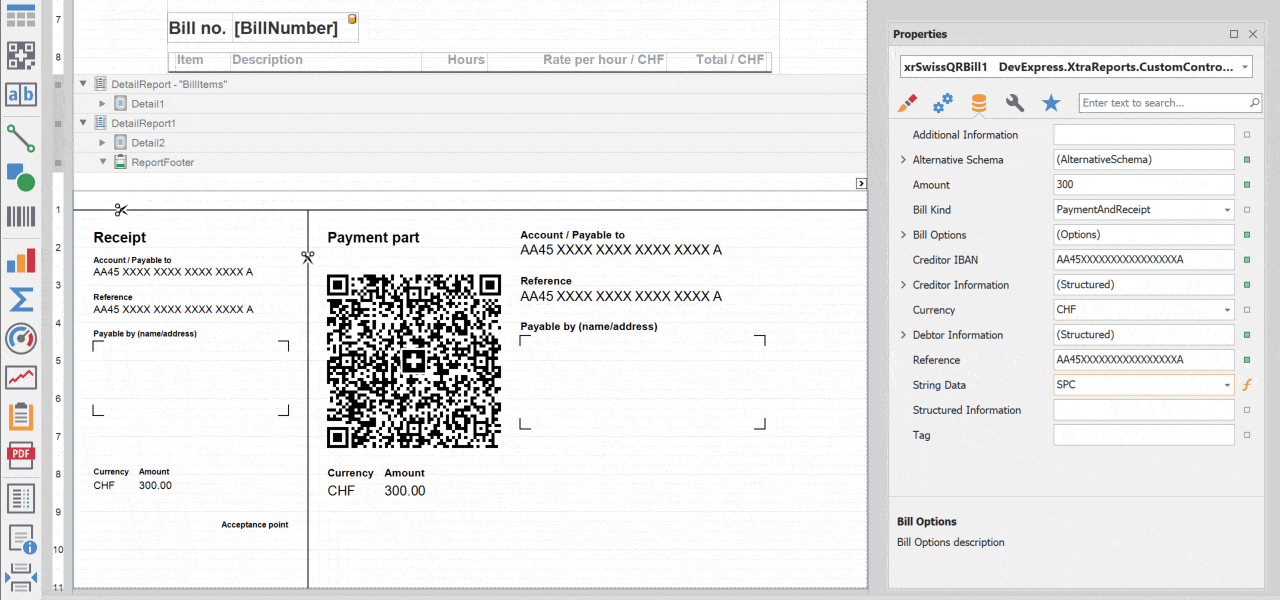
Parallel Periods

When investigating this feature, we dropped our intent to introduce a new Window Calculation. We made this choice because we found that it was both overcomplicated inflexible. Instead, we added two new methods to visualize and compare your data:

  1. With Measure Filter, you can compare data between predefined DateTime periods.
  2. If using calculated fields, you can use the joinRule function (extends Aggr syntax) to shift the Measure value by the DateTime axis.

You can review both methods in our YTD Performance demo.

Are we on the same page?

Before we move to v20.2, we'd like to gauge the overall effectiveness of our v20.1 development efforts. Please take a moment and tell us which of the following v20.1 features you've used or plan to use in an upcoming project.

Ok – time to focus on our upcoming release.

What we expect to ship in v20.2

Additional API enhancements

Wheatfield with Crows by Vincent van Gogh - www.galeriacanvas.pl, Public Domain, https://commons.wikimedia.org/w/index.php?curid=4400305

"Great things are done by a series of small things brought together." (Vincent Van Gogh)

Just last week I came across this quote and thought that it describes our new API set quite well.

We have already adopted this approach in the Lifecycle API. 50 members, used together, create a complete picture.

Real-Time Dashboards

Just like with our Lifecycle API, we want to introduce a series of enhancements and customization options. Together they will allow you to better monitor real-time values using DevExpress Dashboard.

We are considering the following enhancements:

  • Reworked and configurable loading indicators.
  • Improved data update mechanisms.
  • Cache management API for real-time scenarios.

Web Dashboard – Wrappers for Modern Web Frameworks

We want to better support those who develop modern web apps using popular client frameworks.

We plan to introduce platform-specific wrappers for our Web Control. These wrappers will simplify how you add our Dashboard control to your application and bind it's options to your View Models. We'll make it easier to configure the Dashboard control and connect it to your .NET backend (MVC or ASP.NET Core).

Filtering Enhancements

We believe that the DevExpress Dashboard Master-Filtering system is one of the simplest and one of the most powerful data filtering systems available today. Of course, we still want to extend its capabilities and make it even more flexible. While working on the Measure Filter last year, we came across ways to retain simplicity and increase flexibility at the same time.

We expect to introduce the following filtering options this year.

  • Allow the use of Master-Filter values as a part of Filter expression for Dashboard Item Filter / Measure Filter;
  • Introduce a new Post-Calculation step or a "Final Filter." This can be applied to data when all calculations, grouping and aggregation are finalized.

We are prototyping so we can't be certain that this will be delivered in exactly this shape. We'll share some of our results with you soon.

Trends & Regression Lines for Chart Item

We are investigating the best way to use Trends Lines and / or Regression Lines within applications powered by DevExpress Dashboard.

We've concluded that in addition to visual elements, customer requirements vary greatly (variances in the type and parameters and trends calculation logic). This led us to the following feature – post-processing…

Custom Calculation Step

We are considering a new API that allows you to post-process data prepared by our Data Processing Engine (to add additional columns with data calculated on your side). This should give you maximum flexibility during data preparation.

Better Async Support in WinForms Dashboard Designer

Based on feedback, we expect to improve Async support for WinForms / WPF Dashboards. This work has already begun.

Data Source – Unfolding Nested Arrays

Like most analytical tools, DevExpress Dashboard works natively with so called flat Fact Tables.

This is great but does not help if your JSON/Object/XPO formatted objects have nested arrays and require you to unfold as a preprocessing step.

In v20.2, we expect to introduce a new option designed to transform data on our end (part of our ETL engine).

Chart Conditional Formatting

With conditional formatting, Dashboard Charts will be able to highlight values that correspond to specific criteria.

Before we let you go

Your feedback matters a great deal. Please help us further improve DevExpress Dashboard by answering the following survey questions:

Blog Post: XAF - Data Validation, Adaptive Menu and Improved Model Editor for Blazor UI (v20.1)

$
0
0

We updated our Blazor demo and have created an intermediate build to demonstrate recent Blazor UI enhancements. 

New Features

Validation

XAF's Validation Module now displays error messages within the UI as follows: 

  • When an invalid value is entered and focus leaves the editor, XAF highlights the editor. In desktop browsers, a validation message is displayed within a tooltip. In mobile browsers, the validation message is displayed below the editor. 
  • If changes cannot be saved due to validation errors, details are displayed within a validation panel. 

Adaptive Toolbar

  • Menu captions are automatically hidden and displayed based on page width. 
  • Menu items that do not fit within a page are placed onto an overflow menu.

We applied this change recently, and the feature has known issues. Please see below.

Model Editor

  • The DevExpress .NET Framework Unified installer now includes a Model Editor for .NET Standard projects. Previously, this was available only with the .NET Core Components installer.
  • Model Editor uses the current Visual Studio skin.
  • Please review the following article to test our Blazor UI (CTP) with existing projects: How to port an XAF platform-agnostic module to .NET Standard 2.0+.

Known issues

This intermediate build has the following issues:

  • Clicked menu buttons remain in a pressed state;
  • An empty overflow menu is displayed after navigating to Contacts. 

Review other known issues and future plans in the following article: FAQ: XAF ASP.NET Core Blazor Server UI (CTP).

The future of Mobile UI

Things are going according to plan and we are moving towards our Blazor UI release in v20.2: eXpressApp Framework - 2020 Roadmap

Please remember that we are no longer developing XAF’s Mobile UI: Mobile UI (Maintenance Mode). In v19.1, we removed it from our documentation and stopped developing new features. In v20.2, we will remove it from our core installation. Existing Mobile applications will continue to work with previous versions of XAF. 

Your Feedback Matters

As always, we welcome your thoughts. Please comment below and let us know what you think of these new features. Once again, should you have technical questions, feel free to contact us via the DevExpress Support Center.

Blog Post: DevExtreme JavaScript - Tips & Tricks (April - May 2020)

$
0
0
We’ve put together a list of interesting support tickets answered throughout April and May. Hopefully, you’ll find them of value as you explore the capabilities of the DevExpress JavaScript (Angular, React, Vue, jQuery) product line.

All Platforms

Angular

React

Vue

Feedback

As always, we welcome your comments and feedback. If you’ve come across a useful Support Center ticket, feel free to share it our community below.

Blog Post: WPF - Tips & Tricks (June 2020)

$
0
0

Here is this month’s edition of our WPF Tips & Tricks blog post. Hopefully you’ll find the following technical support tickets of value in your current WPF project.

We also created a new example that demonstrates how to create a real-time chart and compiled a KB article describing the multi-select capabilities of our WPF Data Editors.

Should you have any questions, feel free to comment below.

KB ARTICLE:

EXAMPLE:

TICKETS:

WPF Data Grid

WPF Editors

WPF Docking

WPF Charting and Maps

WPF Ribbon & Bars

WPF Scheduler

Other Controls

  • How to enable the MouseWheel event in the Adorner Control when DX themes are used (T895687)

    We patch ScrollViewer's default scrolling logic in our themes. With this, we implemented horizontal scrolling via the mouse, supported touch mouses, etc. To keep using default scrolling logic, set the ScrollBarExtensions.HandlesDefaultMouseScrolling attached property to False:

    
    xmlns:dx="http://schemas.devexpress.com/winfx/2008/xaml/core"
    <UserControl.Resources>
        <Style TargetType="ScrollViewer">
            <Setter Property="dx:ScrollBarExtensions.HandlesDefaultMouseScrolling"
                    Value="False"/>
        </Style>
    </UserControl.Resources>
        

If you’ve come across a WPF-related support ticket you’d like to share with the rest of the DevExpress community, feel free to share the link in the comments section.

Blog Post: eXpressApp Framework - Tips & Tricks (June 2020)

$
0
0

Time flies – we are already halfway through 2020. We certainly hope that you and your loved ones are doing well and staying safe.

Here is this month’s edition of XAF Tips & Tricks. Please let us know if you find the information below of value and tell us how we can improve this content going forward. If you have a support ticket you'd like to share with the XAF developer community, feel free to post a link in the comment section below.

Interesting Support Tickets

Resolved Issues

New and Updated KB Articles

Documentation Updates

XPO Query Parameter Validation

We softened default parameter validation in SELECT, UPDATE, and INSERT statements and introduced a new DevExpress.Xpo.DB.QueryParameterMode enumeration. You can set the ConnectionProviderSql.QueryParameterMode field or the ConnectionProviderSql.GlobalQueryParameterMode static field as needed.

using DevExpress.Xpo.DB;  
//...  
ConnectionProviderSql.GlobalQueryParameterMode = QueryParameterMode.Legacy; 

Unit and Functional Testing

We reworked and updated the Functional Tests (EasyTest) help section and added a new help topic to improve navigation between learning materials related to unit and functional testing.

FirstOrDefault Methods

The IObjectSpace interface includes the following new methods:

These methods mirror our FindObject<ObjectType>(CriteriaOperator) and FindObject<ObjectType>(CriteriaOperator, Boolean) methods, but accept a lambda expression as the first parameter.

// v20.1.4:
ObjectSpace.FirstOrDefault<Person>(p => p.FirstName == "Test");
// Older versions:
ObjectSpace.FindObject<Person>(CriteriaOperator.Parse("FirstName=?", "Test"));
ObjectSpace.FindObject<Person>(new BinaryOperator(nameof(Person.FirstName), "Test"));
ObjectSpace.FindObject<Person>(new OperandProperty(nameof(Person.FirstName)) == "Test");
ObjectSpace.GetObjectsQuery<Person>().Where(p => p.FirstName == "Test").FirstOrDefault();

LINQ may be more convenient than CriteriaOperator and more natural for Entity Framework users. XPO users may also like this shortcut.

Non-Persistent Objects

You can mark an Object Space as modified via the NonPersistentObjectSpace.AutoSetModifiedOnObjectChange property and the BaseObjectSpace.ModifiedChanging event. If you want to reset Object Space modified status once you've created a new object, use the NonPersistentObjectSpace.RemoveFromModifiedObjects method. See how to use these new APIs in the following examples:

Non-Persistent Object Enhancements

Our upcoming v20.1.5 release will offer the following enhancements to non-persistent objects.

  • NonPersistentObjectSpace will include a FindObject(Type, CriteriaOperator, Boolean) method overload. This method iterates objects loaded with GetObjects, GetObject, CreateObject (etc) methods, and returns the first object that matches the specified parameters.
  • NonPersistentObjectSpace supports custom fields (both calculated and non-calculated). You can create these in code and via the Model Editor (just as you would for persistent objects).
  • You can inherit the new NonPersistentObjectBase class instead of creating a Non-Persistent Object item from the Template Gallery.

Blog Post: WPF Splash Screen – A New Splash Screen Manager (v20.1)

$
0
0

A splash screen is an effective way to improve an app’s user experience during lengthy startup operations. Unfortunately, creating an effective splash screen can be tricky because two competing objectives must be addressed simultaneously:

  • A splash screen needs to be visually appealing. It’s your first chance to make a great impression.
  • A splash screen should load instantaneously. Loading delays will defeat the overall purpose of the splash screen.

As you may already know, our WPF Subscription includes DXSplashScreen - A UI component that was built years ago to help you create and add splash screens to any WPF app.

Our latest release (v20.1) includes an entirely new Splash Screen control - a UI component we’ve named SplashScreenManager.

Let’s quickly look at the new DevExpress Splash Screen Manager, review why it was built, and why we replaced DXSplashScreen.

Design Elegance

Our Splash Screen Manager ships with two predefined styles – Themed, Fluent (Acrylic).

As its name implies, a Themed Splash Screen uses the same color scheme as that used by your application.

Our next predefined style - Fluent Splash Screen - features an Acrylic effect. As you can see below, this splash screen uses a translucent background. Once again, we’ve optimized the splash screen as much as possible – making certain that it loads quickly.

App-wide Wait Indicators

Wait Indicators are a great way to provide feedback during time-intensive operations. I can cite countless examples to illustrate this point. For instance, a wait indicator will improve an app’s user experience during long fetch operations.

You can use our new Splash Screen Manager to create wait indicators within your app as needed. Simply set the owner and trackOwnerPosition parameters of the Show method to place a splash screen atop a specific UI element and keep it there if the user resizes or drags the window around.

Splash screens created with the Splash Screen Manager are processed in a separate thread and do not interfere with the main application flow.

However, you may want to control user interaction with your application once you’ve displayed the “splash screen” in this specific usage scenario. This can be done with a single method parameter. Your options vary: you can block the application, restrict input within the window but allow the user to drag the window around, or block a specific element. It’s all up to you.

Performance

This post began with a simple proposition – a splash screen must be loaded quickly. Well, we designed SplashScreenManager so it’s fast. To maximize performance and ensure a timely display, we’ve made certain not to load all DevExpress Theme resources – We load what we need so we can render the splash screen quickly.

We have measured the startup time on different PC configurations with and without the Ngen.exe optimization:

Themed Splash Screen: 290-450 ms

Fluent Splash Screen: 300-460 ms

Compiled with Ngen.exe:

Themed Splash Screen: 170-370 ms

Fluent Splash Screen: 180-370 ms

In comparison, DXSplashScreen (with a default template) renders in 720-1000 ms. (450-900 ms after Ngen.exe compilation). The bottom line is this: our new SplashScreenManager loads about 50% faster.

Of course, performance metrics are app dependent. If you’d like to take a closer look at our comparison figures, simply download this project from Github: https://github.com/DevExpress-Examples/splashscreenmanager-startup-test

Ease of Use

We’ve tried to make use of the SplashScreenManager as painless as possible. Here is how you can integrate it into your next app:

Step One - Add the following code to App.xaml.cs:

SplashScreenManager.CreateThemed(new DXSplashScreenViewModel { 
    Status = "Starting...", 
    Title = "The Best or Nothing!" } 
).ShowOnStartup(); 

Step Two – Just kidding, there’s no second step. The code above generates a splash screen using an application’s default color scheme, displays it with a priority over the main application to minimize delays, and hides it once the application is initialized.

Ease of Customization

You can edit the content of our predefined splash screens with a few lines of code by accessing the view model. You can swap the image used, edit displayed text, and modify progress bar value.

If you require more extensive customization, you can incorporate a predefined splash screen from our Template Gallery or implement your own design from scratch. Our documentation includes a tutorial to help simplify this process.

MVVM in Mind

We extended our set of services to help you add SplashScreenManager functionality to MVVM-compliant applications. Add a splash screen from our template gallery to your application, customize it as you see fit and then add the SplashScreenManagerService to your view of choice. Easy as 1-2-3.

Feedback

If you’d like to share your thoughts about SplashScreenManager, please post a comment below. We’ll be happy to follow up.

Blog Post: Office File API & Office-Inspired Desktop UI Controls – Tips & Tricks (June 2020)

$
0
0

We’ve put together a list of interesting support tickets answered throughout May and June. We hope you find these support tickets interesting and of business value. Should you have any questions, feel free to comment below.

Tips & Tricks

Enhancements

If you’ve come across an interesting support ticket you’d like to share with the rest of the DevExpress developer community, please comment below and include the appropriate link.


Blog Post: Blazor - Roadmap 2020 (Mid-Year Update)

$
0
0

In January 2020, we published our Blazor UI - 2020 Roadmap for the first half of 2020. Based on survey results and Support Center feedback, we’ve finalized our 2020.2 Roadmap. We want to thank you for your continued support and for your insightful comments.

New Components

Memo control

We're creating a new editor component that allows you to display and edit multi-line text. Our Blazor Memo component will ship with both data binding and validation support.

Drop Down Button

Our new Drop Down Button will allow your end-users to select from a list of items.

Drop Down Edit

The Drop Down Edit component will be able to display custom content within its list.

Page Layout

Our Blazor Page Layout component will help you create custom page layouts with ease.

Menu

The DevExpress Blazor Menu component will include support for hierarchical items, items group, left and right item alignment, and templates.

Navigation Bar

Our new Blazor Navigation Bar component will include built-in templates so you can create custom navigation items as needed.

Data Grid

Total Summaries

We're adding a set of predefined total summaries (Min, Max, Sum, Average, etc.) These aggregate function values are calculated against all rows in the Grid and displayed within the Blazor Grid’s footer.

We're also adding custom summary support so you can calculate summaries against records that meet specific criteria. You will also be able to use multiple data fields in your calculations.

Group Summaries

We expect to add a set of predefined summaries and a custom summary for the Blazor Grid’s group row or its group footer.

Column Customization

A new property will allow you to improve column appearance by assigning custom CSS classes to column markup.

Popup Edit

A new edit mode will allow your end users to edit cell values inside a popup edit form.

Inline Edit

Our Blazor Grid’s Inline Edit mode will allow your end user to edit cell values within the current edit row.

Filter Enhancements

We'll introduce the following new filter options to our Blazor Grid:

  • Popup Header Filter
  • Search Panel
  • Advanced Filter API

DevExpress Blazor Grid - Filter

Frozen Columns

Our Grid will ship with support for Frozen columns. This will allow end-users to lock columns in one area and keep this area visible during horizontal scroll operations.

Column Resize

With our new column resize feature, your end-users can easily modify column width via the mouse.

Automatic Data Updates (Observable)

Our Blazor Grid will allow you to bind to ObservableCollection and implement the INotifyPropertyChanged interface. The Grid will automatically update when changes are made to the observable collection.

Scheduler

Custom Fields

Our Blazor Scheduler control will support custom (data bound) fields so you can display and save custom information within an appointment form.

Custom Appointment Form

The Scheduler will allow you to customize the layout of the appointment edit form.

Filter and Group by Resources

The Scheduler will include an option to filter and group appointments by resources (for example employees, hotel rooms, etc.).

Timeline View

The Scheduler will ship with a new Timeline View. The timeline will display appointments/events as horizontal bars along its timescale. This new UI paradigm will give end-users a clearer picture of upcoming/past events.

DevExpress Blazor Scheduler - Timeline View

Data Editors Enhancement

Multiple Columns

The ComboBox, List Box, and TagBox components will include support for multiple columns (display list data across multiple columns).

Two-Way Binding

With two-way binding, you will have the option to bind a value from the ComboBox and TagBox with either a stand-alone variable or your Model's property.

Masked Input

Our Blazor Text Box, ComboBox and data editors that include a text field will support custom Masks (to help you manage user input).

Focus an Editor in Code

We're enhancing our editor's API so you can set focus on the data editor within code.

Item Template

Our List Box and ComboBox will include a new template region. You will be able to display custom information within this region as needed (will include support for an image within the input box).

Time Section in Data Edit

The Date Edit component will incorporate a time edit section and allow end-users to set time values alongside dates.

ComboBox Drop Down Width

We're adding an option to control the width of the ComboBox's drop down. The drop down's width will be calculated from either the:

  • drop down content width
  • entire width of the editor

Alternatively, you can use the expandable option. This option will allow width to increase or decrease as necessary.

Adaptivity Enhancements

For mobile devices, we're adding a popup and modal mode for the drop down window. These modes mimic the behavior of a standard drop down control on mobile browsers.

Visual Studio Integration

To help you get started with our Blazor UI components, we're creating new Project templates for both Blazor Server and Blazor WebAssembly applications.

Before we let you go

Your feedback matters a great deal. Please help us further improve DevExpress UI Components for Blazor by answering the following survey questions:

Blog Post: Reporting - Swiss QR Bill Control Implementation (WinForms, WPF, ASP.NET, MVC, .NET Core, Blazor)

$
0
0

We know that many of you leverage the capabilities of DevExpress Reports to generate invoices, receipts and payment slips. Those that require QR-bill support, will be happy to know that DevExpress Reports now includes QR-bill support via a new report control.

For more information on QR-bill and Switzerland’s new payment standard, please follow this link: QR-bill.

Swiss QR-bill Control - Key Features

  • .NET QR-bill control manages inner margins automatically based upon displayed data.

Swiss QR Bill - Auto-Layout

  • The control is bound to a string field, and you can extend it with other fields when necessary.

Swiss QR Bill - Data Binding

  • PDF and print preview settings include options for tear lines so you can decide how to arrange lines.

Swiss QR Bill - Line Separators

  • Ability to print on A4 and A6 landscape paper.

Swiss QR Bill - Payment Part

  • Arrange bills individually (i.e. on one order - one receipt; or arrange multiple bills on the same page).

Swiss QR Bill - Integrated Mode

  • Support for languages specified in the QR-Bill standard.

Swiss QR Bill - Localization

  • Smart Tag actions available at design time.

We’ve created a complete sample project for WinForms and our Visual Studio Report Designer. To download, simply point your browser to the following GitHub repository: DevExpress Reports - Custom Controls. You will also find a detailed technical description in the readme file within the repository.

Note: Until we officially release v20.1.5, you will need to download the following intermediate build to use this component: Download.

Your Feedback Matters

As always, we welcome your thoughts. Please explore the capabilities of the QR-bill control and share your experiences with us.

Blog Post: TestCafe and TestCafe Studio: Learn How to Integrate Our Web Testing Tools into Your Workflow

$
0
0

We will soon host a TestCafe webinar that will cater to both first-time users and those who may have tried TestCafe (our end-to-end web testing tool) in the past. Paul Usher, our technical evangelist and live session host, will begin with first-time setup and then will go into a few of the more recent TestCafe innovations. He will also cover the differences between TestCafe Open Source and TestCafe Studio. See the details below.

Upcoming Webinar: 10 Ways to Simplify UI Testing

See how you can easily incorporate UI testing in your development workflow. In this presentation, Paul Usher will show you how TestCafe can be leveraged to deliver high quality web apps that always meet end-user expectations. You’ll discover:

  • How to setup TestCafe and start testing in under 10 minutes.
  • How to create customizable tests that can easily evolve as business requirements change.
  • The purpose of Custom Selectors and why they make web testing so much easier.
  • The purpose of the Page Model approach and why it helps increase productivity.
  • And you’ll learn how to master use of Smart Assertions.

Register Now
Date and Time: July 29th at 10am Pacific Time.

What's So Cool about TestCafe?

TestCafe Open Source and TestCafe Studio are driver free and do not require you to manage complex plug-ins. Their flexibility and ease of use are probably best illustrated by the ability to run tests on remote browsers across multiple devices and platforms. TestCafe Studio generates a URL used to connect to the test runner... or a QR code so you can easily connect your mobile devices.

TestCafe Studio QR Code for Remote Web Testing

This functionality is not limited to TestCafe Studio. You can do the same if you use our open source TestCafe library and start your tests from the command line:

TestCafe Open Source QR Code for Remote Web Testing

The URL provides access to run the tests the remote device. This minimal setup philosophy always has been our guiding principle in all areas of web testing - from installation to test debugging.

If you'd like to know more - register for the webinar on July 29th. Even if you cannot attend the live session, we'll make sure to send out a recording to all registrants.

Blog Post: DevExpress WinForms Controls – New Ways to Address Old UI Requirements

$
0
0

We are working hard to make our next WinForms release (v20.2) the best ever. We have a lot of information to share about v20.2 and I will blog about release plans in August. For this post, I wanted to share a few ideas/UI suggestions and demonstrate how our WinForms products have evolved in recent release cycles.

Side Navigation

In times past, apps that required “side navigation” functionality often relied on the DevExpress WinForms NavBarControl was your way-to-go pick for many years. to do the heavy-lifting. Our NavBar control shipped with everything one would expect from a navigation bar. It allowed you to create empty items or populate them with custom content. It allowed you to add items that mimicked buttons or incorporate selectable items that retained user focus. The NavBar allowed you to categorize elements into groups, choose one of three behavior modes, auto-populate the Office Navigation Bar with NavBarControl groups, etc. Yes, the NavBar control was (and is) awesome. The good news is that all major NavBar related functionality is now available in its heir apparent – the DevExpress WinForms Accordion Control.

DevExpress WinForms Accordion Control

In addition to all the things mentioned above, our Accordion UI component also offers:

  • custom header buttons inside items and groups;
  • an embedded Find Panel to help users locate information in an intuitive manner;
  • web-inspired Hamburger style menu;
  • improved high-DPI support, and much more.

If the Accordion’s built-in advantages have yet to convince you of its utility, consider the following. When you place an Accordion Control inside a Fluent Design Form, it can do what no other navigation control can: stretch vertically across the entire form, overlapping its title bar. It will also automatically expand or collapse based on current form width. Thanks to its semi-transparent Acrylic Material support (powered by DevExpress DirectX Hardware Acceleration), it does all this in a highly elegant manner.

DevExpress WinForms Accordion Control with Hamburger Menu Style

Alerts & Notifications

Traditional Alert Windows managed by our WinForms AlertControl are simple message boxes with custom styling. They appear and disappear without a trace when a user closes the alert. Though Alert Windows can service certain needs, we think a better alternative exists... Toast Notifications.

Toast Notifications were first introduced in Microsoft Windows 8 and are much more powerful than traditional “alert windows”. Toast notifications are stored in the Windows Notification Center and allow users to read unread messages in a centralized location. Native Toast Notifications can use system colors and sound settings. These notifications can also display UI elements (to help your app interact with the user) and support the all-important "Snooze" command (delay the notification for a later time).

DevExpress WinForms Toast Notifications

The DevExpress Toast Notification Manager component uses Microsoft’s Windows API and allows you to create native Toast Notifications with absolute ease. A few months ago we published a comprehensive tutorial for this component. If notifications play an important role in your app, please review the following blog post to learn more: How to Display Toast Notifications in WinForms Apps.

Unbound Data

All of our market-leading data-aware controls (WinForms Data Grid, Tree List, Vertical Grid, etc.) fully support unbound data operations. In unbound mode, records are not retrieved from a data source – they are passed to the UI control manually.

So how can you pass unbound data to a data-aware control? It’s simple – for example, to populate our WinForms Data Grid with unbound data, you need to create unbound columns and handle the CustomUnboundColumnData event.

Though you can still use Unbound column events, our DevExpress WinForms Controls suite now ships with a special data source component designed to facilitate unbound data management. This control – the UnboundSource component - fires two events: ValueNeeded (when a data-aware control requires new data) and ValuePushed (when control data has changed and requires you to save modifications). Unbound Source repeatedly fires the ValueNeeded event until record number reaches the number assigned via the SetRowCount method. This straightforward approach allows you to easily scale the data passed to your data-aware control and instantly clear it (by passing zero as the method value). If you’re ready to explore the capabilities of UnboundsSource, feel free to review the following help topic for more information: Unbound Sources.

In addition to UnboundSource, the DevExpress WinForms suite includes an event-based VirtualServerModeSource component. This component allows you to load large data sets in small portions. When used, data-aware controls leverage our Infinite Scrolling mode (an alternative to traditional record paging).

Flyouts

While the word "flyout" may be a relatively new term in the DevExpress WinForms vocabulary, the idea of small panels that pop up in the corner of the screen is nothing new. Years ago you had to use custom floating forms to display such panels. With our WinForms Flyout Panel, you can now incorporate this capability quite easily. Simply drop the Flyout Panel onto your form, choose its position and animation effects, populate it with content and call the ShowPopup / HidePopup methods to toggle panel visibility. The animation below illustrates how we use the Flyout Panel within the DevExpress PDF Viewer (to display a Find panel).

DevExpress Flyout Panel in PDF Viewer

Flyout Panels support an alternate "Beak Panel" style. “Break Panel” allows you to display interactive hints for any UI element on your form. To open a Flyout Panel in “Break Panel” mode, call the ShowBeakForm method instead of ShowPopup.

DevExpress Flyout Panel shown as a Beak Panel

Buttons

As you know, WinForms buttons can include shadows, rounded corners, convex backgrounds, etc. Though these UI elements are somewhat new, nothing innovative has been introduced for a Windows button in quite some time. A button is basically a border, an image, a text string, and a single "Click" event.

Thanks to the evolution of UI design (and of course, the PaintStyle property implemented by our developers), you can now eliminate Simple Button borders. This simple change adds elegance to an app and allows you to use Simple Buttons for completely new usage scenarios. For instance, by eliminating borders, you can now create flat toolbars without a need for our WinForms Bar Manager component.

Custom toolbar made with DevExpress Simple Buttons with Light style

The image below is a screenshot of a sample app I recently sent to one of our customers. He wanted to create a custom vertical toolbar with folding categories. As you can see, our Accordion Control delivers the required element hierarchy. Its content container items host WinForms Stack Panels, and each Panel includes a collection of Simple Buttons with a Light paint style. If you have a similar UI requirement, implementation is a breeze.

Custom side toolbar made with Accordion Control and Simple Buttons

Your Turn

In my next post, I’ll discuss other new UI controls you may want to consider for upcoming WinForms projects. In the meantime, please comment below and let me know which new WinForms control you’ve used recently and why. Long live WinForms!

Blog Post: Announcing DevExpress Support For .NET 5 Preview

$
0
0

As I'm sure you are aware, Microsoft have announced that .NET 5 would be the next major release of the .NET Core ecosystem after .NET Core 3. Since development of the .NET Framework itself has been halted (apart from bug fixes, etc) at v4.8, they've dropped the "Core" name from .NET 5 since it and its successors will be the only .NET going forward.

Although still in Preview mode, with a projected release date in November 2020, .NET 5 includes many new enhancements that will make your applications and development process better and easier.

.NET Schedule

dotNetSchedule

  • .NET Core 3.0 was released in September 2019.
  • .NET Core 3.1 was released in November 2019, and falls under the Long Term Support (LTS) program.
  • .NET 5.0 will be released in November 2020.
  • Major releases of .NET will occur every year, and Microsoft have stated that even-numbered releases will fall under the LTS program.
  • Microsoft are emphasizing a predictable schedule, with minor releases if needed.

With regard to .NET 5, Microsoft have published a series of preview versions (1, 2, 3, 4, 5, 6). With each new preview release, we have been testing our components and libraries to support the changes within .NET 5.

DevExpress v20.1.6 supports .NET 5

Today, we are pleased to announce that DevExpress controls, components, and frameworks from v20.1.6 onwards are officially compatible with .NET 5 preview 6 or later. You can download them from both the Download Manager and NuGet.

If you are ready to experiment and try out .NET 5, here's a quick synopsis of what you will need to do.

Prerequisites

Move your app to .NET 5

If you have an application that uses .NET Framework and not .NET Core, you will have to migrate it to .NET Core 3 first. After which...

If you have an application that uses .NET Core 3, follow the steps below:

  • Change the Target Framework to specify it as net5.0:

    <Project Sdk="Microsoft.NET.Sdk">    
        <PropertyGroup>
            <OutputType>Exe</OutputType>
            <TargetFramework>net5.0</TargetFramework>
        </PropertyGroup>
    </Project>
    
  • In Visual Studio, go to Tools> Options> Preview Features and select the Use previews of the .NET Core SDK option (and, as it indicates, you will have to restart Visual Studio before doing any further work):

    UseDotNET5InVS

Desktop Enhancements

.NET Core 3 already supports desktop platforms such as WinForms and WPF. .NET 5 adds support for UWP (WinUI) and Xamarin (Maui), includes new .NET APIs, and extends the features for desktop development.

WPF

Visual Studio v16.3 allowed you to use a new XAML Designer for WPF .NET Core applications. We tested this XAML Designer with our WPF controls in .NET 5, and we are pleased to announce they fully support the XAML Designer features available for .NET Core.

WPFDesigner

Visual Studio v16.5 added a new feature called Suggested Actions. These actions give you easy access to the most used properties of a control selected within the XAML Designer. We are still exploring whether we can support Suggested Actions within DevExpress WPF controls.

SuggestedActions

Documentation: DevExpress WPF Controls - .NET Core Support

WinForms

Support for WinForms with .NET Core is, shall we say, a little more complicated. Microsoft announced that you can use the Windows Forms Designer for .NET Core projects in Visual Studio v16.6:

WinFormsDesigner

As you can see, the Designer renders forms already created using our controls correctly. However, the current version still does not offer the required extension APIs in order to fully support DevExpress design-time features, including Toolbox. Microsoft have stated that this required support for third party controls is coming, and we are providing input to that team when we can and when asked.

At present, you can use the workarounds demonstrated in the Using the WinForms designer for .NET Core projects section of this official blog post by Microsoft: How to port desktop applications to .NET Core 3.0.

We recommend that you use the second workaround from that post:

"You can have two project files in the same directory as your WinForms project: the old .csproj file from the existing .NET Framework project and the new SDK-style .csproj file of the new .NET Core WinForms project. You’ll just have to unload and reload the project with corresponding project file depending on whether you want to use the designer or not."

Again, we are working closely with Microsoft to ensure that the Windows Form Designer fully supports our WinForms controls for .NET 5 projects. We have no schedule as to when that support will be available.

Documentation: DevExpress WinForms Controls - .NET Core Support

Other Enhancements

Microsoft has clearly stated that .NET 5 is the sole future of the .NET family. All significant enhancements and new features to .NET will be part of .NET 5 and its successors, including language changes, runtime capabilities, and much more:

  • .NET 5 includes C# 9. C# 9 has numerous enhancements including records, top-level statements, improved pattern matching, and more. To learn all about what’s coming with C# 9, refer to Mads Torgersen's Welcome to C# 9 post.
  • .NET 5 allows you control over different runtimes.
  • Additional benefits with .NET 5 include Core Runtime & API Performance enhancements, and deployment flexibility.

Microsoft recommends that developers build new applications with .NET Core 3.1 and then migrate them to .NET 5.

Globalization issues

.NET 5 Preview 4 introduced the use of International Components for Unicode (ICU) globalization APIs by default on Windows 10 1903, or later. (For more information, see Globalization APIs use ICU libraries on Windows.) However, there is currently a bug that Globalization does not read user setting overrides for current cultures when using ICU. As a result, our controls do not apply these overrides. Microsoft is expected to fix this bug in Preview 8.

As a workaround, you can continue using NLS globalization APIs. Set a run-time switch to revert back to the ICU behavior.

Conclusion

Without a doubt, we at DevExpress are excited about .NET 5 and the future of the .NET and Visual Studio stack. I hope this blog post about where we currently stand with .NET 5 was helpful: we're keeping up but there's still a lot to do! As always, we welcome any feedback: feel free to post comments below, or contact us via the DevExpress Support Center.

Viewing all 3390 articles
Browse latest View live