Our next major update (v20.2) is a couple of months away. As such, we wanted to preview the features we expect to ship this Autumn and invite all active DevExpress Universal subscribers to download our Early Access Preview (EAP). Your feedback will help us refine the features described below and allow us to ship the best possible royalty-free Dashboard platform in the marketplace.
Early Access and CTP builds are provided solely for early testing purposes and are not ready for production use. This build can be installed side by side with other major versions of DevExpress products. Please backup your project and other important data before installing Early Access and CTP builds.
This EAP may not include all features/products we expect to ship in our v20.2 release cycle. As its name implies, the EAP offers an early preview of what we expect to ship in two months.
Active Universal Subscribers: Download the EAP Today
Angular & React Web Dashboard Components
Modern web app developers can now incorporate our Angular Web Dashboard or our React Web Dashboard component within their project.
DevExpress Angular and React components are delivered via npm packages and allow you to natively integrate our Web Dashboard Control as needed. You can bind your properties to the components using one and two-way bindings and handle events using native methodologies.
Angular
<dx-dashboard-control
  endpoint="https://demos.devexpress.com/services/dashboard/api"
  [workingMode]="workingMode"
  (onBeforeRender)="beforeRender($event)">
</dx-dashboard-control>
React
import DashboardControl from 'devexpress-dashboard-react';

function App() {
  return (
    <div>
      <DashboardControl
        endpoint="https://demos.devexpress.com/services/dashboard/api"
        workingMode = { this.state.workingMode }
        onBeforeRender = { this.onBeforeRender }>
      </DashboardControl>
  </div>
  );
}
Our documentation has been updated accordingly:
- Getting Started guide for Angular;
- Client-Side Configuration for Angular;
- Client-Side Configuration for React.
We've created a simple Angular application with the DevExpress Web Dashboard Component. It is available on GitHub. To learn more, feel free to review its source code in our GitHub repo.
While these new Angular & React Components can be incorporated into new projects with ease, you can also integrate the components within existing projects.
Our Early Access Preview v20.2 does not include a Vue Dashboard Component. We have not determined whether Vue support will make it into our v20.2 release cycle. If you use Vue in your project and need a Web Dashboard Component for Vue – please comment below!
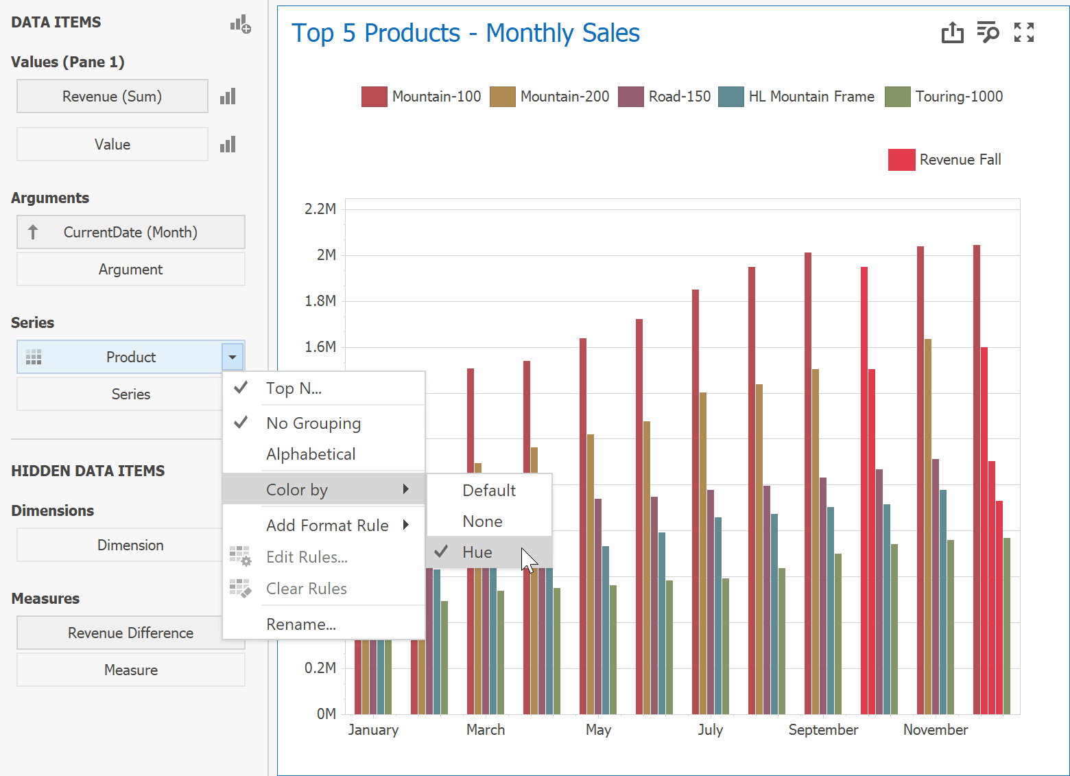
Chart Conditional Formatting
You can now specify rules to highlight Points and Series Lines in Dashboard Chart Item.
Conditional Formatting can be applied to any Line series, any Bar series (including Range Bars), Area series and Bubble chart type.
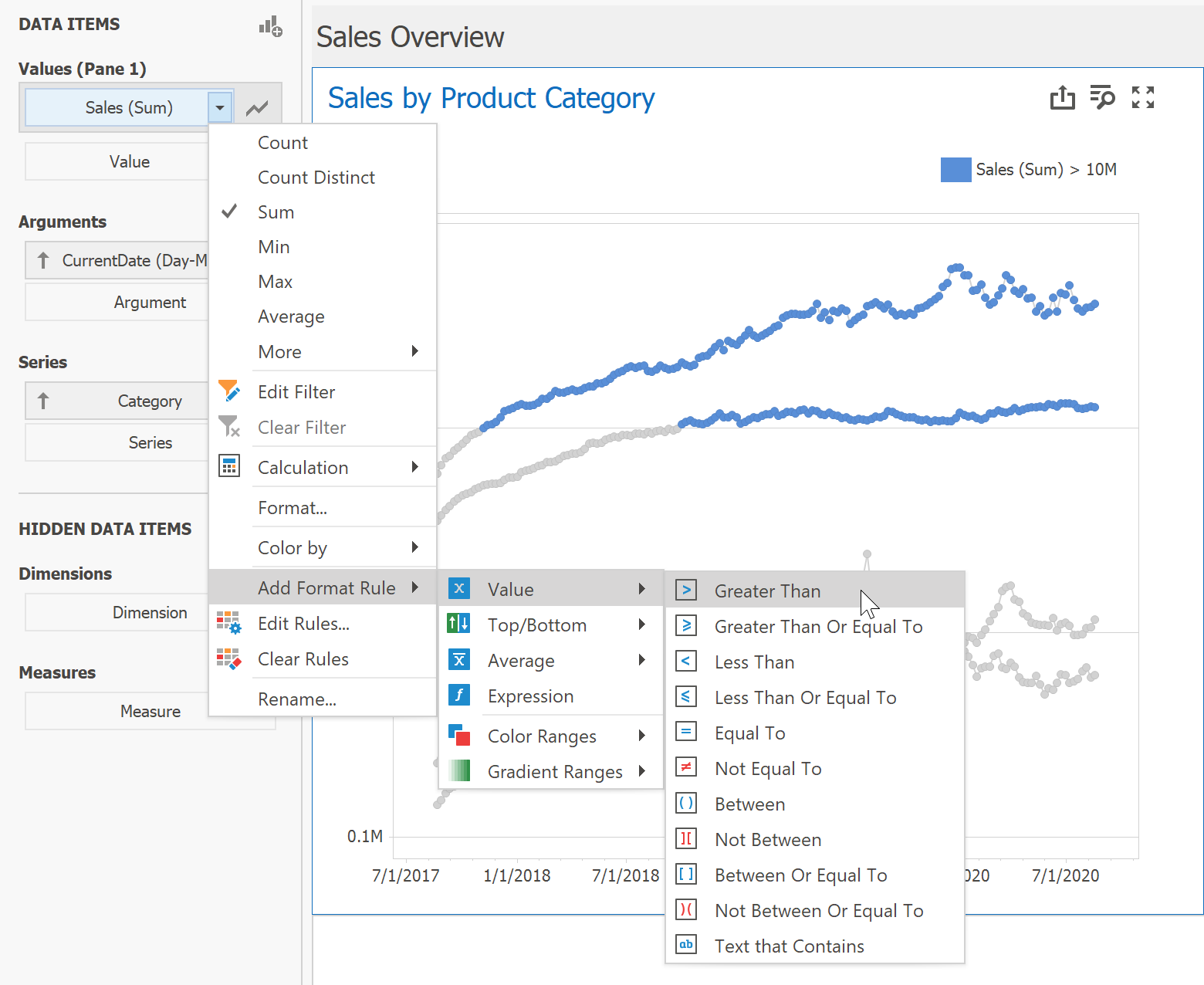
When a user specifies a Format Rule to highlight important points via Conditional Formatting, we gray out remaining points by default. We do this because enabling Conditional Formatting with a fully colored chart can often produce visually noise/overwhelming results. If this default behavior does not meet end-user requirements, you can explicitly enable coloring for chart Values.
You can specify a predefined conditions based on Values/Arguments/Series or Hidden Measure values, or set up a custom expression as needed
You can also select a predefined highlight colors or pick a custom color for every rule. Your rule can include Gradient coloring - this will allow you to display the difference in values as an auto-calculated difference using sequential or diverging coloring.
Finally, you can add a color for every rule in your Chart legend with a custom description.
We've created a help topic that describes Chart Conditional Formatting in greater detail.
Please note that our Early Access Preview only allows you to test Conditional Formatting for our WinForms Designer/Viewer and WPF Viewer.
Chart Conditional Formatting within the Web Dashboard is still in active development. We'll have more news to share in this regard as we get closer to official release.
Ongoing Desktop Async Enhancements
We understand the importance of Async functionality for our WinForms and WPF customers. In our v20.2 release cycle, we've addressed a series of known issues, improved performance and stabilized our code.
As you may already know, we've already released Async related features in our most recent build. (v20.1.6).
New Federation DataSource options
We added two new options for your Join Federation Queries.
You can now use "*" (all columns) operator when you initiate Join operations in you Federation Data Source. You can use this feature within our WinForms End-User Wizard and in our Federation Data Source API. You can also create unbound columns in your Join Federation Queries using custom Expressions.

Data Source – Transform Nested Arrays
Federation Data Source now offers a Transformation option. You can use it to flatten (or expand, or denormalize) your data. Said differently, if one of your columns contains a data array, you can now transform it to a set of rows.
This option is especially useful for JSON, EF and XPO Data Sources.
Assume you have a JSON with nested arrays as follows:
[{
        "manager": "Ann",
        "sales": [{
            "state": "Florida",
            "amount": 132000
        }, {
            "state": "Alabama",
            "amount": 414000
        }]
    },
    {
        "manager": "Bob",
        "sales": [{
            "state": "California",
            "amount": 320000
        }]
    }
]
Though you can use this JSON as a data source for your Dashboard in v20.1.x, the only available field is manager.You cannot use sales or any nested properties.
With our most recent update, you can pass this JSON data source to the Federation Data Source and perform a Transformation.

Behind the scene, the original JSON is transformed into the following:
[
    { "manager": "Ann", "sale_state": "Florida", "sale_amount": 132000},
    { "manager": "Ann", "sale_state": "Alabama", "sale_amount": 414000},
    { "manager": "Bob", "sale_state": "California", "sale_amount": 320000}
]
As you would expect, this table can be used to build you dashboards as needed.
Early Access Preview - This feature is currently available in our WinForms End-User Federation Wizard and via code using the new TransformationNode.
Viewport Filter for Dashboard Items
You now include a new filter option within your Dashboard – Viewport Filter.
The Viewport Filter is applied to a dashboard item after calculations are executed and hides visual data without filtering out the underlying data used in a calculation.

A typical use cases for the Viewport Filter is as follows: Assume you want to display monthly sales differences within a Chart. In this instance, the value for the first Month is always null.
You can now use Viewport Filter to hide the first month and draw you chart from the second month onward.
![]() HTML/JS Dashboard – changing options at runtime
HTML/JS Dashboard – changing options at runtime
You can now change every property of the Web Dashboard Control using option(args) method.
This change was introduced as part of our Angular & React integration initiative.
In the Works
Configuring Connection Pool in WinForms/WPF Dashboard
We expect to officially support parallel query execution mode for SQL Data Sources in Server Mode. You will be able to use a new API to configure pool size.
Other Changes
Neutral Filter Mode is enabled by default
We enabled Neutral Filter Mode by default for all our Dashboard Controls (Web, WinForms, WPF).
Neutral Filter Mode was announced in v18.1.5 and released in v18.2. Since its release, we've recommended its use (versus Standard Mode). As you may know, Neutral Filter Mode is also used in our demos and new Project Templates.
We've enabled Neutral Filter Mode by default in v20.2.1 because it addresses a few known UX and performance bottlenecks.
If you prefer Standard Filter Mode, please review this Breaking Change document.
Your Feedback Matters
As always, we welcome your feedback. Please post your comments below or create a new support ticket if you've beta tested our Early Access Preview.