Quantcast
Channel: Developer Express Global
Viewing all 3389 articles
Browse latest View live

Blog Post: WinForms and MVVM (Coming soon in v15.1)

$
0
0

You may already know, DevExpress ships its own MVVM Framework - one that up until this release, was targeted to the needs of WPF developers using our controls. 

A couple of release cycles ago, we began enhancements to this framework - with the goal of making it available to WinForms developers. The good news is that with the v15.1 release, the DevExpress MVVM Framework fully supports the WinForms platform.

So what's so good about our MVVM Framework and why should you care if you are a WinForms developer? Here are a couple of things to consider...

The DevExpress MVVM Framework ships with features that are absent in WinForms, but essential to MVVM development. These missing features include bindings, commands, UI triggers, behaviors etc. Our Framework includes all of these along with a straightforward API to make WinForms app development more efficient. 

Everything that is otherwise complicated - such as command and property bindings, behaviors, services and their registrations - becomes much simpler with our built-in design-time support. You can do all these basic things with just a few clicks within the Expression Editor.

WinForms MVVM Expression Editor


The DevExpress MMVM Framework works with all third-party UI controls, but was engineered to maximize use of DevExpress WinForms Controls and Libraries. For instance, you can generate Ribbon items for your commands with a single click. If the command has a standard name (Save, Cut, New, Open etc), the Ribbon item automatically selects the appropriate image from the DevExpress Image Gallery.

To make life as easy as possible, multiple new templates have been added to the DevExpress Template Gallery. This means you can create multiple new ViewModels or generate a DataModel using the Scaffolding Wizard.

DevExpress MVVM Framework - Templates for WinForms

...The Framework also includes a set of navigation Services - helpers that can display your View as windowed, tabbed or native MDI, all without modifying the View itself.

Finally, to help you hit the ground running - we're shipping a large ‘MVVM Best Practices’ demo with lots of samples. Each example includes a live code section (modify the sample code and immediately view results). To scope into the desired example, you simply click the corresponding Demo Center button to open the solution inside Visual Studio.

WinForms MVVM Learning Center

What do you think? How likely are you to use this Framework? We'd love to hear your thoughts.


Webinar: 02-Jun-2015 10:00 PST - What's New for WinForms and WPF (v15.1) (Beginner (100))

$
0
0
Join Julian Bucknall and Paul Usher and learn about the new products and features shipping inside our updated WinForms and WPF Subscriptions.

Blog Post: DevExpress Dashboard - Data Access Engine (Coming soon in v15.1)

$
0
0

With the v15.1 release, the DevExpress .NET Dashboard Designer includes new data access capabilities, including connection to stored procedures, use of dashboard parameters as SQL query parameters, Entity Framework/object data source binding, and more...

Dashboard Stored Procedure Support

A new Data Source wizard allows you to connect to stored procedures contained within SQL databases. You simply specify connection settings and select the required stored procedure.

Once complete, you can specify parameter values passed to the stored procedure.

DevExpress Dashboard for .NET - Data Source Wizard SQL Stored Procedures

In addition, you can pass a dynamic dashboard parameter to the stored procedure call.

Query and Dashboard Parameters

As you'll see once we ship v15.1, the Data Source wizard also allows you to pass dashboard parameters to custom SQL queries or stored procedures. To pass a dashboard parameter to a SQL query, create a query parameter, enable the Expression checkbox and select the corresponding dashboard parameter.

DevExpress Dashboard for .NET - Query Parameters

You can then change the current parameter value within the Dashboard Parameters dialog. This value will be passed to the custom SQL query.

DevExpress Dashboard for .NET - Query Parameters

You can pass dashboard parameters to stored procedure calls in a similar way.

DevExpress Dashboard for .NET - Stored Procedure Parameters


Entity Framework and Object Data Sources

This update brings with it Entity Framework and Object data sources support.

To use an Entity Framework data source for your dashboard data source, select the required context from the current project or an external assembly...and then specify the connection string to your data store.

DevExpress Dashboard for .NET - Entity Framework Support

Object data sources allow you to use custom objects as a dashboard data source. For instance, you can use either a DataSet object created at design time within Visual Studio or any class providing data.

That wraps up this post about enhancements we've made to the DevExpress Dashboard's data access engine. As always, we do welcome your feedback so please tell us what you think.

Blog Post: WPF Printing Library- Composite Report Printing (Coming soon in v15.1)

$
0
0

If you've used our Printing Library to output the contents of container controls such as the DevExpress Data Grid for WPF, you'll probably find this new feature quite useful...as it should reduce the number of pre-built reports you'll have to generate since you'll give your users additional options to print/render the contents of your app's UI.

v15.1 extends the WPF Printing Library with a new CompositeLink class. Much like its WinForms counterpart, CompositeLink for WPF allows you to combine multiple printing links together into a single document.

The code below demonstrates how you can use CompositeLink to print the contents of 2 DevExpress WPF Grid Controls in a single document.

using DevExpress.Xpf.Printing;
using DevExpress.Xpf.Core;
// ...
 
privatevoid Print_Click(object sender, RoutedEventArgs e) {
    List<TemplatedLink> links = newList<TemplatedLink>();
    links.Add(newPrintableControlLink((TableView)grid1.View));
    links.Add(newPrintableControlLink((TableView)grid2.View));
 
    CompositeLink compositeLink = newCompositeLink(links);
    PrintHelper.ShowRibbonPrintPreview(this, compositeLink);
}

As you can see, we create two instances of the Printable ControlLink class (one for each control we want to print) and add them to a list. We then create an instance of CompositeLink class by passing the list of links we wish to combine to its constructor. The final step is to use the generated composite link to output a preview...The final result should look something like this..

DevExpress WPF Printing Library - Composite Control Rendering

We'd love to get your thoughts on this feature - How many of you are currently rendering your UI - giving users the option to print/export the contents of UI Controls like our WPF Grid?

Blog Post: WinForms, WPF and ASP.NET Spreadsheet - Copy/Paste Enhancements (Coming soon in v15.1)

$
0
0

The upcoming release of our Spreadsheet control will include significantly improved algorithms for copy/paste operations across all supported platforms (WinForms, WPF, ASP.NET).

In previous versions, copying and/or moving cell contents involved working with actual data instead of creating temporary copies of source objects. This method had a number of restrictions...You were unable to copy and paste, move, drag or drop cells when a source range intersected a target range or when it was located within the target range. v15.1 eliminates these restrictions forever - you can now easily replace formulas by their calculated values with the Paste Special dialog or drag and drop selected cells in a worksheet when the target range overlaps the source range.

.NET Spreadsheet - Paste Values

This release also includes improved algorithms calculating target ranges for copied objects. Prior to v15.1, we divided the target range into separate ranges - at the same size as the source range - and triggered copy operations for each range individually. This approach had some negative side-effects....we got multiple copies of the same object instead of a single object associated with the entire target range. With v15.1, we no longer create multiple copies of the object located in the copied range...Instead we do the following:

  • If the source object range intersects the target range, the new object will not be created for certain object types and the source object will be extended to populate the union or contiguous cell range composed of the source and target ranges. 
  • If the source object range does not intersect the target range, there will be a single copy created which occupies the maximum possible range within the target range.

Let’s see how all of this actually works. For example, a user copies the third row containing a color scale conditional formatting rule and pastes it to rows 6-8.

.NET Spreadsheet - Copy/Paste Operations

Previously, the copy/paste operation would create a separate conditional formatting rule for each row in the target range.


With v15.1, we have a single conditional formatting rule associated with the entire target range. 


By using a new algorithm to calculate target ranges, we have significantly improved performance of copy and paste operations for the DevExpress Spreadsheet control. The following charts should give you an indication of what we've been able to achieve...


As always, we'd love to get your feedback - tell us what you think about this improved approach to copy/paste operations. 


Webinar: 03-Jun-2015 10:00 PST - What's New for ASP.NET and MVC (v15.1) (Beginner (100))

$
0
0
Join Mehul Harry and Don Wibier to see all of the new products and libraries shipping inside our ASP.NET and MVC Subscriptions.

Blog Post: WPF Scaffolding, App Templates & MVVM Enhancements (Coming soon in v15.1)

$
0
0

One of our primary goals when developing the Scaffolding Wizard was to generate apps that support the widest possible usage scenarios - without writing any additional code. One feature that was missing in previous versions was layout serialization. With the latest enhancements to our MVVM toolbox, apps built using our wizard can fully leverage the end-user customization power of our controls.

Layout Serialization - Save and Restore Control State

Any runtime customization applied to controls such as the DevExpress Grid or Layout Control will automatically be saved to a user settings file when the application is closed. When you reopen the application, all settings are restored, including previously active documents and their positions.

On the view side, we include a LayoutSerializationService that is responsible for saving the layout of all supported controls down the visual tree from the object it is attached to. End-users can now customize entity edit views by using the customization features of the Layout Control. The layout of open documents, such as docking states, position and size will be serialized automatically and persist across application restarts.

WPF MVVM Layout Serialization

Google Chrome Inspired App Template

A couple of weeks ago, I blogged about our new Tab Control - a UI component that closely resembles the tab control found in modern web browsers. Scaffolding users can incorporate this new control and create apps that look, feel and behave like a web browser by utilizing the new Web Browser Scaffolding View.

Standard features found in web browsers, such as tab reordering, “new page” tab and dragging a tab to a new window, are all available. This UI implementation offers the maximum use of screen real estate and is well-suited for apps that must run on smaller screens/devices. Like other Scaffolding Views, this view is based on the same set of View Models and thus relies on DocumentUIManagerService to manage opened tabs.

WPF MVVM Chrome Inspired Tabbed UI

WPF Grid Control Instant Feedback Mode

By limiting the number of queries from the database, Instant Feedback Mode allows the DevExpress Grid to display the contents of extremely large datasets. The Grid Control can bind to a table with millions of rows and be as responsive as if there were only a few hundred. Instant Feedback Mode supports both Entity Framework and WCF Data Contract services.

With this release, any scaffold collection view model can take advantage of Instant Feedback mode by substituting its base class with InstantFeedbackCollectionViewModel. This new class is generated along side of the CollectionViewModel class and serves as a drop-in replacement. The use of InstantFeedbackCollectionViewModel is the easiest way to take advantage Instant Feedback mode, while maintain all the advantages of MVVM patterns.

Announcement: Announcing DevExpress Universal v15.1

$
0
0
Developer Express Inc is proud to announce the immediate availability of DevExpress Universal v15.1, its feature-complete software development suite for Visual Studio. Packed with dozens of new products and features, v15.1 empowers software developers and allows development teams to create compelling, high-impact desktop, web and mobile solutions that fully address a broad range of use-case scenarios.

Blog Post: WPF Reporting - GDI+ Document Viewer (Coming soon in v15.1)

$
0
0

A couple of weeks back, I described our new HTML5/Java Script Report Viewer for the Web - in this post, I'll quickly review our new WPF Report Viewer...

v15.1 ships with a brand new WPF Document Viewer that will replace the Document Viewer included in earlier versions of our Reporting platform. This new WPF report preview control utilizes GDI+ for pixel-perfect document rendering...Previewed report documents are displayed exactly as they will appear on paper.

WPF Report Preview - GDI+

Other major enhancements include support for multipage views with continuous scrolling and mouse selection (including the ability to copy selected content to the clipboard).

Both the WPF and HTML5 Document Viewers were engineered to preview reports as accurately as possible and deliver better overall support for features we ship inside our Reporting platform. Together, these new document viewers help you create incredibly consistent user experiences when building solutions for Windows and the web.


Blog Post: DevExtreme HTML5 Widgets - WAI-ARIA Accessibility (Coming soon in v15.1)

$
0
0

With the v15.1 release, the DevExtreme HTML 5/JS widgets now include support for the WAI-ARIA standard (and support screen readers).

WAI-ARIA standard

To understand what WAI-ARIA is, I highly recommend reading this excellent introduction by the W3.org: WAI-ARIA Overview

I've included a short paragraph here:

WAI-ARIA, the Accessible Rich Internet Applications Suite, defines a way to make Web content and Web applications more accessible to people with disabilities. It especially helps with dynamic content and advanced user interface controls developed with Ajax, HTML, JavaScript, and related technologies. Currently certain functionality used in Web sites is not available to some users with disabilities, especially people who rely on screen readers and people who cannot use a mouse. WAI-ARIA addresses these accessibility challenges, for example, by defining new ways for functionality to be provided to assistive technology. With WAI-ARIA, developers can make advanced Web applications accessible and usable to people with disabilities. -WAI-ARIA Overview, w3.org

Technical solution

DevExtreme widgets supports WAI-ARIA standard with the v15.1 release. WAI-ARIA is a web oriented standard, developed in W3C for making web applications accessible. It solves the problem by using special html-attributes in DOM elements which give assistive technologies ability to interact with the page content.

DevExtreme widgets set aria-attributes and change them according to the current control's state.

With DevExtreme v15.1, the end-user can:

  • Interact with widgets without a monitor using the tested screen reader application
  • Interact with widgets without a mouse using our accessible keyboard navigation

Supported Screen Readers

DevExtreme v15.1 supports the NVDA open source screen reader - one of most popular among open source assistive technologies. However, you may use any other assistive technology supporting the WAI-ARIA standard.

Register for v15.1 webinar

To see all the new features coming out for the v15.1 release, sign up for the "What's New for DevExtreme (v15.1)":

Click here to register

I'm preparing to do a fantastic presentation and I hope to see you in the webinar.


Create highly responsive web apps for touch-enabled devices and traditional desktops.

From desktops to mobile devices, DevExtreme HTML5 Data Grid delivers the flexibility you’ll need to build apps that reach the widest audience and deliver touch-first user experiences to power your next great interactive website.

Download a free and fully-functional version of DevExtreme now: Download DevExtreme

Blog Post: WinForms and WPF Spreadsheet: Data Validation, Page Setup and more (Coming soon in v15.1)

$
0
0

Yesterday I discussed the improved Copy/paste functionality  in our Spreadsheet control. In this post, I'll discuss a few other important features we'll introduce for our WinForms and WPF Spreadsheet Control.

Data Validation Support

Use it to prevent invalid data entry into worksheet cells. Here are a few things you'll be able to do with this new feature:

  • Create a drop-down list of predefined values
  • Restrict numbers outside a specified range
  • Restrict dates and times outside a certain time interval
  • Limit the number of characters entered into a cell
  • Validate data using a comprehensive set of spreadsheet formulas

Data validation settings are located in the Data Tools group of the Data tab.

WinForms and WPF Spreadsheet - Data Validation

End-users can apply data validation rules to cells using the Data Validation dialog. The dialog allows them to specify data validation criteria, add a descriptive message to validated cells and create an error alert to be displayed when a user enters invalid data.

WinForms and WPF Spreadsheet - Data Validation Dialog

To specify data validation in code, use the Worksheet.DataValidations property. This provides access to a collection of DataValidation objects, combining the validated cell range, validation rule type and validation parameters required by a rule. For example, you can use the following code to create a data validation rule that invokes a custom error message when a user enters a number less than 5-digits.

// Restrict data entry to a 5-digit number.
DataValidation validation = worksheet.DataValidations.Add(worksheet["B3:B10"], DataValidationType.Custom, "=AND(ISNUMBER(B3),LEN(B3)=5)");
 
// Setup the error message.
validation.ErrorTitle = "Invalid Employee Id";
validation.ErrorMessage = "The value you entered is not valid. Use a 5-digit number for the employee id.";
validation.ShowErrorMessage =true;

Page Setup

In addition to the commands located in the Page Layout ribbon page group, this release incorporates a new Page Setup dialog. Use this dialog to specify printing settings for a worksheet (set page orientation, paper size, page margins, printout and scaling options, etc).

WinForms and WPF Spreadsheet - Page Setup Dialog
 
Headers and Footers

With v15.1, you can now insert headers and footers at the top and bottom of a worksheet printout. To get started, invoke the Page Setup dialog and switch to the Header/Footer tab. Select one of the predefined options in the Header or Footer drop-down list, or click the Custom Header/Footer... button to add your custom header/footer.
 
The Spreadsheet control also supports header/footer codes so you can insert dynamic information, such as page numbers, current date and time, filename, worksheet name, etc.

WinForms and WPF Spreadsheet - Custome Header & Footer
 
To view worksheet headers and footers, invoke the Print Preview window, or export the document to PDF format.

WinForms and WPF Spreadsheet - Print Preview
 
As always, we welcome your comments and feedback. Let us know what you think of these new features.

Webinar: 04-Jun-2015 10:00 PST - What's New for Reporting & Dashboards (v15.1) (Beginner (100))

$
0
0
Join Julian Bucknall and Paul Usher as they demonstrate all the new features we'll introduce across our Reporting and Dashboard platforms - including a preview of our upcoming WPF Report Designer.

Blog Post: XAF: Enhancements to App UI Management Settings in the Database (Shipping in v15.1)

$
0
0

This feature was first demonstrated in our v14.2 release and based on your feedback, was one of the most popular additions to the eXpressApp Framework. For this release, we have made it even more powerful by implementing the following features:

  • The latest design-time changes made by developers to the Model.XAFML file representing shared model settings will be automatically re-read and considered by the application while debugging in Visual Studio. Technically, we have integrated a code solution from this Support Center thread under the #DEBUG directive via the XAF solution wizard so that all newly created apps have this default behavior. If you need this feature in your existing app, implement the current solution from the aforementioned thread.
  • As for updating shared model settings in production environments, you can now import the new settings from the application UI via the Import Shared Model Difference Action of ModelDifferenceViewController, which is available in WinForms apps only. Technically, this command silently loads the contents of the Model.xafml file to the Shared Model Difference object stored in the database.


  • Initially, there was no easy way to have application UI settings for WinForms and WebForms apps stored in the database separately. With the v15.1 release, the ModelDifferenceDbStore class constructor was extended to accept the string ContextId parameter. This allows you to pass “Win”, “Web” and other custom constants, like “Tablet”, for different applications and configure their user settings independently. To save you time, the default prefixes are automatically added for new applications by the XAF solution wizard. Existing applications can be modified as follows: 

         private void Application_CreateCustomUserModelDifferenceStore(Object sender, CreateCustomModelDifferenceStoreEventArgs e) {
                 e.Store = new ModelDifferenceDbStore((XafApplication)sender, typeof(ModelDifference), false, "Web");
                 e.Handled = true;
         }


    The code of the Create Model Differences Action of ModelDifferenceViewController was modified to take into account all the available ContextId values and create Model Difference objects in the database for each available application user.

  • Previously, the Copy Model Difference Action opened a dialog to copy model settings for the selected user to another user by fully overriding them. With our current release, you can choose to either Overwrite target model differences or Merge the source and the target using the Copy Behavior option:


    Technically, this is a smarter version of the Copy command that does not replace everything, but rather combines both differences together. At this stage, there are no special dialogs to merge only certain Application Model setting nodes as is done in the Merge Model Tool.     

Blog Post: DevExpress Universal v15.1 has been released

$
0
0

If you are a customer with an active subscription, you should already have received an important email from us: that Universal v15.1 has been published to the Download Center and it’s ready for you to, well, download.

If you have been watching our community site here over the past couple of weeks, you will have realized that this is a release that is packed to the gills with new controls, new features, new improvements across the board, for all the .NET platforms we currently support. And of course we should not forget CodeRush and DevExtreme either. In essence, if your basis for development is Visual Studio, this release is almost overwhelming.

This whole week we have been also presenting live webinars on the new features, four down and two to go. Thank you to everyone who has attended the four so far – they’re on our YouTube channel if you want to watch them again or for the first time – and thank you if you’ll be there tomorrow and next Tuesday for the two remaining ones.

(Of course, if you’ve reached this point and are wondering about our VCL Subscription, rest assured we have not forgotten. Now that .NET is “out of the way”, we shall be talking about VCL starting next week. Stay tuned.)

UI Controls for Desktop, Web and Mobile: DevExpress v15.1

Normally at about this point in these announcement blog posts, I like to point out those features that have most impressed me about our new release. This time, I’m finding it most difficult indeed to limit the bullet list. For example, there’s:

  • The WPF report designer CTP and the new smooth document viewer
  • The pivot grid and scheduler in DevExtreme – like, wow!
  • The new Excel export engine (and the new Data Access engine, come to that)
  • High DPI support in WinForms and WPF – and, mirabile dictu, the RTL support in WinForms
  • Conditional formatting of data everywhere, it seems
  • The ASP.NET Runtime chart designer
  • The dramatic (as in order of magnitude) speed increase for the PDF document processor

And, so on, so forth. As I said, a really impressive release. The teams have really outdone themselves this time, so imagine how much more they’re going to have to do to impress us for v15.2 (cue the CTO evil laugh).

So, please do navigate over to the Download Center and grab the latest installer. You will not be disappointed. As always, if you do have some feedback for us, the support team are ready and waiting for your messages.

Blog Post: WinForms and WPF Charting–Performance improvements in v15.1

$
0
0

In all walks of programming life, performance matters. It is especially true when you are using third-party controls where you have no influence over how quickly the controls and their content renders on the screen. We agree and have always considered high performance as a vital feature of our products. The charting products are no exception: we are always on the lookout to makes our chart rendering engine faster and faster.

Throughout 2013 and 2014, we introduced data aggregation and other great features to our charts, which helped make the rendering of our ASP.NET, WinForms and WPF charts faster several times over, but for 2015 we faced a big challenge: what else can we improve? In v15.1, then, we spent some time analyzing our charting product for Windows applications, and have come up with a few new strategies to increase performance and, also, reduce memory consumption.

Here are some results from our internal tests.

WinForms app, Numeric data:

DataLoading Numeric: AddPoints

DataLoading Numeric: SeriesBinding

DataLoading Numeric: SeriesTemplate


WinForms app, DateTime data:

DataLoading DateTime: AddPoints

DataLoading DateTime: SeriesBinding

DataLoading DateTime: SeriesTemplate

I’m sure you’d agree, those are some really impressive results. If I were you, I’d download 15.1 now – it was released yesterday! – test the new version in your environment on your data, and share your results with us in the comments.


Blog Post: WinForms & WPF Charting - Series Point Colors and Colorizers (Shipping in v15.1)

$
0
0

As you already know, we've officially released v15.1 and among the new features we're shipping in our Charting libraries for WinForms and WPF is the ability to associate visual information to charts using colors.

WinForms & WPF Charting

In order to provide this functionality, Color (for WinForms) and Brush (for WPF) properties have been added to the SeriesPoint class.

v15.1 also includes support for Colorizers, allowing you to provide a color from data source's data members. At present, our Chart Control ships with the following predefined colorizers. 

  • Color Object Colorizer – Provides a color object to series points when the data source and its data type can be converted to a color (such as an integer value or string - representing color name or the color).
  • Key-Color Colorizer – This colorizer allows color selection based on a key.
  • Range Colorizer – Use this colorizer if you want to select a color based on numeric values within a range.

To colorize data, assign the selected colorizer to the Series.Colorizer property and specify the ColorDataMember property value of the series. This data member will be processed as a color item by the Color Object Colorizer, as a key by the Key-Color Colorizer and as a numeric value by the Range Colorizer. In addition to series points colors, colorizers can provide information to legends to effectively explain the actual meaning of colors used. 

The following code snippets demonstrate use of colorizers for both our WinForms and WPF Chart Controls.

WinForms (C#)
// Prepare colorizer for a bubble series.
Palette palette = newPalette("Custom");
palette.Add(Color.FromArgb(0xFF5A19), Color.FromArgb(0xFF5A19));
palette.Add(Color.FromArgb(0xE5E335), Color.FromArgb(0xE5E335));
palette.Add(Color.FromArgb(0x6EC95C), Color.FromArgb(0x6EC95C));
 
RangeColorizer colorizer = newRangeColorizer() {
    LegendItemPattern = "{V1} - {V2} HPI",
    Palette = palette
};
colorizer.RangeStops.AddRange(newdouble[] { 22, 30, 38, 46, 54, 64 });
 
// Create and customize a series.
Series bubbleSeries = newSeries() {
    DataSource = HpiData,
    ArgumentDataMember = "Country",
    ColorDataMember = "Hpi",
    View = newBubbleSeriesView(),
    Colorizer = colorizer
};
bubbleSeries.ValueDataMembers.AddRange(newstring[] { "GDP", "Population" });
 
// Add a bubble series to the ChartControl's Series collection.
chartControl1.Series.Add(bubbleSeries);
 
WPF (XAML)
<dxc:BubbleSeries2D DataSource="{Binding Source={StaticResource hpiData}, XPath=CountryStatistics}"
                    ArgumentDataMember="Country" ValueDataMember="Product"
                    WeightDataMember="Population" ColorDataMember="HPI">
    <dxc:BubbleSeries2D.Colorizer>
        <dxc:RangeColorizer RangeStops="22, 30, 38, 46, 54, 64" LegendTextPattern="{}{V1} - {V2} HPI">
                            <dxc:RangeColorizer.Palette>
                                <dxc:CustomPalette>
                                    <dxc:CustomPalette.Colors>
                                        <Color>#FF5A19</Color>
                                        <Color>#E5E335</Color>
                                        <Color>#6EC95C</Color>
                                    </dxc:CustomPalette.Colors>
                                </dxc:CustomPalette>
                            </dxc:RangeColorizer.Palette>
        </dxc:RangeColorizer>
    </dxc:BubbleSeries2D.Colorizer>
</dxc:BubbleSeries2D>

Here is the resulting chart...

WinForms & WPF Charting - Colorizer


Blog Post: .NET data access engine–improvements in v15.1

$
0
0

Data access. Pretty mundane, wouldn’t you say? It’s … just there, doing its stuff, while you worry about how to best present the sea of data so that your users can glean the most important information from it. Well, in order to make your job even easier, we’ve made some major changes to our data access components in v15.1. Are you ready?

Query Builder improvements

It was in v14.1 that we first introduced our Data Access library to our product line. This library provides a set of tools intended to simplify the process of binding to different kinds of data sources.

Among this set of tools, I think the Query Builder reigns supreme. It's used by several wizards to provide you and (or?) your end users with a visual interface for constructing custom SQL queries. Unfortunately the Query Designer had some notable limitations from the outset (for example, it did not cover such SQL features as sorting and grouping).

To address this issue, we have made several improvements in v15.1 to the Query Builder’s functionality and usability, without forgetting increasing performance where necessary.

QueryBuilder v15.1: user experience and functionality

New features:

  • A columns list that allows you to preview the set of table columns before adding a table to a query.
  • Revised dialog interface.
  • Improved performance. Column information is now loaded on demand for each data table separately. The performance increase will be especially notable when binding to databases containing many tables with a massive number of columns (for example, when binding to Teradata – see below for information on this).
  • Support for aggregate functions.
  • Support for sorting. If the resulting data is sorted by more than one column, the order in which sorting is applied can be adjusted manually. Specified sorting settings correspond to the optional ORDER BY section of the resulting SQL string.
  • Support for grouping. Specified grouping settings correspond to the GROUP BY section of the resulting query string.

Adding the ability to sort, group and aggregate the data provides more comprehensive coverage of the data shaping functionality of SQL. When you apply such a shaping to a field, it will be marked with a corresponding icon, and this makes the whole process of shaping data more visual and intuitive.

Improved memory consumption

For 15.1 we have improved the internal structure of our SqlDataSource class, as well as the algorithms we use to obtain data from a database table. The upshot of this work is that we’ve drastically reduced its memory consumption in real-life scenarios.

To see the difference between the memory consumption of a SqlDataSource object (bound to the same database) between versions 15.1 and 14.2 , take a look at the chart below. This shows the aggregated profiling information we obtained as provided by the dotMemory profiler. This chart illustrates the dynamic aspect of memory allocation by SqlDataSource from the beginning to the end of the data loading process.

SqlDataSource: Memory Consumption improvements in v15.1

The raw profiling data was obtained from loading the same 3.5-million-row data table, consisting of 20 columns of differing data types.

As you can see, the memory usage has been reduced in v15.1 by about 65%. The improvement in memory consumption is even more pronounced when binding to data tables that contain mostly columns of numeric data types.

Teradata support

With v15.1 we have added support for Teradata (version 13 or later) to our Data Access library. Teradata is a massively parallel processing database management system that typically operates on extremely large amounts of data. Yes, you got it: we’re suddenly talking Big Data.

You can now find Teradata in the list of available data providers in the Data Source Wizard when creating a SQL data source. After that, the process of setting up a data connection will be the same as for any other SQL data provider: you need to specify the server address, the required database name, and the user credentials.  

Teradata support in the Data Source Wizard in v15.1

After a connection is set up, you can go to the next wizard page and construct an SQL query to obtain data from tables in the database. All the connection magic is hidden; you just use it as any other SQL data provider.

Webinar: 05-Jun-2015 10:00 PST - What's New for DevExtreme (v15.1) (Beginner (100))

$
0
0
Join Mehul Harry and Don Wibier as they review the newest products and features shipping inside DevExtreme v15.1 – including our new HTML5 Pivot Grid and HTML5 Scheduler/Calendar widgets.

Webinar: 14-Jul-2015 10:00 PST - Enterprise Ready Apps with DevExtreme Mobile (Intermediate (200))

$
0
0
Join Technical Evangelist Paul Usher and CTO Julian Bucknall as they take you through building an enterprise ready application with DevExtreme Mobile. In this session you will see: how to create a multi platform app, access data via Web API and Mobile Services, authenticate and secure your application and use push notifications to keep users informed.

Blog Post: WinForms Data Layout Control: Data Annotation Attributes (Shipping in v15.1)

$
0
0

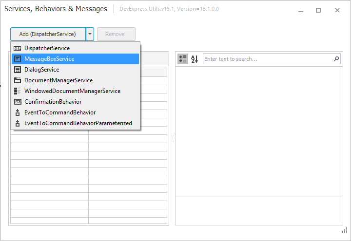
For those unaware of our WinForms Data Layout Control, here is a quick summary of its newest feature (Data Annotation Attributes) and how you can build forms and layout individual controls directly from your data source. As I hope you'll discover, this tool is extremely useful - especially when working with detail forms...

Once bound to a data source, the Layout Control retrieves data fields automatically and builds its layout with the appropriate editors (based on the underlying data type). By default, when binding to a simple business object (see Person class below), the DevExpress Data Layout Control automatically generates a linear layout, wherein layout items (controls) are arranged in one column.

public class Person {
        public int ID { get; set; }
        public string LastName { get; set; }
        public string FirstName { get; set; }
        public Image Image { get; set; }
        public string Phone { get; set; }
        public string Email { get; set; }
        public string Skype { get; set; }
        public string AddressLine1 { get; set; }
        public string AddressLine2 { get; set; }
        public string Description { get; set; }
        public DateTime BirthDate { get; set; }
        public Gender Gender { get; set; }
        public string Group { get; set; }
        public DateTime HireDate { get; set; }
        public decimal Salary { get; set; }
        public string Title { get; set; }
    }

DevExpress Form Layout Control

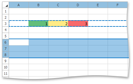
With our most recent update, the Data Layout Control ships with Data Annotation Attribute support (https://documentation.devexpress.com/#WindowsForms/CustomDocument114039) - useful for the automatic generation of complex layouts from a business object. To get started with this new capability, you simply need to mark the bound object's properties using dedicated attributes and assign the object as the control's data source. When building the layout, the control will automatically recognize these attributes and will provide display names and specify layout order item, arrange items into groups and tabbed groups, specify a control's read-only state, assign masks to editors, etc.

Let's dig into this new feature and use specific annotation attributes in the Person class to see the feature in action. First thing we'll do is prevent the ID field from being automatically generated by the Data Layout Control. We'll apply the Display attribute with the AutoGenerateField parameter set to false for the ID field.

[Key,Display(AutoGenerateField =false)]
public int ID { get; set; }

To assign custom captions to layout items, we'll use Display attribute with the Name parameter. For the Image field, we';; specify an empty string to hide the label...

[Display(Name ="Last name :")]
public string LastName { get; set; }
[Display(Name ="First name:")]
public string FirstName { get; set; }
[Display(Name = "")]
public Image Image { get; set; }

By default, single line text editors are generated by the Data Layout Control for editing a bound object's fields. You can change editor types used via the DataType attribute. For instance, the following code specifies use of a multiline Memo editor for the Description field.

[Display(Name = "About :"), DataType(DataType.MultilineText)]
public string Description { get; set; }

And here's the form...

DevExpress Form Layout - Attributes


The Display attribute with GroupName parameter allows you to combine items into groups (borderless, standard or tabbed groups). The following code positions the Email and Skype fields into a borderless group inside the Job tab.

const string EmailAndSkype ="<Root>/<Photo->/<FirstAndLastName>/{Tabs}/Job/<EmailAndSkype->";

[Display(Name = "E-Mail :", GroupName = EmailAndSkype)]
public string Email { get; set; }
[Display(Name = "Skype :", GroupName = EmailAndSkype)]
public string Skype { get; set; }

The form will now look as follows...

DevExpress Form Layout - Detail Form with Groups

Notice that GroupName parameter addresses a target group that is nested in another group. Group names are separated by the slash character. By default, the Layout Control adds auto-generated items to the bottom of the parent group in a vertical orientation and to the right in a horizontal orientation. Of course, you may want to arrange items in the generated layout using a custom order. To do this, you'd apply the Display attribute with the Order parameter.

Display(Name ="", GroupName = Photo, Order=0)]

public Image Image { get; set; }

A look at the final form...


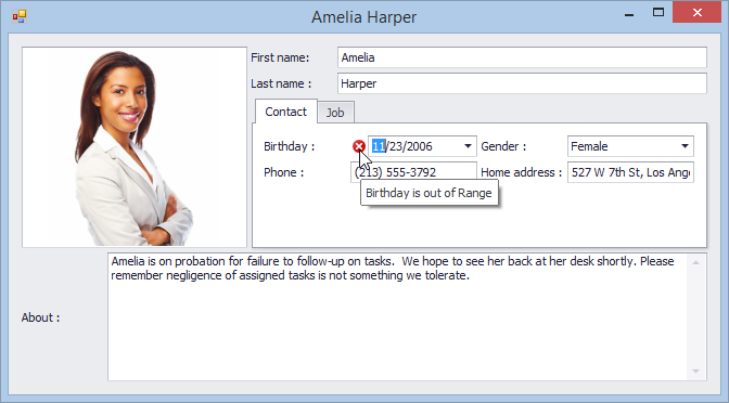
I hope you can see how easy it is to create a ready-to-use form layout by applying Data Annotation attributes to the data object's fields. In addition to layout-aware and editor-specific attributes, the Data Layout Control supports a set of data validation attributes (StringLengthAttribute, RangeAttribute, RequiredAttribute, etc.). In the following example, the Range attribute is used to check whether the BirthDate value is in the specified interval.

[Range(typeof(DateTime),"1/1/1900", "1/1/2000", ErrorMessage = "Birthday is out of Range")]
public DateTime BirthDate { get; set; }
Here is the complete code sample used in this demo:

public class Person {

    const string RootGroup = "<Root>";

    const string Photo = RootGroup + "/" + "<Photo->";

    const string FirstNameAndLastName = Photo + "/" +"<FirstAndLastName>";

    const string TabbedGroup = FirstNameAndLastName + "/" + "{Tabs}";

    const string ContactGroup = TabbedGroup + "/" + "Contact";

    const string BDateAndGender = ContactGroup + "/" +"<BDateAndGender->";

    const string HomeAddressAndPhone = ContactGroup + "/" +"<HomeAddressAndPhone->";

    const string JobGroup = TabbedGroup + "/" + "Job";

    const string HDateAndSalary = JobGroup + "/" +"<HDateAndSalary->";

    const string EmailAndSkype = JobGroup + "/" +"<EmailAndSkype->";

    const string GroupAndTitle = JobGroup + "/" +"<GroupAndTitle->";


    [Key,Display(AutoGenerateField =false)]

    public int ID { get; set; }

   [Display(Name = "Last name :", GroupName = FirstNameAndLastName, Order = 2)]

    public string LastName { get; set; }

   [Display(Name = "First name:", GroupName = FirstNameAndLastName, Order = 1)]

    public string FirstName { get; set; }

   [Display(Name = "", GroupName = Photo, Order=0)]

    public Image Image { get; set; }

   [Display(Name = "Phone :", GroupName = HomeAddressAndPhone)]

    public string Phone { get; set; }

    [Display(Name = "E-Mail :", GroupName = EmailAndSkype, Order=5)]

    public string Email { get; set; }

   [Display(Name = "Skype :", GroupName = EmailAndSkype)]

    public string Skype { get; set; }

   [Display(Name = "Home address :", GroupName = HomeAddressAndPhone)]

    public string AddressLine1 { get; set; }

   [Display(Name = "Work address :", GroupName = JobGroup)]

    public string AddressLine2 { get; set; }

   [Display(Name = "About :", GroupName = RootGroup), DataType(DataType.MultilineText)]

    public string Description { get; set; }

   [Range(typeof(DateTime), "1/1/1900", "1/1/2000", ErrorMessage = "Birthday is out of Range")]

   [Display(Name = "Birthday :", GroupName = BDateAndGender, Order = 3)]

    public DateTime BirthDate { get; set; }

   [Display(Name = "Gender :", GroupName = BDateAndGender)]

    public Gender Gender { get; set; }

   [Display(Name = "Group :", GroupName = GroupAndTitle, Order = 6)]

    public string Group { get; set; }

   [Display(Name = "Hire date :",GroupName=HDateAndSalary, Order=4)]

    public DateTime HireDate { get; set; }

   [Display(Name = "Salary :", GroupName = HDateAndSalary)]

    public decimal Salary { get; set; }

   [Display(Name = "Title :", GroupName = GroupAndTitle)]

    public string Title { get; set; }

}

And before I forget, here's an image of a form layout generated from a business object using our Layout Control -- with data validation enabled.
DevExpress Form Layout Control - Data Validation


Viewing all 3389 articles
Browse latest View live