Quantcast
Channel: Developer Express Global
Viewing all 3388 articles
Browse latest View live

Blog Post: ASP.NET & MVC - Grid Performance Enhancements (v18.1)

$
0
0

With the v18.1 release, we have improved performance of the DevExpress ASP.NET GridView control's adaptive mode. In fact, these enhancements are available for both ASP.NET WebForms and MVC.

Using new internal algorithms, we've significantly improved the layout recalculation logic of the ASP.NET and MVC Grid View in adaptive mode. The control's client Initialization is now up to 6 to 18 times faster when compared to earlier versions.

Adaptive Mode

The DevExpress ASP.NET & MVC GridView controls allow you to build adaptive or responsive page layouts with ease. The grid can automatically resize or hide grid data when the browser window is resized. The layout behavior can be customized by using the SettingsAdaptivity property.

This feature is great for your end-users who view your website from mobile devices.

Performance

Take a look at this animation to see the difference:

The previous version on the left is much slower to update than the improved current version on the right. Here's


GridView v17.2GridView v18.1Performance Efficiency
10 columns / 20 rows1,668 ms280 ms6 times
30 columns / 100 rows52,936 ms2,817 ms18 times

Demos

Test drive the online demos on your devices today:

Thanks!


Email: mharry@devexpress.com

Twitter: @mehulharry


Blog Post: DevExtreme - Bootstrap 4 Support (v18.1)

$
0
0

With our latest release, the DevExtreme components now support the Bootstrap 4 framework in two major ways:

  1. Use any DevExtreme components with applications based on Bootstrap 4
  2. Import colors from any Bootstrap 4 themes to DevExtreme themes

Let's take a look.

Bootstrap 4 released

In January 2018, the Bootstrap team released Bootstrap 4. Then, a week later, we announced our support for Bootstrap 4 in several of our platforms.

Since then, the DevExtreme team has worked hard to ensure compatibility. So, I'm happy to say that all DevExtreme components are fully compatible with Bootstrap 4!

Import Bootstrap themes

The DevExtreme components provide their own set of great themes. In fact, we just released the new 'Material Design' theme in v18.1.

However, if you're using the Bootstrap framework then you likely want to use one of their free or paid themes. And there are so many themes.

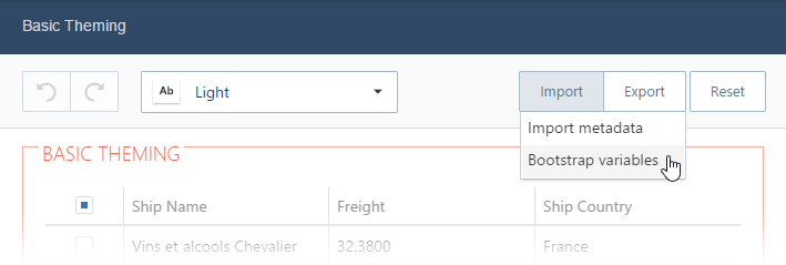
To make it easier to use Bootstrap themes with DevExpress components, our online theme builder provides an option to import a Bootstrap Less variables file:

Once imported, our theme builder analyzes then creates a new CSS file that you can import into your project that uses DevExtreme components. This new CSS contains the colors that specify how the DevExtreme color mimic the look of the Bootstrap theme that you just imported.

Less to Sass

Bootstrap 4 has switched their CSS preprocessor from Less to Sass. In fact, they announced this intention back in 2015:

Moved from Less to Sass. Bootstrap now compiles faster than ever thanks to Libsass, and we join an increasingly large community of Sass developers. - Bootstrap Blog

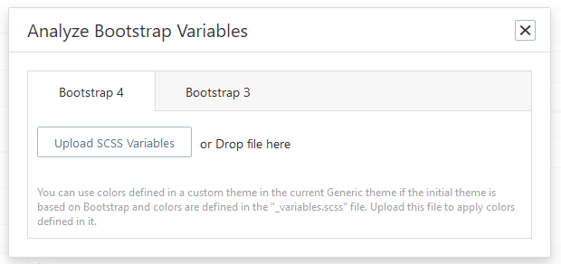
Therefore, we've added a new option to our theme builder that makes it easy to import Bootstrap 3 or 4 themes:

Learn more

Bootstrap 4 brings several changes and new themes; therefore, I recommend reading their announcement. If you're migrating from Bootstrap 3, then take a look at this helpful migration guide.

Give Us Your Feedback

Are you using Bootstrap 4 with DevExtreme? Drop me a line below.

Thanks!


Email: mharry@devexpress.com

Twitter: @mehulharry

Blog Post: ASP.NET & MVC - Scheduler Enhancements (v18.1)

$
0
0

With our latest release, we have introduced several new features for the DevExpress ASP.NET Scheduler control. These features are available for both the ASP.NET WebForms and ASP.NET MVC versions of the Scheduler.

Standalone Storage Control

The DevExpress ASP.NET Scheduler is a big control that provides several great features and a beautiful user interface (UI). We got some great feedback from you, our customers, who shared with us scenarios of using the Scheduler's features without the UI.

Therefore, we're now providing a new control that helps you to use the Scheduler's functionality without using the Scheduler's UI.

v18.1 ships with a new SchedulerStorageControl. This is a non-visual component that provides nearly the same functionality as our ASP.NET Scheduler. It also allows you to integrate all scheduler-based data operations using third-party web controls.

This stand-alone control allows you to do things like:

  • Display and edit appointments using a custom UI
  • Show reminder notifications without the full scheduler (lighter render)
  • Bind Date Navigator to a Storage Control

The new SchedulerStorageControl also provides a Client-side API to:

  • retrieve the resources data
  • CRUD operations for appointments
  • manage reminders

The Server-side API is the same as the scheduler control.

Demo  Documentation

Resource Navigator - Tokens

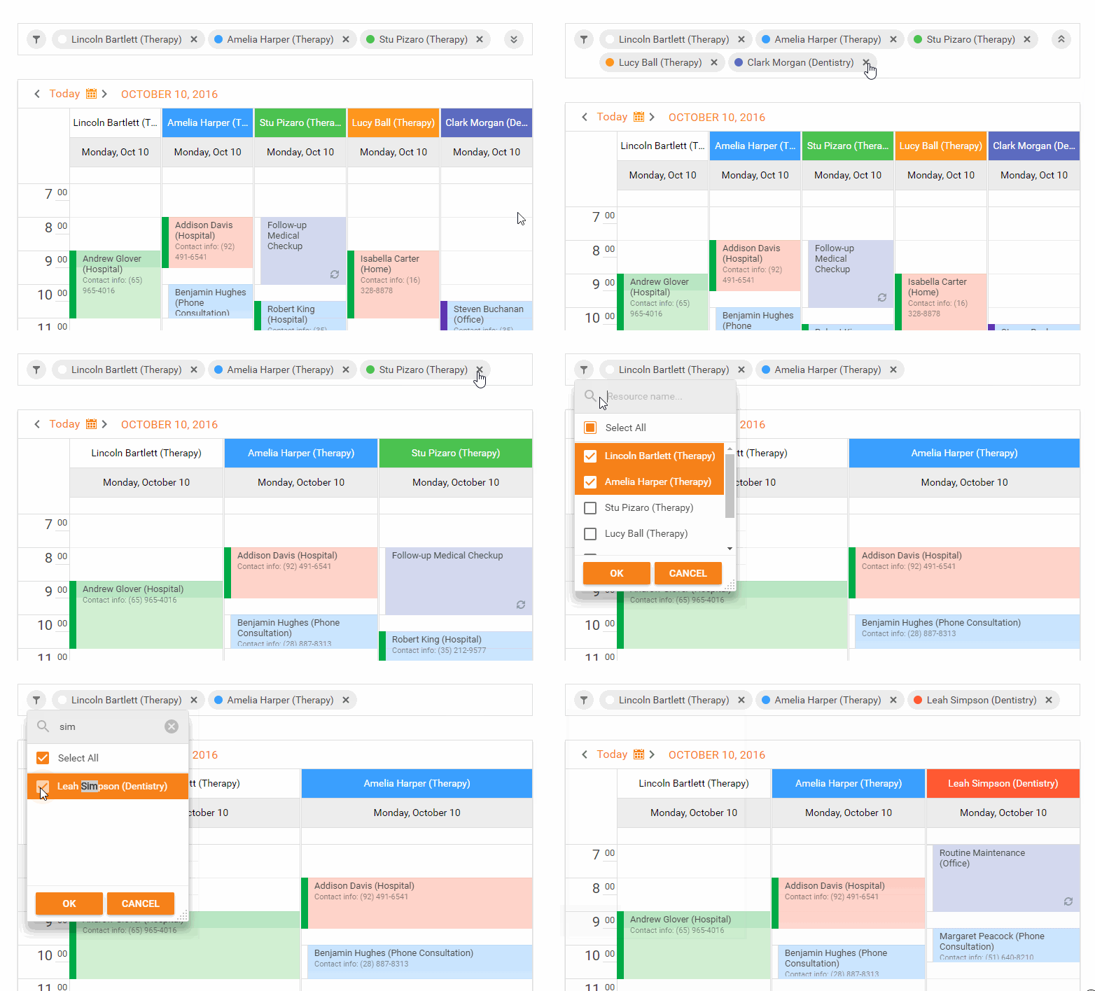
Our Resource Navigator ships with a new navigation mode. In this mode, all available resources are displayed as tokens. End-users can display or hide resources by adding or removing corresponding tokens.

This allows your end-users to select individual resources to be displayed in the scheduler view. They can also Search for a resource by name.

This feature is also great for mobile-users to quickly tap on resources they'd like to filter by.

To enable this feature set the ResourceNavigatorProperties.Mode property to "Tokens".

Demo

Date Navigator: New Highlight Modes

Our Date Navigator has added two new modes to highlight dates with appointments. Now there are three highlight modes available in the Scheduler:

  • Bold - date is displayed in bold text
  • Labels - small colored bricks representing appointments
  • Custom - allows you to define custom highlighting logic

Demo

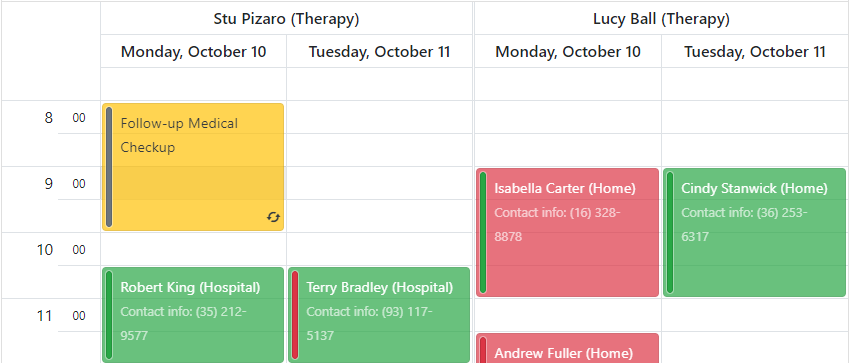
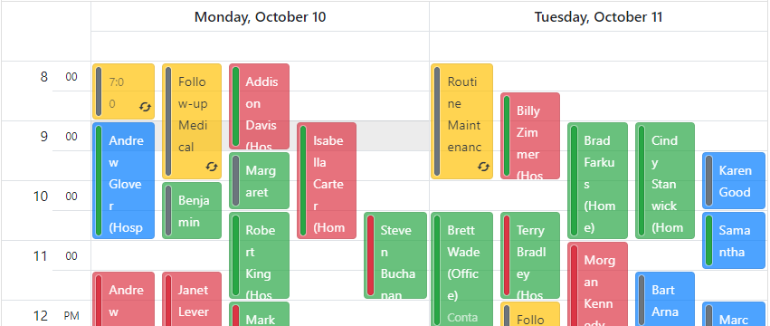
Month View Adaptivity

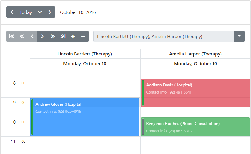
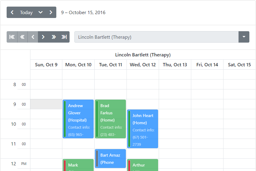
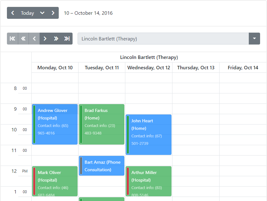
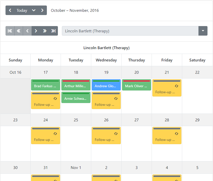
The Scheduler's Month View now supports an adaptive display mode. All appointments are transformed to a more compact view on smaller screens.

In fact, we've also improved the appointment rendering for small screens. Previously, appointments often were not even shown due to the lack of space. Now with this latest release, we render more compact appointments and date headers.

Give Us Your Feedback

Which ASP.NET Scheduler enhancement is your favorite? Drop me a line below.

Thanks!


Email: mharry@devexpress.com

Twitter: @mehulharry

Blog Post: DevExtreme React Chart (CTP)

$
0
0

Here’s another piece of fantastic news for React users: our DevExtreme React Chart is available now as a CTP release!

DevExtreme React Chart

This chart widget is 100% native to React and based on the same plugin architecture used in the DevExtreme React Grid. For visual chart elements, this approach is easy to understand: for instance, if you need to show a chart axis, you add the ArgumentAxis or ValueAxis plugin. In the same way, you compose other visual parts to create a complete chart for your business use case.

<Chart data={data} width={700} height={400}><Legend /><ArgumentAxis name="country" type="band" /><ValueAxis name="age" /><BarSeries name="👶Young"
    valueField="young" argumentField="country"
    axisName="age"
    stack="a" /><BarSeries name="🧑Adult"
    valueField="adult" argumentField="country"
    axisName="age"
    stack="a" /><BarSeries name="🧓Old"
    valueField="old" argumentField="country"
    axisName="age"
    stack="a" /></Chart>

Hybrid rendering

The React Chart uses a rendering mechanism that combines HTML and SVG. This means that you can use HTML and CSS to influence layout and appearance of chart building blocks — currently legend and title, but others to come — while taking advantage of the precision and rendering quality of SVG for the chart series.

For example, you could add a title to the legend like this:

const RootWithTitle = props => (<div><h5 style={{ marginLeft: '2.5rem' }}>👪 Population</h5><Legend.Root {...props} /></div>);

...
<Legend rootComponent={RootWithTitle}/>

Legend with title

What’s in the CTP

We have already implemented a large part of our planned feature set at this stage. Here’s an overview of the completed functionality:

  • Supported series types:
    • Bar
    • Line
    • Spline
    • Area
    • Scatter
    • Pie
    • Stacked series types for bar, line, spline and area
  • It is possible to mix series types in one chart
  • The BarSeries has grouping support
  • Multiple axes can be combined in one chart
  • The Legend, Title and Axis plugins have both Bootstrap 4 and Material-UI implementations, so you can expect seamless integration with your themed application.

Future plans

We are currently working on several features that will be available in the near future:

  • Logarithmic and exponential axes
  • Improved color (palette) management
  • Animations
  • Interactive features: hovering, selection and tooltips

Beyond this, we have longer-term plans that include the following items. Of course your feedback is welcome to help us prioritize!

  • Bubble and Financial series types
  • Additional interactive features: cross-hair support, scrolling and zooming
  • Data aggregation

Try it now!

The React Chart CTP is first published with version 1.3.0-beta.2, available now. We have created an initial set of documentation, and you can find the getting started instructions here. As usual, we’re interested in any thoughts you can share with us, here or in our GitHub issue tracker!

Finally we need to mention this, since we are in a pre-release phase: We can’t promise a timeline for a final React Chart release, and it will not be ready yet by the time 1.3.0 leaves beta status. Please note that we expect code and documentation to have bugs at this point, and there will be breaking changes in the future before a final release is published.

Blog Post: DevExpress ASP.NET, MVC, Bootstrap, & Core Editors - Performance Improvements & Custom Filtering (v18.1)

$
0
0

With the v18.1 release, we have added two major improvements for all DevExpress ASP.NET list-based controls: ListBox, ComboBox, and TokenBox.

  • Improved performance
  • Custom filtering

These improvements are available for all ASP.NET platforms: ASP.NET WebForms, MVC, Bootstrap, and ASP.NET Core Bootstrap. Let's take a look.

Performance - Client-Side Mode

Let's start with the problem: several customers reported issues with editors and large data sources. Therefore, binding the ListBox, ComboBox, or TokenBox to a data source with several thousands of records (or more). The performance gets worse when using multiple (large data) editors on the same page.

So I'm happy to report that we've solved these issues and dramatically increased performance. The list edit controls can now be used in client mode, therefore, you don't need to use callbacks (even for large number of items). Take a look at this animation to see the difference:

I've said it before and I'll say it again: I love it when our devs can squeeze out even more performance improvements from our controls.

Faster render

The improved performance of these editors can help speed up your websites. Take a look at these tables to see the difference with and without optimizations:

List Box Initialization

No. of ItemsTime, without optimizationTime, WITH optimization
5,000600 - 700 ms130- 180 ms
50,0007 - 8 sec700 - 900 ms
500,000out of memory exception7 - 8 sec

Combo Box Filtering

No. of ItemsTime, without optimizationTime, WITH optimization
5,000200 - 500 ms30- 60 ms
50,00060 sec200 - 600 ms
500,000browser does not respond3 - 7 sec

This results in lighter web pages that load faster and respond smoother:

Render-size Comparison

ControlVersion 17.2Version 18.1
Combo Box (10, 000 items)~1 MB~350 KB
List Box (10, 000 items)~940 KB~370 KB
List Box w/CheckBoxes (10, 000 items)~4.2 MB~370 KB

Custom Filtering

These editors also now support custom filtering which allows you to do several new filtering options:

  1. Create your own filter algorithm and override the default filter in either the client or server modes
  2. Implement custom highlighting logic
  3. Implement server-side custom filtering via Filter Expression using the Criteria Operator syntax
  4. Implement client-side custom filtering via custom code in the event handler (processing each item’s visibility separately)
  5. Added the new client API method which allows you to preset a filter: SetText(string text, bool applyFilter)

Multi-Column Search

You can now also search by multiple terms and columns. For example, here we match the rows for the terms USA and re for any columns:

Accents & Umlauts Filtering

With the improvements in the customer filtering API, you can now create scenarios like accent/umlaut insensitive search.

This allows you to easily search for items that contain accents or umlauts without you having to enter those special characters. For example, by entering mu, the filter matches both Mu and :

We've created a demo with the CustomFiltering event so you can see how to implement this in your projects.

Code Reuse - FTW

These features will also be included with the embedded list editors in our GridView, CardView, VerticalGrid, and TreeList controls. This code reuse allows the embedded controls to "bubble up" new features to the parent control too.

Demos

Test drive these improvements online here:

Feedback

What do you love about these features of the DevExpress ASP.NET List Editor controls? Drop me a line below.

Thanks!


Email: mharry@devexpress.com

Twitter: @mehulharry

Blog Post: ASP.NET Core Bootstrap - GridView Control Enhancements (v18.1)

$
0
0

With the v18.1 release, we've added several major features to the DevExpress Bootstrap GridView control for ASP.NET Core. Let's take a look.

Server Mode - Binding to Large Datasets

The Bootstrap Grid View control now supports data binding in server mode. In this mode, the Grid View loads only the minimum amount of data required for display purposes and delegates all data processing (such as grouping and sorting) to the database server.

Demo

Batch Editing

Our ASP.NET Core Bootstrap Grid View control supports data editing in batch mode. Batch modifications allow you to eliminate unnecessary server updates (visual, re-sorting, selection updates, etc.) and speed up grid performance. You update the grid once, after all necessary changes have been made on a client.

ASP.NET Core Bootstrap GridView - Batch Editing | DevExpress

Demo

Bands

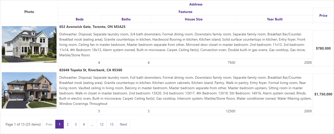
With this release, our Bootstrap Grid View control supports column header and data cell bands.

  • Column Header bands allow yo to arrange column headers across multiple rows.
  • Data cell bands allow you to create banded data row layouts allowing cells to occupy multiple rows.

Demo

Cell Merging

Much like Microsoft Excel, the Grid's cell merging option allows you to improve usability by avoiding the duplication of common information. Neighboring data cells across different rows can be merged whenever they display matching values.

Demo

Column Resizing

End-users can now resize grid columns by dragging a column header's border.

Demo

Merged Column Grouping

Our ASP.NET Bootstrap GridView now includes a 'Merge Column Groups' mode. In this mode, you can merge grouped columns by dragging the appropriate column header(s) to the group panel and arrange them across a line.

ASP.NET Core Bootstrap GridView - Merged Column Grouping | DevExpress

Demo

Header Filter - Instant Find

v18.1 introduces a simple and quick way to find column filter values. The Find Panel allows users to enter a search string and initiate a search against all filter values displayed in the header dropdown.

ASP.NET Core Bootstrap GridView Control - Header Instant Find | DevExpress

Demo

Like it?

We'd love to hear your feedback about the Bootstrap GridView for ASP.NET Core improvements. Drop me a line below, thanks.


Email: mharry@devexpress.com

Twitter: @mehulharry

Blog Post: React and the Report and Dashboard Server

$
0
0

I recently posted about some news in v18.1 of our Report and Dashboard Server and it made me curious to see how an interface could show a report without any ASP.NET components. We have several demos available that show the use of JavaScript applications as report viewing or editing front-ends (such as this one for React), but they assume that there’s a .NET based back-end, usually using ASP.NET MVC. The associated instructions also use bower, which isn’t something I would do today when creating a React app.

I set myself the goal to create a React app using create-react-app (duh!) and implement access to Report and Dashboard Server to show a report in the app, using the HTML5 Document Viewer. The basic steps of a solution are outlined on this documentation page, but again assume ASP.NET MVC.

The post below describes the steps I took in enough detail for you to follow along if you’re interested. Please let me know if you find anything missing or inadequately explained!

React and the DevExpress Report and Dashboard Server

Preparation

After setting up Report and Dashboard Server in a virtual machine, I configured the system with a Data Model and I created a report. I also set up email sending for the server and created a user account, which is necessary so I can authenticate the remote viewer using that account. Following the instructions I linked in the previous paragraph, I activated CORS.

Now I set out to create a first piece of code to run on Node.js, which contacts the server, retrieves a security token and then a list of available reports. Here’s what I ended up with:

const base = 'http://192.168.1.234:83';
const data = r => r.data;

axios
  .post(
    base + '/oauth/token',
    qs.stringify({
      username: 'sturm',
      password: 'secret',
      grant_type: 'password'
    }),
    {
      headers: { 'content-type': 'application/x-www-form-urlencoded' }
    }
  )
  .then(data)
  .then(d => d.access_token)
  .then(token => {
    console.log('Token: ', token);
    return axios
      .get(base + '/api/documents', {
        headers: { Authorization: 'Bearer ' + token }
      })
      .then(data)
      .then(d => {
        console.dir(d);
      });
  })
  .catch(err => {
    console.error(err);
  });

From the top, here are the steps of the process. First, I have an address and a port for the server, which depend on the server configuration. Port 83 is the default for a new installation and I went with that. You can see that I’m using HTTP as the protocol — more about that below.

Using axios (because I like Promises), I make a POST request to the server, using the path /oauth/token. The information I send is URL-encoded and I achieve this using the qs library. There are other solutions for this, but qs is easy to use and works on Node as well as in the browser. As a result of this call, I receive a Bearer Token from the server, which I need to use in further calls to prove authorization.

Note that the token expires sooner or later — mine were valid for twenty minutes each — so you should make sure to retrieve a new one close enough to the actual call you’re going to make!

To retrieve the list of available reports, I make a GET request to /api/documents and I pass the token as part of the Authorization header. This is of course a standard OAuth mechanism. The result is a list of available reports:

[
  {
    id: 1,
    categoryId: 1,
    modifiedById: 0,
    name: 'Venues',
    description: '',
    modifiedBy: 'DESKTOP-TMVPFDM\\sturm',
    modifiedWhen: '2018-05-23T10:08:06.867',
    documentType: 'Report',
    allowModify: false,
    allowDelete: false,
    optimisticLock: 0
  }
],

That was simple enough! There’s just one important thing to sort out…

HTTP - or what?

By default, the OAuth token can not be retrieved from the server using HTTP, it requires HTTPS. There is a good reason: if a third party should get hold of the token, they would be able to access the server using my credentials!

Since I’m running Report and Dashboard Server in a local virtual machine, I can’t easily get hold of a “real” (i.e. not a self-signed) SSL certificate. IIS will gladly provide a self-signed certificate for development purposes, but this is not accepted by a client without some extra steps. On Node, I can tell the client to ignore validation errors by using an HTTPS Agent:

const agent = new https.Agent({
  host: '192.168.1.234',
  port: 443,
  path: '/',
  rejectUnauthorized: false
});

However, this agent mechanism is not available in the browser, since browsers are not allowed to ignore certificate validation issues without direct user confirmation. This means that a self-signed certificate is useless for AJAX calls, even during development.

For my development and test scenario, I chose to deactivate the HTTPS requirement for OAuth. However, before I tell you how that works, you must understand that this is NEVER an acceptable solution for a real-world server outside a dev environment! I recommend you get a signed certificate for your server, for example using Windows ACME Simple in conjunction with Let’s Encrypt.

Now, here’s how to allow Report and Dashboard Server to use HTTP for OAuth, purely for development purposes and entirely at your own risk. Find the table GlobalSettings in the server database (by default called DevExpressReportServer). In that table, find the record with the Key value OAuthServerAllowInsecureHttp and set the associated Value to True. Restart the service using IIS Manager and you’ll be able to run code like mine above.

The React app

With all the preparation and research out of the way, I created a new React app:

create-react-app report-server-react

Since I never see the point in using yarn, I switched things to npm and made sure everything was installed correctly:

cd report-server-react
rm -rf yarn.lock node_modules
npm install

Now I installed required packages, starting with the ones to support the communication logic already shown above:

npm install --save axios qs

I also need the packages for the DevExpress functionality, plus globalize and cldr to support internationalization:

npm install --save cldr globalize devextreme devexpress-reporting

Finally, I need a special loader for webpack:

npm install --save-dev html-loader

Now for some code

I edited the file src/App.js and removed the default component implementation and the logo import. I added some import lines to pull in all the required library functionality:

import axios from 'axios';
import qs from 'qs';
import ko from 'knockout';
import 'devextreme/dist/css/dx.common.css';
import 'devextreme/dist/css/dx.light.css';
import 'devexpress-reporting/css/web-document-viewer-light.min.css';

const viewerHtml = require('devexpress-reporting/dx-web-document-viewer').Html;

I added a new App class:

class App extends Component {
  constructor(props) {
    super(props);
    this.state = { reportName: 'report/1' };
  }
  render() {
    return <ReportViewer reportUrl={this.state.reportName} />;
  }
}

Like in some of our existing examples, the value passed to the reportUrl attribute is retrieved from state. In the demo, I’m setting the value statically to report/<id> (that’s the id from the report list). Of course it is easy to imagine that the value would be retrieved from some other source in a real application.

Finally, here is the ReportViewer component. Again, this is based on our other examples. It is possible to separate the token retrieval logic, but I left it in place here to keep the structure simple.

class ReportViewer extends React.Component {
  constructor(props) {
    super(props);
    this.reportUrl = ko.observable(props.reportUrl);
  }
  render() {
    return (<div><div ref="innerScript" /><div className="fullscreen" data-bind="dxReportViewer: $data" /></div>
    );
  }
  componentWillReceiveProps(newProps) {
    this.reportUrl(newProps.reportUrl);
  }
  componentDidMount() {
    this.refs.innerScript.innerHTML = viewerHtml;
    const baseUrl = 'http://192.168.1.234:83';
    axios
      .post(
        baseUrl + '/oauth/token',
        qs.stringify({
          username: 'sturm',
          password: 'secret',
          grant_type: 'password'
        }),
        {
          headers: { 'content-type': 'application/x-www-form-urlencoded' }
        }
      )
      .then(r => r.data)
      .then(d => d.access_token)
      .then(token => {
        ko.applyBindings(
          {
            reportUrl: this.reportUrl,
            remoteSettings: {
              serverUri: baseUrl,
              authToken: token
            }
          },
          this.refs.viewer
        );
      });
  }
  componentWillUnmount() {
    ko.cleanNode(this.refs.viewer);
  }
}

Once more, from the top, here are the important details of the implementation. First, in the constructor, there is a call to Knockout. This library is used by the document viewer internally, so I need to interface with it from my code. I create an observable value, initializing it with the reportUrl from my own props.

In the render method, two container divs are created. The second one has a data-bind attribute, which is later recognized by Knockout. Since the attribute uses the dxReportViewer binding type, Knockout will integrate the viewer in place of the container component.

In componentWillReceiveProps, I update the internal observable value if and when the same value in the props changes. This in turn updates the viewer since Knockout reacts to the change to the observable value.

The method componentDidMount is called when the React component is ready, and you’ll recognize most of the code in there. The new part is the call to ko.applyBindings: at this point, Knockout receives a data model, which in this case is a structure with document viewer parameters. These are used by the data binding described above, since there is the $data variable in the attribute.

The only remaining element is a bit of clean-up logic in componentWillUnmount.

One final code addition was required: I edited the file src/App.css and added this block at the end, so that the viewer appears in a full-screen setup:

.fullscreen {
  position: absolute;
  top: 0px;
  left: 0;
  right: 0;
  bottom: 20px;
}

And then… nothing worked

With all the code in place, it should have been possible to run the application at this point. Since I used create-react-app, everything was set up for a simple command:

npm start

However, there were errors reported when I did this. The reason was that the globalize and cldr libraries are not compatible with webpack by default — and webpack is used by the create-react-app infrastructure, even if it’s almost invisible.

To solve this problem (and one more, below) it is necessary to modify the hidden webpack configuration that has been generated by create-react-app. Unfortunately this is not supported in the default setup. In fact, the makers of create-react-app advise that whenever you feel the need to break out of the standard system, you should let them know why, so they can fix the original issue rather than support customization.

Note: The project react-app-rewired aims to provide customizability of projects created using create-react-app, at a tradeoff. For real-world scenarios I recommend considering this seriously, for the demo however I didn’t want to complicate matters further by bringing in additional tools.

There is a mechanism in place for the purpose of breaking out, and it’s called eject. Once you eject your project, you are free to modify details like the webpack config files, but you will not be able to use your project with new versions of create-react-app and react-scripts in the future. There are lots of discussions to be found online on the pros and cons of ejecting. For the purposes of this demo, I chose to do it:

npm run eject

Note: If you’re following along with my description, please click the survey link displayed at the end of the eject process and let the project maintainers know that you ejected due to lack of support for CLDR, Globalize and custom loaders.

Adjusting webpack config files

I edited the file config/webpack.config.dev.js and found the block resolve.alias. It contained an item called react-native by default, and I added these lines to solve the integration problems that came up for CLDR and Globalize.

cldr$: 'cldrjs',
cldr: 'cldrjs/dist/cldr',
globalize: 'globalize/dist/globalize'

I made one more change by integrating the html-loader you saw already when I added the package. This was necessary because the devexpress-reporting package contains two files with HTML snippets, and these need to be supported by the loader. I found the block modules.rules and navigated towards the end of it. There is a segment there for the configuration of the file-loader, with a comment right behind it indicating that any custom loaders need to be added ahead of that block. I inserted my setup code in the correct position:

{
  test: [/\.html$/],
  include: [
    path.resolve(paths.appNodeModules, 'devexpress-reporting/html')
  ],
  loader: require.resolve('html-loader')
},

This configuration means that for any HTML files located in the devexpress-reporting package folder, the html-loader is used.

If you intend you build a production version of your project (npm run build), you will need to make the same changes to the file config/webpack.config.prod.js.

That’s it!

If you have been following along, all that remains at this point is to run the application:

npm start

This opens a page in a browser automatically, at http://localhost:3000, showing the running application. If all goes well, it will contact the Report and Dashboard Server, retrieve the report and show it in the HTML5 Document Viewer!

I’m really interested in your thoughts. Will you use this type of integration in your own applications? Please feel free to get back to us if you need more help with your own integration scenarios!

Finally, here is a repository with my own demo app. If you change the URL strings to point to your own server, this should work fine!

Blog Post: ASP.NET & MVC–TreeList Batch Editing (v18.1)

$
0
0

Our ASP.NET WebForms and MVC TreeList controls have a very cool feature added in their v18.1 release. It’s Batched Editing!

batch-img-cropped-and-resized

You might already be familiar with this feature in the ASPxGridView. Batched updates eliminate unnecessary roundtrips to the server, and as a result of that, it greatly improves the performance as well as the end-user experience when modifying a lot of data in different nodes. All changes will be submitted in on callback and you can process them in one go on the server.

We developed the TreeList in a similar way as the GridView so this also means the the API and features work in a similar way as the GridView. There are obviously some differences which I’d like to point out in this post.

Enabling Batched Editing

If you want to enable batched editing, the first thing you need to do is change the TreeListSettingsEditing.Mode property to Batch. The next thing you need to do is implement the BatchUpdate event. This event receives a list with deleted, inserted and updated nodes that you can use to update the underlying datastore.

If you don’t implement this BatchUpdate event, the regular NodeInserting, NodeUpdating and NodeDeleting events will be raised for each node. This is not recommended when using Batch Editing.

What about inserting cascading child-nodes?

When inserting a child node of a parent node that already exists in a data source, it uses the parent node's key field name. The newly inserted child node doesn’t have a key field until it is saved by clicking the Update button in Batch edit mode. This is a problem when a new node has new child-nodes as well in the same batch update. Those child-nodes don’t have a parent id yet.

ezgif-batch-new

To overcome this issue, the TreeList has a new method SetBatchEditInsertedNodeKeyValue. You need to assign the key of the newly inserted node so the row in the datastore can be added automatically.

To see how this works, check out the demo on Batched Editing.

What about cascading deletes?

If you want the TreeList to do cascading deletes, all you need to do is set the SettingsEditing.AllowRecursiveDelete to True.
There is a small caveat here:
The underlying datastore needs to support cascading deletes as well.

If you enable recursive deletes on a datastore that doesn't support this, an exception will be thrown at runtime and you will need to handle the recursive deletes manually.

What do you think?

Let me know what you think of this feature by replying on this article.

Try it?

Did you know that you can test this feature together with all the other exciting new DevExpress candy even if you’re not a customer (yet)?
Feel free to download a free 30-Day trial versionincluding technical support of our award winning controls!


Blog Post: ASP.NET Core & WebForms Bootstrap - New Scheduler Control (v18.1)

$
0
0

With the v18.1 release, we've added the powerful Scheduler control for both Bootstrap versions of our controls: ASP.NET Core and WebForms.

This new Scheduler controls is packed with several major features, let's take a look.

Various view types

The Bootstrap Scheduler control has several types of view that provide different arrangements and formats for scheduling and viewing appointments:

Day

The DayView enables end-users to schedule and view user events by day.

Demo

Agenda

The AgendaView enables end-users to list appointments by day.

Demo

Full Week

The FullWeekView enables end-users to schedule and view user events for the entire week.

Demo

Work Week

The WorkWeekView enables end-users to schedule and view user events by the working week (Saturdays and Sundays are not displayed).

Demo

Time Line

The TimelineView displays appointments as horizontal bars along the timescales and provides end-users with a clearer overview for scheduling purposes.

Demo

Month

The MonthView enables end-users to schedule and view the user events in a month.

Demo

Grouping

The appointments within the current view can be grouped by dates or resources to facilitate an appointments management.

Group by resources

Appointments are grouped by resources.

Demo

Group by dates

Appointments are grouped by dates.

Demo

No Group by

Appointments with out any grouping.

Demo

Edit Form Customization

The Bootstrap Scheduler provides a ViewModel-driven customization API. This allows to remove, replace, or modify existing form parts or add a new UI parts to the edit forms without re-creating the entire form from scratch.

It provides API methods like: GenerateDefaultLayoutElements, InsertBefore, InsertAfter, FindLayoutElement, and more that allow you to modify the existing layout with ease.

For example:

// generates default layout elements to work with
dialog.GenerateDefaultLayoutElements();
var resourceContainerGroup = dialog.LayoutElements.CreateGroup("resourceContainer", (g) => {
   g.LayoutElements.CreateGroup("resourceGroup", (resourceGroup) => { resourceGroup.LayoutElements.Add(dialog.FindLayoutElement("ResourceIds"));
   // moves existing ResourceIds to the created group
   });
   g.LayoutElements.CreateGroup("resourceDetailGroup", (detailGroup) => {
      detailGroup.LayoutElements.CreateField(m => m.Phone);
      detailGroup.LayoutElements.CreateField(m => m.Photo);
   });
});
dialog.InsertAfter(resourceContainerGroup, dialog.FindLayoutElement("StatusKey"));// inserts group before existing layout element

Demo

Reminders

Scheduler provides a capability to create reminders. Reminders are used to send alerts at specified time periods before an appointment's start time.

Standalone controls

Some parts of the Bootstrap Scheduler control's UI are available as standalone controls, which can be used side by side with the scheduler control.

Here is the list of standalone controls and check out their demos:

  • BootstrapSchedulerDateNavigator -Demo
  • BootstrapSchedulerResourceNavigator - Demo
  • BootstrapSchedulerViewNavigator -Demo
  • BootstrapSchedulerViewSelector - Demo

Adaptive layout

Last, but not least, the Bootstrap Scheduler provides adaptive features out-of-the-box! That means looks great on desktop and mobile browsers!

Like it?

We'd love to hear your feedback about the new Bootstrap Scheduler control. Drop me a line below, thanks.


Email: mharry@devexpress.com

Twitter: @mehulharry

Blog Post: XAF - Mobile Layout Enhancements (v18.1)

$
0
0

In this blog post, I will briefly describe two highly requested Mobile UI features in XAF v18.1. They should help you better organize large data amounts on a mobile screen.

Extended Mobile Detail View Layout

This layout is based on the dxForm and dxAccordion widgets from our DevExtreme library. With these widgets, you can design one layout that adapts to different screen sizes. Open your application on a tablet - the layout automatically divides Detail View content into two or more columns.

Your layout has many groups? Display them as tabs or make these groups collapsible not to waste the space.

Enable this feature by setting MobileApplication.EnableExtendedDetailViewLayout to true. Learn more in the Mobile Detail View Layout article.


How to Hide/Show Navigation Control on a Tablet

Choose which tablet layout is more convenient for your clients using the MobileApplication.TabletLayoutType property.
    Split - when the navigation control always sticks to the left. 
    SlideOut - when end-users can collapse or expand the navigation control using the 'hamburger' button.


Your feedback counts

We would love your thoughts on these features and would love to learn more about customizations you've made to XAF Mobile UI. 


Logify

Before I let you go, just a quick question - are you guys using 24/7 app monitoring services such as Logify? Our support team plans on using Logify with some of our enterprise customers and we'd love to know what you guys think of 24/7 app monitoring. Check out the How to replace XAF exception handling with Logify article to learn more about the XAF integration. Please note that we are using this exact approach for our online Web and Mobile demos (available at https://www.devexpress.com/Support/Demos/#xaf).


  Yekaterina K.
  Technical writer
  XAF team

Blog Post: ASP.NET Core & WebForms Bootstrap - Control Enhancements (v18.1)

$
0
0

We have added a couple of nice enhancements on several of our WebForms Bootstrap controls which I’d like to highlight in this post.

For all of you familiar with our ‘regular’ WebForms controls these useful additions might look familiar and guess what?
You’re right!

Like Mehul mentioned several times on blogposts and webinars, these Bootstrap controls are based on our WebForms controls with the exception of layouting, styling and rendering. Because of that, features that we build for WebForms will appear in the Bootstrap Controls as well.

Let’s take a look what has been added in v18.1:

Layout Control

Layout groups

One of my favorite controls, the Form Layout Control now  supports ‘Layout Groups’ as well as ‘Tabbed Layout Groups’.

These Layout Groups serve as containers for Layout Items and allow you to create awesome looking and well organized forms. A Layout Group can be displayed as a card with caption and border.


Click here to test this feature on our demo site

Tabbed Layout groups

Tabbed Layout groups are supported as well and serve as a containers for layout items as well as layout groups.


Click here to test this feature on our demo site

Bootstrap Menu

NavBar mode

One of the things that comes with the Bootstrap framework is the navigation menu which changes appearance on different screen dimensions. When you look at it on a big screen, the menu looks like an ordinary horizontal (pulldown) menu but when it’s being displayed on a smaller screen, it switches from a menu to a navbar when clicking the hamburger menu.

In our v18.1 release we have embedded this behavior in our Bootstrap Menu control. To use this feature, the only thing you need to do is enable the SettingsBootstrap.NavBarMode property.


Click here to test this feature on our demo site

Editors

ListBox Filtering

The ListBox now supports filtering data. The integrated search UI allows users to enter a search string which will cause the control to only display the items matching the criteria. This results in a smaller list with items to select from.
Take a look at the FilteringSettings property to see the settings related to the filtering functionality.


Click here to test this feature on our demo site

ListBox - Select All

Another small but excellent addition to the ListBox is the ‘Select All’ option. When you set the SelectionMode property to CheckColumn, and you enable the EnableSelectAll property on the ListBox, the ‘Select All’ checkbox will be shown in the header of the ListBox.


Click here to test this feature on our demo site

Try it?

Did you know that you can test this feature together with all the other exciting new DevExpress candy even if you’re not a customer (yet)?
Feel free to download a free 30-Day trial versionincluding technical support of our award winning controls!

What do you think?

Let me know what you think of this feature by replying on this article.

Blog Post: ASP.NET WebForms & MVC - Adaptive Improvements

$
0
0

In the last couple of releases we have put quite some effort in making our WebForms controls and MVC extensions adaptive so they will look good on any device.

We decided that there were some controls that needed some more work and in the v18.1 release, we have improved a couple of them which are worth mentioning.

CardView Control

The CardView control is a beautiful UI element for adaptive/responsive WebApps. Think about a webshop displaying products.
While we already had some adaptive features in the CardView control, we have added a new adaptive mode LayoutMode.Breakpoints. You can now populate the Breakpoints collection with Breakpoint elements that hold information like CardsPerRow and MaxWidth specification.

Below is an ASPX example:

<Settings LayoutMode="Breakpoints" VerticalScrollBarMode="Hidden" /><SettingsAdaptivity><BreakpointsLayoutSettings CardsPerRow="6"><Breakpoints><dx:CardViewBreakpoint DeviceSize="XLarge" CardsPerRow="5" /><dx:CardViewBreakpoint DeviceSize="Large" CardsPerRow="4" /><dx:CardViewBreakpoint DeviceSize="Medium" CardsPerRow="3" /><dx:CardViewBreakpoint DeviceSize="Small" CardsPerRow="2" /><dx:CardViewBreakpoint DeviceSize="Custom" MaxWidth="450" CardsPerRow="1" /></Breakpoints></BreakpointsLayoutSettings></SettingsAdaptivity>

And this feature is also available on its MVC counterpart:

settings.Settings.LayoutMode = DevExpress.Web.Layout.Breakpoints;
settings.SettingsAdaptivity.BreakpointsLayoutSettings.CardsPerRow = 6;

settings.SettingsAdaptivity.BreakpointsLayoutSettings
        .Breakpoints.Add(BreakpointsLayoutDeviceSizes.XLarge, 5);

settings.SettingsAdaptivity.BreakpointsLayoutSettings
        .Breakpoints.Add(BreakpointsLayoutDeviceSizes.Large, 4);

settings.SettingsAdaptivity.BreakpointsLayoutSettings
        .Breakpoints.Add(BreakpointsLayoutDeviceSizes.Medium, 3);

settings.SettingsAdaptivity.BreakpointsLayoutSettings
        .Breakpoints.Add(BreakpointsLayoutDeviceSizes.Small, 2);

settings.SettingsAdaptivity.BreakpointsLayoutSettings
        .Breakpoints.Add(450, 1);
  

As a result, the CardView renders beautiful on all devices. Take a look at how the CardView worked in previous versions (in Flow mode):

And now see how it works with the Breakpoints feature configured:

The WebForms demo can be found here and the MVC one can be found here.

ImageGallery Control

Since the Image Gallery looks more or less similar to the CardView, we decided to implement the Breakpoints feature in the Gallery as well. This results again in a beautiful control that looks good on any device:

The ASPx markup looks similar to the CardView one:

<SettingsBreakpointsLayout ItemsPerPage="30" ItemsPerRow="6"><Breakpoints><dx:ImageGalleryBreakpoint DeviceSize="Medium" ItemsPerRow="4" /><dx:ImageGalleryBreakpoint DeviceSize="Small" ItemsPerRow="3" /><dx:ImageGalleryBreakpoint DeviceSize="Custom" MaxWidth="545" ItemsPerRow="2" /></Breakpoints></SettingsBreakpointsLayout>

And the configuration object for the MVC extension looks like:

settings.Layout = DevExpress.Web.Layout.Breakpoints;

settings.SettingsBreakpointsLayout.ItemsPerPage = 30;

settings.SettingsBreakpointsLayout.ItemsPerRow = 6;

settings.SettingsBreakpointsLayout.Breakpoints
        .Add(BreakpointsLayoutDeviceSizes.Medium, 4);

settings.SettingsBreakpointsLayout.Breakpoints
        .Add(BreakpointsLayoutDeviceSizes.Small, 3);

settings.SettingsBreakpointsLayout.Breakpoints
        .Add(545, 2);
  

The WebForms demo can be found here and the MVC one can be found here.

DataView Control

While we were on the roll with this new Breakpoints feature, we took the liberty of applying it on the DataView as well. Again, the DataView looks good on any device with this new Layout option.

The configuration is, again, similar to the CardView and ImageGallery:

<SettingsBreakpointsLayout ItemsPerPage="20" ItemsPerRow="6"><Breakpoints><dx:DataViewBreakpoint DeviceSize="Medium" ItemsPerRow="4" /><dx:DataViewBreakpoint DeviceSize="Small" ItemsPerRow="3" /><dx:DataViewBreakpoint DeviceSize="XSmall" ItemsPerRow="2" /><dx:DataViewBreakpoint DeviceSize="Custom" MaxWidth="545" ItemsPerRow="1" /></Breakpoints></SettingsBreakpointsLayout>

For MVC:

settings.Layout = DevExpress.Web.Layout.Breakpoints;

settings.SettingsBreakpointsLayout.ItemsPerPage = 20;

settings.SettingsBreakpointsLayout.ItemsPerRow = 6;

settings.SettingsBreakpointsLayout.Breakpoints
        .Add(BreakpointsLayoutDeviceSizes.Medium, 4); 
settings.SettingsBreakpointsLayout.Breakpoints
        .Add(BreakpointsLayoutDeviceSizes.Small, 3);

settings.SettingsBreakpointsLayout.Breakpoints
        .Add(BreakpointsLayoutDeviceSizes.XSmall, 2);

settings.SettingsBreakpointsLayout.Breakpoints
        .Add(545, 1);


The WebForms demo can be found here and the MVC one can be found here.

Try it?

Did you know that you can test this feature together with all the other exciting new DevExpress candy even if you’re not a customer (yet)?
Feel free to download a free 30-Day trial versionincluding technical support of our award winning controls!

What do you think?

Let me know what you think of this feature by replying on this article.

Blog Post: Bootstrap ASP.NET Core & WebForms - Sparkline Control available (v18.1)

$
0
0

The Sparkline control is a simplified compact version of a Line chart control. It only contains one series. It is used most commonly in areas which leave very little space but a visual indicator is required. An example is by integrating the Sparkline in a grid column.

Since the charts available in the Bootstrap ASP.NET Core & WebForms control suite are derived from the DevExtreme Chart controls, it was really a no-brainer for us to make it available for the Bootstrap Controls as well.

Though the Sparkline is a compact control, it has a number of interesting features.

8 types of Series

It supports 8 different series types:

You can check them out by clicking here.

Binding to data

It also supports binding to different data stores. What about:

Customization

The Sparkline control provides several customization abilities like:

  • Series and points colors
  • Tooltip font
  • Point type

You can read more about it here.

The Sparkline can be integrated in a GridView column as show in this demo.

Try it?

Did you know that you can test this feature together with all the other exciting new DevExpress candy even if you’re not a customer (yet)?
Feel free to download a free 30-Day trial versionincluding technical support of our award winning controls!

What do you think?

Let me know what you think of this feature by replying on this article.

Blog Post: XPO - Miscellaneous Updates (v18.1)

$
0
0

In this blog post, I will cover a few XPO features that should simplify your development process.

XPO is available through Nuget.org

https://www.nuget.org/packages/DevExpress.Xpo/ - it is now there for anyone to use, free-of-charge.

We are a bit late with this announcement - a third-party reserved the XPO name in the past. So, skip the stats for versions earlier 18.1.3.

BTW, to avoid long legal proceedings with Nuget packages, consider Nuget's Package ID prefix reservation feature. We will be using it from now on;).


Nullable columns

Our core APIs now include properties that allow columns to accept Null values:

You can also use the ColumnDefaultValue, ColumnDbDefaultValue, Nullable, NullableBehavior attributes and specify the required behavior declaratively.

Refer to the following topics to learn more:

For the best experience, we recommend that you install these hot fixes:

  • T638325 - InvalidCastException is thrown when updating the database schema if a default column value is invalid;
  • T642096 - FormatException ("String was not recognized as a valid DateTime") occurs when a nullable datetime column uses an empty string as a default value.


Template Gallery integration

With this release, XPO item and project templates are available through the DevExpress Template Gallery. Select a required platform and look for the XPO group:

Previously, these items were available through the "Add New Item" and "Add New Project" dialogs only.


XPO + .NET Core DB Provider for SAP ASE = LOVE

If you would like to implement a custom XPO connection provider for AdoNetCore.AseClient, please refer to our published example on GitHub. This is another good example of XPO extensibility. 

Currently, XPO for .NET Core / .NET Standard 2.0 officially supports SQL Server, MySql, PostgreSQL, FireBird, SQLite and Oracle for .NET Core. As we noted in our introductory post, the lack of support for other providers is not a limitation of XPO - only a function of support from RDBMS vendors. Once these RDBMS vendors support .NET Standard 2.0, we will test XPO against these backend providers and will add them to our supported list once our internal qualification requirements have been met.


Your feedback is needed!

Which features did you like? Please let our team know in comments.

Love XPO and want to help us promote it? Add the package through Nuget.org instead of DevExpress Nuget!


  Yekaterina K.
  Technical writer
  XPO team

Blog Post: Techorama 2018 Impressions

$
0
0

In the week of May 21st, John, Julian and I where at the Techorama 1018 event in Antwerp, Belgium.

As always, it was a very good conference with lots of existing customers and developers who haven’t heard of us. We were able to show a lot of new v18.1 features and people seemed to like those. I did a well attended partner-session about our VisualStudio productivity tool CodeRush, where I was able to get the “Wow” and “Ahh” responses from the audience.

Below is an impression of the conference:

20180523_0753342018-05-24 10.52.10DSC01209IMG_286720180524_1625372018-05-23 13.20.172018-05-23 13.37.442018-05-24 16.31.46IMG_2869IMG_28742018-05-24 16.32.5820180523_092528DSC01212IMG_2860IMG_2862IMG_2863

In case you missed this one and want to attend a Techorama conference. In the first week of October there will be anotherTechorama conference in Ede, The Netherlands.

Guess what? . . . DevExpress will be there as well!


Blog Post: Brace yourself for NDC Oslo 2018 with DevExpress

$
0
0

This week, John and I will travel to Oslo because DevExpress is a partner of the NDC Oslo conference. If you ever have the chance of going to NDC Oslo . . . GO!

NDC-Header

This conference is being held in the Oslo Spektrum, which is an incredible venue for conferences. With more than 190 talks from top-notch speakers, you’ll get a complete upgrade of your brains!

If this isn’t enough, we’ll be showing our new v18.1 release, and we’ll be handing out our cool eat-sleep-code T-Shirts and other goodies.

If you’re there, make sure to visit our booth!

Blog Post: XAF - WinForms SVG Images Support (v18.1.4)

$
0
0

One of our primary objectives in 2018 is to improve the appearance of XAF desktop apps on high resolution displays. To achieve this aim, we hope to redraw and replace all default XAF PNG icons with their SVG equivalents by the end of 2018. First however, we need to ensure that all XAF visual elements support SVG images themselves: menus and navigation elements, the DetailView layout groups and tabs, built-in property editors, form templates, etc.

To check our progress in this regard and to help us improve our implementation, please follow this knowledge base article.

New visual elements covered

With XAF v18.1.4, you can specify SVG images for the following visual elements:

  • SingleChoiceAction and its items displayed in ButtonsContainer within a detail view. 


  • Validation errors in GridListEditor, DetailView property editors and their tooltips.


  • PivotGridListEditor's context menus for the pivot grid and chart controls.

How to test this feature

To test this feature with your v18.1 project, find and register the appropriate SVG image (described in the Add and Override Images topic). Note that we support SVG images only when WinApplication.UseOldTemplates=False. We also recommend that you set WinApplication.UseLightStyle=True for the best appearance.

To simplify your tests, download and run our customized MainDemo.Win app. It already includes several SVG icons from the XAF and DevExpress Image libraries. Alternatively, click the images below to view them prior to usage.


Like it?

We'd love to hear your feedback about this feature. Drop us a line below, thanks.


  Yekaterina K.
  Technical writer
  XAF team

Blog Post: What's New for Dashboards and Reporting : FAQ

$
0
0

Following our recent “What’s New” webinar for Dashboards and Reporting, we promised to post the Q&A details. Well here it is…


DASHBOARDS

Q: How can I change the chart/graph Title font size and style in Web Dashboard?

A: You can access dxChart widget, if you subscribe to ItemWidgetCreated /ItemWidgetUpdated , and use ASPxClientDashboardItemWidgetEventArgs.GetWidget . Then you can change its Title font settings or Axis Title font options.


Q: Does the dashboard integrate with workspaces?

A: If we are talking about Amazon WorkSpaces, ASP.NET Core Web Dashboard should work in AWS. They declare that they support .NET Core 2.0


Q: Is there an out-of-the box connectivity for MS Project Server Data to dashboard?

A: No, but you can use an ObjectDataSource to get data from MS Project Server and load it into Dashboard.


Q: A missing feature on Dashboard, except tabs is "scrolling". Is it in your plans?
A: We don’t have plans for a scrolling feature right now.


Q: Will the dashboard range control functionality also soon be available for OLAP (as it currently seems to be unavailable/disabled for such data source connection?)

A: After discussion with R&D team, we decided to research additional ways to support Range Filter functionality for OLAP DataSource.


Q: Any direct support to Hadoop? or no sql?

A: We do not support NoSql data sources directly. You can use ObjectDataSource to query any data base in C# code and then load retrieved data into Dashboard


Q: Another question here: Is it possible to use a icon set to show in one of grid column?

A: You can use the Conditional Formatting feature in Grid and Pivot Grid, and show predefined set of icons bound to your data.


Q: Is it planned for Dashboard to have support for SSAS in tabular mode?

A: SSAS in tabular mode is already partially supported.


Q: Do you have a plan for Oracle OLAP support?

A: We don’t have any immediate plans yet. We will take your interest in this scenario into account for future planning.


Q: Any new themes?

A: We didn’t add any new themes in WinForms or Web Dashboard for v18.1. If you are interested in WPF Dashboard Viewer – it comes with a full set of WPF themes.


Q: Performance enhancements in dashboard?

A: In v18.1, we improved multi-core data processing in some scenarios. Please find more info in our What’s New, section Data Processing


Q: Will Winforms dashboards eventually support all the chart types in the chart control suite?

A: We don’t have immediate plans to introduce new chart types. If you have a need for a specific chart type, please contact us in Support Center and describe your requirements and use case. We will take it into account when planning next versions.


Q: Drag and drop option in pivot grid of dashboard?

A: We don’t have immediate plans to introduce drag & drop fields in Viewer mode. You are still able to configure your Pivot in designer mode in any way.


Q: Can u point to the documentation?

A: Beta version of our updated help site is https://docs.devexpress.com


REPORTS

Q: Any plans for Simple Report Designer with drag and drop fields?

A: We have not planned the implementation of any lightweight Report Designer components, but we’d be more than happy to hear and research your requirements. Please contact our support team either by creating a ticket in the Support Center or drop an email to support@devexpress.com.


Q: Formatting rules organization missing in Xtrareports when switching to Expression mode. Has a new organization method been introduced?

A: The key point here is that once you enable the expression bindings mode, the formatting rules are hidden since the same task can be now achieved using the expressions. See the Shaping Data using Expression Bindings help topic for additional information.


Q: Reporting on DevExteme framework, is it going to happen? Soon?

A: We have no plans to implement a JavaScript-based rendering engine. However, you can integrate our .NET-based reporting tools into a client-side application as follows: Using Reporting Controls in JS.


Q: Any plan to support CachedReportSource in XAF?

A: Yes, CachedReportSource can be used in XAF -- you can see we discussed this in this support ticket thread T629463


Blog Post: ASP.NET Core Bootstrap - Insert Control Wizard (v18.1)

$
0
0

With the v18.1 release, we've added a helpful wizard for Visual Studio that makes working with the DevExpress ASP.NET Core Bootstrapcontrols easier. Let's take a look.

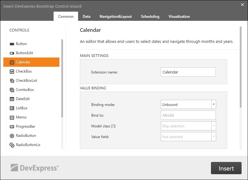
Insert DevExpress Bootstrap Core Control

The Insert Bootstrap Core Wizard helps by adding a fully functional DevExpress ASP.NET Core control to your project. It generates the code for you which saves you time. Any of the DevExpress Bootstrap for ASP.NET Core controls can be used.

To invoke the wizard in Visual Studio, right-click the design area of a view and select the 'Insert DevExpress Bootstrap Core Control' option:

Then from the dialog, select and customize the Bootstrap control you'd like to add to your view and click Insert:

Now the wizard will generate the necessary code and insert it into your View at the cursor position.

Take a look at this video that shows how to add a DevExpress Bootstrap Grid for ASP.NET Core using this new wizard:

Like it?

We'd love to hear your feedback about the new 'Insert DevExpress Bootstrap Core Control' wizard. Drop me a line below, thanks.


Email: mharry@devexpress.com

Twitter: @mehulharry

Blog Post: CodeRush – New Release (v18.1.5) for Visual Studio

$
0
0

This Sprint Packs a Lot

This CodeRush release packs a number of important new features for Visual Studio developers. The training window, more feature support for XAML, XML, and CSS, automatic copyright headers, jump to symbol filtering and the somewhat mind-blowing, all-new, Mega Super Copy (see below for details).

As always, you can download CodeRush from the Visual Studio Gallery or the DevExpress Download Manager.

Training Window

  The Training Window from CodeRush Classic makes a reappearance in this release. You can access it through the CodeRush | Windows | Training menu item.

Training

This window shows shortcuts for available template expansions and CodeRush features based on the current caret position:

Training2

Available templates appear above the horizontal line. Available features, grouped by category, appear below the horizontal line. If you think you may not be getting the most of CodeRush, we suggest showing this window.

Code Cleanup

  Code Cleanup gets a new Copyright Header code provider, with the ability to add copyright comments at the file’s beginning:

CopyrightHeader

It is also available as a Code Cleanup provider and as a template - just press the letter h at the top of the file on an empty line and press your template expansion key (e.g., Space or Tab).

Before using the default header feature for the first time, set values for the “First Name”, “Last Name” and “Company” fields on the IDE | User Info options page.

The actual text of the generated header is stored in the h template expansion, and can be changed there as desired.

Clipboard and Selection Tools

  • We have added Cut, Copy, Select and Comment actions to the Member Icons menu.

    MemberIcons
  • Comment/Uncomment Selectionnow supports XAML, XML and CSS.

Code Analysis

Spell checker suggestions in the Code Actions menu now get their own custom icon, so they are more easily distinguished from other items in the same menu:

SpellCheck

Coding Assistance

Mega Super Copy

Okay, so first we have to confess that we maybe went a little crazy on the name of this feature, but it IS pretty cool.

You can now useMulti-Selectto mark important text elements before selecting and copying/cutting a block of code to get a richer smarter version of the code on the clipboard.

Any code in the selection that has been multi-selected will become linked Text Fieldsupon pasting.

CopyWithFields

It’s simple: Before copying code (that you know you’ll want to change on paste), multi-select the parts you’ll want to change using Ctrl+Alt+Enter. In the example screenshots above a single instance of the variable “property” was multi-selected. Next, select the entire block of code you want to work with (including the multi-selections) and copy or cut normally. CodeRush puts a smarter/richer version of the code on the clipboard, ready to paste as rich code in Visual Studio wherever you want.

You can also create zero-length multi-selections to mark caret insertion points on the paste. Just put the caret where you want the caret to be on paste (no selection), and press Ctrl+Alt+Enter to add a zero-length multi-selection marker at that location. Later when you paste, an empty TextField will be placed at that location for easy form-based entry.

Once you have Mega-Super-Copied something onto the clipboard, you can paste it as many times as you need. This is really useful for repetitive code that needs a few changes, where you know in advance what parts you want to change (and where you want the cursor) after each paste.

You can also use the Ctrl+Alt+V shortcut to paste the most recent text Mega-Super-Copied with fields, even if it is not currently on the clipboard.

Other Coding Assistance Features

The Text Links and Text Fields behavior in Smart Duplicate Line/Selection, Mega Super Copy, and Selection to Template features is now configurable. Use the Editor | All Languages | Linked Text & Fields options page to configure when the automatic links and fields should be created.

TextLinksAndFields

These rules apply to normal selections of code (free of any multi-selections). When multi-selections are present in the selection and any of these features are invoked, the options on this page are applied to only those elements multi-selected.

Navigation

Jump To Filtering

You can now define shortcuts that bring up the Jump Towindow with a predefined filter. The JumpToSymbol command now accepts four parameters:

  • TypeFilter (can be: Classes, Interfaces, Structs, Enums, Delegates, and AllTypes)
  • MemberFilter (can be: Methods, Properties, Events, Fields, LocalsAndParams, and AllMembers)
  • AccessFilter (can be: Private, Protected, Internal, ProtectedInternal, Public, and AllVisibilities)
  • LocationFilter (can be: AllFiles, CurrentSolution, CurrentProject, CurrentNamespace, and CurrentFile)

You can use the “and” keyword to combine filters like this: “Classes and Structs”.

For example, if you’d like a shortcut to quickly jump to all public members in the current project, declare a new shortcut binding to the JumpToSymbol command, passing the “,AllMembers,Public,CurrentProject” filter as a parameter, like this:

ShortcutBindingFilterJumpTo

In this case, pressing this new shortcut would open the Jump to Symbol window with this predefined filter:

JumpToSymbolFilter

Note: In the screenshot above I tapped the Ctrl key after window appeared before snapping this screenshot so you could see the filtering. Jump to Symbol normally appears with the filtering options hidden.

You can use this feature to create custom shortcut bindings to make is easier to find classes, interfaces, members, etc., or to search locally, project-wide, or solution-wide, all with a single keystroke.

Marker Improvements

We have improved markers behavior. System Markers dropped by CodeRush are now cleaned up automatically when CodeRush detects they are redundant or no longer needed.

Refactorings and Code Providers

  • The Declare Method code provider is now available when the caret is located at the end of the line with an undeclared method.
  • The XPO Fields code provider now copies the [Obsolete] attribute from fields to their corresponding maintained properties.
  • We have added a Collapse Accessors code formatter, which collapses both get and set property accessors into single-line form.

Templates

Type Casting Templates

We have extended the CodeRush type-casting templates so that they now additionally support explicit type casting in expressions. The following new templates were added, and will expand as described if the caret is inside a code block (but not on an empty line):

  • c. - Expands as “(Type)” with the Type identifier embedded into a Text Field so you can quickly change it. It’s also an incredibly fast way to get parens inside an expression when you need them.
  • c?Type? - Adds a typecast to a type specified in the template name variable“?Type?”:

    Examples:

    Table1

  • c?Generic1Type?. and c?Generic2Type?. - Adds a typecast to the specified generic type (with one or two parameters) and embeds its parameters into Text Fields:

    Examples:

    Table2

  • c?Generic1Type?.?Type? and c?Generic2Type?.?Type1?,?Type2? - Adds a typecast to the specified generic type (with one or two parameters):

    Examples:

    Table3

Notes: entries in the middle column (in the three tables above) reflect new functionality in this release. Entries in the last column show previously existing (and related) casting technology. The “Expression” referenced in the last column in these tables will be replaced by an identifier in the clipboard (if any). See the C for Casting video for more on this existing functionality.

Improved ForEach Text Command

The ForEach text command now lets you iterate through all the lines of text copied to the clipboard. You can do it with the following text command:

    «ForEach(line in clipboardText,template))»

where template is the name of the template you want to execute for each line of text on the clipboard. You can access the text of each iterated line by calling «?Get(itemName)» from inside your template.

Download the Latest Version of CodeRush Now


Download CodeRush from the Visual Studio Marketplace or use the DevExpress Download Manager. And if you're enjoying CodeRush, please leave a review here so the whole world can see.

Viewing all 3388 articles
Browse latest View live