Quantcast
Channel: Developer Express Global
Viewing all 3388 articles
Browse latest View live

Blog Post: DevExtreme React Grid - Filtering Improvements (Coming Soon)

$
0
0

For the next release of the React Grid, we are currently finalizing some advanced filtering functionality. Of course filtering has been supported before— but this new feature set makes it much more convenient for the end-user!

What we’ve done

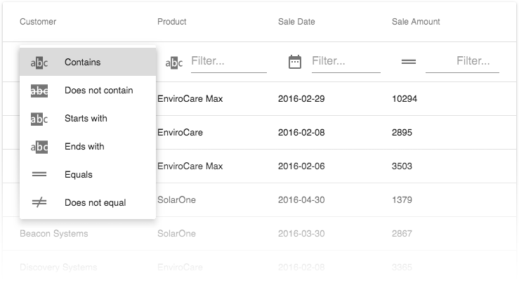
The grid will support a standard set of filter predicate types, and a UI for an end-user to apply those. Similar to our grids for other platforms, the functionality will be integrated in the filter row, providing a menu where filter criteria can be chosen per column:

Standard Filters

Per-column restrictions

It will be possible to customize the available predicate types for individual columns. The DataTypeProvider will provide the new property availableFilterOperations for this purpose. This example restricts the predicate types for the amount column to a (random) selection of three:

<DataTypeProvider
  for={['amount']}
  availableFilterOperations={['equal', 'greaterThan', 'greaterThanOrEqual']}
/>

Custom predicates

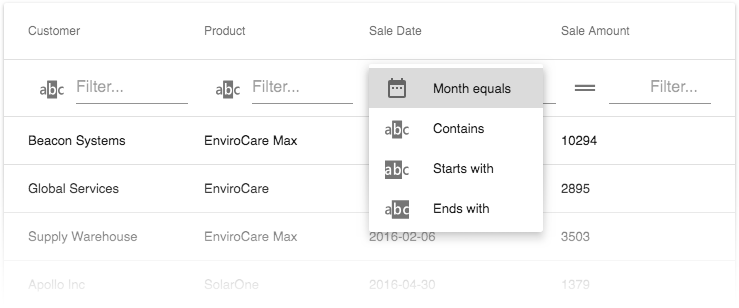
Finally, you will also be able create custom predicate types, and to define the names and icons they use for the UI menu.

Custom Predicates

To illustrate this, here are the code snippets that add the month predicate to the list in the image. This is the custom icon:

const FilterIcon = ({ type, ...restProps }) => {
  if (type === 'month') return <DateRange {...restProps} />;
  return <TableFilterRow.Icon type={type} {...restProps} />;
};

Then there’s the implementation of the custom predicate itself:

const filteringColumnExtensions = [
  {
    columnName: 'saleDate',
    predicate: (value, filter, row, defaultPredicate) => {
      if (!filter.value.length) return true;
      if (filter && filter.operation === 'month') {
        const month = parseInt(value.split('-')[1], 10);
        return month === parseInt(filter.value, 10);
      }
      return defaultPredicate(value, filter, row);
    }
  }
];

And finally, the JSX code where the custom elements are integrated:

<DataTypeProvider
  for={['saleDate']}
  availableFilterOperations={['month', 'contains', 'startsWith', 'endsWith']}
/><IntegratedFiltering columnExtensions={filteringColumnExtensions} /><TableFilterRow
  iconComponent={FilterIcon}
  messages={{ month: 'Month equals' }}
/>

Do you have any thoughts?

We are currently finalizing our implementation of these new features, which will become available with our next release. At this stage, we’re very interested in any thoughts you might have, whether it’s on the feature set as such or our implementation specifically. Please feel free to comment below, or take part in the discussions on our GitHub page.

Join the Webinar

If you want to see all new features introduced in our v18.1 release, sign up for our upcoming “New in v18.1 - DevExtreme HTML / JS Controls” webinar where you’ll have a chance to ask questions as well.

Join the webinar here!


Blog Post: DataGrid and TreeList – Performance Improvements (v18.1)

$
0
0

I love it when our devs can squeeze out even more performance improvements from our controls. So I'm happy to report that we've improved the DevExtreme DataGrid and TreeList's performance for the following features: virtual scrolling, fixed columns, and auto column width. Let's take a look.

Local Virtual Scrolling

Let's start with 'local virtual scrolling'. As you may know, in virtual scrolling mode, pages are loaded when entering the viewport and removed once they leave. This mode allows users to scroll data by jumping swiftly from one row to another. Scrolling in this mode becomes smoother if the widget preloads the adjacent pages. And local means that the data is loaded locally on the client-side.

We have decreased the rendering time during scroll operations for local virtual scrolling. This decrease has allowed us to make rendering synchronous and therefore much faster. You can see the difference from the previous version in the following video:

However, if a grid row's markup is heavy then it may result in 'jerky' scrolling. In this scenario, the grid will revert to asynchronous rendering to avoid grid scrolling issues.

Dispose Out-of-bounds

We've also made an improvement in virtual scrolling where the DataGrid will dispose of markup that is out of the visible boundaries. This improves virtual scrolling performance during intensive scrolling.

Remote Virtual Scrolling

We've also made several changes to virtual scrolling with remote data that helps improve performance.

  1. For remote data that has been loaded, we now cache the pages. This significantly reduces the request count on the server.

  2. A large page size can be used to reduce the request count too. For a DataGrid with large pageSize, you can now use the new scrolling.rowRenderingMode option to improve performance. And you can use it with either paging or virtual scrolling modes:

scrolling: { 
    rowRenderingMode: "virtual" 
}
  1. We also have a great new 'loading' indicator that replaces the old spinning 'loading' icon. In fact, it doesn't even looking like your typical 'loading' indicator. When necessary, it will show 'blocks' where the grid data is typically located. This is much easier on the eyes.

You can see these changes in action here:

Horizontal Virtual Scrolling

There are some instances where you may have more than 100 columns in your DataGrid or TreeList. In fact, we have some customers using many more than that.

For these scenarios, you can get improved performance by enabling virtual scrolling over columns. This feature decreases the rendering time for a grid with a huge number of columns.

You can enable this feature using the columnRenderingMode option:

scrolling: { 
    columnRenderingMode: "virtual" 
}

To achieve the maximum performance in this mode, we recommend setting the columnWidth option as well.

Rendering Performance

The team has also improved the rendering time when using fixed columns or the column auto width features. Take a look at the improved speed differences in grid render time:

* the columnRenderingMode option is set to 'virtual'
** the rowRenderingMode option is set to 'virtual'

Possible Issues

The performance improvements mentioned here apply to both the DataGrid and TreeList widgets.

To improve performance, we have made some changes that can affect your application. Please take a look at the list of five possible breaking changes here BC4277.

If these improvements cause unwanted behavior in your application, you can roll back to the legacy rendering mechanism using the legacyRendering option:

DevExpress.ui.dxDataGrid.defaultOptions({
    options: {
        legacyRendering: true
    }
});

Note: the legacyRendering option will be removed in v18.2. Please update your projects and if you need any help then be sure to contact our excellent support team.

Angular, Vue, React, ASP.NET MVC / Core and more

All of these new features will be available on all the frameworks we support: Angular, Vue, React, jQuery, Knockout, ASP.NET MVC and .NET Core.

Like it?

Upgrade your DevExtreme projects to v18.1 today. Then, let me know what you think of these performance enhancements by leaving a comment below.

If you have questions or suggestions about these improvements then please take part in this github issue. Thanks.


Email: mharry@devexpress.com

Twitter: @mehulharry

Blog Post: Getting Started with DevExtreme, Angular & Ionic

$
0
0

I recently presented a webinar on getting started with DevExtreme, Angular and the Ionic framework. During the  talk I mentioned that the source code, database and links would be made available via a blog post… well here it is!

VSCode - https://code.visualstudio.com/

NodeJS (includes NPM) - https://nodejs.org/en/

Ionic Framework:

To install the Ionic Framework:

OS X (terminal) : sudo npm install -g ionic

or

Windows (command line) : npm install -g ionic


DevExtreme:

To install DevExtreme Angular integration

npm install --save devextreme devextreme-angular

Source Code & Database

The database used was an example provided by Microsoft – World Wide Imports – and can be downloaded from here https://docs.microsoft.com/en-us/sql/samples/wide-world-importers-what-is?view=sql-server-2017

Source code for the projects can be downloaded from here (note: I’ve included all library files)

DevExtreme Project : https://www.devexpress.com.au/files/DevExtreme_Angular_Ionic/Project.zip

Sample WebAPI : https://www.devexpress.com.au/files/DevExtreme_Angular_Ionic/SampleWebApi.zip

My Database ( I updated some dates ) : https://www.devexpress.com.au/files/DevExtreme_Angular_Ionic/webinar_db.zip


This article helped in setting up the Chrome debugger for Ionic apps - http://www.damirscorner.com/blog/posts/20161122-DebuggingIonic2AppsInChromeFromVisualStudioCode.html

The whole webinar can be watched via our YouTube channel, direct link to video: https://youtu.be/JseTvAObEmA


Webinar Q&A

During the presentation there were a lot of questions asked, I’m including the script of these here for easy reference:


Q: why ionic and not xamarin? xamarin is more native and easier for .net developers

A: That's the main point, Abigail. Xamarin is good for .NET. But, DevExtreme is for JavaScript. So, Ionic + Cordova is a platform for cross-platform development for JavaScript and web in general.

Q: Is there a way in Visual Studio 2017, to your knowledge, that will give build errors on JavaScript if the Javascript interpunction/syntax is incorrect?  Like missing ; or missing } or mistyped variable names?

A: AFAIK, Visual Studio 2017 has a built-in capability for static analyzing your JS code. But, I think it's better to switch to TypeScript for this task. Visual Studio Code is also a good IDE for such tasks.

Q: I ask because you onluy have one compoment for xamarin, other suites has more component for xamarin, why devexpress in general focuses in web?

A: To be honest, we are not quite satisfied with Xamarin. So, we only have the grid for it. At the moment, we are looking in another direction. So, we provided native chart (https://www.devexpress.com/Products/Native/Chart/). You can use our native chart with any developing tool you have.

Q: Why do you think for example nativescript is web and  uses angular too?

A: Please, don't mix NativeScript and Ionic. NativeScript is an Angular way to map HTML markup to native elements. Ionic is about creating a web site that will locally work and look like a native application. Both these approaches have their pros and cons. It's up to you which one to use. But, at the moment we don’t have anything for NativeScript.

Q: Is there a similar plug-in for Firefox, or just Chrome?  

A: I suggest you search on VSCode Market. For example: https://marketplace.visualstudio.com/items?itemName=hbenl.vscode-firefox-debug

Q: Is there also a debugger extnesion for FireFox?

A: I suggest you search on VSCode Market. For example: https://marketplace.visualstudio.com/items?itemName=hbenl.vscode-firefox-debug

Q: So what is the trigger for hitting your breakpoints? Installing Ionic, adding the Chrome extension, or putting that json file in the .vscode folder?

A: Please take a look at https://forum.ionicframework.com/t/how-to-debug-typescript-in-ionic-apps-using-vs-code-and-app-scripts-0-0-46/70023

Q: So what is the trigger for hitting your breakpoints? Installing Ionic, adding the Chrome extension, or putting that json file in the .vscode folder?

A: Yes, actually, this is not specific to Ionic. You can debug any site in VS Code as described in https://code.visualstudio.com/docs/nodejs/debugging-recipes

Q: Is there a way to use auto-completion/Intellisense of devextreme component properties in the .JS-files inside Visual Studio 2017 and/or VSCode?  At the moment it doesn't and I have to search every single property on the website documentation of the DevExtreme suite.

A: If you are talking about Angular. Angular has its own language service (https://angular.io/guide/language-service). It works fine with our Angular components. If you are talking about JavaScript and TypeScript in general, you need to add TypeScript definitions to your file as described in https://js.devexpress.com/Documentation/Guide/Getting_Started/TypeScript_Support/Reference_TypeScript_Definitions/

Q: I am a windows developer, but let me see if I can get this straight....

A: I believe your thoughts make sense. Would you please re-ask your doubt?

Q: Is it possible to use an ORM like EntityFramework to get Data ? //Complete new  here :)

A: Yes, you can load data from any data service that supports HTTP requests. This service may use any ORM you like including Entity Framework.

Q: Hi, what is the advantage of converting observable to promise in getProducts http call? Thanks

A: DevExtreme UI components support native Promises that is why they are used. Please refer to https://medium.com/@mpodlasin/promises-vs-observables-4c123c51fe13 to learn more about Promises and Observables.

Q: any webniar for firebase and devxtreme/angular integration ?

A: We have no plans for this webinar yet, but thanks for the suggestion!

Q: It is a little overwhelming. the learning curve seems incredibly steep. npm, nodejs, angular, devextreme, vsCode, couple dozen configurations and Im sure I am missing things. Where does one start? Will there be a devextremecourse/university?

A: I understand you, Bill. At the moment, we don’t have courses on all of this stack. Perhaps, we will have it in the future. For now, I can say that we will have this webinar recording available on our YouTube channel. So, you can follow it when you wish. Also, it’s good to follow Angular documentation on Angular.io, check out Ionic documentation and check out documentation to learn how our widgets work.

Q: Hi, what is the advantage of converting observable to promise in getProducts http call? Thanks

A: In general, if you do not implement a custom data source that is bound to DevExtreme UI component, it is not necessary to use Promises. You can use Observables to load data.

Q: can I have the source code of the webinar?

A: Yes, Paul will do a blog post with links, source code, Q &A answers :)

Q: I installed the ionic package locally, but the command ionic was not

A: Please make sure that you installed it with th -g flag (https://docs.npmjs.com/cli/install)

Q: recognized in the terminal. What could be the problem ?

A: Julian addressing now

Q: OK I understand now.. like node.js,

Q: what makes ionic creator for creating UI components different from devextreme components ?

A: Our DevExtreme components provide you with a Rich UI for your application. They have nothing to do with Ionic Creator. Ionic lacks such UI elements

Q: How well does Ionic work with IE?  I have seen issues with Material UI

A: I suggest you check https://ionicframework.com/docs/intro/browser-support/. I don't think that Ionic supports IE well. In any case, it's better to address this isue wo the Ionic team

Q: Good advice, thank-you.

A: :)

Q: what about security configurations for mobile os. for example taking and saving a photo.

A: This is handled by the Cordova libraries, please refer to their documentation for the specific version of iOS / Andriod.

Q: after installing devextreme, do we need to enter a license key somewhere?  

A: Just make sure that your DevExtreme account has an appropriate license assigned.

Q: Why use a promise instead of an observale ? what is the difference ?  

A: If you are creating a custom data source for DevExtreme UI components use a native Promise object because we support it instead of observables. Please take a look at https://medium.com/@mpodlasin/promises-vs-observables-4c123c51fe13 to learn more about differences.

Q: If I'm using an Angular 4-project in Visual Studio with TypeScript, the load time of a one page application takes about 1 minute to open in the browser. Even though the page doesn't connect to external sources or do anything time consuming (just showing static text) and reloading the page takes another minute. Is this some configuration issue that you know of?

A: If our components cause this, please create a Support Center ticket for this issue along with your project. If this is reproducible with any Ionic application, I'd suggest you address this issue to Ionic.


If you would like to see more on the integration of DevExtreme and Ionic or you have ideas for a webinar topic please leave a comment below or send me an email.


Blog Post: A New Documentation Experience: Available Now for .NET Products

$
0
0

One team at a time, we are moving toward a single toolset used to author and publish documentation for each supported platform. I’m happy to say that we’ve published our first effort in this regard – you can now view our .NET documentation in a modern responsive format by visiting the following URL:

https://docs.devexpress.com

New and Previous Formats, Side-by-Side

From Google, you’ll land on our previous product documentation site. To find content on the new site, you can manually navigate to docs.devexpress.com and use the search box as needed. Within a few weeks (once conversion issues have been addressed), we’ll flip the switch and move to this new engine and archive our old site.

Where possible, the new documentation site will offer you to navigate to the same documentation article in our previous format. We are also going to update the current site with messages that invite you to view updated information, if available.

Note that certain topic types, such as overloaded methods or class constructors, had the URL format changed to better match the standards set by Microsoft's documentation resources. This means that manually replacing "documentation" with "docs" in the URL will not work for all pages, although it will work for some.

Portions of v18.1 Content are Available Only in the New Format

Functionality shipping with v18.1 is documented in the new system for the following products:

These teams have fully adopted our new internal authoring system. They have manually adjusted their content where automatic conversion failed. We don’t expect any formatting issues and encourage you to use the new documentation site when with these products.

UWP and Xamarin Content is Available in Previous Format Only

If you are using our UWP or Xamarin controls, note that their documentation is only available in our previous format.

What’s Next

Our Documentation and R&D teams will continue to address known conversion and formatting issues to complete the transition to a single documentation resource within a few weeks, possibly with the first v18.1 minor update. Until that time, we'll be publishing frequent fixes and updates to the new site, so don’t hesitate to report issues you encounter during use.

Blog Post: WinForms - Fluent Design Form and Acrylic Effects (v18.1)

$
0
0

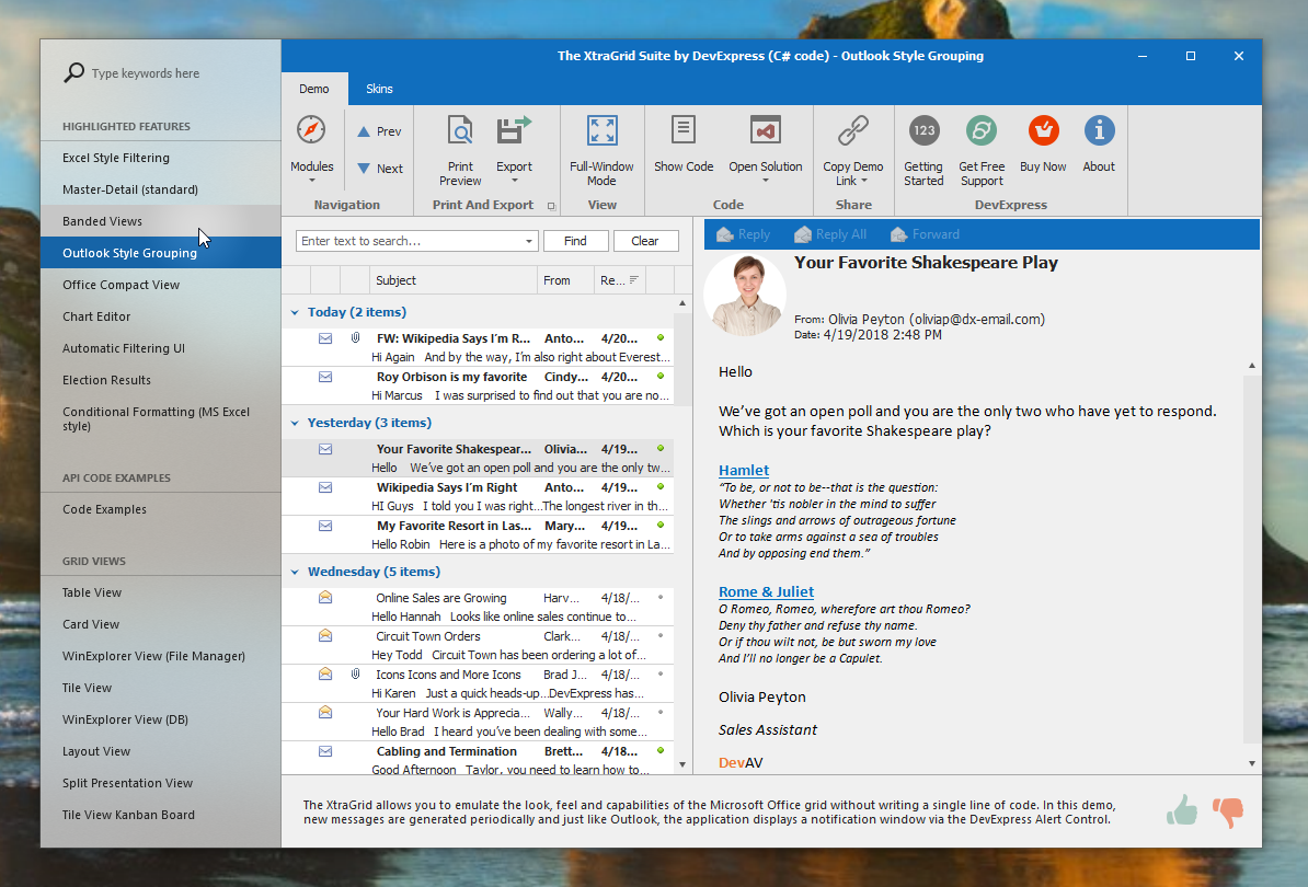
The idea of partially transparent window elements dates back to the Aero effect in Windows 7. In latest Windows 10 builds Microsoft is introducing Acrylic, which is explained in this article relating to UWP. To illustrate, this image shows a form with a partially transparent Accordion control:

Fluent Form

As a consequence of Microsoft’s Fluent Design initiative, many developers of modern applications like the one in the picture make three important choices for their UI implementations:

  • They implement adaptive layout, so application windows look good at different screen sizes
  • They show a navigation bar that utilizes Acrylic and the Reveal Highlight effect
  • They use a Hamburger menu, which plays an important role for adaptive layout scenarios

Fluent Design for WinForms

To enable you to create similar applications for Windows Forms, we took several steps in v18.1. First, we created a new Form control called FluentDesignForm. As a replacement of the standard Form, this is similar to our XtraForm, RibbonForm and TabbedForm, but it is also very different because it combines several connected elements:

  • An Accordion Control for navigation, with our new Hamburger Menu style applied

  • The Fluent Design Form Control takes control of the form header area and allows you to add buttons, editors and labels onto its surface

  • The Fluent Design Form Container holds the form content

Elements of a Fluent Design Form

Partial transparency

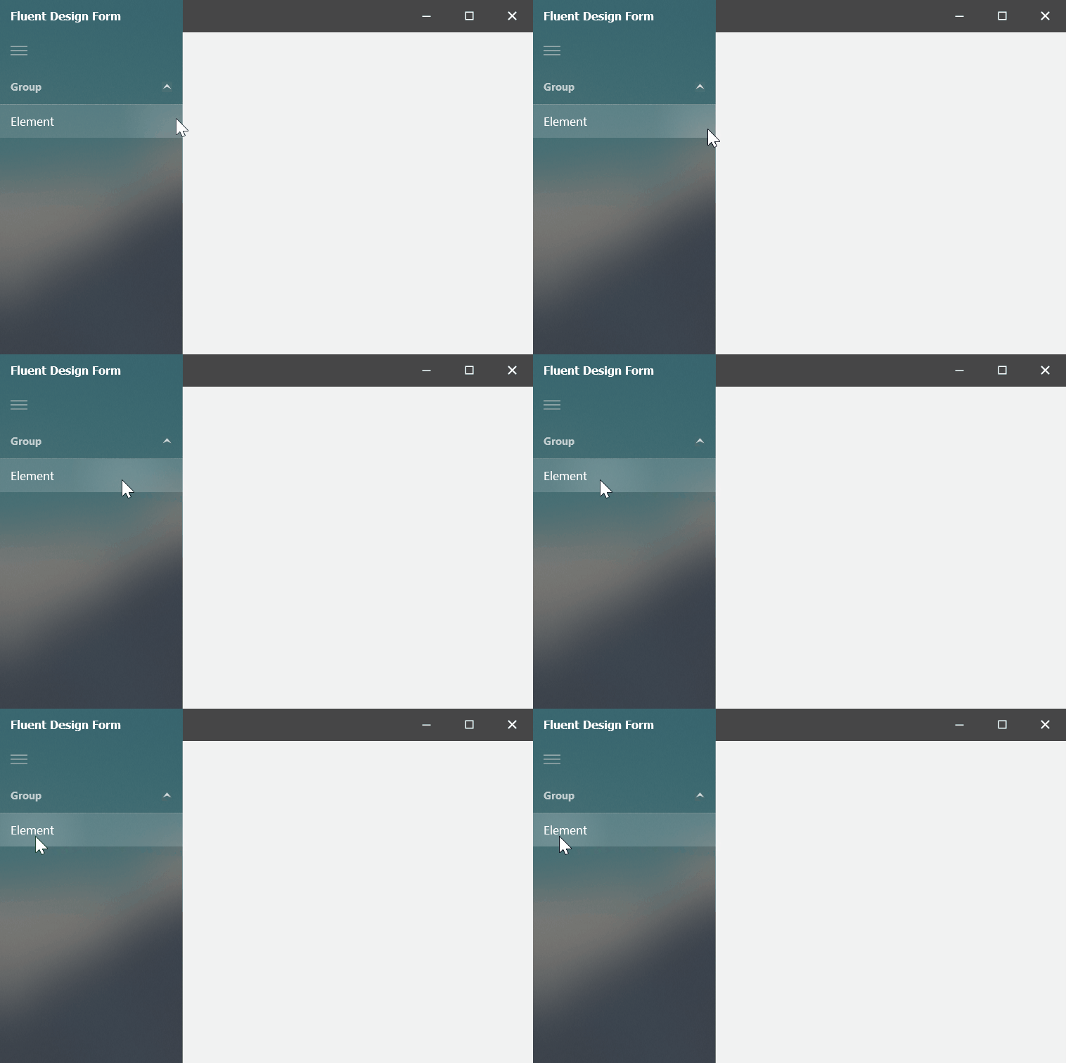
Set FluentDesignForm.EnableAcrylicAccent to true to enable the Acrylic effect for the Accordion Control. At the same time, the Reveal Highlight effect is also activated, imitating a soft light source moving along with the mouse pointer.

Reveal Highlight

Note that both effects are enabled in Windows 10 Version 1803 (OS build 17134), which is required to see these effects in action! The Fluent Design Form detects your Windows build and automatically uses DirectX rendering to paint these effects, if possible.

Adaptive layout

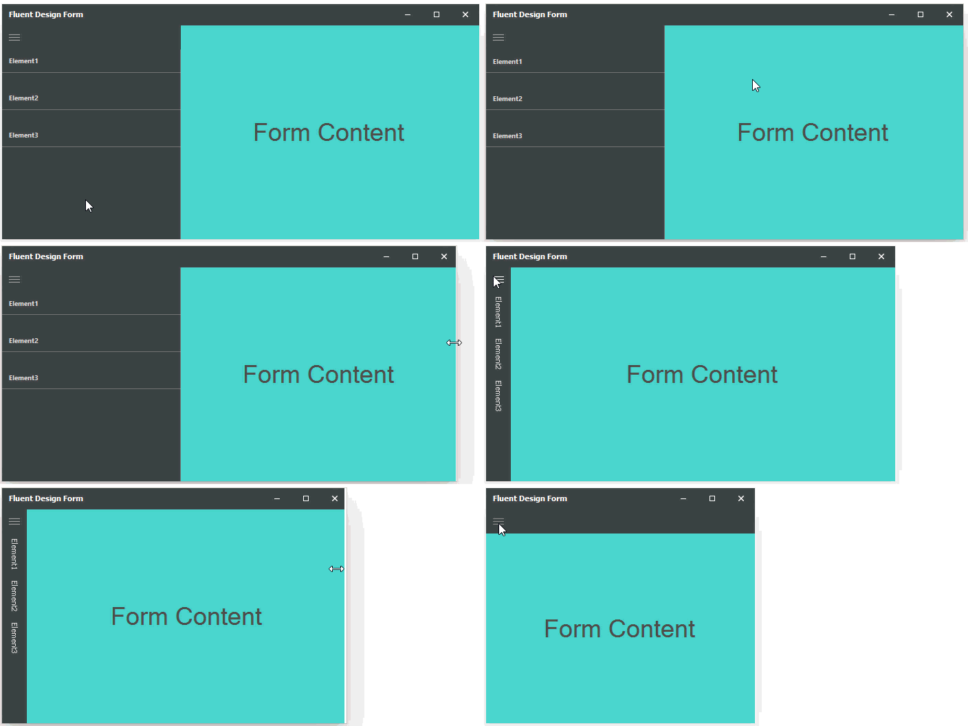
As I mentioned above, adaptive layout is the final important component of Fluent Design, and our new Form implements this using two threshold values for its width. When a user resizes the form, the Accordion Control automatically change its DisplayMode depending on the width.

Adaptive Layout

Accordion integration

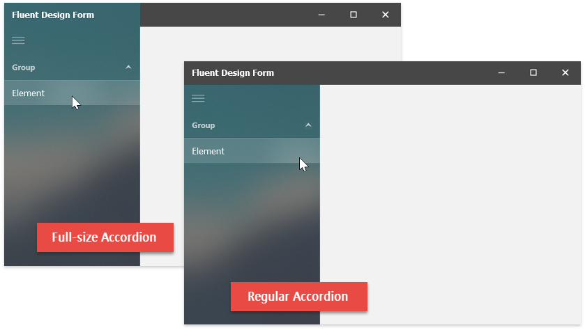
The Accordion Control can integrate with the Fluent Design Form in two modes: a “traditional” mode where the form header is the topmost element, and a “full-size” mode where the Accordion stretches to the top of the Form.

Full-Size Accordion

Note that the full-size mode works best with modern flat skins, so it currently requires either The Bezier or one of the Office 2016 DevExpress skins.

Please share your thoughts with us!

We really hope you will provide us with some feedback on this new feature set. Do you like this new Form, and the idea of Fluent Design in general? Would you consider using them in your next application? Or do you rather think these fancy new effects don’t have a place in a WinForms business app?

Blog Post: CodeRush – New Release (v18.1.3)

$
0
0

New CSS language support, new layered options, plus multi-select and templates all see improvements in this latest release of CodeRush.

Note, if the Visual Studio Marketplace is still showing version 17.2.8, we are working with Microsoft to resolve this issue. In the meantime you can download the latest CodeRush from the DevExpress Download Manager.

CSS Language Support

CSS gets support for the following features:

CSS

Layered Options

CodeRush now stores your settings in Layers, which allow you to bind settings to a particular solution and team, in addition to personal preferences which can serve as defaults (unless overridden by team/solution settings).

You can use this feature to create solution-dependent options and share them across your entire team. These options are applied automatically to all team members using CodeRush when the solution is open.

Layers

The actual configuration settings are determined by merging all the settings layers.

Layers_Merged

There are three pre-defined layers:

  • Solution Personal Options— your personal preferences for the solution that is currently open. This layer has the highest priority and overrides any settings in lower layers.
  • Solution Team Options— your team’s preferences. Stored in a solution directory and should be added to your version control system (VCS) so these options can be shared with the entire team. Solution/Team settings override any default settings below.
  • Personal Options— These are your default preferences for all solutions you work with in CodeRush. This layer has the lowest priority and settings here may be overridden by settings in a higher-priority layer.

You can also add child layers to any pre-defined layer. Custom layers can be stored in any directory and used to specify options not defined in the base layer.

Templates

The “ninst” template (generates a new instance for the variable in clipboard) now initializes all properties with the default values, adding TextFields so you can easily change the default property initialization.

NewInstance

We have also added a "ninst," template (with a comma at the end), which creates a simpler initialization of the variable on the clipboard.

To use either of these templates, first copy a variable name to the clipboard, place the caret on an empty line, type the template name and expand it (with Space or Tab, depending on your settings).

Multi-select

Multi-selections are now cleared after being copied.

We have also added the Ctrl+Alt+Shift+Backspace shortcut to restore the most recent multi-selection.

Download the Latest Version of CodeRush Now

Download CodeRush from the Visual Studio Marketplace or the DevExpress Download Manager. And if you're enjoying CodeRush, please leave a review here so the whole world can see.

Blog Post: Dashboard - WPF Viewer (v18.1)

$
0
0

Back in November last year, Vladimir published the announcement of the WPF Dashboard Viewer CTP release. On the basis of all the customer feedback we received during the CTP phase, we have now completed our work for the v18.1 release!

The feature set of the WPF Dashboard Viewer is the same as that of the WinForms and ASP.NET WebForms counterparts. The control supports the same 15 Data Visualization Items as well as the associated functionality of conditional formatting and coloring, interactive runtime item layouts, filtering, drill-down, export and much more.

WPF Dashboard Viewer

We have removed all limitations of the CTP version. We support Dashboard Parameters, export and printing is fully implemented, and we have made numerous improvements to the programmers’ API and internal processes, including error handling.

If you are familiar with one of our other viewers, for WinForms or ASP.NET WebForms, you should feel immediately at home with the UI and the functionality of the WPF Dashboard Viewer!

Visual Studio Dashboard Designer

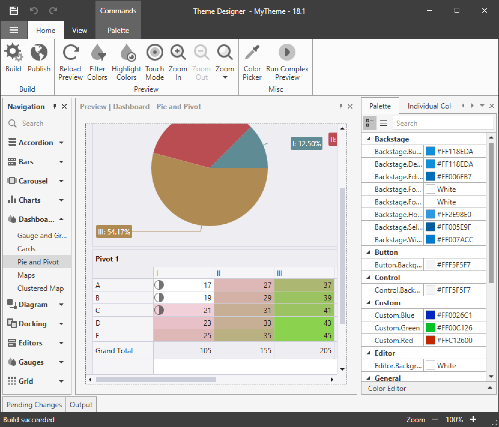
The WPF Dashboard Viewer uses the same theming mechanisms as our other WPF controls, which is important for consistency of look&feel throughout your WPF application. It is also possible to customize the appearance of the Dashboard Viewer using the WPF Theme Designer.

WPF Theme Designer

Availability

The easiest way to test the WPF Dashboard Viewer is to launch our ClickOnce demo. With our v18.1 release installed (note that Dashboards are part of our Universal Subscription), you can also use the DevExpress Template Gallery in Visual Studio to create a new WPF Dashboard project, connect it to your own data source and customize your dashboards using the Visual Studio Dashboard Designer.

As always, please let us know your thoughts! Will you use the WPF dashboard viewer in your apps?

Blog Post: WPF Data Grid - Virtual Sources (v18.1)

$
0
0

The WPF Data Grid has always supported Server Mode and Instant Feedback sources that allow you to process data requests on the server side. This is a good choice and a general recommendation when your data source represents a large number of records. However, these features depend on a provider implementation specific to the data access technology you use. Given the large number of general purpose data access layers out there, we may not always supply an implementation “in the box” that allows you to do exactly what you need. What’s more, the standard providers we offer don’t restrict queries that may be executed by a client. This behavior can be too “open” for a specific application scenario, and it’s difficult to apply meaningful security rules to the complex processing in a Server Mode provider.

In the past, it would have been possible to address these concerns by creating custom implementations of certain interfaces to build special server side data sources. However, this is a rather complicated process and we tried hard to find a better way.

Virtual Sources

For our v18.1 release, we built the new Virtual Sources. Using this technology, you can easily implement server-side processing for the Data Grid with almost any data source, including these:

  • REST services
  • NoSQL databases
  • N-Tier style data services
  • Object/relational mappers and databases not supported by Server Mode sources (NHibernate, Dapper, etc.)

For example, this image shows the GridControl bound to the StackOverflow web service:

StackOverflow web service

Implementation

Virtual Sources proxy data requests to the server. This gives the developer of a Virtual Source full control over the queries that are executed. For instance, if sorting and filtering are not required or not supported by the server, an implementation only needs to fetch a specific number of rows while applying an offset (this is the basic skip/take feature set):

static async Task<FetchRowsResult> FetchRowsAsync(FetchRowsAsyncEventArgs e) {
  return await MyService.GetRowsAsync(skip: e.Skip, take: 30);
}

If you need sorting and filtering, you can pass these parameters to your service at the same point. The event FetchRows (see below) is called every time an end-user sorts or filters data:

static async Task<FetchRowsResult> FetchRowsAsync(FetchRowsAsyncEventArgs e) {
  return await IssuesService.GetIssuesAsync(
    skip: e.Skip,
    take: 30,
    sortOrder: GetIssueSortOrder(e),
    filter: MakeIssueFilter(e.Filter));
}

For sorting, you need to pass to the server the direction and the column names provided by the grid:

static IssueSortOrder GetIssueSortOrder(FetchRowsAsyncEventArgs e) {
  var sort = e.SortOrder.SingleOrDefault();
  if(sort?.PropertyName == "Votes") {
    return sort.Direction == ListSortDirection.Ascending
      ? IssueSortOrder.VotesAscending
      : IssueSortOrder.VotesDescending;
  }

  return IssueSortOrder.Default;
}

If filtering is applied to the grid, a CriteriaOperator value is supplied that represents the filter setup. You need to convert this value into a filter expression supported by your server:

static IssueFilter MakeIssueFilter(CriteriaOperator filter) {
  return filter.Match(
    binary: (propertyName, value, type) => {
      if (propertyName == "Priority" && type == BinaryOperatorType.Equal)
        return new IssueFilter(priority: (Priority)value);
      throw new InvalidOperationException();
    }
  );
}

To implement a Virtual Source, you begin by instantiating a class derived from VirtualSourceBase, of which there are currently four: InfiniteSource and InfiniteAsyncSource, PagedSource and PagedAsyncSource (see below about infinite scrolling and paging). On that instance, you hook up the following three event handlers. Together, they cover all data operations except for grouping, which is not supported.

  • FetchRows/FetchPage fetches N rows, with parameters specifying offset, filter and sort options

  • GetTotalSummaries calculates total summaries based on grid configuration

  • GetUniqueValues retrieves a list of distinct values for display in a column filter drop-down

Note that you only need to implement those event handlers that are used by your grid configuration! If your grid doesn’t display total summaries or has column filtering disabled, you don’t have to supply an implementation of GetTotalSummaries or GetUniqueValues.

Virtual Sources also have default implementations that are used automatically if your data source supports IQueryable. In contrast to Server Mode implementations, your IQueryable doesn’t need to support all operations. Only the Skip and Take methods are required to load segments of rows.

In addition to the convenient API discussed above, Virtual Sources have several other advantages:

  • All data requests are executed in a separate thread, without ever freezing the UI.

  • Virtual Sources can run multiple data requests in parallel, dispatching tasks and canceling them if results are not needed anymore.

  • Data requests are independent. For example, if your query for summary values fails, the grid will still display records returned by the FetchRows query.

Infinite Scrolling and Paging

Together with Virtual Sources, we ship two new UI modes for the GridControl in v18.1, designed specifically for server-side data. The first mode is called Infinite Scrolling and can often be seen in web interfaces. Virtual Sources make this possible, and the feature is only available when using this new type of data source.

In Infinite Scrolling mode, the scroll bar size is determined on the basis of loaded records only. When the user scrolls to the bottom, the grid loads a new batch of rows:

Infinite Scrolling

Depending on your grid configuration, new rows will either be loaded automatically or when an end-user clicks the Load More button displayed at the bottom.

The second new mode is called Paging. This mode can be used with Server Mode data sources as well as Virtual Sources, or even with local data. Like Infinite Scrolling, it loads data in portions, but it displays a pager below the grid:

Paging

This mode allows the user to navigate directly to a specific page of data, and it detects the total number of pages available in the data source.

UI Restrictions

A final concept we implemented for advanced server-side data access restricts what an end-user can do in the GridControl. By default, the grid enables users to construct complex queries easily by taking advantage of interactive sorting or complicated filters. Depending on the server, there is a risk that such a query will run slowly or even fail entirely, leaving the grid empty.

With Virtual Sources, all data operations other than simple row fetching are disabled by default. If you support a certain data operation in your Virtual Source implementation, you can enable this data operation in the UI. For instance, this line enables sorting for the Date column:

<dxg:GridColumn FieldName="Date" AllowSorting="True" DefaultSortOrder="Descending" />

It is also possible to specify which filter operators a column supports. The GridControl will hide all unsupported operators for a column in the Filter Editor, the column filter drop-down and the automatic filter row.

<dxg:GridColumn FieldName="Votes" AllowedBinaryFilters="GreaterOrEqual,LessOrEqual" /><dxg:GridColumn FieldName="Priority" AllowedBinaryFilters="Equals" />

Filtering Restrictions

Try it now!

Virtual Sources and UI restriction settings are available in our recent v18.1 release. Documentation is available, as well as an example on GitHub. If you have installed the local demos, you can also look for the Infinite Scrolling Source and Paged Source demos in the WPF/Data Grid category (here are direct links, which may work depending on your browser: Infinite Scrolling Source Demo, Paged Source Demo).

What do you think? Is server-side data processing something you’d like to implement in your app? What data source are you using? Let us know in the comments section below.


Blog Post: Reporting - Filtering Enhancements

$
0
0

For our upcoming v18.1 release, we have implemented two sets of improvements to existing data filtering functionality. We’re touching two completely different areas here, from end-user UI to low-level parameter representation and transfer.

Improved Filter Editor

The first group of changes applies to the text mode of the Filter Editor, which is used to configure client-side filters. The most important property that uses this editor is XtraReport.FilterString, but it is also used by Parameter.FilterString when creating cascading report parameters, and by the XRPivotGrid.Prefilter.Criteria property.

These are the new features of the Filter Editor:

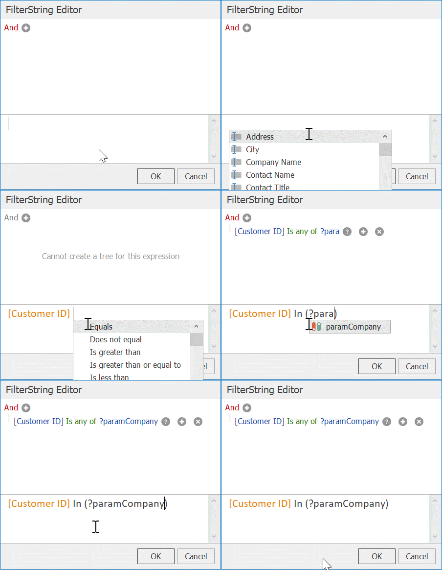
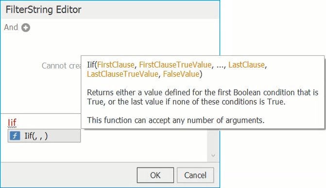
  • Code completion and syntax highlighting help you enter valid expressions quickly:

Code completion

  • Column and function tooltips make it easy to refer to element details while the editor is being used:

Column and function tooltips

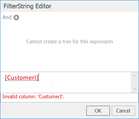
  • Input validation is much stronger than in the past, and errors are shown immediately when they occur:

Input validation and error reporting

Using multi-value report parameters with queries and stored procedures

In the past, we did not have direct support for use cases where multi-value report parameters needed to be mapped to query parameters. A workaround existed that used the DataSourceDemanded event, but it was necessary to write code for this event handler.

We are now adding the ability to handle these scenarios automatically. Things are very simple for SelectQueries— check out this expression:

[Orders.OrderID] Is any of ?OrderIDs

This is what the Filter Editor might show if a parameter is used (?OrderIDs) that represents a list of values, not just one value.

What about stored procedures and custom SQL queries?

Stored procedures are a bit more complicated, because you can’t pass a value list to a stored procedure directly. For this purpose, we are introducing the expression function Join(), which can combine values for you. On the server side, you need to parse the combined parameter string, which depends on your RDBMS of choice.

Note that if you allow your end-users to create custom SQL queries, these are executed in the database server context just like stored procedures. Therefor, the mechanisms described below need to be employed in any custom SQL queries that work with multi-value parameters.

For instance, on SQL Server you could do something like this (note the STRING_SPLIT part that “converts” the values, be sure to check Microsoft’s notes about it!):

select * from Orders
where OrderID in (select value from STRING_SPLIT(@data, ','));

On SQL Server, it is also possible to use stored procedures with table-valued parameters, together with our new CreateTable expression function.

As a second example, here is a MySQL stored procedure, somewhat more elegant due to the availability of the find_in_set helper:

create procedure `get_movies`(in titles varchar(100))
begin
   select *
   from movies
   where find_in_set(title, titles);
end;

You can find documentation of the process at this link, including sample code for several different scenarios, and here are more details about the Join and CreateTable functions.

Of course we always appreciate any feedback you can give us! Are these new features going to be useful to you?

Blog Post: ASP.NET & MVC - Rich Editor Control Enhancements (v18.1)

$
0
0

The DevExpress ASP.NET RichEditor is getting some useful end-user enhancements for the v18.1 release. Many of these features below came as a direct result of your (customer) feedback, so thank you. The features are available for both ASP.NET WebForms and MVC versions of the RichEdit too. Let's take a look...

Table of Contents

With this release, we've added support for interactive table of contents. End-users can now move to a specific position within a document instantly. Several types of tables are supported:

  • Table of Contents
  • Table of Figures
  • Table of Tables
  • Table of Equations

You can add/update tables and mark their entries using the Rich Editor's Ribbon UI. Our new API offers numerous options to manage interactive tables.

Test drive the online demo then take a look at the documentation to learn more.

AutoCorrect

Our ASP.NET Rich Text Editor also ships with an AutoCorrect feature that helps you to fix capitalization errors, create numeric lists, hyperlinks and emails, as well as automatically insert symbols and other pieces of text.

You can enable the built-in AutoCorrect feature using the following server-side properties:

  • CorrectTwoInitialCapitals - specifies whether the control should correct words that start with two capital letters by changing the second letter to lowercase
  • DetectUrls - specifies whether the control should detect URI strings and format them as hyperlinks
  • EnableAutomaticNumbering - specifies whether the control should automatically start numbered or bulleted lists when the specific symbols are typed
  • ReplaceTextAsYouType - specifies whether the control should search a replacement for the typed string in the AutoCorrectReplaceInfoCollection collection

Try out the online demo and learn more by reading documentation.

Table AutoFit

A Table in the RichEdit control can now automatically resize columns to fit to its content width or extend to the width of the document window:

Input Method Editor Support (IME)

We've also added support for your end-users to use an Input Method Editor (IME). An IME allows you to use a Latin-based keyboard to enter Japanese, Chinese, Korean, and Tigrinya symbols. The IME is enabled when an end-user switches the desktop key input to a supported language:

Stateless Mode

With our new stateless option, you can use the DevExpress ASP.NET RichEdit control in scalable environments (cloud, web farms, etc). Learn more about this new feature by reading this blog post.

Give Us Your Feedback

Are you excited by the DevExpress ASP.NET RichEdit's new features? Drop me a line below.

Thanks!


Email: mharry@devexpress.com

Twitter: @mehulharry

Blog Post: WinForms Skins - New Office-Style Color Swatches (v18.1)

$
0
0

The unspoken rule is: when Microsoft releases a new Office suite, our DevExpress designers draw a new set of skins to emulate the fresh Office appearance. We promised in our 2018 roadmap that we would deliver a vector-based Office inspired skin, to follow on from The Bezier, the latest skin we released.

However, things turned out to be more complicated than that, since the newest Office 2019 versions are still in active development at this time. This means we can’t deliver on our promise for our v18.1 release, though of course we will try for v18.2.

Meanwhile, we wanted to have something to offer to those of you who need an Office-inspired vector skin. We considered porting the existing raster skins to SVG, but that seemed a daunting amount of work with limited future perspective. In the end we decided to create four color swatches on the basis of The Bezier to emulate the appearance of Office 2016: Office Colorful, Office Black, Office Dark Gray and Office White. From a designer’s perspective, there are differences between the swatches and a complete skin, but they certainly are difficult to find! The palette colors and the general mood of the swatches mirrors the Office appearance quite precisely, so that most end users will probably not notice any difference.

Colorful swatch

Black swatch

Those of you who wish to migrate to sleek, light-weight and high-DPI-friendly vector skins can do that now and benefit from a refreshed Office-like appearance. On our end, we are looking forward to the upcoming Office 2019 release and we will celebrate it with a truly new vector skin as soon as possible!

Please let us know your thoughts when you try the new color swatches!

Blog Post: XPO ORM Library – Available Free-of-Charge in v18.1!

$
0
0

Available Free-of-Charge without Technical Support
For 15 years, XPO (the DevExpress ORM library for .NET) has been bundled in all of our product subscriptions. With our most recent release, we’re making XPO available free-of-charge. If you’re not familiar with XPO, you can learn more about its feature set here. If you’ve used XPO in the past or are familiar with capabilities, you can read what’s new in v18.1 here.

If you are interested in XPO and want to receive technical support (to reiterate, tech support is not available when using the free version), you can purchase the XPO - ORM Library Subscription for $399.99. Full terms of use can be found here.

XPO continues to be bundled with all other DevExpress Subscriptions. If you own an active Subscription (Universal, DXperience, WinForms, WPF, ASP.NET, Reporting, DevExtreme), you are already licensed to use XPO (with tech support).


Frequently Asked Questions
Q: What platforms and technologies does XPO support? 
A: XPO helps access and manipulate data stored in-memory or within traditional database engines (RDBMS) running on Windows, MacOS or Linux (in desktop, web and mobile projects powered by .NET). Technically, you can create Console, WinForms, WPF, UWP, Xamarin, ASP.NET WebForms and ASP.NET Core apps with XPO. New .NET Standard-based technologies like Blazor will be supported in the future as well (see my recent example).

Q: Has anything changed for existing subscribers?
ANothing has changed for those with active subscriptions to DevExpress Universal, DXperience, WinForms, ASP.NET, WPF, and DevExpress Reports. If you own an active DevExtreme subscription, we've officially added XPO to its product list and we'll happily provide tech support free-of-charge as long as your subscription remains active.

Q: How can I obtain XPO assemblies for my apps?
A: You have two options: You can either use our Unified Installer or Nuget. Nuget is quick and easy but does not come with Visual Studio design time support. Nuget feed: https://nuget.devexpress.com/free/api.
If you'd like to install XPO via our Unified Installer, simply download our trial installation and install our products in "trial mode." XPO will be automatically installed without trial restrictions. If you own a subscription, you can use your existing DevExpress credentials when prompted by our Unified Installer. DevExtreme subscribes require one additional step - see the "Known/expected behavior" section below. Refer to https://www.devexpress.com/Support/EULAs/xpo.xml for a complete list of redistributable assemblies and our terms of use. 

Q: Why is XPO unavailable through the public feed at Nuget.org?
A: This was and is our goal too, but our name was reserved by a third-party in the past without permission. The third-party package is currently unlisted by the author due to compliance issues. If the Nuget.org administration allows us to use our name, we will certainly upload XPO there as well.

Q: Is XPO's source code also free for everyone?
A: No. It's available for Universal and DXperience subscribers only. 

Q: I want to use your ORM, but I don't own a paid subscription (thus, I have no access to support services). How should I get started on my own if using the free version? 
A: You can search our online documentation and our support databasease (with many KB and Code Examples) as needed.


Known/expected behavior
1. Personal DevExpress Nuget feed (with an authorization key) for DevExtreme subscribers does not contain the DevExpress.Xpo package. 
Solution: Use the public feed: https://nuget.devexpress.com/free/api.

2.Unified installer does not automatically install XPO for DevExtreme subscribers. Separate DevExtreme installer does not contain XPO at all. 
Solution: If you don't need XPO design-time features, use the public feed: https://nuget.devexpress.com/free/api. Otherwise, use the unified installer and select "WebForms, MVC, Bootstrap or Core" or other .NET-based products on the "Select the products you'd like to install" screen. This was done intentionally so as not to overwhelm DevExtreme users who are not interested in XPO with unnecessary installations steps or to overly complicate installation logic.

3.T636985: Data Model Designer - Trial Version dialog may pop up for licensed owners of "XPO - ORM Library Subscription", DevExtreme, WPF, ASP.NET, Reporting (Fixed in v18.1.4). 
Solution: Safely skip or wait for a hot fix build.

Blog Post: ASP.NET Bootstrap Core - CLI Templates for ASP.NET Core

$
0
0

The .NET Core command line interface (CLI) allows you to create new projects directly from the console.

We're introducing a set of CLI templates that you can use to create starter cross-platform projects with DevExpress ASP.NET Bootstrap and Dashboard Controls.

This means that you can create ASP.NET Core projects with DevExpress controls on your MacOS, Linux, or Windows consoles!

Install DevExpress CLI templates

Get started by first installing the DevExpress CLI templates. Type the following command in your console:

dotnet new -i "DevExpress.DotNet.Web.ProjectTemplates::\*"

When the template installation command is finished, it will display a list of installed templates on your machine:

You can also run the dotnet new --list command to see this list.

Create new projects

You are now ready to create an ASP.NET Core project with DevExpress controls. Since ASP.NET Core projects mainly use packages, you'll need to use our NuGet packages which are available via the DevExpress NuGet portal.

To get your NuGet feed, please refer to the https://nuget.devexpress.com/#feed-url page.

Note, our templates have one required parameter - feed-{url} (the refers to your personal DevExpress NuGet feed).

You'll need to specify this parameter for creating new projects. For example, if you want create a new project that uses the DevExpress Bootstrap Controls for ASP.NET Core then use the following command:

dotnet new dx.bootstrap -nuget-feed https://nuget.devexpress.com/{auth_key}/api

To create a project with our dashboard:

dotnet new dx.dashboard -nuget-feed https://nuget.devexpress.com/{auth_key}/api

Use -h flag to get a full list of the different parameters on our new CLI commands:

To see list of available functionality that manage of template parameters, use the -h flag:

dotnet new dx.bootstrap -h
 
dotnet new dx.dashboard -h

Take a look at this video that shows our CLI templates in action:

Learn more

Our new DevExpress CLI templates support ASP.NET Core v2.0 and higher.

Learn more about Microsoft ASP.NET Core CLI by following this getting started guide.

Give Us Your Feedback

What do you love about working with ASP.NET Core CLI templates? Drop me a line below.

Thanks!


Email: mharry@devexpress.com

Twitter: @mehulharry

Blog Post: DevExtreme - Data Grid, Tree List, Pivot Grid API Improvements (v18.1)

$
0
0

If you are a regular reader of our blog posts, you must have noticed that we keep stressing how important customer feedback is to our development process. Sometimes we use it to make big decisions, to prioritize one large feature over another — other times, we make small changes to control APIs over time, on the basis of your thoughts and preferences.

In this post, I’ll introduce several API improvements in our v18.1 release. As usual with our DevExtreme products, everything in the post applies to all the platforms we support, including Angular, Vue, React, jQuery, Knockout and ASP.NET MVC and ASP.NET Core.

DataGrid and TreeList provide built-in icons for editing commands

You can now set the option editing.useIcons to true, and the command column links for the Edit and Delete commands will automatically be replaced by the built-in icons:

Built-In Icons

This demo shows the new functionality.

The TreeList helper method getSelectedRowKeys has new modes

You can now pass a mode parameter to the getSelectedRowKeys helper on the TreeList, which provides these options:

  • all returns all selected nodes and includes any selected child nodes
  • excludeRecursive returns all selected nodes, but not any child nodes
  • leavesOnly is the equivalent of an overload we used to have for getSelectedRowKeys (now deprecated), and it returns only selected leaf nodes (i.e. those that don’t have child nodes)

For example, consider this selection:

[x] A
    [ ] B
    [x] C
        [x] D

Here are the results of the different parameters to getSelectedRowKeys in this situation:

treeList.getSelectedRowKeys('excludeRecursive');
// returns A

treeList.getSelectedRowKeys('all');
// returns A, C, D

treeList.getSelectedRowKeys('leavesOnly');
// returns D

If you are one of our many customers using the recursive selection functionality, please note that the exact sample scenario above can only be recreated without the recursive setting. However, the getSelectedRowKeys method works correctly in both cases, and accepts the same parameters. With recursive set to true, the A item would be deselected in the sample and would therefor not be included in any of the getSelectedRowKeys results.

New forEachNode helper on the TreeList

There is a new helper method available on the TreeList, to iterate hierarchically over nodes and child nodes. To iterate over all nodes in the TreeList, call forEachNode(callback) like this:

treeList.forEachNode(function(node) {
  // handle each node
});

If you have already retrieved one or more nodes and you need to iterate the hierarchy starting from these nodes, you can use the overload forEachNode(nodes, callback):

treeList.forEachNode([parentNode1, parentNode2], function(node) {
  // handle each node
});

PivotGridFieldChooser can apply changes on demand

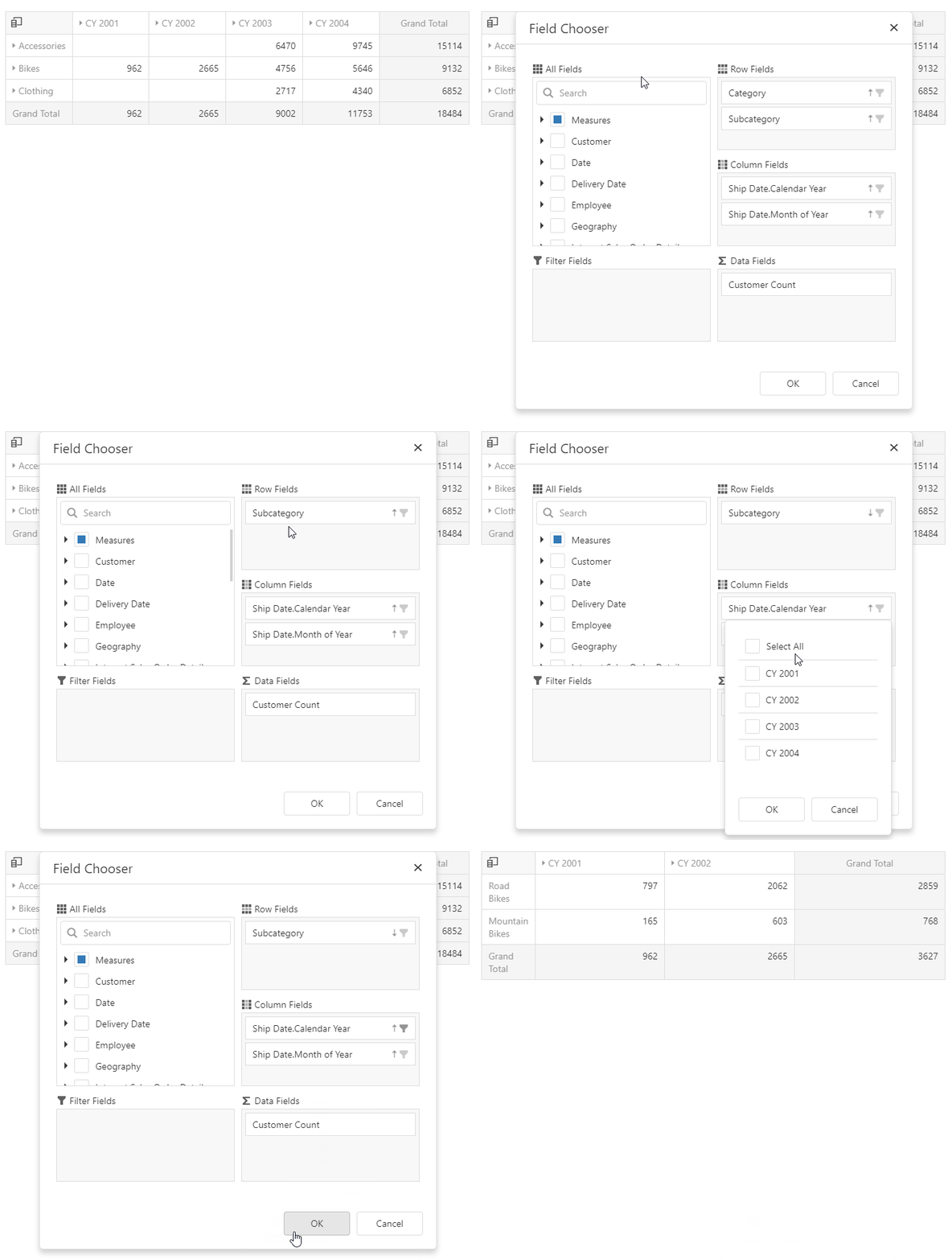
Pivot grids can be configured to work with enormous data volumes. Since they are interactive controls, the user is expected to make changes to the layout at runtime. Unfortunately, this can result in large queries run against the server in quick succession, while the user drags and drops fields in the Pivot Grid.

We have now added the option applyChangesMode to the PivotGridFieldChooser, with the default setting instantly (this corresponds with the previous behavior). By setting this option to onDemand, you can change the behavior so that all changes made by the user are accumulated and applied only when they are confirmed by a click to the OK button in the Field Chooser UI. It is also possible to cancel changes without applying them.

Pivot Grid Field Chooser

Here is a demo of a Pivot Grid setup with an integrated Field Chooser.

Stand-alone Field Choosers

If you are using the Field Chooser as a stand-alone control in onDemand mode, you need to add your own OK and Cancel buttons, or at least trigger the associated functionality from your own code. We supply the two new methods applyChanges and cancelChanges for this purpose.

A demo of a Pivot Grid with a stand-alone Field Chooser is also available.

What do you think?

All the functionality described in this post is available now, as part of our v18.1 release. If you are new to our product suite, find all the details you need here. As always, we are interested in your thoughts! Will you use the new features in your applications?

Blog Post: DevExpress @ Techorama 2018 Edition

$
0
0

This week, the 5th edition of Techorama conference is being held in Antwerp, Belgium and DevExpress will be present as Gold partner.

image

John, Julian and I will be there manning the booth. In case you missed our “What’s New in v18.1” webinars, we’ll be showing you all new awesome features that come with it.

I will be doing a Partner Session about CodeRush so make sure to check that out if you want to get started with CodeRush!

If you’re there, make sure to stop by and get a cool T-Shirt and a raffle ticket to win a platform subscription of choice.


Blog Post: ASP.NET Core Bootstrap - New Controls (v18.1)

$
0
0

The DevExpress ASP.NET Bootstrap controls for ASP.NET Core is introducing several new controls with our latest release.

These controls are fantastic because they support Bootstrap out-of-the-box and can be run from multiple platforms (MacOS, Linux, & Windows)! Let's take a look.

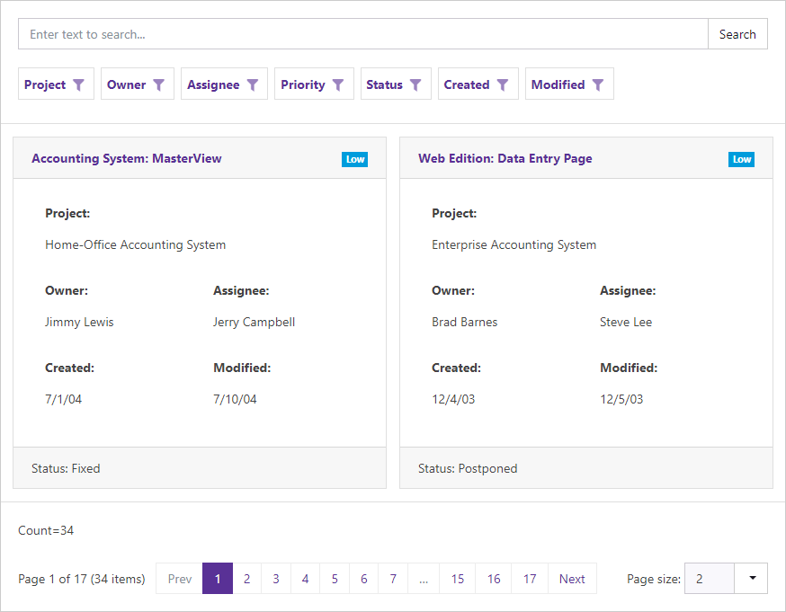
New ASP.NET Core Bootstrap CardView Control

ASP.NET Core Bootstrap CardView Control

v18.1 ships with our new ASP.NET Card View control for Bootstrap Core. Its features include:

ASP.NET Core Bootstrap CardView Control

Demo

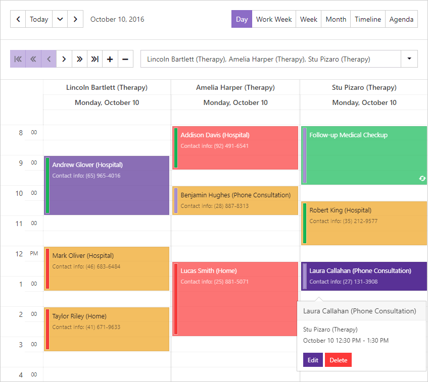
New ASP.NET Core Bootstrap Scheduler Control

v18.1 ships with our new ASP.NET Bootstrap Scheduler control. Its features include:

ASP.NET Core Bootstrap Scheduler Control | DevExpress

Demo

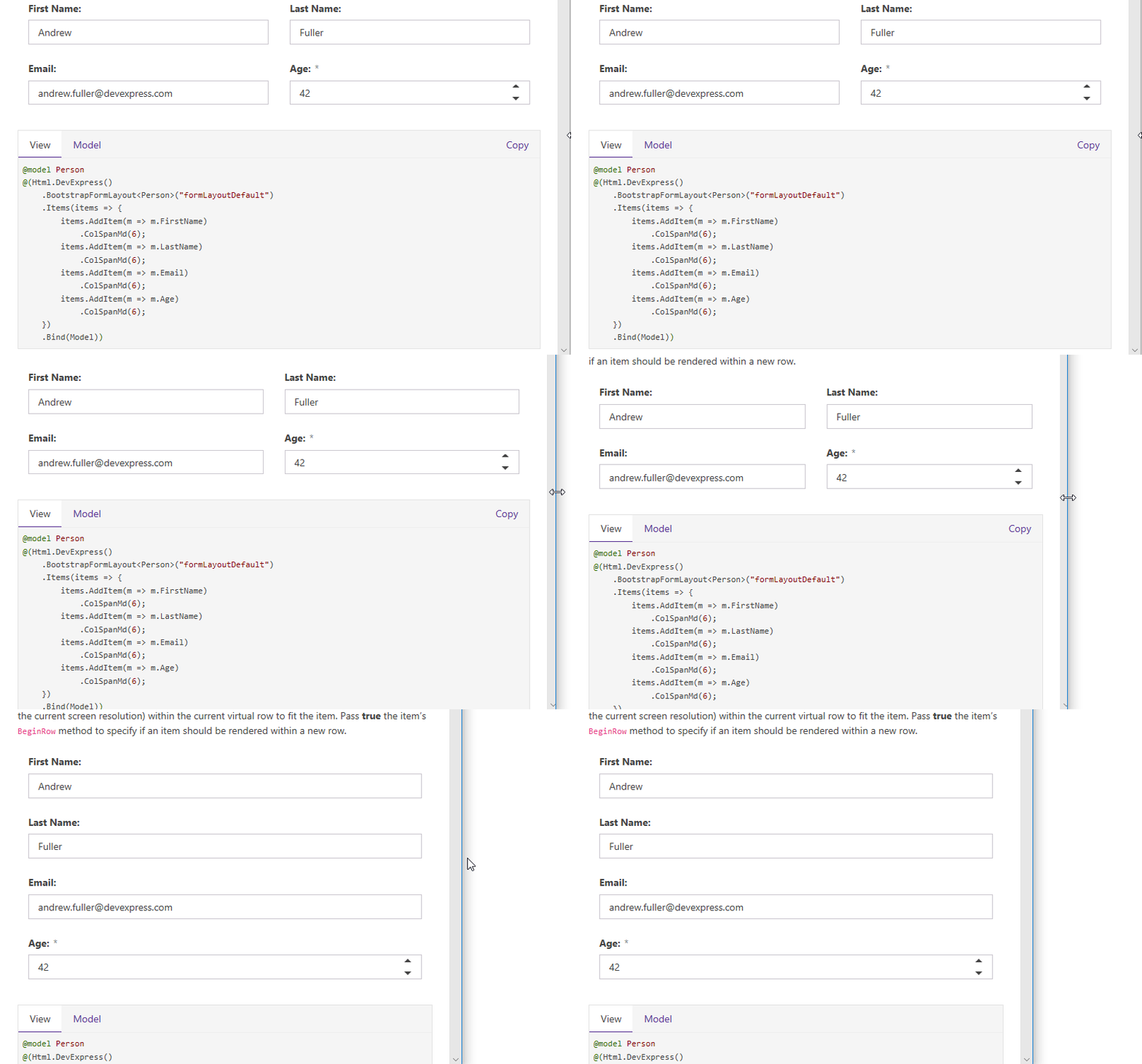
New ASP.NET Core Bootstrap FormLayout Control

Our new Bootstrap ASP.NET Core Form Layout Control allows you to eliminate the restrictions and time consuming limits associated with pixel-based form design.

The Form Layout control supports data binding. You simply bind the Form Layout control to a data source and specify which fields are to be displayed. It is also adaptive, which it makes it possible to use on any device:

ASP.NET Core Bootstrap FormLayout Control | DevExpress

Demo

New ASP.NET Core Bootstrap Sparkline Control

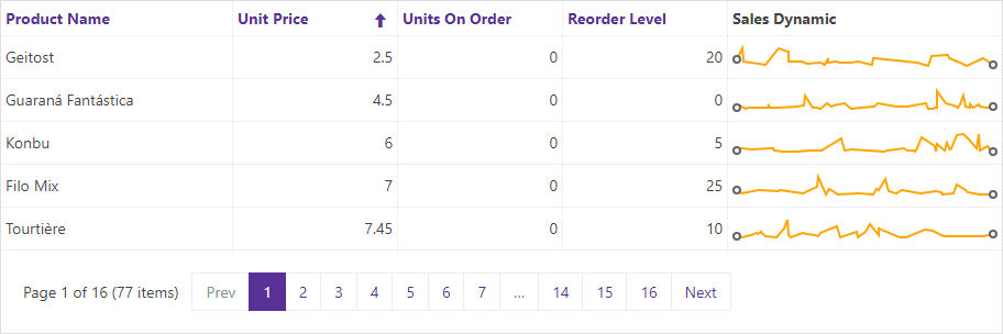
The DevExpress Bootstrap Sparkline control allows you to display a single series chart within containers such as our Grid control. Its features include:

Demo

ASP.NET Core Bootstrap Data Editors

ASP.NET Core Bootstrap Upload Control

The DevExpress Bootstrap Upload Control allows end-users to upload files to the server via the browser. End-users can select a file by invoking the standard Open File dialog or by dragging the file to the Upload control.

Demo

ASP.NET Core Bootstrap TagBox

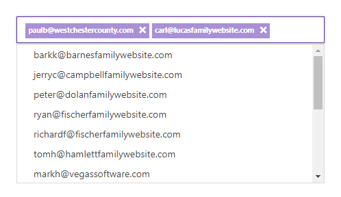
Our Bootstrap Tag Box control allows users to select values from a drop-down list or to enter them manually.

ASP.NET Core Bootstrap TagBox | DevExpress

Demo

ASP.NET Core Bootstrap Time Editor

The DevExpress Bootstrap Time Edit control allows you to display and edit date-time values. End-users can modify values by typing directly into the edit box or clicking spin buttons to increment or decrement months, days, hours, minutes or seconds.

ASP.NET Core Bootstrap Time Editor | DevExpress

Demo

Navigation

New ASP.NET Core Bootstrap Toolbar

The ASP.NET Core Bootstrap Toolbar Control allows you to supply your web application with a lightweight adaptive toolbar interface. A toolbar is presented as a set of buttons arranged across groups.

Demo

ASP.NET Core Bootstrap Popup Menu

The DevExpress ASP.NET Core Bootstrap Popup Menu is a context sensitive menu that can be associated with a control on a web page.

Demo

Like it?

We'd love to hear your feedback about the new Bootstrap controls for ASP.NET Core. Drop me a line below, thanks.


Email: mharry@devexpress.com

Twitter: @mehulharry

Blog Post: DevExtreme Vue Data Grid (CTP)

$
0
0

Just over a week ago, we wrote about Vue.js for the first time, and today there are some big news: the first public version of our native Data Grid for Vue.js is now available!

Vue Data Grid

Here’s what we have right now

Much of the functionality of our React Data Grid is available right now in the Vue Data Grid. This is the short list:

  • Sorting
  • Filtering
  • Grouping
  • Searching
  • Paging
  • Selection
  • Detail Row
  • Editing

We have prepared several demos, which you can check out by following this link. Documentation is also available for the feature set of this CTP release, including both guides and the API reference.

If you have already worked with our React Data Grid, you will recognize most of the concepts in the Vue Data Grid. For instance, the structure of the grid setup is based on plugins, and declaration order is important. Of course the syntax and structure is different for Vue, but it’s nevertheless easy to understand what happens:

export default {
  data() {
    return {
      columns: [
        { name: 'orderNo', title: 'Order Number' },
        { name: 'date', title: 'Date' }
      ],
      rows: [
        { orderNo: 1, date: '2018-05-01T12:02:36.839Z' },
        { orderNo: 2, date: '2018-05-02T10:12:24.534Z' }
      ]
      sorting: [
        { columnName: 'orderNo', direction: 'asc' }
      ],
      currentPage: 0,
      pageSize: 10,
      pageSizes: [5, 10, 15]
    };
  },
  template: `<dx-grid
      :rows="rows"
      :columns="columns"><dx-sorting-state
        :sorting.sync="sorting"
      /><dx-integrated-sorting /><dx-integrated-paging /><dx-table /><dx-table-header-row
        showSortingControls
      /><dx-paging-panel
        :pageSizes="pageSizes"
      /></dx-grid>
  `,
  components: {
    DxSortingState,
    DxPagingState,
    DxIntegratedSorting,
    DxIntegratedPaging,
    DxGrid,
    DxTable,
    DxTableHeaderRow,
    DxPagingPanel
  }
};

Everything is native

Even though the React Data Grid has been the template for the architecture of the Vue Data Grid, our implementation is 100% native to Vue. For example, you can see our use of the .sync modifier in the sample above, which is a Vue-specific shorthand syntax for an event pattern. Our Vue Data Grid is also fully compatible with Vuex (a Flux-style state management implementation for Vue apps) and you can see our Vuex integration demo here.
Some things we don’t have yet

We are working on a set of features beyond this initial CTP release, which should be available soon:

  • Virtual Scrolling
  • Tree View
  • Column Chooser

We also have the following items in our plans, but they are a little further in the future than those above:

  • Bands
  • Advanced Filtering
  • Grouping by Drag&Drop
  • Column Resizing and Reordering

As always, you can help us prioritize by giving us feedback!

Try it now!

The CTP version is available now using the version number 1.3.0-beta.1. You can find Getting Started instructions here. All feedback is very much appreciated!

Note that we can’t make promises at this time about a timeline for the release version. It is also very likely that there will be breaking changes to this CTP product, possibly even in minor version releases. We will do our best to document such changes, but they are to be expected at this stage. Of course it is possible, even likely, that the Vue Data Grid or its documentation has bugs in this version. Please feel free to report any issues you find to our GitHub issue tracker.

Blog Post: Report and Dashboard Server - New Administrative Panel UI, Localization, HTML5 Document Viewer (CTP, v18.1)

$
0
0

For our v18.1 release, there are some very interesting new features to report for users of our Report and Dashboard Server. The gist is this: we implemented the next generation of the Administrative Panel for the server, on the basis of modern technology including WebAPI, Angular and Redux.

Modern UI Administrative Panel

The new UI is available in v18.1 as a CTP release. If you would like to try it, please follow the instructions in the documentation to activate the new design for your users.

Try the new design

A modern interface

We had several reasons to create a new implementation of the Administrative Panel user interface. On a technical level, we saw the need to migrate to a platform based on current technology, to enable future maintenance. In addition, there are numerous functional benefits. Read on for details!

Improved user experience

The new interface is built as a single-page application (SPA). In contrast to a traditional web application that performs frequent server round-trips in response to user actions, SPA apps render their UI on the client with greatly improved response times. We have also changed the UI structure in several places to substitute lists for tiles. This makes it easier to find specific items and to execute operations for multiple items at a time.

Localization

It is now possible to download a JSON file from the Administrative Panel containing localizable strings. The file can be translated and uploaded to the server again, where it is used to provide a localized UI for the Administrative Panel.

Localization interface

WebAPI

The new interface has been built to communicate with the server using a WebAPI service instead of the WCF service we were using previously. Going forward, we will extend the WebAPI service with all new functionality, and in v18.2 it will become possible to perform all administrative tasks through this interface, even from third-party applications. This includes adding documents and users, configuring access permissions and scheduling jobs. We regard WebAPI as the way forward to an easily accessible and full-featured external interface.

White-labeling

During our development work on the new UI, we made provisions for customized CSS styles, images and text elements throughout the Administrative Panel. In v18.2 we plan to deliver full white-labeling support on this basis. We look forward to this very much, since it’s one of our most frequently requested features!

Limitations

Since the new feature set is in CTP status, there are some limitations to the functionality of the new Administrative Panel and to the localization support. You can find details in the documentation, which will be updated in the future. This is the link for functional limitations and here you can information about localization limitations.

During the CTP phase, we hope to remove all limitations.

Finally: HTML5 Document Viewer enables vastly improved client experience

An additional feature we have added in v18.1 is integration with our HTML5 WebDocumentViewer. This feature is loosely related to the above, since it takes advantage of the new WebAPI interface. This functionality is fully supported and not in CTP status.

Previously, we only supported the ASPxDocumentViewer for web applications. In contrast, the HTML5 Document Viewer has huge advantages:

  • Generated documents are retrieved directly from Report Server. No web server is required to render reports, and the WebDocumentViewer can be used in any HTML/JavaScript app.
  • The complete built-in feature set of the HTML5 Document Viewer can be used in conjunction with Report Server. This includes:
    • Asynchronous document generation - no need to wait for the complete document to generate before initial pages can be viewed
    • Pixel-perfect document rendering
    • Mobile Mode for phones and tablets

We have a complete sample in GitHub, and there is a documentation page detailing the process of displaying documents retrieved from Report Server. Finally, this link shows our general documentation for integration of the HTML5 Document Viewer in JavaScript apps, and includes further sample links.

Please share your thoughts

As always, we are interested in any feedback you have. Are you going to use the UI, localization and Document Viewer? Are you looking forward to white-labeling support?

Blog Post: ASP.NET Bootstrap - GridView Enhancements (v18.1)

$
0
0

With our latest release, we introduce several major features for the DevExpress ASP.NET Bootstrap GridView control.

We offer two versions of ASP.NET controls that are built specifically for the Bootstrap framework: ASP.NET WebForms and ASP.NET Core. The features below apply to the ASP.NET WebForms version of our Bootstrap GridView control. Let's take a look.

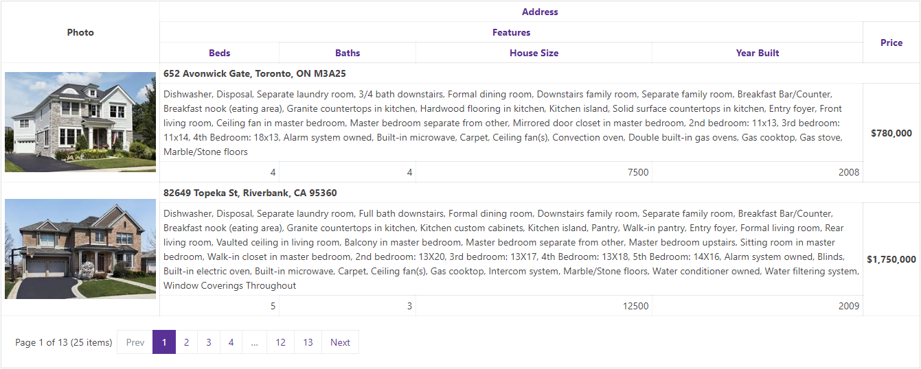
Bands

Our Bootstrap Grid View control now supports the popular column header and data cell bands feature.

  • Column Header bands allow you to arrange column headers across multiple rows.
  • Data cell bands allow you to create banded data row layouts allowing cells to occupy multiple rows.

ASP.NET Bootstrap GridView Control - Bands

Demo

Cell Merging

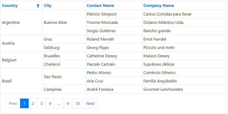
Much like Microsoft Excel, the Grid's cell merging option allows you to improve usability by avoiding the duplication of common information. Neighboring data cells across different rows can be merged whenever they display matching values.

You can manage visibility of the Cell merging feature by using the SettingsBehavior.AllowCellMerge and GridViewDataColumnSettings.AllowCellMerge properties.

ASP.NET Bootstrap GridView Control - Cell Merging

Demo

Column Resizing

End-users can now resize grid columns by dragging a column header's border. Take a look at the SettingsResizing property to see the options related to column resizing.

ASP.NET Bootstrap GridView Control - Column Resizing

Demo

Merged Column Grouping

Our ASP.NET Bootstrap GridView now includes a 'Merge Column Groups' mode. In this mode, you can merge grouped columns by dragging the appropriate column header(s) to the group panel and arrange them across a line.

Merged grouping can be controlled by using the SettingsBehavior.MergeGroupsMode property.

ASP.NET Bootstrap GridView - Merged Column Grouping | DevExpress

Demo

Header Filter - Instant Find

v18.1 introduces a simple and quick way to find column filter values. The Find Panel is enabled by default and allows users to enter a search string and initiate a search against all filter values displayed in the header drop-down.

Control the Find Panel's visibility by using the Settings.ShowHeaderFilterListBoxSearchUI and DataColumn.SettingsHeaderFilter.ListBoxSearchUISettings.Visibility properties.

ASP.NET Bootstrap GridView Control - Header Instant Find | DevExpress

Give Us Your Feedback

How are you using the DevExpress ASP.NET Bootstrap GridView control? Drop me a line below.

Thanks!


Email: mharry@devexpress.com

Twitter: @mehulharry

Blog Post: XAF - New in Documentation on Mobile Application Customization (v18.1)

$
0
0

We've tried to make XAF an extensible/highly customizable business application platform. Developers can customize or replace nearly all built-in application UI elements or behaviors. To help those of you who require this level of customization, we've created dozens of examples in our support database and within our documentation. Additionally, numerous extensions created by members of the XAF community are available.

Please remember that XAF ships with full source code - you can research, debug and modify the framework as needed. The availability of source code is not an incidental benefit. It helps reduce the risks associated with vendor lock-in. It also helps those who wish to extend the platform as needs dictate.

If you've not yet used XAF, feel free to review this comparison to see how XAF stacks up in the marketplace.

In this post, I'll highlight recent updates to mobile-related help topics and documentation related to UI customization. If you are familiar with XAF 's WinForms and ASP.NET development processes, many things will look familiar. For future updates, be sure to bookmark the following help topic: Ways to Customize a Mobile Application.


How to customize existing UI elements
XAF Mobile applications use DevExtreme widgets and provide a set of wrappers that allow you to customize a widget from your C# or VB.NET code. Take a moment to review the following topics:


How to use a custom control that is not integrated by default
Do you want to extend a Mobile application with your own, fancy DevExtreme or some third-party widget? The following help articles should help you get started:


How to implement client-side logic
The following topics demonstrate how to write and register your custom JavaScript using the ActionBaseExtensions.RegisterClientScriptOnExecuteMobileApplication’s RegisterClientScriptXXX and MobileWindowTemplate’s RegisterClientScriptXXX APIs:


How to access mobile device functions
To learn more about adding PhoneGap Plugins to your Mobile application, refer to the following help topics:


Miscellaneous
These customizations will also interest any XAF Mobile developer sooner or later: 

Your feedback counts
We would love your thoughts on these help topics materials and would love to learn more about customizations you've made to XAF Mobile UI. 


Logify
Before I let you go, just a quick question - are you guys using 24/7 app monitoring services such as Logify? Our support team plans on using Logify with some of our enterprise customers and we'd love to know what you guys think of 24/7 app monitoring. Check out the How to replace XAF exception handling with Logify  article to learn more about the XAF integration. Please note that we are using this exact approach for our online Web and Mobile demos (available at https://www.devexpress.com/Support/Demos/#xaf). 

Viewing all 3388 articles
Browse latest View live