Quantcast
Channel: Developer Express Global
Viewing all 3388 articles
Browse latest View live

Blog Post: DevExpress ASP.NET TabControl, PageControl - Tab Swipe (v18.1)

$
0
0

Over the last few years, we've added many responsive and adaptive features to keep our ASP.NET controls modern and relevant with the latest trends. In fact, in the last release (v17.2), we added adaptive support to our Popup control and in this release, we've added Adaptive features to our FormLayout control.

Well, now there's a new feature for the DevExpress ASP.NET TabControl and PageControl that improves usability on mobile devices. Both of these controls now allow for using touch swipe gestures to scroll tabs:

Touch gestures improve user experience on mobile devices. Now your website visitors do not need to tap on small tab arrows. They can just swipe on the tabs.

This feature is available with the DXperience v18.1 release and you can use it with either the DevExpress ASP.NET WebForms or ASP.NET MVC controls.

EnableTabScrolling

To enable this feature, set the EnableTabScrolling setting to true and your end-users will see the tab scroll buttons.

Then, the Tab swipe support is enabled automatically on touch devices.

Download Sample

Test this feature today on your local machine by downloading the attached sample project:

We'd love to hear your feedback about the Tab swipe support. Please leave a comment below, thanks.


Email: mharry@devexpress.com

Twitter: @mehulharry


Blog Post: Reporting - .NET Core Support (CTP, v18.1)

$
0
0

The .NET Core framework is growing and adding more features with each release, so much so that we're getting many requests to support .NET Core in our products. However, one of the major limiting factors for us has been the lack of the System.Drawing assembly, something that's required for many of our controls. Luckily though, Microsoft has just released a version of System.Drawing for .NET Core, which means at last we can now work on migrating some of our libraries.

Well, I'm happy to announce that the powerful DevExpress Reporting tools can now run on .NET Core v2.1. Woohoo! That's right, you can now run DevExpress Reports within both Windows and Linux based environments.

This functionality is available as a CTP (community technology preview) in the v18.1 release. We're not finished with the porting the major features to the new .NET Core framework yet but rest assured, we're working on it.

In this post, I'll dive into the implementation details, limitations, future plans, and how you can start using DevExpress Reporting in your .NET Core applications.

Dependency: System.Drawing

As I mentioned above, many of our products are strongly tied to the System.Drawing assembly and the PrintDocument class. This dependency has made it hard for us to consider .NET Core for some of our products.

We thought about using third-party implementations like the CoreCompat/System.Drawing project. But we decided to wait for an official release from Microsoft before we started the massive effort to support the new .NET Core framework.

As it happened, last year Microsoft released the System.Drawing.Common 4.5.0-preview NuGet package. To be honest, in those early stages it wasn't terribly useful for us, and even now it's still only a "preview" version. It lacks too many features that we need, but it's a good beginning and it's at least something that we can use to start building the .NET Core version of our tools.

It's Alive!

So we got busy and started to port our tools to the .NET Core platform. And after:

We now have a version of XtraReports that works on .NET Core v2.1! It's so exciting that I had to say it twice.

Note: Please use .NET Core v2.1+ as it contains this bug fix that's necessary for XtraReports.

Challenges

Now let me tell you about some of the issues we ran into and how we solved them.

New Item Template

Getting around the System.Drawing assembly issue was big but it wasn't the only issue.

Our next major hurdle was that the main XtraReport class is a descendant of the System.ComponentModel.Component class. And the .NET Core framework does not include the System.ComponentModel assembly and therefore the necessary class. This would have prevented us from displaying the Report Designer in Visual Studio.

So our devs brainstormed a few ideas like running a separate web application (e.g., using IIS Express) with the Web Report Designer. This would allow you to build and design a report then store its layout. However, this approach was too complicated and besides, we came up with a better idea that's more elegant.

We implemented a new "DevExpress v18.1 Report (.NET Standard)" Item Template that adds a blank report template in an XML format to your .NET Core project:

Once you add this item to a project, then Visual Studio will automatically add a dependency to the necessary DevExpress.Reporting.Core NuGet package.

Note: Make sure that this package has been successfully restored because the report designer window will not open until the package is restored.

Report Designer

Then we needed a way to bring up the Report Designer in Visual Studio when someone wanted to edit/create an XtraReport. Luckily, we found a way using Visual Studio's internals to handle the double-click event on the project item. So Double-clicking this report template or selecting the "Open" context menu command in Visual Studio invokes the modal window with the fully-functional desktop Report Designer that enables you to design the report in the manner that you're used to:

ASP.NET Core Integration

Once you have finished designing your report, click the "Save" toolbar button to store the changes in the layout. After that, follow the steps described in this ASP.NET Core Reporting help article, it will help you integrate the Document Viewer or Web Report Designer into your application.

Alternatively, you can use our new "Project Template Item" that creates a new ASP.NET Core Reporting application with the Document Viewer and Web Report Designer already setup. In fact, we have two templates where the first one creates an app with a Bootstrap based theme and the second one uses the Angular framework:

This project template automatically adds a dependency to the DevExpress.AspNetCore.Reporting package. This package now includes two set of assemblies: one for .NET Core and other for .NET Framework (full). Previously, we had implemented support for ASP.NET Core applications targeting only the full version of .NET Framework (e.g. you were able to use a separate back-end to generate report documents).

Now, Visual Studio will automatically reference the corresponding assemblies within your project, depending on the target platform.

Check out this Knowledgebase Article to learn more details.

Docker Support

I'd like to highlight our Docker support. Say for example we took our newly created XtraReports on .NET Core project and added it to a Docker container. Would it work? Yes!

We tested this functionality using the 'microsoft/aspnetcore:2.0' Linux Image. Simply add the following lines into your Dockerfile and you'll be able to generate an XtraReport document in your container:

...
 FROM microsoft/aspnetcore:2.0 AS base
 RUN apt-get update
 RUN apt-get install -y libgdiplus libc6-dev
 ...

Refactoring: DevExpress.XtraReports.Web

While coding for .NET Core support, we noticed that the DevExpress.XtraReports.Web assembly forces an application developer to reference resources that are specific to other platforms (e.g., the source code of ASPxReportDesigner, ASPxWebDocumentViewer, ASPxDocumentViewer, and ASPxQueryBuilder controls and other related Web Forms and MVC-specific classes).

We saw an opportunity to refactor and improve our .NET Core support. We extracted the source code of these components (and the rest of specific classes) into a separate assembly called DevExpress.XtraReports.v18.1.Web.WebForms. So now the DevExpress.XtraReports.Web assembly only contains the cross-platform classes and resources that are used in any supported web platform whether it is ASP.NET, MVC, or ASP.NET Core.

Breaking Change

We also optimized the list of dependencies for each Reporting NuGet package. This is a positive change for the Reporting products but it does cause a minor breaking change. You can read a complete breaking change description here: BC4270.

This breaking change can easily be fixed by using our Project Converter which will add a reference to the required assembly when migrating to v18.1.

Limitations

Alas, there are some limitations that we still need to address, mainly:

  1. The XRRichText control is not available
  2. The PrintableComponentContainer control is not available
  3. The ObjectDataSource component cannot obtain the data source schema from an assembly built against the .NET Core platform (only .NET Standard and full .NET Framework)
  4. Linux-based environments are not able to generate 3D Charts that rely on the OpenGL library

Our goal is to solve the top three items so that we can proceed to the final version. Rest assured, we're working on them for a future release. However, the following list of features likely will not be implemented (due to platform restrictions):

  • Report Scripts are not supported
  • CodeDom serialization functionality is not supported
  • A report cannot be opened by Web Document Viewer's default resolver using the fully qualified type name in ASP.NET Core applications

We will consider if there's any workarounds or solutions to provide this missing functionality.

Future Plans

Our long-term vision is to provide a completely consistent set of features regardless of the platform you choose for reporting. Therefore, we're going to constantly improve the .NET Core support in the context of the next release cycle.

We'd love to hear your feedback about the XtraReports .NET Core support. Please leave a comment below, thanks.


Email: mharry@devexpress.com

Twitter: @mehulharry

Blog Post: DevExtreme - New Material Design Theme (v18.1)

$
0
0

Google's Material Design is one of the most popular design languages used in Web and Mobile apps today.
This UI is characterized by a grid-based layout and the use of only a few vivid colors to raise the user's attention to certain elements on the screen.

Since it is originally developed for Google's Android UI, it has a strong focus on touch based devices but it can absolutely be used on desktops as well. In fact, there is official documentation available on how Material Design should work and look across different devices.

Since we value your feedback - and we got a lot on this subject - we have decided to supply you with a Light Material Design Theme for the DevExtreme components. This theme even comes with 5 predefined color-schemes which match the Material guidelines color palette!


Guidelines vs Real World

Though the documentation on Material Design is very detailed, we faced a couple of scenarios in which the documentation did not accommodate so we had to optimize and change some of those guidelines to have them match real-world use-cases.

DataGrid

One of the issues we encountered is concerning the DevExtreme DataGrid.
The Material Design documentation clearly states that the padding between columns should be at least 56 pixels.

If the grid only contains numbers it looks good, but when the grid contains text columns as well, those texts will be truncated pretty heavily which makes it hard to read.

For this reason we decided to ignore this guideline and reduced the padding in our theme.

PivotGrid

According to the documentation, any table should have large indents between columns and should not have separators.

The purpose of the PivotGrid however is to display a lot of information in a tree-style way. If we would have followed the guidelines concerning spaces and indentation, a lot of screen real estate would be wasted.

For the sake of readability we did include separators between rows and columns.

Then, there are some components that come with DevExtreme which are not described in the guidelines at all.

In these cases we've taken a look at the different apps and services created by Google which provide similar functionality.
An example is the design of the DevExtreme Scheduler which is inspired by Google Calendar.

It's all in the details

To make sure that our controls have the best Material Design experience possible, there are a couple of other things we did that are worth mentioning.

The DevExtreme components have a huge set of configuration options to configure how they look. If you take a look at our scheduler, you can specify whether you want tabs or a drop-down box to select the current view by setting the appropriate configuration property.

If you select our Light Generic Theme, and don't set any of those properties, the Scheduler will display tabs to switch views while if you select the Material Design Theme, the Scheduler will display the drop-down instead of the tabs.

The same happens with labels; With the Material Design Theme we put the labels without a colon above the editor while with the Generic Themes, we put them in front of the control with a colon by changing the options of the Form Widget.

In other words, we apply a default configuration on the controls depending on the selected theme. If you want, you can change this behavior in your application but it will not be according to the Material Design guidelines anymore.  

Demos and Theme Builder

Besides the different color schemes we provide with the Material Design Theme, we will make the Material Design Theme available in our online Theme Builder so you can select the accent color from the Material Palette or choose any color you want to have your personalized Material Theme.

With the official v18.1 release, you'll also be able to switch the Demo Gallery over to the Material Design Theme so you can see how awesome this looks!

More to come

Once v18.1 is released we will keep improving the Material Design theme. There will be a Dark Material Design theme, and we will include things like an option to enable or disable flat-style buttons, a floating action button and animated labels in the Form Widget when its control receives focus. 

Angular, Vue, React, ASP.NET MVC / Core and more

This brand new theme will be available for all the frameworks we support with DevExtreme including:
Angular, Vue, React, jQuery, Knockout, ASP.NET MVC and .NET Core.

Try it now?

If you want to give this feature a test-drive, the public beta is already available. Use the npm pre-release package:

npm install --save devextreme@18.1-unstable

If you're not using npm, check out Mehul’s earlier blog post about pre-releases.

What do you think?

Let me know what you think of this by replying on this article or if you have questions or suggestions, then please take part in the discussion about this feature on GitHub.

Join the Webinar

If you want to see all new features introduced in our v18.1 release including the Material Design Theme, sign up for our upcoming “New in v18.1 - DevExtreme HTML / JS Controls” webinar where you’ll have a chance to ask questions about all the new features as well.

Join the webinar: https://attendee.gotowebinar.com/register/9186007723238099714

Blog Post: XAF - Best practices from Manuel Grundner

$
0
0

Meet Manuel and his blog
Many of you liked my post about the free Llamachant extensions for our business application framework (XAF). I want to take a moment to promote the contributions of another longtime customer and DevExpress MVP - Manuel Grundner. You may already know Manuel from his involvement in the DevExpress Support Center and his personal blog: http://blog.delegate.at/tags/XAF. His most popular work was for Visual Studio Team Services (VSTS) and Nuget integration. Manuel has now taken the time to share his expertise with all XAFers via the following blog series:


Don’t forget to check out the following post – extremely interesting content: How to use the Desktop Bridge to create an appx package for XAF.

Liked Manuel's tips or doing things differently? Are you blogging about XAF as well? Please let the world know in the comments section below.

Learn more about the XAF community
Even more 3rd-party modules, blogs, consulting and custom development services are here: https://www.devexpress.com/Products/NET/Application_Framework/xaf-community.xml.

Blog Post: Logify – Managing Teams within Your Organization

$
0
0

If you’ve yet explore the capabilities of Logify (our 24/7 crash monitoring service) please take a moment to visit logify.devexpress.com. For those currently using Logify, we wanted to take a brief moment and detail its newest features – Team Management.

As the name implies, this new feature allows you to group subscription members into teams and subsequently associate one or more applications to each team. Teams can include members with different access permissions. Team members can view/monitor assigned applications (process reports, modify application settings, create notifications, etc.) using Logify’s web interface.


Can Logify Team Management Help You?

Here are a few of the benefits you can expect once you begin using Logify’s Team Management feature:

Easily organize/manage the activities of individual teams within a single subscription. Your company does need to purchase multiple subscriptions to address the requirements of each team.

Each team is only responsible for the applications assigned to it. This allows team members to focus on relevant crash reports.

Teams allow you to better control access to application crash reports and application settings.

We use Logify within DevExpress to monitor internal test applications and application demos. We’ve divided all our developers into teams (ASP.NET Controls Team, WinForms Controls Team, DevExtreme Team, etc.). As you would expect, each team only reviews/processes crash reports generated by applications assigned to it.


Is Logify Team Management Easy to Use?

It only takes a few minutes to create teams for your Logify subscription. There’s no need to change your source code or configuration parameters. There’s also no need to redeploy your application or perform other time-consuming actions.

To get started, you simply need to create a team then add your application and users (with specified access permissions) to the team via Logify’s straightforward web interface.

Should you need additional information on this feature write to us at support@devexpress.com or visit our online help file at your convenience.

Blog Post: Getting Started with DevExpress Dashboards – Q&A

$
0
0

We had almost 500 people live on the "Getting Started with Dashboards" presentation on Tuesday raising over 100 questions and unfortunately we ran out of time to answer them all. Here are some that we didn’t get to during the webinar – which is now available on our YouTube channel, please feel free to share it or to watch it again.


If  you’re new to our Dashboard products, we have a dedicated playlist here to help you get started.


Q: So basically can I add a dashboard to a Winforms page and interact with other data on that page?

A: Yes, DashboardDesigner/DashboardViewer is simply a WinForms control.

Q: We need datasource json (webservices) When will it be available?

A: We can not provide an exact time estimation, unfortunately, but in the meantime, we advise you to try using the ObjectDataSource – get data from json service with HttpClient and then pass it to dashboard.

Q: Can I filter outside of the dashboard…i.e. based on user accessing, I want to filter for their data.

A: Yes, you can subscribe to DataLoading events and filter data that way.

Q: Hi, it it possible to adjust column width and font size in Pivots mainly, and other modules as well, especially from the web designer for web view?

A: Yes, you may access the internal dxPivotGrid (which we use in the Web Dashboard) and configure it via code. This link should help: https://js.devexpress.com/Documentation/ApiReference/UI_Widgets/dxPivotGrid/

Q: Can all dashboard elements be exported into excel? If not, which ones can

A: Yes! Every Dashboard Item can be exported into Excel. Filter Elements (List Box, Combo Box, TreeView) do not have Export UI, but can be exported using API.

Q: Is it possible to use the viewer somehow with a datastore on the server which is then securely accessed over something like WCF or CSLA. So without giving the database as datasource on the server open to the world.

A: Yes, the Web Dashboard works exactly in this way.

Q: Is the SQL Query builder you have been using available as a standalone control outside of the dashboard designer?

A: Yes, you can create using the following helper:

https://documentation.devexpress.com/WindowsForms/DevExpress.DataAccess.UI.Sql.SqlDataSourceUIHelper.EditQueryWithQueryBuilder.overloads

Q: Does the Web Dashboard display live data? So counts change on screen when data changes in the database…

A: The Web Dashboard displays historical data, but you can use API to refresh it.

Q: Can data displays on dashboard be based on a persons’ rights? If I have 20 customers, I only want them to see the data for their location, but I only want to design one dashboard.

A: Yes, you can handle the DataLoading event and customize your queries. Implementation details depend on your requirements, how you organize authentication and store your data.

Q: What about localizing the dashboard in the designer (set descriptions for multiple languages)? I assume for now it can only done from code.

A: Yes, localization of designed dashboard can be done via code only. And of course, DashboardViewer/Designer controls can be localized – buttons, tooltips etc.

Q: Is the dashboard available in angular?

A2: While we don’t have native angular support, you are still able to write your own Angular wrappers for our Web Dashboard Client Approach https://documentation.devexpress.com/Dashboard/119109/Getting-Started/Build-End-User-Dashboard-Designer-Applications/Create-an-HTML5-JavaScript-Designer

Q: Hi! Is this available for Visual Studio for Mac?

A2: You will be able to develop the Dashboard app in Visual Studio for Mac using ASP.NET Core (it was a CTP in v17.2, and will officially release in v18.1).

Q: When will dashboards be supported for DevExtreme?

A2: We don’t have a native DevExtreme control, but you are still able to use it in your own client-side app https://documentation.devexpress.com/Dashboard/119109/Getting-Started/Build-End-User-Dashboard-Designer-Applications/Create-an-HTML5-JavaScript-Designer


We are currently planning a follow on presentation for Dashboards, please leave a comment below if there is something specific you would like to see covered.

Blog Post: DevExpress ASP.NET Spreadsheet, RichEdit - Scalability - Amazon Web Services & Azure (v18.1)

$
0
0

Last year, a few customers reported to us the lack of scalability in the DevExpress ASP.NET RichEdit and Spreadsheet controls. These rich controls tend to be larger in memory footprint but the real issue was that they did not work on scalable environments like Microsoft Azure and Amazon Web Services.

After investigating, we figured out a great solution which we released as new feature called: 'stateless mode'. We released this feature in the v17.2 release as a CTP (community technology preview). I recommend that you read the blog post to learn more about 'stateless mode':

Scalability of ASP.NET Office Controls - Azure, Web Gardens, Farms, & Cloud Support (CTP - v17.2)

After releasing the CTP, we've received your feedback and have resolved several issues related to 'stateless mode'. Our customers also confirmed that the new feature helps to solves all the usage scenarios we targeted. Therefore, we're now taking it out of CTP and providing the final version in the v18.1 release. But wait, there's more...

Amazon Web Services

Our initial CTP only supported Microsoft Azure. I'm happy to announce that we now support both Microsoft Azure and Amazon Web Services for scalability!

How to enable it?

To turn on the new feature, set the desired document provider in your project's Global.asax file:

void Application_Start(object sender, EventArgs e) {
    ...
    var provider = new DevExpress.Web.SqlOfficeStateProvider.SqlOfficeStateProvider(connectionString);
    // or
    //var provider = new DevExpress.Web.RedisOfficeStateProvider.RedisOfficeStateProvider(connectionString);
    DevExpress.Web.Office.DocumentManager.StateProvider = provider;
    ...
}

In the sample code above, the connectionString refers to the connection string for your storage.

GitHub Sample

To help you test this, we've created and published a sample repo on GitHub:

https://github.com/DevExpress/aspnet-office-solutions

This repo consist of several solutions and projects:

  • Document state providers:
    • RedisOfficeStateProvider - Redis using document state provider
    • SqlOfficeStateProvider - SQL Server using document state provider
  • New solutions examples for Amazon Web Services:
    • AWS-SqlOfficeStateProvider-Starter - Amazon Web Services solution example using the SqlOfficeStateProvider
    • AWS-RedisOfficeStateProvider-Starter - Amazon Web Services solution example using the RedisOfficeStateProvider

Learn more details on the repo's Readme file.

Logify

Last year we released a new exception logging tool called Logify. If you're using the DevExpress ASP.NET RichEdit and Spreadsheet controls in a scalable evironment like Microsoft Azure then consider also using Logify for exception reporting. We've tested our ASP.NET controls on Microsoft Azure and Logify works handles exception reporting seamlessly.

https://logify.devexpress.com/

Give Us Your Feedback

Are you excited by the DevExpress Office Controls support for scalability? Drop me a line below.

Thanks!

Email: mharry@devexpress.com

Twitter: @mehulharry

Blog Post: DevExpress comes to dotnet Cologne 2018

$
0
0

At May 4th 2018, DevExpress is proud to be Gold-Partner at the dotnet Cologne 2018 conference in Cologne Germany.

John and I will be there to show you everything you want to know about our newest v18.1 release, and we'll be handing out some cool T-Shirts and other give aways.

I will also be on stage doing a very cool session about Cognitive Services and A.I.

If you're at dotnet Cologne, make sure to come by and say 'Hi!'


Blog Post: Reporting - Document Generation Performance Improvements (v18.1)

$
0
0

For a long while now, we have been on a mission to improve performance and memory handling when creating very large reports. Traditionally, we kept a complete document model in memory in order to print the document, or export to any of the supported formats. As a result, some customers ran into trouble when they created documents with thousands of pages, and in our release v17.2 we took a first huge step to solve these problems by introducing the PdfStreamingExporter tool. This tool exports reports to PDF in streaming and multi-threaded streaming modes, which reduces memory consumption in comparison to the standard in-memory mode. For the upcoming release v18.1, we have managed to implement a further significant improvement.

The CachedReportSource component

The new component CachedReportSource stores document pages in the file system or in a database during document generation. This decreases memory consumption when creating very large documents — in fact, with the new component, the size of a document is limited largely by the available storage space, with memory consumption increasing only slowly with very large page numbers.

The CachedReportSource component manages caching logic and acts as a mediator between a report and a Document Viewer. When a Document Viewer is bound to a report, the associated CachedReportSource generates the report document and stores it in the configured storage. The Document Viewer loads only visible document pages into memory and disposes pages when they are rendered invisible by scrolling.

Note that you can also benefit from the new functionality if your goal is to export a report, even more so if you target several output formats. An export code sample is shown below.

Design Time (WinForms Apps)

You can utilize the CachedReportSource component at design time in Windows Forms applications. Check the Cache Document Source option in the Document Viewer’s smart tag menu after setting the Document Source property:

WinForms Design Time Cached Document Source

A CachedReportSource component is automatically added to the form. You can now configure component settings, most importantly to choose one of the ready-to-use document storage options provided by the CachedReportSource.Storage property:

  • MemoryDocumentStorage - Use in-memory storage, but with a more compact document model than the standard, non-cached model

  • FileDocumentStorage - Store a set of files in a a specified directory

  • DbDocumentStorage - Store the document model in any database supported by our XPO ORM

Storage settings

Runtime use cases

A runtime setup approach is supported on all platforms. Here is an example for WPF, where the FileDocumentStorage uses a folder in the user profile:

using DevExpress.XtraPrinting.Caching;
using System.IO;

...

var appDataPath = Environment.GetFolderPath(Environment.SpecialFolder.ApplicationData);
var path = Path.Combine(appDataPath, "MyApplicationFolder");
var storage = new FileDocumentStorage(path);
var report = new MyReport();
var cachedReportSource = new CachedReportSource(report, storage);

documentPreviewControl.DocumentSource = cachedReportSource;
cachedReportSource.CreateDocumentAsync();

The method CreateDocumentAsync runs document generation asynchronously in a background task. Alternatively, you can use CreateDocument to generate a large document synchronously, and then export it by calling methods exposed by the PrintingSystem associated with the CachedReportSource:

cachedReportSource.CreateDocument();
cachedReportSource.PrintingSystem.ExportToPdf("MyPdfDocument.pdf");

For Web applications, we supply the component CachedReportSourceWeb. Here’s how to use it in ASP.NET WebForms:

using DevExpress.XtraReports.Web;
using DevExpress.XtraPrinting.Caching;
using System.IO;

...

protected void Page_Load(object sender, EventArgs e) {
  var appDataPath = HttpRuntime.CodegenDir;
  var path = Path.Combine(appDataPath, "tempDocumentsFolder");
  var storage = new FileDocumentStorage(path);
  var report = new XtraReport1();
  var cachedReportSource = new CachedReportSourceWeb(report, storage);

  ASPxWebDocumentViewer1.OpenReport(cachedReportSource);
}

For ASP.NET MVC, here is a sample View:

@model DevExpress.XtraReports.Web.CachedReportSourceWeb

@Html.DevExpress().WebDocumentViewer(settings => {
  settings.Name = "WebDocumentViewer1";
}).Bind(Model).GetHtml()
… and the corresponding controller:

using DevExpress.XtraPrinting.Caching;
using DevExpress.XtraReports.Web.WebDocumentViewer.Native;
using System.IO;

...

public class HomeController : Controller {
  public ActionResult Viewer() {
    var appDataPath = HttpRuntime.CodegenDir;
    var path = Path.Combine(appDataPath, "tempDocumentsFolder");
    var storage = new FileDocumentStorage(path);
    var report = new XtraReport1();
    var cachedReportSource = new CachedReportSourceWeb(report, storage);

    return View(cachedReportSource);
  }
}

Performance comparison results

We used our updated report demo Large Quantity of Data to measure memory consumption in various scenarios. Here are the results (values in Mbytes):

Number of PagesIn Memory creationMemory StorageFile Storage
DB Storage
Pdf Export from DB Storage

RAMRAMRAMHDDRAMHDDRAM
5000294134.495328428155
10000N/A2501405414556368
50000N/AN/A191270204282713
100000N/AN/A2455442685581,160

Try it!

The beta release of v18.1 is available to active Universal subscribers now. Please give the new features a try, and get back to us with any feedback! We are very interested to hear how CachedReportSource improves your reporting scenarios.

Blog Post: Microsoft Build is coming…

$
0
0

…and we shall be there in the hip DevExpress booth.

I’m certain that if you are a developer that uses anything in the Microsoft stack (Azure, Windows, Visual Studio, VSCode) to any great degree, you will know that next week is the week of the Microsoft Build developers’ conference in “sunny” Seattle. May 7th to the 9th, inclusive, to be precise. And, yes, Developer Express will be there with their booth, ably hosted by Amanda; with technical evangelists Areg and Mehul, who really know their stuff and who are ready to discuss your use of our products, and demo our controls and widgets; and … me. I’m pretty good at tidying up the booth and folding the <cough> Eat, Sleep, BUILD <cough> t-shirts we’ll be giving away as swag.

So, if you’re going to Build, please do come on over to the exhibit hall, and specifically to our booth (E24 near the Client and Web area on the expo floor). Come have a chat about your projects, development issues, and to hear how we could help you. Of course, we’ll have some news about our first main major release of 2018 (it’s close!). And did I mention the t-shirts?

We look forward to seeing you there!

Blog Post: DevExtreme MVC - New Web API and Razor View Scaffolding Wizard (v18.1)

$
0
0

As you may know, manually coding your own Web API controllers in ASP.NET MVC can be tedious. Web API controllers are important because they deliver your server's back-end data to your client-side views. Writing each CRUD (create, read, update, delete) method for all your database tables may tempt you to start to copy-and-paste code. But that can lead to typos and errors after deployment.

Good news: with our most recent release (v18.1), we've included new scaffolding wizards that help you add Web API support in minutes. Our new scaffolding wizards can be used on a new or existing project too. In this blog post, I'll describe how to take advantage of these new wizards in your ASP.NET MVC or ASP.NET Core projects.

What is Scaffolding?

The term scaffolding means that the CRUD source code is auto-generated for you. Scaffolding Controllers and Views helps to save you time in ASP.NET MVC and let's you focus on the rest of your application logic.

Visual Studio vs DevExtreme Wizards

While Visual Studio does provide a "Scaffolded Item" wizard, it only generate views that are based on simple HTML tags. (A scaffolded item can be an MVC View, Controller, Area, etc.)

Our new scaffolding wizard provides 'scaffolded items' for Web API controllers. Our wizard also helps you to create the Views with DevExtreme Controls to interact with these WebAPI based controllers.

Now let's dig into how you can use this technology today.

How to use

Our wizard helps you to create both an ASP.NET MVC Controller and View. To bring up the wizard in Visual Studio, right-click on the Solution Explorer and from the context menu and select either: 'Add|Controller', 'Add|View', or 'Add|New Scaffolded Item'.

If you select 'Add|New Scaffolded Item' then you'll see the following DevExtreme items:

  • DevExtreme Web API Controller with actions, using Entity Framework
  • MVC 5 View with a DevExtreme Control
  • Razor Page with a DevExtreme Control

Scaffolding Web API Controllers

We'll start by creating the controller. Right-click on the controllers folder like so:

In the scenario below, we'll assume that you have an Entity Framework DBContext already created.

Note: You'll need to have an existing Database Context. Currently, we only support Entity Framework and Entity Framework Core.

From the dialog, choose the 'DevExtreme Web API Controller with actions, using Entity Framework' option:

This controller wizard is concise and produces impressive results. The generated controllers code provides all the CRUD actions, customization points, and actions to load data for related lookups:

By default, we scaffold all CRUD operations and model properties for convenience. If you don't need certain parts, then please comment them out or delete them.

Scaffold MVC Views & Razor Pages

Controllers are only one piece of the MVC puzzle and our scaffolding wizard helps you to create MVC Views as well. In fact, our wizard also helps you to create 'Razor Pages' which do not use a controller. (Learn more about DevExtreme MVC Controls and Razor Pages support here.)

Now, let's create an MVC View to consume the data from the MVC Controller we just made. Right-click on the Views folder and select 'Add|New Scaffolded Item'. Then choose 'MVC View with a DevExtreme Control' from the 'Add Scaffold' dialog.

This brings up our view wizard which provides more options than the simple controller wizard. The view wizard has four steps:

  1. View configuration (similar to VS built-in version)
  2. Select DevExtreme control to scaffold
  3. Select Web API controller to connect to
  4. Options customization

Insert Control Here

If you already have a View and would like to simply add a DevExtreme control to it then:

  1. Right-click within your Razor file where you'd like to insert the DevExtreme control
  2. Select 'Insert a DevExtreme Control Here' option

Here's an example of a scaffolded DevExtreme DataGrid:

In the DataGrid sample code above, please note:

  • Typed Html helpers are used (generic of type <Product>)
  • Data source is configured with a controller and primary key
  • Columns are declared using strongly typed expressions
  • Columns which represent related entities are configured with lookup data sources

This "Insert..." dialog is useful to build up your View with more DevExtreme controls too. For example, let's say where you first scaffold a view with the DevExtreme DataGrid. Then, declare a detail template and use this "Insert..." feature to scaffold a detail DataGrid in the template.

Learn More

Take a look at the documentation topic for more information: DevExtreme Control Scaffolding

C#, VB, & ASP.NET Core

We haven't forgotten about Visual Basic (VB) developers because we offer our scaffolding wizard for both C#, VB, and ASP.NET Core.

Report Issues

We've setup a support ticket to discuss any issues you may have with the beta testing of this feature. Please report any bugs here: T622095

Future Plans

In this v18.1 release, our View scaffolding wizards only support the DataGrid and TreeList controls. And the configuration options are focused mainly on data binding.

In future releases, we plan to add:

  • More controls, for example, Form & Scheduler!
  • Commonly used options configuration (i.e.: sorting, filter row, grouping, and more)
  • Support for events and templates. For example: generate stubs for selected event handlers, generate a detail template for grid, etc.
  • A way to insert Angular and React components for certain types of ASP.NET Core apps

Follow our progress on our public DevExtreme Roadmap.

Join the Webinar

Sign up for our upcoming “New in v18.1 - DevExtreme HTML / JS Controls” webinar where you’ll have a chance to see all the new DevExtreme v18.1 items demonstrated live and ask any questions about our ASP.NET MVC, ASP.NET Core, React, Vue, or other client-side offerings.

Join the webinar: https://attendee.gotowebinar.com/register/9186007723238099714

Test It Today

If you’re an active Universal or DXperience subscriber, please download beta 1 of our next major update (v18.1) to learn more about our implementation and how you can integrate this feature in your next ASP.NET MVC or ASP.NET Core project.

Then be sure to let us know your feedback, thanks!


Email: mharry@devexpress.com

Twitter: @mehulharry

Blog Post: Web Dashboard - ASP.NET Core 2 (v18.1)

$
0
0

Last year we introduced the DevExpress Web Dashboard for ASP.NET Core as a CTP. Now with our upcoming release (v18.1), we're officially releasing our Web Dashboard for ASP.NET Core 2!

This update allows you to host your ASP.NET Core Dashboard app on both .NET Framework 4.6.1 (or higher) and the cross-platform .NET Core framework too.

.NET Full & Core

When running in environments that support the full .NET Framework, DevExpress Web Dashboard will support the same features and capabilities as it’s classic MVC Web Dashboard counterpart.

Two Limitations

When running your app on the .NET Core Framework, the following features will be unavailable:

  • Export
  • Connecting to MS OLAP service natively. You can still connect to MS OLAP via XMLA

With the exception of these two features, all the functionality you’ve come to expect from the DevExpress ASP.NET MVC Dashboard will be available in our ASP.NET Core Dashboard control (That’s right – you can run your Dashboard on Linux and Mac PCs with ease). We’ve done our very best to rework the Dashboard’s API and configuration options to mirror those of ASP.NET Core.

Getting started

To get started and create your first ASP.NET Core project, you can either use our Visual Studio template or our command line template (for Mac and Linux). We've also prepared documentation to help you get started using the DevExpress Web Dashboard in ASP.NET Core:

Create an ASP.NET Core Designer application

Join the Webinar

Sign up for our upcoming “New in v18.1 - Dashboards, Reporting, Analytics” webinar where you’ll have a chance to see all the new Dashboard v18.1 items demonstrated live and ask any questions about our offerings.

Join the webinar: https://attendee.gotowebinar.com/register/4835335869640131586

Like it?

If you're an ASP.NET developer with an active DevExpress Universal Subscription then download our v18.1 beta release today (final release coming soon).

We'd love to hear your feedback about the our Web Dashboard in ASP.NET Core. Drop me a line below, thanks


Email: mharry@devexpress.com

Twitter: @mehulharry

Blog Post: Build2018: WinForms and .NET Core 3 announcement

$
0
0

Yesterday, both as part of the general Microsoft Build announcements and a blog post from the .NET team, there was a fairly momentous announcement about the proposed .NET Core 3.

In brief, among a bunch of other features, .NET Core 3 will also come with “Desktop packs” for Windows development. These packs will target individual run-times, the main ones being WinForms and WPF, and, unlike .NET Core, will only work on Windows. However, instead of using the full .NET Framework, they will instead use .NET Core. I heartily recommend going to read that blog post for more details.

What I want to do here is to quickly address a couple of questions that you, our customers, may have.

First: this is just an announcement at this particular stage. The first beta release for this is slated for later on in the year, in the autumn, with a possible release of the finished framework in 2019.

Second: we do not have any bits from the .NET team as yet; we heard about this at exactly the same time as everyone else. At this stage, we really cannot comment on how much work would be required to ‘port’ our current set of WinForms and WPF controls over to these new Desktop packs. (I’m reminded as to how long it took Microsoft to get a semi-workable System.Drawing in ASP.NET Core so that we could finally add some kind of export facility.) Or even, to be brutally honest, whether it will be advantageous for us to do so. Remember that the Desktop packs will only work on Windows, this is not a universal panacea to create, say, Mac apps using WinForms.

Third: another part of the announcement was adding the ability for UWP controls to work in a WinForms or WPF app. Again, we can’t profitably promise anything about this until we have the beta.

So, in summary, we’re intrigued, we’ll wait until we have a workable beta, and then experiment and make our decisions. Stay tuned!

Blog Post: DevExtreme - Vue.js Wrappers (v18.1)

$
0
0

The world of JavaScript frameworks is continuously evolving. As a result, we receive requests for integration with a specific new library every day. For a while now, Vue.js has been mentioned to us more than others. The framework is growing into a serious contender in the UI space, having accumulated almost as many GitHub stars as React.

Since we already have the other main players covered — with our Angular integration and the new React Wrappers—, we decided to tackle Vue.js as the next most important platform.

In our upcoming release v18.1, we are introducing more than 65 Vue.js components, based on DevExtreme widgets. Here is the GitHub repository, where you can also find example code and getting-started instructions more detailed than the information in this post.

DevExtreme Vue Wrappers

Deep integration

On a low level, our DevExtreme Widgets run JavaScript and render HTML, so they can be used in any HTML/JS application. However, when you look at different UI frameworks, you find that an important distinguishing aspect is the way libraries implement components, instantiation mechanisms, life-cycle management and runtime features like data binding. Integrating with a certain framework therefor means adopting the specific approaches that make our widgets “feel” native to the environment.

Creating components

Several different Vue.js techniques can be used to instantiate a DevExtreme Vue component. First, you can include it in a single-file component:

<template><div><dx-button text="Click me" /><dx-button
      text="I'm colored"
      :elementAttr="{ style: 'background-color: #ffc' }" /><dx-button
      text="I'm dangerous"
      type="danger" /></div></template><script>
  import { DxButton } from "devextreme-vue";

  export default {
    components: {
      DxButton
    }
  }
</script>

Alternatively, components can be used as part of a template when creating a Vue instance:

new Vue({
  el: '#app',
  components: { DxButton },
  template: '<dx-button :text="text" />',
  data() {
    return { text: 'Hello!' };
  }
});

A third option is to include our Vue components in your own HTML, like this live sample does:

<html>
  ...<body><div id="app"><dx-data-grid
        key-expr="orderId"
        ...>
        ...</dx-data-grid></div></body></html>

Finally, our components are also compatible with JSX render functions.

Data binding

All Vue.js data binding mechanisms are supported:

<dx-button :text="buttonLabel" />
<dx-text-box :value.sync="phoneNumber" />
<dx-text-box v-model="text" />

Event handling

You can install listeners for all DevExtreme widget events using the standard Vue.js v-on or (shorthand) @ syntax.

<dx-button v-on:click="handleClick" text="Click me" />

Templates

Where our DevExtreme widgets support templating of components or elements, you can write these templates using Named Slots. Template data is scoped, with the slot-scope attribute pointing to a variable that can be used to access data within the template.

<div id="app"><dx-list :items="items"><div slot="item" slot-scope="data"><i>This is my template for {{data}}</i></div></dx-list></div>

Prop validation

All our DevExtreme Vue components publish Prop Validation requirement details. This means that you will receive console error messages when you are misusing component properties.

We would like your help!

The public CTP of our DevExtreme Vue Wrappers is available now. For npm, you can use the pre-release package (and check out this post if you’re not using npm).

npm install devextreme@18.1-unstable devextreme-vue@18.1-unstable

Of course we are very interested in any of your thoughts or comments. However, we also need some help prioritizing a few features that have not been implemented yet:

  • Full TypeScript (TS) support — at this time, the Wrappers can be used in TS projects, but their TS declarations require improvement
  • Server-side rendering (SSR) — Wrappers can currently be used with SSR enabled, but they will actually render on the client only
  • Vue.js event modifiers
  • Vue.js key modifiers

Please get back to us if you have any thoughts about these features, or if you think we should prioritize something else. Feel free to comment on this post, or to participate in discussions on GitHub!

Join the Webinar

If you want to see all new features introduced in our v18.1 release, sign up for our upcoming webinar “New in v18.1 - DevExtreme HTML / JS Controls”, where you’ll have a chance to ask questions about all the new features as well.

Join the webinar: https://attendee.gotowebinar.com/register/9186007723238099714

Blog Post: Web Dashboard – Mobile Layout (v18.1)

$
0
0

It's a challenging task to adapt a Dashboard that has many visual controls on it and shrink it to fit on mobile browsers. However, that's exactly what we did when we introduced the 'Mobile Layout' feature of the DevExpress Web Dashboard in last year's CTP.

Many of you tested the CTP and based on some great feedback, we improved the usability of the Mobile Dashboard in many areas. In the upcoming v18.1 release, we're officially releasing the Mobile Layout feature with the improved usability and a few new features too.

New for v18.1

The following are two of the most important UI/UX updates you’ll find in this release (as compared to our CTP):

  1. A new “list” view
  2. Redesigned data filtering system

List View

The Dashboard’s “list” view is the default view and it allows end users to view a summary of your Dashboard and to select a specific item from the complete set of dashboard items (drill down and analyze data in more detail).

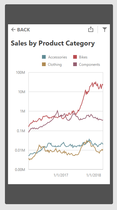
As you can see in this image, end-users can select any item to activate the "item view". When loaded, they can interact with the dashboard item or go back to the “global”  list view.

Filtering

Our redesigned filtering system was designed to improve cross-item interaction. We found that the CTP version could potentially confuse users (the confusion was caused by the manner in which filter items affect the dashboard items being viewed). To help address this issue, our release version includes a new “filters” view.

You can use this view to check the current filter item’s state or quickly navigate to the filter item, modify/change it or come back to the main item.

The ultimate goal with our new filtering UI is to simplify usage – eliminating the need to go back and forth between master and detail dashboard items (which we found a bit annoying in the CTP version).

Other Enhancements

Apart from these major enhancements to our Mobile Dashboard Layout, we have a lot of small changes in mobile rendering, behavior etc.

The Dashboard’s Mobile Layout is enabled by default (you don’t need to manually register an extension any longer). Simply add the viewport tag into your HTML markup to confirm that your site is mobile-ready.

To experience our Mobile Dashboard Layout first hand, please test drive the online demo.

Join the Webinar

Sign up for our upcoming “New in v18.1 - Dashboards, Reporting, Analytics” webinar where you’ll have a chance to see all the new Dashboard v18.1 items demonstrated live and ask any questions about our offerings.

Like it?

If you're a web developer with an active DevExpress Universal Subscription then download our v18.1 beta release today and start creating Dashboards today.

We'd love to hear your feedback about the our Web Dashboard's Mobile Layout feature. Drop me a line below, thanks.


Email: mharry@devexpress.com

Twitter: @mehulharry


Blog Post: XPO - .NET Core Enhancements (v18.1)

$
0
0

Extended database support
With our upcoming release (v18.1), XPO for .NET Core / .NET Standard 2.0 will support the Oracle Data Provider 12.2 for .NET Core in addition to SQL Server, MySql, PostgreSQL, FireBird and SQLite. As we noted in our introductory post, the lack of support for other providers is not a limitation of XPO - only a function of support from RDBMS vendors. Once these RDBMS vendors support .NET Standard 2.0, we will test XPO against these backend providers and will add them to our supported list once our internal qualification requirements have been met.

XPO Profiler supports ASP.NET Core projects
As some of you already know, XPO Profiler is a tool designed to discover performance bottlenecks and code issues. Profiling logs include SQL queries, session method calls, query duration, passed parameters, and callstacks. To enable performance profiling in your ASP.NET Core projects, you'll need to add a special API Controller:

using Microsoft.AspNetCore.Mvc;
using DevExpress.Xpo.Logger;

namespace DevExpress.Xpo.AspNetCoreMvcDemo.Controllers {
    public class XpoLoggerController : Controller {
        readonly static LoggerBase logger = new LoggerBase(50000);
        static XpoLoggerController() {
            LogManager.SetTransport(logger);
        }
        [HttpGet]
        public LogMessage[] GetCompleteLog() {
            return logger.GetCompleteLog();
        }
        [HttpGet]
        public LogMessage GetMessage() {
            return logger.GetMessage();
        }
        [HttpGet]
        public LogMessage[] GetMessages(int messagesAmount) {
            return logger.GetMessages(messagesAmount);
        }
    }
}
Complete documentation will ship with our official v18.1 release. In the meantime, you can use our GitHub demo with the current beta.

Dependency Injection for ASP.NET Core projects
We've implemented new extension methods for the standard IServiceCollection interface to register useful XPO services for the ASP.NET Core pipeline. This follows best practices for the platform and allows you to automatically manage XPO’s data layer and session life cycle as needed.

To call these extensions, the Microsoft.Extensions.DependencyInjection namespace must be imported. Here is an example of the modified ConfigureServices method in the Startup class inside an ASP.NET Core project:

        public void ConfigureServices(IServiceCollection services) {
            services.AddXpoDefaultUnitOfWork(true, options =>
options.UseConnectionString(Configuration.GetConnectionString("SQLite"))
                    .UseConnectionPool(false)
                    .UseThreadSafeDataLayerSchemaInitialization(true)
.UseAutoCreationOption(DB.AutoCreateOption.DatabaseAndSchema)
                    .UseEntityTypes(new Type[] { typeof(User) })
            );
            services.AddMvc();
        }

You can access  or resolve the UnitOfWork service in your Controllers (example), Views markup or Startup (example) class using standard ASP.NET Core techniques. For more information, refer to the Dependency injection in ASP.NET CoreDependency injection into controllers in ASP.NET Core and Dependency injection into views in ASP.NET Core articles in Microsoft documentation.  Additional XPO examples will be available with the official release.

BONUS: I also have an XPO .NET Core version up and running with the Mono runtime on WebAssembly in a Blazor app for both standalone and ASP.NET Core hosted deployment. The example below was used for the in-memory data store within a web browser:

            var serviceProvider = new BrowserServiceProvider(services => {
                services.AddXpoDefaultUnitOfWork(true, options =>
                    options.UseInMemoryDataStore(true)
                    .UseAutoCreationOption(AutoCreateOption.DatabaseAndSchema)
                    .UseThreadSafeDataLayerSchemaInitialization(true)
                    .UseConnectionPool(false)
                    .UseEntityTypes(new Type[] { typeof(WeatherForecast) })
                );
            });

NOTE: we do not officially support WebAssembly-based .NET runtimes at this stage (and of course, Blazor is currently an experimental project). I did this test just for fun and research purposes.  Are you also interested in testing XPO with Blazor? Leave a comment to this post and I will email you my working XPO sample.

Blog Post: It's Official: "Document Server" is Now "Office File API"

$
0
0

Big part of our .NET product line is a non-visual library that allows you to create, modify, and convert office documents in RTF, DOC, XLS, PDF formats, to name a few. In the past, we used different names to refer to the library, such as “Document Server”, “Document Automation”, or “Office File Generation”. With our latest site re-design, we made a change toward clear and consistent naming.

The new official name is “Office File API Subscription”. Those who own the product will see the change applied on Purchase History and Download pages. And when the time comes to renew the subscription, you’ll see the new name too.

The Support Center reflects the change with the following new parent node name and sub-filters:

Old Name New Name
Document Server SubscriptionOffice File API Subscription
Spreadsheet Document ServerSpreadsheet Document API
XL Export LibraryExcel Export Library
Rich Edit Document ServerWord Processing Document API
PDF Document ProcessorPDF Document API
Snap Document ServerSnap Report API
Barcode Generation LibraryBarcode Generation API
Compression and Archive GenerationZip Compression and Archive API
Unit ConversionUnit Conversion API


Office File API remains available as part of the Universal Subscription and can be purchased separately for $599.99. To learn more about the library’s capabilities, to download a free trial or review pricing and renewal options in detail, visit the product’s landing page at: https://www.devexpress.com/Products/NET/Office-File-API/

Blog Post: DevExtreme Charts - New "Material" Palette, Bar Width API, and Other Improvements (v18.1)

$
0
0

The DevExtreme Data Visualization widgets (i.e. charts) have added some notable improvements in our next major release, v18.1.

New "Material" Palette and Palette Extension Modes

DevExtreme Data Visualization widgets made their debut back in 2013. Since then, the idea of how a modern application should look has evolved. Unfortunately, our chart's default appearance remained the same.

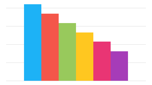
You may have read about the new "Material" theme in the DevExtreme library. Well, we're introducing a new "Material" palette and palette extension modes for the DevExtreme charts too. And it looks fantastic. Here's a comparison of the old on the left and new "Material" palette on the right:

The "Material" palette uses bright colors associated with Material Design and it's now the default palette for DevExtreme charts.

Extension Modes

There's also a set of new palette extension modes. They apply when a chart has several series and the number of colors in a palette is insufficient to draw each series in a different color. Previously, the widgets would only use the alternate mode. Now you can choose between three modes: alternate, extrapolate, and blend:

Alternate Mode

Repeat the full set of palette colors, alternating their normal, lightened, and darkened shades in that order.

Extrapolate Mode

Repeat the full set of palette colors, changing their shade gradually from dark to light.

Blend Mode (used by default)

Create a blend of two neighboring colors and insert it between these colors in the palette.

Setting the paletteExtensionMode option to alternate, extrapolate, or blend specifies the mode.

New Bar Width and Bar Padding API

Customer feedback is valuable to us, in fact, based on use-cases provided by you, we're also adding these new charting features:

  • Specify different bar widths for different series
  • Specify padding for a group of bars associated with the same argument
  • Specify the fixed/relative bar width
  • Specify the fixed/relative bar group width

Control the Bar Width and Padding

You can now set the fixed bar width in pixels for an individual series:

series: [
  { valueField: "year2004", name: "2004", barWidth: 40 },
  { valueField: "year2001", name: "2001", barWidth: 20 }
],

Alternatively, you can use the padding-to-bar ratio to specify the relative bar width:

series: [
 { valueField: "year2004", name: "2004", barPadding: 0.2 },
 { valueField: "year2001", name: "2001", barPadding: 0.7 }
]

In both cases, whatever space is left is reserved for padding. Here's how the chart looks in the default configuration and with these settings applied:

Control the Bar Group Width and Padding

The width and padding of bar groups is controlled similarly to that of single bars. You can use pixel values to specify the fixed bar group width:

{
  ...
  barGroupWidth: 50
}

Here's how the chart looks in the default configuration and with these settings applied:

Or you can use the padding-to-bar group ratio to specify the relative bar group width:

{
  ...
  barGroupPadding: 0
}

Here's the chart when you set barGroupPadding to 0:

Other notable improvements

  1. Data aggregation has been completely revamped. Learn more by reading this blog post.
  2. The Chart's Point object now provides access to the data object it represents via the data field. With data aggregation enabled, the data objects are available via the data field in the aggregationInfo object.
  3. Scale breaks, introduced in v17.2, now can be used in a multi-axis chart:

Angular, Vue, React, ASP.NET MVC / Core and more

All of these new features will be available on all the frameworks we support: Angular, Vue, React, jQuery, Knockout, ASP.NET MVC and .NET Core.

Test It Today

If you want to give these features a test-drive then simply add DevExtreme to your project by adding this npm package:

npm install --save devextreme@18.1-unstable

If you're not using npm, check out my earlier blog post about pre-releases.

Join the Webinar

Sign up for our upcoming “New in v18.1 - DevExtreme HTML / JS Controls” webinar where you’ll have a chance to see all the new DevExtreme v18.1 items demonstrated live and ask any questions about our ASP.NET MVC, ASP.NET Core, React, Vue, or other client-side offerings.

Join the webinar: DevExpress Webinar: New in v18.1 - DevExtreme HTML/JS Controls

Like it?

We'd love to hear your feedback about the DevExtreme Charting improvements. Drop me a line below, thanks.


Email: mharry@devexpress.com

Twitter: @mehulharry

Blog Post: DevExtreme Scheduler - Grouping Improvements and New Context Menu API (v18.1)

$
0
0

As part of the upcoming v18.1 release, we have added improvements to grouping, as well as a new context menu API to the DevExtreme Scheduler. Let's take a look at these enhancements.

Grouping Improvements

We've added the ability to change the default orientation of groups. You can now display groups vertically on the left side or horizontally on the top.

Grouping in a different area can be convenient when the work space is limited and you need to make the view more compact.

To set “vertical” or “horizontal” groups orientation use the groupOrientation option. The option is available on a view configuration level:

$("#scheduler").dxScheduler({ 
// …, 
       views: [{ 
           type: "week", 
           name: "Vertical Grouped Week", 
           groupOrientation: "vertical" 
       }] 
});

If you have questions or suggestions, then please take part in the discussion about this feature on GitHub.

New Context Menu API

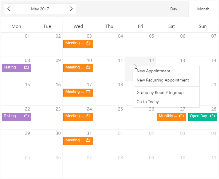
We've also added API events for displaying the context menu for a cell or an appointment. The new onAppointmentContextMenu and onCellContextMenu events help you create your own context menu, and gives your end-users more and better capabilities for interaction with the Scheduler.

These new events help you to create your own context menu. It provides your end-users more capabilities for interaction with the Scheduler.

To customize the context menu appearance, add the following event handlers:

$("#scheduler").dxScheduler({ 
    // …, 
            onAppointmentContextMenu: function(e) { 
            …
        }, 
        onCellContextMenu: function(e) { 
    … 
    } 
});

For example, here's a couple of custom items that we've added near the bottom of each respective menu:

If you have questions or suggestions, then please take part in the discussion about this feature on GitHub.

Angular, Vue, React, ASP.NET MVC / Core and more

All of these new features will be available on all the frameworks we support: Angular, Vue, React, jQuery, Knockout, ASP.NET MVC and .NET Core.

Test It Today

If you want to give these features a test-drive then simply add DevExtreme to your project by adding this npm package:

npm install --save devextreme@18.1-unstable

If you're not using npm, check out my earlier blog post about pre-releases.

Join the Webinar

Sign up for our upcoming “New in v18.1 - DevExtreme HTML / JS Controls” webinar where you’ll have a chance to see all the new DevExtreme v18.1 items demonstrated live and ask any questions about our ASP.NET MVC, ASP.NET Core, React, Vue, or other client-side offerings.

Join the webinar: DevExpress Webinar: New in v18.1 - DevExtreme HTML/JS Controls

Like it?

We'd love to hear your feedback about the DevExtreme Scheduler improvements. Drop me a line below, thanks.


Email: mharry@devexpress.com

Twitter: @mehulharry

Blog Post: WinForms Property Grid - New Office View (v18.1)

$
0
0

The DevExpress Property Grid is an object inspector that displays properties of one or several assigned objects, and allows end-users to modify these properties at runtime. In this image, a Property Grid is attached to the Diagram Control so that users can customize shapes parameters:

Property Grid

Property tabs

Traditionally, the control arranges all public properties in a single tree structure, retrieving the entire hierarchy of properties from the inspected object(s). In our upcoming v18.1 release, we will introduce a feature that allows you to customize the default layout by organizing all properties into convenient tabs, as seen in the UI of the latest Office applications.

Setting up the tabs is easy. Switch the ActiveViewType property to Office, then go to the Tabs page of the control designer. Create one or more tabs and check all those properties in the list that you would like to include on each tab. At runtime, the Property Grid sorts the object properties according to your tab definition.

Property Grid Tabs

Secondary editor for numeric values

The image above reveals a second v18.1 Property Grid feature: the Size property shows two editors simultaneously, a track bar and a SpinEdit. For numeric properties, this makes it easy for the user to adjust values by large margins, but also to be very precise when required. Handle the CustomRowCreated event to enable this additional track bar.

private void PropertyGridControl1_CustomRowCreated(object sender, DevExpress.XtraVerticalGrid.Events.CustomRowCreatedEventArgs e) {
  if (e.Row.Properties.FieldName == "Size") {
    var row = e.Row as PGridNumericEditorRow;
    row.MinValue = 8;
    row.MaxValue = 72;
    row.ShowTrackBar = true;
    row.IgnoreMinMaxForSpinEdit = true;
  }
}

Try it!

The beta release of v18.1 is available to active Universal subscribers now. Please give the new features a try, and get back to us with any feedback!

Viewing all 3388 articles
Browse latest View live