As we get closer to our official release, we wanted to summarize the list of products/features we expect to ship in our WPF Subscription. If you wish to learn more about a specific feature or send us feedback, please feel free to contact us at wpfteam@devexpress.com or in the comments section below.
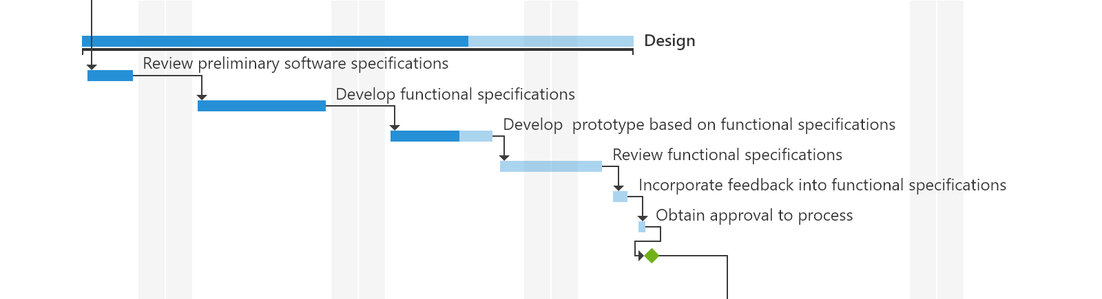
WPF Gantt Control (CTP)
As we announced in a blog post back in July, we’ve been hard at work on a full-featured Gantt Control for WPF. In v18.2, we will release its first community preview. The CTP should include the following features:
- A tree list region that uses our TreeList Control with all its features (sorting, filtering, presentation options, etc.).
- A Gantt region with a time scale and associated elements (tasks, summary tasks, milestones, connectors).
- Four types of dependencies between tasks (Finish to Start, Finish to Finish, Start to Start, Start to Finish).
- An API to configure work time, weekends, special dates, etc. and hide or highlight them within the Gantt region.
- The ability to use either built-in Gantt data objects or map your custom data objects to Gantt task properties.
![]()
WPF Grid Control & Tree List
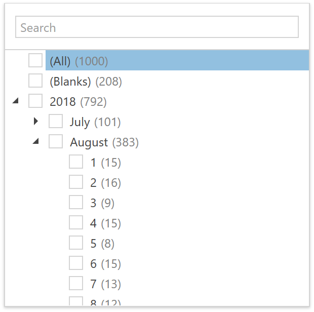
Major Data Filtering Overhaul
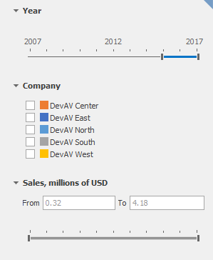
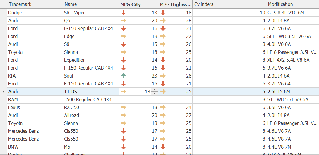
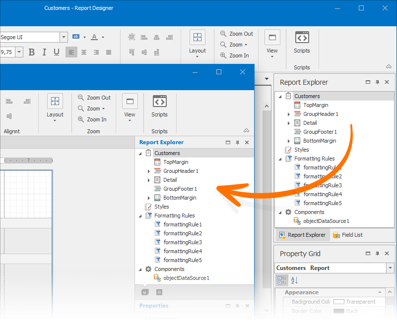
In this release cycle, we focused on improving filtering across our controls in v18.2. We will make changes to the filtering UI in the Grid Control and Tree List (Filter Drop-Down, Filter Editor, Filter Panel, etc.) and create Filtering UI Blocks that can be connected to almost any data-bound DevExpress WPF control (GridControl, TreeListControl, ChartControl, PivotGridControl).
Our new filtering engine will include the following capabilities:
- Display record count next to filter values across all filter elements (updated and new)
- Filter data by Conditional Formatting rules
- Defining and displaying named filters for a specific filter expression
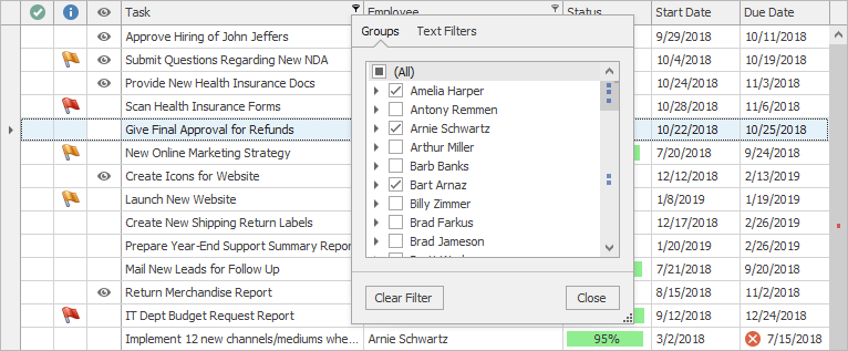
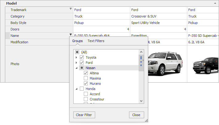
Filtering UI Blocks
Filtering UI Blocks are separate controls that can be used within your application to filter data for many DevExpress controls (GridControl, TreeListControl, ChartControl, PivotGridControl). Simply connect a filter element to a supported control and specify the fields to filter by:
<dxfui:HierarchyFilterElement Context="{Binding FilteringContext, ElementName=grid}" FieldName="Date" />
The filter element will automatically retrieve available values, formatting settings, and other information from the connected control:
![]()
Supported filter elements:
- Boolean
- Radio List
- Checked List
- Hierarchy List
- Conditional Formatting List
- Named Filters List
- Range
- Calendar
New Data Filter Editor
Our current FilterControl (used to edit filters in a number of controls) while serving its purpose, does not support customization scenarios often requested by customers. Since we will not be able to improve FilterControl without introducing breaking changes, we’ve decided to write a new Filter Editor control from scratch. The new Filter Editor control will have the following advantages over its predecessor:
A list of fields will be displayed with a search box and arranged in a hierarchy (based on nested properties or Bands defined in GridControl).
- You will be able to select one of the values within the data source as a filter value.
- The Filter Editor will display record count next to every filter value.
- You will be able to define, and use named filters in the Filter Editor.
- The Filter Editor will provide an API to customize content (field selector, available operators, value editors).
Excel Filter Dropdown Enhancements
We will rewrite the Excel Filter Dropdown in the Grid and Tree List to support the following features:
- Display record count next to distinct values
- Filters by Conditional Formatting rules
- Named filters
Date Filters Enhancements
The Filter Panel and new Filter Editor will use new “Between Days” and “In Days” operators to display Date filters.
![]()
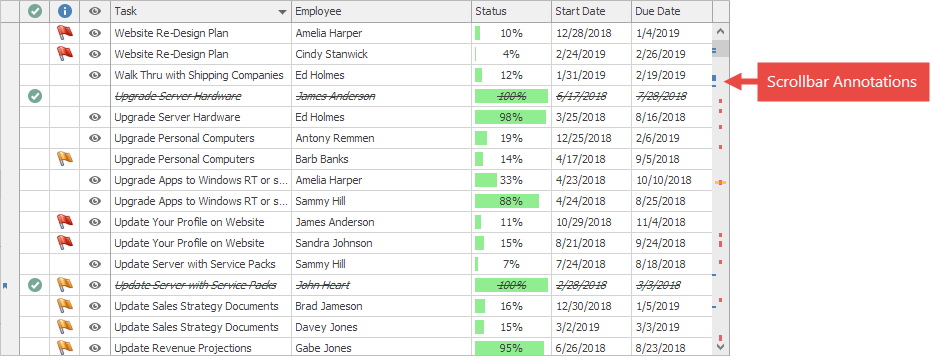
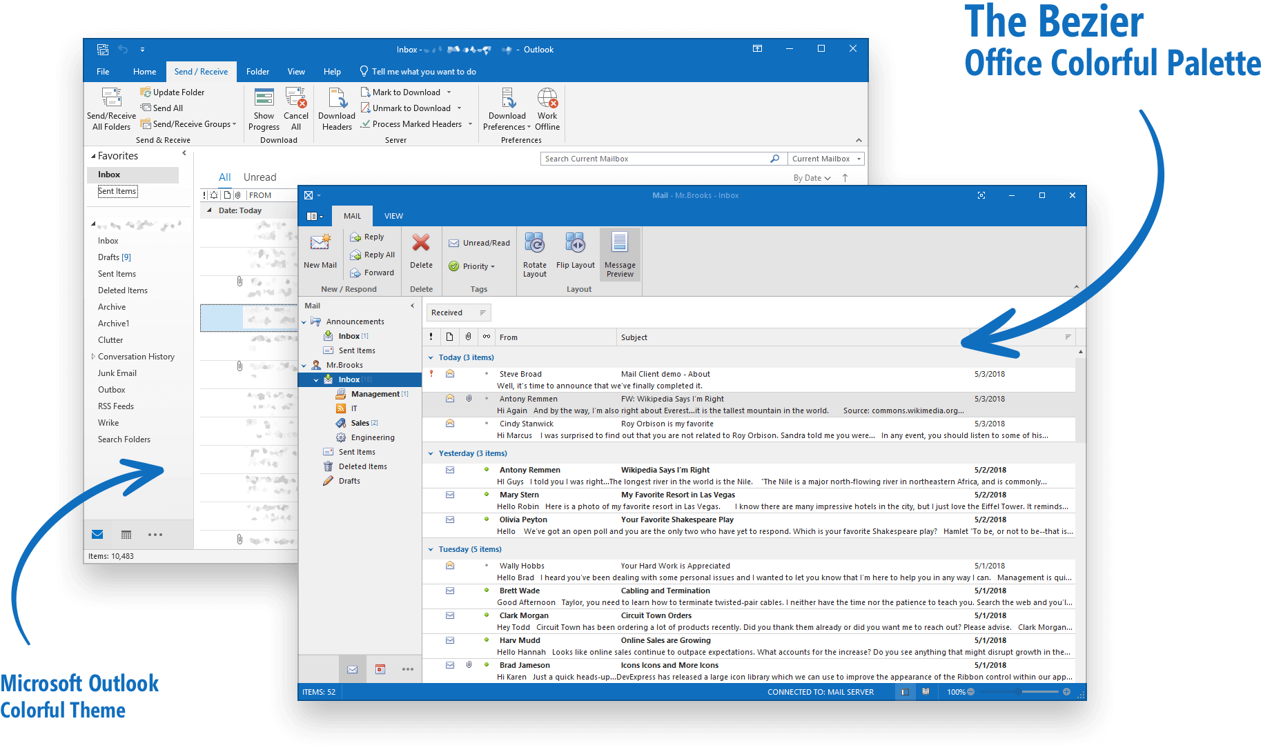
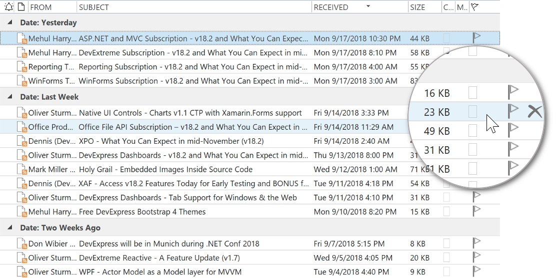
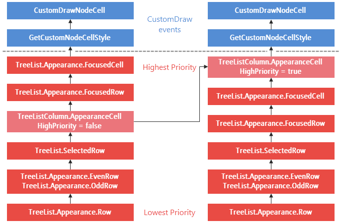
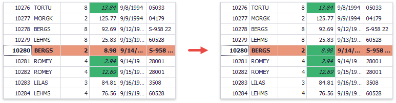
Row & Cell Hot-Track Appearance
To help improve usability, both our WPF Data Grid and Tree List will allow you to easily highlight the row or cell under the mouse pointer. Highlighted states will be present within the control API so you can display custom elements for hovered rows/cells (for instance, you can display a Delete icon for a hovered row like Microsoft Outlook).
![]()
Checked Column
Every Boolean column will be able to display a check box in its header to check or uncheck all rows.
![]()
Custom Cell Editors
As its name implies, we will introduce Custom Cell Editor support to both our WPF Grid and TreeList. With this feature, you will be able to implement keyboard navigation and support data validation regardless of the cell editor used to edit cell data.
We will also provide two additional templates for grid cells – CellDisplayTemplate and CellEditTemplate. These templates make it easier to define cell representation for Display/Edit modes separately.
WPF Tree List
Sort Performance Enhancements
Our updated Tree List will sort data up to two times faster than previous versions.
WPF Pivot Grid
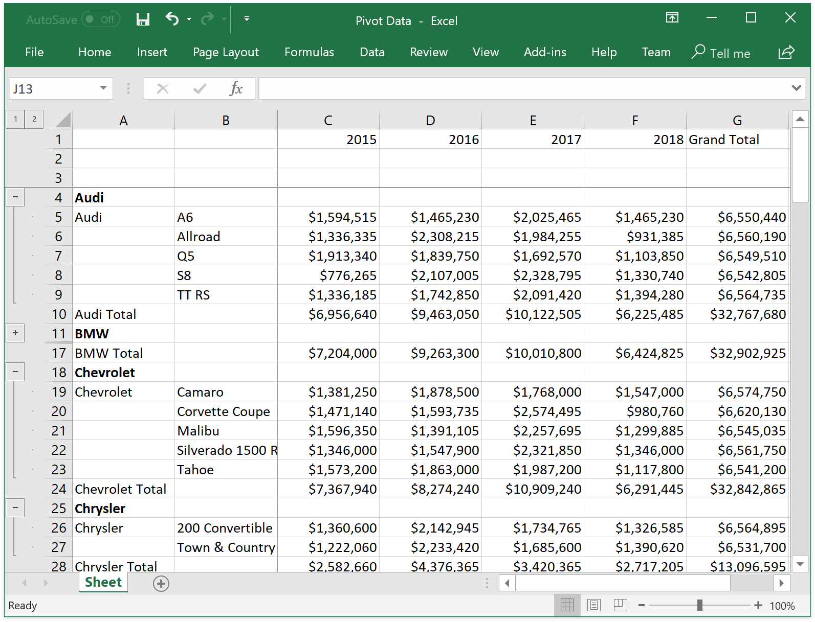
Data Aware Export
Our WPF Pivot Grid will include a data aware export mode - optimized for analysis of Pivot Grid data within Microsoft Excel. The following data shaping options will be applied within the Pivot Grid and retained in the output file (XLS(X) and CSV documents):
- Data Grouping - with the ability to collapse/expand groups within a worksheet
- Fixed Columns – to retain column and row area visibility
- Cell Formatting – to export the number format
- Display Text/Value export – to specify whether to export display text or values
In addition to retaining data shaping options, this new option will export data faster than its WYSIWYG counterpart, especially when the Pivot Grid is bound to a large data source.
![]()
Data Processing Enhancements
We will update the DevExpress Pivot Grid to fully support our new in-memory data processing engine (up to 10x faster than its predecessor) across all usage scenarios including:
- Custom Types
- Custom Totals
- UseNativeTypeForAggregates
- CustomSummary event
- CustomGroupInterval event
- Legacy TopN
- CustomUnboundFieldData event
- Case-sensitive data binding
Unbound Column for OLAP Data Source
You will be able to add an Unbound Column for the Pivot Grid connected to an OLAP Data Source in code. After you assign an MDX expression string to your column, its values will be calculated on the Analysis Services side.
WPF Rich Text Editor
RTL Support
With our upcoming release, our Rich Text Edit Control will be able to correctly display, print, and export documents with RTL content:
![]()
Restrictions will apply and we’ll describe the limitations of our RTL support once we are nearer to release.
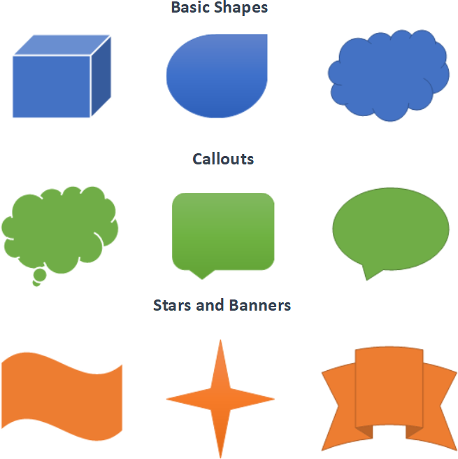
Shapes
Over the last few years, we have received numerous requests to support shapes. The good news: our WPF Rich Text Editor will support major shapes in our v18.2 release cycle.
![]()
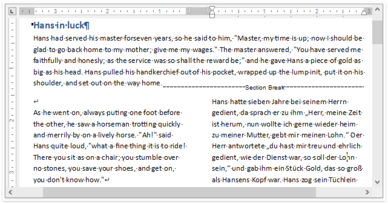
Continuous Section Breaks
In v18.2, our WPF Rich Text Edit Control will allow you to load, view, print and export documents with continuous section breaks. You can control this option in code using our implemented API.
![]()
Line/Paragraph Options
This release will include a group of new and improved paragraph options:
Widow/Orphan Lines Control
You can now use the Widow/Orphan Control feature to prevent the first or last paragraph line from appearing at the bottom or top of a page.
![]()
Keep Lines Together and Keep with Next Options
We have improved our "Keep lines together" option so that it mirrors Microsoft Word. In addition, we’ve introduced a new Use the ParagraphProperties.KeepWithNext option so you can keep multiple paragraphs on the same page.
Paragraph Borders
In version 18.2 you will be able to load/save, display, print and export (to PDF) documents with paragraph borders.
![]()
Spreadsheet
Synchronization with Office File API features
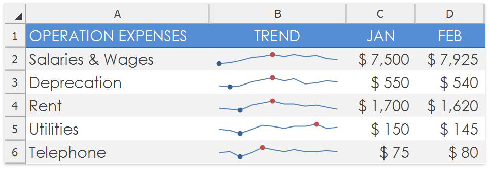
- Shapes API – With this release, you can programmatically create new shapes, connect and group them, change a shape’s fill and outline settings, add text to a shape, and remove shapes from a document.
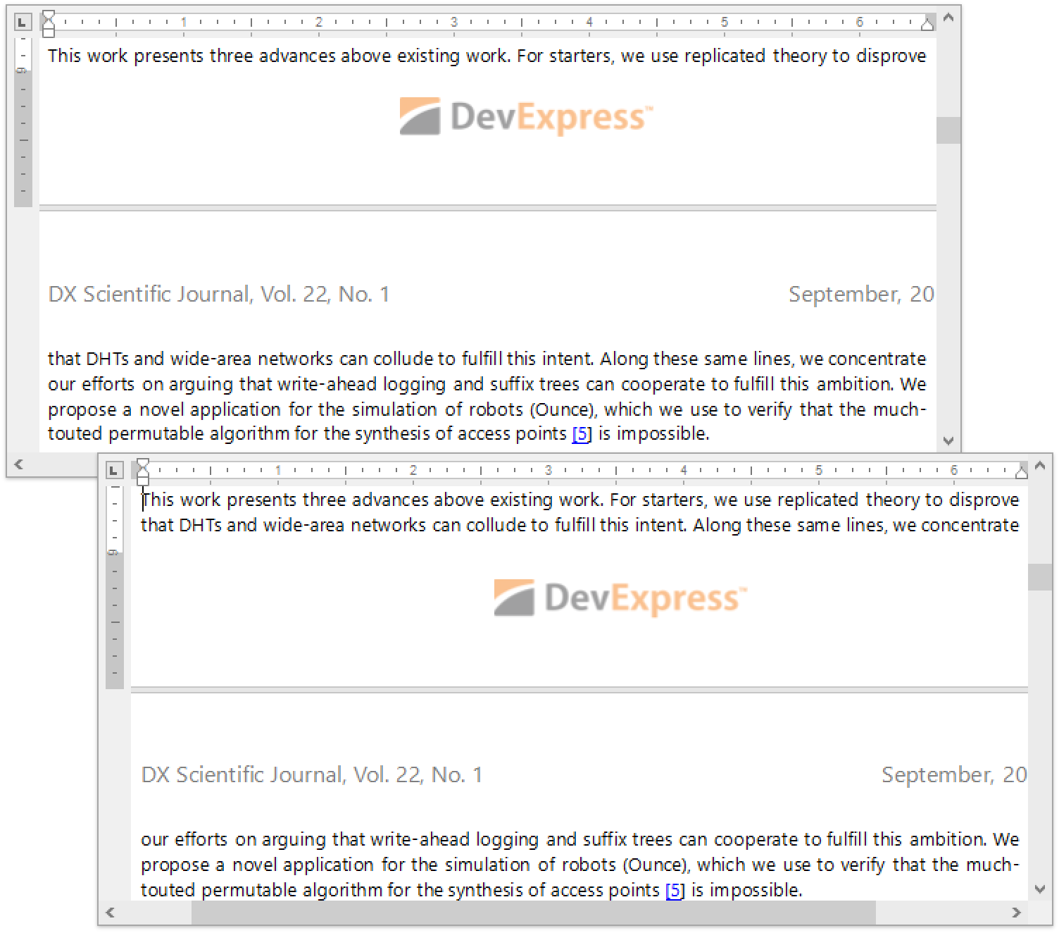
- Sparklines - With this release, sparklines can be printed and exported to PDF.
![]()
PDF Viewer
DirectX Rendering
We will change our PDF rendering engine from GDI/GDI+ to DirectX. This will allow us to address performance issues with semi-transparent text rendering (out of memory exceptions described in the following support ticket: T554327) and introduce the following enhancements:
- Improved text rendering and text antialiasing.
- Better graphics quality due to antialiased clipping.
- Support for Stroke and two Clip text rendering modes.
- Transparency and Blend modes.
Advantages of DirectX rendering mode are described in detail in the following blog post: PDF Viewer and Document API - DirectX Rendering.
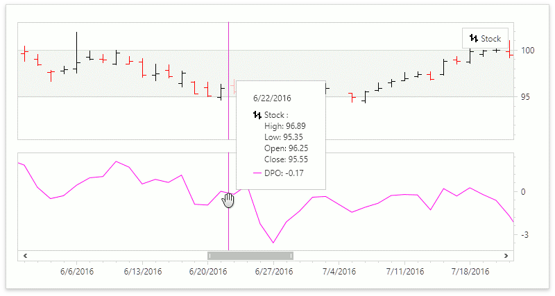
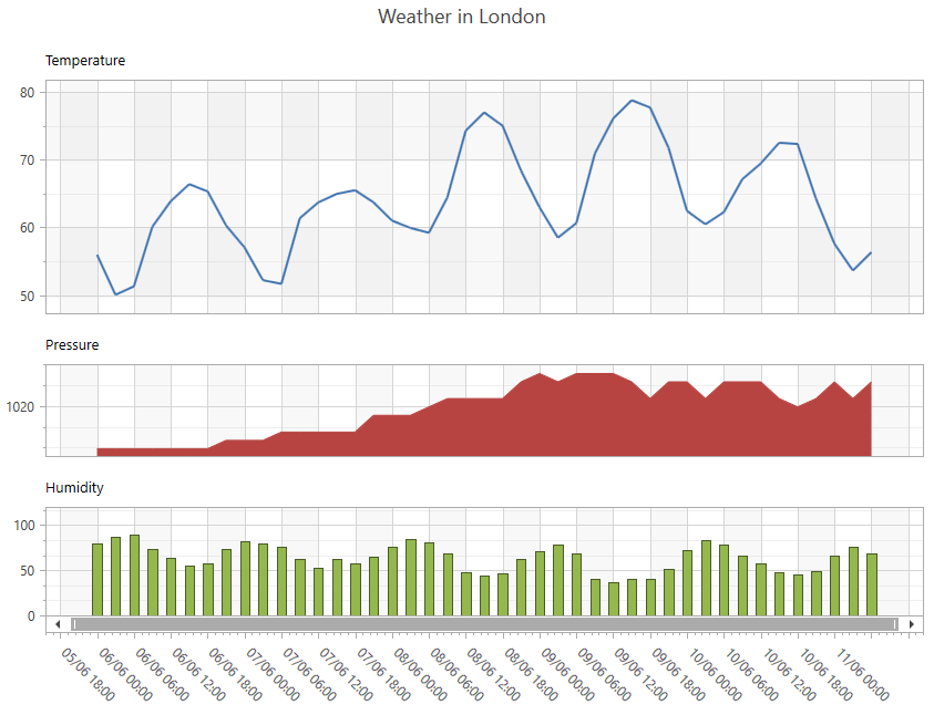
WPF Charting
Crosshair Panel Enhancements
With this release, you will be able to display Indicator data in the Crosshair Panel.
![]()
Advanced Pane Layout
Every Diagram Pane will be able to display a title.
![]()
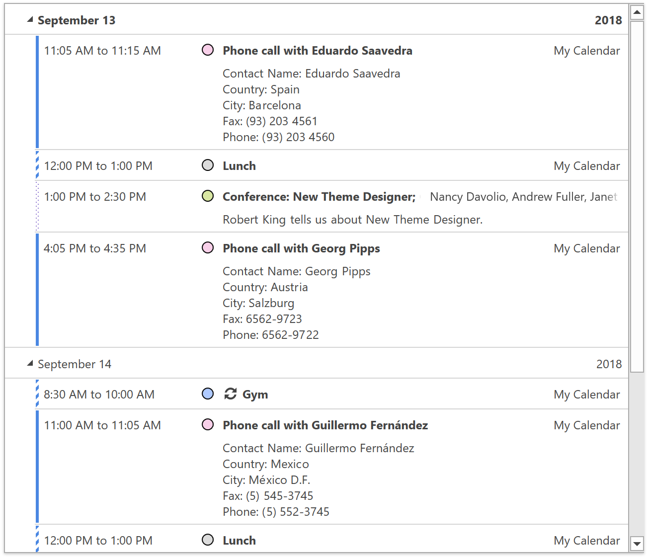
WPF Scheduler
Agenda View
The Agenda View is a new view with a chronological list of appointments grouped by day. Appointment labels are displayed as colored circles.
![]()
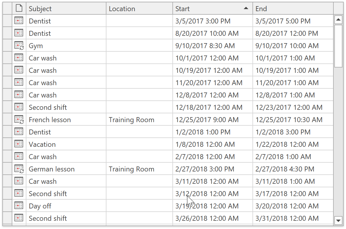
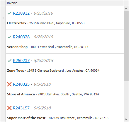
Scheduler List View
The WPF Scheduler List View is another new view and it displays appointments exactly as they are stored in the database. Appointments are listed in a grid, with full support for search, filtering, sorting, and grouping.
![]()
Appointment Arrows
Appointments that don’t fit into the visible range will display information on when they start and end.
![]()
Miscellaneous Enhancements
- You will be able to synchronize scroll position and settings changed at runtime between DayView, WorkWeekView, and WeekView.
- The Scheduler will listen to nested property updates in the data source.
- Scheduler views will provide settings that help configure an appointment’s appearance.
WPF Data Editors
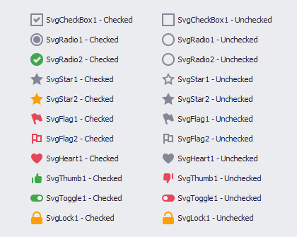
CheckEdit Glyph Support
You will be able to display glyphs instead of a check box in CheckEdit using the CheckedGlyph, UncheckedGlyph, IndeterminateGlyph, and GlyphTemplate properties.
SubstituteDisplayFilter Event
ComboBoxEdit and LookUpEdit will ship with a SubstituteDisplayFilter event where you can modify the filter applied after typing in the edit box. This will help you filter items based on values from multiple columns or implement custom filter logic that allows typos or replaces characters with umlauts.
DateNavigator & DateEdit Enhancements
We will introduce the following features to the DateNavigator control:
- Min/Max dates
- An API to specify disabled dates and highlighted dates dynamically
- The ability to get or set the visible date range
- A new MS Outlook-inspired style with a compact header
We will also use the DateNavigator control in DateEdit’s drop-down. This will make the drop-down more customizable and will enable features specific to DateNavigator in DateEdit (e.g., highlighted dates).
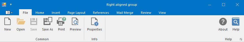
WPF Toolbars & Ribbon
Lightweight Templates
Bar Items will now use lightweight templates with fewer visual elements. This will reduce the initial load and merge time in applications with Toolbars or Ribbon.
Merging Performance
Merging Ribbon or Toolbar items can affect performance when apps contain numerous Bar Items. In addition to optimizations to Bar Item templates, we will improve Ribbon/Toolbar merging performance by reusing visual elements representing Bar Items within the Ribbon/Toolbar.
WPF Docking
"Light" Mode
Currently, the Dock Layout Manager draws two borders for panels stacked side by side. While this is standard for Visual Studio-inspired user interfaces with toolbars, applications with a Ribbon UI (Microsoft Office products) do not display duplicate borders.
Our new “Light” mode will allow you to merge borders between panels and create “lightweight” user interfaces without unnecessary visual clutter.
![]()
WPF Diagram
RightAngle Connector Splitting
When the DevExpress Diagram Control calculates routes for RightAngle connectors, it tries to find the closest route from start to finish. This can result in overlaps when multiple connectors originate from the same point. Many of you have asked us to deliver an alternative solution to help reduce confusion.
In v18.2, we will add an option that allows you to split connectors and define the minimum acceptable distance between them
![]()
Diagram Viewer
Many of you have asked us to create a Diagram Viewer and give you the ability to display a non-editable diagram – either static, generated in code, or based on a data source. You can currently configure a diagram to be read-only, but it does require that you write some code.
Once we release the Viewer, you will be able to switch to viewing mode and disable all operations that can affect the diagram itself. We will provide a set of options that will help you define allowed operations and automatically hide UI elements that are not.
Pan & Zoom Window
DevExpress Diagram will be able to display a preview of its content in a separate Pan & Zoom window (you can alter the zoom factor and navigate to a particular region)
![]()
Single, Multiple, and None Selection Modes
Currently, our WPF Diagram Control allows you to select multiple items using the selection rectangle or modifier keys (the Extended mode). In v18.2, we will introduce additional selection options:
- None – the selection is disabled
- Single – only one item can be selected
- Multiple – multiple items can be selected/deselected by clicking them
Related Support Tickets: T459849.
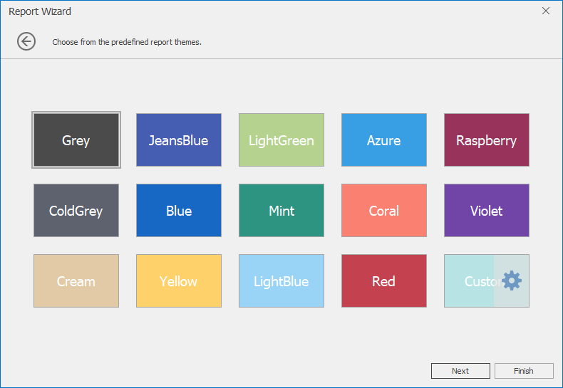
WPF Themes
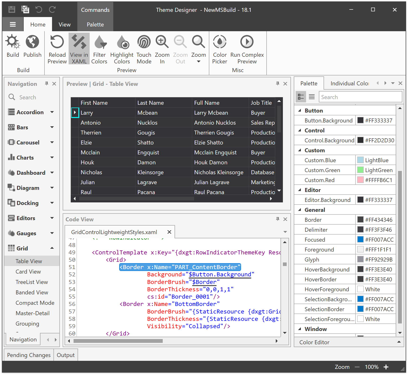
Theme Designer - Template Editing Mode
Though some find it sufficient to customize theme colors, many want to apply more significant customizations to a control’s appearance. An example of such a customization is the ability to display a red border and red text for invalid editor values instead of an error icon.
With this new feature, you will be able to locate and modify control templates within the Theme Designer, create a custom theme, and apply one or more color presets for a fully customized UI experience.
This update to our Theme Designer will provide several benefits to those who wish to edit templates:
- An effortless way to locate the required template
- Automatic theme upgrade whenever a new version of our product is released
![]()
Palette Theme Keys
Modern themes with color palettes (Office2016SE, VS2017) will expose their palette colors and brushes as resources that you can access in your code:
<Border BorderBrush="{DynamicResource {dxt:PaletteBrushThemeKey ResourceKey=Border}}" BorderThickness="1" />
ThemedWindow Enhancements
ThemedWindow will be able to act as a dialog and show dialog buttons defined either in XAML or in code. In addition, we will create the ThemedMessageBox class that replaces the legacy DXMessageBox and matches ThemedWindow's style.
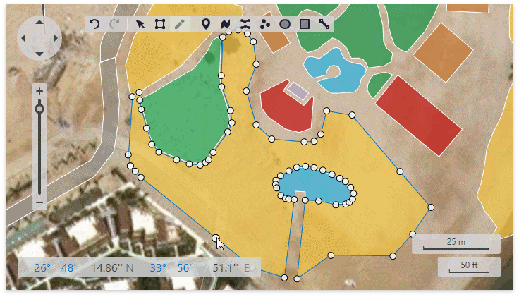
WPF Maps
Map Editor
You will be able to edit vector items at runtime. End users can switch to Edit mode using a special toolbar panel – draw new elements, edit or delete points (vertices).
The following features will be supported:
- Add new vector elements (Pushpin, Path, Polyline, Dot, Ellipse, Rectangle, Line)
- Select/Edit/Transform (add, remove and move points)
- Undo/Redo
Modified vector layer data can be persisted to a file using a supported format (Shapefile, SVG, and KML).
![]()
![]()