Since we announced the Gantt control back in July, we frequently received questions about its current status, whether it will be released in v18.2, and which features the CTP will include. In this blog post I will describe the upcoming features and peek into our plans for 2019.
Main Concept
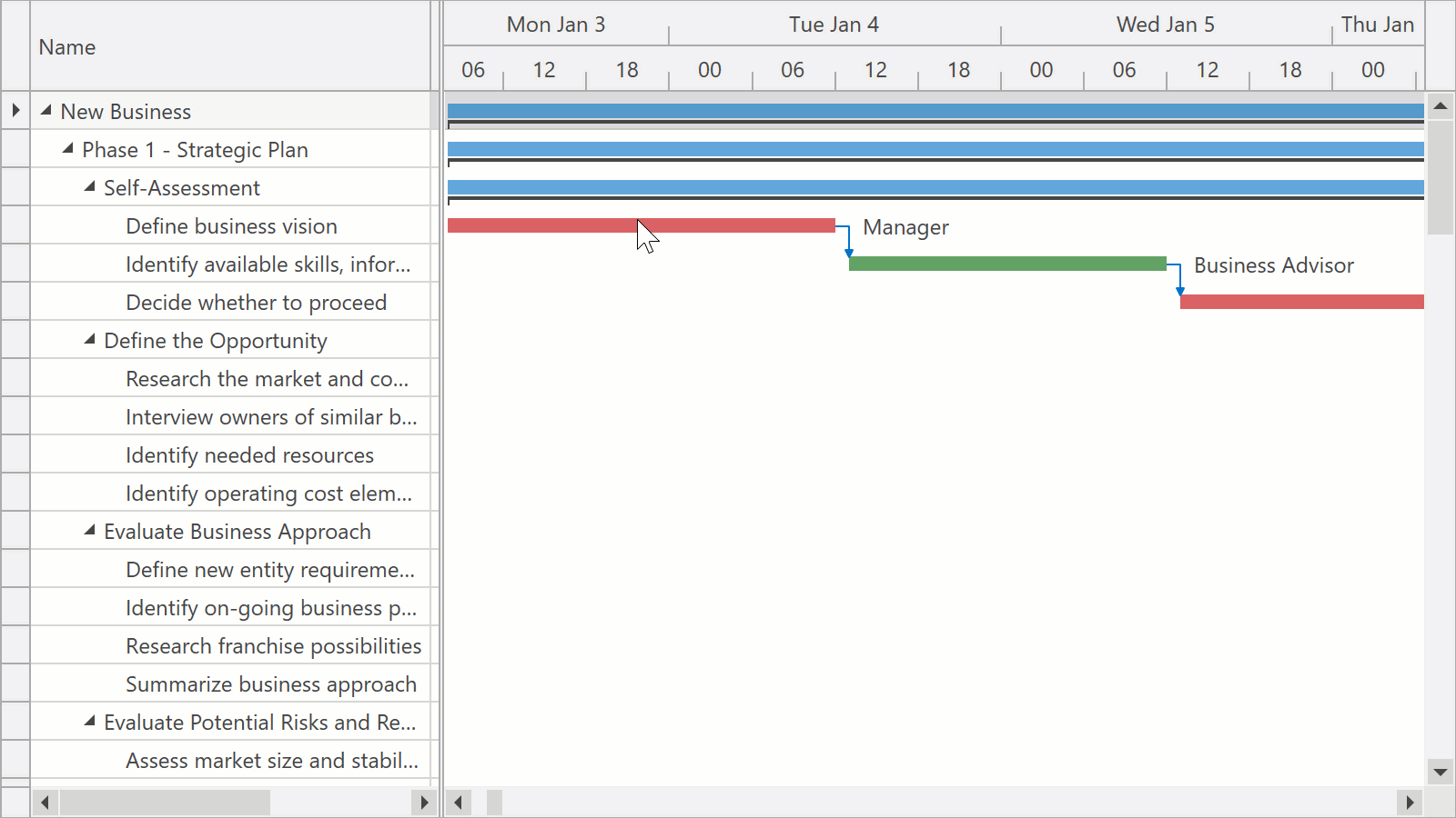
As described in the announcement blog post, the Gantt control is a data-bound control that displays tasks from its ItemsSource in both a tree list and a Gantt area.
![]()
We evaluated several approaches and decided to make the Gantt control a TreeListControl descendant. This has the following advantages:
- The Gantt control uses the existing engine of the TreeListControl to handle its data. It benefits from performance optimizations we’ve made in recent years and supports both self-referential and hierarchical sources.
- The Gantt control supports all existing TreeListControl features, from data operations like filtering and sorting to cell editors and appearance settings.
- Those of you who have worked with the GridControl or the TreeListControl before can configure the Gantt control using a familiar API.
Data Binding
The Gantt control displays a collection of objects assigned to its ItemsSource property. To position these objects in the Gantt area, you need to map their properties to at least two out of the three basic task settings StartDate, FinishDate, and Duration - if you don't map all three, the remaining one will be calculated automatically.
<dxgn:GanttView StartDateMapping="Start" DurationMapping="Duration" />
Other task settings – including Name, Progress, Predecessor links, Baseline dates and duration - can also be linked to your data using mappings.
The DevExpress MVVM Library now also provides the GanttTask class that you can use in your ViewModel. When the Gantt control works with the GanttTaskclass or a descendant, you don't need to specify mappings.
Column Configuration
For every mapping you specify, you can also define a column to display in the tree list area.
<dxgn:GanttColumn BindTo="StartDate" /><dxgn:GanttColumn BindTo="Duration" />
The BindTo property links a column to a specific task setting and allows the Gantt control to automatically configure column options (preferred width, cell editors, etc.)
Columns that are not linked to task settings and display custom data can be defined in the same manner as for the Data Grid or Tree List:
<dxgn:GanttColumn FieldName="Status" Width="45"/>
Task Types
The Gantt control can display three types of items: Tasks, Summary Tasks, and Milestones. The item type is determined automatically: a task with no duration is a Milestone, and a task with children is a Summary Task. Tasks and Summary Tasks can display their progress states in the Gantt area.
![]()
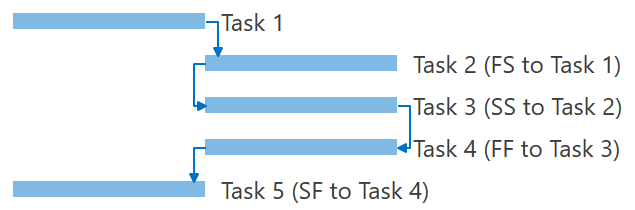
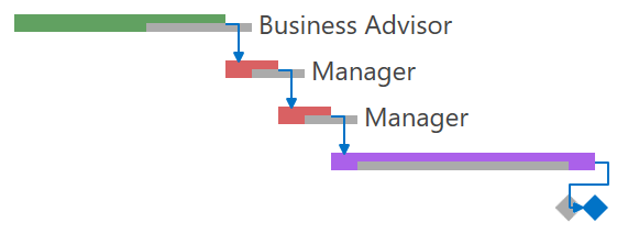
Predecessors
You can describe relations between tasks using separate data objects. Your data objects need to link tasks to their predecessors and can also specify a dependency type.
![]()
Predecessor links can either be defined as a separate collection (PredecessorLinksSource) or a property in a task object (PredecessorLinksPath). In both cases, mappings allow you to connect properties in your data object to link settings.
<dxgn:GanttView.PredecessorLinkMappings><dxgn:GanttPredecessorLinkMappings PredecessorTask="PredecessorId" LinkType="Type" /></dxgn:GanttView.PredecessorLinkMappings>
Just like for GanttTasks, the DevExpress MVVM Library includes the GanttPredecessorLink class that you can use in your ViewModel instead of specifying mappings.
Baseline Support
If your data objects store information about their originally planned dates and duration, you can display this information in the Gantt area.
![]()
Baseline dates and duration can be linked to task settings using mappings.
Dynamic Zoom Levels
End-users can change the zoom factor in the Gantt area. When zooming with the mouse, the Gantt control scrolls to retain focus on the mouse pointer position.
![]()
In code, the zoom level is defined by a TimeSpan value that equates to a single pixel.
Timescale
The Timescale automatically adapts to the current zoom level. You can define how many rows the Timescale displays using the TimescaleRulerCount property. By handling the RequestTimescaleRulers event, you can also specify ruler units, their formatting, and other options. For example, the code below shows the Month and Day rulers when one day takes up from 15 to 100 pixels.
private void GanttView_RequestTimescaleRulers(object sender, RequestTimescaleRulersEventArgs e) {
    if (e.Zoom < TimeSpan.FromDays(1d / 15) && e.Zoom > TimeSpan.FromDays(1d / 100))
        e.TimescaleRulers = new List<TimescaleRuler> { new TimescaleRuler(TimescaleUnit.Month), new TimescaleRuler(TimescaleUnit.Day) };
}
Working Time and Holidays
The Gantt control provides a flexible set of rules that allow you to specify non-working days and define working time for each day. These rules describe to which days a custom schedule should apply and resemble the Recurrence Rule in the iCalendar format.
For example, this rule configures the workday to end one hour earlier every Friday:
<dxgn:GanttView.WorkingTimeRules><dxgn:WorkingTimeRule WorkingTime="8:00-12:00,13:00-16:00" Recurrence="{dxgn:Weekly DayOfWeek=Friday}" /></dxgn:GanttView.WorkingTimeRules>And this rule specifies that Thanksgiving (the fourth Thursday in November) is a holiday:
<dxgn:GanttView.WorkdayRules><dxgn:WorkdayRule IsWorkday="False" Recurrence="{dxgn:YearlyByDayOfWeek Month=11, DayOfWeek=Thursday, Week=4}" /></dxgn:GanttView.WorkdayRules>Of course you can also pass a list of holidays from your ViewModel to the Gantt control:
<dxgn:GanttView.WorkdayRules><dxgn:WorkdayRule IsWorkday="False"><dxgn:SpecificDays Days="{Binding Holidays}" /></dxgn:WorkdayRule></dxgn:GanttView.WorkdayRules>By default, the Gantt control highlights all non-working days and non-working time in the Gantt area. There is an option to turn this highlighting off or remove non-working days and time from the Gantt surface.
Appearance Customization
We know how important it is to customize the appearance of tasks in the Gantt control. Colors and additional elements can help your users visually group similar activities, recognize different resources, and understand task states.
You can use styles to customize task appearance in the Gantt control. Styles support a wide range of customization scenarios from simple background customization to your own task template. Here are a few examples.
This style colors all unfinished tasks that are behind schedule:
<dxgn:GanttView.TaskStyle><Style TargetType="dxgn:GanttTaskControl"><Style.Triggers><DataTrigger Binding="{DXBinding 'Row.Finish lt $sys:DateTime.Now and Row.Progress lt 100'}" Value="True"><Setter Property="Background" Value="LightCoral" /><Setter Property="ProgressBackground" Value="DarkRed" /></DataTrigger></Style.Triggers></Style></dxgn:GanttView.TaskStyle>![]()
And this style changes the appearance of all tasks:
<dxgn:GanttView.TaskStyle><Style TargetType="dxgn:GanttTaskControl"><Setter Property="BorderThickness" Value="1" /><Setter Property="BorderBrush" Value="Black" /><Setter Property="CornerRadius" Value="3" /></Style></dxgn:GanttView.TaskStyle>
![]()
Apart from customizing styles, you can also define what is displayed in a task’s content area:
<dxgn:GanttView.TaskContentTemplate><DataTemplate><TextBlock Text="{Binding Row.Progress, StringFormat=#0\\%}" /></DataTemplate></dxgn:GanttView.TaskContentTemplate>![]()
What's Next?
With the presentation part complete, we want to focus on editing in the next release cycle. Currently you can edit tasks in the Tree List area, and your changes are reflected in the Gantt area. However, we want to introduce automatic calculations within the same task (e.g., recalculating Duration when the FinishDate property is modified) and other dependent tasks (e.g., shifting a task when its preceding task is delayed). We also want to implement editing directly in the Gantt area (dragging tasks, changing their progress, making connections).
Please Tell Us Your Thoughts
As always, your feedback is vital. We are looking forward to hearing your thoughts on the new Gantt control and we will adjust and refine our plans depending on what we hear from you. Did you find the features you were looking for in this blog post? Is there anything else that you would like to see implemented? Let us know in the comments below or contact us at wpfteam@devexpress.com.
A final note: In comments on our previous blog post, many of you were asking about a Gantt control for WinForms. The WinForms team is currently discussing its plans, and the Gantt control has not yet been confirmed. Feel free to drop them an email at winformsteam@devexpress.com to share your opinion.
![]()


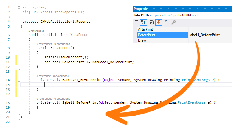
 in the Properties panel shown in the screenshot above. In Solution Explorer you might notice that the ASP.NET Core Report Designer shows a