We've added an improvement to the DevExpress ASP.NET Bootstrap controls that will boost the performance of page rendering. Let's take a look.
Deferred Client Object Initialization
When a control is first loaded, it also needs to load its client-side scripts. This can either be done by using:
- a script resource reference tag (eg
<script id="dxis\_%id%" type="text/javascript" \>) or - an inline JavaScript snippet (a startup script block)
In either scenario, the browser will pause as it loads and executes the script. In fact, if it's an external JavaScript file then you'll need a few more milliseconds to fetch the script from disk, cache, or remote server.
These types of script blocks affect your page rendering performance. So, we've added a couple of ways that help you deal with script loading and, subsequently, improve the overall performance.
Async
With the latest release, the script resource references are rendered as script blocks with the useful async attribute:
<script id="dxis\_%id%" type="text/javascript" async\>
The Async attribute allows the script resources to load asynchronously, therefore in parallel to page loading. This helps your page rendering times because the page will continue to display/render the content for the end-user without waiting for the scripts to finish loading.
Delayed
However, startup scripts will not use the Async attribute because they can be completely delayed until the end of the of the page. Therefore, startup scripts are treated as delayed initialize blocks and executed after all related script resources are loaded.
We've added the new allowClientObjectDeferredInitialization option for this specific purpose.
Performance
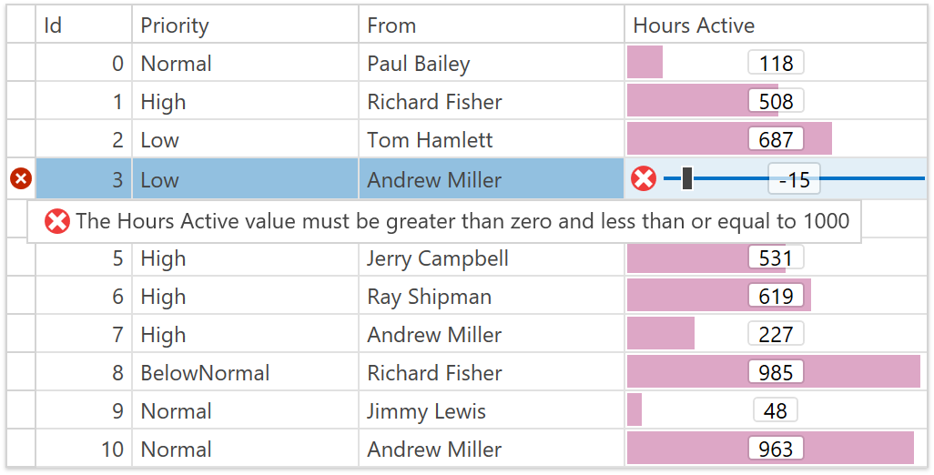
Let's take a look at how the new improvements perform in Google Chrome. For the tests below, we use the DevExpress ASP.NET Bootstrap Navigation Demo demo page.
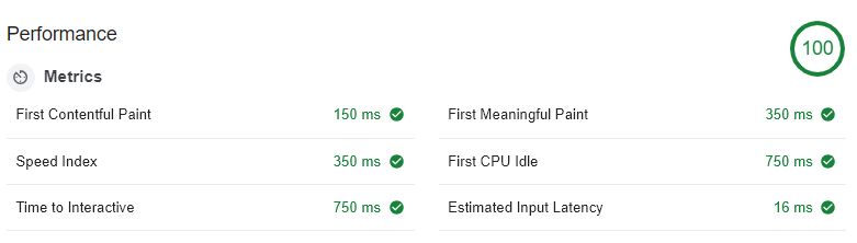
First, let's take a look at the performance without the improvements:
allowClientObjectDeferredInitialization = false
![DevExpress-ASPNET-Bootstrap-v182-Perf]()
Google Chrome Lighthouse audit (desktop, performance test, no throttling)
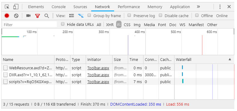
![DevExpress-ASPNET-Bootstrap-v182-Perf]()
Google Chrome Network stats
Now, let's take a look at with the new improvements:
allowClientObjectDeferredInitialization = true
![DevExpress-ASPNET-Bootstrap-v182-Perf]()
Google Chrome Lighthouse audit (desktop, performance test, no throttling)
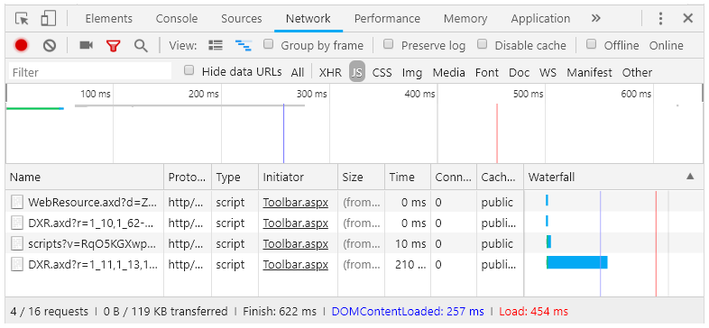
![DevExpress-ASPNET-Bootstrap-v182-Perf]()
Google Chrome Network stats
The network statistics tab shows that the page does not wait for script resource to finish loading (the blue vertical line indicates the DOMContentLoaded event raise timestamp, the red one - window load event raise timestamp).
Take a look at the specific lines with the option disabled and enabled:
allowClientObjectDeferredInitialization = false![DevExpress-ASPNET-Bootstrap-v182-Perf]()
allowClientObjectDeferredInitialization = true![DevExpress-ASPNET-Bootstrap-v182-Perf]()
The new script loading option speeds up page load times and therefore, allows your end-users to start interacting with the page sooner.
Async & Client-side API
Good news, our client-side static API is still available for developers even if the deferred client object initialization is enabled.
You can use global events to track the control's initialization:
<script type="text/javascript"\>
    function onButtonInit(s, e) {
            console.log(s.GetMainElement().id, "from control init");
        }</script><dx:BootstrapButtonID="BootstrapButton1"runat="server"AutoPostBack="false"Text="Button"ClientInstanceName="btn1"\><ClientSideEventsInit="onButtonInit"/\></dx:BootstrapButton\><scripttype="text/javascript"\>
    ASPxClientControl.GetControlCollection().ControlsInitialized.AddHandler(function(s, e) {
        console.log(btn1.GetMainElement().id, "from global init handler");
});</script\>![DevExpress-ASPNET-Bootstrap-v182-Perf]()
The attached handler will be executed after all other scripts are loaded and executed, and the controls are initialized.
Warning
Please note, there may be JavaScript errors when accessing or modifying our controls from a script loaded afterward or in the jQuery $.ready() function.
To avoid this problem, please use the ASPxClientControlCollection.ControlsInitialized event to initialize all the required client-side scripts. This event is raised after all our controls are fully initialized and it's also the generally recommended way that you load your custom scripts. Take a look at the How to ensure that controls are initialized on the client side example to see how to use this event.
Old Style
By default, the new allowClientObjectDeferredInitialization will be set to true. However, if for some reason you'd prefer to use the old approach, then set allowClientObjectDeferredInitialization to false:
<configuration\>
  ...<devExpress\>
        ...<bootstrap allowClientObjectDeferredInitialization="false" /\>
        ...</devExpress\></configuration\>
Also, please make sure that the bootstrap section is defined in the web.config:
<configuration\><configSections\><sectionGroupname="devExpress"\>
        ...<sectionname="bootstrap" type="DevExpress.Web.Bootstrap.BootstrapConfigurationSection, DevExpress.Web.Bootstrap.v18.2, Version=18.2.3.0, Culture=neutral, PublicKeyToken=b88d1754d700e49a" requirePermission="false"/\></sectionGroup\></configSections\>
  ...</configuration\>
What are your thoughts on the new performance improvements of the DevExpress ASP.NET Bootstrap controls? Drop me a line below.
![]()


