Quantcast
Channel: Developer Express Global
Viewing all 3394 articles
Browse latest View live

Blog Post: WinForms - Visual Studio Palette Editor (v19.1)

$
0
0

The introduction of vector skins brought with it a second innovation for our skinning engine: palettes. A palette is basically a skin for a skin. Element settings like border widths, sizes and visibility are stored in a skin, while color themes moved into palettes. This means you can have countless color variations of the same skin.

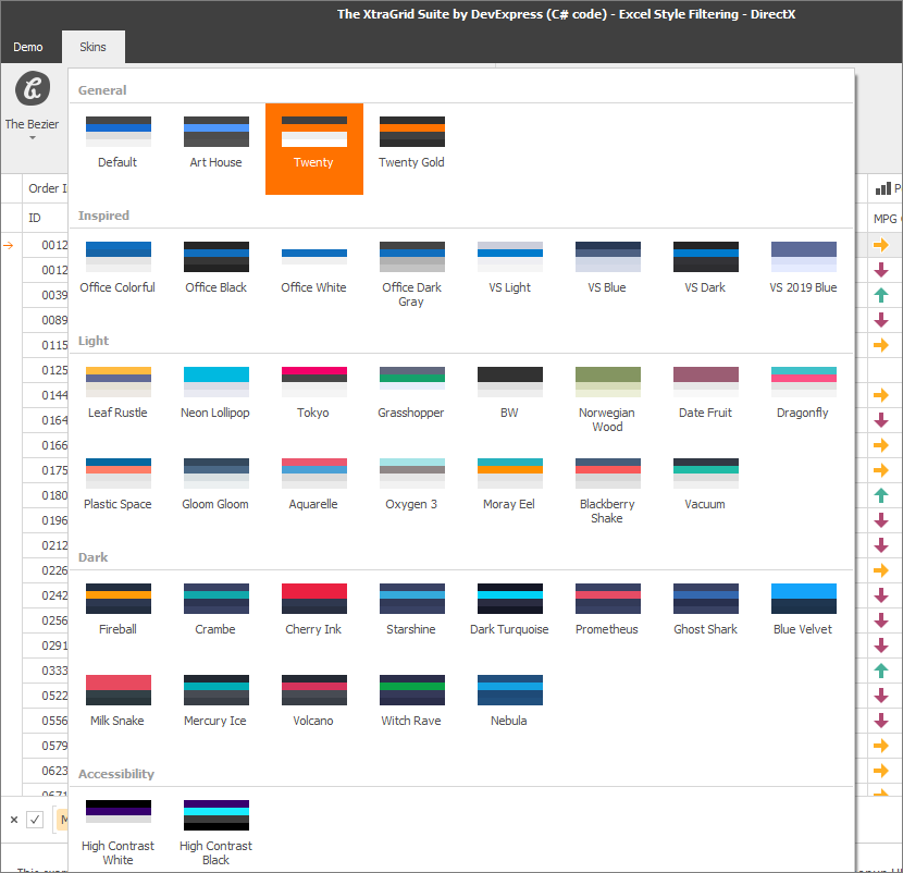
Currently there are two DevExpress vector skins and each of them has a set of unique color palettes. The Office 2019 Colorful skin ships with 7 palettes, the Bezier skin even has 42.

Default Palettes

Of course there are still reasons why you may want to use your own palette:

  • To reflect your corporate brand
  • To apply small modifications to existing palettes
  • To accommodate palettes completely different from our standard ones, for instance black&white or specific high contrast color schemes

To create a custom palette, you can run our Skin Editor and press F7. A dialog comes up where you can change individual colors for out-of-the-box palettes or create unique new ones.

Skin Editor

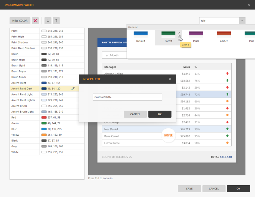
When you select a color from the list on the left, the preview highlights UI elements painted with this color. This feature allows you to find out how colors are used by the skin, and to easily see the difference between items, e.g. Brush Light and Brush High. To apply a palette created using the Skin Editor, you need to create an assembly and include it in your project.

A second option is to add or modify palettes from code.

// obtain a vector skin reference
var commonSkin = CommonSkins.GetSkin(LookAndFeel);
// create a new palette
var svgPalette = new SvgPalette();
// set up palette colors
svgPalette.Colors.Add(new SvgColor("Paint", Color.FromArgb(242, 242, 242)));
svgPalette.Colors.Add(new SvgColor("Paint High", Color.FromArgb(255, 255, 255)));
svgPalette.Colors.Add(new SvgColor("Paint Shadow", Color.FromArgb(222, 222, 222)));

// replace the default color palette with a custom one
commonSkin.SvgPalettes[Skin.DefaultSkinPaletteName].CustomPalette = svgPalette;
LookAndFeelHelper.ForceDefaultLookAndFeelChanged();

// OR add a new palette
commonSkin.CustomSvgPalettes.Add(new SvgPaletteKey(
  commonSkin.CustomSvgPalettes.Count, "Glacier"), svgPalette);

Using the code-based approach eliminates the requirement to have an extra assembly, but you don’t have visual feedback – only experienced users know exactly what each color does, and how to hard-code color values.

In version v19.1 we are adding the Visual Studio Palette Editor. Open the Project Settings page and click the Edit button next to the palette gallery. A dialog comes up similar to the one in the Skin Editor, including interactive preview and text hints which explain each color.

Visual Studio Palette Editor

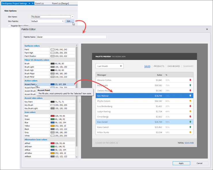
You can also start from a standard palette that is close to your requirements, and then change some of the colors as needed.

Starting with a standard palette

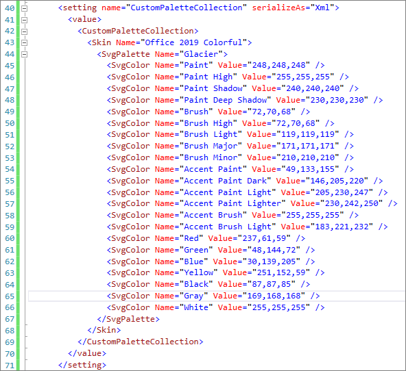
The important difference compared to the Skin Editor approach is that the Visual Studio Palette Editor saves your work to the App.config file in the project, in XML format. This makes it easy to maintain and share palette definitions without requiring an extra assembly reference.

Palette settings in App.config

What do you think? Do you use custom palettes yet? Does the new editor make this decision easier for you?


Blog Post: WinForms - New Layout Panels (v19.1)

$
0
0

Our Layout and Data Layout Controls can create the most sophisticated and complex UI structures – you can arrange hundreds of elements in a form or user control, split them into groups and tabs, persist and restore layouts.

These components wrap every control in a Layout Item that has its own settings to manage item paddings, margins, sizes of the hosted control and the layout item itself, sizing modes and many others. All these settings work together with the embedded control’s settings, which results in great flexibility and in some cases, considerable complexity.

In v19.1 we are introducing two special layout panels that make it easier to deal with certain common layout requirements. These panels may be familiar from WPF and many other UI platforms. They don’t have advanced functionality like runtime editing, but they provide an interesting alternative approach for some scenarios.

Table Panel

This panel is most useful when you need to arrange elements in a grid, as you typically would for data entry forms, as an example.

Table Panel

Creating the layout grid is easy. There are Columns and Rows collections, and Collection Editor dialogs to populate them at design time, as well as intuitive buttons shown in the designer (see the image above) to add items in both dimensions. Each row and column has one of three size modes:

  • Absolute - you specify the exact size of a column or row in pixels
  • Relative - column and row size values are relative to each other. If you have three rows with sizes defined as 1, 1 and 2, the first two rows will have equal height and the last one will be twice as high.
  • AutoSize - size values are ignored, the column or row resizes to accommodate its content

When the layout grid is ready, drag and drop controls into its cells. You can drag controls between the cells to rearrange them. When a control is nested in a TablePanel, the Visual Studio Property Grid shows extender settings to change the control location and its row and column spans.

TablePanel Extender Properties

If you need to set these extender properties from code, use the Set... methods provided by the TablePanel:

// Controls must be included in the TablePanel for the
// Set... methods to work correctly.
tablePanel1.Controls.AddRange(new Control[] {button1, button2});

tablePanel1.SetCell(button1, 0, 0);

tablePanel.SetRow(button2, 2);
tablePanel.SetColumn(button2, 2);

tablePanel.SetRowSpan(button1, 2);
tablePanel.SetColumnSpan(button2, 2);

Stack Panel

The StackPanel is similar to its namesake from the WPF world: it arranges controls in a single row or column. You can choose one of four directions: left to right, right to left, bottom up, or top down. In the image below, the panel arranges its controls top-down.

Stack Panel

Like the TablePanel, the StackPanel accepts controls dropped onto its surface. Once added, child elements can be resized and rearranged with the mouse. There is also an extender property called Stretched, which grows a control in the configured stack direction until all free panel space is occupied or the control’s MaximumSize is reached.

Streched extender property

StackPanels are perfect to create simple control blocks, like search panels or similar. However, you can also nest StackPanels and TablePanels to create layouts of any complexity. Populate a StackPanel, choose its direction, and drag it into a TablePanel cell - or use a TablePanel as an element in a StackPanel.

What Do You Think?

Do you like the new panels? Do you think we are missing an important feature? We would like to hear from you.

Blog Post: WinForms, WPF and ASP.NET Charting - Segment Colorizer (v19.1)

$
0
0

Up to and including v18.2, our charting component supported two series appearance customization methods:

In v19.1 we extend our appearance customization engine with new Segment Colorizer types. Colorizing segments means that a single series can use multiple colors to distinguish its segments. This feature makes it unnecessary to break the data model into partial collections and define separate series in order to use distinctive colors.

We supply three colorizer types that use different strategies to recognize segments and assign colors.

  • With the RangeSegmentColorizer, value ranges are defined explicitly. Using the associated palette, colors are picked depending on those ranges, with intermediate color values calculated automatically.
  • The TrendSegmentColorizer assigns segment colors depending on the values of the previous and current points.
  • The PointBasedSegmentColorizer assigns segment colors to match either of the points next to a segment.

Setting things up is easy: you configure a colorizer object, either at design time or from code, and assign it to the property SeriesView.SegmentColorizer. Below are some examples using the WinForms ChartControl.

Note: For the WPF ChartControl, the SegmentColorizer property is available on the Series object (e.g. LineSeries2D.SegmentColorizer). The colorizer API is similar to that for the WinForms control. The Segment Colorizer is also supported by the XRChart control in an XtraReport and by the WebChartControl for ASP.NET.

Range Segment Colorizer

This code snippet configures a RangeSegmentColorizer using its RangeStops and Palette properties. The colorizer is then assigned to a Line Series View.

var colorizer = new RangeSegmentColorizer();
colorizer.RangeStops.AddRange(new double[] {
  -40, -35, -30, -25, -20, -15, -10, -5, 0, 5, 10, 15, 20, 25, 30 });
colorizer.Palette = new Palette("TemperaturePalette",
  new PaletteEntry[] {
    new PaletteEntry(Color.DarkBlue),
    new PaletteEntry(Color.SteelBlue),
    new PaletteEntry(Color.LightBlue),
    new PaletteEntry(Color.Yellow),
    new PaletteEntry(Color.OrangeRed)
  }
);

// Alternatively, use PaletteName to specify a standard palette.
// colorizer.PaletteName = Palettes.Slipstream.DisplayName;

colorizer.ShowInLegend = true;
colorizer.LegendItemPattern = "{V1:F0}°C — {V2:F0}°C";

// Now assign the colorizer to the series view
var lineSeriesView = chartControl.Series[0].View as LineSeriesView;
lineSeriesView.SegmentColorizer = colorizer;

Range Segment Colorizer

Trend Segment Colorizer

The TrendSegmentColorizer changes the Series color when a point value increases or decreases in comparison with the previous value. Use the properties TrendSegmentColorizer.RisingTrendColor and TrendSegmentColorizer.FallingTrendColor to specify colors for rising and falling value segments.

var colorizer = new TrendSegmentColorizer();
colorizer.FallingTrendColor = Color.RoyalBlue;
colorizer.RisingTrendColor = Color.Firebrick;
colorizer.FallingTrendLegendText = "Temperature Decrease";
colorizer.RisingTrendLegendText = "Temperature Rise";
colorizer.ShowInLegend = true;
var lineSeriesView = chartControl.Series[0].View as LineSeriesView;
lineSeriesView.SegmentColorizer = colorizer;

Trend Segment Colorizer

Point Based Segment Colorizer

The PointBasedSegmentColorizer uses Series Point marker colors to paint line or area segments. Series Point markers can be colored using the simple SeriesPoint.Color property, or any Series Point Colorizer.

var lineSeriesView = chartControl.Series[0].View as LineSeriesView;
lineSeriesView.MarkerVisibility = DevExpress.Utils.DefaultBoolean.True;

// Specify a colorizer to paint the series markers
var rangeColorizer = new RangeColorizer();
rangeColorizer.Palette = new Palette("TemperaturePalette",
  new PaletteEntry[] {
    new PaletteEntry(Color.DarkBlue),
    new PaletteEntry(Color.SteelBlue),
    new PaletteEntry(Color.LightBlue),
    new PaletteEntry(Color.Yellow),
    new PaletteEntry(Color.OrangeRed)
  }
);

rangeColorizer.LegendItemPattern = "{V1: F0}°C — {V2: F0}°C";
rangeColorizer.RangeStops.AddRange(
  new double[] { -40, -35, -30, -25, -20, -15, -10, -5, 0, 5, 10, 15, 20, 25, 30 });
chartControl.Series[0].Colorizer = rangeColorizer;

// The point based segment colorizer reuses the marker colors
var segmentColorizer = new PointBasedSegmentColorizer();
segmentColorizer.Direction = ColorDistributionDirection.Forward;
lineSeriesView.SegmentColorizer = segmentColorizer;

Point Based Segment Colorizer

Compatibility

As mentioned above, the Segment Colorizer features are supported on WinForms, WPF and ASP.NET platforms, including charts used in Reporting.

Here is a list of the Series View types that support segment colorization:

  • Line
  • Spline
  • Step Line
  • Scatter Line
  • Stacked Line
  • Full-Stacked Line
  • Area
  • Spline Area
  • Step Area
  • Stacked Area
  • Stacked Spline Area
  • Stacked Step Area
  • Full-Stacked Area
  • Full-Stacked Spline Area
  • Full-Stacked Step Area

Please Tell Us What You Think

We have previously published samples that replicated some of the new functionality. We believe that our implementation supersedes the approaches used by these samples:

Please let us know if you find any issues. We would also appreciate it if you could submit your response to this short survey:

Blog Post: WPF - AutoSuggest Editor (v19.1)

$
0
0

The AutoSuggestEdit is an editor that displays a drop-down list with suggestions as the user types in the text box. At a glance, it looks similar to the ComboBoxEdit, but it has unique features to support the following use cases:

Dynamic Suggestions For Advanced Search Scenarios

The AutoSuggestEdit can display a dynamically populated list of suggestions and highlight the search text in each result item. The editor allows you to include only matching items, so it can be used to search huge data sources without any UI performance degradation.

Highlight Search Text

You fully control which items to display in the suggestion list, so it is easy to implement use cases where data is retrieved from custom search engines, fuzzy search implementations, remote web services or other sources.

Flexible Popup Control

You can use any control as the editor popup, e.g. a Data Grid or a Tree List.

Flexible Popup Control

Event Controlled

The AutoSuggestEdit is controlled by events:

  • The event QuerySubmitted fires when the end user changes the editor text. In the event handler, you need to retrieve the search text and use it to perform the search. Implementing the search logic is up to you, which provides the flexibility to utilize any search mechanism. You generate a result collection and assign it to the ItemsSource property of the editor.
void AutoSuggestEdit_OnQuerySubmitted(object sender,
  AutoSuggestEditQuerySubmittedEventArgs e) {
  ((AutoSuggestEdit) sender).ItemsSource =
    string.IsNullOrEmpty(e.Text)
      ? null
      : this.context.CountriesArray
        .Where(x => Regex.IsMatch(x, Regex.Escape(e.Text),
          RegexOptions.IgnoreCase | RegexOptions.IgnorePatternWhitespace))
        .Take(10)
        .ToArray();
}
  • SuggestionChosen is the event that fires when the end user selects a suggestion from the editor popup. Handle this event to update the editor text when a new item is selected.

Please Tell Us What You Think

You can see the AutoSuggestEdit in action by following this link (you need an installation of DXperience v19.1 Beta with demos on your machine): AutoSuggestEdit Demo

As always, we welcome your feedback. Please feel free to leave a comment and let us know what you think of the new editor.

Blog Post: Reporting - Hierarchical Reports (v19.1)

$
0
0

The list of different report types supported by the DevExpress Reporting tools continues to grow. In v18.2 we introduced vertical bands, and with v19.1 there will be support for hierarchical data. This functionality enables you to print tree-like data structures – here’s how it works.

New DetailBand Class Members

On the DetailBand, you can now find the property HierarchyPrintOptions with these nested items:

  • KeyFieldName and ParentFieldName– These properties define the data bound fields that represent the parent-child relationship (Parent ID and Child ID) in a data source.
  • ChildListFieldName– If your parent type has an IList<T> sub-collection for related child objects, use this property to specify its name.
  • Indent– This property allows you to define the child level node offset in report units.
  • KeepTogetherWithFirstChild– Enable this property to make sure that a parent node is not separated from its first child by a page break.

New DetailBand Properties

With these properties configured, the print preview shows how the DetailBand recursively steps through the entire data tree, shifting its own position to the right using the HierarchyPrintOptions.Indent property value:

Hierarchical Data in the Preview

In the past, the TreeListControl was sometimes used to include hierarchical data in reports. The new functionality on the band level has several advantages in comparison:

  • You can use the PageHeaderBand to create a tree header that repeats on each page
  • You can print two or more trees side by side using sub-reports
  • You can design a DetailBand or any sub-bands and print them conditionally. The new property DetailBand.CurrentRowHierarchyLevel provides access to the current node level in expression bindings:

Row Hierarchy Level

Anchoring

The value of the property XRControl.AnchorHorizontal has an important effect on hierarchical reports. For example, here’s a report that doesn’t use horizontal anchoring for its table cells:

No Horizontal Anchoring

You can see that the output is incorrect: columns don’t line up properly and the content of the right-most column is pushed off the page. This is what happens when XRControl.AnchorHorizontal is set to None or to Left on the table cells. The controls are shifted to the right by the value configured in HierarchyPrintOptions.Indent.

By setting AnchorHorizontal to Right, you can preserve the left and right borders of a control. If all table cells are configured this way, the report looks like this:

Horizontal Anchoring To The Right

Finally, the property value Both can be used to combine behaviors. The left border of the control is shifted by the Indent value, but the right border stays in place. For the sample report, this is useful for the first column, since it introduces some extra indentation to distinguish clearly between parent and child rows.

Using Both For The First Column

Drill-Down Support Is Available

Once you define the DetailBand.HierarchyPrintOptions, a property editor becomes available for the property DetailBand.DrillDownControl. You can select a report control that manages the drill-down functionality. This control must be located in the same DetailBand. In our demo we use an XRCheckBox with custom glyphs for the purpose. The XRCheckBox.CheckState property value is bound to DetailBand.DrillDownExpanded using an expression binding:

Drill Down Control

In the Print Preview, the control can be used as an interactive expander for the hierarchical data:

Drilling Down In Print Preview

What Do You Think?

As always, we are very interested in your feedback! Please feel free to comment below or to open a Support Center ticket for further discussion.

Blog Post: ASP.NET Core - New DevExtreme-based Responsive Project Template (v19.1)

$
0
0

A project template is great because it creates the core pieces for a full working web application. This allows you to get up and running in minutes.

Last year, we created a responsive project template for our classic ASP.NET web controls. We learned from your excellent feedback that you want more responsive templates for our other web controls too.

Good news, a new responsive project template is now available for our DevExtreme-based ASP.NET Core controls!

The new template is part of the upcoming v19.1 release and you can skip to the end if you're ready to download it. But first, take a look at the template's powerful features.

Responsive & Adaptive

The template makes use of several DevExtreme ASP.NET Core Controls including the DataGrid, Drawer, and ToolBar.

We used our existing DevExtreme Angular Template as a foundation because it provides great responsive features and adaptive navigation.

The navigation layout uses our Drawer component and supports multiple responsive breakpoints. Thus, your apps will look great on any screen:

Best Practices

We built this project template with the latest technologies and best practices. That's why our new project template is:

Rest assured, when Microsoft releases an ASP.NET Core update then we'll keep pace and update our project template as well.

Visual Studio

This new project template is only for Visual Studio users. You'll find it in the Visual Studio "File → New" dialog. If you're using the new Visual Studio 2019 wizard then you can search for our new template. Type 'DevExtreme' rather than "ASP.NET Core" to narrow down to our specific new template:

Test It Now (and provide feedback)

Test-drive the project template on your local machine. If you're a current DXperience customer then download the v19.1 release from the Client Center.

Then let us know your experience with the new project template.

Join the Webinar

Sign up for the upcoming "What's New in v19.1 - ASP.NET, MVC, and ASP.NET Core Controls" webinar where:

  • you'll see all the new features/tools/components in v19.1 and
  • you can ask questions and interact with our devs

Register today: https://register.gotowebinar.com/register/3160148549159921421

Blog Post: WPF Charting - New Rendering Mode (v19.1, experimental)

$
0
0

We analyzed several performance issues in real-time charting scenarios and we found that the rendering speed of the Line Series was worse than expected in certain cases. Specifically, we noticed a big performance decrease when rendering a Line Series that contained many vertical segments. We investigated this behavior and developed a deeper understanding of the origin of the issues: in a nutshell, the WPF rendering system can be inefficient at times.

We decided to implement a custom rendering method to improve performance in the relevant use cases. The new implementation uses a D3DImage object to display a Direct3D surface. We write Direct2D content to that surface.

The new functionality is included in the upcoming v19.1 release. You enable it by setting the property ChartControl.IsDirectXSurfaceRendering to true. In our tests, Line Series rendering speed increased between 1.8 and 5 times in different scenarios, and in extreme cases the rendering speed was about 25 times faster than before. The Spline Series rendering speed improved as well, up to 2.5 times.

Note that series types other than Line and Spline don’t benefit from the new feature. At this point we recommend to activate the IsDirectXSurfaceRendering option only for Line and Spline series, since we haven’t fully ascertained compatibility with all other series types.

Performance Comparison

We created a sample with 20000 input points. Using the old rendering mode, the Line Series rendered around 5 FPS. At High DPI resolutions, the speed even dropped to 1 FPS. All interactive operations, such as zooming and scrolling, were slowed down considerably.

Running the same sample with the IsDirectXSurfaceRendering option enabled, we saw an impressive boost to around 50 FPS – even at High DPI resolutions. At the same time, scroll and zoom operations remained very smooth.

Performance Comparison

In the screenshot, the bottom chart also displays a Spline Series. This uses 800 points and shows an improvement from ~8 to ~45 FPS.

You can download the sample project from our GitHub repository

Your Feedback Is Valuable

If you use Line or Spline series in your data visualization applications, we suggest you try the new rendering method and let us know how it works for you. In case you notice any problems, please contact us via the Support Center. We would also appreciate it if you could take a moment to complete the short survey below.

Blog Post: WinForms - Data Grid - Animated Format Rules (v19.1)

$
0
0

The DevExpress Data Grid control ships with a number of format rules that allow developers and end users to set up cell appearance rules that react to grid data. For instance, you can define a rule to fill cells with a color depending on the cell value in relation to the value range of the bound field.

Static Format Rules

Starting with v19.1, some format rules can be animated. As the image shows, this feature can be very useful when your data changes frequently and the Data Grid is bound to a RealTimeSource. The animation draws attention to the row and the cell where a change happened.

Animated Format Rules

To enable format rule animations when cell values change, enable the property AllowAnimation for a rule. Currently, these format rule types support animation:

Data Update Rule

In addition to the animation support for existing rule types, we also implemented a brand-new Data Update rule. Unlike regular icon-based rules that show cell icons constantly, this rule “flashes” icons or appearance settings only when cell values change. Static cells whose values haven’t changed recently show no appearance changes.

Data Update Rule Animations

It is easy to set up the new Data Update rule in the format rule designer. Select Format only changing values, choose icons for increasing and decreasing values, and specify the icon visibility duration.

Format Rule Designer

Your Feedback Counts

As always, we’re curious about your thoughts. Please feel free to comment below or open a Support Center ticket for further discussion.


Blog Post: VCL Subscription and C++ Builder 2010 support

$
0
0

Since the release of v18.2 of the VCL Subscription back in December, the team have been discussing improvements they'd like to make to the codebase in order to streamline the development of new features and enhancements.

One of the primary Delphi language aspects that they would like to draw on in the future is generics or parametrized types. And, in particular, they would like to make extensive use of the TDictionary class, a generic collection of key-value pairs. Speaking as one who wrote a Delphi book on data structures without any generics being available, I totally concur with this desire.

Although generics were added to Delphi 2009, some 10 years ago now, there is an issue with C++Builder. Specifically, C++Builder has only supported Delphi generics (in the sense of being able to link compiled Delphi code that uses them) since RAD Studio XE. In particular, C++Builder 2010 cannot compile/link Delphi code that takes advantage of generics. Since all of our code is written in Delphi, that poses a problem.

Hence we have decided to drop support for C++Builder 2010 from this point forward. The DevExpress VCL Subscription v19.1 (due in a couple of months) and subsequent versions, will not support this particular compiler. I would strongly encourage those few customers who still use C++Builder 2010 to upgrade to a later one.

Blog Post: WPF - Scheduler - New Drag&Drop Events (v19.1)

$
0
0

We have some great news for those who asked us for advanced drag&drop customization features in the WPF Scheduler. We had requests for the following functionality:

  • To provide control over an ongoing drag&drop operation
  • To simplify event data and make it more consistent across different operations
  • To customize visual feedback during a drag&drop operation
  • To implement dragging to or from an external control or application

To facilitate all this, we redesigned our drag&drop engine for v19.1. New events are now available that give you control over drag&drop operations at all stages.

Note: The new events logically replace SchedulerControl.AppointmentDrag and SchedulerControl.AppointmentDrop. These two old events will remain in place for backwards compatibility. However, you cannot use a mix of old and new events and you will see exceptions thrown by the SchedulerControl if you do.

Here is a diagram of the new event flow:

Scheduler Drag&Drop Event Flow

Internal Drag&Drop

An ongoing scheduler-internal drag operation is controlled by three events, each suited to specific tasks.

  1. The event QueryContinueAppointmentDrag lets you handle user actions
  2. The event DragAppointmentOver is used to process appointments under the cursor, to detect and resolve conflicts
  3. Finally, the event GiveAppointmentDragFeedback allows you to change the cursor style for visual feedback

Each event has its own set of parameters. This structure makes it easier to develop and test customizations for drag&drop operations.

Here is an example implementation. With the help of the new events, the code detects when dragged appointments conflict with others and indicates the problem by assigning a label.

private void Scheduler_DragAppointmentOver(object sender,
  DragAppointmentOverEventArgs e) {
  // if a dragged appointment intersects with another appointment,
  // paint it red to indicate a conflict
  for (int i = 0; i < e.ConflictedAppointments.Count; i++)
    if (e.ConflictedAppointments[i].Count > 0)
      e.DragAppointments[i].LabelId = 1;

  // reset the label if no conflicts are detected
  for (int j = 0; j < e.ConflictedAppointments.Count; j++)
    if (e.ConflictedAppointments[j].Count == 0)
      e.DragAppointments[j].LabelId = e.SourceAppointments[j].LabelId;
}

private void Scheduler_DropAppointment(object sender, DropAppointmentEventArgs e) {
  for (int i = 0; i < e.DragAppointments.Count; i++) {
    // if a dragged appointment has no conflicts
    if (e.ConflictedAppointments[i].Count == 0) {
      // it can be moved to the target position
      e.SourceAppointments[i].Start = e.DragAppointments[i].Start;
      e.SourceAppointments[i].End = e.DragAppointments[i].End;
    }
  }
}

Internal Drag&Drop

External Drag&Drop

As you can also see in the diagram above, external drag operations have their own event flow – whether they originate from other controls in the same application or even from other applications.

The following code implements the required logic to accept drags from a GridControl instance, as well as others that support a string format.

private void Scheduler_StartAppointmentDragFromOutside(object sender,
  StartAppointmentDragFromOutsideEventArgs e) {

  // if the user is dragging GridControl data
  if (e.Data.GetDataPresent(typeof(RecordDragDropData))) {
    var rddData = (RecordDragDropData) e.Data.GetData(typeof(RecordDragDropData));
    foreach (var appData in rddData.Records.Cast<AppointmentData>()) {
      var appointment = new AppointmentItem {
        Subject = appData.Subject,
        Location = appData.Location
      };
      appointment.End = appointment.Start + appData.Length;
      e.DragAppointments.Add(appointment);
    }
  }

  // if the user is dragging text
  if (e.Data.GetDataPresent(typeof(string))) {
    var subject = (string) e.Data.GetData(typeof(string));
    var appointment = new AppointmentItem { Subject = subject };
    e.DragAppointments.Add(appointment);
  }
}

External Drag&Drop

Your Thoughts Count

The new drag&drop engine makes it much more convenient for us to add new events or expand existing ones. Please let us know what you think about the new features, or if you have any additional requests.

Blog Post: WinForms and WPF Reporting - Report Gallery and Band Templates (v19.1)

$
0
0

Report developers and users of the End-User Report Designer may already be familiar with the Report Gallery that allows you to store and reuse certain report parts, including visual styles, report controls, or entire reports and data sources.

So far, this functionality has been available in the WinForms Report Designer, but with v19.1 we are bringing it to WPF. At the same time we used your feedback to extend the functionality on both platforms: you can now store report bands together with their content.

Note that the HTML5/JS Report Designer does not support the Report Gallery at this time. Please see the survey at the end of this post to add your vote for this feature and help us define priorities.

Overview

The WPF Report Designer now ships with the Report Gallery panel that provides Import and Export commands in the toolbar and includes the node Bands for the new Band Templates.

Report Gallery Toolbar

To add a report item to the gallery, right-click it in Report Explorer or on the report design surface and select Add To Gallery:

Add To Gallery

Note that you can copy, paste, remove and rename gallery items as required.

Using the toolbar commands you can import and export gallery items to XML files as a backup or to share with others. You can implement your own database or file storage for end-user reporting applications and enable the property ReportGalleryExtension.EnableSynchronization. Application users can then click the Refresh button on the toolbar to synchronize gallery items. This makes it easy to share Report Gallery content between application users. There are even features included to handle cases of accidental deletion.

Synchronize Gallery Items

Band Template Specifics

As explained above, the Report Gallery can now store band templates. Use cases for this feature include standard report headers or footers, and default disclaimer text. Once you have stored a band, you can add it back into a report in two ways:

  1. Select a band in your new report, right-click a band template in the Report Gallery and select Apply Layout to Band. This action replaces the current content of the target band. Note that the type of the target band must be the same as that of the band used to save the template.

Apply Band Template Via Context Menu

  1. You can drag and drop band templates directly from the Report Gallery. When you hover the mouse over an appropriate target band, a green outline indicates compatibility and you can drop the template to apply it. If you drop a band template on a band delimiter, a new band is inserted based on the template.
Apply Band Template Using Drag&Drop

In the animated illustration above, you can see that drag&drop operations now provide new visual effects when a container is highlighted. We implemented similar effects for all drag&drop actions related to the Field List, the Report Explorer (styles, components) and the Toolbox.

Here is another animation that shows these new effects:

Drag&Drop Enhancements

Your Feedback Counts

We are interested to hear your thoughts about the new features. Please submit the survey below, and feel free to leave comments on this post or open Support Center tickets for further discussion.

Webinar

Please use the link below to register for our upcoming Dashboards and Reporting webinar, where all new features of the v19.1 release are demonstrated.

Register for the Dashboards and Reporting Webinar

Blog Post: TestCafe Studio is Here

$
0
0

We are proud to announce the immediate availability of TestCafe Studio– our next-gen automated web testing framework. To learn more about TestCafe Studio and experience its capabilities first hand, feel free to download a no-cost 30-day evaluation version today.

Online Webinar: Introducing TestCafe Studio

Join Paul Usher and Julian Bucknall on April 30th to learn more about TestCafe Studio and how you can leverage its capabilities to deliver more robust web solutions to your end users.

Webinar: Introducing TestCafe Studio

TestCafe Studio vs TestCafe v15.1

TestCafe Studio ships with unique features unavailable in its predecessor (TestCafe v15.1), including:

  • A more powerful test execution platform – TestCafe Studio is now based on hybrid client-server architecture instead of in-browser execution.
  • A redesigned Visual Test Recorder – TestCafe Studio can now visually record a test from scratch or edit existing test scripts.
  • A feature-complete code editor.
  • A new test debugger designed to run tests step-by-step and access page element data while doing so.

For additional information on the differences between TestCafe v15.x and TestCafe Studio, please refer to the following blog post:

TestCafe Studio: A New Web Testing IDE

Upgrade from TestCafe Open Source Edition

Needless to say, we remain fully committed to TestCafe as an open source web testing platform and are looking forward to extending TestCafe’s end-to-end web testing capabilities now and into the future. As you might expect, users have repeatedly asked us to create a Visual Test Editor/Test Recorder. With the release of TestCafe Studio, we’ve made certain to address this requirement and to deliver a straightforward way to visual record and edit test scripts.

Whether you’re looking to simplify the way you record your tests, or want to delegate testing to a QA team that does not want to write JavaScript, try the Studio edition and tell us what you think. For information on how TestCafe Studio can become part of your existing continuous integration workflow, read the following article:

What's Better than TestCafe? TestCafe Studio

Contact Us if You Have Any Questions

Should you have any questions about TestCafe, its capabilities or licensing terms, post a comment below or create a new ticket in our Support Center and we'll be happy to help.

Blog Post: DevExtreme - File Manager Component CTP (v19.1)

$
0
0

Today, I'm happy to introduce the brand new DevExtreme File Manager Component!

This client-side component allows your end-users to browse, manage, and upload files to your web server. Essentially, it brings the Windows File Explorer UX to your web apps.

DevExtreme File Manager - JavaScript

CTP

The new File Manager component is available as a CTP (community technology preview) in the v19.1 release. We're not finished with the porting the major features yet but rest assured, we're working on it.

Features

The DevExtreme File Manager component gives you these great features built-in:

  • File and folder structure display options
  • Client-side responsive UI
  • REST API for file operations
  • Two view modes: Thumbnail and Details
  • Predefined helpers to connect to a server file system

Let's explore the last two features in the list a little further.

View Modes

As mentioned above, the File Manager component supports two file list view modes: Thumbnails and Details. Both of these modes display similar views which you'd typically find in a desktop file manager.

In the Details view mode, a file list is displayed using a grid which contains information about the files. Take a look at the image above to see an example.

While in the Thumbnails view mode, a file list is shown using file thumbnails (small images):

DevExtreme File Manager ViewModes

Connect to a server file system

While this is a client-side control, a typical scenario involves managing server-side files. To help you, we've created server-side helpers to display a physical file system using the File Manager component. The helpers are available for the ASP.NET MVC and ASP.NET Core platforms only.

On the server-side, you can use the following File Manager operations for files and folders: get, create, remove, move, delete, and rename. To use one of these operations, you'll need to call it from a Controller's Action method. Here's an example:

public object ProcessFileOperations(FileSystemCommand command, string arguments) { 
    var config = new FileSystemConfiguration { 
        Request = Request, 
        FileSystemProvider = new DefaultFileProvider("path to dir"),
        AllowCreate = true, 
        AllowCopy = true 
        ... 
    }; 
    var processor = new FileSystemCommandProcessor(config); 
    var result = processor.Execute(command, arguments); 
    return result.GetClientCommandResult(); 
}

Note: To use this code snippet in your project, be sure to specify the root folder in the DefaultFileProvider class constructor. The following UNC paths can be assigned as a root folder:

  • Path to a folder within the web application
  • Path to a network folder
  • Relative path to a folder
  • Absolute path to a folder on a local disc

Supported Platforms

DevExtreme supports multiple platforms. But, the CTP version of the new File Manager only supports the following:

  • JQuery
  • ASP.NET MVC
  • ASP.NET Core

Rest assured, the final version will support the other platforms DevExtreme is available for: Angular, React, and Vue.

Test It Today

Test-drive the new File Manager component on your local machine. If you're a current DXperience customer then download the v19.1 release from the Client Center.

Your Feedback Counts

We’d like to hear from you about your development plans and needs. Feel free to leave comments below, open Support Center tickets for detailed discussions or take part in conversations in our GitHub repository.

Along those lines, please take a moment to complete this short survey:

Join the Webinar

Sign up for the upcoming "What's New in v19.1 - JavaScript: jQuery, Angular, React, and Vue" webinar where:

  • you'll see all the new features/tools/components in v19.1 and
  • you can ask questions and interact with our devs

Register today: https://register.gotowebinar.com/register/83799677038249484

Blog Post: DevExtreme DataGrid & TreeList - Accessibility, UX and API Enhancements (v19.1)

$
0
0

We've added five major enhancements to the DevExtreme DataGrid and TreeList widgets:

  • Accessibility Enhancements
  • Keyboard Navigation Enhancements
  • Data Editing - New API
  • New Double-Click Events
  • TreeList - A New Filter Mode

The DataGrid and TreeList now provide better accessibility, user experience (UX), and better API. Let's take a look at what benefits these enhancements provide you and your end users.

Note: DevExtreme supports many platforms. So, these enhancements are available for the DataGrid and Treelist controls that run on Angular, Vue, React, jQuery, and ASP.NET MVC and ASP.NET Core.

Accessibility Enhancements

Web accessibility is an important feature for the DevExtreme components.

In the latest release, we've added enhancements to further our accessibility support. End users can now use the keyboard to interact and navigate to UI elements of the DataGrid and Treelist:

DevExtreme DataGrid Keyboard Navigation Accessibility

All action elements are now be accessible using the keyboard (headers, filter panel, pager, command columns, etc.)

These enhancements work out-of-the-box without the need to set or enable an option. Set the useLegacyKeyboardNavigation option to true to use the previous keyboard navigation behavior. Learn more here.

Keyboard Navigation Enhancements

Based on your requests, we have introduced several new keyboard behavior options. They allow you to enable a variety of fast data entry scenarios.

Start Editing on KeyPress

A user can now instantly edit data without switching to edit mode. It works like editing cells in Excel. For example, in the GIF below, you can see the edit start as soon as I type some changes, then when I use the arrow keys, I'm able to easily move to the next cell:

Start Editing via KeyPress

Use the keyboardNavigation.editOnKeyPress property to enable the feature.

Demo

Configurable Enter Key Action

It's now possible to specify what action the Enter key will perform: switch to edit mode or navigate to the next cell:

Use the keyboardNavigation.enterKeyAction to enable the start editing using the Enter key.

Demo

Configurable Enter Key Direction

You can now configure if the Enter key will navigate to the next column or row:

Use the keyboardNavigation.enterKeyDirection property to choose the cell focus direction after the Enter key is pressed.

Demo

New Double-Click Events

We've added new cell and row double-click events for the DataGrid and TreeList.

Use the new onCellDblClick and the onRowDblClick events to implement different scenarios. For example, you can display details on row double-click by adding a popup window or navigating to a detail page.

Data Editing - New API

We're adding a new data editing API which makes editing faster and more intuitive.

Text Selection on Edit

Currently, when you edit a cell or row, the text in the focused editor is not selected. So, to replace the current value, an end user would need to first clear the current value and then enter the new value.

With this new added option, all text in the editor is selected when editing is started. This means the end users can edit cell values in the table faster and easier than before:

DevExtreme Grid TreeList - Select all text before edit

Use editing.selectTextOnEditStart option to enable this feature.

Demo

Start edit action

We've added a new data editing enhancement. Now you can start cell editing using the double-click mouse action. The current single-click option is also available. Use the editing.startEditAction option to control for single or double click.

While the current single-click is useful, it has a couple of issues. It's not possible to use the single selection and focused row features because they rely on the single-click action. But with the new dblClick start edit action, the single selection and focused row can still be used.

Demo

TreeList - A New Filter Mode

We've extended the filtering capabilities of the TreeList with a new mode. It can now include children of filtered nodes into the filter results.

A new filter option, filterMode, helps you to control how the filtered search results are displayed. The option accepts the following two values:

  • withAncestors (default mode) - The filtered results include the rows which meet the filter condition and their ancestors only, no descendants. Here's an example:

DevExtreme TreeList Filter - with ancestors

  • fullBranch - The results include rows which meet the filter condition with both their ancestors and descendants. The descendant rows appear collapsed. Here's an image which shows the subtle difference:

DevExtreme TreeList Filter - full branch

Test it online here: DevExtreme TreeList - Filter Demo


Test It Now (and provide feedback)

Test-drive the public beta now. Use the npm pre-release package:

npm install --save devextreme@19.1-next

Then let us know your experience with these DataGrid and TreeList enhancements.

Your Feedback Counts

We’d like to hear from you about your development plans and needs. Feel free to leave comments below, open Support Center tickets for detailed discussions or take part in conversations in our GitHub repository.

For some quick feedback, please submit your responses to this short survey:

Join the Webinar

Sign up for the upcoming "What's New in v19.1 - JavaScript: jQuery, Angular, React, and Vue" webinar where:

  • you'll see all the new features/tools/components in v19.1 and
  • you can ask questions and interact with our devs

Register today: https://register.gotowebinar.com/register/83799677038249484


Blog Post: Charting - New Histogram Aggregation Mode (v19.1)

$
0
0

Our ChartControl provides a rich set of data processing options including filtering, sorting, summary calculation and data aggregation. Based on the survey we ran in December, we decided to provide built-in support for one of the most requested features: the Histogram chart.

A typical Histogram is created by processing a one-dimensional array of values and displaying the distribution using bars of equal width. In other words, each bar represents a group with a start and an end value, and the length of the bar shows the number of data items from the source that fit into the group. In the context of Histogram charts, the groups are called bins.

We decided to implement the feature by extending our data aggregation mechanism with a new Histogram function and by introducing additional Axis Scale options to customize the Histogram layout. If you are curious about the background of these design decisions, you may be interested in the article Create a histogram that describes a similar concept used in Microsoft Excel.

Here’s how the new features work on all supported platforms.

Implementation For WinForms, ASP.NET and ASP.NET MVC

Note: The Histogram aggregation mode is supported by the XRChart control in an XtraReport document, as well as the WebChartControl in ASP.NET and the Chart extension for ASP.NET MVC. Since all these charting components share the same base API, the Histogram configuration methods are all very similar.

Here is some demo code to add random values to a sampleData array.

double[] sampleData = new double[500];
Random rnd = new Random();
for (int i = 0; i < sampleData.Length; i++)
  sampleData[i] = rnd.NextDouble() * 100.0;

This code adds a new Bar Series to the ChartControl.Series collection, with the DataSource property referring to the data array.

var histogram = new Series("Histogram", ViewType.Bar);
histogram.DataSource = sampleData;
chartControl1.Series.Add(histogram);

For a Histogram chart, you don’t need a Value field, since the value is calculated by the aggregation. If you use a one-dimensional value array as a data source, you don’t need to specify an Argument field either. On the other hand, if you use a .NET collection of objects as a data source, you can specify the Series.ArgumentDataMember property to refer to the required field of your object type.

Finally, these lines configure the AggregateFunction and ScaleMode properties for the Histogram chart:

var diagram = (XYDiagram) chartControl1.Diagram;
var scaleOptions = diagram.AxisX.NumericScaleOptions;
scaleOptions.AggregateFunction = AggregateFunction.Histogram;
scaleOptions.ScaleMode = ScaleMode.Interval;

The resulting chart looks like this:

First WinForms Histogram Chart

The number of bins is automatically calculated by default, using Scott’s Normal Reference Rule, which is the same method used by Microsoft Excel 2016 and later.

The following piece of code configures the BarWidth Property of the series to remove the gaps between the bars. We also change the tickmark position by setting the GridLayoutMode.

((SideBySideBarSeriesView) histogram.View).BarWidth = 1;
scaleOptions.IntervalOptions.GridLayoutMode =
  GridLayoutMode.GridShiftedLabelCentered;

To specify the number of bins or customize the interval size manually, use the properties DivisionMode, Count and Width of the AxisX.NumericScaleOptions.IntervalOptions object. You can also customize the Axis Label format and display the interval start and end values in a single label using a pattern like {A1} - {A2}.

scaleOptions.IntervalOptions.Pattern = "{A1} - {A2}";

With these changes in place, here’s the Histogram chart:

Finished WinForms Histogram Chart

Finally note that you can set up a Histogram chart in design mode, for instance using the Chart Designer dialog. The code samples above show all the required property settings.

Implementation For WPF

To create a Histogram chart in a WPF project, you can define the chart layout in XAML:

<dxc:ChartControl><dxc:XYDiagram2D><dxc:XYDiagram2D.AxisX><dxc:AxisX2D><dxc:AxisX2D.NumericScaleOptions><dxc:IntervalNumericScaleOptions AggregateFunction="Histogram" /></dxc:AxisX2D.NumericScaleOptions></dxc:AxisX2D></dxc:XYDiagram2D.AxisX><dxc:BarSideBySideSeries2D BarWidth="1" DisplayName="Series 1"
      DataSource="{Binding SampleData}" /></dxc:XYDiagram2D></dxc:ChartControl>

This code declares a property to be used as a data source and fills it with random data as before.

public List<double> SampleData { get; set; }

...

SampleData = new List<double>();
Random rnd = new Random();
for (int i = 0; i < 500; i++)
  SampleData.Add(rnd.NextDouble() * 100.0);

As you can see, the approach is similar to that for the other platforms: specify the Histogram aggregation function and enable the Interval scale mode (by using the IntervalNumericScaleOptions type). Of course the other options used above can be set in XAML as well:

<dxc:AxisX2D.NumericScaleOptions><dxc:IntervalNumericScaleOptions AggregateFunction="Histogram"
    Pattern="{}{A1} - {A2}" GridLayoutMode="GridShiftedLabelCentered" /></dxc:AxisX2D.NumericScaleOptions>

As expected, the resulting chart looks the same in WPF:

Finished WPF Histogram Chart

Please Let Us Know Your Thoughts

Please feel free to contact us if you have any feedback to share regarding the Histogram feature set. We try to cover as many common charting scenarios as possible and we are always open to suggestions.


Blog Post: DevExpress Dashboard - New Date Filter (v19.1)

$
0
0

Our list of item types to use with the DevExpress Dashboard is always growing. For our v19.1 release we are introducing the new Date Filter, bringing the total count of Dashboard Items to 18.

Obviously the Date Filter works with dates, and it competes with the existing Range Filter that can also be used to select date ranges. Here are the two item types for comparison:

Range Filter and Date Filter

So what are the differences?

A main difference is the visual size of the widget. Range Filters are designed to display data and provide interactive filtering functionality at the same time. Like most data visualization widgets, they require significant amounts of space in a dashboard layout. For some scenarios, they are too large – we analyzed common setups and found that Range Filters used an average of 15% of dashboard space.

On the other hand, the Date Filter is a widget designed specifically for filtering purposes, and not for visualization. Sometimes you know exactly which date ranges you want to analyze: full calendar or fiscal years, Christmas holidays, dates before or after a marketing campaign, etc. That last scenario implies open-ended ranges, which are not currently supported by the Range Filter.

Date Filter Features

Here is a summary of the new Date Filter features that distinguish it from the Range Filter.

Compact Widget

Compact Date Filter Widget

The smallest Date Filter view is a Date Picker button. In the test scenario, it takes up only 2% of the dashboard space.

Quick Filter Buttons

Quick Filter Buttons

You can add a custom set of predefined ranges for your users. The buttons provide a more obvious selection UI than the Custom Periods functionality of the Range Filter.

Using Quick Filters increases the required screen area to about 5% to 9% in our tests. They can be combined with a Date Picker or used stand-alone.

Vertical Arrangement

Vertical Arrangement

This option is crucial for some dashboard layouts. Our Customer Support Demo shows a common use case.

Filter Options: Before Date, After Date or Exact Date

After Date Filtering

Of course the Date Filter can select exact dates, but it also supports open-ended filtering ranges that begin or end on the date picked by the user.

Start Using Date Filter

The new widget is supported on all platforms – just add a Date Filter item to your dashboard. Alternatively, you can convert an existing Range Filter to a Date Filter using our Item Conversion functionality in the Web Designer or the WinForms Designer.

Feature demos for the Date Filter are available in the Web Dashboard Demo as well as the Customer Support Demo mentioned above. Finally, if you have v19.1 installed on your machine, you can follow this link to start the WinForms Dashboard Demo and this link for the WPF Dashboard Demo.

Please Let Us Know Your Thoughts

We would appreciate it very much if you could submit your response to this short survey:

Webinar

Please use the link below to register for our upcoming Dashboards and Reporting webinar, where all new features of the v19.1 release are demonstrated.

Register for the Dashboards and Reporting Webinar

Blog Post: WPF - Gantt Control - Interactive Editing (v19.1)

$
0
0

Here’s great news for users of our WPF Gantt Control: we completed the CTP phase that began with v18.2 and the control is fully supported in v19.1. Read on for a summary of the new functionality.

Interactive Editing

The Gantt area is now fully interactive. You can drag and resize tasks to change start dates and durations, modify progress, and attach or detach connectors to define predecessor links.

As a developer, you can individually enable or disable these interactive editing features:

  • Changes to a task start date by dragging left or right along the timeline
  • Changes to a task end date by resizing the task
  • Changes to the progress of a task by dragging the right edge of the progress bar
  • Managing dependencies by creating, editing, and removing connectors using drag&drop

Gantt Editing

Following any editing operations, the Gantt Control automatically recalculates positions for related tasks and updates positions, durations, and progress details of summary tasks. If a user changes a task so that it conflicts with defined dependencies, the Gantt Control displays these dependencies as invalid.

Dependency Lag

Every dependency now stores an optional Lag value (positive or negative) that indicates the amount of time that should pass before the dependency affects a connected task. In this image you can see a negative lag (between Write the code and the two tasks following it), a positive lag (ahead of Release the new feature) and a (default) zero lag ahead of Feature is released.

Dependency Lag

Work Time Duration

The Gantt Control takes non-working hours and holidays into account when calculating task duration. For example, with the default configuration, a task with a Duration of 16 hours spans two days on the timeline and displays 2 days in the tree list area.

You may notice this behavior in the animations above and below. Here is an image where you can see the task Write the code stretch across the weekend, even though its Duration is only one day.

Work Time Duration

Validation

The new validation functionality helps you keep data consistent and valid. For example, an end user is not allowed to connect two tasks under the following circumstances:

  • The two tasks are a summary task and one of its child tasks
  • The successor task and the predecessor task are the same
  • The connection already exists
  • Creating a connector will cause a cyclic connection between the tasks

Here’s a demonstration of how the Gantt Control prevents a user from creating a cyclic task connection, and from creating a connection that already exists.

Gantt Validation

Add New Item

When the New Item Row feature is enabled, you can draw a new task in that row without having to manually select its start and end dates.

Add New Item

Your Feedback Is Welcome

We would like to hear your thoughts about the Gantt Control. Have you tried it yet? Do you have requests for additional features now a release version is available? Please feel free to leave comments below or create Support Center tickets for further discussion.

Webinar

Please use the link below to register for our upcoming WPF webinar, where all new features of the v19.1 release are demonstrated.

Register for the WPF Webinar

Blog Post: DevExtreme - Charts - Annotations (v19.1)

$
0
0

DevExtreme Charts just got even more powerful: We added support for chart annotations in our v19.1 release. Using the new features, you can display text or image annotations on the chart surface, and anchor them to various different types of locations.

The new functionality described in this post is available on all platforms supported by DevExtreme, including Angular, Vue, React, jQuery and ASP.NET MVC and ASP.NET Core.

DevExtreme Chart Annotations

There are two types of annotations: image and text. You can see both in the image above. Annotations can be styled using a range of visual parameters. The most important concept, however, is that of anchoring: annotations are positioned on the chart surface, often in relation to other chart elements.

The Origin annotation in the image is defined using this code:

{
  type: 'text',
  text: 'Origin',
  series: 'sine'
  argument: 0,
  color: '#c7ffc4',
}

For anchoring purposes, the parameters series and argument are the important ones. The argument relates to the argument value of the chart datasource (i.e. the horizontal axis). Without a series parameter, the annotation would point at the axis value itself, but since the series name is given in the example, the annotation is placed near the series point for the given argument.

The red annotation in the example uses these parameters:

{
  ...
  value: -0.5877852522924732,
  argument: -2.5132741228718345,
  ...
}

These are values taken from the chart datasource, so the annotation points precisely at the related series point. However, you can place an annotation anywhere you want using argument and value pairs – they are interpreted as coordinates related to the value ranges of the chart.

Finally, here’s the code for the illustrative image (courtesy of Stephan Kulla and Wikipedia) in the top-right corner of the chart:

{
  type: 'image',
  image: {
    url: '...',
    width: 150,
    height: 150
  },
  x: 800,
  y: 100,
  border: {
    color: '#bbbbbb',
    width: 2
  },
  shadow: {
    blur: 8,
    opacity: 0.4
  },
  paddingLeftRight: 3,
  paddingTopBottom: 3
}

Positioning is absolute in this case, using the x and y parameters. The additional options illustrate some of the visual styling features supported by chart annotations.

At least one cool feature is not shown in the image above: Tooltip support

Try It Now

If you’d like to test this feature, you can do so right now using the public beta version. Use the npm pre-release package:

npm install --save devextreme@19.1-next

Documentation is available here: annotations, commonAnnotationSettings, customizeAnnotation

Future Plans

For v19.2 we are working on a custom annotation type using templates, as well as dragging support for annotations.

What Do You Think?

We would love to hear from you. If you have any questions or suggestions, please consider posting them to this github issue for discussion. Of course you can also comment below or open Support Center tickets.

Join The Webinar

If you’d like to see all the new features introduced in v19.1, please sign up for our upcoming webinar using this link: Sign Up For DevExtreme v19.1 Webinar

Blog Post: New community modules, blogs with tips & tricks, documentation updates

$
0
0

New XAF community modules

  1. The eXpand Framework, managed by Apostolis Bekiaris, will soon release new platform-agnostic packages for XAF: http://xaf.expandframework.com/. Unlike the former monolithic version of eXpand, these are low-dependency packages. They also work with previous XAF versions, and include unit tests that run on Azure (an example is available here), wiki and demos. This is a preview for now and there are known issues, so please stay tuned. Just to name a few modules to better understand their functionality: 
    AutoCommit , CloneMemberValueCloneModelViewMasterDetail
    ModelViewInheritanceSuppressConfirmationViewEditMode
  2. A new version of XAFARI that works with v18.2.7 is available and the v18.2.8 build is on its way too. Galaktika Soft has been providing paid reusable XAF modules with documentation and support services for more than 5 years.
  3. LlamaChant published a maintenance update for their free modules, in case you missed it: http://www.llamachant.com/single-documents/llamachant-framework-modules/
  4. https://github.com/SenDevGmbH/SenDevXafDashboards - this extension from Sergej Derjabkin adds 2 new data sources to the DevExpress XAF Dashboards module: C# Script Data Source and Data Extract Data Source. Sergej Derjabkin has been working with DevExpress components from 2003 and made several other contributions to the DevExpress community:
    - Google MapView module for eXpandRoslyn analyzers for XAF; MasterDetail module for eXpand; Nuget packages to host the middle-tier Application Server inside an XAF Web app.
  5. https://github.com/egarim/Ultra - more community-based XAF modules under the Microsoft Public License from Joche Ojeda. You might know Joche from his promotion efforts in the Spanish community. These new modules have basic usage documentation and demos:
    - Email Module allows you to use SMTP email accounts inside of your XAF application.
    - Universal Search Module helps you search across all business objects and present a unified search result. 

New XAF community blogs, tips & tricks

  1. https://www.xafers.jobs/ - a new web site for XAF experts to find jobs, employment and career opportunities. This may be a good alternative to Upwork, Freelancer and other sites I mentioned in my old blog. From the site's description: "Xafers.Jobs is a job service that provides xafers with pre-screened XAF jobs leads that offer real pay for real work. From web to windows to mobile, from reporting to dashboards, all of the job openings we bring you offer some form of our loved XAF framework.".
  2. New blog post from Joche Ojeda: Migrating XAF projects to the new version of csproj (SDK project VS2017). As you probably know, the design-time Model Editor tool supports projects with the new VS 2017 csproj format starting with v18.2. You may find this blog post helpful if you need migration instructions.
  3. Another blog post from Joche: Exposing your XPO ORM using GraphQL dotnet = XPO + https://graphql.org  + ASP.NET Core.
  4. New blog post on startup performance optimization from Manuel Grundner (DevExpress MVP): How to pre cache an XAF Winforms Application. While we are at it, please do not miss the recent performance optimizations in XAF v19.1.
If you have your own blog where you share your expertise about XAF, XPO or other DevExpress products, please let us know in the comments below.  If you are looking for custom XAF development or training, check out these third-party services.

Documentation updates

  1. We have identified the most popular class and member topics in the XAF API reference documentation based on traffic statistics. The team is now working hard to make sure that each document has a helpful code snippet. We plan to do the same for XPO API. Once we complete these initial efforts, we will select and review the next batch of popular documents. Here is the first update:
  2. New security system documents on permission calculation are available at Permissions for Associated Objects - now with schemas! Unlike simpler permissions at the object type level that you see in competitor products, the XAF security system provides more powerful permissions. They help control data access at the object type, member and object by criteria levels.
  3. We are working on samples that show how to use XPO with DevExpress visual controls for popular platforms such as ASP.NET Core MVC, WinForms, and WPF: https://github.com/DevExpress/XPO/tree/master/Tutorials. We have not yet provided step-by-step instructions, but you can research the source code of 10 working apps. This will also be a good start if you wish to reuse your XAF/XPO data model in non-XAF apps.

Interesting Support Center tickets

  1. If the ORM Data Model Designer is unavailable, make sure that you have installed Modeling SDK (or other packages like Entity Framework that rely on it) using the Visual Studio Installer (T730362).
  2. Due to a bug in Visual Studio versions prior to 2019, Application or Module Designers may sometimes be "lost" for the WxxApplication.xx and Module.xx files respectively. This occurs because "Subtype Designer" is added unnecessarily to xml-based files like csproj (204355).
  3. The parameterless IObjectSpace.CreateObjectSpace() method is hidden from Intellisense in v19.1. Use the CreateObjectSpace(Type) overload instead (BC5070).
  4. We performed a lot of measurements and performance enhancements for app startup and DetailView in XAF v19.1. We once again recommend that our users try Native Image Generator (NGEN) to dramatically cut loading time (T731177).
  5. We discussed some NGEN specificities, such as the need for administrative privileges, with other customers (T719697).
  6. A customer provided a sample with the XAF security system used in a non-XAF app: an OData V4 service built using ASP.NET Core (T721161).
  7. Several customers suggested that we change the Model.DesignedDiffs.xafml file name to better identify multiple opened tabs in Visual Studio. What is your opinion on this (T736377)?

Let us know what you think

Blog Post: Reporting - Merge Reports in Report Designer (v19.1)

$
0
0

Many reports are more complicated than single-page invoices and in typical application projects you quickly find scenarios where tables or charts take up lots of horizontal space and don’t fit the page in portrait orientation. Sometimes it helps to format individual pages of a report in landscape orientation, but in versions up to v18.2 of the DevExpress Reporting tools this required code written by a developer.

For v19.1 we extended our XRSubReport control to support these use cases better, and enable end-users to create combined documents with varying page layouts in the designer.

Here’s the most important new property: XRSubReport.GenerateOwnPages. Toggle this property and you see an immediate reaction in the designer:

image alt

The page-width size of the component with GenerateOwnPages = true is a visual indication of the fact that sub-report content will be included on the basis of the page layout settings defined for the sub-report itself. When GenerateOwnPages is false the behavior remains the same as it was in older versions, i.e. the sub-report content is integrated into the parent report without taking sub-report page layout into account (on a technical level, we talk about bricks inserted into the parent report).

An Example

Our Report Merging demo has been updated to show the new functionality. In the designer you can see that the sub-report chartSubreport is included in the group footer of the main report.

Chart Sub-Report in Group Footer

The sub-report displays a bar chart of unit prices for a given category. The sub-report data source and thereby the chart are filtered using Parameter Bindings, which connect a parent-report data field to a sub-report parameter. This parameter is then used to filter the sub-report data. This image shows the Parameter Bindings collection on the XRSubReport component and the criteria that filter the sub-report.

Sub-Report Filtering

The page orientation of the sub-report is Landscape. You can see the result in the designer preview, where the sub-report page stands out because its orientation differs from the pages generated by the parent report.

Combined Report Preview

Another cool feature is that a Table of Contents (TOC) and a Document Map can be created automatically for a report merged from parent- and sub-reports. Set the property XRSubreport.BookmarkParent and the XRSubReport inserts bookmarks from the sub-report into the master TOC and Document Map.

Sub-Report Bookmarks in Document Map

For those of you who have used code-based document merging approaches in the past, these are additional advantages of the new system:

  • You can now export documents in continuous (single file) mode
  • Interactive features that require rebuilding the document (for instance, the drill-down functionality, sorting and report parameter input) are now supported
  • You’re now able to open the Page Setup window for a merged report and change report margins in the print preview window
  • Watermarks are preserved upon document creation

Your Feedback Counts

As always, we’d like to hear from you. How often do you create merge reports? Do you have scenarios where our new functionality doesn’t completely meet your requirements? We’d appreciate your responses to this quick survey:

If you can spare another moment, we have one additional question to ask. We are considering options to make merging easier in the End-User Report Designer. One idea is to let tabs in the designer define the order of merged reports. The report designer would treat the first tab as a master report and append all reports in subsequent tabs:

End-User Designer Merge Tabs

An alternative idea is to display an additional panel, perhaps using a listbox or thumbnail images, to specify the merging order for the final document.

End-User Designer Merge Thumbnail Panel

Please submit your response to the question below if you or your users would like to see improved End-User Designer merging functionality.

Webinar

Please use the link below to register for our upcoming webinar on Dashboards, Reporting and Data Analytics, where all new features the the v19.1 release are demonstrated.

Register for the Dashboards, Reporting & Data Analytics v19.1 Webinar

Viewing all 3394 articles
Browse latest View live


Latest Images