Quantcast
Channel: Developer Express Global
Viewing all 3388 articles
Browse latest View live

Blog Post: ASP.NET WebForms and MVC - New Gantt control CTP (v19.1)

$
0
0

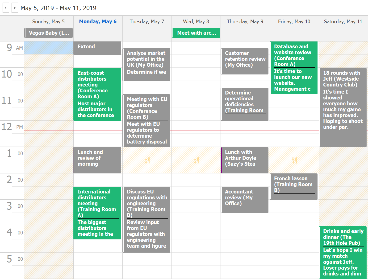
Today, we're happy to introduce a new Gantt control, as a CTP, for our ASP.NET WebForms and MVC set of controls. With our new control, you can add Gantt scheduling to your ASP.NET websites:

The new ASP.NET Gantt control displays 'tasks' as horizontal bars along timescales, shows the current schedule status, and displays the hierarchy and dependency relationships between the tasks.

This new control is great for creating time and resource based schedules for projects like tasks, activities, jobs, orders, and more.

Built With

As you know, we love to reuse code whenever possible. So we've built this new Gantt control by using our current ASP.NET TreeList control as a base! By reusing a solid and proven control, we can provide you a new control with:

  • familiar UI elements
  • powerful built-in features

And it helps us save time too. We use this time to focus on more features and controls for you. So, it's a win-win.

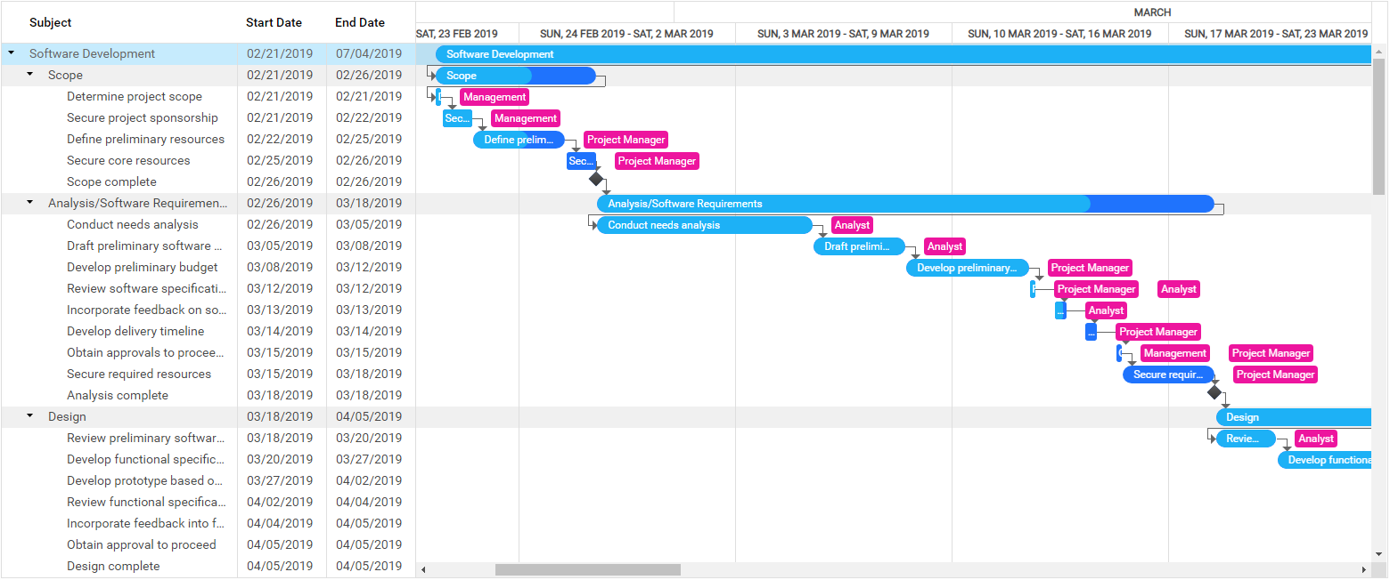
Now let's take a look at the design. The new ASP.NET Gantt control has two main UI areas:
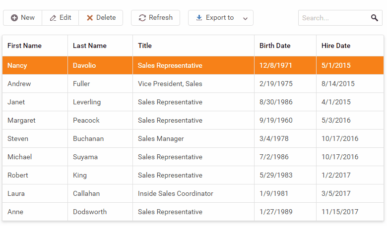
TreeList Area

On the left side of the control is the tree layout. This 'TreeList area' displays the task hierarchy and columns. This functionality is provided courtesy of our TreeList control.

Gantt Area

On the right side is the new 'Gantt area'. This side displays tasks, resources, task dependencies, and a timescale.

Features

While it is a CTP version, our new ASP.NET Gantt control provides some great features out-of-the-box:

  • Data binding
  • Multiple views
  • Built-in scrolling
  • Display task progress
  • Use different time scales (hours to months)
  • Ability to specify resources for tasks
  • TreeList and Gantt regions hierarchically display tasks, milestones, dependencies, and resources
  • API to configure custom work time, weekends, and special dates

Let's take a deeper look at some these features.

Getting Started - Data Binding

The Gantt control works by binding to a data source. You can data bind the control to a variety of data sources too because it supports the standard data source types (SqlDataSource, ObjectDataSource, AccessDataSource, etc.).

After data binding, you'll want to map the fields between your data source and our Gantt control. To see how easy it is, take a look at the 'Mappings' section in this markup:

And you're done, now you can use the Gantt control to display the tasks and their resources and dependencies.
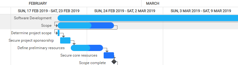
View Types

We've added the scales property which allows you to control how much detail you want to display in the timescale:

Hours

If the Day and Hour scales are enabled, then this allows you to see the granular details of each task:

Days

With the Week and Day scales enabled, we see less detail but get more context in relation to other tasks:

Weeks

When the Month and Week scales are enabled, we get a nice mid-level view:

Months

Finally, enabling the Year and Month scales allows us to see the 'big picture' or top-level view:

Client-Side API

Our new control also provides a client-side API which can:

  • show or hide the resources
  • control the tasks’ subject location

In case you're curious, the subject field is simply the name of the task.

Here's a short overview of the relationship between task and resource:

Typically, a task, like 'Software Development' can have resources (employees, teams, etc.) associated with them. You can see an example of these in the image above. The resources like 'Management' and 'Project Manager' are highlighted in purple.

With the client-side API, you control how the resources and task subjects are displayed. For example...

When the "Subject Location" is set to "Inside" and the "Show Resources" option is enabled, you'll get this layout:

Or you can set the "Subject Location" to "Outside" and disable the "Show Resources" option for this layout:

Custom Work Time

Our new ASP.NET Gantt control allows you to specify custom work days, work hours, and holidays for the timescale.

Use these four work time rules for timescale customization:

  • Daily Rule
  • Weekly Rule
  • Monthly Rule
  • Yearly Rule

With these rules, you can configure both the work time ranges and recurrence settings.

Let's take a look at some examples:

If you need to setup custom work hours, use the Daily Rule:

<dx:DailyRule><WorkTimeRanges><dx:WorkTimeRange Start="08:00" End="11:55" /><dx:WorkTimeRange Start="13:00" End="17:00" /></WorkTimeRanges></dx:DailyRule>

Use the Weekly Rule to set non-working days:

<dx:WeeklyRule IsWorkDay="false"><Recurrence DayOfWeek="Sunday" /></dx:WeeklyRule><dx:WeeklyRule IsWorkDay="false"><Recurrence DayOfWeek="Monday" /></dx:WeeklyRule>

Or use the Yearly Rule and setup custom holidays:

<dx:YearlyRule IsWorkDay="false"><Recurrence Day="14" Month="February" /></dx:YearlyRule><dx:YearlyRule IsWorkDay="false"><Recurrence Day="8" Month="March" /></dx:YearlyRule>

CTP

This new Gantt control is available as a CTP (community technology preview) in the v19.1 release. We're not quite finished with all the features yet but rest assured, we're working on it.

One of the limitations of this CTP is the Gantt MVC extension is not available for testing yet. Therefore, it's not included in the v19.1 beta I mention below. However, it will be available once we release the final version in a future release.

Test it today

Test-drive the new ASP.NET Gantt WebForms control on your local machine. If you're a current DXperience or Universal customer then download the v19.1 release from the Client Center.

Your Feedback Counts

We’d like to hear from you about your development plans and needs. Feel free to leave comments below or open Support Center tickets for detailed discussions.

For some quick feedback, please submit your responses to this short survey:

Join the Webinar

Sign up for the upcoming "What's New in v19.1 - ASP.NET, MVC, and ASP.NET Core Controls" webinar where:

  • you'll see all the new features/tools/components in v19.1 and
  • you can ask questions and interact with our devs

Register today


Blog Post: DevExtreme - New Compact Material Design Theme (v19.1)

$
0
0

Our versatile DevExtreme library has added a new set of Material Design themes which are beautiful but more importantly, compact:

DevExtreme - Compact Material Design Theme

We introduced a set of themes based on Google's Material Design last year. Now, let's dive into why we made a set of compact versions of these themes.

Compact vs Standard

The original DevExtreme Material themes are great for a mobile UI. With large editors, buttons, and tall data grid rows, these themes are great as a touch-friendly interface.

But this extra space for mobile UI is not as useful for other interfaces. For example, high-density apps like CRM systems or desktop web apps. To address this, we created the DevExtreme Compact Material Themes.

In the compact versions, we decreased the indents, icons, and font sizes. By making these elements smaller, we increased space for the number of UI elements. Therefore, you can show more details on the same screen as compared to the standard material theme.

While the sizes are different, rest assured, the set of colors are the same. In both sets of our Material Design themes, the light and dark themes for blue, lime, purple, teal, and orange colors are identical.

Demo

Custom Themes

You can also create your own custom themes based on our new compact themes. Use the latest version of the DevExtreme CLI tool and customize any DevExtreme theme.

Learn how more here: DevExtreme CLI - Custom Theme Generation

Limitations

While you can use the DevExtreme CLI (see previous section), we haven't finished the support for the DevExtreme ThemeBuilder yet. We're working on it and it'll be available in a future release.

Angular, Vue, React, ASP.NET MVC / Core and more

DevExtreme support many frameworks, so the new themes are available for:Angular, Vue, React, jQuery, Knockout, ASP.NET MVC and .NET Core.

Test It Now (and provide feedback)

Test-drive the public beta now. Use the npm pre-release package:

npm install --save devextreme@19.1-next

Then let us know your experience with these new themes.

Your Feedback Counts

We’d like to hear from you about your development plans and needs. Feel free to leave comments below, open Support Center tickets for detailed discussions or take part in conversations in our GitHub repository.

For some quick feedback, please submit your responses to this short survey:

Join the Webinar

Sign up for the upcoming "What's New in v19.1 - JavaScript: jQuery, Angular, React, and Vue" webinar where:

  • you'll see all the new features/tools/components in v19.1 and
  • you can ask questions and interact with our devs

Register today: https://register.gotowebinar.com/register/83799677038249484

Blog Post: Web Reporting - TypeScript Definitions (v19.1)

$
0
0

Last year, we introduced the DevExpress Angular Reporting Components. With these components, you can add our powerful reporting tools into your Angular-based application. However, we missed an important feature for Angular devs, TypeScript.

TypeScript has become the de facto, i.e. standard, language for Angular development. In fact, the Angular framework itself is developed with TypeScript.

The biggest selling point of TypeScript is tooling. It provides advanced autocompletion, navigation, and refactoring. Having such tools is almost a requirement for large projects. -vsavkin.com

Good news, we're now providing TypeScript Definitions for the following packages:

These new definitions are available with the latest v19.1 release.

Sample - Code Completion

I've prepared a small sample to show you how to use our new TypeScript definitions. As mentioned above, code completion is a major feature of TypeScript. So the sample shows you how to setup your project and get code completion working in Visual Studio.

Say you wanted to customize the Web Report Designer toolbar. For example, you want to hide the "Cut" item on the left side of the toolbar:

To do this, we'll need to import the DevExpressAnalytics namespace:

import { DevExpressAnalytics } from '@devexpress/analytics-core/dx-analytics-core';

Now we can use the client-side CustomizeMenuActions event to customize toolbar commands:

export class ReportDesignerComponent {
    getDesignerModelAction= "api/ReportDesigner/GetReportDesignerModel";
    reportUrl = "Report";
    CustomizeMenuActions(event){
      ...
    }
}

Finally, we'll create a variable to store the "Cut" toolbar item. In the sample below, we create the variable called cutAction.

Now, we can see the benefit of TypeScript Definitions and code completion. Call the GetById method and you'll see this handy drop-down with the available toolbar items:

These definitions save you time and help you customize our reporting tools in your Angular based web apps.

Major Refactoring

To support the TypeScript definitions, our devs refactored large portions of code in the package internals. This mainly involved changing names of classes and namespaces. These changes make it easier for you to navigate and find items when using TypeScript with our reporting tools.

Typically, when I hear refactoring, I get concerned about bugs. However, I'm happy to report these are non-breaking changes and our Reporting components will continue to work.

Of course, you may see some warnings about deprecated properties or methods. Rest assured, these warnings will also recommend the replacement property or method:

DevExpress.Designer.ActionId is now deprecated and will be removed in future versions. Use DevExpress.Analytics.Tools.ActionId instead.

Your Feedback Counts

As always, we'd like to hear your feedback. Cast your vote by answering this short survey question:

Test it today

Test-drive the new Reporting TypeScript Definitions on your local machine. If you're a current DXperience customer then download the v19.1 release from the Client Center.

Then let us know your experience, we love to hear your feedback.

Join the Webinar

Click the link below and register for our upcoming Dashboards and Reporting webinar. You'll see all the new features of the v19.1 release demonstrated and you can ask questions too:

Register for the Dashboards and Reporting Webinar

Blog Post: WPF - Office 2019 Themes and Simplified Ribbon (v19.1)

$
0
0

With the release of Office 2019, Microsoft refreshed the appearance of Office applications. The DevExpress v19.1 WPF Controls can replicate this appearance for your projects.

Office 2019 Themes

The following four new Office 2019-inspired themes were added to our WPF Theme collection:

  • White
  • Colorful
  • Dark Gray
  • Black

Office 2019 Themes

Ribbon Control

Office 2019 Style

Our Ribbon Control introduced a new Office 2019 style that closely matches the Ribbon in latest versions of Microsoft products.

Office 2019 Ribbon Styles

Simplified Mode

As you probably know, this is what our Ribbon Control normally looks like:

Ribbon Control

For the v19.1 release, we extended it with the Simplified Mode. In this mode, your end-users have more screen space for application content since the Ribbon appearance is more compact:

Simplified Ribbon Mode

You can control Ribbon item visibility with the attached property SimplifiedModeSettings.Location. Items can be shared between modes or visible only in a particular mode. This code snippet illustrates a configuration where the Paste and Copy buttons are always visible, Cut only in the classic Ribbon style and Delete in a combination on locations.

<dxr:RibbonControl RibbonStyle="Office2019" ToolbarHideSeparators="True"><dxr:RibbonDefaultPageCategory><dxr:RibbonPage Caption="Home"><dxr:RibbonPageGroup Caption="Clipboard"><dxb:BarButtonItem x:Name="btnPaste" Content="Paste"
          dxr:SimplifiedModeSettings.Location="All" /><dxb:BarButtonItem x:Name="btnCut" Content="Cut"
          dxr:SimplifiedModeSettings.Location="Classic" /><dxb:BarButtonItem x:Name="btnCopy" Content="Copy"
          dxr:SimplifiedModeSettings.Location="All" /></dxr:RibbonPageGroup><dxr:RibbonPageGroup Caption="Font"><dxb:BarButtonItem x:Name="btnDelete" Content="Delete"
          dxr:SimplifiedModeSettings.Location="ClassicAndOverflowMenu" /></dxr:RibbonPageGroup></dxr:RibbonPage></dxr:RibbonDefaultPageCategory></dxr:RibbonControl>

Icons

The Simplified Ribbon uses a new 20x20 pixel icon size. This change is designed to make the user experience more accessible. If you don’t have 20x20 sized icons, you can still use the classic 16x16 pixel size.

20x20 Icons

Please Tell Us What You Think

Follow this link to see the Ribbon Controls in action (you need an installation of DXperience v19.1 Beta with demos on your machine): Ribbon UI Demo

Please feel free to leave a comment and let us know what you think of the new features.

Webinar

Please use the link below to register for our upcoming WPF webinar, where all new features of the v19.1 release are demonstrated.

Register for the WPF v19.1 Webinar

Blog Post: WinForms - Scheduler - Time Regions (v19.1)

$
0
0

Time Regions are a new feature for our WinForms Scheduler Control. The enable you to selectively block modifications to appointments in certain timeframes, in other words, “freeze” a timeframe by prohibiting changes to existing appointments and the creation of new ones. Obvious applications for Time Regions include lunch hours and non-working days, but the feature is flexible enough to be used for other application-specific use cases.

If you have installed the v19.1 Beta version, you can run the Full Week Scheduler demo available in the DevExpress Demo Center. In this demo, the Scheduler applies two Time Regions:

  • Weekends
  • 1pm-2pm on working days

Time Regions

Time Regions have the same recurrence settings as appointments. The Editable property specifies whether users are allowed to add or modify appointments in time cells affected by a region, so Time Regions can function both ways: to lock specific time cells if editing is globally allowed, or to unlock them if editing is globally prohibited.

Each Time Region has a collection of appointment resource IDs. If the collection is empty, a Time Region applies to all appointments. If resource IDs are added to the collection, the Time Region only applies to appointments associated with these resources. In scheduler views grouped by resources, Time Regions are only shown for the resources they apply to.

Finally, the event SchedulerControl.TimeRegionCustomize allows detailed Time Region customization. You can write code to conditionally apply the Time Region to appointments. For instance, in the DevExpress demos the 1pm-2pm lunch hour Time Region does not accept any appointments, unless they are marked with the Out of Office status. This image shows a valid drag operation:

Dragging Appointment to Time Region

Your Thoughts Count

We are interested in your thoughts and ideas! Please feel free to comment below or open Support Center tickets for further discussion.

Webinar

Please use the link below to register for our upcoming WinForms webinar, where all new features the the v19.1 release are demonstrated.

Register for the WinForms v19.1 Webinar

Blog Post: MapControl - MapEditor API News and Georeferenced Images (v19.1)

$
0
0

Shape Simplification

Our MapControl supports several popular vector data formats, including Shapefiles (.shp) and SVG images. We optimized our rendering engine in the past so that shapes consisting of up to 7000 segments and one million total vertices can be rendered efficiently. This covers many common use cases, and of course we are always working on further improvements.

However, some shape files may always be too large to render on certain machines, with acceptable performance. At this time, it’s not hard to find files on the Web that have more than 5 million vertices. Available processing power grows over time, but so does the complexity of shape data. The correct way to deal with this moving target is to simplify shapes as and when required.

For v19.1 we extended the MapEditor API with the method SimplifyItems. As a developer, you can call this API method at any point in time to simplify vector shapes based on a tolerance factor – e.g. while loading shape data, or when triggered interactively by the end user. Two different simplification algorithms are supported: Douglas-Peucker and Visvalingam.

Note that it is possible to use the simplification mechanisms without even creating a MapControl. The Simplify method is part of the base class and you can instantiate the DouglasPeuckerShapeSimplifier or the VisvalingamShapeSimplifier independently to call it.

SimplifyItems is implemented for the MapControls for WinForms and WPF. If you have v19.1 installed, check out these demo modules to see how the tolerance parameter takes effect. Be sure to zoom in using the mouse wheel to see the changes for high tolerance values.

Vector Shape Simplification

GeoUtils

We added new MapEditor functionality by introducing the class GeoUtils to support the most common measurement operations, including shape perimeter and area. The Map Editor demo module shows these new features for both WinForms and WPF. Just hover the mouse over an element or click it in select mode in WPF, and the tooltip shows calculated values for perimeter and area.

GeoUtils Perimeter and Area Calculation

The documentation for the GeoUtils Class lists all supported helper methods.

Georeferenced Images

The final feature for this post is our new functionality for the WinForms MapPolygon element: it can now display raster images. Note that the WPF MapPolygon supports this as well, but it doesn’t require any special functionality from our side.

Our implementation covers two common use cases:

  • A raster image matches the shape of a MapPolygon and can be displayed within the polygon boundaries without modification

Raster Image with Matching Shape

  • A raster image has different proportions than the target MapPolygon and needs to be transformed. A set of mapping points specifies how the image will be mapped to the polygon surface.

Raster Image Needs Transformation

Our documentation page Georeferenced Image describes in detail how to set up both scenarios at design time or from code.

If you have v19.1 installed on your machine, you can use this link to access a WinForms demo of the new feature set: Geo Shape Image (WinForms)

What about WPF?

To illustrate the same features for our MapControl for WPF, we created a a similar demo that uses the WPF ImageBrush to fill a MapPolygon with a raster image: Geo Shape Image (WPF)

To implement the second use case described above, WPF developers can use native WPF transform mechanisms. We describe this approach in the documentation article How to: Add a Georeferenced Image to a Map.

For the future we are considering ideas to add specific mapping functionality to the WPF MapPolygon, similar to the mapping points approach in WinForms. If you think this would be useful to you, please be sure to submit your responses to the short survey below.

Please Share Your Thoughts

As always, we are interested in your feedback. Please feel free to leave comments below or open Support Center tickets as required. In addition, we would appreciate your responses to this quick survey:

Webinar

Please use the link below to register for our upcoming Dashboards, Reporting & Data Analytics webinar, where all new features the the v19.1 release are demonstrated.

Register for the Dashboards, Reporting & Data Analytics v19.1 Webinar

Blog Post: Reporting - XRCheckBox SVG, XRLabel HTML (v19.1)

$
0
0

XRCheckBox – SVG Glyphs

Sometimes the built-in style of the XRCheckBox report control does not fit the design requirements of a printable document. It may be necessary to show custom images based on a boolean field value, rather than regular check marks. Of course it is possible to swap images dynamically using a small XRPictureBox, but the XRCheckBox offers a more direct approach that doesn’t require custom logic.

With v19.1 the XRCheckBox supports flexible SVG glyphs. There are several nested options available in the new property XRCheckBox.GlyphOptions:

  • You can choose from several built-in checkbox styles using the Style property:

Checkbox Styles

Note that we didn’t change the default glyph used by the XRCheckBox. If you don’t select any of the new styles, the control still uses a bitmap, so all your reports look the same as before your v19.1 update.

  • The Size property scales the selected check mark image, and it even affects the default bitmap glyph:

Checkbox Size

  • The most interesting new property is called CustomGlyphs and it allows you to upload custom images for each check state. Here’s an example using checkbox images from Material Design:

Custom Glyphs

Note that you can define specific sizes for your custom glyphs and our tools scale them automatically. Be careful when using small bitmap images, they will end up fuzzy if you show them at large sizes.

  • Finally, the Alignment property replaces the old XRCheckBox.TextAlignment setting. It automatically uses the value of the old property if you set it previously, so this is not a breaking change.

As a side note, thanks to customer feedback we changed the drag&drop behavior: when you drop a boolean field on the report surface, the XRCheckBox.Text property value is now automatically set to the name of the data-bound field.

XRLabel – HTML-Inspired Formatting

The XRLabel component now exposes the new property AllowMarkupText. When this is active, you can use the set of pseudo-HTML tags currently supported by our WinForms controls to display formatted content in the label.

Note that we don’t have full HTML support, and many tags are only superficially similar to HTML. Please read the documentation page in case you’re not yet aware of this functionality that is shared with several controls of our WinForms suite.

In the XtraReport class you can find a property called ImageResources. This is a list of images with assigned ids, which can be referred to in the markup for a label. Here’s the editor for this property:

ImageResources Editor

As an example, you can use markup like this:

<size=14>
  Size = 14<br><b>Bold</b><br><i>Italic</i><br><u>Underline</u><br></size><size=11>
  Size = 11<br><color=255, 0, 0>Sample Text</color></size><br><href=www.devexpress.com>Hyperlink</href><br><image=imageItem1;size=60,60>

And here’s how it renders in Report Designer:

Pseudo-HTML Markup in XRLabel

The image placeholder icon is displayed if you specify an invalid image id:

Image Placeholder for Invalid Image ID

Images from the ImageResources list can also be used in an XRPictureBox expression binding. The node Images becomes available in the Expression Editor for this purpose:

Image Resources Expression Binding

The support for pseudo-HTML formatting can be particularly useful for ASP.NET Core developers, since the platform does not yet support a full rich text report control. Of course we don’t consider this formatting feature a complete replacement for rich text functionality, but at the same time the XRLabel-based approach is light-weight and doesn’t consume much memory.

Your Feedback Counts

As always, we’d like to hear your thoughts. Please feel free to leave comments below, and we appreciate it very much if you can submit your responses to this short survey:

Webinar

Please use the link below to register for our upcoming webinar on Dashboards, Reporting and Data Analytics, where all new features the the v19.1 release are demonstrated.

Register for the Dashboards, Reporting & Data Analytics v19.1 Webinar

Blog Post: WPF - Data Grid - New Search Panel (v19.1)

$
0
0

The new Search Panel for the WPF Data Grid ships with a redesigned UI and has been engineered to be more compact and informative.

If you have a v19.1 beta installation on your machine, you can follow this link to the SearchPanel Demo. Documentation for the new features is also available.

New UI

We replaced buttons with icons to make the Search Panel more compact. At the same time, this change results in an appearance common to standard Windows applications.

SearchPanel Icon UI

Integration With The Group Panel

Prior to v19.1, the Search Panel occupied its own space, possibly in addition to the Group Panel. We optimized this by integrating the Search Panel into the Group Panel, so that more space is available to data rows in the Grid. The new property SearchPanelPosition specifies how the Search Panel is shown.

Group Panel Integration

Result Info

In spite of its more compact appearance, the Search Panel is now more informative. If you set the property ShowSearchPanelResultInfo to true, it displays the total number of matches and the index of the current match.

Search Panel Result Info

What’s Next

For v19.2 we are working on new settings that will allow you to change how the Data Grid parses text strings entered in the Search Panel, similar to the WinForms features announced in this post.

Please let us know if you have any thoughts about the new functionality. Feel free to comment below or open a Support Center ticket for further discsusion.

Webinar

Please use the link below to register for our upcoming WPF webinar, where all new features of the v19.1 release are demonstrated.

Register for the WPF v19.1 Webinar


Blog Post: WPF - Scheduler - Outlook-Inspired Appearance (v19.1)

$
0
0

We redesigned the UI of the WPF Scheduler Control for v19.1, to present a modern look that matches Microsoft Outlook. This post outlines some interesting details.

Date Navigation Panel

The Scheduler now includes a Date Navigation Panel that displays navigation buttons as well as the current time interval, formatted depending on the interval length and the current UI culture.

Date Navigation Panel

Colorization

Resources have a new appearance. Our focus was to enhance readability and consistency, so the Scheduler color scheme is now constructed around resource colors. Base colors and derived colors are used to paint resource headers, date headers, navigation buttons, and those appointments which don’t have a label assigned, or whose label is set to a transparent color.

Colorization

Customization

To help you maintain color consistency with application themes, we added the capability to associate resource and label palettes with specific themes. The XAML snippet below illustrates how to configure custom resource palettes for some of our new Office 2019 themes.

<dxsch:ColorCollectio x:Key="{dxscht:SchedulerThemeKey
  ResourceKey=ResourceColors, ThemeName=Office2019Colorful}"><Color>LightBlue</Color><Color>Bisque</Color><Color>#E9AFA3</Color></dxsch:ColorCollection><dxsch:ColorCollection x:Key="{dxscht:SchedulerThemeKey
  ResourceKey=ResourceColors, ThemeName=Office2019Black}"><Color>#3B7547</Color><Color>CadetBlue</Color><Color>#171729</Color></dxsch:ColorCollection>

Custom Theme Colors

Backward Compatibility

To ease transition of your existing customizations applied to our previous Scheduler design, and to ensure that such customizations don’t break when you install v19.1, we maintained full backward compatibility. Please click this link for details about the implementation.

Your Feedback Is Welcome

We are always interested to hear your thoughts. Please feel free to leave a comment below, or to open a Support Center ticket for further discussion.

Webinar

Please use the link below to register for our upcoming WPF webinar, where all new features of the v19.1 release are demonstrated.

Register for the WPF v19.1 Webinar

Blog Post: DevExtreme - HTML Editor - Mentions (v19.1)

$
0
0

Good news for users of our DevExtreme HTML Editor widget: the new Mentions functionality is available starting with v19.1. It is a special auto-complete mechanism that triggers when the user types specific prefixes. This feature is common in many web apps today and you can now achieve the same for your own projects.

As usual, the features described in this blog post apply to all platforms supported by DevExtreme, including Angular, Vue, React, jQuery and ASP.NET MVC and ASP.NET Core.

Suggestion Lists

As you can tell from the image, multiple single-character prefixes – they are called markers– are supported: @ for people and # for issues are used in the example. Each marker is associated with its own datasource, which can work with either local or remote data. You can also configure various other details per marker, such as the minimum number of characters a user has to type after the marker before the popup content is filtered, and of course the data fields that will be searched and displayed.

The image also shows an example for the itemTemplate, which is responsible for the formatting of items in the suggestion list.

Finally, it is also possible to change the appearance of a mention in the document by setting the template. For example:

mentions: [{
  ...,
  displayExpr:  'Name',
  valueExpr: 'ID',
  template: ({ id, value }) => `<a href="https://.../users/${id}>${value}</a>"`
}]

Mention Template

Try It Yourself

The public beta version of v19.1 includes the Mentions feature. Use the npm pre-release package:

npm install --save devextreme@19.1-next

What Do You Think?

We appreciate your feedback! Please feel free to comment below or to take part in the discussion in this GitHub issue. Your response to this quick survey would also be very useful:

Join The Webinar

If you’d like to see all the new features introduced in v19.1, please sign up for our upcoming webinar using this link: Sign Up For DevExtreme v19.1 Webinar

Blog Post: DevExpress UI for Blazor - What's new in Preview 5

$
0
0

Preview 5 of the DevExpress UI for Blazor is now available. It includes support for ASP.NET Core 3 Preview 5 and also two new Blazor components!

Support for ASP.NET Core 3 Preview 5

The Blazor team at Microsoft are releasing updates at a rapid pace as they get closer to the September .NET Core 3.0 final release. For example, Microsoft released the ASP.NET Core 3 Preview 5 only a few days ago.

So I'm happy to report that our latest Blazor release supports the ASP.NET Core 3 Preview 5 update. For simplicity, we're calling our Blazor update Preview 5 too. Our Blazor Nuget package also uses a similar versioning system:

.NET Core 3.0 versionDevExpress.Blazor.nuget version
.NET Core 3.0 Preview 30.0.3
.NET Core 3.0 Preview 40.0.4
.NET Core 3.0 Preview 50.0.5

This lets you quickly see the version compatibility with the .NET Core preview versions.

New Components

We're also introducing two new Blazor components: Form Layout and Tabs! This brings us to a total of nine powerful DevExpress Blazor components before we've even reached our upcoming v1.0 release.

Remember, all of our Blazor components are native and written exclusively for the Blazor framework. Now, let's take a look at the new components:

New Form Layout Component

The DevExpress Form Layout component for Blazor helps you to easily create edit forms which are responsive and automatically-aligned:

This component uses the responsive features provided by the underlying Bootstrap framework. We've also added functionality to align the labels and editors on the form.

Save time by using our Blazor Form Layout component to create simple or complex form layouts.

Check out the online demo: DevExpress Blazor UI - Form Layout Demo

New Tabs Component

We've also added the new Tabs component to our set of Blazor components:

DevExpress Blazor - Tabs

With our Tabs component, you can provide views with a simple tab strip or use it as a navigation component made up of multiple tabbed pages.

Test drive the online demo here: DevExpress Blazor UI - Tabs Demo

Blazor Name Change - Breaking Changes

In a previous update, Microsoft announced the following:

  • Client-side Blazor on WebAssembly now in official preview
  • Razor Components renamed back to server-side Blazor

First, dropping the 'experimental' label on client-side Blazor is good news as it shows the progress they're making. However, client-side Blazor is still not officially recommended by Microsoft.

Note: While not recommended, they do use client-side Blazor on one known production website: Try .NET. You can hear the story of "Try .NET" directly from the Microsoft Blazor PM, Dan Roth. Simply sign up for our upcoming Blazor webinar.

Microsoft also renamed "Razor Components" back to "server-side Blazor". Now Blazor's hosting models will be known as "Blazor (client-side)" and "Blazor (server-side)". Therefore, we've also decided to standardize on "Blazor" for our components too.

Honestly, I prefer this name change because it's simpler. But, it has created a few breaking changes. To address these issues we've made the following changes in this Preview 5 release:

  1. We've changed the namespace from DevExpress.RazorComponents to DevExpress.Blazor
  2. We've also changed the NuGet package name from DevExpress.RazorComponents to DevExpress.Blazor
  3. The DevExpress.RazorComponents.dll assembly has been renamed to DevExpress.Blazor.dll
  4. These two static resources have been appropriately renamed too:
    • dx-razor-components.css -> dx-blazor.css
    • dx-razor-components.js -> dx-blazor.js
  5. The demo site is now located at: https://demos.devexpress.com/blazor/
  6. Microsoft's preview 5 has changed the Blazor template structure. Before, you needed to register the namespace and tag helpers in the /Components/_ViewImports.cshtml file. Now, you'll need to register from the _Imports.razor file, but you'll only need to register the namespace: @using DevExpress.Blazor

Updated Guide and Demo Project

To see the changes mentioned above, please take a look at our updated github demo project and "How to create a new project" guide.

There's also a set of "Getting Started" training videos which help you learn about the Blazor framework.

Download the preview from NuGet

If you wish to test the DevExpress UI for Blazor, download the DevExpress.Blazor.nupkg from the DevExpress NuGet Early Access feed. Once you've added this feed to Visual Studio 2019, you'll see the DevExpress.BlazorComponents package:

This preview is made available under the DevExpress Preview end-user license. To gain access to the build free of charge, you will need a DevExpress.com account. You can either create a free account to test our NuGet package or you can get a free 30-day trial of all our components.

Join the Webinar

Sign up for the upcoming "Blazor - Getting Started" webinar:

Join Dan Roth, Microsoft PM for Blazor, and Mehul Harry, DevExpress Web PM, to learn about how to get started with Blazor. Dan will explain the fundamentals, discuss client vs. server, introduce the roadmap, and create a simple Blazor app. Mehul will then demonstrate the new Developer Express Blazor controls and go into the roadmap for our future Blazor development. Finally they will manage a Q&A session with the attendees. Don't miss this extensive webinar about the exciting Blazor framework!

Register today

Give us your feedback

Although we have many plans for more components within this new ecosystem, as with all of our future projects we rely on feedback from you, our customers, on what we should be looking at and considering. Send us emails, open up support tickets, let us know.

Along those lines, please take a moment to complete this short survey:

Thanks!

Blog Post: WinForms and WPF Reporting - End-User Designer Enhancements (v19.1)

$
0
0

We implemented several enhancements for our End-User Designers in v19.1. This post summarizes the new functionality. All features described below are available in the WinForms End-User Designer. Several are also available in the designer for WPF, they are highlighted specifically.

External Drag&Drop Operations and Clipboard Support

Both the Visual Studio Report Designer and the WinForms End-User Report Designer now support external drag&drop operations and clipboard interaction:

  • You can paste an image file from the clipboard, or drop an image onto the design surface to create an XRPictureBox
  • You can select an XRPictureBox and copy its image to the clipboard, then paste it elsewhere
  • Dropping or pasting files of types .txt, .rtf, .docx and .html creates either an XRLabel or an XRRichText
  • Drop a report definition file onto the Report Designer to replace the layout of the current report

This video shows the operations in action:

External Drag&Drop

SVG Validation

If an SVG image is loaded that contains tags which are not yet supported by our parser, a message box with details is displayed:

SVG Validation Message Box

Similar messages are displayed in the Visual Studio debug output window if you use API methods to load images at runtime.

Summary Editor Form

This feature is also available in the WPF Report Designer.

You can now create a simple summary directly in the Summary Editor, without the need to open the Expression Editor.

Summary Editor Form

Weighted Average Summary Function

As you can tell from the image above, the summary function Weighted average is now available out of the box. We would like to add more built-in summary functions, so please let us know which functions you are missing:

Default Page Settings For New Reports

The XRDesignMdiController class now includes the property DefaultReportSettings with various nested items: ReportUnit, PaperKind, PageWidth, PageHeight, Landscape, RollPaper, Margins. The End-User Report Designer takes all these into account when a new report is created using the commands New Report and New Report via Wizard.

Default Page Settings For New Reports

Please feel free to leave a comment below if you need to specify any other default report settings.

Magnifier Button For Color Properties

All color property editors now include a magnifier button. Click this button to invoke the Magnifier Dialog where you can pick a color from any screen pixel. This is useful to quickly create a common style for several controls, or to pick the color of a template image pixel when viewing it side by side with the Report Designer.

Magnifier

New Tab For The Properties Window

This feature is also available in the WPF Report Designer.

Page Settings are now available on their own tab in the Properties window for a Report object, to make them easier to discover:

Page Settings Tab

We are interested in your feedback about discoverability in the Properties window. Do you think the current tab icons speak for themselves? Do you have ideas for improvements?

Expression Property Tooltips

This feature is also available in the WPF Report Designer.

Finally, another small change to make settings more discoverable: when a property has an expression assigned, this expression is displayed in a tooltip when the mouse hovers over the property editor. No need to open the Expression Editor anymore for simple cases!

Expression Property Tooltips

Please Let Us Hear Your Thoughts

Most of the changes described above were made on the basis of your feedback. Please let us know if you have any new ideas or comments on the new features.

Webinar

Please use the link below to register for our upcoming webinar on Dashboards, Reporting and Data Analytics, where all new features the the v19.1 release are demonstrated.

Register for the Dashboards, Reporting & Data Analytics v19.1 Webinar

Blog Post: WinForms - Scheduler - Sort And Group Appointments (v19.1)

$
0
0

The DevExpress WinForms Scheduler Control now provides two events that allow you to sort and group appointments: CustomAppointmentGroup and CustomAppointmentSort. Both events are demonstrated in our Scheduler Demos, when you use the Group by Category and Sort by Category checkboxes in the right-hand options panel.

The event CustomAppointmentSort is similar to custom sort events in our Data Grid: it applies a three-way comparison to a pair of appointments. You need to write a simple piece of code to set e.Result:

  • Set e.Result to a negative value if the appointment related to the e.AppointmentLayoutInfo1 parameter should appear first
  • Set e.Result to a positive value if the appointment related to the e.AppointmentLayoutInfo2 parameter should appear first
  • Set e.Result to 0 if both appointments are considered equal and the Scheduler should utilize its default sort algorithm to arrange them

This screenshot from the DevExpress demos illustrates an example: appointments with the Out of Office status (the green appointment items in the image) are placed after appointments without assigned status.

Custom Sort

The event CustomAppointmentGroup event helps you build groups that are visually separate in the Scheduler Control. In our demos, the property e.GroupKey (an integer value used as a group index) is set according to appointment labels.

Custom Group

You can combine custom group and sort events to break down appointments into groups, and then sort each group individually.

Let’s Hear Your Feedback

If you have any comments on the new functionality, or ideas for additional extensions, please let us know. Feel free to comment below or open Support Center tickets for further discussion.

Blog Post: WPF - Theme Palettes (v19.1)

$
0
0

We developed a new mechanism that allows you to create multiple palettes for our themes and switch between them easily, even at runtime. This means that we can provide additional color options for built-in themes, and integrating corporate colors into your application is straight-forward.

Predefined Palettes

The Office2016SE, VS2017, and Office2019 themes now ship with a choice of six palettes:

Predefined Palettes

For each palette, our theme mechanism can generate a dynamic theme with palette colors. These dynamic themes will show up in the list of themes and can then be used as regular themes in your application, triggering theme change events and affecting any code that checks the currently applied theme name.

Dynamic Themes

Since not every application needs dynamic themes, they are turned off by default. You can register them by calling the method RegisterPredefinedPaletteThemes in code:

Theme.RegisterPredefinedPaletteThemes();

Once this registration has taken place, the dynamic themes appear in the built-in Ribbon gallery:

Ribbon Gallery

It is also possible to switch palettes in code:

Theme.RegisterPredefinedPaletteThemes();

ApplicationThemeHelper.ApplicationThemeName =
  PredefinedThemePalettes.RedWine.Name + Theme.Office2019Colorful.Name;

If you don’t need all the palettes, create themes for specific palettes manually:

var theme = Theme.CreateTheme(
  PredefinedThemePalettes.RedWine, Theme.Office2019Colorful);

Theme.RegisterTheme(theme);

ApplicationThemeHelper.ApplicationThemeName = theme.Name;

Introducing Corporate Colors

A crucial part of the Theme Palette mechanism is customization. You can create a custom palette based on any of the predefined palettes, modify its colors, and create a new dynamic theme:

var palette = new ThemePalette("WhiteWine", PredefinedThemePalettes.RedWine);

palette.SetColor("Backstage.Window.Background", Colors.Beige);

var theme = Theme.CreateTheme(palette, Theme.Office2019Colorful);

The Theme Designer application now allows you to import colors from predefined palettes into your custom theme.

Theme Designer

In addition, Theme Palettes can help you introduce corporate colors even if you don’t plan on maintaining a custom theme. You can edit default theme colors or colors from one of the predefined palettes in the Theme Designer to match your corporate theme and export the result into a .cs file:

public class Office2019CorporateThemePalette : ThemePalette {
  public Office2019CorporateThemePalette() : base("Office2019Corporate") {
    SetColor("Backstage.SelectionBackground",
      (Color) ColorConverter.ConvertFromString("#FF004B1C"));
    SetColor("Backstage.Window.Background",
      (Color) ColorConverter.ConvertFromString("#FF217346"));
    SetColor("Focused",
      (Color) ColorConverter.ConvertFromString("#FF217346"));
    ...
  }
}

Using the code from the exported .cs file, you can apply your unique colors to standard DevExpress themes:

var palette = new Office2019CorporateThemePalette();

var theme = Theme.CreateTheme(palette, Theme.Office2019Colorful);

Theme.RegisterTheme(theme);

ApplicationThemeHelper.ApplicationThemeName = theme.Name;

This approach allows you to create a unique appearance for your application without the need for a custom theme and does not require any extra work when you migrate from one DevExpress version to another.

We Are Looking Forward To Your Feedback

Which predefined palettes would you like to see us introduce in the future? Are you going to create custom palettes in the Theme Designer? Please let us know in the comments below or send your feedback to wpfteam@devexpress.com.

Blog Post: .NET Core: where we are and where we'll be

$
0
0

Last week was the premier event for developers targeting the Microsoft space: Microsoft Build. DevExpress was there, of course, with a full complement of staff at our booth, including myself.

On the first day of the event, Microsoft published a whole collection of news items for the development community, among which was some further information about the future of .NET, and in particular .NET Core. What I want to do in this post is to explore these announcements, what has happened, where we are now, and what the future portends.

The past

On December 20, 2018, Microsoft released the first public preview of .NET Core 3. Unlike previous versions, this release provided the first look at .NET Core's support for WinForms, WPF, and Entity Framework 6.

Image from https://devblogs.microsoft.com/dotnet/net-core-3-and-support-for-windows-desktop-applications/
Image: https://devblogs.microsoft.com/dotnet/net-core-3-and-support-for-windows-desktop-applications/

A mere two weeks after this preview was made available, we announced that v18.2.4 of the DevExpress controls and components would support .NET Core 3, and furthermore published links to WinForms and WPF GitHub repositories holding our demos that were built and tested under this preview of .NET Core. The repositories have detailed instructions on how to install our NuGet packages and test these .NET Core 3 demos.

And yet, despite the promise of having a single platform for truly cross-platform applications — recall that .NET Core is designed to be used under Windows, Linux or MacOS — there was a certain confusion in the community, Does it mean the traditional .Net Framework days are numbered? Should I start migrating my projects to .NET Core? What’s the future of my desktop apps?

The Present

As part of the announcements at Build, Microsoft answered some of these questions, and announced .NET Core 5 (which for simplicity, they’re calling “.NET 5”). Of course, even having revealed this newer version, Microsoft still haven't fully released .NET Core 3: this is slated for September 2019.

Image from https://devblogs.microsoft.com/dotnet/introducing-net-5/
Image: https://devblogs.microsoft.com/dotnet/introducing-net-5/

But what about the traditional .NET Framework, which stands at version 4.7? What will happen to that? In essence, it is going to be frozen as is, no new features or enhancements will be made. It'll probably reach version 4.8, and that will be that. There will be no .NET Framework 5, and, if you think about it, that's why the version after .NET Core 3 will be .NET 5: they want to skip the possible confusion about using the term ".NET Core 4". They expect that desktop developers will make the effort to migrate to .NET Core to gain all the benefits it provides.

Benefits? Well, first and foremost, it’s the ability to distribute .NET with your applications without having to share it with other apps on the machine. It's just local to your app, so you will no longer require a user to update their machine just to run your product, and maybe stopping other apps working. As for the widely repeated “cross-platform” promise, be warned: you won’t be able to run your WinForms Office-like application on a Mac or anything like that. Windows and WPF are strictly for Windows machines. .NET Core adds multi-platform support only for application engines and their internal logic. The user interface will remain platform-dependent.

The news about .NET 5 is exciting, no doubt, and shows how optimistic Microsoft are about this unified platform, but at present it is still too far away. Right now we’re focusing on what matters most: proper .NET Core 3 support. In contrast to our original announcement about .NET Core, DevExpress NuGet packages now deliver more libraries, including XAF and Office controls, and, even better, they are now natively built under .NET Core (previously, you’d get libraries built under .NET Framework that were compatible with Core).

The Future

Now that we know .NET Core is the Real Deal, here comes another big question: “what should I, as a developer, do next”?

First, take some time to investigate whether your current Windows apps can be migrated to .NET Core 3. This would be an ideal time to identify possible issues, such as a namespace, class, property or method being only available in the full Framework, but not in .NET Core (maybe there's a replacement?). Perhaps you'll decide that it's best to leave those legacy apps on the .NET Framework and only use .NET Core for new apps. Take a look at our GitHub repositories, they may give you some ideas:

There's another caveat here: please realize that the Visual Studio designers do not work at present with .NET Core 3 Preview. Microsoft still have a lot of work to make this happen and we are in close contact with the development team there.

Second, realize that there is still quite a bit of time: .NET Core 3 is slated for September of this year, and .NET 5 will be over a year later.

Image from https://devblogs.microsoft.com/dotnet/introducing-net-5/
Image: https://devblogs.microsoft.com/dotnet/introducing-net-5/

Third, you can rely on us to keep up with Microsoft's releases. We are committed to maintaining and updating our controls and libraries to work with .NET Core. We’ll make sure to publish NuGet packages with our .NET Core-compatible libraries immediately after Microsoft release a new version. Once .NET Core 3 is officially published, we’ll provide more information on how to migrate your big legacy projects, and share existing limitations and possible ways around it.


Blog Post: WPF - Filter Editor

$
0
0

Our new WPF Filter Editor ships with a redesigned UX designed to simplify usage and engineered to simplify field and operator selection. At present, the WPF Filter Editor supports the following DevExpress products:

  • WPF Data Grid and Tree List (v18.2+)
  • WPF Pivot Grid (v19.1+)

Filter Editor

We have published a detailed article on our website. Please follow this link to read more about the Filter Editor.

Blog Post: .NET Word Processing - Encryption, Enhanced Language Support and Skinned Dialogs (v19.1)

$
0
0

The DevExpress Rich Text Editor and Word Processing Document API (v19.1) ship with a number of new rendering, file export and security related features.

Encryption

Our WinForms and WPF Rich Text Editor and Word Processing Document API allow you to load and save password encrypted DOCX and DOC files. The controls and API support both standard and agile encryption. You can handle new events to control the decryption process. Use the EncryptionSettings object to export a password protected document in code, as shown below:

EncryptionSettings encryptionSettings = new EncryptionSettings();
encryptionSettings.Type = EncryptionType.Strong;
encryptionSettings.Password = "12345";

richTextProcessor.SaveDocument(stream, documentFormat, encryptionSettings);

The DevExpress Rich Text Editor for WinForms and WPF ships with new encryption related User Interface elements.

Note: We also updated the encryption functionality in our Spreadsheet control (added new SaveDocument method overloads and new EncryptedFilePasswordCheckFailed event).

East-Asian Languages Enhancements

This release includes new paragraph alignment options for East-Asian languages (Distributed and Thai Distributed). These alignment types distribute text evenly between right and left margins (based on language specifics: for example, tone and vowel symbols). The Rich Text Editor (WinForms and WPF) displays new UI elements based upon the language packs installed on a given machine.

Our Word Processing Document API and Rich Text Editor allow you to change paragraph alignment in code. The code sample below demonstrates how to use the Alignment property to specify Distributed alignment:

ParagraphProperties pp = document.BeginUpdateParagraphs(range);

// Change paragraph alignment
pp.Alignment = ParagraphAlignment.Distributed; 
document.EndUpdateParagraphs(pp);

PDF Export Enhancements

v19.1 includes the following PDF file export enhancements:

  1. We expanded the number of supported embedded fonts. You can now embed both TrueType and OpenType fonts (containing PostScript Type 1 outlines).
  2. We upgraded export for non-embedded fonts. Our PDF export engine now uses Unicode code points to export symbols that are not included in the Adobe Glyph List.

Skinned Dialogs

Our WinForms Rich Text Editor now supports skinned Open File and Save File dialogs.

Use the WindowsFormsSettings.UseDXDialogs option on application startup to enable skinned dialogs.

What Do You Think?

As always, we are interested in your feedback. Please feel free to leave comments below or open Support Center tickets as required. In addition, we would appreciate your responses to this quick survey:

Blog Post: WinForms - Single-File Applications With .NET Core 3

$
0
0

Shortly after Microsoft announced WinForms support for .NET Core 3, we published a blog post to confirm our commitment to .NET Core. Recently Microsoft posted about .NET Core 3 Preview 5 and their long-term plans. An interesting .NET Core feature is the support for single-file executable AOT-compiled apps. Read on to find out how to use this functionality with one of the DevExpress WinForms demos for .NET Core 3.

Prerequisites

First, you need to install the .NET Core 3 Preview 5 SDK. For the purposes of this article, the SDK is all you need – for your own projects, the latest Visual Studio 2019 should also be available.

Clone the GitHub repository DevExpress .NET Core WinForms Demos on your machine, using Git command line tools or Visual Studio, or by downloading a zip file.

Note that the file README.md in the repository contains instructions to work with the demos in Visual Studio. However, this is not required to see the single-file executable publication mechanism in action.

Test Single-File Executable Publication

Open a command prompt and use the cd command to navigate to the StockMarketTraderApp demo folder. Run the command dotnet publish -r win10-x64 to build and publish the solution.

The parameter -r win10-x64 identifies the target platform for the application. See the article .NET Core RID Catalog for more information.

For most real-world scenarios you should add the parameter -c Release to build the application using the Release configuration. Otherwise, it will be built using Debug.

In the demo folder, navigate to the newly created directory \bin\Debug\netcoreapp3.0\win10-x64\publish (or \bin\Release\netcoreapp3.0\win10-x64\publish if you added -c Release) The folder contains more than 340 files that you need to distribute to your end-users, including assemblies for your own application logic, standard .NET and DevExpress assemblies. Building for the Release configuration produces fewer files, but the difference is not large.

Standard Publication Folder

Run DevExpress.StockMarketTrader.exe and check the memory consumption in the task manager. On our test machine the value varied between 220 and 260 MBytes.

Memory Consumption for Multi-File Executable

To test single-file executable publication, delete the folder bin. Now run the dotnet publish command again, but this time add a parameter to set the PublishSingleFile property for MSBuild:

dotnet publish -r win10-x64 -c Release -p:PublishSingleFile=true

Check the auto-generated publish folder again, in the same path as before. This time you’ll see a single file, a 267-megabyte self-extracting executable.

Single-File Publication Folder

This file runs the StockMarketTrader demo on any Windows 10 x64 bit machine and contains everything the application needs in one file.

The Running Application

The first application launch takes a bit longer than for a multi-file deployment, since all dependencies are unpacked into a temporary folder in %AppData%.

Temporary AppData Folder

On further runs, there are no penalties on startup time or memory consumption.

Memory Consumption for Single-File Executable

More Information

Microsoft promises that by the time of the .NET 5 release you will be able to publish single-file executables created by the ahead-of-time (AOT) compiler, as an alternative to the self-extracting executables available now. We are watching all .NET Core updates closely to make sure our controls and components fully support all new features.

Several design documents are available about single-file publication. If you’re curious, please check out these links:

DevExpress Winforms For .NET Core 3

DevExpress NuGet packages are available to use our WinForms components with .NET Core 3. We recently updated these packages with support for additional assemblies, and everything is now built natively with .NET Core 3.

Here is the demo link again. The paragraph Integrate DevExpress WinForms Controls into a .NET Core 3 application of the Readme has instructions for the early-access NuGet feed.

Blog Post: DevExpress at Techorama Conference in Antwerp, Belgium

$
0
0

This week the awesome Techorama conference is taking place in the Kinepolis Cinema complex in Antwerp, Belgium.

The opening keynote will be presented by Scott Hanselman and the closing keynote by Dutch astronaut André Kuipers!

DevExpress will be there as well, and we’ll be proud to show off all the latest features of our v19.1 release!

If you’re attending to Techorama, make sure to come by and get your DevExpress T-Shirt and a raffle ticket to win a  subscription or a DevExpress Backpack.

Blog Post: ASP.NET WebForms and MVC GridView - Enhancements (v19.1)

$
0
0

The DevExpress ASP.NET GridView (v19.1) ships with a new adaptive toolbar and number of enhancements to the batch editing feature.

Batch Edit Enhancements

Our ASP.NET WebForms and MVC GridView control allows you to edit multiple grid rows on the client side and then send the changes to the server in a single request. We call this feature the 'batch edit' mode.

Endless paging

We've enhanced the 'batch edit' mode with support for 'endless paging' in this release:

DevExpress ASP.NET GridView - Batch Edit and Endless Paging

If you're not familiar with the 'endless paging' mode, it automatically loads content as you scroll or page down.

To enable this new functionality, set the SettingsPager.Mode property to EndlessPaging:

<SettingsEditing Mode="Batch" /> <SettingsPager Mode="EndlessPaging" />

New styles for Command Buttons

The DevExpress GridView for ASP.NET WebForms and MVC ships with three new render styles for the command buttons in batch edit mode:

  • Outline (default)
  • Secondary
  • Danger

By default, the command buttons will use the Outline style:

DevExpress ASP.NET GridView - New styles for Command Buttons in Batch Edit

Use the SettingsCommandButton.RenderMode option to change the command button style individually or as a collection:

<SettingsCommandButton RenderMode="Secondary"><DeleteButton RenderMode="Danger" /></SettingsCommandButton>

Adaptive toolbar

DevExpress ASP.NET WebForms and MVC GridView toolbars now support adaptive layouts.

The toolbar can automatically resize, hide its items' text and display only icons when the browser window is resized:

DevExpress ASP.NET GridView - New Adaptive Toolbar

Demo

To enable, set the EnableCollapseRootItemsToIcons property to true:

<dx:GridViewToolbar><SettingsAdaptivity Enabled="true"
    EnableCollapseRootItemsToIcons="true" />

You can also target specific browsers by setting a 'responsive breakpoint'. For example, use the CollapseRootItemsToIconsAtWindowInnerWidth property to set a specific width breakpoint:

<dx:GridViewToolbar><SettingsAdaptivity Enabled="true"
    EnableCollapseRootItemsToIcons="true"
    CollapseRootItemsToIconsAtWindowInnerWidth="600" />

If the target screens are small, you can also hide items in a side-menu panel:

<dx:GridViewToolbar><SettingsAdaptivity Enabled="true" EnableAutoHideRootItems="true"
      EnableCollapseToSideMenu="true"
      CollapseToSideMenuAtWindowInnerWidth="300"
      EnableCollapseRootItemsToIcons="true"
      CollapseRootItemsToIconsAtWindowInnerWidth="700" />

Each item's adaptive priority is also configurable.


Callback name via EndCallback event

The ASP.NET GridView's EndCallback event introduces the command name parameter in v19.1. You can now identify the operation type that has just resulted in a callback and take appropriate actions.

function OnEndCallback(s, e) {
    if (e.command == "ADDNEWROW") {
        s.Refresh();
    }
}

What Do You Think?

As always, we are interested in your feedback. Please feel free to leave comments below or open Support Center tickets as required.

Viewing all 3388 articles
Browse latest View live