Quantcast
Channel: Developer Express Global
Viewing all 3388 articles
Browse latest View live

Blog Post: DevExpress Universal v19.1 released

$
0
0

I am pleased to announce the release of DevExpress Universal v19.1. This release includes our platform suites for WinForms, WPF, UWP, the assorted varieties of ASP.NET, as well as DevExtreme. CodeRush has also been updated. TestCafe Studio was released about a month ago. As is usual, however, the new version of our VCL Subscription will be released in a couple of weeks' time.

For what’s new in this release — and there have been many enhancements and new features across the board — please go to this page. Also, you can always navigate to devexpress.com/new and see what’s new in the latest version, whichever version number that happens to be.

As usual, we’ve listed the Resolved Issues introduced in this release. That page also enables you to review the changes we’ve made from any release to any other.

For every major release, no matter how hard we try and minimize the impact, some new features and enhancements are bound to cause a few breaking changes. You can read about the v19.1 breaking changes here.

As with every year recently, by publishing surveys, chatting with customers at conferences, reviewing comments and support tickets, we have focused hard on trying to ascertain what our customers want from our products going forward. Also, we’ve continued to publish relevant posts on what we are doing and how we aim to move forward. We now cover a lot of platforms with our components, and given the news from the open source community and from Microsoft, we need valuable feedback from our customers more than ever before.

I’d certainly like to thank everyone who provided feedback on our products throughout this year, who used and tested the beta and provided information on the issues they found, and, of course, to all our customers who use our products every day. In my mind, it’s clear-cut: we would never be able to produce such robust and full-featured controls without all of this invaluable help. We are confident that the new controls, features, and enhancements in v19.1 will validate your trust in our products.


Blog Post: Reporting - Data Federation (v19.1)

$
0
0

Sometimes, all the data you require for a report is not available in a single location. Perhaps the main application uses a SQL database, but there are secondary systems with their own data storage. Or perhaps users accumulate information in external files, for instance Excel spreadsheets. In order to create a report, you need to combine data from multiple sources. Our new Federation Data Source allows you to do this.

This new data source can combine several of the built-in reporting data source types, including the SqlDataSource, the ExcelDataSource, the JsonDataSource, the EFDataSource, the XpoDataSource and the ObjectDataSource.

You can define joins and relationships between queries and collections, across underlying data sources. Here’s how to do this using the wizard.

Data Federation Wizard

The Report Wizard now offers a new entry called Data Federation. Please note that this functionality is not supported in the Web Report Designer at this time – please let us know in the post comments if you require it. Also please be aware that the item is only visible if your report already contains other data sources.

Report Wizard Data Federation

In the data sources tree, you can check items to add queries or collections to the list FederationDataSource.Sources.

Data Sources Tree

Click Manage Relations to define relationships between individual collections from different data sources.

Manage Relations

The Add Query button invokes the Query Builder dialog. Here you can create queries that join data from multiple sources using either LEFT OUTER JOIN or INNER JOIN logic. You can also specify column aliases.

Query Builder

All other wizard pages are the same as usual. Once you finish setting up your report, the Field List displays the new data source and its combined structure. When you include data fields in the report design, the configured relations and querying logic are applied automatically.

This Field List image shows the Product Order information from the Excel Data Source nested underneath the Products table from the SQL Data Source, by means of the defined master/detail relationship. The item OrdersWithProductName represents the custom query shown in the previous image.

Field List

Data Federation From Code

The following sample code demonstrates how to join two different data sources using helper methods in the class SelectNodeBuilder.

FederationDataSource CreateFederationDataSource(
  SqlDataSource sql, ExcelDataSource excel)   {

  var federation = new FederationDataSource();

  // Sources are building blocks of a federation query
  var sqlSource = new Source("Sql", sql, "Products_Query");
  var excelSource = new Source("Excel", excel, "");

  // Create a federation query starting from the SQL source
  var query = sqlSource.From()
    // Select two columns, assigning an alias for ProductID
    .Select("ProductName", "ProductID".As("Sql_ProductID"))
    // Join the Excel source using an explicit condition
    .Join(excelSource, "[Sql.ProductID] = [Excel.Product ID]")
    // Select columns from the Excel source
    .Select("Product ID".As("Excel_ProductID"), "Unit Price", "Quantity", "Discount")
    // Build the federation query and assign a name
    .Build("query");

  federation.Queries.Add(query);
  federation.RebuildResultSchema();
  return federation;
}

Note that you need to add the resulting federation query to the FederationDataSource.Queries collection and then call RebuildResultSchema.

In addition, all data source components must be included in the XtraReport.ComponentStorage collection to prevent serialization issues when opening the report in the Report Designer.

var sqlDataSource = CreateSqlDataSource();
var excelDataSource = CreateExcelDataSource();

var federationDataSource =
  CreateFederationDataSource(sqlDataSource, excelDataSource);

var report = new XtraReport();
report.ComponentStorage.AddRange( new IComponent[] {
  sqlDataSource,
  excelDataSource,
  federationDataSource
});
report.DataSource = federationDataSource;

var reportDesignTool = new ReportDesignTool(report);
reportDesignTool.ShowDesignerDialog();

To define a relationship between different data sources, use the FederationDataSource.Relations collection. However, relations are built between defined queries, so these need to be added first.

FederationDataSource CreateFederationDataSourceRelation(
  SqlDataSource sql, ExcelDataSource excel)  {

  var federation = new FederationDataSource();

  var products = new Source("Sql", sql, "Products_Query");
  var productDetails = new Source("Excel", excel, "");

  // Query columns from the Products source
  var queryProducts = products.From()
    .Select("ProductName", "ProductID", "UnitsInStock", "UnitsOnOrder")
    .Build("Products_Query");
  federation.Queries.Add(queryProducts);

  // Query columns from the Product Details source
  var queryProductDetails = productDetails.From()
    .Select("Product ID".As("Excel_ProductID"), "Unit Price", "Quantity", "Discount")
    .Build("Product_Details_Query");
  federation.Queries.Add(queryProductDetails);

  // Now define the relation on the basis of the two existing queries
  // named by the first two parameters to the constructor of
  // FederationMasterDetailInfo
  federation.Relations.Add(
    new FederationMasterDetailInfo(
        "Products_Query","Product_Details_Query",
        new FederationRelationColumnInfo("ProductID", "Excel_ProductID")));
  federation.RebuildResultSchema();
  return federation;
}

If you would like to see more details and examples, please refer to this sample walk-through and others in the same section of the documentation.

Status And Future Plans - Your Feedback Counts

For the future, we are considering support for unions across queries and data sources. We would really like to hear about your ideas to help us enhance this new data source component further. Please don’t hesitate to share your scenarios, either by leaving a comment below or by responding to this short survey:

Blog Post: WinForms - Icon Builder - Custom Icons

$
0
0

A while back, we announced the availability of our Icon Builder in the Microsoft Store. The tool provides hundreds of SVG icon templates drawn by DevExpress designers, for you to mix and adapt to your own color schemes.

In the latest version of Icon Builder we added a frequently requested feature: you can now add your own SVG icons to the tool. And not just that, you can use our automatic conversion feature to make your icons fit in with our standard set and adapt to skins and palettes.

To make your icons available to Icon Builder, switch to the Library Settings tab and click Add Folder, then choose a folder with custom icons. You can add as many folders as you need. Icon Builder creates a category for each sub-folder, and you can rename, hide or remove categories as required.

Add Folder in Library Settings

Categories are available from the main Icon Builder screen. You can choose categories to quickly navigate between different icon packs.

Categories

3rd-Party Icon Processing

At DevExpress, our designers follow a set of rules when creating icons. This is important, because our icons are meant to work correctly in our controls, which usually require certain standard icon sizes and which change their appearance based on skins and skin palettes.

Icons downloaded from the internet can have proportions that scale badly to standard icon sizes. They most likely also use colors incompatible with our skins. Of course you are free to use them as they are, but DevExpress icons will automatically adjust to skin settings, while third party icons – by default – won’t.

Here’s a Ribbon with standard DevExpress icons in the Common and Print button groups and 3rd-party icons downloaded from the web in the Custom Icons group.

Standard and Custom Icons

When the application uses a dark palette, the DevExpress icons change. But the 3rd party icons stay the same, which results in a very low contrast appearance.

Standard and Custom Icons with Dark Palette

To solve this problem, we have added the button Adjust Icon Settings to the Custom Icon Folders configuration page.

Adjust Icon Settings

When you click this button, Icon Builder processes icons in all checked folders. A selection dialog comes up where you can check individual conversion results and change colors as needed.

Note that the conversion process also attempts to optimize the bounding boxes of source icons so that proportions remain correct when icons are scaled to standard sizes later.

Conversion Process

Once you click Convert, new icons are placed into a sub-folder .iconbuilder in the original path. Of course your source icons remain intact! If converted icons are available, they will now be shown in place of the original ones inside Icon Builder.

For comparison, here’s the result of converting the same 3rd party icons as before, with different skin settings:

Different Skin Settings With Converted Icons

Let’s Hear What You Think

Have you used Icon Builder yet? Are you looking forward to using custom SVG icons with full skin support in your applications? Please feel free to comment below or open Support Center tickets for discussion.

Blog Post: DevExtreme - Floating Action Button (v19.1)

$
0
0

The Floating Action Button is a button that performs the primary action of a view. In some cases it can act as a Speed Dial, opening a small stack of actions that are all considered to be of equal importance to the view. The button is displayed in front of all screen content, to be readily accessible to the user.

The Floating Action Button is available on all platforms supported by DevExtreme, including Angular, Vue, React, jQuery and ASP.NET MVC and ASP.NET Core.

Configuration

Taking inspiration from the Material Design guidelines published by Google, we adopted the Speed Dial concept and implemented the Floating Action Button as a configuration container that automatically collects and includes all SpeedDialAction components defined on a page. There is no specific component to instantiate for the Floating Action Button itself, it becomes visible as soon as SpeedDialAction instances are created.

$('#action-add').dxSpeedDialAction({
  icon: 'add',
  onClick: e => {
    // handle event
  }
});

Floating Action Button With A Single Action

If more than one SpeedDialAction is found, the button automatically acts as a container and opens up the stack of actions when clicked.

Speed Dial with Multiple Actions

Some configuration options influence how the Floating Action Button behaves. By default, a maximum of 5 SpeedDialActions is included, but this can be changed. It is also possible to position the button relative to a specific control on the page, using the position options. Documentation of all configuration settings is here.

DevExpress.config({
  floatingActionButtonConfig: {
    position: {
      at: 'right bottom',
      my: 'right bottom',
      offset: '-16 -16'
    },
    icon: 'add',
    closeIcon: 'close',
    maxSpeedDialActionCount: 5
  }
});

What Do You Think?

Demos for all supported platforms are available here. We have several plans for the future, including labeled actions, configurable expansion direction, templating, and automatic integration with Data Grid, Scheduler and Tree List widgets.

If you have any thoughts on our implementation, or suggestions for improvements, please feel free to leave a comment below or get back to us on GitHub.

Blog Post: Techorama Belgium 2019 Impressions

$
0
0

This week Julian, John, Alexander, Dmitry and I traveled to Antwerp, Belgium for the Techorama 2019 Event.

It was nice to catch up with our customers as well as some international speakers and Microsoft people involved in the latest developments on dotNET Core, Blazor and other exiting things.

We had a lot of people visiting our booth so I was able to demo all the new features in our v19.1 release. As always, we had some great fun during the drawing of our daily raffles.

The second day, I had a session about CodeRush which working out pretty nice and people where shocked when I inserted an image as comments in my code.

To see what Techorama Belgium is al about? Below are some pictures to get an impression:

Blog Post: WPF - Breadcrumb Control (v19.1)

$
0
0

The new WPF Breadcrumb control is a navigation bar, similar to the one Microsoft Explorer has used since Windows 7.

Breadcrumb Control in Explorer

Data Binding

The Breadcrumb control displays a collection of objects assigned to its ItemsSource property. The data source can contain hierarchical data, each node referring to one or more child nodes. At runtime the control displays the current navigation position within this tree.

The control supports binding to several data source structures.

  • Self-referenced structures include a parent reference, which can be an ID or an object reference. You configure for this case using the ParentMember property.
  • Data types with child element collections are navigated using the field configured in the ChildMember property. Types in the hierarchy can differ, as long as the child collection names are the same.
  • To support hierarchical structures with varying types, a custom child selector implementation (using the IChildSelector interface) can be assigned. This selector uses custom logic to access nested elements.

In all cases, details like item text and image can be retrieved using field name configuration (for instance, DisplayMember and ImageMember), but events are also available to work with different types flexibly.

The demo Breadcrumb Code Examples is available to show these different structures. If you have the demos installed on your machine, you can follow this link to run it.

Edit Modes

The Breadcrumb control can operate in two edit modes:

  • In Path Mode, end users type a path into the edit box. The Breadcrumb control displays a dropdown list of suggestions as the user types.

Path Mode

  • In Items Mode, end users navigate the hierarchy selecting nodes from the dropdown lists.

Items Mode

Both modes are combined at runtime depending on user actions, but it is possible to explicitly set a specific mode when required. This animation shows an example:

Editing Modes

Check out the demo Breadcrumb File System Navigation to test this functionality for yourself. If you have our demos installed on your machine, click this link to get there.

Your Feedback Is Welcome

Please let us know if you have any thoughts on this functionality. Feel free to leave comments below or open Support Center tickets for discussion.

Blog Post: XPO – New Server Mode components with lower memory consumption and improved load, sort, group and filter performance (v19.1)

$
0
0
Our new read-only server mode components – XPServerModeView and XPInstantFeedbackView – represent mixtures of XPServerCollectionSource/XPInstantFeedbackSource and XPView for use with DevExpress Grid controls. These read-only components offer the following benefits for those using XPO:
  • Ability to handle large data sources with lower memory usage (will not load entire persistent object instance).
  • Ability to customize SELECT statements and exclude unused data columns.
  • Ability to include reference property data in the root query to avoid the 1+N problem.
  • Ability to include custom (virtual) properties that are calculated on the server side (similar to ViewProperty).

Why these hybrid components are more efficient than XPServerCollectionSource and XPInstantFeedbackSource

The design of these hybrid server components delivers improved performance when compared to our existing XPO server mode components. The following screenshot compares load, sort and filter operations and allocated memory use for XPServerCollectionSource and XPServerModelView.

We used BenchmarkDotNet in a test sample with 10K master objects. Each record consists of 5 scalar and 20 reference type properties (the reference type contained 5 scalar properties). I'd be more than happy to publish our test project should anyone wish to run their own tests.

Getting Started – How to use our new hybrid server components

If you're ready to try these new components, please refer to our existing WinForms and WPF code examples. XPServerModeView and XPInstantFeedbackView work just like XPServerCollectionSource/XPInstantFeedbackSource and XPView.

Current state and future plans

These server components are currently available as a CTP (v19.1). Documentation is incomplete and there are a few known issues. By the time we release v19.2, we expect to improve the design time experience (such as adding WinForms and WPF project wizards), support WinForms and WPF lookup editors, and complete documentation. We also hope to support these new components within XAF.
As always, we'd love to hear your thoughts. Please feel free to share you experience and let us know if you encounter issues.

Updated performance benchmarks against Entity Framework

We recently updated our https://github.com/DevExpress/XPO/tree/master/Benchmarks repro based on test executed against the latest version of EF Core 3.0 and XPO v19.1. I hope you find this information of value.

Your feedback matters!

We appreciate any thoughts you post to the comments section below and your answers to the question in the survey below. Thank you very much for your help!

Love XPO and want to help us promote it? Add the package through Nuget.org instead of DevExpress Nuget!

Blog Post: DevExpress UI for Blazor - Preview 7 - New Features (Now Available)

$
0
0

Preview 7 of the DevExpress UI for Blazor is now available and it includes three big features.

New Features

We've enhanced our Blazor editor components and upgraded the online demo to highlight our excellent support for Bootstrap themes. Let's take a deeper look at these new features.

1. Form Validation

DevExpress FormLayout and Data Editor controls now support the same validation attributes as standard Blazor components. To learn more about this capability, refer to the Microsoft Documentation. To see our implementation in action, see our new Validation demo.

In the demo, our editors are highlighted in either green or red color based on their validation state:

DevExpress UI for Blazor - Form Validation

2. ComboBox – Null Text

Our ComboBox component can now display a customizable prompt string. For example, the image below shows the editor's appearance when its value is null and its NullText property is set to "Set classification".

DevExpress UI for Blazor - Null Text Property

This serves as a helpful hint to the end user to select a value:

DevExpress UI for Blazor - ComboBox Null Text

3. Bootstrap Theme support

Last, but not least, we've upgraded our Blazor components demo to highlight our support for Bootstrap themes! First, let's take a look at why we chose Bootstrap.

The only way to create native Blazor components was to write the server-side part from scratch, and we did that. This didn't mean, however, that we couldn't reuse client-side code from our other web product lines. Our ASP.NET Bootstrap controls feature modern render techniques and there were many reasons to have the same code for our Blazor UI:

  1. They provide adaptive and mobile-friendly features
  2. Are proven and work well in different browsers
  3. They're lightweight, using less render, and leverage modern performance-optimization techniques
Note: the Bootstrap framework is established, popular, and free. It has a good ecosystem of open-source contributors, third-party themes, etc. In fact, Microsoft chose Bootstrap for their File->New experience.

So for our Preview 7 release, we've updated our demo with a new configuration button on the top right. Clicking this button will bring up the following themes panel:

DevExpress UI for Blazor - Bootstrap Themes

You can choose from the following:

  • A standard bootstrap theme
  • Two DevExpress Bootstrap themes
  • 21 Bootswatch themes

Test the updated demo online here: DevExpress Blazor Themes - Online Demo

Download the Preview from NuGet

If you wish to test the DevExpress UI for Blazor, download the DevExpress.Blazor.nupkg from the DevExpress NuGet Early Access feed. Once you've added this feed to Visual Studio 2019, you'll see the DevExpress.BlazorComponents package:

This preview is made available under the DevExpress Blazor UI license. To gain access to the build free of charge, you will need a DevExpress.com account. You can create a free account to test our NuGet package and can get a free 30-day trial of all our components too.

Getting Started

The following resources will help you get started with DevExpress UI for Blazor:

Join the Webinar

Sign up for the upcoming "Blazor - Getting Started" webinar:

Join Dan Roth, Microsoft PM for Blazor, and Mehul Harry, DevExpress Web PM, to learn about how to get started with Blazor. Dan will explain the fundamentals, discuss client vs. server, introduce the roadmap, and create a simple Blazor app. Mehul will then demonstrate the new Developer Express Blazor controls and go into the roadmap for our future Blazor development. Finally, they will manage a Q&A session with the attendees. Don't miss this extensive webinar about the exciting Blazor framework!

Register today

Give us your feedback

Although we have many plans for more components within this new ecosystem, as with all of our future projects we rely on feedback from you, our customers, on what we should be looking at and considering. Send us emails, open up support tickets, let us know.


Blog Post: DevExtreme - Web Diagram Control CTP (v19.1)

$
0
0

Back in March 2019, we released an early access preview of our Web Diagram control, and now, with the release of v19.1, we've upgraded it to the CTP (Community Technical Preview) level. It is getting close to a full release, and in this post I will list the latest features and discuss our future plans for the control.

Our Web Diagram Control provides a canvas where you or your end-users can display, create, and edit various diagrams:

DevExpress ASP.NET Diagram Control

The core part of the DevExpress Web Diagram control is implemented in TypeScript. Consequently, all of the user experience and interactions run completely in the browser, the back-and-forth with the server is minimized. Apart from efficiency, this also gives us the benefit that we can fairly easily introduce the control for all DevExpress web platforms: DevExtreme, ASP.NET WebForms, ASP.NET MVC, and ASP.NET Core.

This CTP version provides support for two of those platforms: a DevExtreme jQuery widget and an ASP.NET Core extension built using it.

Features

Our new Web Diagram control CTP provides the following features:

  • 35+ Predefined Shapes
  • Custom Shapes
  • Shape Sizing
  • Shape Drag-and-Drop
  • Auto Layout
  • Snap to Grid
  • External Data Binding
  • Configurable Page Settings
  • Customizable Shape and Connector Style Settings
  • Export to SVG, PNG, and JPEG

Let's take a deeper look at some of these new features.

Load and Save

We've added an API to the Web Diagram control to load and save data:

$("#orgstruct").dxDiagram({
    onDataChanged: function(e) {
        if(e.component.isReady()) {
            var data = e.component.getData();
            // save layout data in storage
        }
    },
    // ...
    onContentReady: function(e) {
        // load layout data and apply it to the generated shapes
        var foo = window.localStorage.getItem("foo");
        if(foo)
            e.component.setData(foo, true);
    }
});

New and Custom Shapes

We've added two new shape groups: Common and Flow. These groups provide more than 35 shapes and we plan to add more shapes in future releases.

You can also import SVG images to create your own custom shapes and change their colors. Check out our 'Custom Shapes' demo which has a toolbar with three combo boxes for choosing color. These allow you to set the foreground, background, and text color for a shape or connector:

Demo

Each shape connector can display an arrow on each end. You can also customize these connectors using the toolbar:

Data Binding

With our Web Diagram control you can data bind to either:

After data binding, the Diagram control will automatically align new shapes. An end-user can re-align all the shapes or only selected shapes by clicking the Auto Layout toolbar item.

You can also create data toolbox items based on an external data source. End users can then drag data items from the toolbox and drop them onto a canvas to build a diagram.

Page Properties

The Diagram provides several options to customize page settings for size, orientation, zoom level, and more:

Export

With this CTP, the Web Diagram control can now export a diagram to one of three image formats: SVG, PNG, and JPEG:

Demo

Plans

Please review our plans for the Web Diagram control and tell us what you think of the features we have planned:

  1. Create Diagram controls for other DevExpress web platforms including: ASP.NET WebForms and MVC. Web Diagram will also support other DevExtreme client-side Frameworks: Angular, React, Vue, etc.
  2. Add Diagram API to help you:
    • handle end-user actions events (shapes/connectors clicks, editing, etc.), manage UI elements visibility and edit the diagram
    • customize diagram settings, toolbars, contextual menus, panels, etc.
    • interact with the diagram using external bars and widgets
  3. Support images in shapes
  4. Provide a read-only mode
  5. Add more built-in shapes and shape packs

Feedback

Please take a moment to answer the question in this short survey:

Thank you.

Blog Post: XAF – WinForms UI Case Study by CTL Computertechnik Lang

$
0
0

Meet Michael Lang and Rina Saremba of CTL Computertechnik Lang. Michael is the founder and Rina is a senior developer and a leader of software development.

We recently published a case study about their ERP project L'UnicaVia® (“the only way” in Italian). Here’s what Michael said about having to adjust to a new development paradigm and the benefits brought on by this shift:

After understanding the MVC developing method of DevExpress XAF, we learned to use it and experienced, that almost anything is easier to do with it, but it is really different from all other usual methods. We love it.

Read the full article to learn how Michael and Rina came to choose the DevExpress eXpressApp Framework (XAF) and eXpress Persistent Objects (XPO) for their WinForms project development, what they struggled with, and what they liked about our tools:

    CTL Computertechnik Lang Case Study: XAF and WinForms Controls

Do You Have a Story to Share?

We'd love to publish your story on our website. It doesn’t matter if the project is big or small, or which DevExpress tools you used. Fill out this simple case study form and email us at clientservices@devexpress.com.

Blog Post: .NET Spreadsheet — Multi-Threaded Calculations, Rich Text Support, and More (v19.1)

$
0
0

In a previous blog post, we detailed enhancements to our WinForms and WPF Spreadsheet controls and .NET Spreadsheet Document API. This blog post describes other Spreadsheet specific features shipping in our most recent release (v19.1).

Multi-Threaded Calculations

With this release, we have significantly increased formula calculation speed. Our Excel compatible calculation engine is now very accurate, efficient and fast. In addition to calculation optimizations described in our previous blog post, we have also implemented multi-threaded operations for the Spreadsheet’s chain-based calculation engine. The DevExpress Spreadsheet now calculates formulas nearly 5.5 times faster than its predecessor when multi-threaded calculations are enabled. The following chart displays the total time needed to calculate all formulas in multiple complex files.

Our .NET Spreadsheet uses the Environment.ProcessorCount property to determine the optimal number of calculation threads based on the number of available logical processors. You can use the CalculationOptions.ThreadCount property to change the default number of calculation threads.

To disable multi-threaded calculations, set the CalculationOptions.EnableMultiThreading option to false.

workbook.DocumentSettings.Calculation.EnableMultiThreading = false;

Rich Text Support within Spreadsheet Cells

Both our WinForms Spreadsheet control and .NET Spreadsheet Document API use a new layout calculation engine. This change allowed us to improve layout calculation performance, layout accuracy, rendering and scroll performance. It also allowed us to deliver enhanced printing capabilities. Another advantage of the new layout engine is its ability to display rich formatted cell text. Documents with rich text can also be printed and exported to PDF.

Note: Our WinForms Spreadsheet control does not allow you to apply rich formatting to cell text via the control’s UI. Use our Rich Text API to create rich text in code and assign it to a cell.

Rich Text in Headers and Footers

Our WinForms Spreadsheet control and .NET Spreadsheet Document API allow you to print and export (to PDF) documents with rich text and inline pictures within headers and footers (available if using our new layout calculation engine).

At present, you can apply rich formatting to header or footer text in code. The Spreadsheet supports special codes to help you add dynamic data to a header or footer and format its content. These codes are also available as constant fields and static methods of the HeaderFooterCode class.

The example below shows how to add a header to odd pages. We use the following codes in this example:

  • &B— Makes the characters bold.
  • HeaderFooterCode.FontColor method overload — Applies a theme color to the text.
  • &A— Inserts the current worksheet's name
WorksheetHeaderFooterOptions options = worksheet.HeaderFooterOptions;
// Insert the rich formatted text into the header's left section.
options.OddHeader.Left = string.Format("{0}&BDev{1}AV", HeaderFooterCode.FontColor(4, -50), 
                                                        HeaderFooterCode.FontColor(4, 10));
// Insert the sheet name into the header's right section and format it as bold.
options.OddHeader.Right = "&B&A";

Skinned Dialogs

Our WinForms Spreadsheet now supports skinned Open File and Save File dialogs.

Use the WindowsFormsSettings.UseDXDialogs option on application startup to enable skinned dialogs.

static void Main()
{
    DevExpress.XtraEditors.WindowsFormsSettings.UseDXDialogs = 
                                                DevExpress.Utils.DefaultBoolean.True;
    // ...
}

API Enhancements

Our WinForms and WPF Spreadsheet controls support new events that allow you to control drag-and-drop and fill operations for a cell range. New events include:

  • BeforeDragRange— Occurs when a user starts to drag the selected cell range. Allows you to determine operation type (drag-and-drop or fill) and cancel it, if required.
  • BeforeDropRange— Occurs when a user is about to drop the selected cell range to a new location. Allows you to obtain the source and destination range, determine operation type (CopyCells or MoveCells) and cancel it, if required.
  • AfterDropRange— Occurs after a user has dropped the selected cell range to a new location.
  • BeforeFillRange— Occurs when a user is dragging the fill handle to automatically populate cells with data. Allows you to obtain the source and resulting ranges, determine operation type (CopyCells or FillSeries) and cancel it, if required.
  • AfterFillRange— Occurs after a cell range has been populated with data based on values in the source range.

The following example demonstrates how you can use the BeforeDropRange event to prevent users from moving a table or its data to a new location.

spreadsheetControl.BeforeDropRange += (s, e) => {
    if (e.OperationType == DragDropOperationType.MoveCells && 
        table.Range.IsIntersecting(e.SourceRange))
    e.Cancel = true;
};

What Do You Think?

As always, we are interested in your feedback. Please feel free to leave comments below or open Support Center ticket. In addition, we would appreciate your responses to this quick survey:

Blog Post: DevExtreme – Scheduler Adaptability & UX Enhancements (v19.1)

$
0
0

Some of you might remember that we started DevExtreme as a toolkit for hybrid mobile development. With the rise of several popular client-side frameworks - like Angular, Vue and React– our focus shifted a bit as you can read here.

However, this doesn’t mean that our controls can’t be used on mobile devices. In fact, all of these controls have really nice adaptive / responsive features which make them look good on any device.

With the v19.1 release, we have introduced some really cool enhancements on our DevExtreme Scheduler Control specifically for smaller screens.

Larger overflow indicators

The first thing we did was to increase the size of so called “overflow indicators”. These dots indicate that there are appointments on a specific date. By making these indicators bigger, touch gestures will be easier for your end-user.

Drawer with appointment details

The overflow indicators do indicate that there are appointments on a certain date, but they don’t show specific details like starting time, duration and title. On a desktop environment when you hover with your mouse over one of these indicators, a tooltip with the appointments will be shown. On a mobile device however, this can't be done since there is no mouse and as a result no hover state.

Instead, the control will open a drawer from one of the edges of the screen which will display the appointment details.

You can then decide to open one of the appointments or to even delete the appointment by touching the recycle bin.

Fullscreen appointment details

Once you click on one of the appointments in the drawer to check its details, a full screen details view appears instead of a modal popup to better accommodate the screen including a native date picker instead of a dropdown.


Adaptive layout for appointment details view

As I mentioned earlier, the DevExtreme controls have some really cool Adaptive / Responsive features out of the box but we managed to improve one of those in the Scheduler control when looked at on a desktop device.

The appointment details popup now has a fully adaptive layout. You can see this when you change the recurrence type of appointment. The height of the popup will change dynamically because some recurrence type have some specific additional settings

Another example is that the number of columns with controls depends on the width of the screen and even the position of the labels can change from left to top.

And what about this new floating action button?

You might have been reading the blog post about this new floating action button. Can it be used as well in combination with the Scheduler control?

Well, yes! And it's quite simple to implement this behavior by using the showAppointmentPopup method.
Check your favorite coding example by clicking here

How can you use these features?

These adaptive features are already available in v19.1 so once you've upgraded your project to v19.1 and you set the newly introduced property adaptivityEnabled, you can experience this in your own apps.

What do you think?

Let me know what you think of these enhancements and also if you think something is missing by replying on this post or drop me an e-mail.
Alternative you can leave a comment on GitHub.

Blog Post: XAF - WinForms UI Case Study by PraKom Software GmbH

$
0
0

Meet DevExpress MVP Martin Praxmarer of PraKom Software GmbH. PraKom, an Austrian software company, was founded in 2008.

We recently published a case study about their product VenDoc (an ERP software solution). VenDoc currently addresses the needs of over 750 companies in both the DACH and South Tyrol regions of Europe. 

To learn more about VenDoc, please visit the company's Facebook page. PraKom's recent newsletter shows how VenDoc users can benefit from performance and usability enhancements in XAF v19.1. PraKom also previewed VenDoc's Web version (built using XAF Web UI capabilities). As you'll see, PraKom successfully reused XAF data models, app modules and core business logic for its web interface.


Here’s what Martin said about XAF's main benefits:

XAF has helped us deliver a highly flexible and stable product. XAF allows us to quickly deliver new functionality with a relatively small team. We started with one developer and now have 8 developers working on our XAF-based software.

Read the full article to learn how Martin came to choose the DevExpress eXpressApp Framework (XAF) and eXpress Persistent Objects (XPO) for their WinForms project development, what they struggled with, and what they liked about our tools:

    PraKom Software GmbH Case Study: XAF and WinForms Controls

Do You Have a Story to Share?

We'd love to publish your story on our website. It doesn’t matter if the project is big or small, or which DevExpress tools you used. Fill out this simple case study form and email us at clientservices@devexpress.com.

Blog Post: ASP.NET WebForms for Bootstrap - GridView Enhancements (v19.1)

$
0
0

The DevExpress ASP.NET Bootstrap GridView (v19.1) ships with several enhancements to the batch editing feature and a new adaptive toolbar.

Batch Edit Enhancements

Our ASP.NET Bootstrap GridView control allows you to edit multiple grid rows on the client side and then send the changes to the server in a single callback. We call this feature the 'batch edit' mode. In this mode, the GridView maintains all user changes on the client side until the user saves or discards them.

Unfortunately, the Batch Edit mode was limited because it would only work for the page you were currently on. It did not allow you to page, sort, group, or perform any callback-based operation until you accepted or canceled those original changes.

Good news, in v19.1 we’ve solved this limitation. The GridView will now store your pending batch edits as you perform other callback-based operations with the control. We realized that in doing so, it could be very easy to forget those pending changes, so we have introduced a new Batch Edit preview dialog.

Preview Batch Changes

The new Batch Edit preview dialog allows you to see and modify, if needed, the pending insertions, edits, and deletions you’ve made, before the batched changes are saved to the data source. Take a look:

DevExpress ASP.NET Bootstrap GridView - Batch Edit Preview Dialog

Demo

Endless Paging

We've enhanced the 'batch edit' mode with support for 'endless paging' in this release. If you're not familiar with the 'endless paging' mode, it automatically loads content as you scroll or page down:

DevExpress ASP.NET Bootstrap GridView - Batch Edit Endless Paging

To enable this new functionality, set the SettingsPager.Mode property to EndlessPaging:

<SettingsPager Mode="EndlessPaging" />

New styles for Command Buttons

The DevExpress ASP.NET Bootstrap GridView ships with three new render styles for the command buttons in batch edit mode:

  • Outline (default)
  • Secondary
  • Danger
Note: the 'danger' style is based on the Bootstrap button style so we kept the same name too.

By default, the command buttons will use the Outline style:

DevExpress ASP.NET Bootstrap GridView - New styles for Command Buttons in Batch Edit

Use the SettingsCommandButton.RenderMode option to change the command button style individually or as a collection:

<SettingsCommandButton RenderMode="Secondary"><DeleteButton RenderMode="Danger" /><CancelButton RenderMode="Danger" /><UpdateButton RenderMode="Danger" />

Callback name via EndCallback event

Our ASP.NET Bootstrap GridView's EndCallback event introduces the command name parameter in v19.1. You can now identify the operation type that has just resulted in a callback and take appropriate actions.

Adaptive toolbar

The DevExpress ASP.NET Bootstrap GridView toolbars now support adaptive layouts.

The toolbar can automatically resize, hide its items' text, and display only icons when the browser window is resized:

DevExpress ASP.NET GridView - New Adaptive Toolbar

Demo

The BootstrapGridViewToolbar object allows you to add adaptive toolbars to different Grid View parts (inside the grid’s header/footer, outside the Panel element).

Toolbar Position

The following table lists the properties that control the toolbar's position:


Position = TopPosition = Bottom
ShowInsidePanel = trueThe toolbar is displayed in the PanelHeader (<div class="card-header">...</div>)The toolbar is displayed in the PanelFooter (<div class="card-footer">...</div>)
ShowInsidePanel = falseThe toolbar is displayed above the Panel element (<div class="card">...</div>)The toolbar is displayed below the Panel element (<div class="card">...</div>)
Note: If a Grid View has one or more toolbars in the the PanelHeader, the Grid View's title is displayed inside the first toolbar. Otherwise, the title is displayed above the Grid View.

Toolbar Adaptivity

The following properties control how the toolbar responds when the container’s width changes:

  1. SettingsAdaptivity.EnableCollapseRootItemsToIcons - If true, the text of all items that contain icons are hidden. You can also use the item's BootstrapGridViewToolbarItem.AdaptivePriority property to specify the order in which items are hidden.
  2. SettingsAdaptivity.EnableAutoHideRootItems - If true, the toolbar combines root items one by one in the root submenu until the toolbar contains the minimum number of root items (specified in the SettingsAdaptivity.MinRootItemsCount property).

What Do You Think?

As always, we are interested in your feedback. Please feel free to leave comments below or open Support Center tickets as required.

Blog Post: DevExtreme React Grid - Virtual Scrolling with Remote Data: Lazy Loading (v19.1)

$
0
0

For a long time, our React Grid has supported Virtual Scrolling functionality. This feature enables the grid to render data efficiently when the source dataset is very large. Before v19.1, the entire dataset was expected to be available at once to support Virtual Scrolling.

It is now possible to combine Virtual Scrolling with remote data loading. With this configuration, the VirtualTable plugin loads the required data selectively from the server, as and when the user scrolls. The new plugin VirtualTableState handles the loading process on the basis of a custom loading function supplied by the developer. We call this feature set Lazy Loading.

this.getRemoteRows = (skip, take) => {
  ... // construct data query
  fetch(query)
    .then(response => response.json())
    .then(({data}) => {
      this.setState({
        skip,
        rows: data,
        ...
      })
    });
};

...

<Grid ... rows={rows}><VirtualTableState ... getRows={this.getRemoteRows} skip={skip} />
  ...

Virtual Scrolling with Remote Data

Caching

To make remote data loading more efficient and save server round-trips, it is possible to activate a cache for loaded rows. A default implementation is available, but it is also possible to use a custom cache. You can implement your own or take advantage of existing caching implementations (e.g. when using GraphQL sources, or Redux).

const cache = createRowCache(VIRTUAL_PAGE_SIZE);
...
this.getRemoteRows = (skip, take) => {
  const cached = cache.getRows(skip, take);
  if (cached.length) {
    ...
  }
  else {
    fetch(query) ...
  }
};

Status And Future Plans

There is documentation for the VirtualTableState plugin and the guide page for the Lazy Loading features includes several demos. Currently, Infinite Scrolling is supported in addition to the default scrolling mentioned above.

We are working on support for a few grid features that cannot currently be combined with Virtual Scrolling (Detail Row and Grouping), and we are considering a combined Virtual Scrolling and Paging “mode”. As always, your feedback is valuable! If you have any thoughts, please feel free to post a comment below or open a ticket in our GitHub repository for discussion.


Blog Post: WinForms Tips & Tricks - Mastering Filter Editors

$
0
0

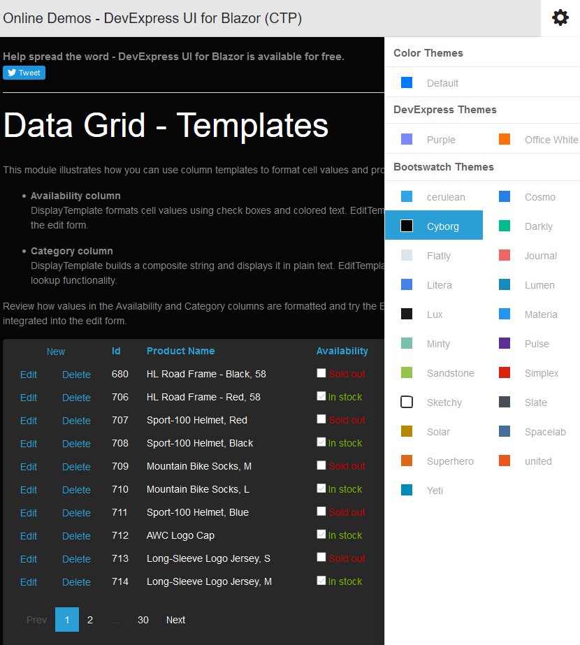
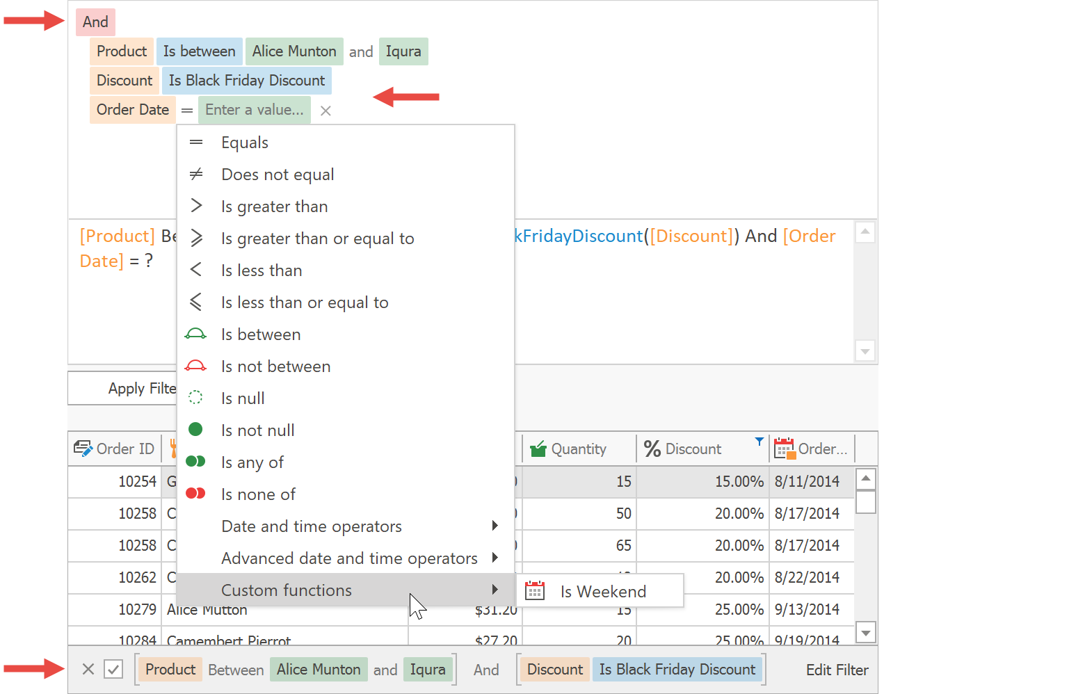
The DevExpress WinForms installation ships with two controls that allow end-users to build filter queries: a Filter Control that provides a GUI, and a Filter Editor Control that combines the Filter Control with a text input-based panel. Most data-aware controls in the WinForms line-up use these components, but you can also include them in your own forms and bind them to data-aware controls as required.

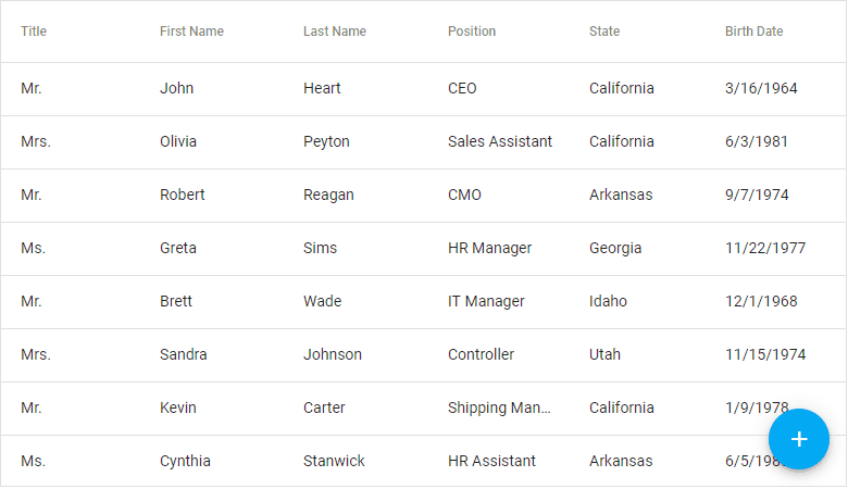
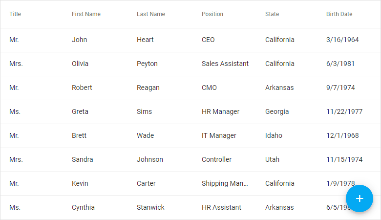
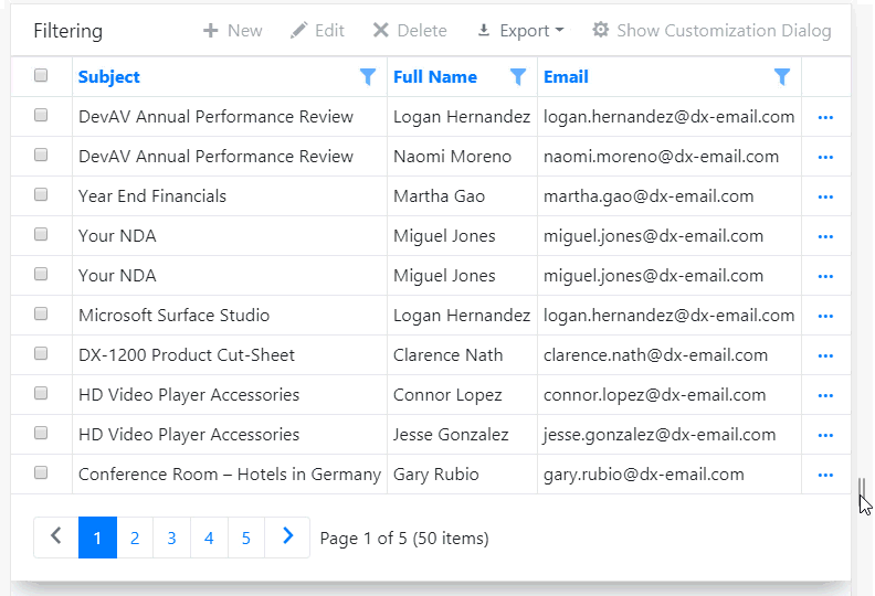
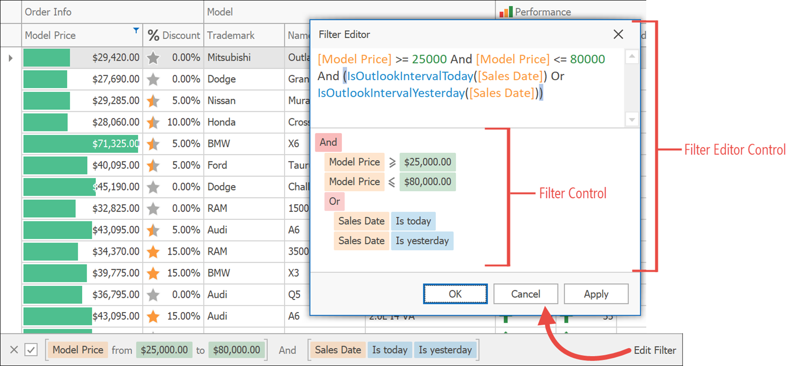
To illustrate, below is a Data Grid with its Filter Editor Control. Users can click the Edit Filter button in the filter panel to bring up the Filter Editor, and the text panel of the Filter Editor Control is visible because the property DefaultFilterEditorView is set to TextAndVisual.

Filter Controls

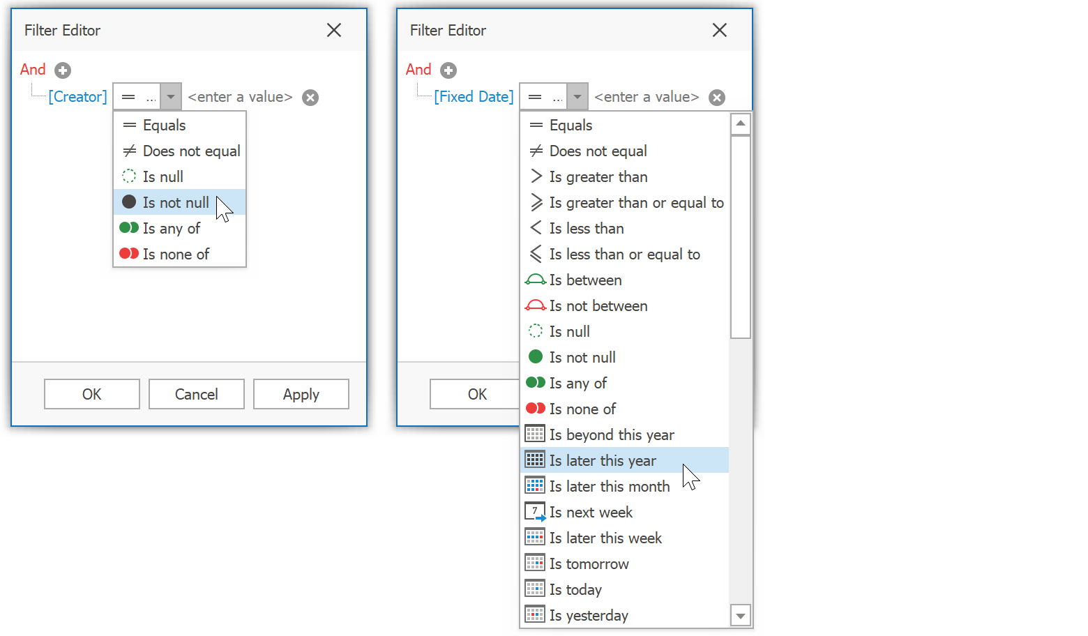
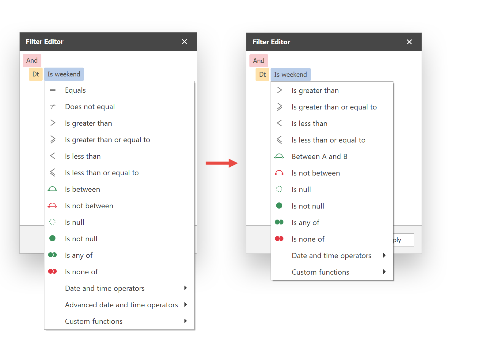
In the following image you can see some of the standard functions available in both controls, including Less or Equal, More or Equal, Is Today, Is Yesterday, and many others. Both Filter Control and Filter Editor Control provide a large variety of functions to choose from. The set of available functions varies depending on the type of the data field for which you’re building an expression.

Standard Functions

Custom Functions

In some scenarios, the standard set of functions is not enough. We processed a large number of Support Center tickets in order to find the most frequently requested custom functions. Here are the three most popular scenarios:

  • Inversions of standard functions, e.g. Does not begin with as the opposite of Begins with. Of course these inversions can be applied manually in the filter editor, but for frequent use a custom function is more convenient.
  • Functions that represent combinations of standard functions for complex expressions. For example, a function Within Days of X could include rows where the field value is within N days before or after a given date. This saves users the effort of configuring the standard function In Between with two separate dates.
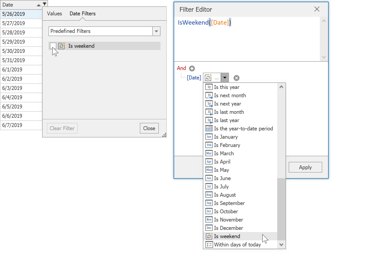
  • Custom DateTime functions, like Is Weekend, N Days Ago and others

Starting with v19.1, both Filter Editor Control and Filter Control fully support custom functions, making it easy to implement the scenarios above and many others.

Technical Basics

A custom function is a class that implements the interface ICustomFunctionDisplayAttributes. Note that you can additionally implement the interface ICustomFunctionOperatorFormattable if you need server-side processing of your custom functions, but in the scope of this article we focus on ICustomFunctionDisplayAttributes alone.

These are the methods and properties required for the interface implementation:

  • Name - the technical function name that you use to refer to a custom function from code

  • DisplayName - a readable function name displayed in the GUI. For instance, a function with the name NotStartsWith may have the DisplayName Does not start with.

  • Image - an icon shown for the function in Filter Control menus. The property type is Object, but the samples below show how to use existing standard images. Image objects can also be assigned.

  • Description - a function description, displayed in a pop-up hint when users write expressions in the text panel of the Filter Editor Control

  • Category - the function category for the Expression Editor. This is not relevant if you plan to use your function only for filters.

  • MinOperatorCount, MaxOperatorCount, IsValidOperandCount - the number of operators supported by the function. For Filter and Filter Editor Controls, all three values can be equal. If you plan to use your functions in the Expression Editor, you can flexibly support variable numbers of operators.

  • IsValidOperandType - called for each operand to check whether it has a valid type. Only the first operand is checked for filters.

  • ResultType - the return value type of the function. The Filter Control shows only functions with a bool result type.

  • Evaluate - the method called every time the function evaluates a data field for inclusion. Values are passed in the operands array. Return true to include the related row, false to exclude it.

Finally, we recommend adding two static convenience functions Register and Unregister. This is an optional step, but the implementations are simple (see below) and they call into existing helpers on the CriteriaOperator type.

Examples

For your reference, here are three examples that cover the three most requested scenarios mentioned above. This first custom function is called NotBeginsWith, a negation of the standard function BeginsWith.

public class NotBeginsWithFunction : ICustomFunctionDisplayAttributes {
  public const string FunctionName = "NotBeginsWith";
  static readonly NotBeginsWithFunction instance = new NotBeginsWithFunction();
  public static void Register() {
    CriteriaOperator.RegisterCustomFunction(instance);
  }
  public static bool Unregister() {
    return CriteriaOperator.UnregisterCustomFunction(instance);
  }

  public string Name => FunctionName;
  public string DisplayName => "Does not begin with";
  public object Image => "FontSizeDecrease;Office2013";
  public string Description => "Hides records when the field begins with the given value";
  public FunctionCategory Category => FunctionCategory.Text;

  public int MinOperandCount => 2;
  public int MaxOperandCount => 2;
  public bool IsValidOperandCount(int count) => count == 2;
  public bool IsValidOperandType(int operandIndex, int operandCount, Type type) =>
    type == typeof(string);
  public Type ResultType(params Type[] operands) => typeof(bool);

  public object Evaluate(params object[] operands) {
    if(operands[0] != null && operands[1] != null) {
      string str1 = operands[0].ToString();
      string str2 = operands[1].ToString();
      return !str1.StartsWith(str2, StringComparison.InvariantCultureIgnoreCase);
    }
    return false;
  }
}

Here’s a second custom function WithinDaysOfToday which checks whether a DateTime value is within the timeframe Today - N days and Today + N days.

public class WithinDaysOfTodayFunction : ICustomFunctionDisplayAttributes {
  public const string FunctionName = "WithinDaysOfToday";
  static readonly WithinDaysOfTodayFunction instance = new WithinDaysOfTodayFunction();
  public static void Register() {
    CriteriaOperator.RegisterCustomFunction(instance);
  }
  public static bool Unregister() {
    return CriteriaOperator.UnregisterCustomFunction(instance);
  }

  public string Name => FunctionName;
  public string DisplayName => "Within days of today";
  public object Image => "SwitchTimeScalesTo;Size16x16;Colored";
  public string Description =>"Shows records when the field value within X days of today";
  public FunctionCategory Category => FunctionCategory.DateTime;

  public int MinOperandCount => 2;
  public int MaxOperandCount => 2;
  public bool IsValidOperandCount(int count) => count == 2;
  public bool IsValidOperandType(int operandIndex, int operandCount, Type type) =>
    operandIndex == 0 && type == typeof(DateTime) ||
    operandIndex == 1 && type == typeof(int);
  public Type ResultType(params Type[] operands) => return typeof(bool);

  public object Evaluate(params object[] operands) {
    DateTime dt = Convert.ToDateTime(operands[0]);
    int days = Convert.ToInt32(operands[1]);
    DateTime start = DateTime.Today.AddDays(-days);
    DateTime end = DateTime.Today.AddDays(days);
    return dt >= start && dt <= end;
  }
}

Finally, IsWeekend tests whether a DateTime value is Saturday or Sunday.

public class IsWeekendFunction : ICustomFunctionDisplayAttributes {
  public const string FunctionName = "IsWeekend";
  static readonly IsWeekendFunction instance = new IsWeekendFunction();
  public static void Register() {
    CriteriaOperator.RegisterCustomFunction(instance);
  }
  public static bool Unregister() {
    return CriteriaOperator.UnregisterCustomFunction(instance);
  }

  public string Name => FunctionName;
  public string DisplayName => "Is weekend";
  public object Image => "DayView;Office2013";
  public string Description => "Shows records when the field value is on Saturday or Sunday";
  public FunctionCategory Category => FunctionCategory.DateTime;

  public int MinOperandCount => 1;
  public int MaxOperandCount => 1;
  public bool IsValidOperandCount(int count) => count == 1;
  public bool IsValidOperandType(int operandIndex, int operandCount, Type type) =>
    type == typeof(DateTime);
  public Type ResultType(params Type[] operands) => typeof(bool);

  public object Evaluate(params object[] operands) {
    DateTime dt = Convert.ToDateTime(operands[0]);
    return dt.DayOfWeek == DayOfWeek.Sunday || dt.DayOfWeek == DayOfWeek.Saturday;
  }
}

Registering Functions

When your custom functions are ready, you need to register them, i.e. add them to the supported function list for Filter Control and Filter Editor Control. If you included the optional Register and Unregister methods in your custom function classes, the registration code is quite short:

//Program.cs file
namespace DXSample {
  static class Program {
    [STAThread]
    static void Main() {
      IsWeekendFunction.Register();
      WithinDaysOfTodayFunction.Register();
      NotBeginsWithFunction.Register();

      // ...
      Application.Run(new Main());
    }
  }
}

Technically, your functions are now available. If you manually write an expression in the text panel of the Filter Editor Control and you use any of these custom functions, a valid filter criteria is generated. However, up to this point the functions will not be included in the visual panel.

Depending on your requirements, use one of the following three techniques to add your custom functions to the GUI.

One Specific Control

To make a function available only for one specific data-aware control and its embedded Filter Editor Control, implement a handler for the event QueryCustomFunctions of the control. Using the code below, the IsWeekendFunction is made available for a Data Grid in both embedded Filter Editor and Excel-style filter menus, while the function WithinDaysOfToday is visible in the Filter Editor only.

gridView1.QueryCustomFunctions += OnQueryCustomFunctions;

private void OnQueryCustomFunctions(object sender,
  DevExpress.XtraGrid.Views.Grid.CustomFunctionEventArgs e) {
  if(e.PropertyType == typeof(DateTime)) {
    e.Add(IsWeekendFunction.FunctionName);
    if(e.IsFilterEditor)
      e.Add(WithinDaysOfTodayFunction.FunctionName);
  }
}

Registering For One Specific Control

All Filter And Filter Editor Controls

To register global custom functions for inclusion in all Filter and Filter Editor controls, add them in a handler of the event CriteriaOperator.QueryCustomFunctions. The function NotBeginsWith is registered globally in this sample:

static class Program {
  [STAThread]
  static void Main() {
    // ...
    CriteriaOperator.QueryCustomFunctions += OnQueryCustomUIFunctions;
    // ...
  }

  private static void OnQueryCustomUIFunctions(object sender,
    DevExpress.Data.Filtering.CustomFunctionEventArgs e) {
    if(e.PropertyType == typeof(string)) {
      e.Add(NotBeginsWithFunction.FunctionName);
    }
  }
}

Specific To Individual Properties

To register functions that should be available for all Filter and Filter Editor Controls but specific to properties on data types, annotate properties with the attribute DevExpress.Data.Filtering.CustomFunction. In this sample, a Data Grid shows a type with two string properties Text and Info. The custom function NotBeginsWith is available only for the Info field.

[CustomFunction(NotBeginsWithFunction.FunctionName /*, Image = <image>*/)]
public string Info {
  get { return info; }
  set {
    if (info != value) {
      info = value;
      OnPropertyChanged();
    }
  }
}

Registration Specific To Individual Properties

Demo

If you have our demos installed on your machine, you can see these samples in the Advanced Filter Control Data Grid demo module.

Customization

In v19.1 we introduced the Visual option for the FilterCriteriaDisplayStyle setting. It combines visual changes to the Filter Panel and the Filter Control, which use little blocks painted with skin colors to show criteria. It also uses a drop-down menu instead of a combo box to select criteria when building expressions. We expect to improve this menu in the future, since it currently lacks a few features (incremental search and fixed height support), but it does arrange functions into groups as a definite improvement over the “non-visual” style where the list of functions can grow inconveniently long.

gridView1.OptionsView.FilterCriteriaDisplayStyle =
  DevExpress.XtraEditors.FilterCriteriaDisplayStyle.Visual;

Visual Criteria Display Style

The menu is fully customizable. The main entry point for such customization work is the event FilterEditorCreated. It provides access to an instance of the FilterEditorControl, which in turn has three events you can handle.

PopupMenuShowing allows you to hide, remove and rename items, and change their icons for any Filter Editor Control menu. The relevant menu for this purpose has e.MenuType == FilterControlMenuType.Clause:

gridView1.FilterEditorCreated += OnFilterEditorCreated;

private void OnFilterEditorCreated(object sender,
  DevExpress.XtraGrid.Views.Base.FilterControlEventArgs e) {
  e.FilterEditor.PopupMenuShowing += OnPopupMenuShowing;
}

private void OnPopupMenuShowing(object sender,
  DevExpress.XtraEditors.Filtering.PopupMenuShowingEventArgs e) {
  if (e.MenuType == FilterControlMenuType.Clause) {
    var node = e.CurrentNode as ClauseNode;

    // customize function menus for DateTime fields
    if (node != null && node.Property.Type == typeof(DateTime)) {
      e.Menu.Hide(ClauseType.Equals);
      e.Menu.Remove(ClauseType.DoesNotEqual);
      e.Menu.Hide(
        DevExpress.XtraEditors.Controls.StringId.FilterAdvancedDateTimeOperatorMenuCaption);
      var menuItem = e.Menu.Find(ClauseType.Between);
      menuItem.Caption = "Between A and B";
      menuItem.ImageOptions.SvgImage = MySvgImage1;
    }
  }
}

PopupMenuShowing

Handle the event InitNode to initialize new FilterEditor nodes created by users, for instance to assign default functions and operators. In the following example, if a user creates a new condition for the field ShippingDate, the function IsWeekend will be selected initially. The function Contains is also configured as the default for all string fields.

gridView1.FilterEditorCreated += OnFilterEditorCreated;

private void OnFilterEditorCreated(object sender,
  DevExpress.XtraGrid.Views.Base.FilterControlEventArgs e) {
  e.FilterEditor.InitNode += OnInitNode;
}

private void OnInitNode(object sender, InitNodeEventArgs e) {
  if (e.IsNewNode) {
    e.PropertyName = "ShippingDate";
    e.SetOperation("IsWeekend");
  }
  else if (e.PropertyType == typeof(string))
    e.SetOperation(FunctionOperatorType.Contains);
}

Implement a handler for BeforeShowValueEditor to customize value editors used in Filter Editor Controls. For example, most DateTime functions work with date operands and use the Calendar editor. However, the custom function WithinDaysOfToday (above) accepts an integer value for the number of days, and the code below changes the default Calendar editor to the SpinEdit control.

gridView1.FilterEditorCreated += OnFilterEditorCreated;

private void OnFilterEditorCreated(object sender,
  DevExpress.XtraGrid.Views.Base.FilterControlEventArgs e) {
  e.FilterEditor.BeforeShowValueEditor += OnBeforeShowValueEditor;
}

private void OnQueryCustomFunctions(object sender,
  DevExpress.XtraGrid.Views.Grid.CustomFunctionEventArgs e) {
  if (e.PropertyType == typeof(DateTime)) {
    e.Add(IsWeekendFunction.FunctionName);
    if (e.IsFilterEditor)
      e.Add(WithinDaysOfTodayFunction.FunctionName);
  }
}

BeforeShowValueEditor

Please Let Us Have Your Feedback

As always, we’re looking forward to your thoughts. We’re continuously working to improve our products, so please let us know if your use case is not covered by our implementation.

More Tips & Tricks Posts

This post is part of our Tips & Tricks blog series. These are other posts in the series:

Blog Post: .NET Word Processing — RTL Enhancements

$
0
0

Over our last two release cycles, we’ve significantly improved right-to-left text handling within our Rich Text Editor (WinForms and WPF) and Word Processing Document API. This blog post summarizes what we’ve delivered to date.

v18.2

With this release, we upgraded undo/redo operations, caret navigation in bidirectional paragraphs and implemented the following enhancements to all our word processing components:

  1. Support for dir=”rtl” HTML tag (import and export).
  2. RightToLeft option for paragraphs, paragraph styles, tables, sections and comments in API.
  3. Text Direction for user interface elements (Command UI and dialogs).
  4. Introduced new numbering formats (ArabicAbjad, ArabicAlpha, Hebrew1, Hebrew2) within the API (the ListLevel.NumberingFormat property) and component UI.
  5. Updated Rulers for right-to-left paragraphs.

v19.1 ships with the following new enhancements:

Paragraph Alignment Types

New paragraph alignment options for Arabic text (Justify High, Justify Medium, Justify Low). You can change alignment in code using the Alignment property. The Rich Text Editor for WinForms and WPF also provides new UI elements for language packs installed on a given machine.

Command UI items for paragraph properties (indents, bulleted, numbered and multilevel lists) now adjust to the direction of a focused paragraph.

Line Numbering

We improved line numbering for right-to-left paragraphs. Numbers now change location based on a sections’s direction. You can print and export (to PDF) right-to-left text with line numbering.

Your Feedback Counts

Tell us your thoughts in the comments section below and help us improve our .NET Word Processor by answering the following question:

Blog Post: ASP.NET, MVC, and XAF Popup Control – Google Chrome v75 Render Issue

$
0
0

Recently, we discovered an issue with Google's latest Chrome browser: our Popup Control will not render page content inside Chrome version v75 (specifically v75.0.3770.80).

The issue was caused by Chrome's inability to correctly render IFrame content when using the src attribute. If you'd like to learn more, please take a look at our bug report on chromium.org:

Issue 971641: Chrome 75 does not render IFRAME content if the content was specified using "src" attribute with some delay

What's affected?

The following components are affected by this issue:

  • WebForms ASPxPopupControl
  • PopupControl MVC Extension
  • XAF Pop-up Window

If you set a URL using either the client-side SetContentUrl method or the ContentUrl property, the popup window will appear empty.

Solution

We've addressed Google’s bug in the following versions (available early next week):

  • v18.1.13
  • v18.2.10
  • v19.1.4

If you need a workaround for current versions, register the following script at the bottom of your HTML page (before the body closure tag):

<body><form id="form1" runat="server">
        ...........</form><script>
        if (window.ASPx && ASPxClientUtils.webKitFamily && ASPxClientUtils.browserVersion >= 75) {
            ASPx.SSLSecureBlankUrl = "about:blank";
        }</script></body>

This workaround should be implemented on each web page that contains our Popup control. If you use a MasterPage (or LayoutView in MVC), register the same script in those pages instead of each content page/view.

If you run in to any issues then please contact our support team and they can help you.

Blog Post: DevExtreme - Data Grid - New Excel Export API (CTP in v19.1)

$
0
0

Our DevExtreme Data Grid has supported data exports to Excel for a long time now. This functionality works well and is sufficient for many use cases. However, there are not many customization points and certain export scenarios are difficult to support on this basis. We received requests to improve the export feature set, including these:

  • Add headers and footers
  • Export multiple widgets into one Excel document
  • Export to different sheets
  • Start exporting to a specific cell
  • Include images and hyperlinks in exports

We planned and attempted some modifications and extensions to our own document generator for the XLSX format, but we realized that the required changes would be substantial. We decided to go a different way and provide an adapter to the feature-rich ExcelJS library.

The resulting solution is now available in v19.1 as a CTP. We added the section Advanced Document Customization to our Widget Gallery demo, and you can see there how the new functionality works with all our usual supported platforms, including Angular, Vue, React, jQuery and ASP.NET MVC and ASP.NET Core.

Advanced Document Customization

Exports Using ExcelJS

It is easy to use the new API. Here is a basic code snippet:

 1
2
3
4
5
6
7
8
9
10
11
12
13
14
15
16
17
18
19
onExporting:e => {
varworkbook=newExcelJS.Workbook();
varworksheet=workbook.addWorksheet('Main sheet');

DevExpress.excelExporter
.exportDataGrid({
worksheet:worksheet,
component:e.component
})
.then(function() {
workbook.xlsx.writeBuffer().then(function(buffer) {
saveAs(
newBlob([buffer], { type:'application/octet-stream' }),
'DataGrid.xlsx'
);
});
});
e.cancel=true;
};

These are the steps implemented by this short sample:

  • The trigger point is an event handler for the onExporting event. Technically you can run the export functionality at any point, but if you use this event you can take advantage of the standard Export button supported by the Data Grid. Note that standard processing is deactivated at the end of the code snippet by setting e.cancel = true.
  • Using ExcelJS API calls, a new workbook/worksheet combination is created
  • Using our new API, the Data Grid is exported to the given worksheet
  • To save the document to a file, the saveAs function from FileSaver.js is called.

You are free to customize this approach, for example by referring to any existing worksheet, or by post-processing the document after the export has taken place.

Here is a link to the basic export sample on CodePen.

Advanced Processing

We prepared several additional CodePen samples to cover common use cases. The ExcelJS API is flexible and allows you to modify worksheets directly, or target them multiple times to combine exports.

Headers And Footers

This code sample adds a step between initial export and saving. In this step, the worksheet range used by the exported Data Grid is available, so you can use it to calculate relative cell coordinates. Note that the topLeftCell property is also used here to influence the location of the Data Grid export in the target worksheet.

 1
2
3
4
5
6
7
8
9
10
11
12
13
14
15
16
17
18
19
DevExpress.excelExporter
.exportDataGrid({
component:e.component,
worksheet,
topLeftCell: { row:5, column:1 }
}).then(function(dataGridRange) {
Object.assign(
worksheet.getRow(2).getCell(2),
{ value:"My Header", font: { bold:true, size:16, underline:'double' } }
);
Object.assign(
worksheet.getRow(dataGridRange.to.row+2).getCell(2),
{ value:"My Footer", font: { bold:true, size:16, underline:'double' } }
);
}).then(function() {
workbook.xlsx.writeBuffer().then(function(buffer) {
saveAs(newBlob([buffer], { type:"application/octet-stream" }),
"DataGrid.xlsx");
});

Headers And Footers

The full sample is available in CodePen.

Custom Cell Formats

Call the exporter and pass a function to the option customizeCell in order to influence the format on the basis of grid information. In this example, cells in a grouped Data Grid are colored depending on their group levels.

 1
2
3
4
5
6
7
8
9
10
11
12
13
14
15
16
17
18
19
20
21
22
DevExpress.excelExporter
.exportDataGrid({
component:e.component,
worksheet:worksheet,
customizeCell:function(options) {
vargridCell=options.gridCell;
varexcelCell=options.cell;

varnodeColors= [ 'FFBEDFE6', 'FFC9ECD7'];
varcolor=gridCell.groupIndex!==undefined?
nodeColors[gridCell.groupIndex] :'FFDDDDDD';
Object.assign(excelCell, {
font: { bold:true },
fill: {
type:'pattern',
pattern:'solid',
fgColor: { argb:color },
bgColor: { argb:color }
}
});
}
}).then(function() { ... }

Custom Cell Formats

The CodePen sample is available here.

Multiple Grids

If necessary, you can call the exporter multiple times. Here is an example that targets different locations in the same worksheet:

 1
2
3
4
5
6
7
8
9
10
11
12
13
14
15
16
17
18
19
20
21
DevExpress.excelExporter
.exportDataGrid({
worksheet,
component:dataGrid1,
topLeftCell: { row:4, column:2 }
})
.then(function(dataGridRange) {
returnDevExpress.excelExporter.exportDataGrid({
worksheet,
component:dataGrid2,
topLeftCell: { row:4, column:dataGridRange.to.column+2 }
});
})
.then(function() {
workbook.xlsx.writeBuffer().then(function(buffer) {
saveAs(
newBlob([buffer], { type:'application/octet-stream' }),
'DataGrid.xlsx'
);
});
});

Two Grids Into One Worksheet

Here is the full sample. We have also prepared a similar sample to export two grids into separate worksheets.

Images

ExcelJS has good support for images in workbooks, and these can be combined with Data Grid exports.

Images In Worksheets

Here is the complete CodePen sample.

Show A Load Panel

As a final sample, we prepared a demo that shows a DevExtreme Load Panel while the export is running. This can be useful for large Data Grid setups where the process takes a little while to complete.

Load Panel

The full CodePen sample is here.

What Do You Think?

If you have any feedback on our implementation, or if you feel that your own export scenarios are not completely covered yet, please don’t hesitate to get back to us. You can leave comments below, open Support Center tickets or take part in the discussion on GitHub. We are always interested in your thoughts!

Blog Post: Upgrade to jQuery v3.4.1+ - DevExpress Controls

$
0
0

In late March 2019, a new medium-level jQuery security vulnerability was disclosed.

This vulnerability is specific for jQuery versions older than v3.4.0 and we encourage you to upgrade to jQuery v3.4.1+.

In this post, I'll discuss why you should update both your jQuery and DevExpress installation.

jQuery Prototype Pollution

The new jQuery 'prototype pollution' vulnerability can be dangerous to your websites because:

This security vulnerability referred to and manifests as prototype pollution, enables attackers to overwrite a JavaScript application object prototype. When that happens, properties that are controlled by the attacker can be injected into objects and then either lead to denial of service by triggering JavaScript exceptions, or tamper with the application source code to force the code path that the attacker injects. - Liran Tal

Specifically, the jQuery.extend() method is affected:

"jQuery before 3.4.0, as used in Drupal, Backdrop CMS, and other products, mishandles jQuery.extend(true, {}, ...) because of Object.prototype pollution. If an unsanitized source object contained an enumerable proto property, it could extend the native Object.prototype." - CVE-2019-11358 Detail

For more information on this vulnerability, please refer to the following posts:

DevExtreme, Web Reports, & Dashboards

This vulnerability affects customers who use DevExtreme, Web Reports, or Dashboards.

Our DevExtreme components use the aforementioned jQuery.extend() method. Since DevExpress Web Reports and Dashboards use the DevExtreme widgets, they are also affected by this vulnerability.

The good news: this vulnerability has been fixed in jQuery v3.4.1+. As such, we've updated the following versions of our product suite:

  • v18.1.12
  • v18.2.9
  • v19.1.4

I recommend that you install our update - this will be the easiest way to move to jQuery v3.4.1.

Our ASP.NET MVC extensions do not use the jQuery.extend() method and subsequently, are not affected. However, for safety and consistency, we've upgraded the jQuery version used by our ASP.NET MVC library as well.

Upgrade npm packages

The following Dashboards and Web Reports npm packages are also affected:

  • @devexpress/analytics-core,
  • devexpress-reporting, and
  • devexpress-dashboard.

These packages have jQuery dependency version >= 3.3.1. Please run the following command and it'll update your jQuery to the latest version:

npm i jquery

If you encounter any issues, please contact our support team for immediate assistance.

Viewing all 3388 articles
Browse latest View live