Quantcast
Channel: Developer Express Global
Viewing all 3392 articles
Browse latest View live

Blog Post: DevExpress UI for Blazor - Virtual Scrolling in Preview 12 (Now Available)

$
0
0

Preview 12 of the DevExpress UI for Blazor is now available and it includes virtual scrolling support for two of our Blazor components.

If you’ve not yet reviewed our Blazor product line, please be certain to check out our Blazor Components webpage. If you are new to Blazor, feel free to review our 5-part Blazor training videos on YouTube.

What's New

Data Grid - Virtual Scrolling

The DevExpress Blazor Data Grid now supports virtual scrolling – allowing your end-users to navigate individual grid rows via the control’s vertical scrollbar.

Use the DataNavigationMode property to enable virtual scrolling:

<DxDataGrid Data=@DataSource
  ...
  DataNavigationMode="@DataGridNavigationMode.VirtualScrolling"
  ...
</DxDataGrid>

ComboBox - Virtual Scrolling

The DevExpress Blazor ComboBox can now load visible items within its drop down list (loads data virtually and on demand). This improves performance when binding to a large dataset.

Set the DataLoadMode property to enable virtual scrolling:

<DxComboBox Data=@Strings
  DataLoadMode="@ComboBoxDataLoadMode.VirtualScrolling"
  FilteringMode="@FilteringMode.Contains"
  @bind-SelectedItem=@SelectedItem>
</DxComboBox>

Demos

You can test our new virtual scrolling demos using the following links:

Download the Preview from NuGet

Our most recent version is available via the DevExpress NuGet Early Access feed:

https://nuget.devexpress.com/early-access/api

If you are a new user, please refer to this article to get started with Blazor today.

This preview is made available under the DevExpress Blazor UI license.

To obtain the build, you will need a DevExpress.com account. Create your free account online or contact us for assistance.

Watch the Webinar

Your Feedback Matters


Blog Post: DevExpress will be at KCDC Conference

$
0
0

This week, the KCDC Conference is being organized in Kansas City and DevExpress is proud to be gold sponsor of this conference. Julian and I will be available to answer all your question about our v19.1 release as well as all the new technology we're releasing. If you want to know what we have for Blazor or Xamarin or what's going on with DevExpress and the upcoming .NET Core v3, stop by and ask.

I will also present a really cool session about AI and Machine Learning so make sure to check that out.

If you're attending to the KCDC Conference, make sure to come by and say 'Hi'.

Blog Post: DevExpress Blazor - Update Metadata at Runtime - Free SEO Tool

$
0
0

In this blog post, I'll discuss a limitation in the Blazor framework and our new utility designed to address it.

As you may know, the Blazor framework does not provide any way to change a document's metadata at runtime (for document metadata: page title, meta tags, and other SEO-related data).

Our utility fixes this issue and is available free of charge.

How to Use the DevExpress SEO Metadata Utility

To get started, you'll need to add our SEO Metadata Utility to your project:

  1. Download the DevExpress Document Metadata project source code from GitHub.
  2. Add the Document Metadata project to your Blazor solution in Visual Studio.

Then follow these steps to learn how to configure the tool.

Server Side Blazor

I'll discuss the server side approach first. Details on the client-side approach are below.

How to Add Default Document Metadata

  1. Add the DocumentMetadata component to a page header:
<head>
    @(await Html.RenderComponentAsync<DocumentMetadataComponent>())
    ...
</head>
  1. Call the AddDocumentMetadata() extension method to register default document metadata:
using DevExpress.Blazor.DocumentMetadata;
namespace BlazorDemo.ServerSide
{
    public class Startup
    {
        public void ConfigureServices(IServiceCollection services)
        {
            services.AddDocumentMetadata((IServiceProvider serviceProvider,
                IDocumentMetadataRegistrator registrator) => {
                registrator.Default()
                    .Title("Blazor UI Components")
                ...
            });
        }
        ...
    }
}

Note, the registrator.Default() method returns a document metadata builder. Use this builder to register metadata defaults for all pages:

registrator.Default()
    .Base("~/")
    .Charset("utf-8")
    .TitleFormat("Demo: {0} | DevExpress")
    .Viewport("width=device-width, initial-scale=1.0")
    .OpenGraph("url", https://dxpr.es/2WogLq7)
    ...

How to Add Custom Document Metadata

  1. You can also load metadata from a database, text file, or any other supported storage location. For example, in our demo application, we store the pages' metadata in a 'DemoConfiguration' section of the appsettings.json file:
{
  "DemoConfiguration": {
    "SiteMode": false,
    "DemoPages": [
      {
        "Url": "",
        "Title": "Blazor UI Components",
        "NavLinkText": "Overview",
        "Icon": "images/Overview.svg",
        "IsUpdated": true,
        "TitleFormat": "Demos: {0} | DevExpress"
      },
      {
        "Url": "GridColumnTypes",
        "Title": "Grid - Column Types",
        "Icon": "images/GridColumnType.svg"
      },
      ...

The following code loads metadata from appsettings.json:

services.Configure<DemoConfiguration> Configuration.GetSection("DemoConfiguration"));
  1. Call the AddDocumentMetadata() method to add custom metadata to web pages:
services.AddDocumentMetadata((serviceProvider, registrator) => {
    var config = serviceProvider.GetService<IOptions<DemoConfiguration>>().Value;
    config.RegisterPagesMetadata(registrator);
});

The config.RegisterPagesMetadata() method populates the service with custom metadata. The following code assigns default metadata for all pages and also specifies the page title for each page:

public class DemoConfiguration
{
    public List<DemoPageConfiguration> DemoPages { get; set; }
    public void RegisterPagesMetadata(IDocumentMetadataRegistrator registrator)
    {
        registrator.Default()
            .Charset("utf-8")
            .TitleFormat("Demo: {0} | DevExpress");
 
        DemoPages.ForEach(pageMetadata => {
            IDocumentMetadataBuilder metadataBuilder = registrator.Page(pageMetadata.Url);
            metadataBuilder.Title(pageMetadata.Title);
            if (!string.IsNullOrEmpty(pageMetadata.TitleFormat))
                metadataBuilder.TitleFormat(pageMetadata.TitleFormat);
        });
    }
}

The TitleFormat() method sets the format for text assigned using the Title() method. If the page title format is not set then the page title is displayed as is.

Client-Side Blazor

Client-side Blazor apps present a challenge because they only render page markup after the web assembly has been loaded. Since search engine crawlers do not read web assembly files, they only get to scan simple HTML pages with static content and meta tags.

So, to update metadata for a client-side Blazor application, you'll need to create both a server-side and client-side Blazor projects. The client-side project code is compiled to a web assembly and will work in the end user's browser. While the server-side project will host the client-side project on your server, deliver the web assembly to the client,and handle requests to the server side. This approach is based on Microsoft's recommendation for Client-side Blazor applications with pre-rendering.

How to Add Default Document Metadata

If you want to add default meta tag set for all Blazor application pages, add metatags to the Page/_Host.cshtml page located in the server-side project. You can see an example of this here.

How to Add Custom Document Metadata

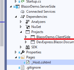
  1. Enable pre-rendering in your blazor application because it allows you to add page-specific meta tags and improve your website's SEO parameters. Start by adding a reference to your client-side Blazor project to the server-side Blazor project:

DevExpress Blazor SEO Tool

Then call the app.UseClientSideBlazorFiles() method in the server-side application's Startup.cs file. Use the client-side application's Startup class as a generic parameter:

public void Configure(IApplicationBuilder app, IWebHostEnvironment env)
{
    …
    app.UseClientSideBlazorFiles<ClientSide.Startup>();
 
    app.UseHttpsRedirection();
 
    app.UseStaticFiles();
    app.UseRouting();
    app.UseEndpoints(endpoints =>
    {
        endpoints.MapDefaultControllerRoute();
        endpoints.MapFallbackToPage("/_Host");
    });
}
  1. Once page pre-render is enabled, call the render the RenderStaticComponentAsync() method with the DocumentMetadata component in the Page/_Host.razor page of your server-side Blazor application:
<head>
    @(await Html.RenderStaticComponentAsync<DocumentMetadataComponent>())
</head>

Note that no additional content is allowed inside the 'head' tags in this case.

  1. Register the DemoConfiguration options and the DocumentMetadata service in both client-side and server-side Blazor projects:
services.AddSingleton<IOptions<DemoConfiguration>, ClientSideDemoConfiguration>(); services.AddDocumentMetadata((serviceProvider, registrator) =>
{
    DemoConfiguration config = serviceProvider.GetService<IOptions<DemoConfiguration>>().Value;
    config.RegisterPagesMetadata(registrator);
});

The appsettings.json configuration file is not transferred to the client side. Therefore, page metadata is populated in the PopulateDemoPages() method of the DemoConfiguration class.

void PopulateDemoPages()
{
    DemoPages.Add(new DemoPageConfiguration() {
        Url = "",
        Title = "Blazor UI Components",
        NavLinkText = "Overview",
        Icon = "images/Overview.svg",
        IsUpdated = true,
        TitleFormat = "Demos: {0} | DevExpress"
    });
    DemoPages.Add(new DemoPageConfiguration() {
        Url = "GridColumnTypes",
        Title = "Grid - Column Types",
        Icon = "images/GridColumnType.svg"
    });
…

Since we have a reference to the client-side Blazor project in the server-side project, this class is available in both projects. You can use it in the server-side Blazor project instead of appsettings.json.

  1. Add the DocumentMetadata component to the Components Application Builder in your client-side Blazor project:
public void Configure(IComponentsApplicationBuilder app)
{
    app.AddComponent<App>("app");
    app.AddComponent<DocumentMetadataComponent>("head");
}

This way, the DocumentMetadata component renders content inside the 'head' HTML tag when an end-user changes web pages in a browser.

The SEO tool is now enabled.

Source code

You can find the SEO Metadata tool source code here:

https://github.com/DevExpress/Blazor/tree/master/tools/DevExpress.Blazor.DocumentMetadata

An example of a server-side Blazor application with the use of the SEO Metadata tool:

https://github.com/DevExpress/Blazor/tree/master/demo/BlazorDemo.ServerSide

An example of a client-side Blazor application with the use of the SEO Metadata tool:

https://github.com/DevExpress/Blazor/tree/master/demo/BlazorDemo.ClientSideWithPrerendering

Your Feedback Matters


Blog Post: XAF - Using XAF's Security System in non-XAF .NET Apps powered by XPO

$
0
0

We recently began a series of posts designed to explain XAF’s security system and how it can be used in non-XAF .NET apps powered by XPO.

The first example was a Console application that reads data protected by current user permissions and outputs the "Protected content" placeholder instead of secured data values.

In our next example, we’ll discuss DevExtreme + ASP.NET Web API OData. Before we do, however, we wanted to summarize some of the reasons we think you should consider XAF’s security system in your next .NET application.

Target Audience & Scenarios

  • XAF developers who create non-XAF .NET apps and want to reuse existing data models and Security System settings (users, roles and permissions) stored in an XAF application database. Based on experience, XAF customers often create custom Web and mobile UI clients with ASP.NET MVC, DevExtreme; backend servers with ASP.NET Web API/OData or Console, Windows Service, WCF apps for various administrative tasks (data modifications, report generation, scheduled workflows).
  • Non-XAF developers who create standard line-of-business (LOB) apps with login, logout forms and security related functionality for any .NET UI technologies like WinForms, WPF, ASP.NET (WebForms, MVC 5, MVC Core, Razor Pages) and .NET server technologies like ASP.NET Web API/OData, WCF, etc. Yet more use-cases with Blazor & Xamarin.Forms (Android, iOS, UWP) UI technologies may come when XAF v19.2 supports .NET Standard 2.0. 

Pain Points

Developers often face the following difficulties when creating security systems:

  • Getting security right: safe, fast, up-to-date, flexible, and database agnostic. Ready-to-use middleware libraries like ASP.NET Core Identity or Identity Server can be difficult to configure or offer unnecessary functionality.
  • LOB app developers want to save time and do not want to implement complex security memberships and authentication/authorization algorithms from scratch. For instance, filtering protected data against the current user’s access rights or checking if the current user is allowed to delete records.
  • Access right customization (runtime). While certain technologies like ASP.NET simplify authentication and basic authorization with built-in design time APIs, it is difficult to build a flexible and customizable security system (allowing users to customize the system once the app is deployed).

The XAF Security System

The primary XAF security system features used in line-of-business applications across supported platforms include:

1. Role-based access control with multi-database permission storage.

1.1. Access control permissions linked to roles and users that can be stored in more than a dozen popular data stores powered by the XPO ORM (including popular RDBMS like SQL Server, Oracle, PostgreSQL, MySql, Firebird, XML and "in-memory" stores).

  • Type permissions grant Read, Write, Create, and Delete access to all objects that belong to a particular type.
  • Object Permissions work in conjunction with Type Permissions and grant access to object instances that fit a specified criterion.
  • Member Permissions grant access to specific members unconditionally or based on a criterion.

1.2. Powerful and easy-to-use APIs to configure users, roles and permissions in code or visually in XAF apps.

1.3. Support for extensions or replacement with fully custom user, role, and permission objects to meet the needs of your business domain or address various integration scenarios.

2. Authentication.

2.1. Built-in authentication types: Forms (user name/password), Active Directory (Windows user) and Mixed (several authentication providers).

2.2. A modern and secure algorithm for password generation and validation.

2.3. Support for extension or replacement with custom authentication strategies and logon parameters. For instance, our popular example shows how to use OAuth2 with Google, Facebook or Microsoft authentication providers.

3. Authorization.

3.1. Just two code lines to read secure records filtered against a logged user (role and permission based). When you set up SecuredObjectSpaceProvider, you can create an unlimited number of secure data contexts - your data query and modification APIs will remain unchanged. A bit more code is required to connect a non-XAF client to the Middle-Tier application server.

3.2. Fine-grain access control for base and inherited objects, one to many and many to many object relationships, individual columns with or without criteria (example: can read the Full Name field, but cannot see and modify Salary) and specific object instances only.

3.3. Straightforward APIs to check CRUD or custom access rights for UI element customizations. With this, you can hide or mask protected grid columns, editors in detail forms, and disable menu toolbar commands like New, Delete, Edit, etc.

3.4. Security permission caching for the best possible performance. Two built-in Permission Policies determine the security system’s behavior when explicitly specified permissions for a specific type, object, or member do not exist.

3.5. Proven in production environments. DevExpress Support, comprehensive documentation, examples and a diagnostic tool are at your service to troubleshoot complex security permission configurations.


Blog Post: WinForms Spreadsheet – How to Create a Rich Text Editor for Worksheet Cells

$
0
0

In our most recent update (v19.1), we added rich text support to our WinForms Spreadsheet control. It now displays rich text within worksheet cells. As you may already know, you can also print and export documents with rich text to PDF. Though our WinForms Spreadsheet control does not allow users to apply rich formatting to cell text within its UI, you can use the following approach to create your own rich text editor for Spreadsheet cells.

This example uses the DevExpress Rich Text Editor control to format cell text. The Rich Text Edit Form appears when a user selects ‘Set Rich Text’ within the Spreadsheet control’s context menu or starts editing a cell that already contains rich text.

How to Create a Custom Rich Text Edit Form

Create a custom form within your Spreadsheet application and add the Rich Text Editor with the Font bar items to the form.

Use the RichEditControl.Options.Behavior properties to disable the Open, Save, Save As, Print, ShowPopupMenu, and Zoom commands in the form. In addition, set the RichEditControl.Options.DocumentCapabilities properties to disable all document features except for CharacterFormatting, Paragraphs, and Undo.

Add a custom item to the Spreadsheet cell’s context menu to invoke the form. Use the SpreadsheetControl.PopupMenuShowing event for this purpose.

private void spreadsheetControl_PopupMenuShowing(object sender, 
												 PopupMenuShowingEventArgs e) 
{
	if (e.MenuType == DevExpress.XtraSpreadsheet.SpreadsheetMenuType.Cell) 
    {
    	Cell activeCell = spreadsheetControl.ActiveCell;
        // If a cell is empty or contains a text value,
        // add the 'Set Rich Text' item to its context menu.
        if (activeCell.Value.IsEmpty || (!activeCell.HasFormula && activeCell.Value.IsText))
        {
        	var setRichTextItem = new SpreadsheetMenuItem("Set Rich Text", 
													new EventHandler(SetRichTextItemClick));
            e.Menu.Items.Add(setRichTextItem);
        }
    }
}

private void SetRichTextItemClick(object sender, EventArgs e)
{
	var richEditForm = new RichTextEditForm(spreadsheetControl.ActiveCell);
    richEditForm.ShowDialog();
}

Handle the SpreadsheetControl.CellBeginEdit event to display the form when a user starts to edit a cell with rich text.

private void spreadsheetControl_CellBeginEdit(object sender, 
                                              SpreadsheetCellCancelEventArgs e)
{
	if (e.Cell.HasRichText)
    {
    	e.Cancel = true;
        var richEditForm = new RichTextEditForm(e.Cell);
        richEditForm.ShowDialog();
    }
}

Display Cell Text in the Rich Text Editor When a User Opens the Custom Form

To display cell text in the Rich Text Editor, you need to transform a cell's value from the Spreadsheet control’s document model into the RichEdit control’s document model.

Use the Spreadsheet API to split a cell’s rich text into runs (text regions with unique formatting), and retrieve text and format settings for all runs in the run collection.

Call the Rich Text Editor’s InsertText method to add each text run to a document. Use CharacterProperties to format the text based on font settings for corresponding runs.

public partial class RichTextEditForm : DevExpress.XtraEditors.XtraForm
{
	private Cell cell;
    
    public RichTextEditForm(Cell cell)
    {
    	InitializeComponent();
        this.cell = cell;
        InitRichEditControl();
    }
    
    private void InitRichEditControl()
    {
        richEditControl1.BeginUpdate();
        if (cell.HasRichText)
        {
        	// Retrieve rich text from a cell.
            RichTextString richText = cell.GetRichText();
            // Obtain a document loaded into the Rich Text Editor.
            Document document = richEditControl1.Document;
            foreach (RichTextRun run in richText.Runs)
            {
            	// Append the current run's text to the RichEditControl document.
                DocumentRange range = document.InsertText(document.Range.End, run.Text);
                // Create CharacterProperties based on the run's font settings
                // and format the inserted text.
                CharacterProperties cp = document.BeginUpdateCharacters(range);
                cp.Bold = run.Font.Bold;
                cp.ForeColor = run.Font.Color;
                cp.Italic = run.Font.Italic;
                cp.FontName = run.Font.Name;
                cp.FontSize = (float)run.Font.Size;
                cp.Strikeout = run.Font.Strikethrough ? StrikeoutType.Single 
                									  : StrikeoutType.None;
                switch (run.Font.Script)
                {
                	case ScriptType.Subscript:
                    	cp.Subscript = true;
                        break;
                    case ScriptType.Superscript:
                    	cp.Superscript = true;
                        break;
                    default:
                        cp.Subscript = false;
                        cp.Superscript = false;
                        break;
               	}
                switch (run.Font.UnderlineType)
                {
                	case DevExpress.Spreadsheet.UnderlineType.Single:
                    	cp.Underline = 
                        	DevExpress.XtraRichEdit.API.Native.UnderlineType.Single;
                        break;
                    case DevExpress.Spreadsheet.UnderlineType.Double:
                    	cp.Underline = 
                        	DevExpress.XtraRichEdit.API.Native.UnderlineType.Double;
                        break;
                    default:
                    	cp.Underline = 
                        	DevExpress.XtraRichEdit.API.Native.UnderlineType.None;
                        break;
                }
            	document.EndUpdateCharacters(cp);
        	}
        }
		else
        	richEditControl1.Text = cell.DisplayText;
        richEditControl1.EndUpdate();
    }
}

Post Changes from the Rich Text Editor to a Worksheet Cell When a User Closes the Custom Form

To submit changes when the form is closed, transform the RichEdit control's document model back to the Spreadsheet’s document model and create a cell value.

Implement a custom Document Visitor to split the RichEdit control’s document into text runs and transform each run into the Spreadsheet’s RichTextRun object. Use the RichTextString.AddTextRun method to combine all RichTextRun objects into the resulting RichTextString.

public class CustomDocumentVisitor : DocumentVisitorBase
{

	private int endPosition;
    
    public RichTextString RichText { get; }

    public CustomDocumentVisitor(int endPos)
    {
    	RichText = new RichTextString();
        endPosition = endPos;
    }
    
    public override void Visit(DocumentText text)
    {
    	base.Visit(text);
        RichTextRunFont runFont = CreateRichTextRun(text.TextProperties);
        RichText.AddTextRun(text.Text, runFont);
    }
    
    public override void Visit(DocumentParagraphEnd paragraphEnd)
    {
    	base.Visit(paragraphEnd);
        if (endPosition - 1 != paragraphEnd.Position)
       	{
        	RichTextRunFont runFont = CreateRichTextRun(paragraphEnd.TextProperties);
            RichText.AddTextRun(paragraphEnd.Text, runFont);
        }
    }

    private RichTextRunFont CreateRichTextRun(ReadOnlyTextProperties tp)
    {
    	// Create a new RichTextRunFont object based on 
        // font attributes of the currently processed text.
        var runFont = new RichTextRunFont(tp.FontName, tp.DoubleFontSize / 2, tp.ForeColor)
        {
        	Bold = tp.FontBold,
            Italic = tp.FontItalic,
            Strikethrough = tp.StrikeoutType == StrikeoutType.Single
        };
        switch (tp.Script)
        {
        	case CharacterFormattingScript.Subscript:
            	runFont.Script = ScriptType.Subscript;
                break;
            case CharacterFormattingScript.Superscript:
            	runFont.Script = ScriptType.Superscript;
                break;
            default:
            	runFont.Script = ScriptType.None;
                break;
        }
		switch (tp.UnderlineType)
        {
        	case DevExpress.XtraRichEdit.API.Native.UnderlineType.Single:
            	runFont.UnderlineType = DevExpress.Spreadsheet.UnderlineType.Single;
                break;
            case DevExpress.XtraRichEdit.API.Native.UnderlineType.Double:
            	runFont.UnderlineType = DevExpress.Spreadsheet.UnderlineType.Double;
                break;
            default:
            	runFont.UnderlineType = DevExpress.Spreadsheet.UnderlineType.None;
                break;
        }
        return runFont;
    }
}

Handle the Click event of our Rich Text Edit Form’s OK button. Create the CustomDocumentVisitor and DocumentIterator instances within the event handler, and iterate over the RichEdit control’s document to combine its text regions into the rich text string. Call the Range.SetRichText method to assign the resulting text to a cell.

private void OKButton_Click(object sender, EventArgs e)
{
	var visitor = new CustomDocumentVisitor(richEditControl1.Document.Range.End.ToInt());
    var iterator = new DocumentIterator(richEditControl1.Document, true);
    while (iterator.MoveNext())
    {
    	iterator.Current.Accept(visitor);
    }
    RichTextString richText = visitor.RichText;
    // Assign the resulting rich text to a cell.
    cell.SetRichText(richText);
    // If a document contains multiple paragraphs,
    // wrap text in a cell.
    if (richEditControl1.Document.Paragraphs.Count > 1)
    	cell.Alignment.WrapText = true;
}

You can download a complete sample project from https://github.com/DevExpress-Examples/how-to-edit-rich-text-in-spreadsheetcontrol.

If you have questions, feel free to contact us via the DevExpress Support Center. We’d love to hear your feedback!

Blog Post: ASP.NET Spreadsheet - Enhancements (v19.1)

$
0
0

In our most recent update (v19.1), we added two major enhancements to our ASP.NET Spreadsheet (the features described herein are available for the WebForms, MVC, Core, and Bootstrap versions of the DevExpress Spreadsheet control).

Client-Side API Enhancements

We've added a new client-side Print command so you can easily invoke the browser's Print dialog.

DevExpress-ASP-Spreadsheet-ClientPrint

<script>
        function onPrintButtonClick(s, e) {
            spreadsheet.Print("_self");
        }
    </script>
    <dx:ASPxButton runat="server" Text="Print document" AutoPostBack="false" Image-IconID="actions_print_16x16devav">
        <ClientSideEvents Click="onPrintButtonClick" />
    </dx:ASPxButton>
Note: Send "_self" to the Print method to display the print dialog on the same page. To display the dialog on a new page, send "_blank" to the method.

If the browser does not support printing, you can export your workbook to PDF. To learn more about client-side printing, please take a look at this blog post.

Culture-Specific Format

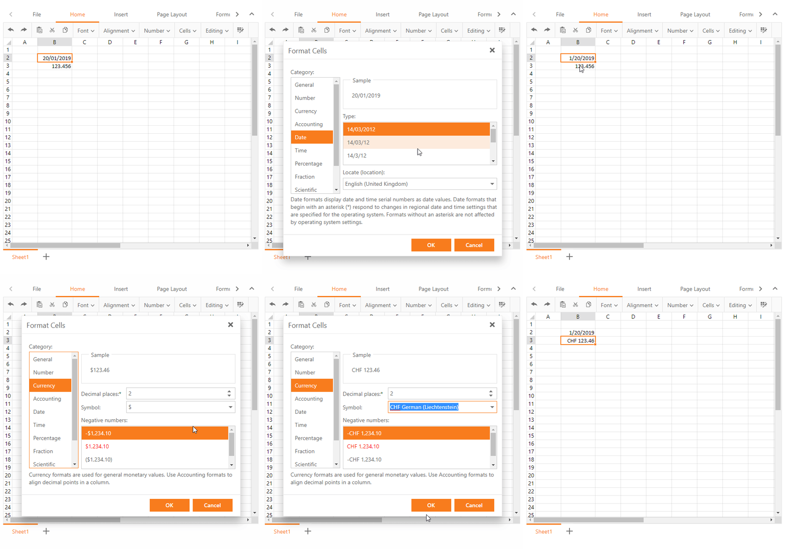
The Format Cells dialog allows you to apply culture-specific formatting to date and numeric values.

DevExpress-ASP-Spreadsheet-CultureFormat

Сulture-specific formatting is applied to a date or numeric cell values based on the current culture (locale). Use the following steps to change the default locale for the Date values:

  • Select a cell or cell range to format
  • Right click on the selection and choose the "Format Cells" menu item
  • Click the Date category on the left side of the dialog
  • Using the "Locale" combo-box, choose a country or region that uses the required date format
  • Select the required date format. The Sample region on the dialog will display a preview of the formatted value
  • Click "OK" to apply the changes

You can also change the default locale for Time, Currency and Accounting type values.

Feedback

We want to hear your thoughts. Please tell us what you think of these new capabilities and how you expect to use it in an upcoming project. Are you currently happy with our server-side print implementation? Do you expect to you use this new client-side print option?

Blog Post: DevExtreme React Chart - Zoom and Pan (v19.1)

$
0
0

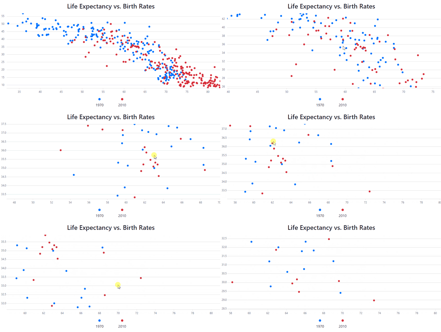
Our React Chart is getting better all the time! In v19.1 we added interactive features that allow users to zoom and pan the chart content with the mouse or with touch gestures.

Chart Zoom and Pan

To activate the new functionality, simply add the ZoomAndPan plugin to the component. You can also use the plugin in controlled mode by setting its viewport and onViewportChange properties.

To control the dimensions for the zoom and pan operations, there are two properties interactionWithArguments and interactionWithValues. Each of these can be set to zoom, pan, both or none. This gives you precise control of the interactions available to the end user.

To pan the chart, the user simply drags the mouse or their finger. To zoom, they can use pinch gestures or the mouse wheel. Additionally, region selection is supported by mouse. By default, the shift key enables this, but the modifier can be changed using the zoomRegionKey property.

Chart Zoom by Region Selection

There is a guide article available in our documentation, which includes some demos. Here’s the reference for the ZoomAndPan plugin, and the demo you saw in the animations above is available here.

What Do You Think?

Please don’t hesitate to leave a comment below if you have any thoughts on the new functionality. You can also access the GitHub repository and submit issues there.

Blog Post: Xamarin.Forms UI Controls - Building the Logify Client App (Part 1)

$
0
0

The Logify Mobile Client – Powered by DevExpress Xamarin.Forms UI Controls

As you may already know, Logify is our 24/7 application crash monitoring platform. Its runtime exception monitoring services and crash reports are available via an intuitive web interface.

Though Logify’s existing web interface does allow you to view and process individual crash reports on mobile devices, we felt it was time to deliver an optimized client for today’s mobile world.

To help showcase the capabilities of our Xamarin.Forms UI controls and to deliver the best possible user experience, we chose to create native Android and iOS apps from a single shared C# code.

This blog series will detail the process from beginning to end. We will solicit feedback and hopefully work with you to deliver a great mobile client for Logify and extend the capabilities of our Xamarin.Forms UI controls where appropriate.

Building the Logify Mobile Client – UI Mockup

We expect the Logify mobile client to include the following app screens. If you’re currently using Logify or expect to do so in the near future, we would love to hear from you. Please tell us if the user interface below addresses your business needs.

If you are new to Logify or are primarily interested in our Xamarin.Forms UI controls, this blog series should offer deeper insights into what is possible with DevExpress Xamarin.Forms components and how you can deliver amazing mobile user experiences in the shortest possible timeframe.

The Logify Mobile Client - Main Menu

The Logify client will include multiple views. As such, we need to create a well-organized navigation menu. We will use the DevExpress Xamarin.Forms Drawer control with a title and links to individual application pages.
  

This Drawer control is our implementation of the Xamarin.Forms MasterDetailPage control.

Reports

Logify’s main workspace will display a list of crash reports/exception events. As you can see in this image, the exception report list requires an advanced UI template. We will use our Xamarin.Forms DataGrid View with a single column. Since our Xamarin Grid supports cell templates, it can be customized as a traditional ListView.

A cell template is a Xamarin.Forms DataTemplate. When the grid is bound to a collection of data objects, the elements specified in the DataTemplate are bound to properties of each data object. This defines the manner in which the component displays values.

The DevExpress Xamarin.Forms Data Grid supports gestures. The Logify client will use the following gestures within the Reports workspace:

  • Swipe Actions – We will implement common actions, including Ignore and Close.

  • Load More – For maximum UI efficiency, we will avoid loading too many items within the list and use “load more” to populate the list.

Filters

The Logify mobile client will display its filter panel within a sidebar (we will use our Drawer component for the sidebar). This panel will allow users to configure custom filters by individual application and report status type. It will also allow users to modify the subscription and team memberships (just like Logify’s web interface).

Note: As you may know, the Xamarin.Forms MasterDetailPage allows us to position a drawer UI element on the left side of the screen. We've decided to use our custom DrawerView to maintain better control over screen position and UI behavior.

Crash Reports View

In the Reports list, we only display application name and the exception associated with individual reports. We will activate the Crash Reports View when a user taps an item in the report list and display detailed information on each exception/crash event.

Logify divides exception information into logical blocks. These blocks can be quite large and can consume significant screen real-estate. To help improve readability, we will use TabView and provide a separate tab for each information block. Custom templates allow us to modify the appearance of tab headers.

Monitored Apps View

Logify’s web UI displays a list of all registered applications (apps that are tracked/monitored by Logify). This image illustrates how we expect to display the information within Logify’s mobile client. 

We will use our Xamarin.Forms Data Grid and custom templates to create the appropriate UI. Each item within this list displays a chart that specifies the number of logged reports for a given app. At present, we do not have a special control for this purpose. We will revisit this as we move forward in this project.

App Detail View

When a user taps an individual application item, the Logify mobile client will display additional information within its Detail View. 

This view includes application name, API key, description and proportion of active crash reports.

Statistics

Logify’s Statistics screen will allow users to visually inspect the overall “health” of an application. 

To improve readability, we expect to organize individual charts within separate tabs.

Your Feedback Matters

At present, DevExpress Xamarin.Forms UI components are included in our Universal Subscription (a new Xamarin-only subscription will be announced later this year). If you’ve yet to try our Xamarin.Forms UI controls or would like to discuss your business needs further, please write to us at info@devexpress.com.

As this project progresses, we expect to regularly share implementation details via this blog. Should you have any questions about this project or would like to share your Xamarin experiences with us, feel free to comment below.


Blog Post: WPF - SVG Image Gallery (v19.1)

$
0
0

The DevExpress Image Gallery includes thousands of icons for use in your next WPF project. To better support high DPI monitors, our design team just added 1980 vector icons to the gallery.

New Collection of SVG Images

New SVG Images

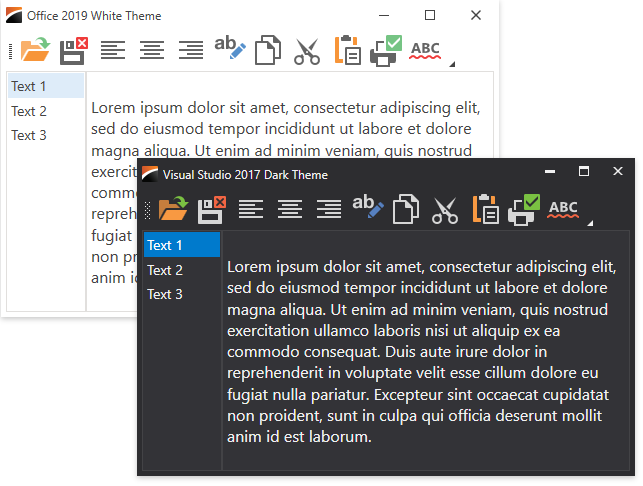
A cool feature of these vector images is that they can change colors based on your application theme. In case you’re curious how this works, the mechanism is described in our documentation.

Image Colors With Different Themes

Standalone Image Picker

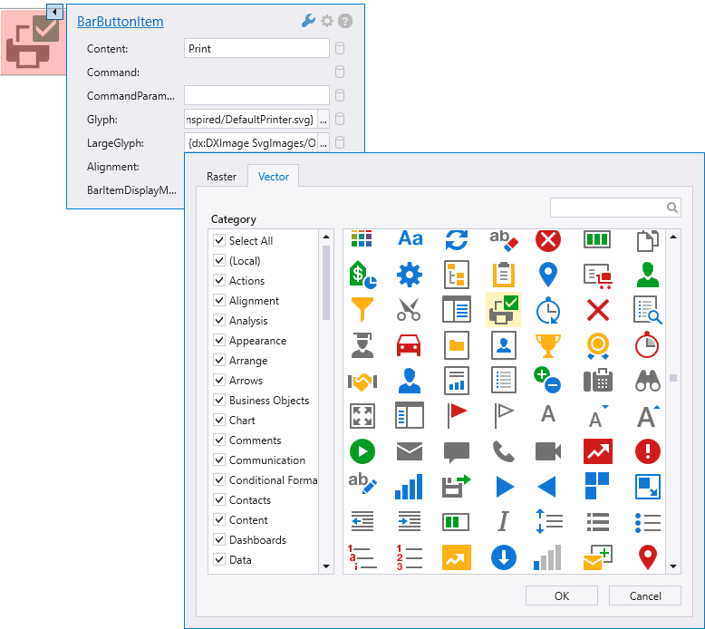
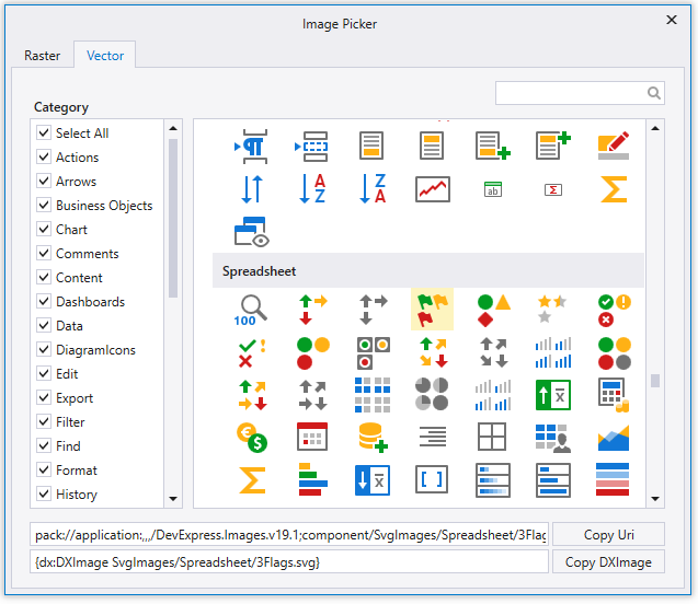
The Image Gallery is only available for properties shown in Smart Tag menus. We now include a standalone Image Picker that you can launch from the DevExpress menu in Visual Studio.

Standalone Image Picker

The Image Picker helps you specify images for properties that are not included in Smart Tag menus, for controls that are not visible in the designer, or for code-behind.

<Stylex:Key="OpenFileBarButtonItemStyle"
TargetType="dxb:BarButtonItem">
<SetterProperty="Command"Value="{Binding OpenFileCommand}"/>
<SetterProperty="Glyph"
Value="{dx:DXImage SvgImages/Actions/Open.svg}"/>
</Style>
window.Icon = newBitmapImage(
newURI("pack://application:,,, [...] ColorMixer_32x32.png"));

Your Feedback Is Welcome

Please feel free to leave comments below if you have any thoughts about the new SVG images or the standalone Image Picker. Your feedback is important to us!

Blog Post: Charting (WinForms, WPF, ASP.NET/MVC) – API Enhancements

$
0
0

A quick post to detail some of the changes we made to our WinForms, WPF, ASP.NET/MVC Charting Library in the v19.1 release cycle.

  • Our ChartControl now offers extended axis label and tick mark positioning support. With v19.1, you can use two extra options to align axis labels and tick marks according to Series point elements. For additional information, please refer to the following articles: Grid Layout Mode (WinForms, ASP.NET), Grid Layout Mode (WPF). You can also refer to the following support tickets for usage scenarios: Axis Label Layout | Center Axis Label Alignment.
  • Both our WinForms and ASP.NET Radar/Polar charts now include an AxisLabel.Angle property. With it, you can modify Radar/Polar chart angle and draw labels using a fixed orientation. For additional information, please review the following support ticket: Polar Diagram Axis Label.
  • A chart’s Pane region can be obtained using the DefaultPane.GetBounds method (Chart Control for WinForms, ASP.NET) or Pane.GetBounds method (ChartControl for WPF). Refer to the following support tickets for sample use cases: Diagram Boundaries | Annotations | Custom Lines | Diagram Location.
  • To improve data source processing speed, use the Series.DataSourceSorted property (ChartControl for WinForms, ASP.NET) to disable the control’s internal sorting procedure. A similar option is available for our WPF Chart control.

Blog Post: Two issues with Windows 10, version 1903

$
0
0

Although version 1903 of Windows 10 is still an optional upgrade, I’m going to guess that more people will be applying it as more news and information about it is revealed by Microsoft. Hence, in order to ensure that our code still works under this new upgrade, we have been doing some testing, the results of which means I have a couple of warnings to impart.

In essence, we have two separate issues with this latest Windows update, and both affect a wide range of our releases. (I will add that we are definitely in touch with Microsoft about these issues, and hopefully solutions will be forthcoming quickly.)

The first of these two issues is related to the new .NET Framework version 4.8, which is included with the update. In short, the bug prevents debugging a WinForms application under Visual Studio 2017 and 2019. Doing so will cause the app to crash with an unhandled exception:

The only way we’ve discovered to avoid the problem is to ensure the application is compiled to target 32bit, or to launch the app without using the debugger. This issue affects all of our WinForms releases.

The second issue is related to the Desktop Window Manager (DWM) and how we use the Windows Acrylic API to create a fluent design. This particular issue affects our demos, and also those customers who use our NavPane control with the Acrylic option enabled – that is, for v18.1 onwards. Unfortunately we have no workaround as yet. The hotfix we shall use for now is to basically disable the Acrylic feature if a specific Windows update is detected.

Again, we are in touch with Microsoft about these issues, but thought them important enough that we let you, our customers, know as well.

Blog Post: XPO - ORM Data Model Designer & LINQ Enhancements, Updates on new Data Sources

$
0
0

Thought I’d write a quick post to detail a few of the changes we’ve made to our XPO ORM Library in the v19.1 release cycle and a couple of changes we expect to make for our next major release (v19.2). 

LINQ to XPO

  • XPQuery now supports the SelectMany(collectionSelector, resultSelector) overload with two arguments - this simplifies LINQ queries for collections, especially many-to-many associations (v19.2). In certain instance, it helps completely eliminate the need for the Join method. Examples:

    new XPQuery<Test>()
         .Where(c => c.Name == "2")
         .OrderBy(c => c.Oid)
         .SelectMany(c => c.ManyToManyCollection, 
             (t, c) => new { 
                  Test = t, ManyToManyCollectionElement = c 
             }
          )
         .OrderBy(tc => tc.ManyToManyCollectionElement.SubName);
    //...
    new XPQuery<Test>()
        .Where(c => c.Name == "2")
        .OrderBy(c => c.Oid)
        .SelectMany(c => new XPQuery<TestRef>()
            .Where(w => w.Owner.Oid == c.Oid && w.Oid >= 0), 
                (r, c) => new { Test = r, TestRef = c })
            .Select(o => new { 
                Name = o.Test.Name, 
                SubName = o.TestRef.SubName 
            }
    );
  • XPQuery supports the new SelectDeleted option when it is initialized with a Session-based constructor (v19.2). Examples:

    unitOfWork.Query<Employee>()
        .SelectDeleted()
        .Where(e => e.Name == null).ToList();
    
    new XPQuery<Employee>(unitOfWork)
         .SelectDeleted()
         .Where(e => e.Name == null).ToList();
  • XPO throws a NotSupportedException when a non-persistent property is used in OrderByXXX or Where expressions (v19.1). You can still set the static DevExpress.Xpo.XPQueryBase.SuppressNonPersistentPropertiesCheck option to False to temporarily disable this behavior (not recommended).

New XPO Data Sources


ORM Data Model Designer

  • The designer can now store connection string in the appsettings.json file of .NET Core projects (v19.2). 
  • You can now control whether to generate JSON serialization and Dependency Injection extensions for XPO in .NET Core apps (v19.2). These extensions are especially helpful for ASP.NET Core and Web API/OData apps.

  • Of course, many other data model generation options are available within the designer: 

  • When a connection to a database fails, the wizard will display detailed error information and links so you can easily troubleshoot connection issues (v19.1).

  • Important Note: Please beware of a Visual Studio issue that causes the ORMDataModel window to render transparently or black. As a workaround, uncheck Envrionment > General > Optimize rendering for screens in the IDE options and restart (T756731).

Love XPO and want to help us promote it? Add the package through Nuget.org instead of DevExpress Nuget!

Blog Post: WinForms DockManager - Dock Panels to center

$
0
0

Our WinForms component suite includes a feature-complete Dock Manager component. It was designed to help you create panels within your app and to dock those panels to a form’s edge or float the panel as necessary.

From a layout perspective, our Dock Manager is quite flexible – it’s only limitation is that panels cannot be docked to the center of a given container.

nohint

To populate the central region of a form or UserControl, you need to add a different component to your form – the DevExpress Document Manager. This component works with its own child objects (Documents), but it accepts our Dock Manager’s panels as well.

documents-and-panels

The following list summarizes the major benefits of our Document Manager:

  • By using the Document Manager, you can separate the central “content” region from form edges;
  • The Document Manager gives you the ability to load Document content dynamically. Dynamic content loading improves application performance.
  • The Document Manager can scan your application for UserControls and create Documents for each automatically;
  • The Document Manager can be used in non-Document Mode for non-MDI (multi-document interface) apps.

If you are not interested in any of the benefits outlined above, but still wish to dock panels to the center of your form, we have some good news for you. In our next major release (v19.2), you’ll be able to dock DockManager panels to the center of your container.

panels-to-center

This new behavior will be available by default. You will be able to revert to the old behavior by disabling the AllowDockToCenter property (DockManager.DockingOptions settings group). If you wish to retain the option but prevent users from docking panels to the central region, you’ll simply handle the ShowingDockGuides event.

1
2
3
4
5
6
7
8
usingDevExpress.XtraBars.Docking2010.Customization;
//. . .
privatevoidDockManager1_ShowingDockGuides(objectsender,
ShowingDockGuidesEventArgse)
{
if (e.Panel == panToolbox&& e.TargetPanel == null)
e.Configuration.Disable(DockGuide.Center);
}

Your Feedback Matters

This blog is the first in a series of posts related to v19.2 features. Our goal is to share as much information as possible so you can express your thoughts and tell us how you’d like to see us improve our next release. If you’re using our DockManager or DocumentManager, we’d love to hear your feedback. Do you currently allow users to dock panels to the center of your form?

Blog Post: Mapping (WinForms, WPF) – API Enhancements

$
0
0

A few days ago, I shared some of the API changes we made to our WinForms, WPF, and ASP.NET/MVC Charting library (v19.1). In this post, I’ll detail recent API enhancements to our WinForms and WPF Mapping library.

Blog Post: Blazor Components - New Blazor Scheduler Control, Data Grid Enhancements and more (available in Beta #1)

$
0
0

As you may know, DevExpress released the first preview of its Blazor UI components in April. Thanks to your outstanding feedback, we are inching closer to our official release.

Our first beta brings with it a new Blazor Scheduler component along with a myriad of enhancements designed to improve the overall capabilities of our Blazor product line.

Blazor Preview 7 Support

Microsoft recently announced availability of Blazor Preview 7. The components in our first beta fully support Preview 7.

New Blazor Scheduler Component

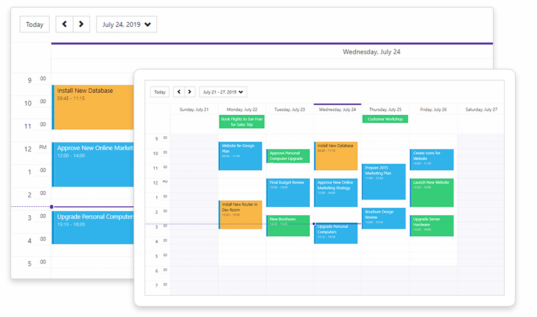
A picture is worth a thousand words…Here is a screenshot of our new Blazor Scheduler component (available in Beta #1).

DevExpress Blazor - Scheduler Component

Mobile Friendly

The component is ready for the use on desktop and tablets alike. We plan to add a mobile-optimized Agenda view in a future release.

Scheduler Views

The DevExpress Blazor Scheduler control supports 3 calendar views: 'Day View', 'Work Week View', and 'Week View'. As its name implies, our 'Day View' displays appointments for single or multiple days. Use the DayCount setting to control day display count. The 'Work Week View' displays 5-day intervals. The 'Week View' displays appointments/events across a 7 day period. FirstDayOfWeek allows you to specify the first day of the week (Sunday by default).

Data Binding

To bind the Scheduler control to data, use the DxSchedulerDataStorage object. Populate AppointmentsSource and AppointmentMappings collections. The DxSchedulerDataStorage object supports additional fields for custom data:

  • Use AppointmentLabelsSource and AppointmentLabelMappings to display custom Labels within the Scheduler
  • Use AppointmentStatusSource and AppointmentStatusMappings to display custom event status

Once the DxSchedulerDataStorage object is created, you can assign it to the DxScheduler.DataStorage property or use it as a stand-alone data source to retrieve appointment data without adding the Scheduler component on a web page. See our online demo for more information.

Recurring Appointments

Our Blazor Scheduler control supports recurring appointments. To create a recurring appointment, add assign in the following format to the RecurrenceInfo field:

<RecurrenceInfo Start="07/23/2019 9:30:00" End="07/23/2019 11:00:00" WeekDays="36" Id="04dcc127-df56-49d7-baff-ce4b6264addd" OccurrenceCount="10" Range="1" Type="1" />

An appointment supports the following Ranges:

public enum RecurrenceType {
  Daily = 0,
  Weekly = 1,
  Monthly = 2,
  Yearly = 3,
  Minutely = 4,
  Hourly = 5,
}

and recurrence Types:

public enum RecurrenceRange {
  NoEndDate = 0,
  OccurrenceCount = 1,
  EndByDate = 2
}

Online Demo

Data Grid

Vertical and Horizontal Scrolling

Our Blazor Data Grid control now supports both vertical and horizontal scrolling. To activate scrolling, assign one of the following values to VerticalScrollBarMode and HorizontalScrollBarMode properties:

  • Auto– A scrollbar is automatically displayed when content size exceeds the component size.
  • Visible - The scrollbar is always visible.
  • Hidden - The scrollbar is hidden.

Use the VerticalScrollableHeight property to set the height of the visible scroll region.

Horizontal scrolling is fully compatible with the Virtual Scrolling mode. You can enable Virtual mode for vertical scrolling and a horizontal scrolling at the same time.

See the online demo for additional info.

Column Visibility

Our Blazor Data Grid now offers hidden column support. Use the Visible property to manage column visibility. Once you hide a column, its editor is no longer available. If you want to display the editor, assign one of the following values to the DxDataGridColumn.EditorVisible property:

  • Default– Column editor visibility is linked to column visibility. If the column is hidden, the editor is hidden as well. If the column is visible, the editor is also visible.
  • True– The Column editor is visible regardless of the column’s Visible property value.
  • False– The Column’s editor is always hidden.

TreeView

Data Binding

Our Blazor TreeView allows you to bind hierarchical data via any object that implements the IEnumerable interface (one that has a child item collection for use as a data source for the TreeView). Assign your data source to the TreeView.Data property and ChildrenExpression to obtain the child item collection used to bind our TreeView to data.

Additionally, our TreeView provides the following properties for custom data display:

  • TextExpression - A lambda expression that returns node text from a corresponding data item
  • NameExpression - A lambda expression that returns a node’s unique identifier (a name)
  • NavigateUrlExpression - A lambda expression that returns a node’s target URL
  • IconCssClassExpression - A lambda expression that returns the name of a CSS class applied to a node’s icon

To learn more, please review our TreeView - Binding to Hierarchical Data demo.

Note: This data binding implementation allows our Blazor TreeView to display Master-Detail relationships (nodes at different levels can be bound to different type item collections). See the TreeView - Master-Detail Data Binding demo to configure our TreeView to operate in this manner.

Form Layout

Items Visibility

We’ve added a Visible property to the following FormLayout items:

  • DxFormLayoutItem
  • DxFormLayoutGroup
  • DxFormLayoutTabPages
  • DxFormLayoutTabPage

You can now display or hide specific items, item groups or tabs by setting the Visible property to true or false.

Your Feedback

Your feedback matters. Please share your thoughts about this update below and tell us what you’d like to see us develop next for the Blazor platform.


Blog Post: XPO - .NET Core 3.0 Support for WinForms and WPF Apps with Microsoft.NET.Sdk.WindowsDesktop

$
0
0

In late 2018, we announced .NET Core 3.0 support for WinForms and WPF apps with the new desktop SDK (Microsoft.NET.Sdk.WindowsDesktop). As of July 2019, we have completed all unit tests for XPO v19.2 for both WinForms and WPF .NET Core 3.0 apps. We will also migrate these changes to v19.1.

Distribution via Nuget

XPO for .NET Core 3.0 WinForms and WPF apps can be added using the DevExpress.WindowsDesktop.* packages from the DevExpress Nuget:

  • DevExpress.WindowsDesktop.Core
  • DevExpress.WindowsDesktop.Win
  • DevExpress.WindowsDesktop.Wpf
  • DevExpress.WindowsDesktop.Xaf 

Updated early access preview feeds should be available sometime in August.

Platform Limitations

At present, the .NET Core 3.0-based version of XPO has the following limitations (these limitations are dictated by the target framework and other factors):

  • ImageValueConverter. To workaround this limitation, change your image property declaration from System.Drawing.Image to byte[] (example).
  • XpoDefault helper methods that allow you to create WCF data store clients from connection strings. This is also true for the .NET Standard 2.0 version of XPO - we cannot add dependencies to System.ServiceModel.Http and other Nuget packages (T736928).
  • Database vendor limitation for .NET Core 3.0. For instance, the newest version of System.Data.SqlClient does not support SQL Server 2000.
  • More difficult code sharing if you create core libraries with the DevExpress.Data or DevExpress.Xpo assemblies. You may need to create 2 *.csproj files: one for .NET Core 3.0 desktop apps and the other for .NET Standard 2.0 cross-platform apps (this may improve with .NET 5 in 2020).

Love XPO and want to help us promote it? Add the package through Nuget.org instead of DevExpress Nuget!

Blog Post: WinForms Tips & Tricks (July Edition)

$
0
0

We’ve received some great WinForms support questions this month and want to share our favorites with you. Please take a moment to review the following tickets and tell us whether these solutions (or peer suggestions) are something you’ll implement in an upcoming WinForms app.

  • How to customize our WinForms Ribbon control’s Search Menu item (yes, this is a new feature - v19.1) and catch Enter key presses.
    Ticket ID:T800370
  • How to display text within WinForms Grid cells while in display mode and checkboxes while in edit mode.
    nohint
    Ticket ID:T759268
  • How to display an image below text content within WinForms Grid cells (using RepositoryItemHypertextLabel).
    nohint
    Ticket ID:T759033
  • Common usage scenario: Form size change when loading PresentationCore DLL in an MVVM application.
    Ticket ID:T800072
  • How to customize the layout and add new controls to our XtraDialog (and display it as a custom MessageBox).
    Ticket ID:T800075
  • How to edit controls hosted in LayoutControlItems at runtime.
    Ticket ID:T753577
  • How to customize our WinForms Ribbon control for MVVM WindowedDocumentManagerService, RibbonFormService. You can follow this approach to customize any other WindowedDocumentManagerService container (e.g., the RibbonForm).
    Ticket ID:T752295
  • How to draw a custom Line and align it to the beginning of our WinForms Chart control’s diagram area (using built-in API).
    Ticket ID:T757396
  • What's the difference between XtraReport.Print and ReportPrintTool.Print methods.
    Ticket ID:T755391
  • Query Builder: Unicode characters are not displayed in data column captions.
    Ticket ID:T750829
  • How to disable our WinForms Report format converter dialog (data bindings to expression bindings).
    Ticket ID:T754776
  • How to change the appearance of a selected control in the End-User Report Designer.
    Ticket ID:T800652

If you come across a support ticket that was particularly useful to you and your team, please share it with the DevExpress developer community (Twitter | Facebook).

Blog Post: DevExpress Reports - Tips & Tricks (July 2019)

$
0
0

Thank you for you continued support and for choosing DevExpress Reports. We appreciate the great feedback and questions. Here are a few interesting support tickets we answered in July. Hopefully you’ll find them of value as you integrate our reporting platform in your next desktop or web project.

New Reporting Feature

Editing content within the Print Preview: How to remove a pre-loaded image from XRPictureBox.

New Image Editing Options

Refer to the Content Editing in Print Preview topic in our documentation for the actual information on the image editors.

Ticket ID:T747500

Reporting – Multiple Supported Platforms (WinForms, WPF, ASP.NET, .NET Core)

  • How to add a formatting rule in DevExpress Reports v17.2+.
    Ticket ID:T759318

  • How to include a diagram (DevExpress WinForms Diagram) control inside a WinForms report.
    Ticket ID:T758740

  • How to know whether a query returns no data for a report.
    Ticket ID:T758520

  • How to store and read edit field metadata from a PDF file generated by DevExpress Reports.
    Ticket ID:T757807

  • How to change JsonDataSource at Runtime.
    Ticket ID:T801514

WinForms Reporting

  • What’s the difference between XtraReport.Print and ReportPrintTool.Print methods.
    Ticket ID:T755391

  • Query Builder: Unicode characters are not displayed in data column captions
    Ticket ID:T750829

  • How to disable our WinForms Report format converter dialog (data bindings to expression bindings).
    Ticket ID:T754776

  • How to change the appearance of a selected control in the End-User Report Designer.
    Ticket ID:T800652

WPF Reporting

  • How to migrate a WPF application to .NET Core 3 and integrate DevExpress Reports within it.
    Ticket ID:T756863

  • How to open a report created in a WPF application (.NET Framework) and save it as a PDF file in a .NET Core application.
    Ticket ID:T758061

Web Reporting

  • Web Report Designer: Memory leaks in browser while using designer in an Angular application.
    Ticket ID:T756640

  • JsonDataSource - Special characters such as € are not displayed.
    Ticket ID:T758660

  • How to stop a previewed report’s document generation process automatically via a timeout (to prevent performance issue).
    Ticket ID:T757658

  • Web Report Designer: How to create a read-only report.
    Ticket ID:T756780

  • Adding authentication to our HTML5 Report Viewer component (ASP.NET Core / Angular).
    Ticket ID:T714576

  • Web Report Designer: How to hide a subreport from the toolbox.
    Ticket ID:T801675

  • Web Report Designer: Wizard customization - How to remove report types.
    Ticket ID:T750005

  • Web Report Designer: How to open multiple reports and save them simultaneously.
    Ticket ID:T750714

Documentation Updates

Please note, we updated the following help topics:

We also published the How to customize the Web Report Wizard example and added a Report and Dashboard Server Registration help topic.

As always, we welcome your comments and feedback. If you’ve come across a useful Support Center ticket, feel free to share it with the DevExpress developer community here.

Blog Post: WPF Tips & Tricks (July 2019)

$
0
0

To all our WPF users – thanks for the great feedback this month. The following is a short summary of support tickets we answered in July. As always, we are here to help. Should you have any questions or issues with our WPF products, feel free to post your comments below or submit a support ticket via the DevExpress support center.

Performance Related Support Tickets

  • How to dynamically populate columns within our WPF Data Grid (and increase overall performance).
    Ticket ID: T801190
  • How to improve initial loading speed.
    Ticket ID: T802121
  • How to work around WPF performance issues with items of different height.
    Ticket ID: T801341

WPF Data Grid and WPF Tree List

  • How to bind cell colors to data within a grid when using dynamically generated columns.
    Ticket ID: T801118
  • How to copy cell values from one column to another by dragging column headers.
    Ticket ID: T801625
  • How to only display node images for root nodes within the Tree List.
    Ticket ID: T801857

WPF Charting

  • How to create a line annotation at the end of the Line Series with our WPF Chart control (anchor annotations to the end of Line Series segments).
    Ticket ID: T745025
  • Charting large amounts of data with our WPF Chart control: How to implement a sliding window using MVVM
    Ticket ID: T753643

WPF Reporting

  • How to migrate a WPF application to .NET Core 3 and integrate DevExpress Reports within it.
    Ticket ID: T756863
  • How to open a report created in a WPF application (.NET Framework) and save it as a PDF file in a .NET Core application.
    Ticket ID: T758061

Other Controls

  • How to populate the Ribbon control (MVVM) and merge all Home pages into one.
    Ticket ID: T801345
  • How to display a loading indicator over a specific region of your app and keep the rest of the app responsive to user actions.
    Ticket ID: T802181
  • How to get all panels from our WPF Dock Manager (DockLayoutManager).
    Ticket ID: T300923
  • How to prevent leaf node selection in a hierarchical WPF Lookup control (LookUpEdit).
    Ticket ID: T802749

If you have a support ticket you’d like to share with the DevExpress developer community, please share the link below. Thanks for choosing DevExpress for your WPF development needs.

Blog Post: DevExtreme-Based ASP.NET Controls support ASP.NET Core 3 Preview (v19.1.5)

$
0
0

Our DevExtreme-based ASP.NET controls are now compatible with the preview version of the upcoming ASP.NET Core 3.0 framework.

Thanks to your feedback, we fixed the TypeLoadExceptionissue which cleared the way for ASP.NET Core 3.0 compatibility.

DevExtreme versions 19.1.5 and 18.2.10 provide the above mentioned compatibility as well.

Enable in VS2019

The .NET Core 3 framework is set for release in September 2019. If you're curious about its features, I recommend testing our DevExtreme-based ASP.NET Controls with Visual Studio 2019 and .NET Core 3 Preview.

Helpful links:

Note: DevExtreme Visual Studio project templates and demos still use .NET Core framework v2.x, however, the "Add DevExtreme to the Project" context menu and Scaffolders work with 3.0-preview projects.

Your Feedback

Your feedback matters. Please share your thoughts about the upcoming .NET Core Preview 3 and tell us what you’d like to see us develop next for the DevExtreme-based ASP.NET controls.

Viewing all 3392 articles
Browse latest View live