In this post, we'll detail some of the features we expect to ship in our next major release (v19.2) and invite active Universal and DXperience Subscribers to test new functionality before we complete our current dev cycle.
As always, we thank you for choosing our WPF components and for placing your faith in DevExpress.
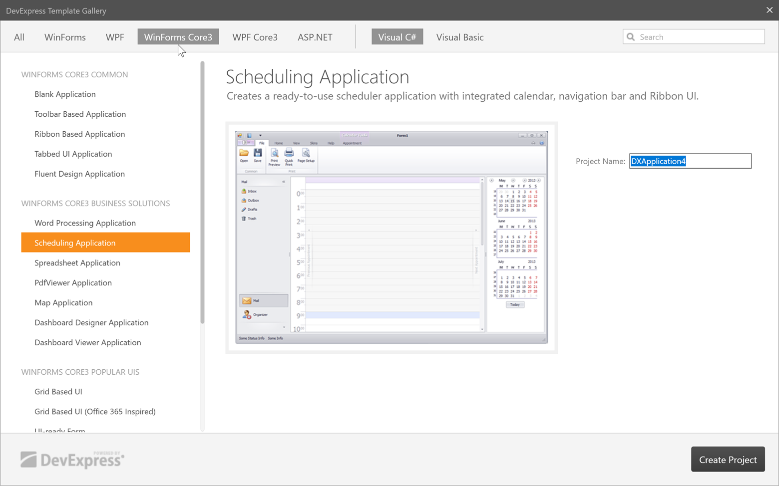
.NET Core Support
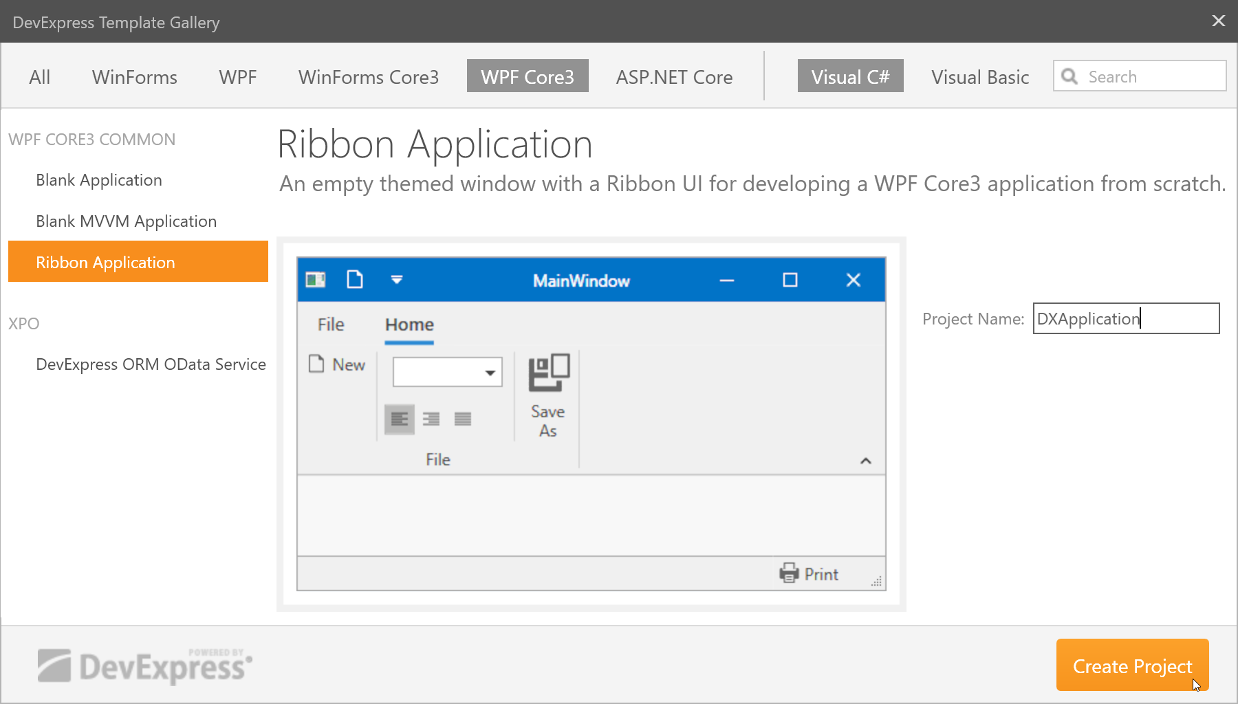
Our v19.2 installation includes project templates for the .NET Core 3. You can find the new project templates in our Template Gallery.
These project templates allow you to create new WPF .NET Core applications and integrate DevExpress WPF controls within them without the need for manual integration.
![DevExpress Template Gallery]()
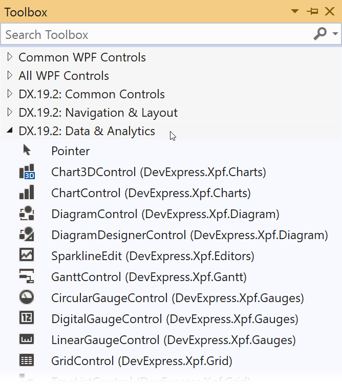
Once the new .NET Core project is generated and built, you can drag DevExpress WPF controls from the toolbox onto the XAML designer or the markup.
![DevExpress Visual Studio Toolbox Integration]()
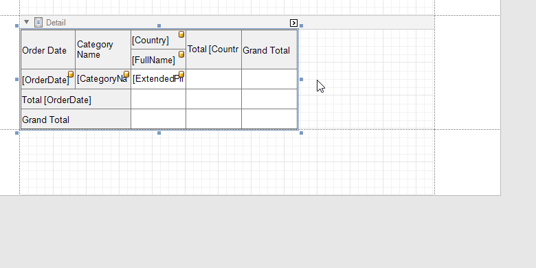
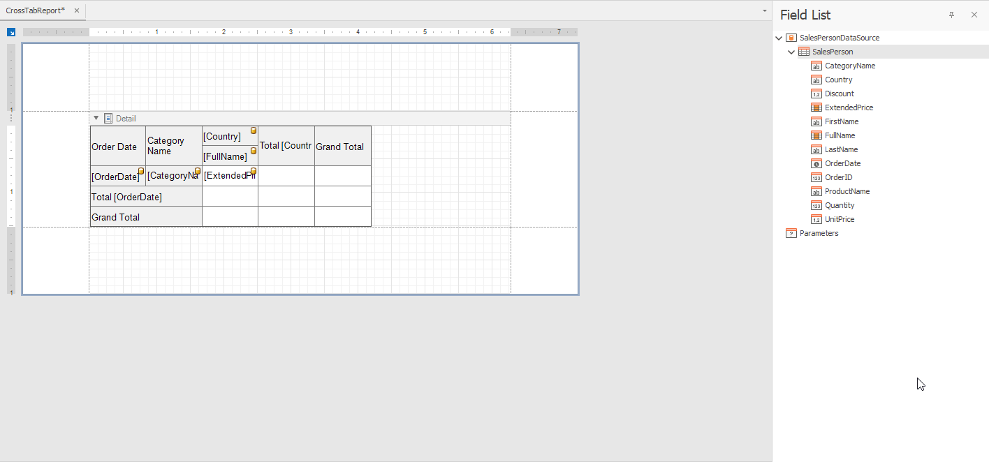
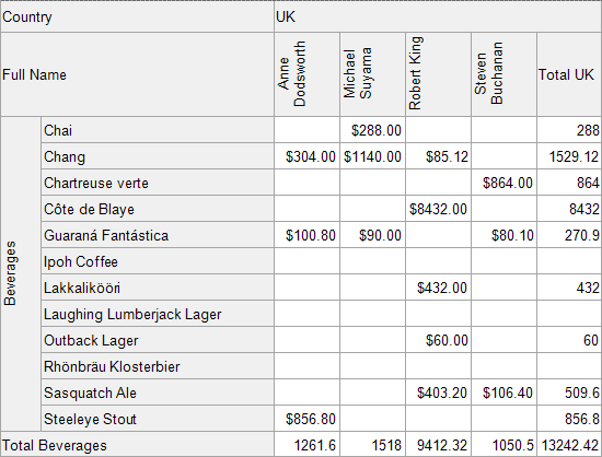
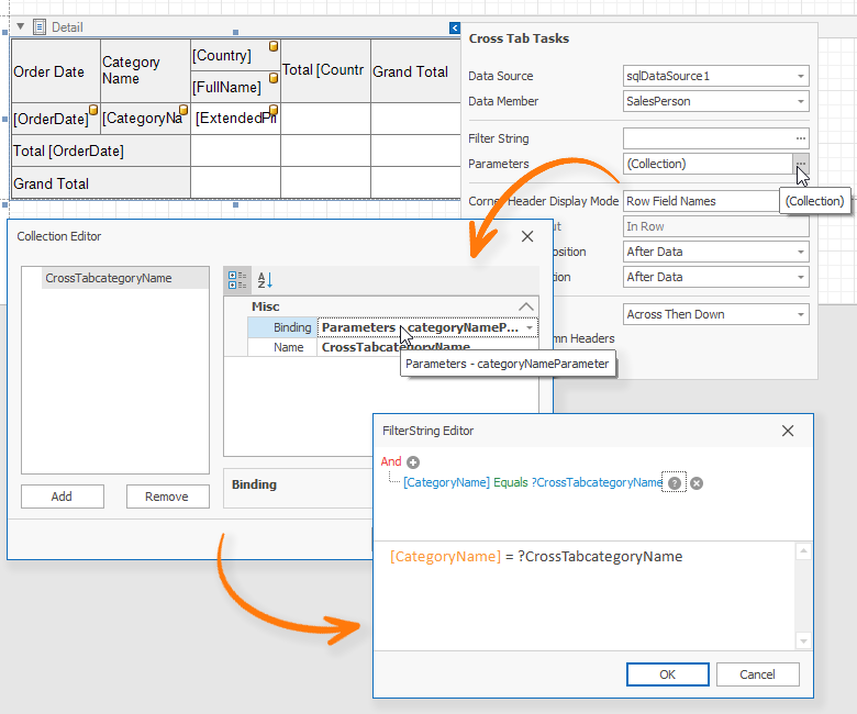
WPF Data Grid & Tree List
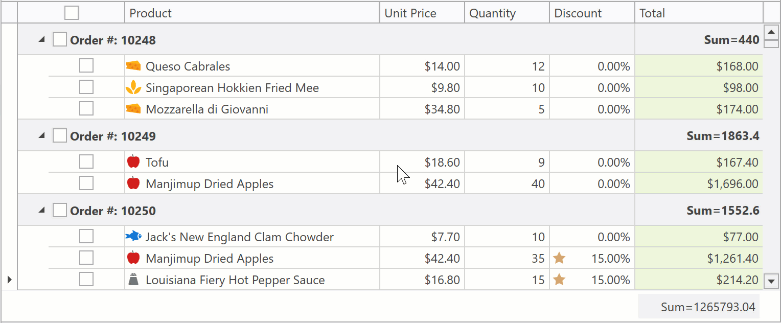
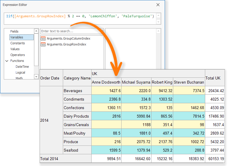
Summary for Selection
The Data Grid and Tree List can now calculate summary values for selected rows or cells. You can enable this functionality for all group and total summaries:
![Grid summary for selected rows]()
Demo Link:Data Grid - Web Style Row Selection
Alternatively, you can create individual summary items for selected rows/cells (in addition to standard totals):
![]()
Demo Link:Data Grid - Multi Row Selection
Though summary for selection needs to be recalculated every time a user changes selection, we made certain to maximize execution speed.
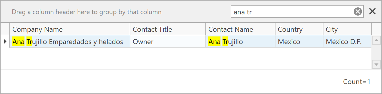
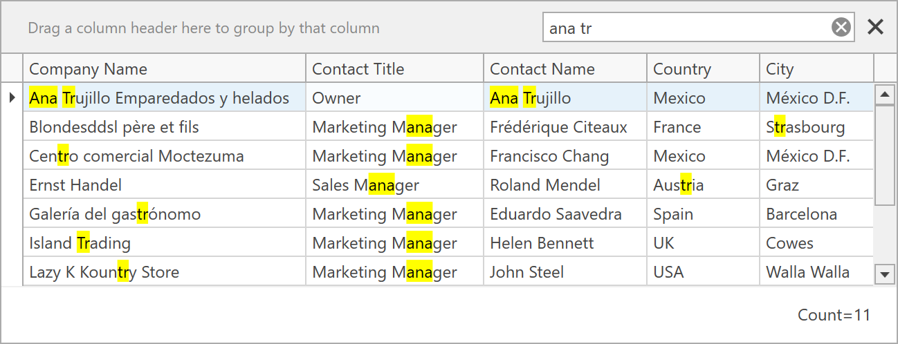
New Search Panel Parse Modes
Our WPF Search Panel introduces three new parse modes and provides the following search options:
Exact - the search engine does not split the query into individual words and thereby looks for exact matches:
![pic]()
In this mode, the search engine treats all symbols as-is and does not support any special keywords.
Or - words in the search query are combined with the Or operator:
![pic]()
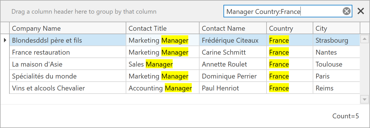
And - words in the search query are combined with the And operator:
![pic]()
Mixed (Default) - words in the search query are combined with the Or operator. The operator changes to And if you specify a column name before a search word:
![pic]()
This mode was available prior to v19.2 and will remain the default option.
You can switch between WPF Search Panel's parse modes using the SearchPanelParseMode property, specify the filter condition (Contains, StartsWith, Equals, and Like) using the SearchPanelFindFilter property, or handle the SearchStringToFilterCriteria event to implement custom search logic.
Demo Link:Data Grid - Search Panel
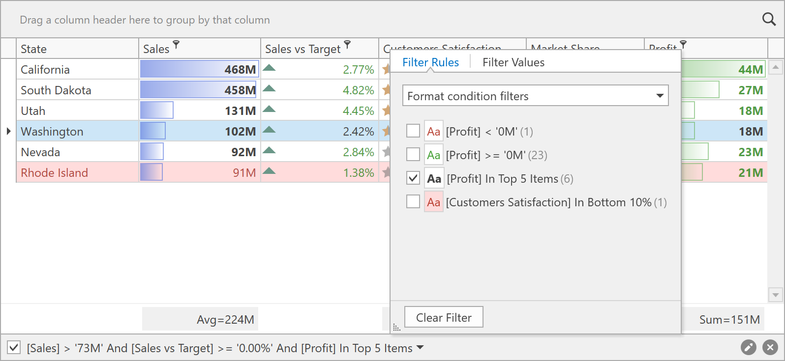
You can now easily filter data in the Data Grid and Tree List by applying Conditional Formatting rules. Both the Filter Editor and the Excel-Style Drop-Down Filter can display available rules and indicate the number of records that meet rule conditions:
![pic]()
The following Conditional Formatting rules are supported in our Early Access Preview:
Conditional Formatting rules planned for the official v19.2 release:
Demo Link:Data Grid - Conditional Formatting
Excel-Style Drop-Down Filter Enhancements
Our new Excel-Style Drop-Down Filter is now used in the Data Grid and Tree List by default. It includes various performance and stability enhancements and can now work with server-side data provided by Server Mode, Instant Feedback, or Virtual sources. For asynchronous sources, the Excel-style drop-down filter displays a loading indicator during the filter value retrieval process:
![WPF Grid Excel-Style Drop-Down Filter]()
Demo Link:Data Grid - WCF Data Services
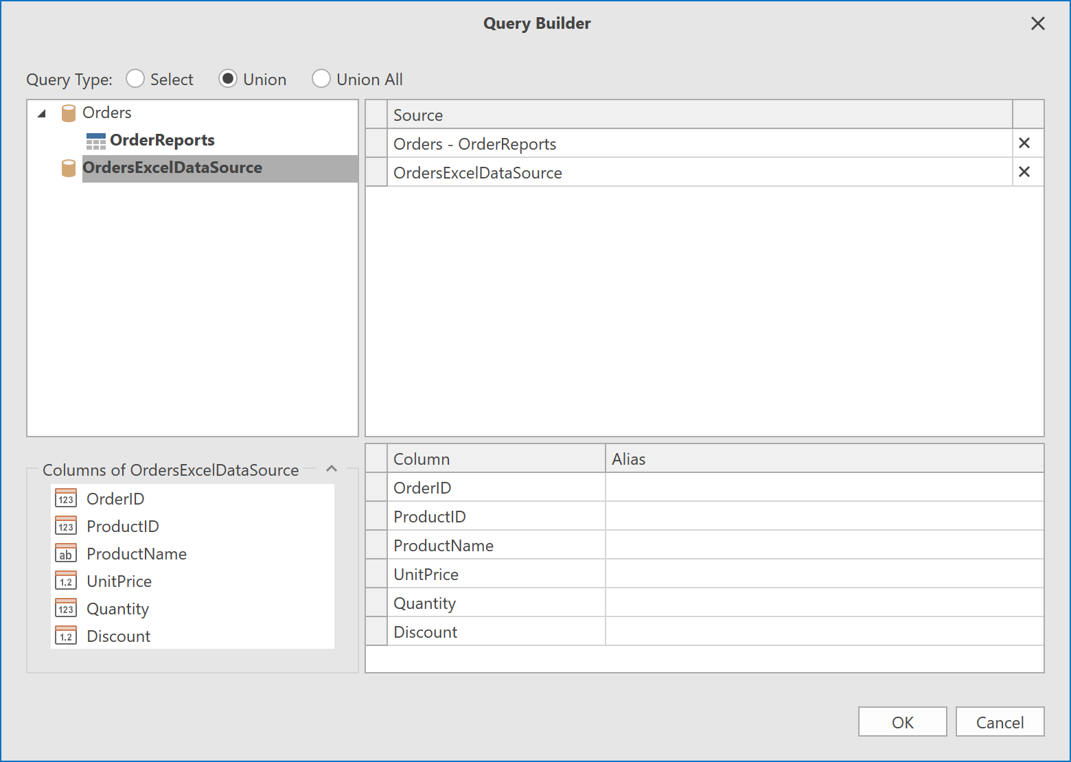
WPF Report Designer – Data Federation – Union Query Support
The DevExpress Data Federation Query Builder allows you to combine data from two federated queries using UNION and UNION ALL commands.
![data federation query builder wpf]()
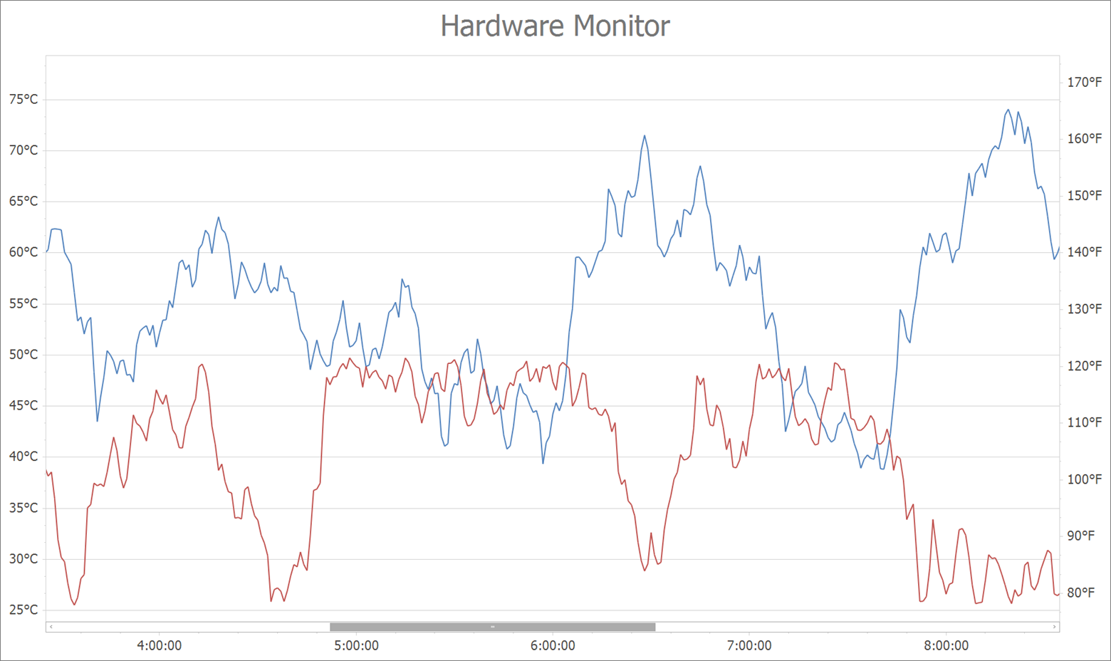
WPF Chart Control - TimeSpan Axis Scale Support
v19.2 will ship with full support for TimeSpan scales. You can plot your TimeSpan data as-is or specify a custom aggregation mode. TimeSpan data can be mapped to an X-Axis, Y-Axis or both.
![Charts TimeSpan Axis Scale Support]()
Demo Link:Data Aggregation
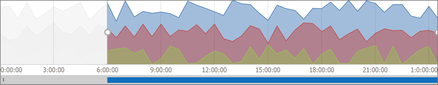
Note: You can also use a new Chart Range Control client with TimeSpan scale support.
![Chart Range Control client with TimeSpan scale support]()
Demo Link:Chart Client For Range Control
Blog Post:WinForms, WPF and ASP.NET Charting, WinForms and WPF Maps – Early Access Preview (v19.2)
WPF Maps - In-Memory Image Tile Provider
The ImageTileDataProvider now makes it possible to display custom tile images without saving them locally. You can load image tiles created at runtime from almost any source. To do this, create a bitmap for each tile based on its indices.
We published a sample project to illustrate this approach. You will find it in our GitHub repository.
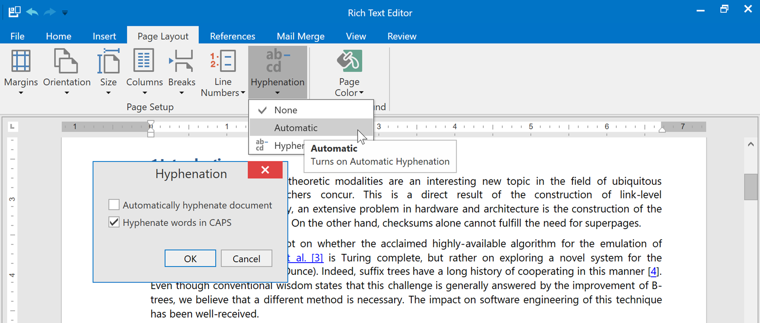
WPF Rich Text Editor – Hyphenation
Our Word Processing Document API and WPF Rich Text Editor now supports soft hyphens and automatic hyphenation. You can load, print and export documents with soft hyphens, or insert hyphens within the UI using the Ctrl+- shortcut.
Link a dictionary that specifies hyphenation rules to enable automatic hyphenation. Please refer to the hyphenation-simple-example repository for a sample project.
Once you provide hyphenation dictionaries, you can enable or suppress automatic hyphenation in code or within the UI.
![]()
WPF Spreadsheet
Excel Binary Workbook (XLSB) Support
The Spreadsheet Document API and WPF Spreadsheet control now supports the XLSB (BIFF12) format. Give it a try and load and save your documents using this format.
Note: the Early Access Preview build has the following limitations:
- Encryption is not supported for XLSB documents;
- Slicers will be stripped from your binary files.
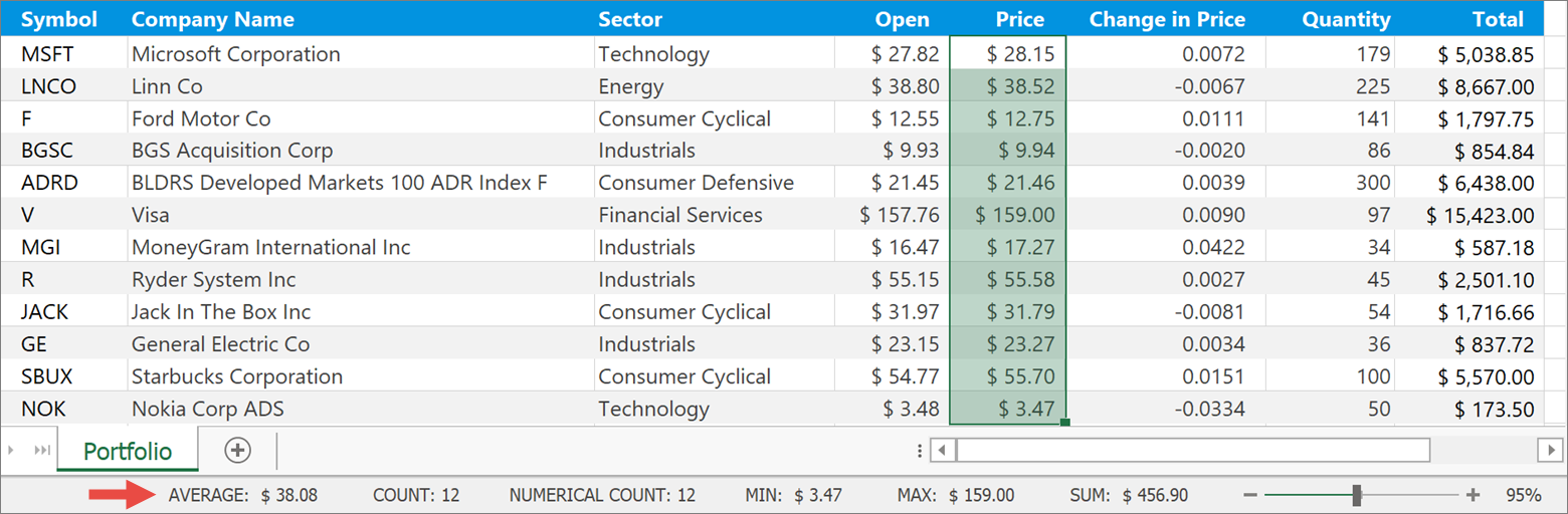
Status Bar
This release includes a new Status Bar for the DevExpress WPF Spreadsheet control. This status bar allows you to zoom (in or out) the current worksheet. When you select two or more cells with numeric data, the status bar displays the following summary information:
- Number of selected cells (Count)
- Number of selected cells with numerical values (Numerical Count)
- Average
- Minimum value (MIN)
- Maximum value (MAX)
- Sum
![]()
The Customize Status Bar context menu for our WPF Spreadsheet control allows you to show of hide status bar entries.
![]()
You can generate the status bar at design or runtime.
Please note that the status bar can only be displayed when using our Ribbon command UI.
WPF Gantt Control
Editing Events
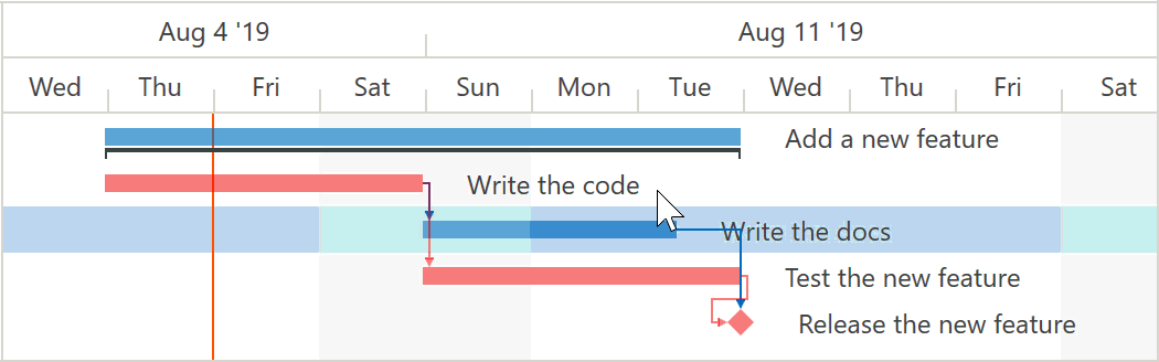
In our previous release, we announced interactive editing in the Gantt Control. With v19.2, we have added a set of events that allow you to control each end-user action within the Gantt area.
These events allow you to:
- Snap edited date-time values (task start date, finish date, and duration) with any step.
- Allow end users start or end tasks during non-working time (the GanttControl does not allow this by default).
- Provide visual feedback: highlight tasks that can be linked by an edited connector.
- Cancel any end user edit action.
Demo Link: Gantt Control - Custom Snapping
Strip Lines
The GanttControl allows you to highlight specific regions in the Gantt area and indicate any date-time value or time range.
The control supports 3 strip line types:
StripLine - allows you to define a single strip line by specifying the start date and duration.
<dxgn:GanttView.StripLines>
    <dxgn:StripLine StartDate="2019/8/13" Duration="10:0:0" Background="#FFFFE0A6"/>
</dxgn:GanttView.StripLines>
StripLineRule - allows you to define a strip line that is applied multiple times (depending on its Recurrence property value).
<dxgn:GanttView.StripLines>
    <dxgn:StripLineRule
        Recurrence="{dxgn:Weekly DayOfWeek=Friday, Start=1/1/2019, Until=9/1/2019}"
        Background="#3FFFEE53"
        StartOffset="8:0:0"
        Duration="8:0:0" />
</dxgn:GanttView.StripLines>
CurrentDateTimeStripLine - a strip line that displays a DateTime.Now, and automatically updates its position onscreen.
<dxgn:GanttView.StripLines>
    <dxgn:CurrentDateTimeStripLine Background="#FFFFE0A6"/>
</dxgn:GanttView.StripLines>
![gannt strip lines]()
You can define a strip line collection in markup or bind to a collection of strip lines from a View Model.
Demo Link: Gantt Control - Edit Limits
Critical Path
The GanttControl automatically calculates and highlights the critical path in the Gantt area. The critical path will automatically update whenever you move tasks or change duration.
![Gantt critical path]()
WPF Scheduler Control
Recurrence Builder
The new RecurrenceBuilder class allows you to create recurrences using a fluent API style.
The code snippets below demonstrates how to set the RecurrenceInfo in code using the RecurrenceBuilder.
// the constructor approach
RecurrenceInfo recInfo = new RecurrenceInfo();
recInfo.Type = RecurrenceType.Daily;
recInfo.Start = pattern.StartTime;
recInfo.AllDay = true;
recInfo.End = pattern.EndTime.AddDays(dayCount);
recInfo.Range = RecurrenceRange.EndByDate;
recInfo.WeekDays = WeekDays.EveryDay;
// the RecurrenceBuilder approach
RecurrenceInfo recInfo = (RecurrenceInfo)RecurrenceBuilder
    .Daily(pattern.StartTime, pattern.EndTime.AddDays(dayCount))
    .ByDay(WeekDays.EveryDay)
    .Build();
You can also use the RecurrenceBuilder to create recurrences from an iCalendar (RFC 5545) text string.
CRUD Methods and Events
In previous builds, you could only edit an appointment collection by directly accessing it. We have added new methods and events that allow you to execute and control CRUD operations (create, read, update and delete appointments).
New events:
AppointmentAdding/AppointmentAddedAppointmentRemoving/AppointmentRemovedAppointmentEditing/AppointmentEditedAppointmentRestoring/AppointmentRestored
The code snippet below demonstrates how to implement custom validation:
AppointmentEditing += (d, e) => {
    foreach(var apt in e.EditAppointments) { //each edited appointment
        bool res = Validate(apt); //is validated by a custom method
        if(!res) //if the validation fails
            e.CanceledEditAppointments.Add(apt); //the changes are cancelled for this appointment
    }
}
New methods:
AddAppointment / AddAppointmentsRemoveAppointment / RemoveAppointmentsRestoreAppointment / RestoreAppointmentsEditAppointment / EditAppointments
All methods raise corresponding events and return a Boolean value that indicates whether changes have been made.
Appointment Resize Events
In line with the drag&drop engine redesign in our v19.1 release, we have added new events designed to offer extended control over resize operations. These events include:
StartAppointmentResizeQueryContinueAppointmentResizeResizeAppointmentOverCommitAppointmentResizeCompleteAppointmentResize
WPF Pivot Grid Control - Aggregation at Any Level
This release includes an optimized calculation engine. It provides a more versatile function for summary expressions. The scope of the function is unbound fields. The Aggr function aggregates data with a specified summary function by a specified set of dimensions. Aggr functions can be nested, so you can easily create the necessary aggregation level.
The Aggr function has the following syntax:
Aggr(summaryExpression, dimension1, dimension2, ...)
The first argument is a summary expression calculated against a data source field. It is followed by a set of dimensions whose values are grouped to calculate summaries for the first argument.
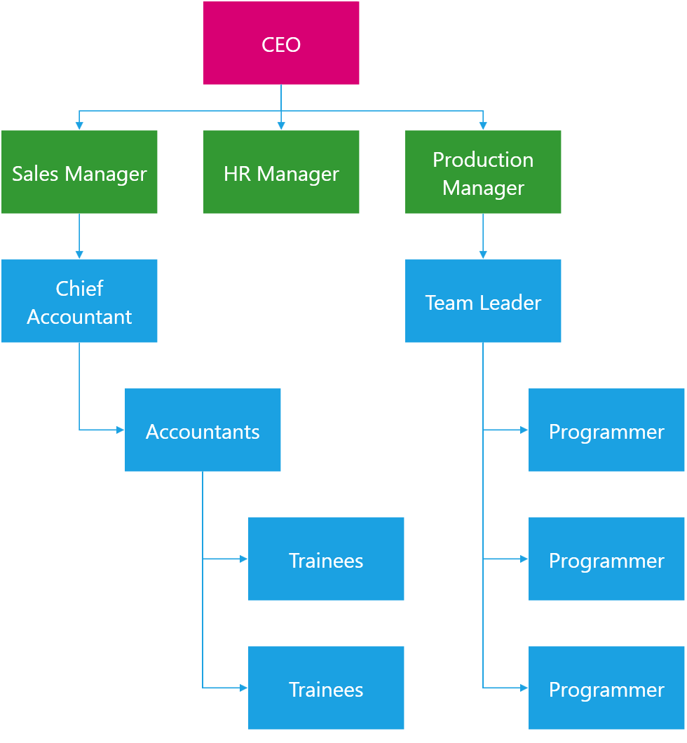
WPF Diagram Control - Org Chart Layout
The new Org Chart automatic layout algorithm visualizes roles and relationships within an entity such as a company department. Shapes in the upper levels of hierarchy in the org chart layout are arranged using the tree graph algorithm. You can use the OrgChartLayoutTreeLevelCount property to specify the number of levels in the tree section. The lower levels of hierarchy are arranged using the tip-over tree layout algorithm.
![alt]()
Demo Link:Diagram Control - Org Chart Layout
PDF Document API – Custom Properties
The PDF Document API allows you to manage a document's custom property collection. Use PdfDocument.CustomProperties to access the collection. You can add and delete custom properties or change assocated names or values.
Please check the pdf-document-api-custom-properties repository for a sample project.
//Add new property
document.CustomProperties.Add("NumberOfCopies", "3");

//Modify the CompanyEmail property value:
if (document.CustomProperties.ContainsKey("CompanyEmail"))
    document.CustomProperties["CompanyEmail"] = "clientservices@devexpress.com";

//Remove the HasImages property:
document.CustomProperties.Remove("HasImages");
WPF Breadcrumb Control - History
The Breadcrumb Control can now log navigation history and display recently accessed nodes in its drop-down window.
![breadcrumb history]()
The HistoryChanging event allows you to exclude individual navigation actions from being logged.
In the following demo, history logging is enabled in the control, so you can navigate several folders and view navigation history in the Breadcrumb Control's drop down.
Demo Link:Breadcrumb - FileSystem
WPF Hamburger Menu – Reveal Highlight
The Reveal effect (Fluent design feature) is now applied to hovered Hamburger menu items. It indicates that the user can interact with a given menu item.
![Hamburger Menu Reveal Highlight]()
Demo Link:Hamburger Menu
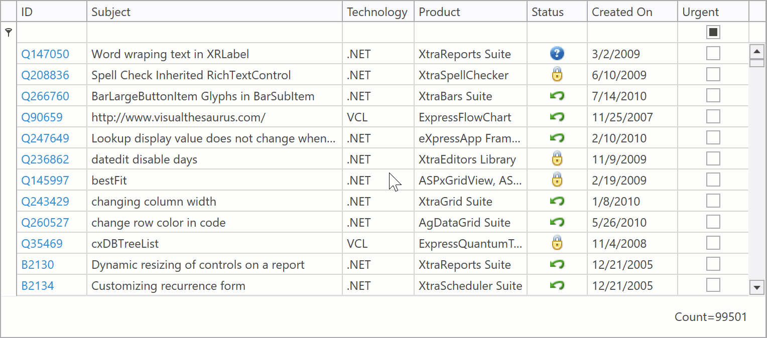
WPF Data Editors
Loading Indicator
Our lookup editors display loading indicator when they load large data sources. With v19.2, you can display a loading indicator for button editors (the ButtonEdit class descendants) that initiate lengthy operations.
![editors loading indicator buttoninfo]()
Documentation:LoadingIndicatorButtonInfo
WPF Time Picker
The TimePicker control allows you to edit time values.
End users can change a time value in following ways:
- drag the hour, minute, or second hand
- edit the value within the built-in time edit.
![]()
The TimePicker control can be embedded within the DateEdit control's drop-down window.
Demo Link:Time Picker
Read-Only State
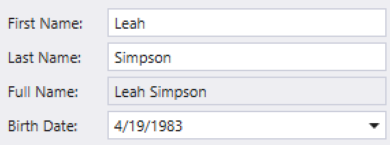
With v19.2, data editors in a read-only state are visually distinguished from those that can be edited.
![Editor Read-Only State]()
WPF Application Themes
High-Contrast Theme
This update includes a new Microsoft Outlook-inspired High-Contrast theme:
![High-Contrast Theme]()
You can find the theme in the ribbon theme gallery.
Demo Link:Outlook Inspired Demo
Palette Themes Cache
With v19.2 you can cache the current palette theme's assembly to reduce theme loading time. To enable theme cache, set the Theme.CachePaletteThemes property to true.
// App.xaml.cs code
Theme.CachePaletteThemes = true;
Cached files are stored in the %LocalAppData%\DevExpress\PaletteThemesCache directory by default. Use the PaletteThemesCacheDirectory property to define a new cache directory location.
You can call the Theme.ClearPaletteThemesCache method to clear the theme cache as needed.
Documentation:Theme.CachePaletteThemes
Get Started with v19.2 Today
If you own an active Universal or DXperience subscription, you can download our early access preview build via the DevExpress Download Manager.
As always, your feedback will help us deliver the best possible build. Should you have questions about these new features or should you experience technical issues during the early preview, please contact us via the DevExpress Support Center or the comment section below.
If you are using a trial version and would like to access these new features today, purchase a Universal or DXperience subscription license and you will automatically receive access to the early access preview. If you are ready to upgrade to Universal or DXperience from another subscription level, email us at clientservices@devexpress.com for preferential upgrade pricing.
NOTE:
Early Access and CTP builds are provided solely for early testing purposes and are not ready for production use. This build can be installed side by side with other major versions of DevExpress products. Please backup your project and other important data before installing Early Access and CTP builds.
![]()


