Quantcast
Channel: Developer Express Global
Viewing all 3392 articles
Browse latest View live

Blog Post: PDF Document Processor: Updates to PDF creation API (Coming soon in v15.2)

$
0
0

In our previous major release we introduced the Document Creation API that is used to generate a document layout from scratch as well as create your own graphics on the PDF page using a rectangle, a path, an ellipse, a polygon and other graphic elements.

v15.2 extends the PDF creation API and provides the document generation for PDF, PDF-A-2b and PDF-A-3b file formats as well as adding the capability to add a link to a page or URI, attach a file and create or modify bookmarks.

Let’s take a look at what is involved…

Creating PDF with Graphics

After creating a new instance of the PdfDocumentProcessor object, you can call one of the CreateEmptyDocument overload methods. These methods have been introduced to reduce memory consumption and improve performance.

For example, here we can see the CreateEmptyDocument method is called with some PdfCreationOptions.

using (PdfDocumentProcessor processor = newPdfDocumentProcessor())
            {
                processor.CreateEmptyDocument("..\\..\\Document.pdf", new PdfCreationOptions()
                {
                    Compatibility = PdfCompatibility.PdfA2b,
                    DisableEmbeddingAllFonts = false
                });
            }

The document creation options are represented by an instance of the PdfCreationOptions class and contains the following settings:

  • Compatibility property - specifies PDF compatibility. This property returns one of the three enumeration values: Pdf,PdfA2b, and PdfA3b. The Pdf compatibility allows you to perform most operations with a document (e.g., document merging, page insertion and deletion), while the PdfA2b, and PdfA3b compatibility can be used only for document creation.
  • DisableEmbeddingAllFontsproperty - specifies whether to prohibit embedding all fonts in a PDF document. You can set this property to true if you wish to not embed all fonts in a PDF document (e.g, the font could not be embedded due to licensing).
  • NotEmbeddedFontFamilies property- specifies font families list that should not be embedded to a PDF document.

The CreateEmptyDocument method can be called using save options represented by an instance of the PdfSaveOptions class. This class contains encryption options and PDF signature specified using the PdfSaveOptions.Signature property. The encryption options are used to protect a document with a password and permissions. These options can be accessed via the PdfSaveOptions.EncryptionOptions property.

Once the document has been created you can add graphics to it.

void doSomething()
        {// PdfDocumentProcessorusing (PdfDocumentProcessor processor = newPdfDocumentProcessor())
            {
                processor.CreateEmptyDocument("..\\..\\Document.pdf", new PdfCreationOptions()
                {
                    Compatibility = PdfCompatibility.PdfA2b,
                    DisableEmbeddingAllFonts = false
                });using (PdfGraphics graph = processor.CreateGraphics())
                {
                    DrawGraphics(graph);
                    processor.RenderNewPage(PdfPaperSize.Letter, graph);
                }
            }
        }privatevoid DrawGraphics(PdfGraphics graph)
        {SolidBrush black = (SolidBrush)Brushes.Black;using (Font font = newFont("Times New Roman", 32, FontStyle.Bold))
            {
                graph.DrawString("PDF Document Processor", font, black, 180, 150);
            }
        }

Drawing any type of graphic content on a document requires an instance of the PdfGraphics class, so you will need to reference the DevExpress.Pdf.Drawing assembly. To draw graphics, create a PdfGraphics object using the PdfDocumentProcessor.CreateGraphics method and call the Draw method for corresponding elements (e.g., the DrawString method at the specified location with the specified SolidBrush and Font objects).

To render a page with created graphics, call the PdfDocumentProcessor.RenderNewPage method, this optimizes memory usage (the resources that belong to the different pages are not doubled).

Adding Hyperlinks

The PdfGraphics class also contain methods that allow you to add links to a page or URI using either the corresponding PdfGraphics.AddLinkToPage or PdfGraphics.AddLinkToUri method. To add a link to a page, you need to supply an area, page number, and, if necessary, zoom factor and link destination to one of the AddLinkToPage overload methods. The link to URI is created using URI and link area as arguments of the AddLinkToUri method.

privatevoid AddHyperlinks(PdfGraphics graph)
        {// Create a link to a page specifying link area, the page number and X, Y destinations.
            graph.AddLinkToPage(newRectangleF(180, 160, 480, 30), 1, 168, 230);// Create a link to URI specifying link area and URI.
            graph.AddLinkToUri(newRectangleF(110, 350, 180, 15), newUri("https://www.devexpress.com"));
        }

Bookmarks Creation

The Document Creation API provides properties and methods to generate bookmarks via code.

A PDF bookmark is represented by an instance of the PdfBookmark class. It can be accessed as an item of the PdfBookmark objects list returned by the PdfDocument.Bookmarks property. The PdfBookmark class contains the following properties to customize bookmarks:


Action

Provides access to the bookmark action being executed.


Children

Specifies the collection of bookmark children for a document with a tree-structured hierarchy.


Destination

Gets or sets a destination (a particular view of a document) to which a bookmark is referred to


IsBold

Gets or sets the value indicating whether the bookmark text is formatted as bold.


IsInitiallyClosed

Gets or sets a value that indicates whether bookmarks are initially closed (bookmark children are hidden) in the navigation panel after a document is loaded.


IsItalic

Gets or sets the value indicating whether the bookmark text is formatted as italic.


TextColor

Gets or sets the color for a bookmark’s text in the navigation pane.


Title

Gets or sets the text that is displayed for a bookmark on the navigation pane.

Below you can see an example of creating bookmarks via code using one of the PdfDocumentProcessor.CreateDestination overload methods, passing in a page number and page coordinates.

privatevoid AddBookmarks(PdfDocumentProcessor processor)
        {PdfDestination destination1 = processor.CreateDestination(1, 180, 150);PdfDestination destination2 = processor.CreateDestination(1, 168, 230);PdfDestination destination3 = processor.CreateDestination(1, 20, 350);
            processor.Document.Bookmarks.Add(new PdfBookmark()
            {
                Title = "PDF Document Processor",
                Destination = destination1
            });
            processor.Document.Bookmarks.Add(new PdfBookmark()
            {
                Title = "Display, Print and Export PDF Documents",
                Destination = destination2
            });
            processor.Document.Bookmarks.Add(new PdfBookmark()
            {
                Title = "Learn More",
                Destination = destination3
            });
        }

File Attachments

You can attach a file to PDF by calling the PdfDocumentProcessor.AttachFile method as shown below.

privatevoid AttachFile(PdfDocumentProcessor processor)
        {
            processor.AttachFile(new PdfFileAttachment()
            {
                CreationDate = DateTime.Now,
                Description = "This is a sample attached file.",
                MimeType = "text/plain",
                FileName = "MyAttachment.txt",
                Data = GetData()
            });
            processor.SaveDocument("..\\..\\Result.pdf");
        }privatebyte[] GetData()
        {string s = "sample text inside my attached document.";byte[] data = Encoding.ASCII.GetBytes(s);return data;
        }

The file attachments is represented by an instance of the PdfFileAttachment class. You can specify the attachment creation date, description, mime type, file name, and relationship using PdfFileAttachment.CreationDate, PdfFileAttachment.Description, PdfFileAttachment.MimeType, PdfFileAttachment.FileName, and PdfFileAttachment.Relationship properties. A data source must be specified by using the PdfFileAttachment.Dataproperty.

Inversely, you can get access to an existing attachments via the PdfDocument.FileAttachments property.

To delete an attachment, call the PdfDocumentProcessor.DeleteAttachment method.

=========================

We'd love to hear your thoughts on these new enhancements. Let us know what you think.


Blog Post: DevExpress Dashboard - Conditionally Formatted Data Bars (Coming soon in v15.2)

$
0
0

Over the last few release cycles, we've added Excel inspired conditional formatting support to a number of our products, across .NET platforms. With v15.2, we'll extend conditional formatting support for DevExpress Dashboard with the introduction of formatted data bars.

For those unfamiliar with this feature, I think a screenshot will best explain it's visual impact/business value when used within a Dashboard.

DevExpress Dashboard Conditionally Formatted Data Bars

DevExpress Dashboards allows you to add data bars to grid/pivot table cells that contain numeric values. The following format rules/options are supported.

Bar - Visualize numeric values using bars. Different colors may be used for positive and negative values. 

DevExpress Dashboard Formatted Data Bars - Negative Values

Bar Color Ranges - Visualize numeric values using bars with colors contained in a specific color set.
Bar Gradient Ranges - Visualize numeric values using bars with colors contained in a specific color gradient.

Let me show you how to apply these format rules to data displayed within the Dashboard's Pivot Grid item. I'll demonstrate use of Bar Gradient Ranges (I'm going to assume you are already familiar with the Dashboard Designer)...

Step 1 is to choose the appropriate measure - in this screenshot we're using Reseller Sales Amount. Once we know which measure to use, we'll activate the dropdown menu and select Add Format Rule -> Bar Gradient Ranges -> Red-Blue.


DevExpress Dashboard Design Time

Once the Bar Gradient Ranges dialog is displayed, we'll set Intersection mode to Specific level and select the State-province row dimension to highlight values corresponding to individual states.

DevExpress Dashboard Formatted Data Bar Dialog

The final step is to press Apply...Here's the resulting output within the Dashboard...


=========================

We'd love to hear your thoughts on Formatted Data Bars and how you might use them in your next Dashboard.


Blog Post: DevExpress Scheduler controls: big changes are coming in v15.2

$
0
0

One of the more popular controls we have in our platforms suites is the scheduler control. Not every app needs a scheduler, but when you’re having to worry about scheduling resources and appointments, it’s invaluable.

Although everyone is pretty happy with the scheduler user interface, for a while now we’ve been getting feedback related to performance. Consequently over the past few months we’ve put in a lot of effort into speeding up the scheduler, especially with regard to rendering the layout and data (in this version) and laying down some infrastructural improvements ready for speeding up data retrieval (in a future version). Fairly early on with this exercise we determined that some of our data structures were not optimal and so had to redesign and refactor them.

First the good news: we have managed to achieve a significant performance improvement by adjusting the way the layout is calculated. For day-view-based views (that is, Day View, Work Week View, and Full Week View) scrolling the views and switching between them is a snap because response times have been significantly decreased. Appointments now scroll smoothly. We’ve tested with as many as 5000 appointments in a view and performance is smooth and fluid. To minimize the occasional “freezing” that can affect the scheduler in your app, calculations are now executed in multiple threads. This advanced asynchronous mode can be switched off if desired; however, even in synchronous mode the layout calculations are faster than before.

Unfortunately – and here comes the bad news – these changes to the scheduler’s performance envelope have had to be percolated up into the public Scheduler API. And that in turn means some breaking changes, although we have tried to minimize the number and extent of these.

The biggest change is that several classes have been abstracted out as interfaces, and we’ve introduced several others as well. For example. the most frequently used classes, such as Appointment, Resource, AppointmentDependency are now interfaces; and we’ve added the ISchedulerStorage, IAppointmentStorage, IResourceStorage, IAppointmentLabel, IAppointmentStatus interfaces. This dual approach enables us to leave any legacy code intact (pretty much) while implementing new cross-platform features. For example, different AppointmentLabel and AppointmentStatus classes (which expose IAppointmentLabel and IAppointmentStatus interfaces) exist for each platform. However, the AppointmentViewInfo.Status property now returns an IAppointmentStatus object because the AppointmentViewInfo class instances are used for all platforms and in Scheduler Reports.

Having laid the foundations for why we have breaking changes in v15.2, I do have to mention that overall the logic used in the Scheduler API has not changed, nor have most of the method and property names and their signatures. It is all very similar, such that the number and nature of the changes you will have to make in upgrading your app are small and easily made:

  • Appointment: no longer has a constructor since it’s now an interface. To construct an Appointment object use SchedulerStorage.CreateAppointment() instead .
  • Resource: no longer has a constructor since it’s now an interface. To create a Resource object, use the SchedulerStorage.CreateResource method. The static property Empty has been removed, and you should use ResourceEmpty.Resource or ResourceEmpty.Id instead, depending on the context.
  • AppointmentDependency: no longer has a constructor since it’s now an interface. You now use the SchedulerStorage.CreateAppointmentDependency method to create an appointment dependency object.
  • The AppointmentViewInfo.Status property now returns an object that implements the IAppointmentStatus interface instead of an instance of the AppointmentStatusBase class.
  • The Appointment.RecurrenceInfo property now returns an object that implements the IRecurrenceInfo interface.
  • Several properties and methods has been marked as obsolete and will be removed in a future major version. You should be aware that this is going to happen at some point and make plans to rewrite your code to avoid them. You can defer these changes until after the v15.2 major release though.
  • Until v15.2 the Appointment.StatusId and Appointment.LabelId properties were declared to be Int32s, since they were in essence an index value into the label and status collections. From the developer point of view, this choice made it really difficult to bind such labels and statuses to fields in an external database. From v15.2 onwards, the new AppointmentStatus and AppointmentLabel objects have their own Id object property which is no longer related to an index of a collection. These objects are returned by the Appointment.StatusKey and Appointment.LabelKey properties (and, obviously, can now be represented as rows in a table in a database). This should help developers who had to devise various workarounds to deal with the original problem.

Now for the new features!

1. A new feature is a Brush property for the status that enables the developer to define the brush used to visualize and display the appointment status. In fact the label color and status brush properties are platform-specific in order to utilize native brushes and colors for each platform.

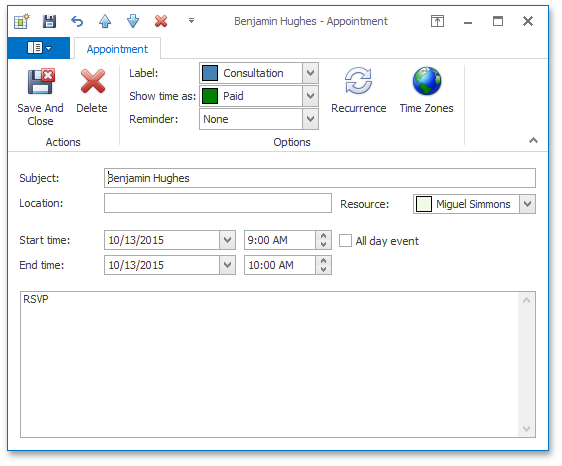
2. We have implemented a new default appointment form used by your users to create an edit appointment details. This has been designed to mimic the Microsoft Outlook appointment dialog.

The new scheduler appointment form

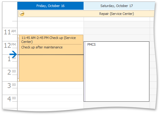
3. The Scheduler control now can indicate the current time by drawing a line in the view. In the Day, Work-Week, and Full Week views the horizontal line can go across the entire view, or it can be restricted to the current date.

The new time indicator for the current time

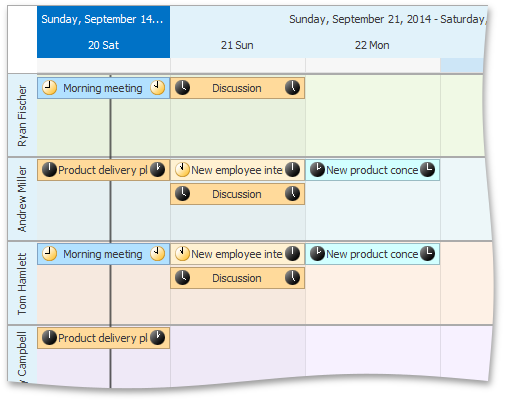
In the Timeline view however, the time indicator is a vertical line drawn down the view.

The new time indicator for the current time

Blog Post: WinForms & WPF Grid and TreeList Control - Enhanced Clipboard Operations (Coming soon in v15.2)

$
0
0

Over the years, a number of you have asked us to improve the manner in which we copy Grid and TreeList data - specifically, to maintain formatting so that data pasted into third-party programs will retain the formatting displayed within your app. With v15.2 and the introduction of Formatted Copy mode, you'll now retain full formatting whenever Grid and TreeList data is copied to the clipboard.

This new option simultaneously copies data to the clipboard  in XLS (Biff8), RTF, HTML, CSV and plain text (ANSI and Unicode) formats. As you'd expect, once pasted, the destination application will use the appropriate format.

WinForms and WPF DataGrid - TreeList Clipboard Operations


Formatted Data mode will retain the following whenever data is copied to the clipboard:

  • Appearance settings applied to the control and its individual columns.
  • Appearance settings customized using dedicated events (custom draw events are not supported).
  • Excel-style cell conditional formatting.


Both our WinForms/WPF Data Grid and Tree List controls include dedicated properties to customize clipboard operations. Copying data in plain text is enabled by default (to avoid breaking changes).  You can enable Formatted Data copy mode using the ClipboardMode option.

At present, the Data Grid only supports formatted data copy operations for standard Grid Views. We'll support other Views in future updates.

=========================

We'd love to hear your thoughts on this new feature. Let us know what you think.

Blog Post: ASP.NET Card View - Conditional Formatting, Batch Editing and More (Coming soon in v15.2)

$
0
0

Earlier in 2015, we showed you a preview version of the Card View layout. However, this new Card layout was part of the DevExpress ASP.NET GridView control. As developed its features, we realized that this needs to be its own stand-alone control, so...

I'm happy to announce that in the v15.2 release, we have a new control: DevExpress ASP.NET CardView control (ASPxCardView):

The ASP.NET Card View control is packed with functionality and includes these great new features:

  • Adaptive & Responsive
  • Batch Editing & Updating
  • Conditional Formatting
  • Export to PDF, XLS, XLSX and RTF Formats
  • Selected Records Export
  • Large Database Support (Server Mode)
  • Conditional Formatting Export
  • Header Panel
  • Total Summary
  • Endless Paging
  • Date Range Header Filter
  • Filter Control
  • Ellipsis with tooltips in cell texts
  • Design-Time Card Layout Editor allows you to build a Microsoft Outlook inspired Contacts View with integrated data shaping and editing capabilities.

There's way too much to show about this control in just this blog post so be sure to sign up the upcoming webinar below.

Register for v15.2 webinar

To see all the new features coming out for the v15.2 release, sign up for the "v15.2: What's New for ASP.NET Developers":

Click here to register

Thanks!


Your Next Great .NET App Starts Here

Year after year, .NET developers such as yourself consistently vote DevExpress products #1.

Experience the DevExpress difference for yourself and download a free 30-day trial of all our products today: DevExpress.com/trial (free support is included during your evaluation).

Announcement: DevExpress Wins 18 Visual Studio Reader's Choice Awards

$
0
0
With 31 categories and over 400 products to choose from, DevExpress is honored to have been voted best in class 18 times in this year's Visual Studio Magazine Reader's Choice Awards. From the best Component Suite for the Desktop to the best Web Development Toolset, the awards help highlight our commitment to delivering high-performance, easy-to-use and feature-complete tools for Visual Studio developers worldwide.

Blog Post: ASP.NET Reporting: Sub-reports, Report Explorer and more (Coming soon in v15.2)

$
0
0

In the v15.2 release of our ASP.NET Reporting controls, we have implemented a couple of really exciting must-have features!

Sub-reports

One of the things we’ve built is support for sub-reports. This allows you to embed (several) existing pre-made reports into a new report.

We have created a new control for this functionality which is the XRSubreport. You can drag it onto the design-surface in the Report Designer, double click it and start creating the new sub-report just the same way as designing the parent report.

Subreports - Add a Subreport

When working with sub-reports, you will see a number of tabs below the report designer which allow you to switch between the various reports.

Subreport - Tabs

Once you’re finished creating a new sub-report, you will need to save the sub-report as separate definition on the web-server. For this we have added a Save (As) dialog:

Subreport - Save Dialog

Alternatively, you can also specify the Report Source URL in the object inspector of XRSubreport control if you want to use an existing report.

Subreport - Report Source Url

For the sub-reports features to work, we needed to change a couple of things in the reports storage mechanism. This requires you (the developer) to implement a report storage class so the reporting engine and designer are able to locate available sub-reports on the server for processing. This class is also used for saving new or modified report definitions on the server.

This reports storage class was already available on the WinForms counterpart where it is an optional feature. With the v15.2 release of the ASP.NET reporting suite, it has become something mandatory to implement. We will obviously provide you with a number of examples so you can use this new feature without problems!

Report Explorer

To improve the design experience as well as the productivity when designing reports, we have included a new feature; The Report Explorer.

Report Explorer - Control Properties

The Report Explorer allows you to quickly navigate through different parts of your report, such as bands, styles and formatting rules. When selecting one of the nodes in the explorer, you will be able to delete it or modify it’s properties by clicking the appropriate button in the explorer.

The Report Explorer also gives you a quick and convenient way on creating new styles and formatting rules by selecting the styles node and next click the ‘+’ button.

Report Explorer - Add a Style

By dragging a style of formatting rule from the explorer onto a control, this style or rule will be applied.

Report Explorer - Apply a Style

RichText support

We have redone the XRRichText control to fully support embedding RichText content (or database fields containing this) in your reports. It allows you to put either static, data-bound or content loaded from a file into your reports.

RTF

The XRRichText control also provides WYSIWYG rendering of RTF, HTML or plain text content in the Report Designer.

Register for v15.2 webinar

To see all the new features coming out for the v15.2 release, sign up for the "v15.2: What's New for ASP.NET Developers":

Click here to register

Let me know what you think of this upcoming reporting sweetness!

Blog Post: ASP.NET Rich Text Editor: Tables, Mail Merge and More (Coming soon in v15.2)

$
0
0

To make sure that you’re developing with the best feature rich controls in the market, we have added some popular (and most requested) features in the v15.2 release of the RichText Editor.

Tables

In this release we are happy to provide table support in the RichText Editor. For this, we have added some Office style features to create and modify tables inside your document.

image

Also styling tables and individual cells is done the Office way. We have added 2 “Contextual Ribbon Tabs” which will be shown when putting the cursor inside a table. These ribbons give you quick access to merging/splitting cells, deleting/adding rows and columns, and specifying other cell/table properties.

image

Mail Merge

In the current v15.1 release of the RichText Editor, we provided mail merging capabilities. In the v15.2 release we have taken it a step further by allowing you to visually select and insert auto-updated fields from a bound datasource:

You also have the possibility to switch between the live merged data and the field-codes by clicking the button in the ribbon:

Headers and Footers

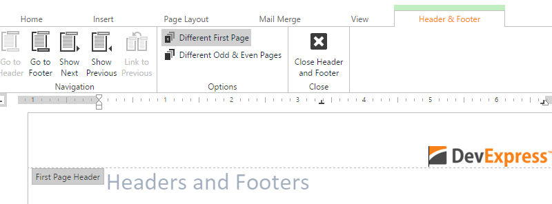
Yes! We have support for headers and footers inside your documents! This includes insertion of different headers and footers on even and odd pages. A contextual tab in the Ribbon Control will be shown, enabling you to insert specific items like page numbers and counts in the header and footer.

image

Bookmarks

To navigate quickly back and forward through your document, you can now put bookmarks inside the document. These bookmarks can also be bound to hyperlinks.

Register for v15.2 webinar

To see all the new features coming out for the v15.2 release, sign up for the "v15.2: What's New for ASP.NET Developers":

Click here to register


Blog Post: WPF Tree Map Control (Coming soon in v15.2)

$
0
0

Our upcoming release will include a new WPF TreeMap Control - a powerful way to visualize hierarchical or flat data using nested rectangles. If you are not familiar with TreeMaps and their possible use-cases, the following Wikipedia article provides a good background on TreeMaps.

WPF Tree Map Control

Appearance and Behavior Customization

As you'd expect, our WPF TreeMap allows you to specify the layout algorithm used to arrange tree map items. The following options are supported out of the box.

AlgorithmExample
Slice and Dice
 
WPF Tree Map Slice & Dice
Squarified
 
WPF Tree Map Squarified
Striped
 
WPF Tree Map Striped

Should your needs dictate a different layout algorithm, you can design derivatives as needed. 

With the use of Colorizers, you can specify TreeMap colors automatically. The list below includes all colorizers shipped with the Tree Map.

ColorizerExample
Palette
 
WPF Tree Map Palette Colorizer
Gradient
 
WPF Tree Map Gradient Colorizer
Group Gradient
 
WPF Tree Map Group Gradient Colorizer
Range
 
WPF Tree Map Range Colorizer


Just like layout algorithms, you can implement your custom colorizer when needed.

Finally, the TreeMap control supports interactivity features, such as selection, highlighting and tooltips.

WPF Tree Map Control - Tooltip

=========================

We'd love to hear your thoughts on this new WPF product. Let us know what you think.


Blog Post: WPF Grid Control - Inline Editing, Partial Groups & Record Selection (Coming soon in v15.2)

$
0
0

Our upcoming release is going to include a number of key enhancements to our WPF Grid - the first of which is Inline Data Editing - something we first introduced in WinForms Grid a couple of years ago.


Inline Data Editing


As you can see in the screenshot below, inline editing is an alternative approach to editing column values within grid cells.


WPF Data Grid - Inline Data Editing


The Inline Data Edit Form can be displayed directly below the edited row or as a popup window.


WPF Data Grid Inline Editing Popup


By default, the Inline Edit Form is auto-generated based on column settings, but you can customize it as needed via options or completely redesign it using templates.


Partial Data Grouping


This release introduces partial data grouping within our WPF Grid Control. By setting a single option, group rows will only be displayed for rows with 2 or more matching values. As you would expect, this reduces the amount of scrolling/mouse clicks necessary to view information on-screen when grouped data is disparate.


WPF Data Grid Partial Data Grouping


Marquee Record Selection


This features gives users a quick and easy way to select a range of rows/cells.


WPF Grid - Marquee Record Selection


=========================

We'd love to hear your thoughts on these new features. Let us know what you think.


Blog Post: ASP.NET Spreadsheet - Frozen Columns/Rows, Data Validation and More (Coming soon in v15.2)

$
0
0

Check out these great new features coming to the powerful DevExpress ASP.NET Spreadsheet in the next release, v15.2.

These features are available for both the ASP.NET WebForms and MVC versions of the Spreadsheet. The new features include:

Frozen Panes (Rows and Columns)

With an Excel inspired Freeze Panes feature, end-users can lock specific rows or columns in one area to keep this area of a worksheet visible while scrolling the worksheet content vertically or horizontally.

DevExpress ASP.NET Spreadsheet - Frozen Columns & Rows

Data Validation

An Excel inspired data validation feature helps prevent end-users from entering invalid data into worksheet cells. This feature allows you to definie restrictions and provide notifications on what data can or should be entered in a cell:

DevExpress ASP.NET Spreadsheet - Data Validation

Because it is difficult to see what validation is added to a cell, in the above image, we've added the green callout box images to highlight the validation in the spreadsheet cells. Those boxes are not part of the spreadspeet.

Table Sorting and Filtering

End-users can now use the Excel inspired AutoFilter feature to filter data by columns and to easily display only rows that meet specific conditions. Three filter types are available (depending upon the column data types): Text, Number, and Date Filters. In addition, the Filter by Values option can be used which allows you to select from column unique values.

DevExpress ASP.NET Spreadsheet - Sorting & AutoFilter

Formula Bar

An Excel-like formula bar shows the contents of the current cell and allows creating and viewing formulas. To start creating a formula, click the mouse cursor in the formula bar and enter an equal sign (=).

DevExpress ASP.NET Spreadsheet - Formulas

Formula AutoComplete

The Formula AutoComplete feature makes it easier to create and edit formulas and minimizes typing and syntax errors. After typing an equal sign (=) and beginning letters into a cell, a dynamic drop-down list of valid functions that match the letters is displayed below the cell.

Document Autosave

The Autosave feature helps reduce the risk of data loss by saving an opened document automatically at predefined but customizable intervals. And you can programmatically handle:

  • autosave operations: like saving to some other custom storage
  • resolve multi-user conflicts (should any arise)

Work Session Hibernation

This feature helps you to save memory (RAM). When enabled, the 'work session hibernation' will automatically free server memory by hibernating inactive open documents in the spreadsheet.

If this feature is enabled, open documents which where idle for a certain time can be released from the server memory and saved to the server file system at a specific path. The hibernation settings (such as a session timeout, server directory) are available through an API exposed by the server DocumentManager object.

This hibernation feature helps if the server fails because when the server is restarted, the spreadsheet control will load the hibernated document and allow you to continue working.

Extended Page Setup Functionality

A new Page Setup dialog helps end-users prepare the document for printing. The dialog helps setup several print-related settings (such as document orientation, paper size, page margins, page order, etc.) and provides the capability to specify header and footer text too.

DevExpress ASP.NET Spreadsheet - Page Setup

Ribbon Improvements

The built-in ribbon is improved by employing the ASPxRibbon control's newly implemented features, such as contextual tabs and one-line mode. Thus, the 'Design' ribbon context tab help with working with tables in a worksheet. One-line ribbon can be used to make navigation more compact within a control and make more room for document editing.

Register for v15.2 webinar

To see all the new features coming out for the v15.2 release, sign up for the "v15.2: What's New for ASP.NET Developers":

Click here to register

Thanks!


Use the best, DevExpress!

Year after year, .NET developers such as yourself consistently vote DevExpress products #1.

Experience the DevExpress difference for yourself and download a free 30-day trial of all our products today: DevExpress.com/trial (free support is included during your evaluation).

Blog Post: WPF Grid-Based Report Generation (Coming soon in v15.2)

$
0
0

In our never-ending quest to make reporting easier (and more flexible) for developers and end-users alike, v15.2 will introduce a new WPF Grid-based report generation option. As you can see from the screenshot below, this new option gives your power users a way to customize output and hopefully go a long way to reducing the number of custom reports you'll have to create over the life of your app.

WPF Grid-based Report Generation

With just a few lines of code, you can invoke the DevExpress WPF Report Designer at runtime from the Grid Control and create reports based on its data.

public static void ShowDesigner(IGridViewFactory<ColumnWrapper, RowBaseWrapper> factory)
       {
           var report = new XtraReport();
           ReportGenerationExtensions<ColumnWrapper, RowBaseWrapper>.GenerateFrom(report, factory);
           var reportDesigner = new ReportDesigner();
           reportDesigner.Loaded += (s, e) =>
           {
               reportDesigner.OpenDocument(report);
           };
           reportDesigner.ShowWindow(factory as FrameworkElement);
       }

To make things as easy as possible, we've added two behaviors that allow you to incorporate Grid-based report generation in your app when using our WPF Ribbon control:

  • DevExpress.Xpf.Reports.UserDesigner.Extensions.ReportManagerBehavior
  • DevExpress.Xpf.Reports.UserDesigner.Extensions.GridReportManagerService.

Here's how it works...first, attach the GridReportManagerService to a TableView:

xmlns:dxmvvm="http://schemas.devexpress.com/winfx/2008/xaml/mvvm"

xmlns:dxrudex="http://schemas.devexpress.com/winfx/2008/xaml/reports/userdesignerextensions"
<!---->
                       <dxg:TableView>
                           <dxmvvm:Interaction.Behaviors>
                               <dxrudex:GridReportManagerServicex:Name="CourseCollectionViewReportService"/>
                           </dxmvvm:Interaction.Behaviors>
                       </dxg:TableView>


...then attach ReportManagerBehavior to a Ribbon item and bind its Service property to GridReportManagerService:


xmlns:dxmvvm="http://schemas.devexpress.com/winfx/2008/xaml/mvvm"
xmlns:dxrudex="http://schemas.devexpress.com/winfx/2008/xaml/reports/userdesignerextensions"
<!---->
           <dxr:RibbonControl>
               <!---->
                           <dxb:BarSplitButtonItemContent="Reports"ActAsDropDown="True"LargeGlyph="{dx:DXImage Image=Print_32x32.png}"Glyph="{dx:DXImage Image=Print_16x16.png}">
                               <dxmvvm:Interaction.Behaviors>
                                   <dxrudex:ReportManagerBehaviorService="{Binding ElementName=CourseCollectionViewReportService}"/>
                               </dxmvvm:Interaction.Behaviors>
                           </dxb:BarSplitButtonItem>
               <!---->
           </dxr:RibbonControl>


WPF Grid-based Report Generation

=========================

We'd love to hear your thoughts on these new features. Let us know what you think.


Blog Post: DevExpress Dashboard - High Performance In Memory Data Processing (Coming soon in v15.2)

$
0
0

DevExpress Dashboard v15.2 will ship with a completely redesigned client side data processing engine. This new data engine reduces memory consumption and improves the speed of client-side data shaping operations (grouping, sorting and aggregation) by loading a compressed snapshots of aggregated data into memory. As you'll read in a moment, the improvement in memory consumption/performance is significant thanks to the following techniques:

  • Data compression is used to reduce memory consumption. For instance, dictionary compression is used to replace common dimension values with integer key values.
  • The Dashboard's new data grouping algorithm uses hash tables (with integer key values obtained during data compression). The use of key values means data grouping and sort operations are executed much faster. 
  • New multi-threading algorithms are used to perform independent operations. The Dashboard's data engine uses TPL (Task Parallel Library) to perform these operations.


We've also introduced strong typing for all operations within the data engine. This removes overhead expenses related to boxing/unboxing conversions.

Comparing v15.1 to v15.2

Seeing is believing and so here are a few test results that help illustrate the performance gains you'll find in DevExpress Dashboard v15.2.

Note: These results were gathered using Microsoft's Contoso Dataset and the underlying data source was formed using the following SQL requests:

select * from [dbo].[V_CustomerOrders] where ProductCategoryName = 'TV and Video'  | Returns approximately 1.2M records.

select * from [dbo].[V_CustomerOrders] | Returns approximately 12M records.

Memory Consumption

To say that v15.2 reduces memory consumption might be an understatement.

DevExpress Dashboard Performance - 12M Records

Binding/Loading

In this test, the Dashboard's List Box was bound to the ProductSubcategory dimension. As you can see below, we have a nearly 50x improvement from v15.1 to v15.2

DevExpress Dashboard High Performance Data Loading

In the test scenario below, the Dashboard's Grid was bound to the following dimensions and measures.

  • Dimensions: ProductCategoryName, ProductSubcategory, Product
  • Measures: Amount, Quantity (summary type set to Sum).

The power of the Dashboard's data processing engine speaks for itself - a 37x improvement in calculation speed. 

DevExpress Dashboard High Performance Data Binding

In this last example, we measured load times for the Dashboard's Pivot Grid (column/row values expanded at all levels).

Row Dimensions: ProductCategoryName, ProductSubcategory, Product
Column Dimensions: Region, CalendarYear
Measures: Amount, Quantity (summary type set to Sum)

Again, the results speak for themselves - calculation speed has improved 32x.

DevExpress Dashboard High Performance Pivot Table

=========================

We'd love to hear your thoughts on DevExpress Dashboard and these performance improvements. Let us know what you think.


Blog Post: WPF Themes - Office 2016 (Coming soon in v15.2)

$
0
0

Though not a radical departure from Office 2013, v15.2 adds 3 new Office 2016 inspire themes to our WPF Theme collection:

Office 2016 Black | Office 2016 White Office 2016 Colorful

In the following screenshot, we've applied the Office 2016 Colorful theme to our DevAV demo...

WPF Office 2016 Theme

=====================================

If you've used our WinForms products in the past - and are moving to WPF - we'd love to hear from you...Is there a specific theme/skin you'd like to see us port from WinForms to WPF?


Blog Post: WinForms & WPF Spreadsheet - Pivot Table Support and Misc Enhancements (Coming soon in v15.2)

$
0
0

Well, you asked for it and we've delivered - Pivot Table support for our WinForms and WPF Spreadsheet.

With our v15.2 release, both the DevExpress WinForms and WPF Spreadsheet controls will include Pivot Table functionality so your users can analyze, categorize and summarize large volumes of data directly inside a worksheet. The control allows you to dynamically manage data source fields by using a Field List, to sort and filter Pivot Table items, expand and collapse detail levels, perform calculations on field values using built-in aggregate functions, apply formatting and more.

WinForms and WPF Spreadsheet Pivot Table Support

Once v15.2 is released, we'll be certain to blog about this feature in more detail.

Copy/Paste Enhancements

With v15.2, clipboard operations support BIFF8. You can now preserve cell formatting when data is pasted into a DevExpress Spreadsheet or Microsoft Excel.
The WinForms Spreadsheet control can now delay clipboard data rendering until data is requested.
The WinForms Spreadsheet now responds to any external changes made to the clipboard and automatically resets the copied cell range once the clipboard is cleared.


Blog Post: WinForms & WPF Map Control - Clustering (Coming soon in v15.2)

$
0
0

Set for release in v15.2 is clustering support for both our WinForms and WPF Map Controls. For those unfamiliar with this feature, its designed to aggregate map items and perform data density analysis.

WinForms and WPF Map Control - Data Clustering

Once shipped, the DevExpress Map Control will support 2 clustering algorithms:

  • Distance Based: joins items - whose separation is smaller than a specified threshold - into a single cluster. The cluster's indicator is calculated as the mean of items.
  • Marker: joins items - whose distance to the central item is smaller than a specified threshold - into a single cluster. The cluster indicator matches the central item.

You can also implement a custom clustering algorithm by inheriting from the MapClustererBase class (WPF) or implementing the IClusterer (WinForms) interface.

Groups

Predefined clusterers allow you to separate items into groups prior to clustering (for instance, to group items by attribute values before clustering).

WinForms & WPF Map Control - Clustering Groups
 

It's relatively straightforward to implement this feature for our WPF Map Control - You simply assign the MapClustererGroupProviderBase class descendant object to the GroupProperty property:

<dxm:ListSourceDataAdapter.Clusterer>
    <dxm:DistanceBasedClusterer>
       <dxm:DistanceBasedClusterer.GroupProvider>
            <dxm:AttributeGroupProvider AttributeName="LocationName"/>
        </dxm:DistanceBasedClusterer.GroupProvider>
    </dxm:DistanceBasedClusterer>
 </dxm:ListSourceDataAdapter.Clusterer>

If you're using the WinForms version of our Map Control, you would assign an object implementing the IClustererGroupProvider interface to the GroupProperty property:

ListSourceDataAdapter vectorDataAdapter = newListSourceDataAdapter();
// Several data adapter configurations...
vectorDataAdapter.Clusterer = newDistanceBasedClusterer {
    GroupProvider = newAttributeGroupProvider { AttributeName = "LocationName" }
};


Custom Indicators

As you'd expect, you can customize cluster indicators as needed (by using custom cluster item factories for WinForms or item settings for WPF).

WinForms & WPF Map Control - Custom Clustering Indicators


To customize indicators for the WinForms Map Control, use the clusterer's SetClusterFactory(IClusterItemFactory) method to specify the factory used to generate cluster indicators:

publicclassCustomClusterItemFactory : IClusterItemFactory {
// Code to generate items...
}
 
// Additional Code...
clusterer.SetClusterItemFactory(newCustomClusterItemFactory());

For WPF, specify the required MapItemSetting class descendant object to the ClusterSettings property of the clusterer:

<dxm:DistanceBasedClusterer>
   <dxm:DistanceBasedClusterer.ClusterSettings>
       <dxm:MapCustomElementSettings ContentTemplate="{Binding Source={StaticResource itemTemplate}}"/>
   </dxm:DistanceBasedClusterer.ClusterSettings>
</dxm:DistanceBasedClusterer>

===========================

We'd love to get your feedback on this new Map Clustering feature. How likely are you to use it in your next WinForms or WPF project?

Blog Post: WinForms and WPF Rich Text Editor - Enhancements (Coming soon in v15.2)

$
0
0

The v15.2 Rich Text Editor boasts some exciting new enhancements on both the WinForms and WPF platforms.   

Custom Draw via Layout API

One powerful feature coming soon is the ability to replace page elements. Using the Layout API, you can now draw lines, shapes and text above, below or in place of an element. For example, the image below demonstrates text drawn over an existing image, and blue rectangles in place of the text blocks.

Custom Draw 

Interacting with the document is achieved by subscribing to the RichEditControl.BeforePagePaint event and substituting the default Painter object with a customised descendant.

Implementing Custom Draw


Nested Comments

With this release, we have added the ability for end-users to respond to comments inside a document, each reply is displayed in a conversational manner using groups making this a powerful collaboration tool.

Nested Comments


Improved PDF Export

The engineering teams are always looking to increase performance where possible, and in v15.2 the PDF Export feature was targeted. You can see from the chart below that the exporting functionality is more that twice as fast, and uses 30% less memory.

Memory and Performance

===========================

As always, we would love to hear your feedback on the new features for the Rich Text Edit, and in particular the different use cases for the custom draw functionality.

Blog Post: WinForms & WPF Charting - New Financial Indicators (Coming soon in v15.2)

$
0
0

Data visualisation is an important part of any application and in v15.2 we have extended our chart controls to provide 16 new financial indicators that are widely used by analysts around the world.

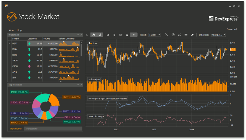
The DevExpress Stock Demo illustrates the type of complex trading system achievable by the WinForms and WPF libraries.

Stock Market Demo

One of the key new features is the ability to plot several indicators in separate panes with individual axes assigned to themselves.

Separate Panel Indicator Settings

Lets take a look at some of the newly supported financial indicators:

Price Indicators are approximations of the average price for a period and can be used as a filter for moving average systems. In v15.2 the following price indicators are now supported:

  • Median Price
  • Typical Price
  • Weighted Close

Price Indicators

Oscillators in technical analysis are an indicator that varies over time within a value range specified by a centre line or min/max lines. Oscillators are used to discover short-term over bought or over sold conditions.  v15.2 now supports the following list of oscillators.

  • Average True Range
  • Commodity Channel Index
  • Detrended Price Oscillator
  • Moving Average Convergence Divergence
  • Rate Of Change (Momentum)
  • Relative Strength Index
  • Chaikin’s Volatility
  • Triple Exponential Moving Average (TriX)
  • Williams %R

Oscilators

Trend Indicators attempt to provide an objective measure of the direction of a trend. Price data is smoothed and the trend is represented by a single line, like a moving average.

  • Mass Index
  • Standard Deviation
  • Stochastic Indicator

Trend

Moving Averages provide an objective measure of trend direction by smoothing price data.

  • Triple Exponential Moving Average (TEMA)

TEMA


===========================

We would love to get your feedback on these new financial indicators. How likely are you to use it in your next WinForms or WPF project?

Blog Post: ASP.NET Ribbon Control - One Line Mode and Context Tabs (Coming soon in v15.2)

$
0
0

Those of you familiar with the Ribbon Control, originally created for the Microsoft Office® applications, might have come to the conclusion that this UI element is actually a pretty complex control with one simple design aspect in mind: “Show a lot of logical grouped actions without using a lot of real estate on screen”.

The DevExpress ASP.NET Ribbon Control already incorporates a lot of really nice features like Tabs and Galleries.

In the upcoming v15.2 release we have added two new features!

One Line Mode

This allows the Ribbon Control to save even more screen space by putting all actions on one line in the Ribbon. This also comes in quite handy in responsive web-pages, and still gives you access to the full action set in the control.

Context Tabs

This is a feature which allows you (the developer) to show Tabs with certain actions that are only applicable for the current feature the user is using. An excellent example of this is within the RichEditor: when the user moves the cursor inside a table, two new tabs with an accented background color are shown containing table-specific actions.

Register for v15.2 webinar

To see all the new features coming out for the v15.2 release, sign up for the "v15.2: What's New for ASP.NET Developers":

Click here to register

Blog Post: DevExtreme HTML5 Pivot Grid - Excel Export, Drill Down & More (Coming soon in v15.2)

$
0
0

Our HTML5 team has been hard at work improving the DevExtreme HTML 5 Pivot Grid widget and with v15.2, we'll introduce the following new features/capabilities:

Excel Data Export

Once v15.2 is released, you'll be able to export Pivot Grid Data to an Excel Document. Data is exported as it's displayed inside the Pivot Grid - with sorting, filtering, cell formatting applied. As you'd expect, export operations will be executed on the client side.

HTML 5 Pivot Table Widget - Export to Excel

Drill Downs

To help improve usability and facilitate data analysis, we've incorporated drill down support for our HTML5 Pivot Grid. You can now retrieve the list of records used to calculate a specific summary value.

DevExtreme HTML 5 Pivot Table Widget - Data Drill Down


Summary Level Calculations

If you've worked with pivot tables, you'll know that it's often more important to understand how a summary value correlates with other cells than it is to know the summary value itself. To that end, v15.2 allows you to choose the appropriate summary display mode from one of the following:

  • “absoluteVariation”
  • “percentVariation”
  • “percentOfColumnTotal”
  • “percentOfRowTotal”
  • “percentOfColumnGrandTotal”
  • “percentOfRowGrandTotal”
  • “percentOfGrandTotal”
  • If a predefined mode does not address your business requirements, you can implement your own summary calculation algorithm.

And yes, our Pivot Grid widget can now display in-group or cross-group running summaries.

DevExtreme HTML5 Pivot Table Widget - Running Totals


Virtual Scrolling

When enabled, our new virtual scrolling mode divides all loaded data across multiple pages and draws only those visible. This improves performance when working with extremely large datasets. In addition, virtual scrolling allows you to load more than 5,000,000 Pivot Grid cells (the maximum number of loaded cells without virtual scrolling is 25,000).


Storing Pivot Grid State

In previous versions, if a user modified row, column, data field configurations or filter/sort conditions (etc) within the Pivot Grid, changes made by end users were lost when the widget was disposed. With this release, our HTML5 Pivot Grid widget can save its current state and therefore restore its last configuration.


Appearance and Layout Enhancements

You can now specify whether total and grand total cells are displayed prior to or after data rows/columns.

HTML 5 Pivot Table


In addition, you can now hide grand totals or values for specified fields.

==========================

If you're using our HTML5 Pivot Grid or are considering it in your next project, we'd love to hear from you. Tell us what you think of these new features.


Viewing all 3392 articles
Browse latest View live