Quantcast
Channel: Developer Express Global
Viewing all 3389 articles
Browse latest View live

Blog Post: DevExpress Dashboard - Excel Export & Excel Data Binding (Coming soon in v15.2)

$
0
0

As you all know, Microsoft Excel plays a significant role in business and so with our upcoming release, DevExpress Dashboard will introduce Microsoft Excel data export support. Simply said, you'll now be able to export the contents of the following Dashboard items to Excel.

  • Charts
  • Scatter Charts
  • Grids
  • Pie Charts
  • Cards
  • Gauges
  • Pivot Tables
  • Choropleth Map
  • Geo Point Maps
  • Range Filters

Here's an example of a Grid Dashboard Item with Sparklines exported to XLSx.

DevExpress Dashboard Data Export

Note: DevExpress Dashboard preserves original data formats during export (Custom, Currency, Date, Time, etc).

It's painless to export data - simply select the Export to Excel menu item for the Dashboard Item you wish to export.

DevExpress Dashboard - Export to Excel

Binding to Microsoft Excel Workbooks and CSV Files

DevExpress Dashboard v15.2 allows you to load data from Microsoft Excel workbooks and CSV files. You can select everything in a worksheet or a cell range referenced by a defined table or name.

  1. Select Microsoft Excel workbook / CSV file as  you data source type.
  2. Locate the required workbook.
  3. Specify import settings.
  4. Select a worksheet, table or specified range.


Blog Post: WinForms & WPF Toolbox Control (Coming soon in v15.2)

$
0
0

Last week I announced the upcoming release of our WinForms and WPF Diagram Control. A "by-product" of our investments in a Diagram component is our new Toolbox Control. As you can see in the image below, it can be used as a "toolbox" but also offers unique UX options for those of you with complex navigation requirements.

WinForms and WPF Toolbox Control

And yes, I know, we have a number of navigation oriented controls and it can be hard to choose the right one - As mentioned before, if you do not need a toolbox but do need additional flexibility when building your app, the Toolbox Control might be the right choice for you. It ships with the following features:

  • Multiple Item support
  • Item Groups/Categories
  • Search Box
  • Ability to minimize the control.
  • Quick access to item groups via a menu.
  • Extended events for handling drag & drop operations.

I want to quickly elaborate on the last item...When it comes to drag & drop, the Toolbox Control includes:


A DragItemStart event - which notifies that the drag & drop process has started and allows you to specify a preview-image (like shape previews used by our Diagram Control).

A DragItemMove event - which allows you to manage mouse cursor state and provide users with visual feedback (whether they can perform a drop action at the current position).

A DragItemDrop event - which allows you to handle a drop action;

=============================

We'd love to get your feedback on the new WinForms & WPF Toolbox Control. How likely are you use this in your next project?

Blog Post: WPF Reporting - Report Wizard, Report Explorer and more (Coming soon in v15.2)

$
0
0

v15.2 will bring with it a number of enhancements to our WPF Report Designer. Before I describe those, please note that though you are free to use this control inside your WPF projects, we have not yet officially released it. This product will remain a community tech preview once we ship v15.2.


Both a Report Wizard and Data Source Wizard are shipping in this release and work just like their WinForms counterparts: The Wizards allow you to select data source type (including our new Excel Data Source), specify connection settings, build a SQL query using the Query Builder, and in the case of the Report Wizard, specify settings for automatic report layout generation.

WPF Reporting - Data Source Wizard

WPF Reporting - Report Wizard

v15.2 also includes dedicated editors for complex report control properties. These include a Collection Editors, Formatting Rules Editor and Style Editor.

WPF Report Designer - Report Property Editors

As you can see in the image below, the Report Explorer now displays Formatting Rules, Styles and non-visual components available in the open report.

 WPF Reporting - Report Explorer

A Group and Sort panel has also been added to the Report Designer. Just like its WinForms counterpart, the panel makes it easier to apply grouping and sorting rules to a report.

WPF Reporting - Grouping & Sorting

New Report Designer View

If you've used our WPF Report Designer, you'll be familiar with our classic designer view (ReportDesignerClassicView) pictured below.

WPF Report Designer - Classic

v15.2 will introduce a new, modern web browser inspired view (ReportDesignerBrowserView).  This view is now used by default.

WPF Report Designer - Modern

Finally, context menus are now available for all report controls. Context menus provide access to important settings and commands for all report controls and bands. For certain report controls, the context menu also includes an Edit… option, which invokes a dialog with complex setting options for the control (such as data binding settings, formatting, etc.)


WPF Report Designer - Context Menus


Blog Post: ASP.NET HTML Editor - Source Code Editing and more (Coming soon in v15.2)

$
0
0

There's a great new feature for the DevExpress ASP.NET HTML Editor in v15.2 release: Source Code Editing features like Visual Studio.

To see it in action, check out this short video:

New Features

Here's a list of all the new features for the DevExpress ASP.NET HTML Editor in the v15.2 release:

  • Syntax highlighting
  • Auto completion
  • Indents
  • Auto closing tags
  • Highlight active line & matching tags
  • Find and Replace functionality
  • Edit whole document
  • Contextual tabs (via Ribbon control)

Find and Replace

Your end-users can now easily locate and modify text data within both the Design and HTML views of the DevExpress ASP.NET HTML Editor. We've added a combination of a Search Panel and the Find and Replace Dialog to enable slick new functionality.

To show the Search Panel, use the Ctrl+F shortcut. The Find and Replace Dialog can be invoked using a specific toolbar button or through the Search Panel's dropdown button.

When you type a search string, the editor's search engine automatically searches the content and highlights potential matches making them navigatable. In the Find and Replace Dialog, the search results are displayed as clickable list items that you can navigate as well.

Edit Full HTML Document

The DevExpress ASP.NET HTML Editor now provides the ability to edit the entire HTML document, including the content of the following tags:

Now your end-users can create and edit the entire web pages using the DevExpress ASP.NET HTML Editor.

Ribbon Improvements

New features of the ASPxRibbon control (contextual tabs) are also available in the DevExpress ASP.NET HTML Editor to improve the functionality of its built-in ribbon navigation.

Register for v15.2 webinar

To see all the new features coming out for the v15.2 release, sign up for the "v15.2: What's New for ASP.NET Developers":

Click here to register

Thanks!


#OnlyTheBest

Year after year, .NET developers such as yourself consistently vote DevExpress products #1.

Experience the DevExpress difference for yourself and download a free 30-day trial of all our products today: DevExpress.com/trial (free support is included during your evaluation). 

Blog Post: HTML5 Data Grid - Enhancements (Coming soon in v15.2)

$
0
0

Based on great customer feedback, the upcoming release of our HTML5 Grid will include a number of usability and performance enhancements.

#1 - The Built-in Edit Form

As you can see in the image below, v15.2 includes a new Grid based “form” editing mode, allowing users to edit grid values directly within the grid's layout..

HTML5 Data Grid - Inline Data Editing


This new capability is made possible by the soon-to-be-released dxForm widget . As you'd expect, you can customize the edit form to your needs by specifying the desired dxForm configuration object. 

HTML5 Grid Inline Edit Form Customization


#2 - Filtering by Range

You can now filer numeric or date columns by range using the new "between" filter row operator.

HTML 5 Grid - Filter by Range


#3 - Column Header - Filter Customization

This release allows you to customize header filters for each column individually. You can specify custom header filter items by using one of the following options:

  • Specify a custom data source
  • Modify the default data source
  • Specify group intervals for numeric and date columns

HTML5 Grid Header Filter Customization
 
#4 - Performance Enhancements

The DevExtreme HTML 5 Data Grid is now significantly faster than its predecessor...

  • Nearly twice as fast for common usage scenarios (rendering, data refresh, etc)
  • Data caching support prevents unnecessary requests from remote data storage. This new feature improves performance for a number of built-in grid operations (sorting, filtering, grouping etc.).
  • Optimized data lookups. With the new calculateDisplayValue option, you can specify the initial value of Lookup cells, avoiding the loading of lookup data sources where appropriate.
  • Data grouping and summary calculations can now be performed on the server. This reduces the amount of data transfer and improves overall performance when working with large datasets.

Additional Enhancements

  • Two-way binding support for Knockout and AngularJS frameworks - enables grid cells to be updated if corresponding field values change outside the grid.
  • Ability to specify configuration options for editors used to edit cell values.
  • Show/hide check box columns when multiple cell selection mode is enabled.
  • Execute asynchronous operations for rowInsering | rowUpdating | rowRemoving events.
  • Obtain and modify desired cell values programmatically using the cellValue method.
  • Check if changes made to grid data are committed to the server using the hasEditData method (useful during batch editing).
  • Page navigator now displays total row count.

================================

We'd love to get your feedback on these new features. Tell us how you're using our HTML 5 grid and how you might use some of these new capabilities in your next web project.

Blog Post: WinForms Grid Based Reporting (Coming soon in v15.2)

$
0
0

A couple of weeks ago, I posted a short blog about our upcoming Grid-based reporting solution for our WPF product line. As is always the case when we announce a new feature for a specific .NET platform, one of the questions on people's minds was whether the same capability will be introduced for WinForms. The good news is that yes, it will. 

Before I describe grid-based reporting for WinForms, let me give you a quick background..

Over the years, we've had great feedback on the grid's ability to print and render its contents (If you've used DevExpress WinForms controls in the past, you'll know that printing support is a long-standing feature). For many, this feature reduces the need to create pre-built custom reports, since end-users are able to customize the display of data within the Grid (sort, group, aggregate, add/remove columns) and then print/export the customized view. Though extremely popular, there has always been an Achilles heel to our Printing System - that being the ability to fully customize the output (be it to paper or exported to file).

Well, with our v15.2 release, we've taken ad-hoc grid-based reporting to a new level and given you a way to quickly create a report (both design and runtime), customize the report (or delegate customization to an end-user) and then send the report to a printer or export it to various formats with just a single button click.


WinForms Grid Based Report Generation
 
This new report generation engine supports a variety of grid features, including grouping, sorting, filtering, data summaries, appearance settings, etc.

You can generate a report at design time by adding the ReportGenerator component from the Toolbox onto your form, and then selecting the Generate Report command from the component's smart tag.

WinForms Grid Based Report Generator
 
The Report Generation Wizard that is invoked will allow you to...

  • Select the Grid View against which to generate the report (only the standard Grid View is presently supported).
  • Specify layout, grouping and appearance settings for the report (to simplify setup, changes are immediately reflected in the preview pane).
  • Specify the report's title.

WinForms Grid Based Report Wizard
 
The new report is automatically added to the current project. You can then customize it using our award-winning Report Designer within the Visual Studio IDE.

WinForms Grid Based Report Designer
 
The report designer allows you to...

  • Preview, print and export the report
  • Modify report element layout
  • Modify report element appearance 
  • Apply data grouping, sorting and filtering
  • Add totals
  • Add page numbers and system information;
    And so much more...

At runtime, you can either display the report's output within its print preview window or you can delegate report customization to end-users via the DevExpress End-User Report Designer

Note that you can generate a report in code -  with a single call to the GenerateReport static method...

XtraReport report = ReportGenerator.GenerateReport(gridView1);

And to generate the report using report generation options available in our Report Generation Wizard...

ReportGenerationOptions options = newReportGenerationOptions();
options.PrintGroupFooter = DefaultBoolean.False;
// ...    
XtraReport report = ReportGenerator.GenerateReport(gridView1, options);

============================

We'd love to get your feedback on grid-based reporting. How likely are you to use this feature?


Blog Post: Using a Secure WebAPI Web Service from a Mobile App

$
0
0


YouTube: Using a Secure WebAPI Web Service from a Mobile App

Check out the webinar video above which helps you learn how to:

  1. Create a secure WebAPI service
  2. Understand authentication & authorization
  3. Consume the service using a mobile app

Github repo

DXDevExtremeWebAPI

Fork the repo, send pull requests, and tell us what've you're using the 'educational' library for by leaving a comment below.

Common terms

Best Practices

Cloud API Service

Public API

Additional resources

Have you tried DevExtreme yet? I'd love to hear about it. Drop me a line below.

Thanks!


#OnlyTheBest

Year after year, .NET developers such as yourself consistently vote DevExpress products #1.

Experience the DevExpress difference for yourself and download a free 30-day trial of all our products today: DevExpress.com/trial (free support is included during your evaluation).

Blog Post: XAF - Validation Module Enhancements for Windows and the Web (Coming soon in v15.2)

$
0
0

In our upcoming release of the eXpressApp Framework, data validation occurs immediately after input focus changes when validation rule evaluation does not require querying additional data from the server. These rules are RuleRequiredField,RuleRegularExpressionRuleStringComparisonRuleValueComparison and RuleRange.


In-place validation is enabled for the Save context by default. To enable it for other contexts, use the AllowInplaceValidation property of the Validation | Contexts | Context node in the Model Editor.


Since rule evaluation occurs on the client side, in-place validation does not occur when:


The asterisk (*) symbol is automatically appended to an editor label when the RuleRequiredField is applied.

In-place validation engine relies on Controllers provided in our platform-specific ValidationWindowsFormsModule and ValidationAspNetModule components.

Note: The ASP.NET module was introduced in v15.2. In order to use in-place validation after upgrading your existing ASP.NET applications to v15.2, be certain to add  this module from the Toolbox into the Application Designer.

=====================================

The XAF Team would love your feedback. Please tell us what you think of these new features.


Blog Post: XAF - Web Map Module (Coming soon in v15.2)

$
0
0

With this release, we're shipping a new Map module for XAF Web apps - allowing you display business objects on different kinds of maps. The module integrates the client-side dxMap and dxVectorMap widgets from DevExtreme into ASP.NET XAF applications via specialized XAF server-side wrappers like List and Property Editors: WebMapsListEditor, WebVectorMapsListEditor and WebMapsPropertyEditor.


Primary Capabilities

While designing this module, we considered customer feedback received during the research we conducted earlier this year and also previous user requests from the Support Center and other sources. Let's take a quick look at the functionality implemented in the initial release:


1. Interactive map displays objects implementing the IMapsMarker interface using the Google Maps API or Bing Maps API:

2015-09-30_1040.png

2. Vector map displays objects implementing the IAreaInfo interface as areas with different colors:

2015-09-30_1056.png


3. Vector map displays objects implementing the IVectorMapsPieMarker interface as pie-chart markers:

2015-09-30_1059.png

You can experience a live demo of our Map module in the ListEditors | Maps section of the offline Feature Center demo that is installed with XAF or check its online version at demos.devexpress.com/xaf/featurecenter once v15.2 is officially released.


Configuration

You can configure map types via the Model Editor invoked from Visual Studio or in code:

1. Configuring WebMapsPropertyEditor for a DetailView:

2. Configuring WebVectorMapsListEditor for a ListView:

3. Customizing the underlying dxMap widget in code of a ViewController for a ListView:

usingDevExpress.Persistent.Base;

namespaceDevExpress.ExpressApp.Maps.Web.Controllers {

   publicclassMapCenterController:ObjectViewController<ListView, Store> {

       protectedoverridevoidOnViewControlsCreated() {

           base.OnViewControlsCreated();

           ((WebMapsListEditor)View.Editor).MapViewer.ClientSideEvents.Customize=GetCustomizeScript();

       }

       privatestringGetCustomizeScript() {

           return@"function(sender, map) {

      map.option('center', 'Brooklyn Bridge,New York,NY');

                      map.option('autoAdjust', false);

    }";

       }

   }

}

===========================

We'd love to get your feedback on this new Map module and whether you are planning to use it in upcoming XAF Web apps.

Blog Post: HTML5 Form Layout Widget (Coming soon in v15.2)

$
0
0

v15.2 will ship with a great new addition to our HTML5 / JavaScript widget collection - dxForm. As I'll explain in a moment, this client-side widget was designed to simplify how you create and layout forms. 

HTML5 JS Form Layout Widget
The screenshot above helps illustrate the power of this new widget - with dxForm, you can create form layouts of any complexity.  

You may be asking how easy is it to use...The answer is extremely easy. The following screenshot represents a simple form - with a single column layout. To generate this layout, you simply create a form instance and pass a data object to it.

HTML5 JS Form Layout - Default
 
When the dxForm widget generates a form item for a data field, it selects the appropriate data editor (based on data type) and transforms the data field name to a label with appropriate text. For instance, if a data field name is “firstName”, “First Name” will be used for the label. If the auto-generated label does not meet with your satisfaction, you can implement a custom algorithm for label text generation.

Form Layout Customization

Once a form is generated, dxForm gives you a number of customization options so you can fine-tune your forms to meet the exacting needs of your end-users. Layout customization features include:

  • Specify a fixed number of columns within the layout or force the widget to automatically choose the number of columns based upon current form width. The dxForm widget layout is adaptive: It uses a single-column on devices with small screens.
  • Organize items into groups and tabbed pages.
  • Customize label position.
  • Customize the visibility and appearance of “required” and “optional” validation text.
  • Display help/info text label for specific items.

HTML5 JS Form Layout
 

Validation

dxForm allows you to specify validation rules for individual items. If rules are defined for an item, it is marked as a required. Each editor is validated separately when it loses focus. You can, however, validate all editors simultaneously by calling the validate method (when validating all editors, a validation summary will be displayed at the bottom of the form).

HTML5 JS Form Layout and Validation


Updating Values

Form item values are automatically updated when you assign a new data object to the formData option. Alternatively, you can update the required data field using the updateData method. In this instance, the widget is not re-rendered...It only updates the required item values. Two-way binding for AngularJS and Knockout is also supported.

=======================

Tell us what you think of this new widget - We'd love to get your feedback.


Blog Post: HTML5 Scheduler & Calendar - Enhancements (Coming soon in v15.2)

$
0
0

Our upcoming release is going to include a number of enhancements to our HMTL5 JS Scheduler widget, including the ability to customize appointment detail forms. With the help of the new dxForm widget (read my blog post from earlier today), you can now modify all items on the form. Additionally, you can display appointment data using a custom popup.

HTML5 - JavaScript Custom Appointment Form

Timeline Views

Our HTML5 Scheduler widget can now display appointments horizontally across a timeline. The following views are available:

  • Timeline day
  • Timeline week
  • Timeline work week

As you'd expect, grouping appointments by resources is available for these views.

HTML5 - JavaScript - Scheduler Timeline View

Manage Appointment Editing

v15.2 allows you to control appointment editing actions available via the Scheduler's UI. You can now specify whether a user can edit, create, delete, drag or resize appointments.

Appointment Recurrence Enhancements

The Scheduler now allows you to exclude an appointment from a recurrence series. When you edit a recurring appointment, you are now prompted to edit the active appointment or the entire series. In the first instance, the widget creates a new appointment object and adds it to the data source. Otherwise, changes made to the appointment are applied to the entire series.

All Day Events

v15.2 allows you to manage visibility of the all-day event panel. If your scheduler does not contain all-day appointments, you can hide the all-day panel.

Custom Appointment Tooltips

If our standard appointment tooltip does not satisfy your needs, you can now define a custom template for tooltips used within your web app.

UI Events

This release includes new Scheduler widget events so you can perform custom actions when a user interacts with widget elements. These include:

  • onAppointmentClick
  • onAppointmentDblClick
  • onCellClick

Mobile UI Optimizations

Our Scheduling widget is now optimized for use on mobile devices. 

HTML5 - JavaScript Calendar for Mobile Devices

New capabilities include:

A compact drop-down menu is used to switch a view instead of tabs.
A popup with appointment details can be displayed in full-screen mode.
You can now scroll a calendar view horizontally.

==============================

We welcome your feedback - tell us how you plan on using our HTML5 Scheduler widget in your next web/mobile app.


Blog Post: XAF - Web UX Enhancements (Coming soon in v15.2)

$
0
0

In this release cycle, we've evolved our web page templates and themes optimized for touch devices (released n v15.1). While we still continue to refine things, we believe that this feature is ready to be used in production and we do not expect major breaking changes going forward.

In addition to numerous cosmetic enhancements and capabilities that were already test-driven in previous minor updates, let me highlight a few important features:

1. Adaptive and Responsive Layout

Our ASPxGridListEditor supports adaptive layouts and is enabled in the new web style by default. Columns are collapsed automatically when the browser window is resized.

You can control this behavior via the IModelColumnWeb.AdaptivePriority property in the Model Editor invoked for the ASP.NET project. 


This option specifies the column's priority. Columns with a lower AdaptivePriority value remain visible when the browser window shrinks, while columns with a higher value are hidden. Hidden column data can be accessed via the ellipse "..." button. In the image above, both the SUBJECT and PROJECT columns have a lower AdaptivePriority value than others.

2. Device-Specific Settings in ASP.NET Applications

Web applications can now have separate settings for desktop, tablet and mobile devices. Device-specific model differences are stored in the Model.Desktop.xafml, Model.Tablet.xafml and Model.Mobile.xafml files. Database settings storage is also supported.

3. Customizable ASP.NET Templates for Touch Devices

Page templates designed for touch devices can be easily customized. Corresponding project item templates are now available in Visual Studio:

  • DevExpress v15.2 XAF ASP.NET Default Template Content V2
  • DevExpress v15.2 XAF ASP.NET Dialog Template Content V2
  • DevExpress v15.2 XAF ASP.NET Logon Template Content V2
  • DevExpress v15.2 XAF ASP.NET Nested Frame Control V2


Reporting

With v15.2, the DevExpress HTML5 Report Viewer is used by default. 


Our Web Report Designer now supports parameters with complex types (including multi-value parameters for complex types).

Finally, XAF's Reports Module can now store a layout in XML format, making complex report rendering much faster (learn more)!


Confirm unsaved changes

ASP.NET applications can now prevent loss of unsaved data by displaying a warning dialog if a user attempts to close the browser tab, or clicks an Action whose execution may lead to loss of unsaved data.


This behavior is enabled by default. You can disable it using the ConfirmUnsavedChanges property of the Options node in the Model Editor invoked for an ASP.NET project:

The option above is global. To enable/disable the confirmation dialog for a specific Action, use the ConfirmUnsavedChanges property of the ActionDesign | Action node.

By default, the IModelActionWeb.ConfirmUnsavedChanges option is set to true for the following Actions: NextObject, PreviousObject, New, DialogCancel, DialogClose, ChooseTheme, Refresh, Cancel, Edit, Logoff, ChangeVariant

Batch Edit support

ASPxGridListEditor now supports Batch Edit Mode. Unlike other modes, Batch Edit allows you to edit multiple rows and then save all modified objects at the same time.


To enable Batch Edit Mode, set the InlineEditMode property of the ListView node to Batch in the Model Editor and ensure that the AllowEdit property of the same node is set to true.


Please note the following: 

    In Batch Edit mode, the Detail View is not invoked when a user clicks a row.
    A few data types cannot be edited: imagesreferencescriteriafile attachments.
    Initial property values for new objects are passed to the client when the grid control is created and are not updated each time you create objects using the New Command Item.

Batch Edit Mode supports our new ConfirmUnsavedChanges and Validation module features.


Master-Detail support

ASPxGridListEditor now provides built-in support for the master-detail data presentation. To enable it, run the Model Editor for an ASP.NET project, and set the DetailRowMode property of the Views | ListView node to DetailView or DetailViewWithActions.


In DetailViewWithActions mode, a Detail View specified using the DetailRowView property is shown in a detail row. In DetailView mode, the same Detail View is displayed, but the toolbar of its nested List View is hidden.


By default, DetailRowMode is None and the master-detail mode is disabled.

=====================================

Please tell us what you think of these new features.

Blog Post: XAF - Enhancements to Core and other modules (Coming soon in v15.2)

$
0
0
Over the last few days, I've described some of the new features we've introduced into the eXpressApp Framework v15.2. In this post, I'll describe enhancements we've made to XAF's core and other modules.
Reset View Settings
The Reset View Settings Action re-opens the current View and resets all user customizations made to the View's model. This Action is disabled (grayed out) if there are unsaved changes.


Detail Form Layout Customization in Code

With this release, you can customize the Detail View's default layout in your Data Model code using the DetailViewLayout attribute. Please refer to the following example code/screenshot below:

publicclassContact{[Browsable(false)]publicintID{get;privateset;}[DetailViewLayoutAttribute(LayoutColumnPosition.Left)]publicstringFirstName{get;set;}[DetailViewLayoutAttribute(LayoutColumnPosition.Right)]publicstringLastName{get;set;}[DetailViewLayoutAttribute("FullName", 0)]publicstringFullName{get{returnFirstName+" "+LastName;}}[DetailViewLayoutAttribute(LayoutColumnPosition.Left)]publicstringEmail{get;set;}[DetailViewLayoutAttribute(LayoutColumnPosition.Right)]publicvirtualContactManager{get;set;}[DetailViewLayoutAttribute(LayoutColumnPosition.Left)]publicDateTime?Birthday{get;set;}[FieldSize(FieldSizeAttribute.Unlimited)][DetailViewLayoutAttribute("NotesAndRemarks",LayoutGroupType.TabbedGroup, 100)]publicstringNotes{get;set;}[FieldSize(FieldSizeAttribute.Unlimited)][DetailViewLayoutAttribute("NotesAndRemarks",LayoutGroupType.TabbedGroup, 100)]publicstringRemarks{get;set;}}


Non-Persistent Objects Enhancements

In this release we have extended support for usage scenarios when using non-persistent objects first introduced in v15.1:

  • The New, Delete and Save Actions are available for non-persistent objects. Modified objects are accessible using the NonPersistentObjectSpace.ModifiedObjects property.
  • The INotifyPropertyChanged.PropertyChanged event is now triggered for non-persistent objects.
  • The non-persistent Object Space is now accessible for objects that support IObjectSpaceLink.

Security System Enhancements

We continue making the new security system more capable with the following updates:

  • Security permissions are immediately refreshed once the administrator applies changes. You are no longer required to log off all affected users to refresh permissions (learn more...).
  • If the administrator grants certain permissions to a reference or collection property that participates in an association (one-to-many or many-to-many), the same permissions are automatically granted for a property at the other end of this association (learn more...).
  • The Data View mode in now supported.
  • Upcasting is now supported in List View columns.
You should expect more news in this regard after the official release.


General usability and API improvements:

The following is a list of minor features that should make using XAF a little easier. While you can see the full list of these smaller enhancements in our What's New docs, I would like to highlight the following items:

  • S38140 - Core - Introduce IObjectSpace.Evaluate method that will evaluate a criteria expression against both EF and XPO objects (including Domain Components)
  • Q483608 - Core - Make it easier to obtain IQueryable<T> collection through IObjectSpace for LINQ
  • S171061 - Core - Provide an option to avoid saving a master record immediately when a new non-aggregated child object is created in a nested List View
  • S170756 - Core - Provide Refresh method overloads allowing the refresh of the underlying data source
  • T204296 - EF.Usability - Support complex types that are not registered in DbContext and have no key property
  • T177760 - EFDataView - Support common criteria function operators
  • S172038 - Core - Provide a simplified database compatibility check mode; one that relies on the database schema and ignores module assembly versions
  • T312781 - ImagePropertyEditor - Support images declared as reference properties instead of byte array
  • T303205 - Workflow - Add an option to repeat the workflow multiple times while the target object fits criteria

=====================================

I will post additional content on some of these items (like S172038) separatly, once we release v15.2. Please stay tuned and let us know what you think of these new features.

Blog Post: XAF – A Simpler Way to Check Database Compatibility (Coming soon in v15.2)

$
0
0


In earlier versions, to check the compatibility of an application and its database, a ModuleInfo table was created in the database. This table stores information on the module versions used in an application. When checking the compatibility of the database and the application, the versions stored in the ModuleInfo table are compared with actual module versions. A DatabaseVersionMismatch event occurs when there's a mismatch. By default, each module's version is set to "1.0.*" using the AssemblyVersion Attribute in the Properties\AssemblyInfo.cs file. The asterisk sign in the version indicates that the build and revision numbers in the version are autoincremented, and so version value is updated with each new build. As a result, WinForms and ASP.NET module versions may not be synced if you build WinForms and ASP.NET applications separately (e.g, when creating a ClickOnce installation or deploying to IIS).

  
With v15.2, we've introduced a new application and database compatibility check mode; one that utilizes native XPO methodologies. In this mode, the following checks are performed:

  1. The database exists.

  2. All required tables exist.

  3. All required columns exist.


The DatabaseVersionMismatch event occurs if any of these checks fails.


The new XafApplication.CheckCompatibilityType property specifies which mode to use. The CheckCompatibilityType.ModuleInfo value indicates that the old mode that relies on the ModuleInfo table is used. This mode is still used by default for applications created with earlier versions of XAF. In applications created with the Solution Wizard in version v15.2, the XafApplication.CheckCompatibilityType value is CheckCompatibilityType.DatabaseSchema, which corresponds to the new mode detailed above. This property value can be changed in the Application Designer:


Untitled (1)


Note that the use of ModuleInfo is more complicated, but it ensures business logic compatibility in addition to data model compatibility. The new DatabaseSchema mode relies on the database schema only.

A CheckCompatibilityType property has also been added to the IObjectSpaceProvider interface, allowing you to specify the mode individually for each Object Space Provider (when you use multiple databases). By default, it is set to null and the XafApplication.CheckCompatibilityType value is actually used. Another useful change with this interface is the new  IObjectSpaceProvider.SchemaUpdateMode property. You can now use it to specify handle compatibility checking for the database associated with the current Object Space Provider. The following values are available:

  • DatabaseAndSchema - Missing database is autocreated. The database schema is updated when the compatibility check fails.

  • None - Database compatibility issues are ignored.

=======================================

That's my  last post prior to launch and hopefully you've liked what we've done with XAF. As always, we want to hear your thoughts. Please tell us what you think of XAF v15.2.

Blog Post: WinForms Themes - Office 2016 (coming soon in v15.2)

$
0
0

Thanksgiving weekend wouldn't be complete without a few screenshots for our WinForms customers.

Office 2016 Black WinForms Theme

WinForms Office 2016 Black Theme

Office 2016 Color WinForms Theme

WinForms Office 2016 Colorful Theme

We'd love to hear your thoughts on these 2 new themes? Are you likely to use them vs existing Office themes?


Blog Post: WinForms and MVVM

$
0
0

Our WinForms team recently told me that we should to a better job telling the world about our MVVM Framework for WinForms developers. Seems the news hasn't spread fast enough. :)

Reddit | https://www.reddit.com/r/csharp/comments/3u6pp5/modern_winforms_design_whats_your_goto_desigb/

Stack Overflow | http://stackoverflow.com/questions/595469/ui-design-pattern-for-windows-forms-like-mvvm-for-wpf

If you've not yet seen or used our MVVM Framework, please refer to the following blog post from June, 2015.

DevExpress WinForms and MVVM Blog Post  

I'd be curious to hear your thoughts on MVVM and WinForms. How many of you prefer it over traditional WinForms methodologies?

Blog Post: ASP.NET Query Builder (Coming soon in v15.2)

$
0
0

Good news, there is a new ASP.NET control, in the v15.2 release, that allows your end-users to visually build queries! And you can then apply those queries on existing DevExpress controls like the ASP.NET GridView.

Here's a screenshot of the new Query Builder control's UI:

The Query Builder functionality was first introduced as part of our XtraReports' new web report designer. Many of you have requested this as a separate/independent control (and we agree).

Your power users will love this feature as it provides them a visual way to create their own queries.

Query Builder (Preview)

We're introducing the new DevExpress ASP.NET Query Builder control as a preview version in the v15.2 release because it's we're still perfecting it. However, the new ASP.NET Query Builder control has enough of a feature set that we'd love for you to test drive it and give us your feedback.

Features

The DevExpress ASP.NET Query Builder allows your end-users to visually construct SQL queries and return a string containing a SELECT statement. So it contains great features like:

  • The database schema is automatically obtained and displayed within the QueryBuilder's UI.
  • Ability to visually edit 'WHERE', 'ORDER BY' and 'GROUP BY' query clauses.
  • Relationships between tables are automatically resolved based on foreign keys.
  • Query results preview.

Register for v15.2 webinar

To see all the new features coming out for the v15.2 release, sign up for the "v15.2: What's New for ASP.NET Developers":

Click here to register

Thanks!


Your Next Great .NET App Starts Here

Year after year, .NET developers such as yourself consistently vote DevExpress products #1.

Experience the DevExpress difference for yourself and download a free 30-day trial of all our products today: DevExpress.com/trial (free support is included during your evaluation).

Blog Post: HTML5 Chart and Data Visualization Widgets - Enhancements (Coming soon in v15.2)

$
0
0

Our upcoming release includes a number of important enhancements/features to our HTML5 data visualization widgets - making them faster and more flexible than ever before.

Performance

We've been hard at work tuning performance and with v15.2, HTML5 Chart rendering has been improved significantly...In some instances up to 3 times faster.

HTML5 JavaScript Client Side Chart Rendering Performance

Quick Side Note: All DevExtreme HTML5 Data Visualization widgets now allow you to specify a Tile and Subtitle.

Multi-Series Pie Charts

With this release, our Pie Chart widget can display multiple series. Series are displayed as nested rings, which gives end-users an easy way to detect even the slightest differences between point values.

HTML5 Java Script Pie Chart with Multiple Series - Nested Pie Chart Rings

You'll find that we've made it easy to incorporate this new feature in your next web/mobile app - Simply specify several series objects as follows.

series: [

    { valueField: "year1998", name: "1998" },
    { valueField: "year2001", name: "2001" },
    { valueField:"year2004", name: "2004" }
],

We've also made it easier to analyze information with the HTML5 Pie Widget. You can now  interact with a point using its label; necessary when a point value is too small and is displayed as a thin pie or doughnut sector.

HTML5 JavaScript Client-Side Pie Chart Labels

Vector Maps

With v15.2, our HTML5 JS Vector Map widget gets support for the following map projections:


Mercator
Equirectangular
Lambert
Miller

You'll find these projections useful for a number of use-case scenarios  - for instance, a map with a custom projection for a floor plan:

HTML5 JavaScript Vector Map Projections

Another new HTML5 Vector Map feature is support of unlimited layers. As you'd expect with this capability, you can now display additional information on your map using layers (areas, markers and lines). Map layers accept GeoJSON formatted data.

HTML5 Java Script Client-Side Map Layers

You can allow users to select a single layer element or multiple elements. Layer elements support hovered states and can display a tooltip on hover. In addition, you can group layer elements by color or size and display the legend based on grouping.

HTML5 JavaScript Map Layers


As is evident in the screenshots above, when used together, multiple layers along with customizable projections provide you a broad range of data visuzliation capabilities/options.

============================
 
Tell us what you think. We want to hear your thoughts on these new features.


Blog Post: What’s New in CodeRush Classic 15.2

$
0
0

CodeRush Classic (CRC) gets two new features in 15.2.

Note that most of our development effort is currently directed toward CodeRush for Roslyn (CRR) which is driven by 45-day sprints between releases. We’ll talk about new features in CodeRush for Roslyn as those releases become available.

In CodeRush Classic, we’ve found clever ways to improve the speed of Quick Nav, making it significantly more responsive.

Also, CodeRush Classic gets two new features in this release:

Code Coverage

CodeRush classic gets Code Coverage, which tells you how much of your application is covered by test cases, which can be one indicator of overall code quality. This feature is also useful when maintaining code – you can get a clear picture of how safe it is to change methods or even individual lines of code. If the code you want to change is covered by test cases, it is safer to change that code (because the test cases covering the code you want to change increase the chances you’ll know immediately if you unintentionally break something).

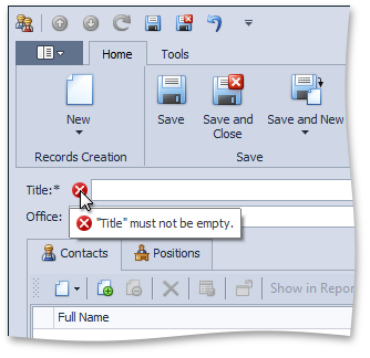
To see Code Coverage, you need to first run your tests from the CodeRush Unit Test Runner using one of the two orange test tube icons at the top:

 UnitTestRunner

These icons run your tests so CodeRush watches for coverage.

The orange test tube button with only a single green triangle ( RunSelectedTests ) shows coverage provided by only the selected tests.

The orange test tube button with two green triangles ( RunAllTests  ) shows coverage provided by all your tests.

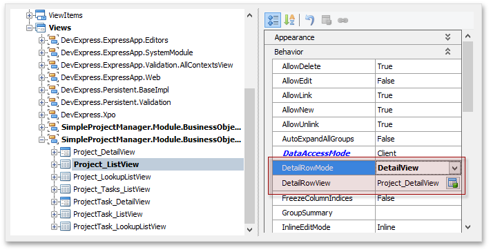
Regardless of which button you press, after the test run is complete, CodeRush reports the results in the Code Coverage window, which looks like this:

 image

The Code Coverage window provides a hierarchical view of the projects in your solution, and shows the code coverage results for each member, type, namespace or project. Results are summarized in the percent graphs on the right, showing the lines of code covered over the total lines of code.

The Code Coverage window optionally shows you a code preview in a separate pane, shown in the screenshot above. Code highlighted in green is covered – that means at least one of the test cases resulted in that line of code being executed. Code with a gray background is not covered by the tests that were run.

You can bring a method of interest to focus inside the Visual Studio editor by right-clicking that node in the tree view and choosing “Go to Method”.
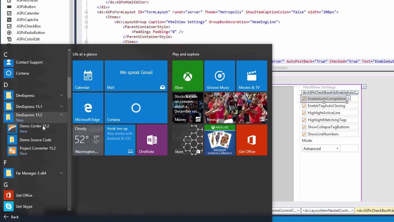
Paste as Xaml/Svg

This is one of the more interesting features we’ve introduced in some time, and it’s for developers who are creating applications and web sites that need scalable graphics. Up until now, creating vector graphics for your applications has been relatively painful, especially if your team lacks a dedicated graphic designer. Existing vector graphic editors are either functionally weak or they require a sequence of tedious export/import steps to get those vector graphics from the graphic editor into Visual Studio.

CodeRush Classic 15.2 solves this challenge rather elegantly, with the new Paste as Xaml/Svg code providers. Just design or open the graphic in your vector editor of choice (Microsoft® Visio, Microsoft® PowerPoint, Adobe® Illustrator, etc.), copy it to the clipboard, and then paste the graphic inside Visual Studio (inside a XAML file or an HTML file using Ctrl+V or Shift+Insert). CodeRush will convert the vector data on the clipboard into XAML or SVG automatically. You can also press the CodeRush key to bring up the CodeRush menu and choose Paste as Xaml or Paste as SVG.

To be clear, here are the steps:

1. Create or open your vector shape in the vector editor of your choice: 
VectorPowerPoint
For example, I used PowerPoint to create the gear shown above by forming a union with four rounded rectangles and a circle, and then subtracting a circular hole from the center (you can create this custom shape in PowerPoint in about 45 seconds – it’s that easy).

2. Copy your custom shape to the clipboard.

3. Paste into the XAML code or into an HTML file inside Visual Studio:

PasteAsXaml 

Of course, you can adjust properties after the paste, such as height/width, fill, stroke, etc.

Here’s the same gear that I created in PowerPoint pasted inside Visual Studio as SVG (and then copied and pasted here into this post):

<svgheight="352px"width="351px"viewBox="0 0 351 352">
 
<defs>
    <
linearGradientid="gradient0"y2="0%"x2="100%"y1="0%"x1="0%">
      <
stopstyle="stop-color: #2e75b6; stop-opacity: 0.5"offset="0%"/>
      <stopstyle="stop-color: #2e75b6; stop-opacity: 0.5"offset="100%"/>
    </
linearGradient>
  </
defs>
  <
pathd="M173,85.0625C124.3125,85.0625,84.8125,124.6875,84.8125,173.5C84.8125,222.375,124.3125,262,173,262
    C221.75,262,261.25,222.375,261.25,173.5C261.25,124.6875,221.75,85.0625,173,85.0625z M153.6875,0L192.375,0
    C197.6875,0,202,4.375,202,9.75L202,33.5625 205.1875,34.0625C219.5,37,233.0625,42,245.5,48.8125
    L252.3125,52.9375 268,37.125C269.9375,35.25,272.375,34.3125,274.875,34.3125
    C277.3125,34.3125,279.8125,35.25,281.6875,37.125L309,64.5625C312.8125,68.3125,312.8125,74.5,309,
    78.25L294.75,92.5625 297.125,95.8125C305.0625,107.5625,311.3125,120.5,315.5625,134.25L318.1875,
    144.4375 336.375,144.4375C341.6875,144.4375,346,148.8125,346,154.125L346,192.9375C346,198.25,
    341.6875,202.625,336.375,202.625L319.9375,202.625 319.1875,207.5625C316.25,221.9375,311.25,235.5,
    304.5,248L298.375,258.125 309,268.8125C312.8125,272.5625,312.8125,278.75,309,282.5L281.6875,309.9375
    C277.9375,313.6875,271.8125,313.6875,268,309.9375L257.75,299.625 257.5625,299.75C242,310.3125,
    224.3125,317.9375,205.1875,321.875L202,322.375 202,337.3125C202,342.6875,197.6875,347,192.375,347
    L153.6875,347C148.375,347,144.0625,342.6875,144.0625,337.3125L144.0625,321.3125 132.125,318.25
    C118.375,313.9375,105.5,307.6875,93.8125,299.75L90.5625,297.3125 78.0625,309.9375C74.25,313.6875,
    68.125,313.6875,64.375,309.9375L37.0625,282.5C33.25,278.75,33.25,272.5625,37.0625,268.8125L51,254.75
    46.875,248C40.125,235.5,35.125,221.9375,32.1875,207.5625L31.4375,202.625 9.6875,202.625C4.375,
    202.625,0,198.25,0,192.9375L0,154.125C0,148.8125,4.375,144.4375,9.6875,144.4375L33.1875,144.4375 
    35.8125,134.25C40.0625,120.5,46.3125,107.5625,54.25,95.8125L54.375,95.625 37.0625,78.25C33.25,74.5,
    33.25,68.3125,37.0625,64.5625L64.375,37.125C66.25,35.25,68.75,34.3125,71.1875,34.3125C73.6875,
    34.3125,76.125,35.25,78.0625,37.125L95.8125,54.9375 105.875,48.8125C114.1875,44.25,122.9375,40.5,
    132.125,37.6875L144.0625,34.625 144.0625,9.75C144.0625,4.375,148.375,0,153.6875,0z"
 
    fill="url(#gradient0)"stroke-width="1"stroke="#1F4E79"/>
</
svg>

If you would like to see how this SVG renders in your browser (with an added animated spin), click here.

So now it’s easy to create your own custom vector graphics and use them inside your XAML applications and web sites.

As always, let us know what you think.

Blog Post: What’s New in CodeRush for Roslyn (preview) 1.0.7

$
0
0

CodeRush for Roslyn (preview) v1.0.7 is now available on the Visual Studio gallery.

Here’s an overview of new and improved functionality in CodeRush for Roslyn (CRR):

Unit Test Runner

The Unit Test Runner now detects and runs unit tests for the MSTest framework. The Test Runner also runs CoreCLR test cases in the DNX environment.

Structural Highlighting

This release includes Structural Highlighting support for C#, Visual Basic and XAML. Structural Highlighting helps you easily see the structure of your code.

Navigation Tools

The Quick Nav and Quick File Nav features have been ported to CodeRush for Roslyn, so you can quickly find symbols and files throughout your solution.

Refactorings

The Refactorings Catalog options page is now available. This options page lists all refactorings and enables you to control the availability of each refactoring.

Code Cleanup

The Make properties auto-implemented code cleanup rule is now available.

Code Coverage

Now you can export code coverage statistics to XML, HMTL, and an NDepend-compatible format. CodeRush for Roslyn also now collects and presents coverage information for MSTest unit tests.

Decompiler

Decompiled code structure now more closely matches the original structure of the code (before it was compiled), and the Decompiler now automatically names variables based on their usage or type.

Additionally, the following code structures are now supported:

  • for and foreach loops
  • using statements
  • auto-implemented properties
  • null-coalescing operators

Give it a Try

As always, you are encouraged to download the CodeRush for Roslyn preview and give it a try.

Side note: One of the new CodeRush 15.2 features, Paste as XAML/SVG, did not make it into the CodeRush for Roslyn v1.0.7 release due to tight development constraints. Our intention is to release this feature in the next CodeRush for Roslyn update, v1.0.8.

Earlier blog posts on CodeRush for Roslyn:

Viewing all 3389 articles
Browse latest View live