Quantcast
Channel: Developer Express Global
Viewing all 3388 articles
Browse latest View live

Blog Post: DirectX Rendering in WinForms Controls: An Update

$
0
0

As you've probably heard by now, during the last release cycle we've carried out a massive overhaul to enable DirectX rendering in our WinForms controls. Our Grid Control and Range Bar were the first ones to take advantage of the performance boost that comes with hardware acceleration. The R&D team remains super-excited about this and keeps working on DirectX support for more controls, one coming earlier than planned - with a v17.2 update.

Here's the state of things with DirectX painting in DevExpress WinForms.

WinForms Controls with DirectX Rendering


PictureEdit with DirectX Rendering - Available with a v17.2 Update

Why PictureEdit, you might ask... Truth be told, we didn't have plans to update it, until a support ticket about painting performance has been submitted:

"I want to use the pictureEdit for displaying "large" images (5000 x 3510) and this works smooth with panning but once I zoom out once it becomes really slow and hardly usable. What's going on?"

Normally, the answer would blame the platform constraints, i.e. the slowness of WinForms and GDI+, and would ultimately be closed without being actually being resolved for the customer. But now, having laid the groundwork for DirectX rendering in our controls, we managed to roll out an updated control with fast rendering in a minor release that usually only includes bug fixes.

If you're interested in a faster PictureEdit, download and install the latest update. And remember, the new rendering mode should be manually enabled for each control, as described in this KB article.


Why Are We so Excited about This?

Once we provided the solution to the support ticket I mentioned above, the response was:

"Oh wow! That is SMOOTH."

This alone - our new-found ability to address customer problems beyond their expectation - is enough a reason for us to keep going. Here are a couple more reasons for us to be excited, outside of that particular use case:

  • If you're suffering performance issues, the new rendering mode will solve them without you having to manually implement any speed-booster hacks. And if you search online, among those hacks the one most effective, yet most unrealistic would be "rendering with DirectX instead of GDI+", which is exactly what we do.
  • If you've been considering a move to the WPF platform to gain performance improvements, maybe our new features will let you stay with WinForms and save the transition costs.

We're proud to be the only UI Control vendor who transforms WinForms experience in such a way.


What Comes Next?

I'll re-iterate what you might have already seen on our 2018 Roadmap. The next controls to get DirectX rendering will be TreeList and Chart, and we expect to release these updated versions in v18.1. Of course we'll continue working on more for later major releases, and will definitely take your feedback into account. So let us know if you're as excited about these changes as we are, and which controls do you think should be prioritized to receive new DirectX rendering.


Blog Post: A Searchable ColumnChooser for the React Grid

$
0
0

A customer asked me recently whether the ColumnChooser plugin for our React Grid could be customized to include a search box. A quick check of the documentation showed some properties on the component that accept building block components for individual parts.

On that basis, I built a sample. You can check it out here:

The implementation in the file SearchableColumnChooser.js has three parts. Starting from the bottom, you can see the component body implemented like this:

<form style={styles}><FormGroup controlId="searchText"><ControlLabel>Search</ControlLabel><FormControl
      type="text"
      value={filter}
      placeholder="Column Title"
      onChange={e => setFilter(e.target.value)}
    /></FormGroup><ColumnChooser.Container>{filteredChildren}</ColumnChooser.Container></form>

The form is implemented using React Bootstrap elements, and it includes the standard rendering of the ColumnChooser.Container plugin component, with a filtered list of children.

The second part of the implementation is a call to the recompose compose helper and the withState and withPropsOnChange HOC (that’s Higher Order Component) functions.

const SearchableColumnChooser = compose(
  withState('filter', 'setFilter', ''),
  withPropsOnChange(['children', 'filter'], ({ children, filter }) => ({
    filteredChildren: children.filter(c => childMatches(c, filter))
  }))
)(...);

withState introduces a state field called filter and a corresponding setFilter function. You can see both these values in use in the component rendering above - no surprises there.

withPropsOnChange creates a prop for the component that depends on the existing props children (that’s the standard React thing) and filter (the one created just before by withState), and is re-created when either of these props changes. filteredChildren is the name of the new property, it is created as a filtered list of based upon the original children, and it is eventually rendered into the ColumnChooser.Container component.

The third part of the implementation is the predicate function used to filter the child nodes:

const childMatches = (child, filter) =>
  child.props.item.column.title.toLowerCase().includes(filter.toLowerCase());

The function implements a simple case-insensitive search for the filter string entered by the end user.

The final bit required for the demo functionality is the line in index.js where the ColumnChooser is created. The newly created container component is passed as a property here:

<ColumnChooser containerComponent={SearchableColumnChooser} />

That’s it - try it! When you bring up the column chooser via the button in the top-right corner of the grid, it shows the search box. Enter a string and see the column list filtered down.

Please feel free to comment if you have any questions or ideas!

Blog Post: XPO - Firebird 3.0 Server and other new DB feature Support

$
0
0

Extended database support

As you may already know, XPO (our object-relational mapping library) supports more than a dozen database engines (including SQL Server, Oracle and various Open Source products). As part of our ongoing commitment to support the needs of those using XPO, we've updated it with the following database specific features:

Firebird

In addition to SQL Server, MySql, PostgreSQL and SQLite, XPO for .NET Core / .NET Standard 2.0 supports ADO.NET provider 5.11+ for Firebird starting with v17.2.5. As we noted in our introductory post, the lack of support for other providers is not an XPO limitation - as soon as RDBMS vendors begin supporting .NET Standard 2.0, we will test XPO with these RDBMS providers and add them to our supported list.

Support for Firebird 3.0 server and the client ADO.NET data provider (FirebirdSql.Data.FirebirdClient 5.8.0) will be available in v18.1. We will also support the Substring criteria function that was missing before.


PostgreSql

XPO currently supports Npgsql versions up to v2.0.11, and the runtime System.Guid type maps to the CHAR(36) column. The Npgsql library supports the UUID column type, a more natural solution for a primary key, starting with v3.1.0. XPO support for this latest Npgsql version and its features is available in v18.1.

SQL Server

Support for the Row Level Security and Dynamic Data Masking feature of MS SQL Server 2016 and SQL Azure is available starting with v17.2.3.

Oracle

Support for Oracle 12c (both 12.1 and 12.2) version is available starting with v17.2.3.

SQL Anywhere

We have added support for fetching of table lists from the ASA database in v18.1 (it requires special privileges for the query). This was helpful for a specific Report Server scenario. Did you know that various DevExpress products besides XAF use XPO core features for data access?

WCF Data Services & OData v4 client

The IsOutlookIntervalToday and a dozen or so other IsOutlookXXX criteria functions work with grid data sources for Server and Instant Feedback Modes starting with v17.2.3. These are the WcfInstantFeedbackSource / WcfServerModeSource and ODataServerModeSource / ODataInstantFeedbackSource components from the DevExpress Data library.


Your feedback counts

What do you think of the features above? Have you built XPO apps on the .NET Core platform so far? As always, we will be more than happy to provide v18.1 early access preview builds to users who want to ensure that we have covered their needs in the best possible way. Contact me at dennis@devexpress.com or use the https://www.devexpress.com/ask service.

Guess the next XPO feature!

We are finishing work on a cool and popular user request for v18.1. If you are an XPO fan like me, can you guess its name? Tip: the name contains 'NULL'. I am looking forward to hearing from you in comments!

Blog Post: React Data Grid v1.1.0 is available

$
0
0

A little while ago we announced React Grid version 1.0. We talked about plans back then, and today we introduce version 1.1.0, the first minor update that contains the most requested features.

TypeScript

Our new TypeScript definitions are the first big feature to mention. We hope this support helps you to build high-quality React applications faster.

TypeScript Support

Bootstrap 4

One of the most popular frameworks in the HTML/JS front-end space is Bootstrap, so it was a high priority for us to support the new version 4 quickly. Starting with v1.1.0, React Grid supports Bootstrap 4. If Bootstrap is your preferred UI toolkit, check out our new package dx-react-grid-bootstrap4.

Bootstrap 4

Table Customization

In this update we have added the ability to customize the appearance of the table element. Just pass your own component to the tableComponent property on the Table plugin to take advantage of this. For instance, this component renders Bootstrap striped rows by changing the class name:

const TableComponent = ({ ...restProps }) => (<Table.Table {...restProps} className="table-striped" />
);

Table Customization

Integrated Search Panel

A simple and common feature that allows searching in all columns. The functionality is provided by the new SearchPanel plug-in.

Integrated Search Panel

Column-Specific Settings

In this update we have implemented a pattern that allows you to enable plug-in features for specific columns. At this time, state-management plugins (SortingState, GroupingState, FilteringState, EditingState andTableColumnVisibility) support this approach. The usage is quite simple:

<SortingState
  columnExtensions={[{ columnName: 'car', sortingEnabled: false }]}
/>

For other plug-ins, the columnExtensions syntax is the same. You can find details about the specific extension properties on the plug-in documentation pages, for instance here for the SortingState plug-in, and here for TableColumnVisibility.

What’s next

The goal of this post was to highlight the “biggest” new features. Please refer to our Changelog to see the full list of changes.

We are already busy making the React Grid even better - new features are in progress as this post is published.

It is very important to us to hear about any feedback you have. Please share your thoughts here!

Blog Post: CodeRush 17.2.7 for Visual Studio is Now Available

$
0
0

In this month’s release, we add automatic block and statement formatting options, the test runner UI gets some improvements, and we introduce the Feature Advisor to help you get more out of CodeRush. Download the latest version of CodeRush at the Visual Studio Marketplace. Here’s more on what’s new:

Feature Advisor

The Feature Advisor introduces CodeRush features likely to improve your coding efficiency based on the ways you create and modify code in the editor.

When CodeRush notices code created or modified in ways which CodeRush features can do faster, it adds an entry to the feature advisor and increments the red and white counter in the bottom right of Visual Studio:

FeatureAdvisorNotification

Click this counter to open the Feature Advisor window to learn more about the new CodeRush features that can help.

FeatureAdvisor

The Feature Advisor options page shows the full list of features supported by Feature Advisor and lets you disable hinting for features you already know how to use.

FeatureAdvisorOptions

Code Formatting

We have added new options to Format statements and blocks after pressing the } and ; keys.

FormatOnBrace

Unit Testing

The world’s fastest test runner gets some improvements to help you analyze and use test run results faster.

  • You can now select and copy text from the Test Runner’s Results section.

TestRunnerSel

  • We have added a right-click radio button action to category buttons in the filtering toolbar. When you right-click a filter item, that item becomes the only filter checked.
  • When all filtering items are unchecked, the Test Runner Window shows all tests without filtering.
  • The Test Runner hints shown in the code editor now let you select and copy expected and actual values.

TestRunnerHint

Give it a Try

Download the latest version and let us know what you think about it. Our goal is to make CodeRush the fastest, most powerful code-creation tool for developers. Tell us how we’re doing. And if you love something about CodeRush, you can tell the world about it here. As always, we thank you for your support.

Blog Post: XAF Mobile: Localization and Custom Control Support (v17.2)

$
0
0

In this short blog post, I want to summarize two major mobile related features shipping in XAF v17.2: Localization support and custom mobile modules.

1. Localization Mobile Module

The new Localization Mobile Module can automatically translate XAF Mobile applications into German, Japanese, and Russian. If you need a different language, create a custom dictionary, and the module will use it for translation. An XAF Mobile application can also match its language to that of the target browser (on a user's smartphone or tablet). Additionally, end-users can now switch client-side application language at runtime. Study our How to: Change a Mobile UI Language at Runtime article for more details.


2. Custom Modules

With our most recent update, you can extend the capabilities of your XAF mobile app with the addition of custom modules. Custom modules allow you to use third-party (or your own) JavaScript controls within XAF's mobile UI. Custom modules allow you to integrate business-specific functionality with relative ease. For an example check out Alex's new KB article: How to use a Signature Pad in XAF Mobile, or our new help topic: How to: Use a DevExtreme Chart in a Mobile Application.


Have you already updated to XAF 17.2? What do you think of our new XAF Mobile features? We'd love to hear from you in the comments below!

Also, keep your eye out for our newest experimental addition - the Report Viewer. You'll be able to download a hotfix and try it out very soon!


Blog Post: DevExtreme ASP.NET Core Templates Deprecation for VS2015 - v18.1

$
0
0

Starting with the v18.1 release, the DevExtreme ASP.NET Core project templates will not be available in instances of Visual Studio 2015. You'll need to have Visual Studio 2017 or higher to use these templates.

Here's why:

  1. In Visual Studio 2015, only the .NET Core projects based on project.json are supported. However, these projects have been replaced with the MSBuild/csproj (see announcement).

  2. The .NET Core Tooling for Visual Studio 2015 is still in the 'preview' stage and will not be developed further.

Therefore, you will not be able to create new DevExtreme ASP.NET Core projects in Visual Studio 2015. You can still open and work with existing projects. However, for creating new projects, you will need Visual Studio 2017 (or higher).

Workaround

If you don't have Visual Studio 2017 installed then you can use the following workaround:

  1. Create a new standard ASP.NET Core application
  2. Then manually add DevExtreme resources

However, I don't recommend using project.json for new projects.

There is also a free community edition of Visual Studio 2017 available too.

Please leave me a comment below if you doing any ASP.NET Core development in Visual Studio 2015. Thanks!


Email: mharry@devexpress.com

Twitter: @mehulharry

Blog Post: XAF - Access v18.1 Features Today for Early Testing

$
0
0

Your feedback counts!

As part of our ongoing commitment to support the needs of our XAF customers, the upcoming v18.1 release will ship with several major features. Many of them are inspired directly by customer feedback!

FreeImages.com/Timi az enIf you are an active v17.2 subscriber and you’d like to test these new features prior to the official release, please create a private ticket in the Support Center. We will verify your account and provide you with the v18.1 preview installation privately.

By providing early build access, we hope to find out whether our new features and solutions address your requirements and issues. Your testing efforts and your feedback help us deliver the best possible final implementation. My colleague Mehul has recently described other benefits of this cooperation in his great post here.

In advance, thank you very much for your help!


New Rich Text Editor Module for WinForms

As you may already know, the DevExpress WinForms Rich Text Editor is part of a powerful word-processing library, allowing you to create, load, modify, print, save and convert rich text documents. In 2018, we will introduce a new XAF property editor based on this control. It will be available for byte array or text properties and will support mail merge.

Earlier, we have already collected community feedback on our initial vision of this new module, to make sure we don’t miss any important use-case scenarios. This time we want you to test our first implementation in your real projects and clarify some new functionality.

To learn more about the new Rich Text Editor module capabilities and for getting-started instructions to empower your WinForms projects with it, please read this knowledge base article.


SVG Icons Support for WinForms

One of our primary objectives in 2018 is to improve the appearance of XAF desktop apps on high resolution displays. To achieve this, we will work to replace all default XAF PNG icons with their SVG equivalents (by the end of 2018).

First however, we need to ensure that all XAF visual elements support SVG images themselves: menus and navigation elements, the DetailView layout groups and tabs, built-in property editors, form templates, etc.

To check our progress in this regard and to help future development by answering questions from our team, please read this knowledge base article.


New Lookup Property Editor for ASP.NET WebForms

We will ship a new Web property editor for reference properties — one that is based on the DevExpress ASPxGridLookup. As you may already know, the existing ASPxLookupPropertyEditor relies on the ASPxComboBox and the ASPxPopupControl, and has not evolved much in recent years.

Our main reason to replace the ASPxLookupPropertyEditor is that the new ASPxGridLookup ASP.NET component brings lots of new useful features, including multiple columns, better server mode support, incremental search, filtering, sorting, and others.

To learn more about the new ASPxGridLookupPropertyEditor capabilities and for getting-started instructions to enable it for Web projects, please read this knowledge base article.


Security Diagnostic Tool

We created this new tool to help XAF users understand why access to a certain object and its members is allowed or denied by security permissions. This is also helpful to us, reducing time spent on diagnosing customer issues related to security permissions.

The tool is already available for early testing in v17.2.6+, and you can enable it using the familiar EnableDiagnosticActions option.

To learn more about saving development and maintenance time with this tool, please read this knowledge base article.

Security Diagnostic Info


Blog Post: XAF - Free Extra Modules from Llamachant

$
0
0

I have some interesting news from a longtime XAF customer (and DevExpress MVP) Dave Hesketh. You may know Dave from his Support Center contributions and his XAF training and consulting services.

Dave has just introduced Llamachant Framework Modules at http://www.llamachant.com/single-documents/llamachant-framework-modules/.


Here is a quote from his site along with feature descriptions:

"We have worked with clients from all around the world and we discovered that many of them wanted to implement similar features in their solutions. We collected a few of the most common requests and created a reusable module that we wanted to share with everyone!"

Extended Functionality

 Audit Trail Enhancements Win & Web
 Tracked Objects Win & Web
 Singleton Business Objects Win & Web

Visual Components

 Font Size Win Only
 Collection Counts in Tabs Win & Web
 SVG Skin Palettes Win Only
 Toolbar Options Win & Web
 List View Row Processing Options Win & Web
 Delete on Non-Aggregated Collections (Link & Unlink) Win & Web
 Open Object Action Caption Win Only
 Summary Panel Options Win Only
 Smooth Splash Screen Loading Win Only

Be sure to visit http://www.llamachant.com/single-documents/llamachant-framework-modules/ for more information.


Feedback and other XAF extensions

Even though certain features from this list can be found in the DevExpress knowledge base, it is valuable to have them all in a form of a reusable XAF module. I hope that XAF community members will enjoy this functionality or at least learn from its implementation. Hopefully, Llamachant will evolve and support these extensions over the long haul...on GitHub or another suitable locations. 

I should also mention that additional XAF extensions can be obtained from https://www.devexpress.com/Products/NET/Application_Framework/xaf-community.xml. This includes the eXpand Framework - the first open source toolkit for XAF and the Xafari Framework - both free and paid modules from Galaktika Soft.

Did you find this blog post and Dave's module helpful? Or are you developing the next eXpand on GitHub:)? Please let us know!

Blog Post: SVG Icon Builder: Now Available in the Microsoft Store

$
0
0

As you can tell from the title of this post, we have released the SVG Icon Builder to the Microsoft Store. Please follow this link to install.

SVG Icon Builder

The SVG Icon Builder is documented here. It provides template shapes that you can mix to create custom icons. The tool is highly useful both for developers struggling with free-hand icon drawing, and for designers to create glyphs that fully support the icon colorization feature.

Custom Icons

You can add up to 4 different small action images to a primary icon, rotate and flip every glyph, and set individual colors for each icon element. Final icons can be saved as both vector SVG and raster PNG files.

Icon Actions

Displaying SVG icons with our controls is very easy, using the SvgImage property. You can find more information here.

Please let us know what you think about our SVG support, and specifically about the SVG Icon Builder!

Blog Post: Access v18.1 of DevExpress ASP.NET Web Controls Today - v18.1 CTP Available

$
0
0

The official v18.1 release of the DevExpress ASP.NET tools is only weeks away. And our developers will continue to work hard until we reach the 'code freeze' date. However, they want to get your feedback on features and controls that they've developed so far.

Today, we're making available a special v18.1 CTP (community technology preview) that includes new controls and features. This release includes all the DevExpress ASP.NET line of controls for ASP.NET WebForms, MVC, Bootstrap WebForms, and Bootstrap Core.

However, it does not include all of the features and controls that will be part of the official v18.1 release. Hey, we have until code freeze date to finish those features.

Note: This is pre-release software, so please, consider yourself warned.

What's Included

There's a ton of new features and some new controls too. Each item below is either linked to an online demo or a corresponding support ticket that describes the feature.

Here's what's included in this v18.1 CTP:

DevExpress ASP.NET WebForms and MVC

Let's start with the classic ASP.NET WebForms and MVC controls:

RichEdit

The DevExpress ASP.NET RichEdit control for ASP.NET WebForms and MVC is getting these excellent new features:

Spreadsheet

The DevExpress ASP.NET Spreadsheet control for ASP.NET WebForms and MVC is adding:

ListBox, ComboBox, TokenBox

FormLayout

TabControl/PageControl

DevExpress ASP.NET Bootstrap for ASP.NET Core

The DevExpress Bootstrap ASP.NET Core GridView controls gets the following enhancements:

We're also adding these new controls and a new way to work with our client-side API:

DevExpress Bootstrap ASP.NET WebForms

The DevExpress ASP.NET Bootstrap controls for ASP.NET WebForms is enhancing the three controls and adding a new one:

GridView

FormLayout

ListBox

New control

Download

Download the v18.1 CTP here: v18.1 DevExpress ASP.NET CTP - Installer

Please note that the v18.1 CTP installer can only be installed in trial mode. This CTP will not be necessary (or available) after the official release.

The DevExpress ASP.NET Bootstrap controls for ASP.NET Core are only available via NuGet packages and you can download those here: NuGet - v18.1 DevExpress ASP.NET Core CTP

Try the latest DevExpress ASP.NET v18.1 CTP and please give us your feedback, thanks!


Email: mharry@devexpress.com

Twitter: @mehulharry

Blog Post: Introducing DevExpress WinForms Project Settings - Dropping Global Components

$
0
0

Throughout years of development, we have been adding components and static properties that allow you to instantly apply global settings across an entire project. Here are a few notable mentions:

  • DefaultFont - allows you to change the default font for all controls.
  • DefaultMenuFont - same as the DefaultFont, but affects only menus.
  • SetSkinStyle and the DefaultLookAndFeel component - theme an application using DevExpress skins.
  • ForceDirectXPaint - employs the DirectX engine instead of the default GDI+ rendering.
  • RightToLeft - specifies whether DevExpress controls should re-align to support locales with right-to-left writing.

While all of these definitely simplify the development process, we decided that centralized design-time access to all major project settings is even more convenient: you would have all available options right in front of you, out in the open, with no need to remember property names or manually add components.

That is precisely what are introducing in the v18.1 release. Whenever you start a new project, you can now right-click in the Visual Studio Solution Explorer and select DevExpress Project Settings to bring up a page that exposes major DevExpress project settings.

Project Settings

With this new settings page available, we are now able to deprecate certain global components. The first candidate is DefaultLookAndFeel, which has always caused issues when used incorrectly: it should be placed on the main project form only, but nothing stops a developer on your team from adding an instance to every Form or UserControl and creating a maintenance nightmare.

Note that we will keep the component available in the toolbox, to support scenarios where (out of habit or technical requirement) instances are added to forms at design time. An attempt to add a DefaultLookAndFeel instance will now trigger a message suggesting the settings page as a better alternative.

We might deprecate the DefaultBarAndDockingController for similar reasons — toolbars, menus, and docking MDI windows will now automatically recognize skins applied to parent forms and the component will be rendered useless.

We have spent much time taking all known use cases into consideration and we are not aware of scenarios that will cause issues. If you’d like to discuss your own circumstances, and especially if you believe that these changes will make your life harder, please don’t hesitate to get back to us and let us know!

We are also generally interested in your thoughts on these changes. Obviously the existing system has been unchanged in a very long time! Please get back to us if you have any comments, or suggestions for additional items that could be included in the settings page, perhaps repetitive project-wide actions you take every time you start a new project.

Blog Post: XAF Mobile - Preview and Test the Report Viewer in v17.2.7+

$
0
0

Our XAF Mobile Report Viewer is now available for testing! It ships with the v17.2.7 update as a preview you can enable using a feature flag. We expect to release the Report Viewer in v18.2.

Previously, end users could view and download reports in WinForms and ASP.NET applications, but only download reports in Mobile applications. The new Mobile Report Viewer allows end users to view and download reports - just like in their desktop and web applications. The Report Viewer is based on the HTML5 Document Viewer and uses its Mobile Mode.

Ready to try the new Report Viewer? Read our new KB article to learn how to use the new feature: XAF Mobile Report Viewer - Preview in v17.2.7+. Remember to backup your projects before testing.


We Need Your Feedback
Try the Report Viewer and tell us what you think. How did you like it? How can we improve it? We would like to hear from you and we appreciate your help improving XAF Mobile.

Blog Post: New Client-Side API - DevExpress Bootstrap ASP.NET Core Controls (coming soon v18.1)

$
0
0

In the next major release, v18.1, we've updated the client-side API format for all DevExpress Bootstrap ASP.NET Core controls. The changes in the API make it more intuitive and will improve your development experience.

Let's see what is changed.

camelCase Methods

Camel case (stylized as camelCase ...) is the practice of writing compound words or phrases such that each word or abbreviation in the middle of the phrase begins with a capital letter, with no intervening spaces or punctuation. -Wikipedia

In JavaScript, it's common to use lower camel case for method names where the first letter is lowercase. Therefore, all methods that were previously written like this:

GetItem()
GetEnabled() / SetEnabled()
GetIconCssClass() / SetIconCssClass()
GetText() / SetText()
GetVisible() / SetVisible()

Starting with v18.1, they'll now use camelCase:

getItem()
setEnabled() / getEnabled()
setIconCssClass() / getIconCssClass()
setText() / getText()
setVisible() / getVisible()

Event Handling

There's big changes in event handling because with the v18.1 release, we're making it easier to work with event handlers.

For example, let's say that you want to handle the client-side Init and Click events of the DevExpress Bootstrap ASP.NET Core Button control. Then you would use the following JavaScript functions as handlers for the respective events:

function onButton1Init(s, e) {
   // ...
}
function onButton1Click(s, e) {
   // ...
}

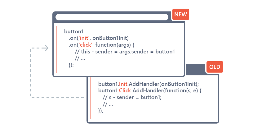
This improves on the old way of declaring functions and then attaching the handlers for events:

button1.Init.AddHandler(onButton1Init);
button1.Click.AddHandler(function(s, e) {
   // s - sender = button1;
   // ...
});
button1.Click.AddHandler(onButton1Click);

New Functions: 'on', 'off', & 'once'

New for the v18.1 release, is the ability for every control to provide the on function. The on function accepts an event name and a handler function:

on = function (eventName, handler){
...
   return this;
}

These new functions return the object they're called on, and so calls to them can be chained. This allows you to write fluent syntax to assign event handlers:

button1
   .on('init', onButton1Init)
   .on('click', function(args) {
       // this - sender = args.sender = button1
       // ...
   })
   .on('click', args => { // es6 or TS
       // this - external context;
       // args.sender = button1
       // ...
   })
   .on('click', onButton1Click);

Detach with 'off'

There's also a corresponding off function that allows you to detach handlers:

button1
   .off('init', onButton1Init)
   .off('click', onButton1Click);
button1
   .off('init', onButton1Init)
   .off('click'); // remove all handlers for the click event
button1
   .off() // remove all event handlers

'once' Function

We also added the once function that is identical to the on function above, except that the handler will be removed after its first invocation.

JavaScript Promises

Also with the v18.1 release, we will provide overload functions that return JavaScript Promises for callback methods, e.g. BootstrapGridView.performCallback(). So without promises, we would use this approach:

grid.performCallback('myParameter', function (result) {
    // This callback function will be executed when the result comes from the server
    // The 'result' argument is a value received from the server
    console.log(result);
});

By using JavaScript Promises then we can write fluent code instead:

grid.performCallback('myParameter')
    .then(function (result) {
       // The 'result' argument is a value received from the server
       console.log(result);
    } );

If you use async/await syntax (supported in ECMAScript 2016+), then the code can be simplified:

// The `result` argument is a value received from the server
let result = await grid.performCallback('myParameter');
console.log(result);

VS IntelliSense

Last, but not least, with the official 18.1 release, we will provide type definitions for the new client-side API so that you get IntelliSense in Visual Studio.

Old API Still Available

The old client-side API has been marked as deprecated in the v18.1 release (and beyond). However, it has not been removed from v18.1. I recommend using the new API in your projects, but there is no need to change the current applications immediately.

Rest assured that you'll be able to upgrade to v18.1 and get all these great changes without your previous client-side code breaking.

Try v18.1 CTP Today

You can access the v18.1 CTP of the DevExpress Bootstrap for ASP.NET Core via NuGet:

Use the https://nuget.devexpress.com/early-access/api NuGet feed to install the DevExpress.AspNetCore.Bootstrap package.

Or use the following dotnet CLI command to install the controls:

dotnet add package DevExpress.AspNetCore.Bootstrap -s https://nuget.devexpress.com/early-access/api -v 18.1.2-pre-18082

Learn more about the limited time v18.1 CTP here.

Feedback

Your feedback is valuable to us. For these new changes to the Client-Side API, we've created a support ticket where I'd love for you to give us your input: T620627

Thanks!


Email: mharry@devexpress.com

Twitter: @mehulharry

Blog Post: WinForms Overlay Forms - Coming soon in v18.1

$
0
0

Many of you are probably familiar with the Splash Screen Manager and its Wait Forms. These tiny elements implement a solution for the popular scenario of displaying a loading panel to indicate that the application is currently busy.

Wait Forms are good enough when all code executes in the UI thread and the application UI locks up. However, with asynchronous operations natively supported in C# using the async and await keywords, more programmers employ background threads to execute long-running processes, such as massive calculations or data retrieval operations. In these scenarios, the application UI remains responsive, and even when a Wait Form is being shown, end users can still drag and drop child form elements, modify editor content, press Ribbon buttons etc. This is undesirable and a different solution is required for these scenarios.

Responding to your requests, the Splash Screen Manager supports a new element, the Overlay Form, starting with the v18.1 release. The Overlay Form is a semi-transparent splash screen that runs in a background thread and prevents access to a control or form by displaying an overlay.

An associated control is grayed out when the Overlay Form is active, providing a clear visual message indicating that this control is currently unavailable. The control can be a Form, but you can also pass a basic Control. For instance, it would make sense to pass a root control on a form to ShowOverlayForm, so that the form itself could still be dragged by its title bar.

Overlay Form

To show and hide Overlay Forms, call the static ShowOverlayForm andCloseOverlayForm methods in code.

using DevExpress.XtraSplashScreen;

// ... Inside a form class,
// two small helper methods:

IOverlaySplashScreenHandle ShowProgressPanel() {
  // Pass "this" to use the current form as the "parent"
  return SplashScreenManager.ShowOverlayForm(this);
}

void CloseProgressPanel(IOverlaySplashScreenHandle handle) {
  if(handle != null)
    SplashScreenManager.CloseOverlayForm(handle);
}

// Finally, within the context of a long-running operation:

IOverlaySplashScreenHandle handle = null;

try {
  handle = ShowProgressPanel();

  // Now perform the long-running operation while
  // the Overlay Form overlaps the current form.
}
finally {
  CloseProgressPanel(handle);
}

You don’t need to manually modify Overlay Form appearance, as it automatically adapts to the current application skin. However, if required, you can edit look-and-feel settings or implement a custom painter to change the appearance of an Overlay Form completely.


Blog Post: Logify Breadcrumbs: How to Reproduce Application Errors with Ease

$
0
0

Logify was designed to help you catch and log unhandled exceptions as they occur and correct issues within your app as quickly as possible.

Each exception report sent to Logify contains a detailed description of individual app crash events (exceptions and their call stacks, operating system info, application data, loaded modules, etc.).

Though quite descriptive, this information may at times be insufficient to discover the root cause of a given crash. To properly diagnose the problem encountered by end-users, you may need to know the sequence of actions that caused the exception and the steps needed to replicate the error.


Logify Breadcrumbs to the Rescue

To help you quickly diagnose the underlying cause of application exceptions, Logify allows you to log user actions that precede an exception.

This feature (Breadcrumbs) can be enabled by setting the Logify client's CollectBreadcrumbs property to true. Once enabled, Logify will automatically collect user actions so you can determine the root cause of an exception (Logify attaches the corresponding breadcrumb log to a report).

The information Logify collects varies based upon the technology and platform used. For example, Logify logs mouse clicks, keyboard button presses and focus changes for WinForms applications.

Breadcrumbs are limited to 1000 records per report (default), but you can change this value using the client’s BreadcrumbsMaxCount property.

You can also manually collect user actions by adding the necessary information (about each user action) to the Logify client's Breadcrumbs collection. This collection is automatically stored in a report.


Breadcrumb Logs

As you might expect, displaying each keyboard event in a Breadcrumb log can generate a very large and difficult to understand file. For example, this is what happens when you enter “Hello World!”:


To help remedy this reality, Logify identifies important log sequences and displays the information in a more compact and readable message:

NOTE: Logify clients do not send passwords and allow you to remove sensitive data from reports before they are sent to the service.


For more information on Breadcrumbs, please refer to the following help topic: Breadcrumbs.

If you have questions about Logify or would like to share your thoughts on our 24x7 app monitoring service, feel free to leave a comment or write to us at clientservices@devexpress.com.

Blog Post: ASP.NET MVC - Query Builder (v18.1)

$
0
0

Use the powerful DevExpress Query Builder with your DevExpress ASP.NET MVC controls, starting with the v18.1 release!

The Query Builder component allows an end-user to visually build queries using our UI controls. This saves the end-user from learning and writing SQL statements. Once the queries are built, you can then apply those queries on existing DevExpress controls like the ASP.NET MVC GridView. This puts the power of ad-hoc querying in your end-users control.

Here's a screenshot of the MVC Query Builder control, click on the image for a larger version:

The Query Builder was first introduced as part of our XtraReports' Web Report Designer and then was released as a separate control for ASP.NET Web Forms. Many of you have requested this as an independent control for ASP.NET MVC and now it's available in v18.1 release.

Features

We've packed a ton of great features in the DevExpress ASP.NET MVC Query Builder:

  • The database schema is automatically obtained and displayed within the QueryBuilder's UI. You can also customize the database schema at runtime by implementing a custom schema provider to reduce the list of tables and views available for an end-user
  • Relationships between tables are automatically resolved based on foreign keys
  • An enhanced filter editor features the Advanced Mode allowing you to specify a filter string manually instead of using a visual editor. The code completion is available
  • Ability to visually shape retrieved data (sort, group and filter), which automatically edits 'ORDER BY', 'GROUP BY' and 'WHERE' query clauses
  • Ability to use the 'SELECT DISTINCT' clause
  • Aggregation of columns’ data
  • Preview entire SELECT statement
  • Preview the Query execution results

How do you plan to use the Query Builder in your ASP.NET MVC projects? Drop me a line below.

Thanks!


Email: mharry@devexpress.com

Twitter: @mehulharry

Blog Post: Reporting - Designer Improvements (v18.1)

$
0
0

We have implemented several Report Designer enhancements that will become available with the upcoming v18.1 release. Wherever you invoke the Report Designer, in Visual Studio, a desktop application or a web application, the new features are available.

Adjusting sizes of labels and label content

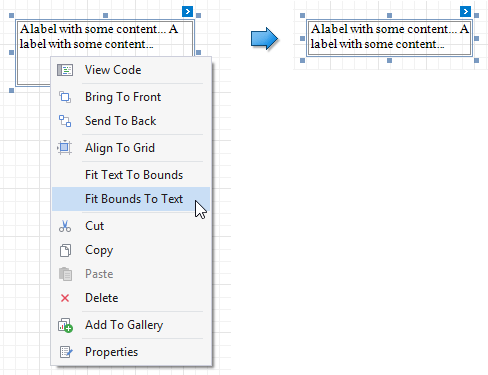
Two new context menu commands are available to automatically adjust the sizes of labels and their content. Right-click a label and select the Fit Bounds To Text command to resize the label to the minimum size required to accommodate its static text content.

Fit Bounds to Text

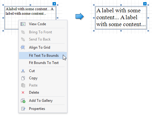
And vice versa, use the Fit Text to Bounds command to adjust the label font size so that the static text content occupies the entire available space in the label.

Fit Text to Bounds

Note that if you enable the WordWrap option for the label, long text may wrap to multiple lines while the Fit Text to Bounds command changes the font size.

We also introduced an API that performs similar operations in case you are interested in fitting dynamic label data at runtime. We’ll provide details on this API in our documentation soon.

Resizing table columns and rows proportionally

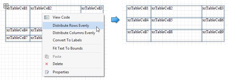
When you include tables in your reports, you can now use new context menu commands to set the same size for multiple rows and columns, just like similar table formatting commands in Microsoft Word.

Select the required rows, or an entire table, right-click the selected area and choose Distribute Rows Evenly in the context menu.

Distribute Rows Evenly

If cell content is partially visible in the resulting row, the row automatically increases its height to fit the content, and also adjusts the other rows accordingly.

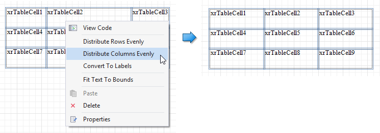
Similarly, use the command Distribute Columns Evenly with multiple selected columns.

Distribute Columns Evenly

Adjusting report control bounds to fit the parent container

When you need to insert a control (e.g. an XRPictureBox or an XRRichText) into a container (e.g. a table cell), you can use the new Fit Bounds to Container command to position the control perfectly within the container.

Fit Bounds to Container

Note that by setting the AnchorHorizontal and/or AnchorVertical properties, a control can remain anchored while you resize its container.

Tables that include controls in their cells are exported to XLS and XLSX formats perfectly after the Fit Bounds to Container command has been used to adjust control sizes. This result was more difficult to achieve in the past, and export files often contained superfluous extra rows or columns.

Line Widths are now given in pixels

The type used for the XRLine.LineWidth property is changed in v18.1, from Int32 to Single. More importantly, line width is now considered a pixel value, not a value in report units anymore. This change was introduced for consistency with the XRControl.BorderWidth property, and the change means that report designs can accommodate very thin lines now, and that line thickness will always be consistent throughout a report.

Note that this is a breaking change! We will soon provide adequate breaking change documentation, including details about a switch that reverts to the old behavior.

Smart copy/paste operations

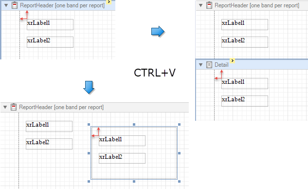
When you copy report controls to the clipboard and then paste them to a new container or band, the original positions of the controls are now preserved.

Smart Copy/Paste

If another control already occupies the target position, the pasted controls are repositioned by an offset of 10 units on both axes.

Blog Post: DevExtreme TreeList - Paging and State Persisting (v18.1)

$
0
0

We've included some really cool features in the DevExtreme TreeList widget in our upcoming v18.1 release.

Paging

If you're dealing with a lot of data in the TreeList, you might not want to scroll all the way down (or up).
For this reason, we decided to implement a pager in the TreeList similar to the one found in the DataGrid widget. Not only does it allow you to page through the nodes, but it also allows you to select the page size and it shows you the number of nodes and pages.

You can configure the use of the pager by specifying the paging and pager configuration options as shown below:

{
    //...
    scrolling: {
        mode: "standard"
    },
    paging: {
        enabled: true,
        pageSize: 10
    },
    pager: {
        showPageSizeSelector: true,
        allowedPageSizes: [5, 10, 20],
        showInfo: true
    }
}

The TreeList widget has the same API as the DataGrid widget.

If you have questions or suggestions, feel free to take part in the discussion about this feature at GitHub.

Note: Due to the difficulty of remote hierarchical data paging, this feature is only available on the client-side.

State Persisting

Suppose you have made some run-time customizations in the TreeList widget like filter-settings, column visibility or even expanded/collapsed/selected nodes.

You can now re-apply these settings in a later stage of the application with our v18.1 version of the TreeList widget.
Below is a code fragment on how to persist this information in the browser's localStorage:

{
    //...
    stateStoring: {
        enabled: true,
        type: 'localStorage',
        storageKey: 'treeListStorage'
    }
}

Angular, Vue, React, ASP.NET MVC / Core and more

All of these new features will be available on all the frameworks we support like Angular, Vue, React, jQuery, Knockout, ASP.NET MVC and .NET Core.

Try it now?

If you want to give these features a test-drive, simply add it to your project by entering:

npm install --save devextreme@18.1-unstable

If you're not using npm, check out this post.

Like it?

Let me know by replying to this post.

Blog Post: DevExtreme Angular - Server Side Rendering Support (v18.1)

$
0
0

In DevExtreme v17.2, we made the jQuery dependency optional. In that context, we were talking about Server Side Rendering (SSR) for Angular in our blog post. Now we have finished implementing this feature for the DevExtreme v18.1 release, which means that you can use any DevExtreme widget in your Angular Universal (SSR) application. We have prepared an article in our documentation to help you create your own Angular Universal applications with DevExtreme Angular Components, or to add Server-Side Rendering into an existing Angular application.

Transfer State for better performance

Additionally, we have implemented caching of AJAX requests on page loading to make the Server-Side Rendering more effective since data can be loaded from a cache when it is accessed a second time from the client. Caching uses Server Transfer State, so this module must be imported into the server module of your application as described in our documentation. With the caching mechanism in place, client-side components are initialized much faster and display issues due to the swap of server-side and client-side markup are mostly eliminated.

Impressive performance gains

Check out the improved loading speed in our Golf Club demo. We have also prepared a new technical example universal-angular.

Golf Club Demo

Performance Comparison

Limitations

The Server Side environment has some technical limitations. The most important one is that it is impossible to detect the size of a client window. As a result, the rendering of some widgets is not exactly the same on the server as it would be on a client. For example:

  • The Scheduler renders its general container structure, but not the appointments.
  • The Form uses the “desktop” layout, which may turn out to be the incorrect one in case the user is on a mobile device.
  • The Toolbar renders completely, not taking any adaptivity considerations into account (which determine hidden items based on available space).

The visualization widgets and the PivotGrid will render only a placeholder on the server, with the full rendering taking place on the client.

Overlays, such as Popup, Popover, Toast, Tooltip etc. are not displayed on the server, since this is unnecessary for SSR purposes.

We are interested in your feedback

We don’t intend to stop working on this feature just yet! Please let us know your thoughts and your specific use cases or priorities, and we’ll do our very best to keep moving DevExtreme in the right direction.

Viewing all 3388 articles
Browse latest View live