Quantcast
Channel: Developer Express Global
Viewing all 3388 articles
Browse latest View live

Blog Post: DevExtreme TreeList Improvements (v17.2)

$
0
0

Check out these new features of the DevExtreme HTML5 TreeList widget in the upcoming v17.2 release.

1. Recursive Selection Mode

The TreeList will include a new recursive selection mode that enables you to select or deselect an entire branch with only a single click. A click on a node can select or deselect all the children nodes too. Enable the feature using the selection.recursive option:

selection: {
    // …
    recursive: true
},

Here you can see that when we select a child node then the TreeList recursively selects the associated parent nodes as well:

2. Built-in Search

If your TreeList contains thousands of records then it's difficult to find a specific node. That's why in the v17.2 release we've added search functionality within the header filter to speed up filtering.

The headerFilter.allowSearch option is available at the widget options root level and within column’s options. This allows you to enable header filter search for all columns or only for a specific column.

treeListOptions: {
    //...
    headerFilter: {
        //...
        allowSearch: true //all columns
    },

    columns: [{
        //...
        headerFilter: {
            //...
            allowSearch: true //specific column
        },
    }]
}

In this animation below, you can see how time-saving the header filter search functionality can be:

What if there are too many columns in your TreeList? Simply enable the search box in the column chooser to get the same search functionality for columns:

columnChooser: {
    //...
    allowSearch: true
}

This makes finding columns a breeze and the feature is available regardless of the column chooser mode:

3. New Lazy Loading Mode

With the upcoming release, you can optimize the TreeList’s performance by delaying the load of collapsed items (and their children). In this mode, you can load child nodes using the following methods:

  1. loadDescendants()– loads children nodes recursively

  2. loadDescendants(keys) - loads the specific node’s children recursively

  3. loadDescendants(keys, childrenOnly)– loads only a single level of the specific node’s children or all its children recursively depending on the childrenOnly argument value

4. getNodeByKey Method

Also in this release, you can obtain a TreeList’s node using the key by calling getNodeByKey(keyParam):

treeListInstance.getNodeByKey(8);

This call returns the full node which includes the level, key, the “visible” and “hasChildren” flags, children array, and an object representing the node's parent.

Angular, ASP.NET MVC/Core, & More!

Note that all these new features are available in the TreeList Angular component, ASP.NET MVC and .NET Core control, and jQuery widget too.

Try it now

The new features of our TreeList widget is included in the v17.2 pre-release that is available via npm right now. Please note that this pre-release may contain some bugs and is not intended to be used in production:

npm install devextreme@17.2.1-pre-17291

Learn more about DevExtreme's pre-releases in this blog post.


What do you think about the TreeList improvements in the next release? Drop me a line below.

Email: mharry@devexpress.com

Twitter: @mehulharry


Blog Post: DevExtreme Editor Improvements (v17.2)

$
0
0

Besides the improvements and new features on complex controls like the dxScheduler, dxDataGrid, dxTreeList and dxPivotGrid, we also managed to add some useful features to the single-field Editors.

editors-enhancements-blog

dxTagBox

The TagBox control, in general, is a rather new control found in many applications today. It allows you to select or mark several entities in a drop down list when editing. If you're not editing the control, it displays a number of blocks containing the selected items (tags).

In v17.2 we've added the possibility to use overflow mode or MultiTag.
This means that if the total width of selected tag blocks is greater than the total control width, the overflowing blocks will be 'collapsed' into one block containing the count of the collapsed tags. You can optionally specify a tag count threshold as well as appearance customization.

tagbox

dxDropDownBox

In v17.1 we introduced the dxDropDownBox as a new widget for DevExtreme.
In v17.2 we've added some customization features on this control like: templates, image cells, format text and specify additional event-handlers on cells in the dropdown.

ddbox

dxDateBox

One of the most requested features on the dxDateBox is to display the time in 12-hour as well as 24-hour format. Because of that, there is now the possibility to explicitly specify the time format.
(In previous and current versions, the format depends on the stored value)

dateBox

dxDateBox and dxCalendar

In v17.2 you can apply selectable date ranges on the dxDateBox and the dxCalendar. This means that dates outside the valid ranges will be crossed out and unselectable. You can use this feature by applying a list of restricted dates or you can pass a function which determines whether a date is valid or not.

calendar

Want more?

Because we value your feedback, there will be a number of long-awaited improvements on other editors as well.
What about:

  • dxNumberBox with formatting
  • dxScheduler appointment overlapping modes and time indication
  • FilterBuilder Widget (new)
    filtercontrol

More information on these topics will be posted in subsequent blogposts.

    Angular, ASP.NET MVC/ Core & More!

    All of these new features will be available on all the frameworks we support like Angular, jQuery, Knockout, ASP.NET MVC and .NET Core

    Try it now?

    So have we whet your appetite and you want to give it a test-drive?

    These new features are included in the v17.2 pre-release that is available via npm right now. Please note that this pre-release may contain some bugs and is not intended to be used in production: 

    npm install devextreme@17.2.1-pre-17291

    Learn more about DevExtreme's pre-releases in this blog post.

    Like it?

    Let me know by replying to this post if you like the features outlined in this post.

    Blog Post: Custom Sorting, Grouping, Filtering and More in DevExtreme Grid for React

    $
    0
    0

    We have received a lot of valuable feedback from users of our React Grid alpha versions. Many thanks to everybody! Some of the feedback has already been used as a basis for enhancements to the component. I should mention that we tend not to extend the Grid as a “black box” with lots of built-in features. Usually, we just provide customization capabilities to implement new features on top of our React Grid. Mostly we make API improvements that allow a developer to customize grid behavior and appearance by replacing some of its core algorithms or UI templates. Here is an overview of some recent changes.
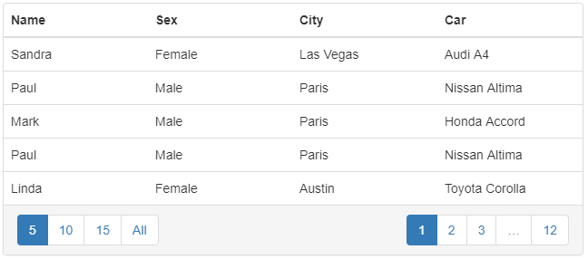
    Custom Sorting, Grouping, Filtering and More

    Custom data accessors

    Document-based NoSQL databases are getting more and more popular, which means the data from the server is not flat and tabular, but has complex structures involving nested objects and arrays. It is inconvenient to flatten the data every time it’s obtained from the server, before passing it to the Grid, and a flattening step makes it more complicated to send modified data back to the server. To display nested or computed data, you can now specify a getCellValue function in a column configuration object:

    const rows = [
      { user: { firstName: 'John', lastName: 'Smith' } }
      /* ... */
    ];
    const columns = [
      {
        name: 'firstName',
        title: 'First Name',
        getCellValue: row => (row.user ? row.user.firstName : undefined)
      },
      {
        name: 'lastName',
        title: 'Last Name',
        getCellValue: row => (row.user ? row.user.lastName : undefined)
      },
      /* ... */
    ];
    
    /* ... */
    
    <Grid
      rows={rows}
      columns={columns}
    />

    If your data grid is editable, you also need a way to pass cell changes back to the row object. We introduced a createRowChange function, which accepts the whole row and the new cell value as parameters, and should return a “row change” object that reflects changes made to the row. Note that the original row should be regarded immutable, so we create and return a new object with the modified fields. This change is merged into the changedRows state via the EditingState plugin.

    const rows = [
      { user: { firstName: 'John', lastName: 'Smith' } }
      /* ... */
    ];
    const columns = [
      {
        name: 'firstName',
        title: 'First Name',
        getCellValue: row => (row.user ? row.user.firstName : undefined),
        createRowChange: (row, value) => ({
          user: {
            ...row.user,
            firstName: value,
          },
        }),
      },
      /* ... */
    ];

    Please refer to the data accessors guide for demos and more details.

    Formatters and editors for custom data types

    Now you can define any custom data type and specify how a value of this type should be displayed and edited. This capability is provided by the DataTypeProvider plugin. All you need to do is to add a dataType to the column configuration object and set up formatterTemplate and editorTemplate properties for the DataTypeProvider, which will be used to show or edit the column value:

    const rows = [
      { product: 'SolarOne', price: '3039' }
    ];
    const columns = [
      { name: 'product', title: 'Product' },
      { name: 'amount', title: 'Sale Amount', dataType: 'currency' }
    ];<Grid
      rows={rows}
      columns={columns}><DataTypeProvider
        type="currency"
        formatterTemplate={({ value }) => <span>${value}</span>}
        editorTemplate={({ value, onValueChange }) => (<span>
            $<input
              type="number"
              value={value}
              onChange={e => onValueChange(Number(e.target.value))}
            /></span>
        )}
      /><TableView/></Grid>

    Please refer to the data types guide for demos and more details.

    Custom filtering predicates

    The default React Grid filtering predicate uses a case-insensitive “contains” algorithm. Now you can specify custom filtering predicates using the getColumnPredicate property on the LocalFiltering plugin. If the getColumnPredicate function returns undefined for a column, the default filtering predicate is used.

    const startsWithPredicate = (value, filter) =>
      String(value).startsWith(String(filter.value));
    const getColumnPredicate = columnName => {
      if (columnName === 'city') {
        return startsWithPredicate;
      }
    };<Grid
      rows={rows}
      columns={columns}><FilteringState /><LocalFiltering getColumnPredicate={getColumnPredicate} /><TableView /><TableHeaderRow /><TableFilterRow /></Grid>

    Please refer to the filtering guide for demos and more details.

    Custom sorting compare functions

    In some scenarios, custom sorting algorithms are required. For instance, you might have an enumeration value represented by its ID in your database. Imagine a ‘priority’ column with valid values “Low”, “Normal” and “High”. You would want this column to be sorted by the underlying numeric values, not alphabetically. The getColumnCompare property of the LocalSorting plugin allows you to implement this scenario.

    Note that the comparison function is expected to implement a three-way comparison. For brevity, the following example uses a simple method of calculating a result for numeric values.

    const priorityWeights = {
      Low: 0,
      Normal: 1,
      High: 2
    };
    
    const comparePriority = (valA, valB) =>
      priorityWeights[valB] - priorityWeights[valA];
    
    const getColumnCompare = columnName => {
      if (columnName === 'priority') {
        return comparePriority;
      }
    }<Grid
      rows={rows}
      columns={columns}><SortingState /><LocalSorting
        getColumnCompare={getColumnCompare}
      /><TableView /><TableHeaderRow allowSorting /></Grid>

    If the getColumnCompare function returns undefined, it applies the default sorting algorithm.

    Please refer to the sorting guide for demos and more details.

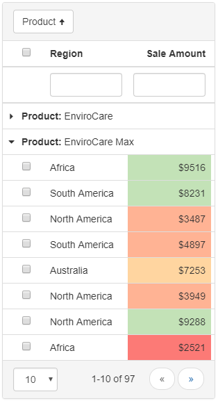
    Custom grouping values

    Data grouping is a powerful feature that helps visualize and analyze large numbers of rows. Usually, a particular row is classified to belong to a specific group by its exact column value. For instance, two rows can belong to one group if they have equal values for the ‘city’ column. Sometimes, your application requires data grouping to use more complex algorithms for row classification.

    One common scenario is to group items by only the first character of a string property. For instance, you might need to group people by the first characters of their last names. Another use case is to group orders by year, month, day, or other custom intervals. Our Grid provides the capability to perform these kinds of custom groupings by implementing the getColumnIdentity property of the LocalGrouping plugin:

    const byFirstLetter = value => ({
      key: value.substr(0, 1)
    });
    const getColumnIdentity = (columnName) => {
      if (columnName === 'city') {
        return byFirstLetter;
      }
    };<Grid
      rows={rows}
      columns={columns}><GroupingState /><LocalGrouping getColumnIdentity={getColumnIdentity} /><TableView /><TableHeaderRow /><TableGroupRow /></Grid>

    Please refer to the grouping guide for demos and more details.

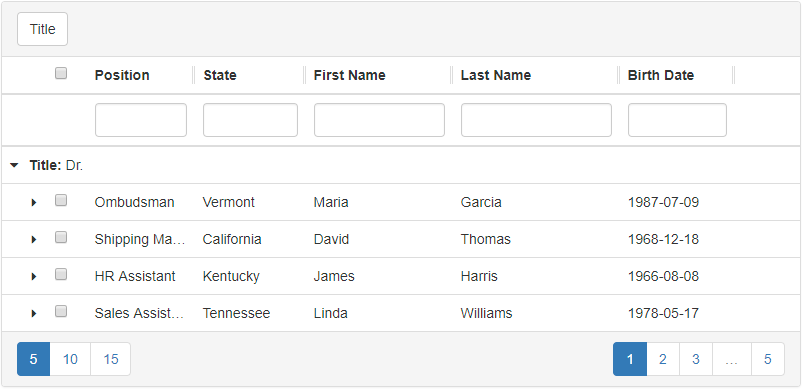
    Remote and custom local grouping

    In some cases, your data might be grouped already. For instance, the data may have been obtained from a server that supports grouping itself. You would like to pass this data to the Grid “as is”, while retaining the standard grouping UI with its interactive group expanding/collapsing features. The new CustomGrouping plugin has been introduced for this purpose. You need to configure it to describe your data structure and then pass the grouped data to the grid.

    const columns = columns: [
      { name: 'name', title: 'Name' },
      { name: 'sex', title: 'Sex' },
    ];
    
    const groupedData = [{
      key: 'Male',
      items: [
        { id: 1, name: 'Paul', sex: 'Male' },
        { id: 2, name: 'John', sex: 'Male' },
      ],
    }, {
      key: 'Female',
      items: [
        { id: 3, name: 'Jane', sex: 'Female' },
        { id: 4, name: 'Kate', sex: 'Female' },
      ],
    }];
    
    const getChildGroups = groups => groups
      .map(group => ({ key: group.key, childRows: group.items }));
    
    const grouping = [{ columnName: 'sex' }];<Grid rows={groupedData} columns={columns}><GroupingState grouping={grouping} /><CustomGrouping getChildGroups={getChildGroups} /><TableView /><TableHeaderRow /><TableGroupRow /></Grid>

    Please refer to the custom grouping and remote grouping guides for demos and more details.

    UI customization via templates

    To render individual UI elements, our React Grid uses templates that are passed via props to the Grid’s UI plugins. This happens automatically and internally, so you don’t normally see these templates specified anywhere. A template is a function that returns a React Element depending on the arguments it receives. If you need to modify the default appearance or behavior you can replace default templates with custom ones using template properties on the various plugins.

    const customRowTemplate = ({ children, row }) => (<tr onClick={() => alert(row.id)}>
        {children}</tr>
    );<Grid
      rows={rows}
      columns={columns}><TableView tableRowTemplate={customRowTemplate} /><TableHeaderRow /></Grid>

    Please refer to the appearance customization guide for demos and more details. This approach is applicable to both the Bootstrap React Grid and the React Grid for Material Design.

    Feel free to download your copy from npm and let us know what you think.

    Blog Post: DevExtreme ASP.NET MVC: New Strongly-Typed HTML Helpers (Lambda Expressions Ftw!) - v17.2

    $
    0
    0

    Strongly-typed HTML helpers are great when you're constructing your view in ASP.NET MVC. Helper methods like the built-in @Html.TextBoxFor(m => m.FirstName) have been around for a long time. And they provide benefits like compile-time checking of views, Razor support, and enable the use of data annotations to automatically configure important options like validation rules.

    Since we released the DevExtreme ASP.NET MVC Controls, they have included a set of HTML helper methods to help you do things like setting up the DevExtreme editors. For example, here we're creating a DevExtreme MVC DateBox control that will be bound to our OrderDate field from the model:

    @Html.DevExtreme().DateBoxFor(m => m.OrderDate)

    In one line, we're creating the editor and binding it, magic!

    More Lambda Expressions

    In the next major release, v17.2, we've extended the ability to use expressions within our HTML helpers. We have added more lambda expressions to our larger widgets. This allows to use them to configure items like:

    • DataGrid and TreeList columns
    • DataGrid summaries
    • PivotGrid fields
    • Items of our Form control

    Therefore, the DataGrid control can now be declared using this syntax:

    @(Html.DevExtreme().DataGrid<Sale>()
        .Columns(columns => {
            columns.AddFor(m => m.CategoryName);
            columns.AddFor(m => m.ProductName);
            columns.AddFor(m => m.ProductSales);
        })
        .Summary(s => s.TotalItems(total => {
            total
                .AddFor(m => m.ProductSales)
                .SummaryType(SummaryType.Sum);
        }))
    )

    Notice the generic type argument of the DataGrid<Sale>() and AddFor calls configuring columns and total summary without the use of any string constants.

    Previously, the column would be declared using strings like so: columns.Add().DataField("CategoryName");. The new lamdba expressions approach is better for the reasons listed below and makes you more productive.

    IntelliSense support

    One of the best things about using lambda expressions is that you get IntelliSense in your Razor views based on the type:

    Data Annotations

    A nice feature of the AddFor method is that it infers useful information about the property. This information includes the property name and data type.

    And we also process the model's data annotations. For example, if any members of the Sale class are annotated with the Display attribute, then it will be automatically assigned as the column caption:

    public partial class Sale {
        [Display(Name = "Category")]
        public string CategoryName { get; set; }
    
        [Display(Name = "Product")]
        public string ProductName { get; set; }
    
        [Display(Name = "Sales")]
        public Nullable<decimal> ProductSales { get; set; }
    }

    Better Validation

    If your data is annotated with Validation attributes, such as [Required], [StringLength], [Range], etc, then DevExtreme MVC will honor and apply them to column validation options of DataGrid or TreeList. So, when using expressions, you get client-side validation configured automatically for you.

    Typed Form Control!

    The new strongly-type HTML helpers also enables us to implement 'highly-requested' customer scenarios like this one for a 'typed Form control' sample:

    @(Html.DevExtreme().Form<Employee>().Items(items => {
        items.AddSimpleFor(m => m.FirstName);
        items.AddSimpleFor(m => m.LastName);
    
        items.AddGroup().Caption("Address").Items(addressItems => {
            addressItems.AddSimpleFor(m => m.Address);
            addressItems.AddSimpleFor(m => m.Region);
            addressItems.AddSimpleFor(m => m.PostalCode);
        });
    }))

    Optional but recommended

    You don't have rewrite your existing code because this new functionality is completely optional. You can continue to use strings, and existing projects will work fine after the upgrade. I suspect that after reading about the benefits above that you'll consider using them in a future project. Which is what I recommend, that you use expressions for newer projects.

    Lambda expressions are available in both the classic ASP.NET MVC and the new ASP.NET Core versions of our library. You can use them regardless of the app language, be it C# or VB.NET.

    We like them so much that we've updated all of our demos and project templates to use expressions (where possible).


    What do you think about the strongly-typed HTML helper improvements in the next release? Drop me a line below.

    Email: mharry@devexpress.com

    Twitter: @mehulharry

    Blog Post: DevExpress ASP.NET Scheduler's New Adaptive Features - (coming soon in v17.2)

    $
    0
    0

    Check out these great new 'adaptive' features of the DevExpress ASP.NET Scheduler in the v17.2 release. What do I mean by adaptive?

    Adaptive web design (AWD) promotes the creation of multiple versions of a web page to better fit the user's device, as opposed to a single version that other web design techniques use. Adaptive web design encompasses a range of other strategies that can be combined with responsive web design. - Wikipedia

    Adaptive web design helps you to address the various size screens that your website may beAdaptive web design helps you address the presentation of data on the differently-sized screens that your users may be using.

    In the v17.2 release, we maximized the ASP.NET Scheduler's views and visual elements to adapt to the width of their parent container. Adaptive Layout is now supported for the following ASP.NET Scheduler elements:

    Agenda View

    The Agenda View is now fully adaptive. The layout is automatically adjusted to the current client width for the following Agenda View elements:

    • “Date Header” column
    • “Appointment Interval” column
    • “Main Appointment Content” column
    • “Resources” column

    Therefore, you can view information about appointments without horizontal scrolling on different screen sizes:

    Edit Appointment Form

    The Form Layout Control is now used as a container for the Edit Appointment Form editors.

    This allows the Scheduler to automatically re-organize the Edit Appointment Form content based on the available client area:

    View Selector

    The Scheduler's View Selector panel also provides a slick feature where it'll place buttons in a drop-down menu when there is not enough space to display them all:

    Scrolling Fixed Headers

    We've also improved (or fixed depending on your point of view) the vertical scrolling in the Agenda view. Now the “Date” headers’ content remains visible on screen as a fixed header while scrolling:

    View Visible Interval

    The View Visible Interval width can be automatically adjusted to an available client width by changing date-time formats:

    WebForms & MVC

    These new adaptive features will be available for our ASP.NET WebForms and MVC versions of the ASP.NET Scheduler control. And they are part of the v17.2 release.

    Which of the adaptive enhancements are you most excited about? Drop me a line below.

    Thanks!

    Email: mharry@devexpress.com

    Twitter: @mehulharry

    Blog Post: Sydney Meetup: December 1 - Powerhouse Museum

    $
    0
    0

    00z21204Can you believe it is November already! Where did 2017 go? 

    The best thing about this time of year, aside from the up coming holiday season, is RELEASE TIME! and v17.2 will be launching in the coming weeks.

    In appreciation of your continued support, we want to show you personally through some of the new features in v17.2 and provide a forum to hear your feedback and ideas as we start planning 2018, that and shout you a glass of wine or a beer and some nibblies.

    This year we've chosen the Powerhouse Museum in Sydney to kick things off. All you need to do is register here to reserve your spot, then turn up on the day. 

    If you’re looking for an event closer to you, please email me and we will look into organising something.

    Blog Post: DevExtreme HTML5 Pivot Grid Remote Data Processing

    $
    0
    0

    In the past (prior to v16.2), a connection to an OLAP cube (an XMLA store) was the only way to use the Pivot Grid with large data sources. Configuration and use of OLAP cubes are complicated, and client-side data processing can’t easily be applied because of the limited memory and performance available to browser runtimes as well as the simple fact that large data volumes would need to be transferred to the client in the first place. Server side data aggregation without an OLAP cube is the technique of choice for this scenario.

    Starting with DevExtreme v16.2, you can connect the Pivot Grid to a relational data source in server mode to perform filtering, grouping and summary calculation operations on the server without using OLAP or Analytic services.

    If you enable server mode by assigning true to the remoteOperations option, the Pivot Grid sends filtering, grouping and summary calculation options to the server and waits for the processed data.

    Comparing performance

    We compared loading time and network traffic volume when processing data locally and remotely. Here’s what we did, in case you would like to reproduce our tests.

    We created a database with the following table:

    CREATE TABLE [dbo].[Categories] (
      [CategoryID] INT IDENTITY (1, 1) NOT NULL,
      [CategoryName] VARCHAR (10) NULL,
      [RegisterDate] DATETIME NOT NULL,
      [Count] INT NOT NULL,
      [Price] DECIMAL (18, 2) NOT NULL,
      CONSTRAINT [PK_dbo.Categories] PRIMARY KEY CLUSTERED ([CategoryID] ASC)
    );

    We added the following indices to the table to optimize server-side grouping:

    CREATE INDEX CategoryIndex [dbo].[Categories] (CategoryName);
    CREATE INDEX DateIndex [dbo].[Categories] (RegisterDate);

    We fill the table with random data, including 100 unique CategoryName values and a RegisterDate range of three years.

    We configured the Pivot Grid like this:

    $("#container").dxPivotGrid({
      ...
      dataSource: {
        ...
        fields: [
          { dataField: "RegisterDate", dataType: "date", area: "column" },
          { dataField: "CategoryName", area: "row" },
          { dataField: "Price", summaryType: "sum", area: "data",
            format: { type: "currency" } }
        ]
      }
    });

    When measuring performance, we used the DevExtreme.AspNet.Data library to process data on the server. Below are a comparison table and charts showing the results.

    Comparison table

    Comparison charts

    As you can see, client-side processing slows down dramatically with increasing record count, and becomes quite unusable with data sets of one million records. Remote data processing works fine even if the record count is 3 million. Note also how the data transfer volume remains almost constant for remote operations, while it obviously increases quickly for local operations. Of course, the Pivot Grid in server mode can process data sets containing many more than 3 million records, with loading time depending only on database configuration and server performance.

    Try it!

    We have published a sample that demonstrates how to configure the Pivot Grid widget to work with a remote WebAPI data service. Additionally, there is the DevExtreme PHP Data Library, which allows you to use the Pivot Grid Remote Data Processing feature with a mysql database and a PHP server. Finally, it is possible to run a JavaScript based server accessing a MongoDB database using this library.

    We maintain a list of links to samples in the devextreme-examples GitHub repository.

    Please let us know your thoughts about this feature and our results!

    Blog Post: Utrecht Meetup: November 27th – The Colour Kitchen Oudegracht

    $
    0
    0

    imageOur series of meetups will kick off in Utrecht, The Netherlands. John and I will be looking forward to meet you in the Colour Kitchen Oudegracht in the city center of Utrecht.

    I will be telling you all about our v17.2 release, and we would like to get your feedback and ideas before we start planning our next release. We will make sure that you’ll get refreshed with some beer or wine and some snacks.

    If you want to join this meetup, please register your seat by clicking here, and show up.

    Also let me know if this location is too far for you. I’ll look into it and see if we can organize another one on a different location.

    I hope to meet you in The Colour Kitchen Oudegracht!


    Blog Post: Search Integrated into More DevExtreme HTML5 JavaScript Widgets (v17.2)

    $
    0
    0

    The DevExtreme HTML5 JavaScript widgets provide a number of ways to help your end-users work with a large amount of data that is presented in our UI controls. For example, the data grid widget provides excellent features like paging, filtering, and searching to help you find the information you need.

    With the v17.2 release, we're extending the search functionality to many of our other widgets too.

    TreeView and List

    With the upcoming release, we have added the searchValue option for the dxList widget. We've also extended the search capabilities for both TreeView and List widgets by adding the following options:

    SearchEnabled, searchExpr, searchMode, and searchEditorOptions

    Learn more about these options by reading the v17.2 documentation

    In previous versions, we added the Search functionality to the TreeView widget. With v17.2, you can now customize that search further. For example, in the code below, we've setup placeholder text for the search textbox:

    treeViewOptions: {
        //...
        searchEnabled: true,
        searchMode: "contains",
        searchEditorOptions: {
            //TextBox config
            placeholder: "Search..."
        }
    }

    The same search textbox can be enabled for the List widget too. In this sample, we're limiting our search expression to only the "Name" and "Price" fields:

    listOptions: {
        //...
        searchEnabled: true,
        searchExpr: ["Name", "Price"]
    }

    DataGrid and TreeList

    The DevExtreme HTML5 JavaScript DataGrid and TreeList widgets also have improved search functionality. I recommend reading these two posts that dive deeper into these widgets:

    One feature I'd like highlight is the updated 'column chooser' that also has search functionality now. This can help you when you have several columns in your widget. To show the search box, turn on the columnChooser.allowSearch option.

    dataGridOptions: {
        //...
        columnChooser: {
            //...
            enabled: true,
            allowSearch: true
        }
    }

    Once enabled, you'll see the search textbox in the column chooser:

    To provide quicker access to values, we have also added a built-in search box to the header filter. It can be enabled both at the widget and specific column levels:

    treeListOptions: {
        //...
        headerFilter: {
            //...
            allowSearch: true //all columns
        },
        columns: [{
            //...
            headerFilter: {
                //...
                allowSearch: true //specific column
            },
        }]
    }

    Once enabled, you'll see the search textbox in the column's header filter:

    PivotGrid

    We have also integrated search into the HTML5 JavaScript PivotGrid's Header filter. It's available inside the Field Panel as well as the PivotGridFieldChooser. The Field Chooser also allows you to search by fields. Your end-user will find this useful because helps when:

    • there are a large number of fields
    • some of them are grouped by properties and are not visible
    pivotGridFieldChooserOptions: {
        //...
        allowSearch: true
    }

    Angular, ASP.NET MVC/Core, & More!

    Note that all these new features are available in the DataGrid and PivotGrid Angular components, ASP.NET MVC and .NET Core controls, and jQuery widgets too.

    Try it now

    The new features of our dxTreeView, dxList, dxTreeList, dxDataGrid and dxPivotGrid widgets are included in the v17.2 pre-release that is available via npm right now. Please note that this pre-release may contain some bugs and is not intended to be used in production:

    npm install devextreme@17.2.2-pre-beta

    Learn more about DevExtreme's pre-releases in this blog post.


    What do you think about the search improvements in the next release? Drop me a line below.

    Email: mharry@devexpress.com

    Twitter: @mehulharry

    Blog Post: DevExpress v17.2 beta has just been released!

    $
    0
    0

    Just a quick note to say that the beta for DevExpress v17.2 has just been published. Be the first kid on the block that downloads it and tries it out. Usual caveats: it is a beta, so beware. Things work, sure, but there may be some issues that are still undiscovered or still being worked on. Me, personally, I’d advise to not use it in production yet. We would love to hear from you if you do test it out, via our usual support channels.

    For information on What’s New in this beta please check out this page. To download the actual install, log in to the Download Center and have at it!

    We shall now kick off the publication of blog posts that discuss the new features and enhancements in this release. so stay tuned.

    Blog Post: Major speed enhancements in WinForms grid (coming soon in v17.2)

    $
    0
    0

    Now that we’ve published the beta for v17.2, it’s time to reveal a major new enhancement for our WinForms grid. After reading this, I’m going to bet you’ll be downloading the installer and trying it out for yourself. Let us know your results!

    WinForms. It’s been around since the very first days of .NET. Our first control for the run-time, released before .NET had even come out of beta (2002!), was XtraGrid, and we’ve released numerous other controls and suites for the platform since then. And after 15 years, Microsoft has pretty much frozen new development for WinForms. It’s got that taint of “legacy”.

    And yet… People are still writing new thick-client apps for Windows. They have existing successful business apps in daily use that need maintaining and enhancing. Indeed, in every major release we provide new functionality and even new controls for WinForms. It is not going away.

    MicrosoftDirectXOne big issue is that, compared to 15 years ago, the monitors and display adapters we use for Windows have become faster and have much higher resolution and WinForms has not kept up. We are now talking about and using 4K screens, so called because they are roughly 4,000 pixels horizontally (the main standard is 3840×2160, which is twice the resolution horizontally and vertically of the 1080p standard, or 4 times the number of pixels). Not only that, but the standard for drawing graphics on the screen has changed: it used to be GDI+ but is now DirectX. One of the big differences between the two is DirectX renders graphics through hardware acceleration, whereas the older GDI+ does not; simply put, DirectX is faster. Poor old WinForms still uses GDI+ under the hood.

    Given all this, our WinForms team at DevExpress decided to do an experiment, or a spike in development-speak: could they take one of our more complicated WinForms controls—oh, let’s say that original control we wrote, the good old data grid – and change its rendering code to use DirectX and hardware acceleration instead of the “built-in” WinForms GDI+? Would anyone notice the purported speed improvements?

    […time passes, lots of work is done…]

    Well? The result? Wow. To be blunt: this is going to revolutionize WinForms.

    A big example: one of the most intensive rendering tasks we can do with the data grid is to scroll the rows in the grid pixel-by-pixel. On one of our hi-res test machines, with GDI+ we get about 22 frames per second. In other words, what’s happening in crude terms is for each frame the code is scrolling the data rows by a pixel and then adding another single row of pixels. Every second on the test machine, we can do that 22 times with GDI+. Just about flicker free. With DirectX? 72 FPS, over three times faster. That’s just butter smooth. Our competition, for the same task, is way behind (which also goes to show how well we’d optimized the grid up to now).

    With a scroll by page example (where each frame is a new page), we used to get 25 FPS. With DirectX, 35 FPS.

    But that’s not all. In essence, all of this work is done way down in the depths of the grid. The DirectX grid is totally compatible with the old GDI+ grid: all that needs to be done is to set a single option. So, you already have an app with our grid but want that extra rendering speed? Recompile with v17.2, set the option, and you’re away. Get on your users’ Christmas card lists again.

    There are some limitations that you should be aware of with this new functionality. The biggest one is that it does not work under Windows versions that are older than 8, with Windows 7 being the biggest example. I’d have to say that, given that the end of extended support for Windows 7 is only 2 years away, is not that big of an issue. For these older operating system versions, the DirectX hardware-acceleration setting is simply ignored and you just get standard GDI+ speeds.

    Next, if you are doing any of your own drawing in the grid by using the window handle for example, it’ll be ignored, but then again it’s bad practice. If, however, you do have some custom draw handlers that use e.Graphics , you must now use the e.Cache.* methods instead. We plan to introduce some special tools and/or modes to catch potential problems with custom draw later.

    Lastly, I warn you that it can be REALLY resource hungry. Good job you have lots of memory on those machines with those 4K screens.

    In v17.2, the only control that will have this enhanced DirectX support will be the aforementioned data grid, XtraGrid. We have plans to upgrade our other major controls in future versions (v18.1, v18.2, and so on). Note that we have our ideas on the order to enhance them (tree list, pivot grid, and so on), but we’d love to hear from you what would be most important to you in your WinForms apps.

    Blog Post: Chart enhancements on WinForms (v17.2)

    $
    0
    0

    In v17.2 of our WinForms Charts, we’ve added some useful features that both of you, the developer, and your end-users might appreciate.

    Criteria Based Filtering

    The Chart control already supported filtering on series, but in this release we have replaced the DataFilter property with the FilterCriteria and FilterString properties. This makes filtering more powerful and is also inline with several other controls like the Grid, Reporting and XPO. It allows you to use the DevExpress Criteria Language to filter series.

    It also allows you to use the FilterControl or the Filtering UI Context to select the data which is used by the Chart control without writing any code.

    FilteringUIContext

    Because of this change, you can use one filter control which manages the data for a Grid as well as a Chart!

    EqualFilter

    Bind a Chart to Grid data

    In the previous releases you always needed to bind the data to a DataSource like a collection of objects or a DataReader. In scenarios which involve a grid and a chart, these DataSources where used by both controls. With custom unbound grid columns, grouping and filtering  you always needed to code some additional mechanism to get that data in the chart as well.

    With v17.2, we have added a ControlRowSource component which allows you to bind the chart directly to the Grid control. With this feature, the chart doesn’t use the same DataSource as the grid, but it will actually use the rows and columns available in the grid as its DataSource. It will make use of things like Grouping, Sorting, Filtering which might have been set in the Grid when supplying data to the Chart.

    This also works in combination with the Treelist, Listbox and VerticalGrid controls.

    Grid Data In Chart

    Use a Chart as Grid Cell Editor

    With v17.2 we implemented a long requested feature; Use a chart as Grid Cell Editor!

    This gives you the possibility to design beautiful master-detail data visualizations as you can see:

    Cell Chart

    This functionality is based on the RepositoryItemAnyControl class and is now possible because we have implemented the IAnyControlEdit interface on the Chart control.

    Conclusion

    With this release we’ve taken a big step in letting different controls make use of each others functionality. For you this means writing less code and better performance. This will result in an even better experience for your end-users.

    Talking about performance and user experience; have you seen Julian’s blog post about that we’ve done with the XtraGrid in v17.2?

    Blog Post: DevExtreme: A new set of themes and palettes (v17.2)

    $
    0
    0

    Since the first DevExtreme release, we shipped the product with a generic theme in both light and dark color schemes. We wanted to avoid color accents so the widgets would fit in any design.

    For us this meant that we needed to customize quite a bit in our demos like the DevAV and GolfClub projects to give them their own unique visual appearance.

    As a result, we occasionally got questions from you about customizing the generic theme, or use one of those demo themes.

    Because we value your feedback, with v17.2 we will give you 5 totally new themes that you can use in your DevExtreme projects:

    Soft Blue, Carmine, Green Mist, Dark Moon and Dark Violet.

    themes-blog

    Customizing your entire application

    Each new theme makes every single widget, from Button to Data Grid look vivid and shiny. The only thing you need to do is include the desired theme’s css file in your page and optionally add your own customizations to it.

    All the new themes will be available as separate css files e.g. dx.generic.carmine.css. They are included in the installation package and on the DevExtreme CDN which hosts the new release.

    Not enough?

    Ok, so for our visualization widgets, we’ve taken things a bit further; besides the themes, we have added a new palette with every theme for these widgets to make them stand out. 

    palettes

    A palette is basically a set of colors for each series, range or area in widgets like the Chart, Pie Chart, Polar Chart, Circular Gauge, Linear Gauge, Vector Map, Tree Map and Funnel.

    You can apply an individual palette to one control or to all the controls without including different css files.

    If you want to use a palette for a single widget, you can use the palette property like:

    var chartOptions = {
        palette: 'Dark Moon', // or 'Carmine', 'Dark Violet', 'Soft Blue', 'Green Fog'
        //...
    };

    If you want to change the palette for all widgets, you can call the changePalette method at the start of your application:

    DevExpress.viz.currentPalette('Dark Moon'); // or 'Carmine', 'Dark Violet', 'Soft Blue', 'Green Fog'

    Play around with the demos

    Once we have officially released our v17.2 version, the DevExtreme web-site will be updated as well so you can have a look how those new themes look by selecting one in the dropdown of the DevExtreme Gallery.

    widgetsgallery

    The ThemeBuilder

    One of the things I love about the new themes is that we have created them with our own DevExtreme ThemeBuilder. And now that we have those themes, the ThemeBuilder itself will be updated with the official v17.2 release to include these themes as well.

    This means that you can use one of the themes as a starting point to create your own!

    Can’t wait for the official release?

    You can start with the Soft Blue, Carmine, Green Mist, Dark Moon and Dark Violet themes today by getting the pre-beta version of DevExtreme through npm or bower by using the following command in your project folder:

    npm install devextreme@17.2.2-pre-beta

    Let me know what you think of these new themes!

    Blog Post: DevExtreme Case Study: ISDK Information Systems

    $
    0
    0

    Hearing customer stories about real-world usage of our controls is a treat.

    That's why I was happy to read about ISDK Information Systems use of our excellent client-side JavaScript library: DevExtreme.

    Goals

    The company had several big goals to address:

    • Integration and aggregation of data from disparate IT systems
    • Creation of single task center based on Microsoft SharePoint corporate portal
    • Development of visualization and monitoring tool for key programs and project and their KPIs
    • Development of mobile client for tablets and wide format devices allowing to show key aggregated data and KPI on dashboards and do quick task assignments

    They chose DevExtreme and were able to achieve their goals. In fact, they were so happy with the solution that they reached out to us (and we appreciate it).

    Dashboard & Mobile

    ISDK Information systems has developed a solution that is fast, includes dashboards, and address their mobile clients too:

    Mobile client for tablets includes dashboards for aggregated project information – target KPIs and dates, actual statuses and key issues with the ability to quickly create and assign tasks. Average mobile application response time with stable Internet connection is 1 second or less.

    Here's a screenshot of their slick solution:

    Read The Case Study

    I recommend you read their story here:

    Case Study: ISDK Information Systems

    I hope this inspires you to make your own great software with DevExtreme. Do you have a story to share with us about your DevExpress usage then send me an email?

    Email: mharry@devexpress.com

    Twitter: @mehulharry


    Your Next Great .NET App Starts Here

    Year after year, .NET developers such as yourself consistently vote DevExpress products #1.

    Experience the DevExpress difference for yourself and download a free 30-day trial of all our products today: DevExpress.com/trial (free support is included during your evaluation).

    Blog Post: New HTML5 JavaScript Filter Builder Widget (v17.2)

    $
    0
    0

    In the v17.2 release, we're introducing a powerful new widget that helps your end-users to build complex filter criteria: the DevExtreme Filter Builder widget.

    DevExpress is known for great UI controls with powerful features. And if you've used other DevExpress platforms like ASP.NET then you'll be happy to hear that DevExtreme now offers this as well.

    Filter Builder Helps You Find Data

    The Filter Builder widget provides advanced filter and criteria options to help end-users filter data with an unlimited number of conditions combined by logical operators. Therefore, it helps you to build filter criteria using logical operators that anyone can easily understand.

    By adding this ability to specify complex filters in your UI, you can save time for end-users and improve productivity when working with large amounts of data.

    The following code shows how to create a filter builder:

    $("#filterBuilder").dxFilterBuilder({
        fields: [ {
                dataField: "Product_Name"
            }, {
                caption: "Cost",
                dataField: "Product_Cost",
                dataType: "number",
                format: "currency"
            }, {
                dataField: "Product_Current_Inventory",
                dataType: "number",
                caption: "Inventory"
            }
        ],
        value: [
            ["Product_Current_Inventory", "<>", 0],"Or",
            [
                ["Product_Name", "contains", "HD"],
                ["Product_Cost", "<", 200]
            ]
        ]
    });

    Filter Other Widgets

    The Filter Builder widget is a stand-alone widget that can be combined to be used to filter other DevExtreme widgets whose data source supports filtering. For example, widgets like the HTML5 JavaScript DataGrid or TreeList:

    widgetInstance.filter(filterBuilderInstance.option("value"));

    The following code demonstrates how to use filter editor with DevExtreme List, PivodGrid (excluding XmlaStore), TreeView and other DevExtreme widgets:

    var widgetDataSource = widgetInstance.getDataSource();
    
    widgetDataSource.filter(filterBuilderInstance.option("value"));
    
    widgetDataSource.load();

    To help you get started with our new Filter Builder widget, we have prepared several technical demos and also included the Filter Builder in the DevAV demo. These demos will be available with the v17.2 release.

    Common Usage Scenario

    A social network is a good example where complex filter expressions can be helpful. People often set up a filter when looking for a person they want to find, and they generally specify the name, age, country, town, professional position, etc. - the more conditions they specify the faster they find a person they were looking for.

    We even 'dogfood' (aka test and promote) our own products internally. And after using it internally for our own projects, we are positive that you'll love this new widget as much as we do.

    Here is an example of how Filter Builder widget can be used to filter developer tasks:

    Angular, ASP.NET MVC/Core, & More!

    The new dxFilterFuilder widget will be available on all the frameworks we support: Angular, jQuery, Knockout, ASP.NET MVC, and .NET Core.

    Try it now

    The new dxFilterBuilder widget is included in the v17.2 pre-release that is available via npm right now. Please note that this pre-release may contain some bugs and is not intended to be used in production:

    npm install devextreme@17.2.2-pre-beta

    Learn more about DevExtreme's pre-releases in this blog post.


    What do you think about the new Filter Builder widget? Drop me a line below.

    Email: mharry@devexpress.com

    Twitter: @mehulharry


    Blog Post: XPO for .NET Core (.NET Standard 2.0, Beta in v17.2)

    $
    0
    0

    Ever since .NET Core was first released, we have had requests to support XPO, our object/relational mapping solution, on the platform. Today I can finally announce that support is available – .NET Standard 2.0 made it possible!

    XPO for .NET Core 2

    Getting started

    We have added a special page for .NET Core to our product documentation, which you can find by following this link. You’ll see that XPO can be added to your project as a NuGet package with a simple command:

    dotnet add package DevExpress.Xpo -v 17.2.2-beta -s https://nuget.devexpress.com/early-access/api

    The special URL you see, with early-access in it, can be used by all during the current beta phase. If you have a personal key for our NuGet repository (all about that here), you can replace the early-access part with that key, or omit the -s parameter entirely if you have NuGet configured already on your system.

    Once the package is installed, I recommend you have a look at the special .NET Standard 2.0 demos we have created. Of course the XPO API remains the same! You can apply all the information from our tutorials and examples, and even the overview I gave in my XPO webinar still applies for most of its content.

    On November 21st, we offer a webinar about XPO on .NET Core. Here’s our list of webinars, where you can sign up for this event.

    Limitations

    Even though .NET Standard 2.0 has come a long way and added lots of APIs that were previously missing from .NET Core, there are still a few pieces of XPO functionality that aren’t supported due to platform restrictions. Here’s a list that I believe to be complete at this time:

    1– Providers: The full list of XPO supported database systems will be updated soon. At this time, XPO on .NET Core supports SQL Server, MySql, PostgreSQL and SQLite.

    2– OData: OData Services are not supported because our existing implementation relies on the Microsoft.Data.Services library, which only supports the .NET Framework.

    3– The WCF based IDataStore implementations DataStoreService and CachedDataStoreService are technically available, but you won’t be able to run an application that uses them on .NET Core because it lacks the ServiceHost class. However, the related DataStoreClient and CachedDataStoreClient can be used, for instance in a Xamarin app, to access XPO services hosted on full .NET.

    4– The visual designer should not be used at this time, because it adds references to “standard” XPO into your project. Of course it is possible to use designer-generated classes, for instance by copying them from another project.

    Try it!

    If you use .NET Core, or consider doing so, please give XPO a spin! We are very interested in your feedback or questions!

    Finally, we are still interested in feedback through our survey about ORM and .NET Core!

    Blog Post: ASP.NET GridView Enhancements - Merged Groups, Header Filter Search, & More (Coming soon in v17.2)

    $
    0
    0

    In the next major release, v17.2, we're adding some great new features to the DevExpress ASP.NET GridView. All the features below will be available for both the ASP.NET WebForms and ASP.NET MVC versions of our GridView:

    Merged Column Grouping

    We're introducing a new way to display grouped rows in the ASP.NET GridView control. Currently, you can display grouped rows so that the first grouped column is displayed above the other columns and the data is nested underneath:

    Starting with v17.2, you can now use the new option that will remove the nested group rows and merge them into a single 'grouping line':

    This saves space and also provides more space to display data rows. This is an option so both display types are available, however, I prefer the merged grouping. This feature was inspired by our excellent WinForms Grid control.

    Header Filter Search

    We're also improving the Grid's Header Filter feature by adding a search text box. Take a look at this animation to see it in action:

    The new 'header filter search' can help your end-users save even more time when searching through a large number of records.

    Easier Exporting API

    Another improvement in the next release is that we've moved the export functionality from the ASPxGridViewExporter to ASPxGridView class. Now you can export the the Grid using a single line of code: grid.ExportTo...

    This change also helped us to create export commands for the ToolBar and Context Menu. We've updated all our export demos by using toolbar export items. You can see an example of this by downloading v17.2 beta today or wait till the official v17.2 release when we'll update our online demos too.

    Adaptive Popup Dialogs

    And last but not least is another great adaptive feature.

    Starting with v17.2, we now use the Popup Control's Adaptive feature for all of the GridView's inner popup controls: HeaderFilter, EditForm, and FilterBuilder. This feature will make using the excellent DevExpress ASP.NET GridView control better on mobile devices.

    For example, here's the ASPxGridView's PopupEditForm on a desktop browser:

    When you view the same PopupEditForm on a mobile device, the new adaptive dialog will look like this:

    The new feature is enabled by default but you can customize it using the Grid.SettingsPopup.EditForm.SettingsAdaptivity.Mode property.

    You can test these new features today by downloading the DXperience v17.2 Beta that is available in your download center (for existing customers).

    Thanks!

    Email: mharry@devexpress.com

    Twitter: @mehulharry

    Blog Post: DevExtreme with and without jQuery (v17.2)

    $
    0
    0

    When we started developing DevExtreme back in 2012, jQuery was the de-facto library everybody used. It gave us the possibility to create a set of feature-rich widgets such as the DataGrid, TreeList, Scheduler and more in a short time-frame.

    jquery-optional-blog

    If we take a look at today’s front-end development landscape, there are a number of really popular JavaScript frameworks like Angular and React and new ones appear every day.

    When using one of those frameworks, jQuery seems to become less important which is understandable since jQuery serves a different purpose.

    jQuery’s primary purpose is DOM-manipulation while those frameworks allow you to follow several design patterns (MVVM/MVC) and support things like client-side model-binding and unit testing.

    Some of those frameworks have some really cool features e.g. Angular’s server-side rendering.
    (Yes, we’re working on that)
    If we want to support server-side rendering, jQuery is preventing us from doing so.

    At the same time we know that jQuery is still a very popular library which is used in a huge number of projects, but we also want you to be able to use everything that your framework of choice has to offer.

    For these reasons we decided to remove the jQuery dependency in DevExtreme v17.2, and have a jQuery integration module like we have for Angular.

    What does this mean?

    If you want to use jQuery with DevExtreme, please do so. The DevExtreme widgets will just work. If you don’t want to use jQuery, then don’t! The widgets will still work.

    If you’re using something like Angular and don’t need to include jQuery, it will reduce the download time of your application. Another nice ‘side-effect’ is that there is a performance improvement of our widgets up to 30% in some scenarios!

    The chart below shows the performance improvements on the jQuery-free widgets vs. the jQuery-included widgets.  

    nojquery-performance

    Server-Side rendering

    As I mentioned before, one of the really cool things for Angular we’re working on is Server-Side rendering (SSR). Without SSR, your web-page will only contain a DOM element like a <DIV> which will be dynamically filled with the UI of your app during page load. As a result, your initial page-load takes a bit longer and because of your ‘empty’ page, indexation by search engines is very difficult because of the client-side rendering. (Search engine spiders only execute some basic  JavaScript)

    With Server-Side rendering, the page with the initial view of your app is fully rendered at the server. Angular makes this possible by executing the same JavaScript on a NodeJS server process.

    For your end-user, it means that they don’t need to look at an ‘empty’ page, but they have the initial view immediately in their browser.

    Making jQuery optional is a first step towards SSR.

    Search Engine Optimization

    SSR will also have a very positive effect on search engine spiders since no client-side JavaScript needs to be executed before your initial view is shown. The spider is able to crawl all the links in the initial view, and will nicely follow and index all of them.

    Your entire Angular app will be index properly!

    Other benefits

    As a result of removing the jQuery dependency, DevExtreme can now work with jQuery.Deferred as well as ES6 Native Promises for asynchronous operations.

    For all of you using DevExtreme in other frameworks like Aurelia, React, VueJS and others, you don’t need to include jQuery anymore and you can skip the jQuery API for creating, updating, event-binding and destroying DevExtreme Widgets.

    Try it now?

    So have we whet your appetite and you want to give it a test-drive?

    These new features are included in the v17.2 pre-release that is available via npm right now. Please note that this pre-release may contain some bugs and is not intended to be used in production: 

    npm install devextreme@17.2.1-pre-17291

    Learn more about DevExtreme's pre-releases in this blog post.

    Like it?

    Let me know by replying to this post if you like this improvement.

    Blog Post: What's New in the Data Grid for React (Beta)

    $
    0
    0

    The first Beta version of the DevExtreme React Grid is now available!

    We have already talked about some new features of the React Grid in our recent blog posts. If you’ve missed them, you can follow these links to read about the Material Design integration and some new capabilities for data processing customization. In this post I’ll sum up other improvements that we’ve made between the very first CTP release and the Beta. In this post I’ll be using the Bootstrap version for the visual examples.

    Paging control improvements

    Page size selector

    We have introduced a page size selector control that appears in the Grid footer side by side with the page switcher. It allows the user to change the number of rows visible on a single page. It also can be configured to contain an ‘All Rows’ item to show all rows at once.

    Please refer to the data paging guide for demos and more details.

    Page size selector

    Responsive mobile-friendly paging panel

    Mobile devices have become the primary channel for consuming digital information and working with data online. To provide the best possible experience on such devices, we have made the React Grid paging controls responsive and usable on small screen sizes.

    Mobile pager

    New configuration features for end users

    Column reordering and resizing

    Our React Data Grid allows the end user to configure many aspects of structural data appearance: sorting, grouping and others. Since the very first release we’ve introduced column resizing and column reordering functionality.

    Please refer to the column reordering and column resizing guides for demos and more details.

    Reordering and resizing

    Configuration via Drag-and-Drop

    Some end user configuration tasks can naturally be performed via drag-and-drop. For instance, an end user might want to change the column order by dragging a column to the desired position. We have introduced this functionality recently: now it’s possible to reorder columns by drag-and-drop, and to change column sizes by dragging a column’s resizing grip (see the screencast above this paragraph). It is now also possible to group and ungroup fields by dragging and dropping a column header to or from the Grid grouping panel. This capability is optional, and it is possible to disable drag-and-drop customization, and to enable column grouping buttons instead or in addition.

    Drag and drop

    Column chooser

    In a real-world web application data structures are often complex, with large numbers of properties, resulting in large numbers of Grid columns. End users may need to see only certain subsets of all available columns for specific use cases. The ColumnChooser component allows the user to set up the visible columns. It works with the TableColumnVisibility React Grid plugin. You have full control over the column chooser, and where or when to make it visible within your app. You can also control Grid column visibility without using the column chooser, perhaps with the help of your own custom UI component. Please refer to the Controlling Column Visibility guide for demos and more details.

    Column chooser

    Cancel column sorting with the Ctrl or Command key

    A minor but important improvement: sorting can be canceled for a specific column by clicking its header cell with the Ctrl key pressed (Command on Mac).

    Virtual Scrolling in React Grid for Material UI

    Before the React Grid Beta release, the virtual scrolling feature was only available for the Bootstrap grid. We can now announce that virtual scrolling is supported for Material UI. Hundreds of thousands of records can be shown without pagination.

    Try it yourself in our demo (switch to Material UI).

    Localization

    All built-in React Data Grid text resources are now localizable via the messages properties on the plugins. It’s also possible to configure data formatting with the help of the DataTypeProvider plugin. That means you can use any localization library you like, or the built-in Intl localization capabilities of the browser.

    Please refer to the localization and data types guides for demos and more details.

    Localization

    Accessibility and other improvements

    We have spent some time making the Grid more accessible. The first step is keyboard navigation. It is now possible to work with the Grid, in a desktop scenario, without using a mouse. We also plan to support the WIA-ARIA standard in future releases.

    You might find other minor improvements in our Grid for React that are not mentioned in this post.

    Feel free to download your copy from npm and let us know what you think. Your feedback is highly appreciated and will help us ship a stable RTM release without bugs or API inconveniences, as soon as possible.

    Blog Post: Easily Add DevExtreme ASP.NET MVC Controls to .NET Core Visual Studio Projects (Coming Soon in 17.2)

    $
    0
    0

    The DevExtreme MVC Controls work great with the ASP.NET Core 2.0 framework but what if you've got an existing project?

    To help you get started with using DevExtreme MVC Controls in ASP.NET Core 2.0 projects, we've upgraded "Add DevExtreme to the Project" option in the upcoming v17.2 release.

    Context Menu - Single Click

    This tool, long familiar to our ASP.NET customers, is now available for ASP.NET Core projects, too. Right-click on your Visual Studio 2017 project and select the menu option:

    Then you'll see a confirmation dialog. Select 'Yes' to run the tool.

    Once it starts, the tool will help you to include the necessary references, scripts, styles, and also modify the important project files such as Startup.cs and NuGet.config. You can still do this manually but this tool saves you a ton of time.

    When the tool is done, it'll display the following 'Readme page' which details the changes made and also recommends that you complete the last small but important step:

    IMPORTANT: Complete the conversion

    There is one final important step you need to complete after running this tool. The goal of this tool is to make enough changes to enable using DevExtreme MVC Controls in your .NET Core projects. However, we didn't want to modify your _Layout.cshtml file, more on this below.

    The final step requires you to switch to use a new file which we add to the project called: _DevExtremeLayout.cshtml. This file contains the references that are needed in the head section (and elsewhere) to use DevExtreme MVC Controls in your existing project.

    Unlike ASP.NET MVC 5 projects (which we refer to as "classic MVC"), in .NET Core there are no bundles. Instead, there is now a hierarchy of <environment>, <script>, and <link> tag helpers that are used. This gives developers more flexibility, however, for automated tools, it can complicate your process.

    We understand that in existing projects the _Layout.cshtml and the corresponding sections of it can be highly customized. Therefore, we don’t try to parse and patch it. Instead we provide two alternatives to complete adding DevExtreme to your project:

    1. Either switch to the ready-to-use new layout _DevExtremeLayout.cshtml (which is the same as the one used in projects created from DevExtreme ASP.NET MVC Project Templates)

    2. -OR- modify your existing layout by following the recommendations from the mentioned Readme page

    I want to stress, that the tool's primary purpose is to add DevExtreme to your existing projects. If you create a new project then please use our DevExtreme Project templates instead as they have everything setup already. They're available in the Web, .NET Core, and DevExtreme sections of the 'New Project' dialog.

    Watch the webinar

    I recommend watching this recent webinar which goes over the process of using the updated tool:

    Try it now

    You can test these new features today by downloading the DXperience v17.2 Beta that is available in your download center (for existing customers).


    What do you think about the DevExtreme MVC Controls in ASP.NET Core 2.0? Drop me a line below.

    Email: mharry@devexpress.com

    Twitter: @mehulharry

    Viewing all 3388 articles
    Browse latest View live